
Here I will go through an example of using inline GPL statements to import map backgrounds in SPSS charts. Here you can download the data and code to follow along with this post. This is different than using maps via VIZTEMPLATE, as I will show.
Note you can also use the graphboard template chooser to make some default maps, but I’ve never really learned how to make them on my own. For example, say I want to map that sets both the color and the transparency of areas based on different attributes. This is not possible with the current selection of map templates that comes with SPSS (V22).
But I figured out some undocumented ways to import maps into inline GPL code, and you can get pretty far with just the possibilities available within the grammar of graphics.
The data I will be using is a regular grid of values across DC. What I calculated was the hour of the day with the most Robberies over along time period (2011 through 2015 data) using a weighted average approach synonymous with geographically weighted regression. Don’t take this too seriously though, as there appears to be some errors in the time fields for the historical DC crime data.
So below I first define a handle to where my data is stored, recode the hour field into a smaller set of bins, and then make a scatterplot.
FILE HANDLE data /NAME = "C:\Users\andrew.wheeler\Dropbox\Documents\BLOG\Inline_Maps_GGRAPH".

GET FILE = "data\MaxRobHour.sav".
DATASET NAME MaxRob.

*Basic Scatterplot.
FREQ HourEv.
RECODE HourEv (0 THRU 3 = 1)(11 THRU 19 = 2)(ELSE = COPY) INTO HourBin.
VALUE LABELS HourBin
 1 '0 to 3'
 2 '11 to 19'.

DATASET ACTIVATE MaxRob.
* Chart Builder.
GGRAPH
  /GRAPHDATASET NAME="graphdataset" VARIABLES=XMetFish[LEVEL=SCALE] YMetFish[LEVEL=SCALE] HourBin
    MISSING=LISTWISE REPORTMISSING=NO
  /GRAPHSPEC SOURCE=INLINE.
BEGIN GPL
  SOURCE: s=userSource(id("graphdataset"))
  DATA: XMetFish=col(source(s), name("XMetFish"))
  DATA: YMetFish=col(source(s), name("YMetFish"))
  DATA: HourBin=col(source(s), name("HourBin"), unit.category())
  GUIDE: axis(dim(1), label("XMetFish"))
  GUIDE: axis(dim(2), label("YMetFish"))
  GUIDE: legend(aesthetic(aesthetic.color.exterior), label("HourBin"))
  ELEMENT: point(position(XMetFish*YMetFish), color.exterior(HourBin))
END GPL.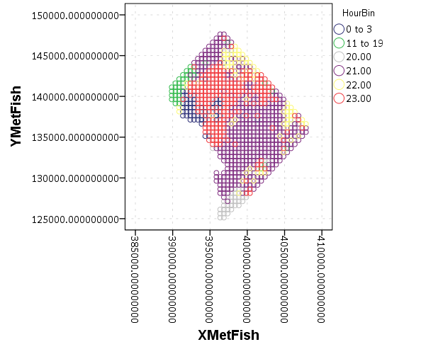
We can do quite a bit to make this map look nicer. Here I change:
- make the aspect ratio 1 to 1, and set the map limits
- get rid of the X and Y axis (the particular projected coordinates make no difference)
- make a nice set of colors based on a ColorBrewer palatte and map the color to the interior of the point
And below that is the map it produces.
*Making chart nice, same aspect ratio, colors, drop x & y.
FORMATS HourBin (F2.0).
GGRAPH
  /GRAPHDATASET NAME="graphdataset" VARIABLES=XMetFish[LEVEL=SCALE] YMetFish[LEVEL=SCALE] HourBin
    MISSING=LISTWISE REPORTMISSING=NO
  /GRAPHSPEC SOURCE=INLINE.
BEGIN GPL
  SOURCE: s=userSource(id("graphdataset"))
  DATA: XMetFish=col(source(s), name("XMetFish"))
  DATA: YMetFish=col(source(s), name("YMetFish"))
  DATA: HourBin=col(source(s), name("HourBin"), unit.category())
  COORD: rect(dim(1,2), sameRatio())
  GUIDE: axis(dim(1), null())
  GUIDE: axis(dim(2), null())
  GUIDE: legend(aesthetic(aesthetic.color.exterior), label("HourBin"))
  SCALE: linear(dim(1), min(389800), max(408000))
  SCALE: linear(dim(2), min(125000), max(147800))
  SCALE: cat(aesthetic(aesthetic.color.interior), map(("1",color."810f7c"),("2",color."edf8fb"),("20",color."bfd3e6"),("21",color."9ebcda"),
         ("22",color."8c96c6"),("23",color."8856a7")))
  ELEMENT: point(position(XMetFish*YMetFish), color.interior(HourBin))
END GPL.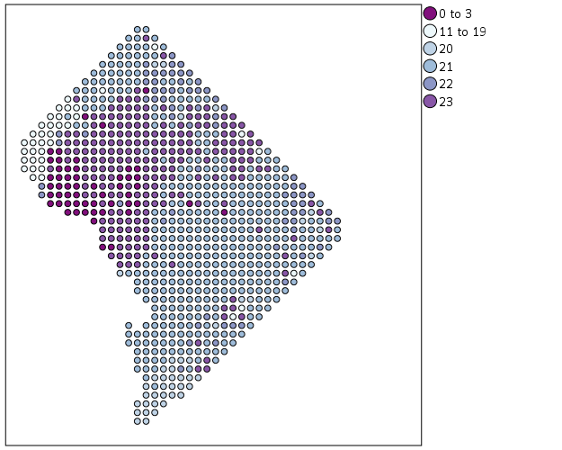
So that is not too shabby a map for just plain SPSS. Now it is a bit hard to vizualize the patterns though, because the surface has needless discontinuities because of the circles. We can use squares as the shape and just do some experimentation to figure out the size needed to fill up each grid cell. Also pro-tip when making choropleth maps, with many areas often light outlines look nicer than black ones.
*Alittle nicer, squares, no outline.
GGRAPH
  /GRAPHDATASET NAME="graphdataset" VARIABLES=XMetFish[LEVEL=SCALE] YMetFish[LEVEL=SCALE] HourBin
    MISSING=LISTWISE REPORTMISSING=NO
  /GRAPHSPEC SOURCE=INLINE.
BEGIN GPL
  SOURCE: s=userSource(id("graphdataset"))
  DATA: XMetFish=col(source(s), name("XMetFish"))
  DATA: YMetFish=col(source(s), name("YMetFish"))
  DATA: HourBin=col(source(s), name("HourBin"), unit.category())
  COORD: rect(dim(1,2), sameRatio())
  GUIDE: axis(dim(1), null())
  GUIDE: axis(dim(2), null())
  GUIDE: legend(aesthetic(aesthetic.color.exterior), label("HourBin"))
  SCALE: linear(dim(1), min(389800), max(408000))
  SCALE: linear(dim(2), min(125000), max(147800))
  SCALE: cat(aesthetic(aesthetic.color.interior), map(("1",color."810f7c"),("2",color."edf8fb"),("20",color."bfd3e6"),("21",color."9ebcda"),
         ("22",color."8c96c6"),("23",color."8856a7")))
  ELEMENT: point(position(XMetFish*YMetFish), color.interior(HourBin), shape(shape.square), size(size."9.5"),
           transparency.exterior(transparency."1"))
END GPL.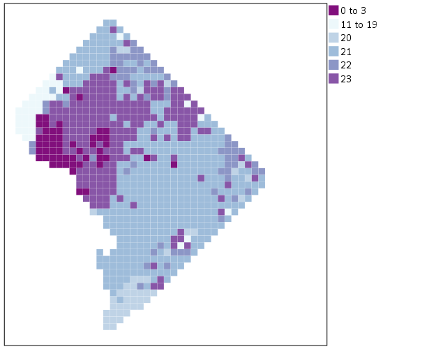
Again looking pretty good for just a map in plain SPSS. With the larger squares it is easier to clump together areas with similar patterns for the peak robbery time. The city never sleeps in Georgetown it appears. A few of the polygons though are very hard to see on the edge of DC though, so we will add in the outline. See the SOURCE: mapsrc, DATA: lon*lat, and the ELEMENT: polygon lines for how this is done. The “DCOutline.smz” is the map template file created by SPSS.
*Now include the outline.
GGRAPH
  /GRAPHDATASET NAME="graphdataset" VARIABLES=XMetFish[LEVEL=SCALE] YMetFish[LEVEL=SCALE] HourBin
    MISSING=LISTWISE REPORTMISSING=NO
  /GRAPHSPEC SOURCE=INLINE.
BEGIN GPL
  SOURCE: s=userSource(id("graphdataset"))
  DATA: XMetFish=col(source(s), name("XMetFish"))
  DATA: YMetFish=col(source(s), name("YMetFish"))
  DATA: HourBin=col(source(s), name("HourBin"), unit.category())
  SOURCE: mapsrc = mapSource(file("C:\\Users\\andrew.wheeler\\Dropbox\\Documents\\BLOG\\Inline_Maps_GGRAPH\\DCOutline.smz"))
  DATA: lon*lat = mapVariables(source(mapsrc))
  COORD: rect(dim(1,2), sameRatio())
  GUIDE: axis(dim(1), null())
  GUIDE: axis(dim(2), null())
  GUIDE: legend(aesthetic(aesthetic.color.exterior), label("HourBin"))
  SCALE: linear(dim(1), min(389800), max(408000))
  SCALE: linear(dim(2), min(125000), max(147800))
  SCALE: cat(aesthetic(aesthetic.color.interior), map(("1",color."810f7c"),("2",color."edf8fb"),("20",color."bfd3e6"),("21",color."9ebcda"),
         ("22",color."8c96c6"),("23",color."8856a7")))
  ELEMENT: point(position(XMetFish*YMetFish), color.interior(HourBin), shape(shape.square), size(size."9.5"),
           transparency.exterior(transparency."1"))
  ELEMENT: polygon(position(lon*lat))
END GPL.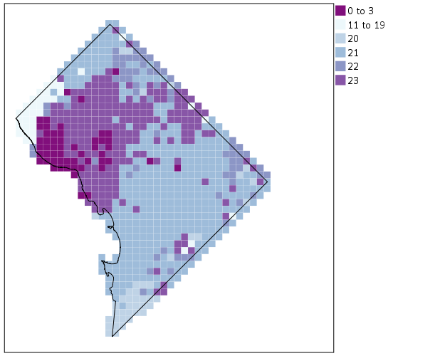
Now we have a bit more of a reference. The really late at night area appears to be north of Georgetown. The reason I figured this was even possible is that although mapSource is not documented in the GPL reference guide, there is an example using it with the project function (see page 194).
Now, if I were only making one map this isn’t really much of a help – I would just export the data values, make it in ArcGIS and be done with it. But, one of the things hard to do in GIS is make small multiple maps. That is something we can do fairly easily in stat. software though. For an example, here I make a random map to compare with the observed patterns. The grammar automatically recognizes lon*lat*Type and replicates the background outline across each panel. Also I change the size of the overall plot using PAGE statements. I just typically experiment until it looks nice.
*Can use the outline to do small multiples.
COMPUTE HourRand = TRUNC(RV.UNIFORM(0,24)).
RECODE HourRand (0 THRU 3 = 1)(4 THRU 19 = 2)(ELSE = COPY).
VARSTOCASES
  /MAKE Hour FROM HourBin HourRand
  /INDEX Type.
VALUE LABELS Type 1 'Observed' 2 'Random'.

*Small multiple.
GGRAPH
  /GRAPHDATASET NAME="graphdataset" VARIABLES=XMetFish YMetFish Hour Type
    MISSING=LISTWISE REPORTMISSING=NO
  /GRAPHSPEC SOURCE=INLINE.
BEGIN GPL
  PAGE: begin(scale(1000px,500px))
  SOURCE: s=userSource(id("graphdataset"))
  DATA: XMetFish=col(source(s), name("XMetFish"))
  DATA: YMetFish=col(source(s), name("YMetFish"))
  DATA: Hour=col(source(s), name("Hour"), unit.category())
  DATA: Type=col(source(s), name("Type"), unit.category())
  SOURCE: mapsrc = mapSource(file("C:\\Users\\andrew.wheeler\\Dropbox\\Documents\\BLOG\\Inline_Maps_GGRAPH\\DCOutline.smz"))
  DATA: lon*lat = mapVariables(source(mapsrc))
  COORD: rect(dim(1,2), sameRatio(), wrap())
  GUIDE: axis(dim(1), null())
  GUIDE: axis(dim(2), null())
  GUIDE: axis(dim(3), opposite())
  GUIDE: legend(aesthetic(aesthetic.color.exterior), label("HourBin"))
  SCALE: linear(dim(1), min(389800), max(408000))
  SCALE: linear(dim(2), min(125000), max(147800))
  SCALE: cat(aesthetic(aesthetic.color.interior), map(("1",color."810f7c"),("2",color."edf8fb"),("20",color."bfd3e6"),("21",color."9ebcda"),
         ("22",color."8c96c6"),("23",color."8856a7")))
  ELEMENT: point(position(XMetFish*YMetFish*Type), color.interior(Hour), shape(shape.square), size(size."8"),
           transparency.exterior(transparency."1"))
  ELEMENT: polygon(position(lon*lat*Type))
  PAGE: end()
END GPL.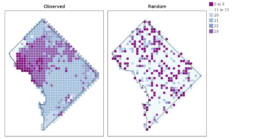
We can see that this extreme amount of clustering is clearly not random.
This example works out quite nice because the micro level areas are a regular grid, so I can simulate a choropleth map look by just using square point markers. Unfortunately, I was not able to figure out how to map areas to merge a map file and an id like you can in VIZTEMPLATE. You can see some of my attempts in the attached code. You can however have multiple mapSource statements, so you could import say a street network, rivers and parks and map a nice background map right in SPSS. Hopefully IBM updates the documentation so I can figure out how to make a choropleth map in inline GPL statements.


Paul Beaulne
/ January 25, 2016GGraph
[cid:image007.png@01D15765.D7150F10]
[cid:image003.png@01D15765.D4C13400]
Dr. A. Paul Beaulne, PhD, DHA, RAI-C
President
[cid:image004.jpg@01D15765.D4C13400]
MED e-care Health Care Solutions Inc.
Paul@MEDe-care.com,
CORPORATE WEB http://WWW.MEDe-care.com
RAI Usersâ Forum http://www.RAI.to
Toronto Canada
Office 416-686-8592
Cell 647-242-6858
710 Kingston Road
Toronto, Ontario
Canada, M4E1R7
Manchester, United Kingdom
Office 0161 236 2865
Unit 301
11 Whitworth Street West
Manchester, M1 5DB
[cid:image008.jpg@01D15765.D7150F10]
apwheele
/ January 25, 2016Hi Paul, not sure what to make of these comments. Did you try to attach an image?
Paul Beaulne
/ January 25, 2016*Using key doesnt give error message, but not sure how to map to each other.
GGRAPH
/GRAPHDATASET NAME=”graphdataset” VARIABLES=XMetFish[LEVEL=SCALE] YMetFish[LEVEL=SCALE] HourBin FishId
MISSING=LISTWISE REPORTMISSING=NO
/GRAPHSPEC SOURCE=INLINE.
BEGIN GPL
SOURCE: s=userSource(id(“graphdataset”))
DATA: XMetFish=col(source(s), name(“XMetFish”))
DATA: YMetFish=col(source(s), name(“YMetFish”))
DATA: HourBin=col(source(s), name(“HourBin”), unit.category())
DATA: FishId=col(source(s), name(“FishId”), unit.category())
SOURCE: mapsrc = mapSource(file(“C:\\Users\\apbeaulne\\Documents\\SPSS\\MAPS\\DCFishnet.smz”),
key(“FishId”))
DATA: lon*lat = mapVariables(source(mapsrc))
COORD: rect(dim(1,2), sameRatio())
GUIDE: axis(dim(1), null())
GUIDE: axis(dim(2), null())
GUIDE: legend(aesthetic(aesthetic.color.exterior), label(“HourBin”))
SCALE: linear(dim(1), min(389800), max(408000))
SCALE: linear(dim(2), min(125000), max(147800))
SCALE: cat(aesthetic(aesthetic.color.interior), map((“1″,color.”810f7c”),(“2″,color.”edf8fb”),(“20″,color.”bfd3e6”),(“21″,color.”9ebcda”),
(“22″,color.”8c96c6”),(“23″,color.”8856a7″)))
ELEMENT: polygon(position(lon*lat), color.interior(HourBin)))
END GPL.
*ELEMENT: point(position(XMetFish*YMetFish), color.interior(HourBin), shape(shape.square), size(size.”9.5″),
transparency.exterior(transparency.”1”))
Dr. A. Paul Beaulne, PhD, DHA, RAI-C
President
[cid:image001.jpg@01D15765.F8CA0E80]
MED e-care Health Care Solutions Inc.
Paul@MEDe-care.com,
CORPORATE WEB http://WWW.MEDe-care.com
RAI Usersâ Forum http://www.RAI.to
Toronto Canada
Office 416-686-8592
Cell 647-242-6858
710 Kingston Road
Toronto, Ontario
Canada, M4E1R7
Manchester, United Kingdom
Office 0161 236 2865
Unit 301
11 Whitworth Street West
Manchester, M1 5DB
[cid:image004.jpg@01D15766.00BCA9E0]
Paul
/ September 6, 2016The Call to SOURCE: mapsrc = mapSource(file(“F:\\BackUp From FreeAgent\Documents\\SPSS\\GGraph\\MAPS\\DCOutline.smz”))
Fails
Bad Value
For Parameter mapfile
apwheele
/ September 6, 2016Since it is not documented I can’t say for sure, but I would try a path that does not have spaces in it. I haven’t tried to see if this works with newer versions either.
Paul
/ September 6, 2016The last 2 graphs now give an error
Layer fishId not found in mapfile
The last graph runs but it is empty only the structure shows
apwheele
/ September 6, 2016Are you using the key option? I was never able to get that to map between the two datasets. I’m not sure if I made that smz file with the variable “FishID” in it or not (it could have been named differently or with different casing.)
Paul
/ September 6, 2016The last file uses Key (This one produces error)
The second last uses error (this produces empty graph)
I am only using your code with any change
*Trying with the fishnet – this does not work.
GGRAPH
/GRAPHDATASET NAME=”graphdataset” VARIABLES=XMetFish[LEVEL=SCALE] YMetFish[LEVEL=SCALE] HourBin
MISSING=LISTWISE REPORTMISSING=NO
/GRAPHSPEC SOURCE=INLINE.
BEGIN GPL
SOURCE: s=userSource(id(“graphdataset”))
DATA: XMetFish=col(source(s), name(“XMetFish”))
DATA: YMetFish=col(source(s), name(“YMetFish”))
DATA: HourBin=col(source(s), name(“HourBin”), unit.category())
SOURCE: mapsrc = mapSource(file(“F:\\BackUpFromFreeAgent\\Documents\\SPSS\\GGraph\\MAPS\\DCFishnet.smz”),layer(“FishId”))
DATA: lon*lat = mapVariables(source(mapsrc))
COORD: rect(dim(1,2), sameRatio())
GUIDE: axis(dim(1), null())
GUIDE: axis(dim(2), null())
GUIDE: legend(aesthetic(aesthetic.color.exterior), label(“HourBin”))
SCALE: linear(dim(1), min(389800), max(408000))
SCALE: linear(dim(2), min(125000), max(147800))
SCALE: cat(aesthetic(aesthetic.color.interior), map((“1″,color.”810f7c”),(“2″,color.”edf8fb”),(“20″,color.”bfd3e6”),(“21″,color.”9ebcda”),
(“22″,color.”8c96c6”),(“23″,color.”8856a7″)))
ELEMENT: point(position(XMetFish*YMetFish), color.interior(HourBin), shape(shape.square), size(size.”9.5″),
transparency.exterior(transparency.”1″))
ELEMENT: polygon(position(lon*lat))
END GPL.
*Using key doesnt give error message, but not sure how to map to each other.
GGRAPH
/GRAPHDATASET NAME=”graphdataset” VARIABLES=XMetFish[LEVEL=SCALE] YMetFish[LEVEL=SCALE] HourBin FishId
MISSING=LISTWISE REPORTMISSING=NO
/GRAPHSPEC SOURCE=INLINE.
BEGIN GPL
SOURCE: s=userSource(id(“graphdataset”))
DATA: XMetFish=col(source(s), name(“XMetFish”))
DATA: YMetFish=col(source(s), name(“YMetFish”))
DATA: HourBin=col(source(s), name(“HourBin”), unit.category())
DATA: FishId=col(source(s), name(“FishId”), unit.category())
SOURCE: mapsrc = mapSource(file(“F:\\BackUpFromFreeAgent\\Documents\\SPSS\\GGraph\\MAPS\\DCFishnet.smz”),key(“FishId”))
DATA: lon*lat = mapVariables(source(mapsrc))
COORD: rect(dim(1,2), sameRatio())
GUIDE: axis(dim(1), null())
GUIDE: axis(dim(2), null())
GUIDE: legend(aesthetic(aesthetic.color.exterior), label(“HourBin”))
SCALE: linear(dim(1), min(389800), max(408000))
SCALE: linear(dim(2), min(125000), max(147800))
SCALE: cat(aesthetic(aesthetic.color.interior), map((“1″,color.”810f7c”),(“2″,color.”edf8fb”),(“20″,color.”bfd3e6”),(“21″,color.”9ebcda”),
(“22″,color.”8c96c6”),(“23″,color.”8856a7″)))
ELEMENT: polygon(position(lon*lat), color.interior(HourBin)))
END GPL.
*ELEMENT: point(position(XMetFish*YMetFish), color.interior(HourBin), shape(shape.square), size(size.”9.5″),
transparency.exterior(transparency.”1”))
apwheele
/ September 6, 2016That is my general point I think – I don’t know how to map the keys. Those examples did not work for me either – the ones I show in my blog post do however.
It shows how to use the outline as a general background, even for small multiples. It does not show how to make a choropleth map where the data keys are assigned to map locations. See my comments in the original sps file.