
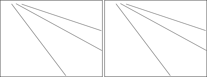
Save in the memory banks whether the slope of the lines in the left hand panel appear similar, smaller or larger than the slope of the lines in the right hand panel.
I enjoy reading about optical illusions, both purely because I think they are neat and there applicability to how we present and perceive information in statistical graphics. A few examples I am familiar with are;
- The Rubin Vase optical illusion in which it is difficult to distinguish between what object is the background and which is the foreground. This is applicable to making clear background/foreground seperation between grid lines and chart elements.
- Change blindness, which makes it difficult to interpret animated graphics that do not have smooth, continous transitions between chart states.
- Mach bands, where the color of an object is perceived differently given the context of the surrounding colors. I recently came across one of the most dramatic examples of this at the very cool mighty optical illusion site. I actually went and edited the image in that example to make sure there was no funny business it was so dramatic an effect! Image included below.

I was recently pointed to a new (to me) example of an optical illusion, the leaning tower illusion, in a paper by Kingdom, Yoonessi & Gheorghiu (2007) (referred via the Freakonometrics blog).
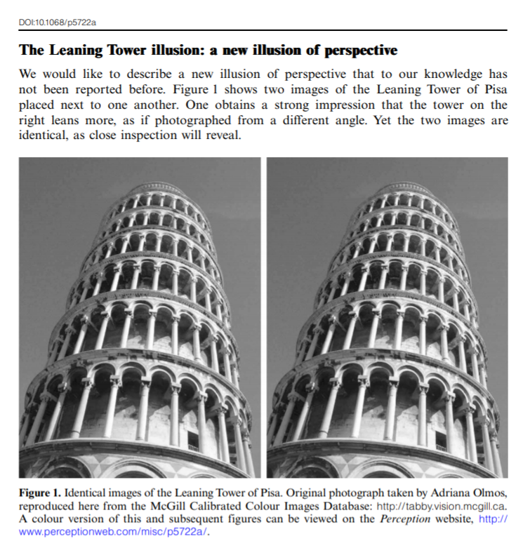
Although I suggest to read the article (it is very brief) – to sum it up both pictures above are identical, although the tower on the right appears to be leaning more to the right. Although the pictures are seperate (and have some visual distinction) our minds interpret them in the same “plane”. And hence objects that are further away in the distance should not be parallel but should actually converge within the image.
Off-the-cuff this reminded me of the Ponzo illusion, where our minds know that the lines are still running parallel, and our perception of other surrounding elements changes conditional on that dominant parallel lines pattern. Here is another good example of this from the mighty optical illusions site (actually I did not know the name of this effect – and when I googled subway tile illusion this is the site that came up – and I’m glad I found it!)
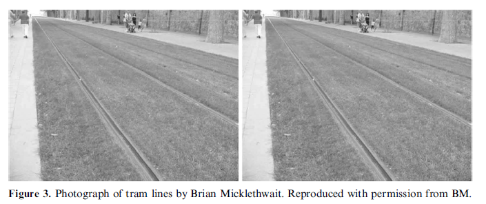
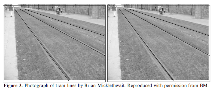
Is this applicable to statistical graphics though? One of the later images in the Perception article appear to be potentially more reminiscent of a small multiple line chart (and we all know I strongly advocate for the use of small multiple charts).
We do know that interpreting the distance between sloping lines is difficult (as elaborated on in some of Cleveland’s work), but this is different in that potentially our perception of the parallelness of lines between panels in a small multiple is distorted based the directions of lines within the panel. Off-hand though we may expect that the context doesn’t exactly carry-over, there is no visual schematic in 2d statistical graphics that lines are running further from our perspective. So to test this out I attempted to create some settings in small multiple line panels that might cause similar optical illusions.
So, going back to the picture at the beginning of the article, here are those same lines superimposed on the original picture. My personal objectivity to tell if these result in visual distortions is gone at this point, but at best I could only conjure up perhaps some slight distortion between panels (which is perhaps no worse than our ability to effectively perceive slopes accurately anyway).
I think along these lines one could come up with some more examples where between panel comparisons for line graphs in small multiples produce such distortions, but I was unable to produce anything compelling in some brief tries (so let me know if you come across any examples where such distortions occur!) Simply food for thought though at this point.
I do think though that the Ponzo scheme can be illustrated with essentially the same graphic.
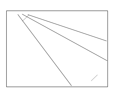
It isn’t as dramatic as the subway tile example, but I do think it appears the positive sloping line where the negative sloping lines converge at the top of the image appears larger than the line in space and the bottom right of the image.
I suspect this could actually occur in real life graphics in which we have error bars superimposed on a graph with several lines of point estimates. If the point estimates start at a wide interval and then converge, it may produce a similar illusion that the error bars appear larger around the point estimates that are closer together. Again though I produced nothing real compelling in my short experimentation.

