
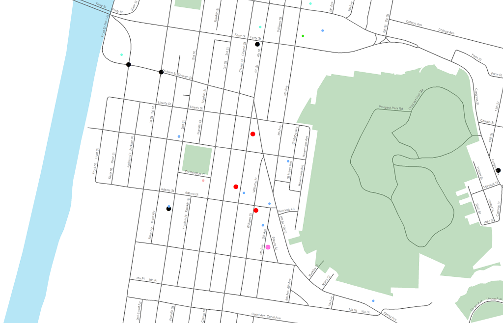
I am at it again discussing black map backgrounds. I make a set of crime maps for several local community groups as part of my job as a crime analyst for Troy PD. I tend to make several maps for each group, seperating out violent, property and quality of life related crimes. Within each map I try to attempt to make a hierarchy between crime types, with more serious crimes as larger markers and less severe crimes as smaller markers.
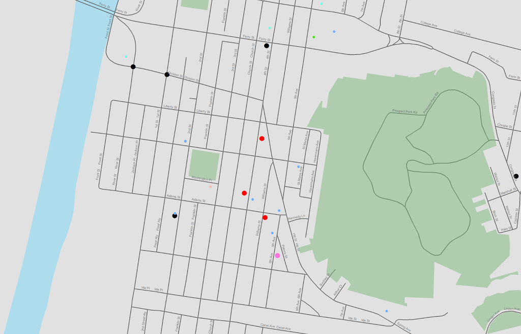
Despite critiques, I believe the dark background can be useful, as it creates greater contrast for map elements. In particular, the small crime dots are much easier to see (and IMO in these examples the streets and street name labels are still easy to read). Below are examples of the white background, a light grey background, and a black background for the same map (only changes are the black point marker is changed to white in the black background map, streets and parks are drawn with a heavy amount of transparency to begin with so don’t need to be changed).
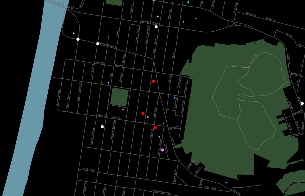
Surprisingly to me, ink be damned, even printing out the black background looks pretty good! (I need to disseminate paper copies at these meetings) I think if I had to place the legend on the black map background I would be less thrilled, but currently I have half the page devoted to the map and the other half devoted to a table listing the events and the time they occurred, along with the legend (ditto for the scale bar and the North arrow not looking so nice).
I could probably manipulate the markers to provide more contrast in the white background map (e.g. make them bigger, draw the lighter/smaller symbols with dark outlines, etc.) But, I was quite happy with the black background map (and the grey background may be a useful in-between the two as well). It took no changes besides changing the background in my current template (and change black circles to white ones) to produce the example maps. I also chose those sizes for markers for a reason (so the map did not appear flooded with crime dots, and more severe and less severe crimes were easily distinguished), and so I’m hesistant to think that I can do much better than what I have so far with the white background maps (and I refuse to put those cheesy crime marker symbols, like a hand gun or a body outline, on my maps).
In terms of differentiating between global and local information in the maps, I believe the high contrast dark background map is nice to identify local points, but does not aid any in identifying general patterns. I don’t think general patterns are a real concern though for the local community groups (displaying so many points on the same map in general isn’t good for distinguishing general patterns anyway).
I’m a bit hesitant to roll out the black maps as of yet (maybe if I get some good feedback on this post I will be more daring). I’m still on the fence, but I may try out the grey background maps for the next round of monthly meetings. I will have to think if I can devise a reasonable experiment to differentiate between the maps and whether they meet the community groups goals and/or expectations. But, all together, the black background maps should certainly be given serious consideration for similar tasks. Again, as I said previously, the high contrast with smaller elements makes them more obvious (brings them more to the foreground) than with the white background, which as I show here can be useful in some circumstances.

