
Andrew Gelman blogged the other day about an example of Odds Ratios being plotted on a linear scale. I have seen this mistake a couple of times, so I figured it would be worth the time to further elaborate on.
Reported odds ratios are almost invariably from the output of a generalized linear regression model (e.g. logistic, poisson). Graphing the associated exponentiated coefficients and their standard errors (or confidence intervals) is certainly a reasonable thing to want to do – but unless someone wants to be misleading they need to be on a log scale. When the coefficients (and the associated intervals) are exponeniated they are no longer symmetric on a linear scale.
To illustrate a few nefarious examples, lets pretend our software spit out a series of regression coefficients. The table shows the original coefficients on the log odds scale, and the subsequent exponentiated coefficients +- 2 Standard Errors.
Est.  Point  S.E. Exp(Point) Exp(-2*S.E.) Exp(+2*S.E.)
  1   -0.7   0.1    0.5        0.4            0.6
  2    0.7   0.1    2.0        1.6            2.5
  3    0.2   0.1    1.2        1.0            1.5
  4    0.1   0.8    1.1        0.2            5.5
  5   -0.3   0.9    0.7        0.1            4.5
Now, to start lets graph the exponentiated estimates (the odds ratios) for estimates 1 and 2 and their standard errors on an arithmetic scale, and see what happens.
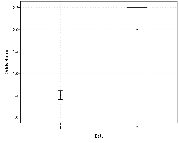
This graph would give the impression that 2 is both a larger effect and has a wider variance than effect 1. Now lets look at the same chart on a log scale.
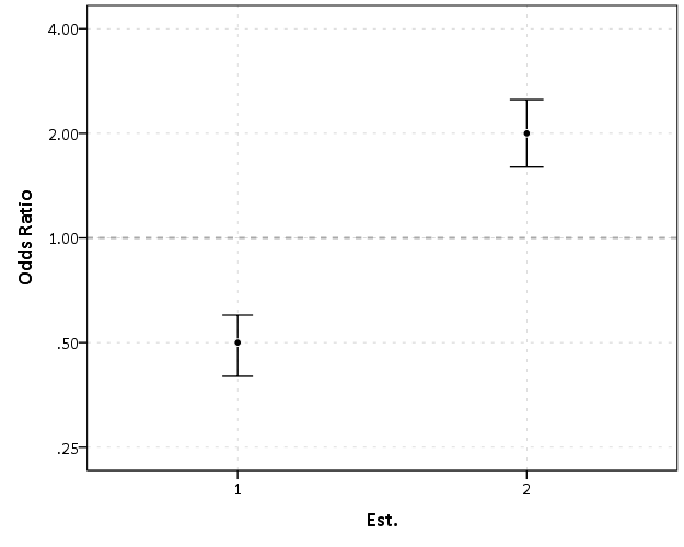
By construction effects 1 and 2 are exactly the same (this is clear on the original log odds scale before the coefficients were exponentiated). Changes in the ratio of the odds can not go below zero, and a change from an odds ratio between 0.5 and 0.4 is the same relative change as that between 2.0 and 2.5. On the linear scale though the former is a difference of 0.1, and the latter a difference of 0.5.
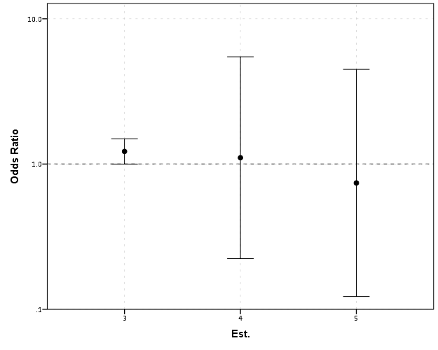
Such visual discrepancies get larger the further towards zero you go, and as what goes in the denominator and what goes in the numerator is arbitrary, displaying these values on a linear scale is very misleading. Consider a different example:
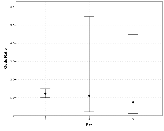
Well, what would we gather from this? Estimates 4 and 5 both have a wide variance, and the majority of their error bars are both above 1. This is an incorrect interpretation though, as the point estimate of 5 is below 1, and more of its error bar is on the below 1 side.
Looking up some more examples online this may be a problem more often than I thought (doing a google image search for “plot odds ratios” turns up plenty of examples to support my position). I even see some examples of forest plots of odds ratios fail to do this. An oft critique of log scales is that they are harder to understand. Even if I acquiesce that this is true, plotting odds ratios on a linear scale is misleading and should never be done.
To make a set of charts in SPSS with log scales for your particular data you can simply enter in the model estimates using DATA LIST and then use GGRAPH to make the plot. In particular for GGRAPH see the SCALE lines to set the base of the logarithms. Example below:
*Can input your own data.
DATA LIST FREE / Id  (A10) PointEst  SEPoint Exp_Point CIExp_L CIExp_H.
BEGIN DATA
  1   -0.7   0.1    0.5        0.4            0.6
  2    0.7   0.1    2.0        1.6            2.5
  3    0.2   0.1    1.2        1.0            1.5
  4    0.1   0.8    1.1        0.2            5.5
  5   -0.3   0.9    0.7        0.1            4.5
END DATA.
DATASET NAME OddsRat.

*Graph of Confidence intervals on log scale.
FORMATS Exp_Point CIExp_L CIExp_H (F2.1).
GGRAPH
  /GRAPHDATASET NAME="graphdataset" VARIABLES=Id Exp_Point CIExp_L CIExp_H
  /GRAPHSPEC SOURCE=INLINE.
BEGIN GPL
  SOURCE: s=userSource(id("graphdataset"))
  DATA: Id=col(source(s), name("Id"), unit.category())
  DATA: Exp_Point=col(source(s), name("Exp_Point"))
  DATA: CIExp_L=col(source(s), name("CIExp_L"))
  DATA: CIExp_H=col(source(s), name("CIExp_H"))
  GUIDE: axis(dim(1), label("Point Estimate and 95% Confidence Interval"))
  GUIDE: axis(dim(2))
  GUIDE: form.line(position(1,*), size(size."2"), color(color.darkgrey))
  SCALE: log(dim(1), base(2), min(0.1), max(6))
  ELEMENT: edge(position((CIExp_L+CIExp_H)*Id))
  ELEMENT: point(position(Exp_Point*Id), color.interior(color.black),
           color.exterior(color.white))
END GPL.

Julie
/ August 5, 2014Where did you get your graphs? I understand your point here, but I am having trouble finding a way to generate a graph with a log-scale axis. I just need to make fairly simple graphs, like you use here.
apwheele
/ August 5, 2014I made these graphs in SPSS Julie. Are you asking for example code in SPSS to make log scales?
Julie
/ August 5, 2014Thank you for the quick response!!!
Yes! If you could share the syntax with me, that would be helpful. I needed to do my analyses in HLM and am not sure how to now graph the odds ratios on a log scale.
Julie
/ August 5, 2014I’m hoping I can find a way to just enter the OR and CI from my HLM output.
apwheele
/ August 5, 2014Julie, I’ve added an example at the end of this post of entering in data manually and making a chart in SPSS.
I will slate a full post on making logarithmic and other non-linear scales in SPSS for my next post when I get a chance. If you have any other questions feel free to either send me an email or ask a question on the SPSS NABBLE list-serve.
Julie
/ August 5, 2014This is incredibly helpful! I already used successfully used it. Thank you so so much for your quick and really helpful responses!
Sarah
/ May 18, 2017This syntax worked perfectly. Thank you! I have struggled making very unattractive graphs in Excel but not any more. Thanks again Andrew
Hannah
/ June 28, 2017I know this is an old post, but was wondering if you would be able to help. I have to present the odds ratio from a ordinal regression (using the PLUM procedure). Do these also need to be on log scales? And if so is the SPSS syntax different?
apwheele
/ June 28, 2017If you want to specifically plot the odd’s ratio then yes it should be on a log scale. Basically anything that is a ratio should be on a log scale, given the problem if you switch the numerator and denominator it dramatically influences the plot on a linear scale.
Given the latent variable interpretation of ordinal regression I don’t think you *have* to plot the odds ratio (I think odds ratios only make sense for the logit link function). If you plotted the original linear effects they can of course be on a linear scale, and that is applicable to any link function.
Mike
/ January 3, 2018What is your advice when we present the results in a table? Should we present the regression coefficients, or the exponential values? The former seems equivalent to plotting the ORs on a log scale, but is not common.
And would you ever consider plotting on some type of reciprocal scale, i.e. OR when OR>1 and 1/OR when OR<1 (but plotted below y=1.00)?
apwheele
/ January 3, 2018Good questions – I’m definitely in the minority, but I like the linear coefficients in the table.
You do all hypothesis tests and contrasts between coefficients on the linear scale, so I think they are more informative (that is if you want to compare effect A to effect B, you need to do it on the linear scale). I rather take the extra effort and convert the results to the probability scale (absolute risk) for meaningful comparisons as opposed to the odd’s ratios. (I’ve just seen so many examples where odds ratios can be misleading due to a rare event or the scale of the independent variable.)
I mean, go ahead and also include the odd’s ratio if you want, but I just don’t think they are as informative.
Even when all of the ratios are positive it still has the same fundamental problem. The distance between an odd’s ratio of 2-1 is the same as the distance for an odd’s ratio of 4-2.
Ken Rothman made a similar suggestion, saying that when they are all positive they are closer to absolute risk differences, so are ok to plot on the linear scale. My general response to that is just plot the absolute risk differences then, see https://andrewpwheeler.wordpress.com/2015/01/02/2014-blog-stats-and-why-blogging-articles/.
Mike
/ January 4, 2018With ORs from case-control studies it can be tricky to convert to the probability (risk) scale (and often in case-control studies we are interested in rate/hazard ratios anyway). But with cross-sectional or prevalence data I agree it is easier to convert to the probability scale — but then would it be more satisfactory to actually model the risks (probabilities) rather than the odds (https://stats.idre.ucla.edu/stata/faq/how-can-i-estimate-relative-risk-using-glm-for-common-outcomes-in-cohort-studies/)? I think odds are an unusual concept for most people, except gamblers 🙂
apwheele
/ January 4, 2018I’m not an epidemiologist, so take it for what it is worth, but I fail to see much of a problem with applying this advice to case-control data. So you don’t have overall prevalence – so just describe the differences in probabilities in the observed sample – that is still informative and easier to interpret than odds ratios (even if you cannot convert to population risk differences).
Those coefficients from log-binomial models or Poisson models are no different than logistic for my advice here. If you plot them you should still plot them on a log scale. In general if it is a ratio you should plot it on a log scale.
Ayu
/ February 10, 2020Hi, would you mind sharing how to plot a log scale graph in excel? Your help much appreciated. Thank you
apwheele
/ February 10, 2020I forget exactly how to do it. If you select the axis and right click format axis (or something like that) you can style the plot and choose a log scale I believe. (I’m sure someone else already has a post on the internet about that as well!)