
The other day in Google books I noticed Graphics for Statistics and Data Analysis with R by Kevin Keen in the related book section. What caught my eye was not the title (there have to be 100+ related R books at this point) but the really awful 3d pie chart.
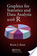
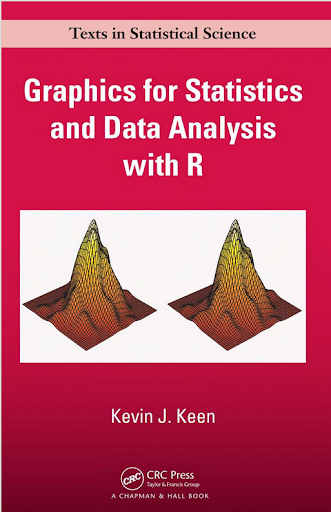
Looking at the preview on google books this appears to be an unfortunate substitution. The actual cover has a much more reasonable set of surface plots and other online book stores (e.g. Amazon) appear to have the correct cover.
I suspect someone at CRC Press used some stock imagery for the cover, and unfortunately the weird 3d pie graph has been propagated to the google book preview without correction.
This reminded me of a few other book covers in cartography and data visualization though that I find less than appealing. Now, I’m not saying here to judge a book by its cover, and I have not read all of the books I will point to here. But I find the use of 3d graphics in book covers in the data visualization field to be strange and bordering cognitive dissonance with the advice most of the authors give.
First I’ll start with a book I have read, and would suggest to everyone, Thematic cartography and geographic visualization by Slocum et al. I have the 2005 version, and it is dawned by this 3d landscape. (Sorry this is the largest image I can find online – other editions I believe have different covers.)

The multivariate display of data is admirable – so for exploratory analysis you could make a reasonable argument for the use of proportional sized circles superimposed on the choropleth map. The use of 3d in this circumstance though is gratuitous, and the extreme perspective hides much of the data while highlighting the green hills in the background.
The second mapping book I have slight reservations about critiquing the cover (I am on the job market!). I have not read the book, so I can not say anything about its contents. But roaming the book displays at an ASC conference I remember seeing this cover, GIS and Spatial Analysis for the Social Sciences: Coding, Mapping, and Modeling by Nash and Asencio.
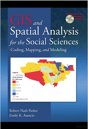
This probably should not count in the other 3d graphics I am showing. The bar columns do have shading for 3d perspective – but the map otherwise is 2d. But the spectral color scheme is an awful choice. The red in the map tends to stand out the most – which places with zero crimes I don’t think you want to make that impression. The choropleth colors appear to be displaying the same data as the point data. The point data are so clustered that the choropleth can only be described as misleading – which may be a good point in text for side by side maps – but on the cover? Bar locations seem to be unrelated (as we might expect for juvenile crime) but they are again aggregated to the (probably) census units – making me question if the aggregation obfuscates the relationship. Bars are not available from the census – so it is likely this aggregation was intentional. I have no idea about the content of the book and I will likely get it and do an overall review of all crime mapping books sometime. But the cover is unambiguously a bad map.
The last book cover with 3d graphics (related to data-visualization) that I immediately remembered was R For Dummies by Meys and de Vries.
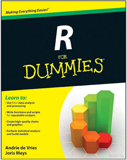
Now this when you look close really is not bad. It is not a graph on the cover, but a set of winding, hexagon cylinder stairsteps. So the analogy of taking small steps is fine – but the visual similarity to other statistical 3d graphics is clear. Consider the SPSS For Dummies book by Griffith.

Now that is an intentional, 3d chart made up of tiny blocks, with a trend line if you look closely, shadowed by cigarette like red bars in the background. At least this is so strange (and not possible in statistical software) that this example would never be confused with an actual reasonable statistical graphic. The Dummies series has such brand recognition as well that the dominant part of the cover might be the iconic yellow and type, as opposed to the inset graphic.
Not wanting to leave other software out of the loop, I looked for examples for SAS and Stata. SAS has a reasonable 3d cover in SAS System for Statistical Graphics by Friendly.

Short sidetrack story: I first learned statistical programming using SAS back in undergrad days at Bloomsburg University. Default graphics for SAS at that point (04-08) I believe were still the ASCII art looking things (at least that is what I remember). During our last meeting for my last statistics class – one of the other students showed me you could turn on the ODS output to html – and tables and graphs were by default pretty nice. I since have not had a need to use SAS.
This 3d cover by Friendly is arguably a reasonable use of 3d. 3d graphs are hard to navigate, and the use the anchors connecting the observations to the non-linear surface more easily associate a point with below or above the surface. It is certainly difficult though to understand the fit of the function – so likely a series of bivariate graphs would be more intuitive – especially given the meager number of points. I suspect the 3d on the cover is for the same reason 3d graphics were used in the other covers – because it looks cooler to book marketers!
Stata managed to debunk the 3d graph trends – I could not find any example Stata books with 3d graphics. Nick Cox’s newer collection of his Speaking Stata series though has some interesting embellishments.

While in isolation all of the graphs are fine – I’m sure Cox would not endorse the gratuitous use of color gradients in the graphics (I don’t think svg like gradients like that are even possible in Stata graphics). The ternary diagrams show nothing but triangles as well – so I don’t think such gradients are a good idea in any case for simply the background of the plot. Such embellishments could actually decode data, but in the case of bar graphs do not likely hurt or help with understanding the plot. When such gradients are used as the background though they likely compete with the actual data in the plot. Stata apparently can do 3d graphs – so I might suggest I write a book on crime modelling (published by Stata press) and insert a 3d graph on the cover (as this is clearly a niche in the market not currently filled!) I might have to make room for Chernoff faces somewhere on the front or back cover as well.
So maybe I am just seeing things in the examples of 3d covers. If anyone has any insight into how these publishers choose the covers let me know – or if you have other examples of bad book cover examples of data vizualization! Since most of my maps and graphs are pretty dull in 2d I might just outsource the graphic design if I made a book.


1 Comment