
Stephen Few had a recent post critiquing an evaluation of a particular data visualization. Long story short, the experiment asked questions like “What is the probability that X is above 5?”, and showed the accuracy based on mean+error bar charts, histogram like visualizations, and animated vizualations showing random draws.
It is always the case in data viz. that some charts are easier to answer particular questions. This is one question, what is the probability a value is above X, in which traditional histograms or error bar charts are not well suited for. But there is an alternative I don’t see used very often, the cumulative probability chart, that is well suited to answer that question.
It is a totally reasonable question to ask as well. For one example use when I was a crime analyst, I used this chart to show the time in-between shootings. Many shootings are retaliatory so I was interested in saying if a shooting happened on Sunday, how long should be PD be on guard for after an initial shooting. Do most retaliatory shootings happen within hours, days, or weeks of a prior shooting? This is a hard question to answer with histograms, but is easier to answer with cumulative probability plots.
Here is that example chart for time-in-between shootings:
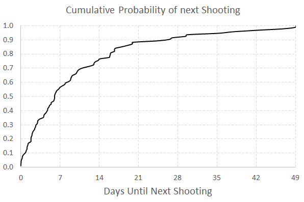
Although this chart is not regularly used, it is really easy to explain how to interpret. For example, at time equals 7 days (on the X axis), the probability that a shooting would have occurred is under 60%. In my opinion, it is easier to explain this chart than a histogram to a lay audience.
To produce the chart it is often not a canned option in software, but it takes very simple set of steps to produce the right ingrediants – and then you can use a typical line chart. So those steps generically are:
- sort the data
- rank the data (1 for the lowest value, 2 for the second lowest value, etc.)
- calculate rank/(total sample size) – call this
Prop - plot the data on the X axis, and
Propon the Y axis
Which can be easily done in any software, but here you can download an excel spreadsheet here used to make the above chart.
A variant of this chart often used in crime analysis is the proportion of places on the X axis and the cumulative proportion of crime on the Y axis. E.g. Pareto’s 80/20 rule – or 50/1 rule – or whatever. The chart makes it easy to pick whatever cut-offs you want. If you have your spatial units of analysis in one column, and the total number of crimes in a second column, the procedure to produce this chart is:
- sort the data descending by number of crimes
- rank the data
- calculate rank/(total sample size) – this equals the proportion of all spatial units – call this
PropUnits - calculate the cumulative number of crimes – call this Cum_Crime
- calculate Cum_Crime/(Total Crime) – this equals the proportion of all crimes – call this
PerCumCrime - plot
PerCumCrimeon the Y axis andPropUnitson the X axis.
See the third sheet of the excel file for a hypothetical example. This pattern basically happens in all aspects of criminal justice. That is, the majority of the bad stuff is happening among a small number of people/places. See this example from William Spelman showing places, victims, and offenders.
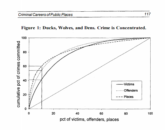
We can see there that 10% of the victims account for 40% of all victimizations etc.

