
Andrew Gelman posted an example graph the other day in a blog post which showed trends over time in measures of smiling in high school yearbook photos.

Surprisingly, Andrew did not make a comment on the error bars in the graph. Error bars with cross hairs are often distracting in the plot. In the example graph it is quite bad, in that they perfectly overlap, so the ends are very difficult to disentangle. Here I will suggest some alternatives.
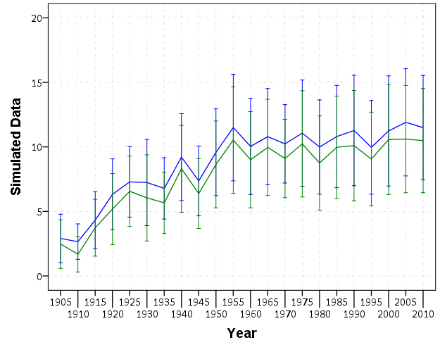
I simulated data that approximately captures the same overall trends, and replicated the initial chart in SPSS.
First, a simple solution with only two groups is to use semi-transparent areas instead of the error bars.
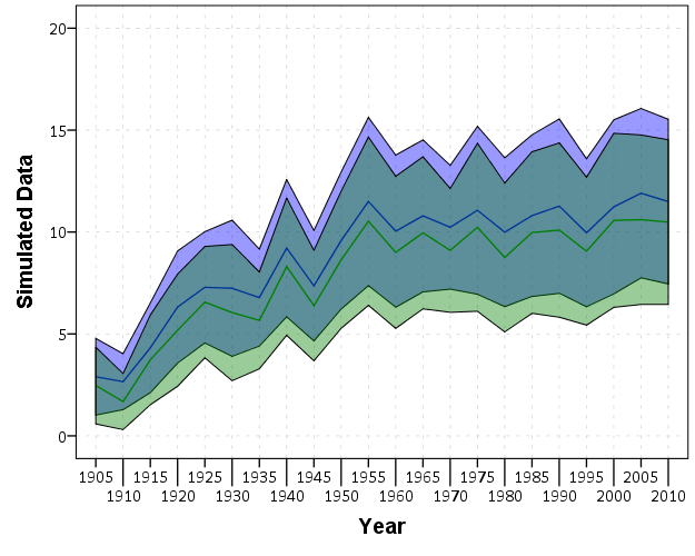
This makes it quite easy to see the overlap and non-overlap of the two groups. This will even print out nice in black-white. In the end, this chart is over-complicated by separating out genders. Since each follow the same trend, with females just having a constant level shift over the entire study period, there is not much point in showing each in a graph. A simpler solution would just pool them together (presumably the error bars would be smaller by pooling as well). The advice here still applies though, and the areas are easier to viz. than the discontinuous error bars.
For more complicated plots with more groups, I would suggest doing small multiples.
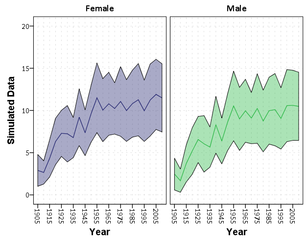
While it is harder now to see the exact overlap between groups, we can at least visually assess the trends within each group quite well. In the original it is quite a bit of work to figure out the differences between groups and keep the within group comparisons straight. Since the trends are so simple it is not impossible, but with more variable charts it would be quite a bit of work.
For instances in which a trend line is not appropriate, you can dodge the individual error bars on the x-axis so that they do not perfectly overlap. This is the same principle as in clustered bar charts, just with points and error bars instead of bars.
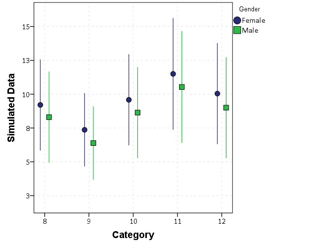
Here I like using just the straight lines (a tip taken from Andrew Gelman). The serif part of the I beam like error bars I find distracting, and make it necessary to separate the lines further. Using just the lines you can pack many more into a small space, like caterpillar plots of many random effects.
Here is a copy of the SPSS syntax used to generate these graphs.


Freddy
/ March 22, 2016Thank you. I have recently struggled with getting the error bars not messing up my visualizations. I will use what I learned from your guide to implement in a project I have (i.e., creating what is called Delta Plots). Again, thank you for a nice guide!