
The other day I had a set of three separate categories of binary data that I wanted to visualize with a Venn diagram (or a Euler) diagram of their intersections. I used the venneuler R package and it worked out pretty well.
library(venneuler)
MyVenn <- venneuler(c(A=74344,B=33197,C=26464,D=148531,"A&B"=11797,
                       "A&C"=9004,"B&C"=6056,"A&B&C"=2172,"A&D"=0,"A&D"=0,"B&D"=0,"C&D"=0))
MyVenn$labels <- c("A\n22","B\n7","C\n5","D\n58")
plot(MyVenn)
text(0.59,0.52,"1")
text(0.535,0.51,"3")
text(0.60,0.57,"2")
text(0.64,0.48,"4") 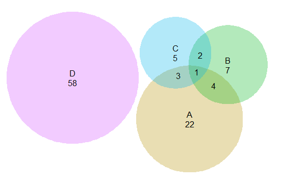
Some digging around on this topic though I came across some pretty interesting discussion, in particular a graph makeover of a set of autism diagnoses, see:
- Robert Kosara’s blog, Sightings: A Vennerable Challenge plus his American Scientist piece.
- Andrew Gelman’s blog, Venn Diagram Challenge Summary 1 (although that post is not by Andrew)
for background. Below is a recreated image of the original Venn diagram under discussion (from Kosara’s American Scientist article.)

Applying this example to the venneuler library did not work out so well.
MyVenn2 <- venneuler(c(A=111,B=65,C=94,"A&B"=62,"A&C"=77,"B&C"=52,"A&B&C"=51))
MyVenn2$labels <- c("PL-ADOS","clinician","ADI-R")
plot(MyVenn2)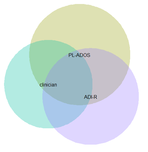
Basically there is a limit on the size the intersections can be with the circles, and here the intersection of all three sets is very large, so there is no feasible solution for this example.
This is alittle bit different situation than typical for Venn diagrams though. Typically these charts all one is interested in is the overlaps between each set. But the autism graph that is secondary. What they were really interested in was the sensitivity of the different diagnostic measures (i.e. percentage identifying true positives), and to see if any particular combination had the greatest sensitivity. Although Kosara in his blog post says that all of the redesigns are better than the original I don’t entirely agree, I think Kosara’s version of the Venn diagram with the text labels does a pretty good job, although I think Kosara’s table is sufficient as well. (Kosara’s recreated graph has better labelling than the original Venn diagram, mainly by increasing the relative font size.)
For the autism graph there are basically two over-arching goals:
- identifying the percent within arbitrary multiple intersections
- keeping in mind the baseline N for each of the arbitrary sets
It is not immediately visually obvious, but IMO it is not that hard to arbitrarily collapse different categories in the original Venn diagram and make some rough judgements about the sensitivity. To me the first thing I look at is the center piece, see it is quite a high percentage, and then look to see if I can make any other arbitrary categories to improve upon the sensitivity of all three tests together. All others are either very small baselines or do not improve the percentage, so I conclude that all three combined likely have the most sensitivity. You may also see that the clinicians are quite high for each intersection, so it is questionable whether the two other diagnostics offer any significant improvement over just the clinicians judgement, but many of the clinician sets have quite small N’s, so I don’t put as much stock in that.
Another way to put it is if we think of the original Venn diagram as a graphical table I think it does a pretty good job. The circles and the intersections are a lie factor in the graph, in that their areas do not represent the baseline rates, but it is an intuitive way to lay out the textual categories, and only takes a little work to digest the material. Kosara’s sorted table does a nice job of this as well, but it is easier to ad-hoc combine categories in the Venn diagram than in table rows that are not adjacent. Visually the information does not pop out at you, like a functional relationship in a scatterplot, but the Venn diagram has the ingredients that allow you to drill down and estimate the information you are looking for. Being able to combine arbitrary categories is the key here, and I don’t think any of the other graphical representations allow one to do that very easily.
I thought a useful redesign would be to keep the Venn theme, but have the repeated structures show the base rate via Isotype like recurring graphs. Some of this is motivated by using such diagrams in interpreting statistics (see this post by David Spieghalter for one example, the work of Gerd Gigenzer is relevant as well). I was not able make a nice set of contained glyphs though. Here is a start of what I am talking about, I just exported the R graph into Inkscape and superimposed a bunch of rectangles.
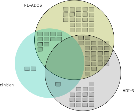
This does not visualize the percentage, but one way to do that would be to color or otherwise distinguish the blocks in a certain way. Also I gave up before I finished the intersecting middle piece, and I would need to make the boxes a bit smaller to be able to squeeze it in. I think this idea could be made to work, but this particular example making the Venn even approximately proportional is impossible, and so sticking with the non-proportional Venn diagram and just saying it is not proportional is maybe less likely to be misleading.
I think the idea of using Isotype like repeated structures though could be a generally good idea. Even when the circles can be made to have the areas of the intersection exact, it is still hard to visually gauge the size of circles (rectangles are easier). So the multiple repeated pixels may be more useful anyway, and putting them inside of the circles still allows the arbitrary collapsing of different intersections while still being able to approximately gauge base rates.


Tom Nash
/ July 19, 2016Could you explain how you came to the coordinates for the text labels on the venneuler example?
apwheele
/ July 23, 2016Sorry for the late reply, been off the grid for a bit. If you print the MyVenn object you will see it shows the circle centers. I just manually figured out the locations for the labels then, but you could script up something more automated I’m sure if you needed it.
Tim Hulsen
/ March 28, 2017BioVenn (http://www.cmbi.ru.nl/cdd/biovenn/) can create proportional Venn diagrams with large overlaps, and the labels can be drag-and-dropped.
apwheele
/ March 28, 2017Tim, thank you, but it isn’t obvious to me how I input my examples here into your program. Care to share an example? Is there anyway to insert aggregated data?
Tim Hulsen
/ October 27, 2020Sorry for the (very) late reply. It needs list of identifiers indeed, but it should be quite straightforward to create a simple dataset based on these numbers. You can also try http://www.deepvenn.com.