
A fairly generic problem I’ve been trying to do some research on is how large should fonts be for posters and PowerPoint presentations. The motivation is my diminishing eyesight over the years, and in particular default labels for statistical graphics are almost always too small in my opinion. Projected presentations just exacerbate the problem.
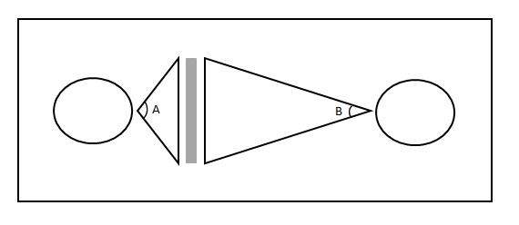
First, to tackle the project we need to find research about the the sizes that individuals can comfortably read letters. You don’t measure size of letters in absolute distance terms though, you measure it in the subtended angle that an object commands in your vision. That is, it is both a function of the height of the letters as well as the distance you are away from the object. I.e. in the below diagram angle A is larger than angle B.
The best guide for the size of this angle I have found for letters is an article by Sidney Smith, Letter Size and Legibility. Smith (1979) had a set of students make various labels and then have people stand too far away to be able to read them. Then the participants walked towards the labels until they could read them. Here is the histogram of those subtended angles (in radians) Smith produced:
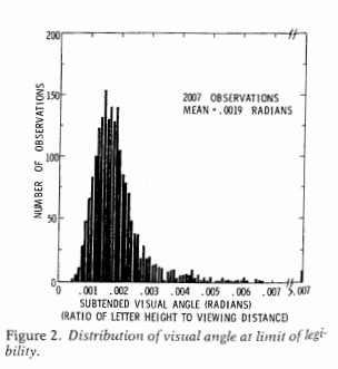
From this Smith gives the recommendation as 0.007 radians as a good bet for pretty much everyone to be able to read the text. My research into other recommendations (eye tests, highway symbols) tends to be smaller, and between mine and Smith’s other sources tends to produce a range of 0.003 to 0.010 radians. Personal experimentation for me is that 0.007 is a good size, although up to 0.010 is not uncomfortably large. Most everyone with corrective vision can clearly see under 0.007, but we shouldn’t be making our readers strain to read the text.
For comparison, I sit approximately 22 inches away from my computer screen. A subtended angle of 0.007 produces a font size of just over 11 points at that distance. At my usual sitting distance I can read fonts down to 7 points, but I would prefer not to under usual circumstances.
This advice can readily translate to font sizes in poster presentations, since there is a limited range in which people will attempt to read them. Block’s (1996) suggestion that most people are around 4 feet away when they read a poster seems pretty reasonable to me, and so this produces a letter height of 0.34 inches needed to correspond to a 0.007 subtended angle. One point of font is 1/72 inches in letter height, so this converts to a 25 point font as the minimum to which most individuals can comfortably read the words in a poster. (R Functions at the end of the post for conversions, although it is based on relatively simple geometry.)
This advice is larger than Block’s (which is 20 point), but fits in line with Colin Purrington’s templates, which use 28 point for the smallest font. Again note that this is the minimum font for the poster, things like titles and author names should clearly be larger than the minimum to create a hierarchy. Again a frequent problem are axis labels for statistical graphics.
It will take more work to extend this advice to projected presentations, since there is more variability in projected sizes as well as rooms. So if you see a weirdo with a measuring tape at the upcoming ASC conference, don’t be alarmed, I’m just collecting some data!
Here are some R functions, the first takes a height and distance and return the subtended angle (in radians). The second takes the distance and radians to produce a height.
visual_angleR <- function(H,D){
   x <- 2*atan(H/(2*D))
   return(x)
}

visual_height <- function(D,Rad) {
  x <- 2*D*tan(Rad/2) #can use sin as well instead of tan
  return(x)
}
Since a point of font is 1/72 of an inch, the code to calculate the recommended font size is visual_height(D=48,Rad=0.007)*72 and I take the ceiling of this value for the 25 point recommendation.


2 Comments