
Here are some notes (for myself!) about how to format histograms in python using pandas and matplotlib. The defaults are no doubt ugly, but here are some pointers to simple changes to formatting to make them more presentation ready.
First, here are the libraries I am going to be using.
import pandas as pd
import numpy as np
import matplotlib
from matplotlib import pyplot as plt
from matplotlib.ticker import StrMethodFormatter
from matplotlib.ticker import FuncFormatter
Then I create some fake log-normal data and three groups of unequal size.
#generate three groups of differing size
n = 50000
group = pd.Series(np.random.choice(3, n, p=[0.6, 0.35, 0.05]))
#generate log-normal data
vals = pd.Series(np.random.lognormal(mean=(group+2)*2,sigma=1))
dat = pd.concat([group,vals], axis=1)
dat.columns = ['group','vals']
And note I change my default plot style as well. So if you are following along your plots may look slightly different than mine.
One trick I like is using groupby and describe to do a simple textual summary of groups. But I also like transposing that summary to make it a bit nicer to print out in long format. (I use spyder more frequently than notebooks, so it often cuts off the output.) I also show setting the pandas options to a print format with no decimals.
#Using describe per group
pd.set_option('display.float_format', '{:,.0f}'.format)
print( dat.groupby('group')['vals'].describe().T )
Now onto histograms. Pandas has many convenience functions for plotting, and I typically do my histograms by simply upping the default number of bins.
dat['vals'].hist(bins=100, alpha=0.8)
Well that is not helpful! So typically when I see this I do a log transform. (Although note if you are working with low count data that can have zeroes, a square root transformation may make more sense. If you have only a handful of zeroes you may just want to do something like np.log([dat['x'].clip(1)) just to make a plot on the log scale, or some other negative value to make those zeroes stand out.)
#Histogram On the log scale
dat['log_vals'] = np.log(dat['vals'])
dat['log_vals'].hist(bins=100, alpha=0.8)
Much better! It may not be obvious, but using pandas convenience plotting functions is very similar to just calling things like ax.plot or plt.scatter etc. So you can assign the plot to an axes object, and then do subsequent manipulations. (Don’t ask me when you should be putzing with axes objects vs plt objects, I’m just muddling my way through.)
So here is an example of adding in an X label and title.
#Can add in all the usual goodies
ax = dat['log_vals'].hist(bins=100, alpha=0.8)
plt.title('Histogram on Log Scale')
ax.set_xlabel('Logged Values')
Although it is hard to tell in this plot, the data are actually a mixture of three different log-normal distributions. One way to compare the distributions of different groups are by using groupby before the histogram call.
#Using groupby to superimpose histograms
dat.groupby('group')['log_vals'].hist(bins=100)
But you see here two problems, since the groups are not near the same size, some are shrunk in the plot. The second is I don’t know which group is which. To normalize the areas for each subgroup, specifying the density option is one solution. Also plotting at a higher alpha level lets you see the overlaps a bit more clearly.
dat.groupby('group')['log_vals'].hist(bins=100, alpha=0.65, density=True)
Unfortunately I keep getting an error when I specify legend=True within the hist() function, and specifying plt.legend after the call just results in an empty legend. So another option is to do a small multiple plot, by specifying a by option within the hist function (instead of groupby).
#Small multiple plot
dat['log_vals'].hist(bins=100, by=dat['group'],
                     alpha=0.8, figsize=(8,8))
This takes up more room, so can pass in the figsize() parameter directly to expand the area of the plot. Be careful when interpreting these, as all the axes are by default not shared, so both the Y and X axes are different, making it harder to compare offhand.
Going back to the superimposed histograms, to get the legend to work correctly this is the best solution I have come up with, just simply creating different charts in a loop based on the subset of data. (I think that is easier than building the legend yourself.)
#Getting the legend to work!
for g in pd.unique(dat['group']):
    dat.loc[dat['group']==g,'log_vals'].hist(bins=100,alpha=0.65,
                                             label=g,density=True)
plt.legend(loc='upper left')
Besides the density=True to get the areas to be the same size, another trick that can sometimes be helpful is to weight the statistics by the inverse of the group size. The Y axis is not really meaningful here, but this sometimes is useful for other chart stats as well.
#another trick, inverse weighting
dat['inv_weights'] = 1/dat.groupby('group')['vals'].transform('count')
for g in pd.unique(dat['group']):
    sub_dat = dat[dat['group']==g]
    sub_dat['log_vals'].hist(bins=100,alpha=0.65,
                             label=g,weights=sub_dat['inv_weights'])
plt.legend(loc='upper left') 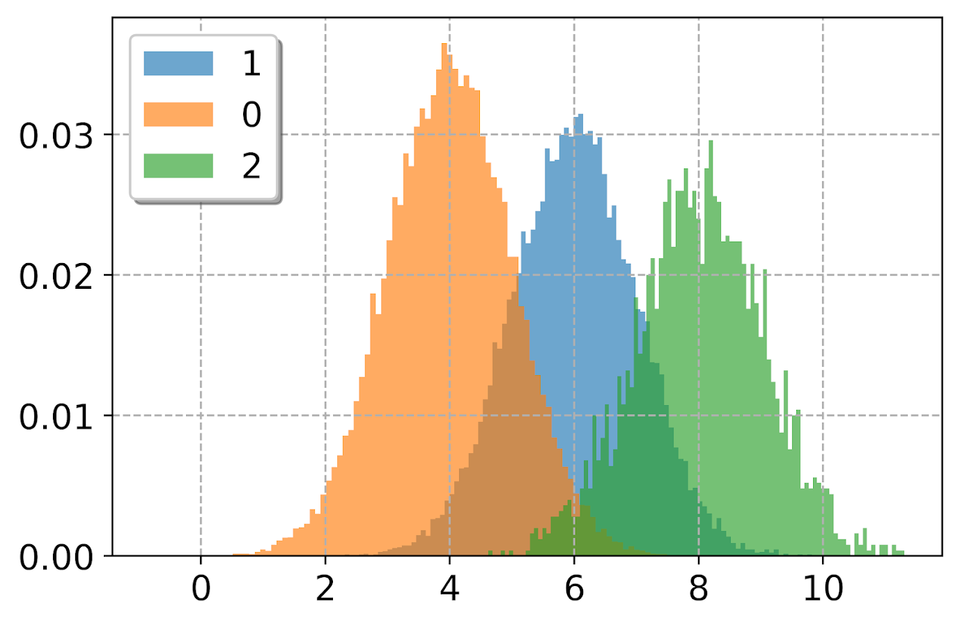
So far, I have plotted the logged values. But I often want the labels to show the original values, not the logged ones. There are two different ways to deal with that. One is to plot the original values, but then use a log scale axis. When you do it this way, you want to specify your own bins for the histogram. Here I also show how you can use StrMethodFormatter to return a money value. Also rotate the labels so they do not collide.
#Specifying your own bins on original scale
#And using log formatting
log_bins = np.exp(np.arange(0,12.1,0.1))
ax = dat['vals'].hist(bins=log_bins, alpha=0.8)
plt.xscale('log', basex=10)
ax.xaxis.set_major_formatter(StrMethodFormatter('${x:,.0f}'))
plt.xticks(rotation=45)
If you omit the formatter option, you can see the returned values are 10^2, 10^3 etc. Besides log base 10, folks should often give log base 2 or log base 5 a shot for your data.
Another way though is to use our original logged values, and change the format in the chart. Here we can do that using FuncFormatter.
#Using the logged scaled, then a formatter
#https://napsterinblue.github.io/notes/python/viz/tick_string_formatting/
def exp_fmt(x,pos):
    return '${:,.0f}'.format(np.exp(x))
fmtr = FuncFormatter(exp_fmt)

ax = dat['log_vals'].hist(bins=100, alpha=0.8)
plt.xticks(np.log([5**i for i in range(7)]))
ax.xaxis.set_major_formatter(fmtr)
plt.xticks(rotation=45)
On the slate is to do some other helpers for scatterplots and boxplots. The panda defaults are no doubt good for EDA, but need some TLC to make more presentation ready.

