
Log scales are convenient for a variety of data. Here I am going to post a brief tutorial about making and formatting log scales in SPSS charts. So first lets start with a simple set of data:
DATA LIST FREE / X (F1.0) Y (F3.0).
BEGIN DATA
1 1
2 5
3 10
4 20
5 40
6 50
7 70
8 90
9 110.
END DATA.
DATASET NAME LogScales.
VARIABLE LEVEL X Y (SCALE).
EXECUTE.
In GPL code a scatterplot with linear scales would simply be:
GGRAPH
  /GRAPHDATASET NAME="graphdataset" VARIABLES=X Y
  /GRAPHSPEC SOURCE=INLINE.
BEGIN GPL
  SOURCE: s=userSource(id("graphdataset"))
  DATA: X=col(source(s), name("X"))
  DATA: Y=col(source(s), name("Y"))
  GUIDE: axis(dim(1), label("X"))
  GUIDE: axis(dim(2), label("Y"))
  ELEMENT: point(position(X*Y))
END GPL.
To change this chart to a log scale you need to add a SCALE statement. Here I will specify the Y axis (the 2nd dimension) as having a logarithmic scale by inserting SCALE: log(dim(2), base(2)) between the last GUIDE statement and the first ELEMENT statement. When using log scales, many people default to having a base of 10, but this uses a base of 2, which works much better with the range of data in this example. (Log base 2 also works much better for ratios that don’t span into the 1,000’s as well.)
GGRAPH
  /GRAPHDATASET NAME="graphdataset" VARIABLES=X Y
  /GRAPHSPEC SOURCE=INLINE.
BEGIN GPL
  SOURCE: s=userSource(id("graphdataset"))
  DATA: X=col(source(s), name("X"))
  DATA: Y=col(source(s), name("Y"))
  GUIDE: axis(dim(1), label("X"))
  GUIDE: axis(dim(2), label("Y"))
  SCALE: log(dim(2), base(2))
  ELEMENT: point(position(X*Y))
END GPL.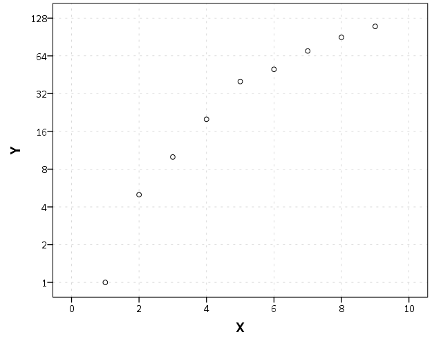
Although the order of the commands makes no difference, I like to have the ELEMENT statements last, and then the prior statements before and together with like statements. If you want to have more control over the scale, you can specify and min or a max for the chart (by default SPSS tries to choose nice values based on the data). With log scales the minimum needs to be above 0. Here I use 0.5, which is an equivalent distance from 1 -> 2 on a log scale.
GGRAPH
  /GRAPHDATASET NAME="graphdataset" VARIABLES=X Y
  /GRAPHSPEC SOURCE=INLINE.
BEGIN GPL
  SOURCE: s=userSource(id("graphdataset"))
  DATA: X=col(source(s), name("X"))
  DATA: Y=col(source(s), name("Y"))
  GUIDE: axis(dim(1), label("X"))
  GUIDE: axis(dim(2), label("Y"))
  SCALE: log(dim(2), base(2), min(0.5))
  ELEMENT: point(position(X*Y))
END GPL.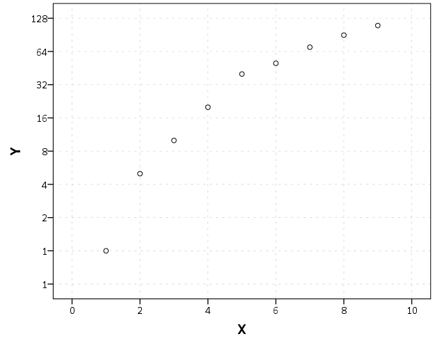
You can see here though we have a problem — two 1’s in the Y axis! SPSS inherits the formats for the axis from the data. Since the Y data are formatted as F3.0, the 0.5 tick mark is rounded up to 1. You can fix this by formatting the variable before the GGRAPH command.
FORMATS Y (F4.1).
GGRAPH
  /GRAPHDATASET NAME="graphdataset" VARIABLES=X Y
  /GRAPHSPEC SOURCE=INLINE.
BEGIN GPL
  SOURCE: s=userSource(id("graphdataset"))
  DATA: X=col(source(s), name("X"))
  DATA: Y=col(source(s), name("Y"))
  GUIDE: axis(dim(1), label("X"))
  GUIDE: axis(dim(2), label("Y"))
  SCALE: log(dim(2), base(2), min(0.5))
  ELEMENT: point(position(X*Y))
END GPL.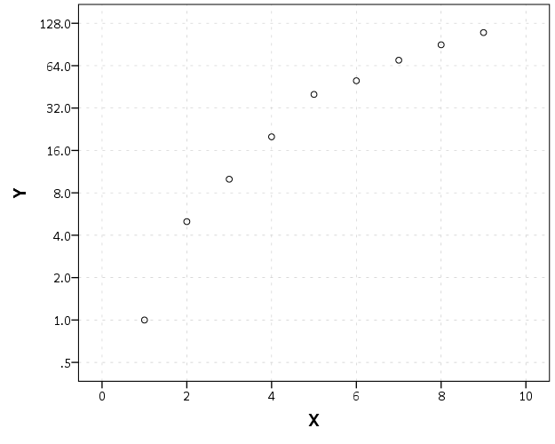
But this is annoying, as it adds a decimal to all of the tick values. I wish you could use fractions in the ticks, but this is not possible that I know of. To prevent this you should be able to specify the start() option in the GUIDE command for the second dimension, but in a few attempts it was not working for me (and it wasn’t a conflict with my template — in this example set the DEFAULTTEMPLATE=NO to check). So here I adjusted the minimum to be 0.8 instead of 0.5 and SPSS did not draw any ticks below 1 (you may have to experiment with this based on how much padding the Y axis has in your default template).
FORMATS Y (F3.0).
GGRAPH
  /GRAPHDATASET NAME="graphdataset" VARIABLES=X Y
  /GRAPHSPEC SOURCE=INLINE DEFAULTTEMPLATE=YES.
BEGIN GPL
  SOURCE: s=userSource(id("graphdataset"))
  DATA: X=col(source(s), name("X"))
  DATA: Y=col(source(s), name("Y"))
  GUIDE: axis(dim(1), label("X"))
  GUIDE: axis(dim(2), label("Y"), start(1))
  SCALE: log(dim(2), base(2), min(0.8))
  ELEMENT: point(position(X*Y))
END GPL.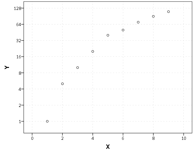
I will leave talking about using log scales if you have 0’s in your data for another day (and talk about displaying missing data in the plot as well.) SPSS has a safeLog scale, which is good for data that has negative values, but not necessarily my preferred approach if you have count data with 0’s.


Bartje
/ August 1, 2020Thanks a lot!
Curious about how to deal with zero’s though! Any solution on this?
apwheele
/ August 1, 2020While SPSS has safelog I don’t really recommend it. You might do a rug for 0 values (since they are undefined on the log scale). It sort of depends on the distribution of your data (and the type of graph) to recode log(0) to a reasonable value, if you have values spanning in the 0-100,000, it is probably ok to set log(0) to log(0+1)=0 just for graphing purposes.
If it is smaller ratios, you may want to set 0 to some small decimal based on the distribution of the other values. Say your data spans 0-10, I may set 0 to a value of 0.1 (to make it symmetric with the top value).
Or say if the two other non-zero smallest values in that dataset are 0.1 and 0.15, I may set the zero value to 0.05 for example. If you go too small though it may make the chart explode in that dimension, so you may just make it somewhat smaller than the smallest value (and then highlight it in the chart to articulate that it is 0 values).