One of the problems with visualizing and interpreting spatial data is that there are characteristics of the geographical data that are hard to display on a static, two dimensional map. Friendly (2007) makes the pertinent distinction between map and non-map based graphics, and so the challenge is to effectively interweave them. One way to try to overcome this is to create graphics intended to supplement the map based data. Below I give two examples pertinent to analyzing point level crime patterns with attached temporal data, co-maps (Brunsdon et al., 2009) and the hot spot plot (Townsley, 2008).
co-maps
The concept of co-maps is an extension of co-plots, a visualization technique for small multiple scatterplots originally introduced by William Cleveland (1994). Co-plots are in essence a series of small multiples scatterplots in which the visualized scatter plot is conditioned on a third (or potentially fourth) variable. What is unique about co-plots are though the conditioning variable(s) is not mutually exclusive between categories, so the conditions overlap.
The point of co-plots is in general to see if the relationship between two variables has an interaction with a third continuous variable. When the conditioning variable is continuous, we wouldn’t expect the interaction to change dramatically with discrete cut-offs of the continuous variable, so we want to examine the interaction effect at varying levels of the conditioning variable. It is also useful in instances in which the data is sparse, and you don’t want to introduce artifactual relationships by making arbitrary cut-offs for the conditioning variable.
Besides the Cleveland paper cited (which is publicly available, link in citations at bottom of post), there are some good examples of coplot scatterplots from the R graphical manual.
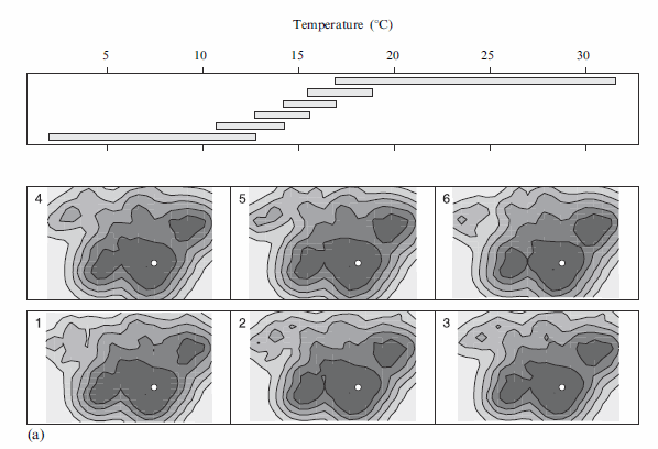
Brunsdon et al. (2009) extend the concept to analyzing point patterns, when time is the conditioning variable. Also because the geographic data are numerous, they apply kernel density estimation (kde) to visualize the results (instead of a sea of overlapping points). When visualizing geographic data, too many points are common, and the solutions to visualizing the data are essentially the same as people use for scatterplots (this thread at the stats site gives a few resources and examples concerning that). Below I’ve copied a picture from Brusdon et al., 2009 to show it applied to crime data.
Although the example is conditional on temperature (instead of time), it should be easy to see how it could be extended to make the same plot conditional on time. Also note the bar graph at the top denotes the temperature range, with the lowest bar corresponding to the graphic that is in the panel on the bottom left.
Also of potential interest, the same authors applied the same visualization technique to reported fires in another publication (Corcoran et al., 2007).
the hot spot plot
Another similarly motivated graphical presentation of the interaction of time and space is the hot-spot plot proposed by Michael Townsley (2008). Below is an example.
So the motivation here is having coincident graphics simulataneously depicting long term temporal trends (in a sparkline like graphic at the top of the plot), spatial hot spots depicted using kde, and a lower bar graphic depicting hourly fluctuations. This allows one to identify spatial hot spots, and then quickly assess their temporal nature. The example from the Townsley article I give is a secondary plot showing zoomed in locations of several analyst chosen hot spots, with the cut out remaining events left as a baseline.
Some food for thought when examing space-time trends with point pattern crime data.
Citations
- Brunsdon, Chris, Jonathan Corcoran, Gary Higgs & Andrew Ware. 2009. The influence of weather on local geographical patterns of police calls for service. Environment and Planning B 36(5): 906-926.
- Corcoran, Jonathan, Gary Higgs, Chris Brunsdon & Andrew Ware. 2007. The use of comaps to explore the spatial and temporal dynamics of fire incidents: A case study in South Wales, United Kingdom. The Professional Geographer 59(4): 521-536.
- Cleveland, William. 1994. Coplots, nonparametric regression, and conditionally parametric fits. IMS Lecture Notes Monograph Series 24: 21-36. PDF available in link from Project Euclid.
- Friendly, Michael. 2007. A.-M. Guerry’s moral statistics of France: Challenges for multivariable spatial analysis. Statistical Science 22(3): 368-399. PDF available from publisher.
- Townsley, Michael. 2008. Visualizing space time patterns in crime: The hotspot plot. Crime Patterns and Analysis 1(1): 61-74. PDF available from publisher.


