
I’ve uploaded a new pre-print, Tables and graphs for monitoring temporal crime patterns. The paper basically has three parts, which I will briefly recap here:
- percent change is a bad metric
- there are data viz. principles to constructing nicer tables
- graphs >> tables for monitoring trends
Percent change encourages chasing the noise
It is tacitly understood that percent change when the baseline is small can fluctuate wildly – but how about when the baseline average is higher? If the average of crime was around 100 what would you guess would be a significant swing in terms of percent change? Using simulations I estimate for a 1 in 100 false positive rate you need an over 40% increase (yikes)! I’ve seen people make a big deal about much smaller changes with much smaller baseline averages.
I propose an alternative metric based on the Poisson distribution,
2*( SQRT(Post) - SQRT(Pre) )
This approximately follows a normal distribution if the data is Poisson distributed. I show with actual crime data it behaves pretty well, and using a value of 3 to flag significant values has a pretty reasonable rate of flags when monitoring weekly time series for five different crimes.
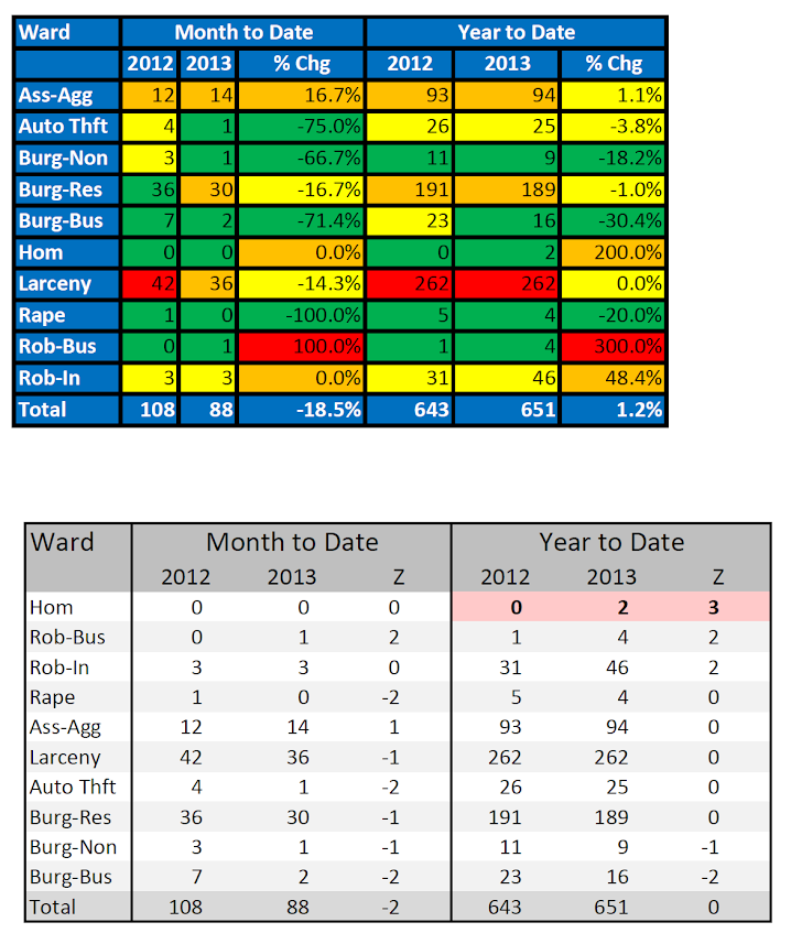
Tables are visualizations too!
Instead of recapping all the points I make in this section, I will just show an example. The top table is from an award winning statistical report by the IACA. The latter is my remake.
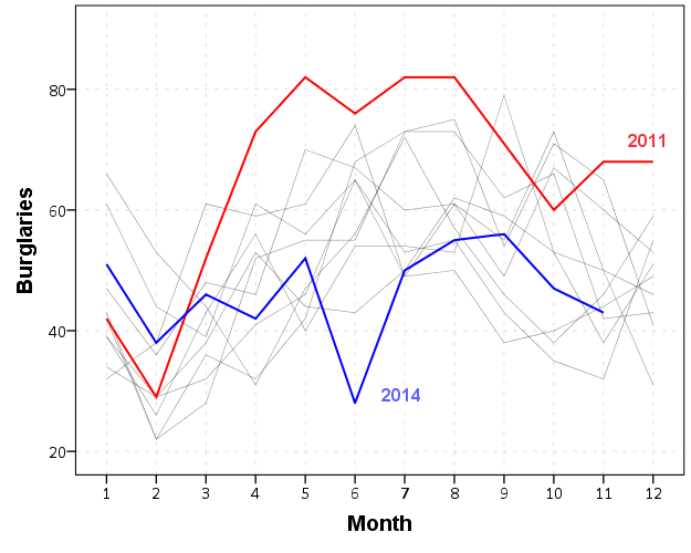
Graphs >> Tables
I understand tables are necessary for reporting of statistics to accounting agencies, but they are not as effective as graphs to monitor changes in time series. Here is an example, a seasonal chart of burglaries per month. The light grey lines are years from 04 through 2013. I highlight some outlier years in the chart as well. It is easy to see whether new data is an outlier compared to old data in these charts.
I have another example of monitoring weekly statistics in the paper, and with some smoothing in the chart you can easily see some interesting crime waves that you would never comprehend by looking at a single number in a table.
As always, if you have comments on the paper I am all ears.


1 Comment