
A quick blog post – so you all are not continually assaulted by my mug shot on the front page of the blog!
Panel data is complicated. When conducting univariate time series analysis, pretty much everyone plots the series. I presume people do not do this often for panel data because the charts tend to be more messy and less informative. But by using transparency and small multiple plots are easy places to start to unpack the information. Here I am going to show these using plots of arrest rates from 1970 through 2014 in New York state counties. The data and code can be downloaded here, and that zip file contains info. on where the original data came from. It is all publicly available – but mashing up the historical census data for the population counts by county is a bit of a pain.
So I will start with grabbing my created dataset, and then making a default plot of all the lines. Y axis is the arrest rate per 1,000 population, and the X axis are years.
*Grab the dataset.
FILE HANDLE data /NAME = "!!Your File Handle Here!!!".
GET FILE = "data\Arrest_WPop.sav".
DATASET NAME ArrestRates.

*Small multiple lines over time - default plot.
GGRAPH
  /GRAPHDATASET NAME="graphdataset" VARIABLES=Year Total_Rate County
  /GRAPHSPEC SOURCE=INLINE.
BEGIN GPL
  SOURCE: s=userSource(id("graphdataset"))
  DATA: Year=col(source(s), name("Year"))
  DATA: Total_Rate=col(source(s), name("Total_Rate"))
  DATA: County=col(source(s), name("County"), unit.category())
  GUIDE: axis(dim(1), label("Year"))
  GUIDE: axis(dim(2), label("Total Arrest Rate per 1,000"))
  ELEMENT: line(position(Year*Total_Rate), split(County))
END GPL.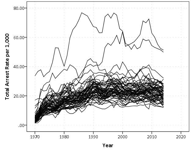
That is not too bad, but we can do slightly better by making the lines small and semi-transparent (which is the same advice for dense scatterplots):
*Make them transparent and smaller.
FORMATS Total_Rate (F2.0).
GGRAPH
  /GRAPHDATASET NAME="graphdataset" VARIABLES=Year Total_Rate County
  /GRAPHSPEC SOURCE=INLINE.
BEGIN GPL
  SOURCE: s=userSource(id("graphdataset"))
  DATA: Year=col(source(s), name("Year"))
  DATA: Total_Rate=col(source(s), name("Total_Rate"))
  DATA: County=col(source(s), name("County"), unit.category())
  GUIDE: axis(dim(1), label("Year"))
  GUIDE: axis(dim(2), label("Total Arrest Rate per 1,000"))
  SCALE: linear(dim(1), min(1970), max(2014))
  ELEMENT: line(position(Year*Total_Rate), split(County), transparency(transparency."0.7"), size(size."0.7"))
END GPL.
This helps disentangle the many lines bunched up. There appear to be two outliers, and basically the rest of the pack.
A quick way to check out each individual line is then to make small multiples. Here I wrap the panels, and make the plot size bigger. I also make the X and Y axis null. This is ok though, as I am just focusing on the shape of the trend, not the absolute level.
*Small multiples.
GGRAPH
  /GRAPHDATASET NAME="graphdataset" VARIABLES=Year Total_Rate County
  /GRAPHSPEC SOURCE=INLINE.
BEGIN GPL
  PAGE: begin(scale(1000px,1000px))
  SOURCE: s=userSource(id("graphdataset"))
  DATA: Year=col(source(s), name("Year"))
  DATA: Total_Rate=col(source(s), name("Total_Rate"))
  DATA: County=col(source(s), name("County"), unit.category())
  COORD: rect(dim(1,2), wrap())
  GUIDE: axis(dim(1), null())
  GUIDE: axis(dim(2), null())
  GUIDE: axis(dim(3), opposite())
  SCALE: linear(dim(1), min(1970), max(2014))
  ELEMENT: line(position(Year*Total_Rate*County))
  PAGE: end()
END GPL.
*Manually edited to make less space between panels.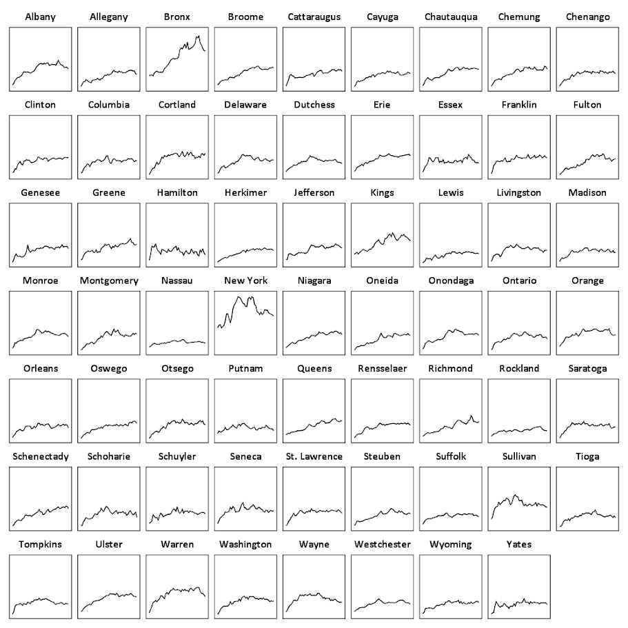
There are a total of 62 counties in New York, so this is feasible. With panel sets of many more lines, you can either split the small multiple into more graphs, or cluster the lines based on the overall shape of the trend into different panels.
Here you can see that the outliers are New York county (Manhattan) and Bronx county. Bronx is a pretty straight upward trend (which mirrors many other counties), but Manhattan’s trajectory is pretty unique and has a higher variance than most other places in the state. Also you can see Sullivan county has quite a high rate compared to most other upstate counties (upstate is New York talk for everything not in New York City). But it leveled off fairly early in the time series.
This dataset also has arrest rates broken down by different categories; felony (drug, violent, dwi, other), and misdemeanor (drug, dwi, property, other). It is interesting to see that arrest rates have been increasing in most places over this long time period, even though crime rates have been going down since the 1990’s. They all appear to be pretty correlated, but let me know if you use this dataset to do some more digging. (It appears index crime totals can be found going back to 1990 here.)


Kelsey Morrison
/ March 5, 2018Do you have any advice regarding power considerations? I’d like to be able to determine the sample size required for seemingly unrelated regression analyses I wish to run.
apwheele
/ March 5, 2018Bit off topic for this post. Power only goes up for SUR, so you can do a power analysis as usual for the individual dependent variables — it will be the worst case scenario for the SUR.
Kelsey Morrison
/ March 7, 2018I realized after the fact that I commented on the wrong post. Thanks for answering anyway. Great blog!
Jamie Hetherington
/ July 20, 2020Hi Andrew, can you set the panel spacing in the syntax? I know you can go in an manually and change the spacing but wondering if there is a way to set the panel spacing % automatically in syntax?
apwheele
/ July 20, 2020The docs list a gap function to be specified within a GUIDE statement. So something like
GUIDE: axis(dim(3), opposite(), gap(0px))
is supposed to work I believe. But IIRC I was never able to get this to work properly out of the box, so you will need to try it out yourself to see if it works (maybe it also needs to be specified on the prior guides?).
AF_St
/ January 6, 2023Thanks for the cool explanation!
Is there a way to color lines based on an additional variable (e.g., in your example, color northern counties in green and southern in red, given that we have a variable that determines northern/southern)?
apwheele
/ January 6, 2023Yes, you could do something like:
DATA: Area=col(source(s), name(“Area”), unit.category())
…
SCALE: cat(aesthetic(aesthetic.color), map((“Northern”, color.red),(“Southern”, color.green)))
GUIDE: legend(aesthetic(aesthetic.color), label(“Area”))
…
ELEMENT: line(position(Year*Total_Rate), split(County), color(Area))
Here assuming the variable in the dataset “Area” is passed into the plot command, and it has string values of Northern and Southern (so amend as needed, do not recommend red/green specifically as color choices due to common male colorblindness).
AF_St
/ January 6, 2023Thanks so much!
I’m getting a “GPL error: map((“Northern”, color.red),(“Southern”, color.green)) Not a quoted string: “Northern”
Any idea what might cause that?
AF_St
/ January 6, 2023GGRAPH
/GRAPHDATASET NAME=”graphdataset” VARIABLES=Year Total_Rate County Area
/GRAPHSPEC SOURCE=INLINE.
BEGIN GPL
SOURCE: s=userSource(id(“graphdataset”))
DATA: Year=col(source(s), name(“Year”))
DATA: Total_Rate=col(source(s), name(“Total_Rate”))
DATA: County=col(source(s), name(“County”), unit.category())
DATA: Area=col(source(s), name(“Area”), unit.category()
SCALE: cat(aesthetic(aesthetic.color), map((“Northern”, color.red),(“Southern”, color.green)))
GUIDE: legend(aesthetic(aesthetic.color), label(“Area”))
GUIDE: axis(dim(1), label(“Year”))
GUIDE: axis(dim(2), label(“Total Arrest Rate per 1,000”))
ELEMENT: line(position(Year*Total_Rate), split(County), color(Area))
END GPL.
apwheele
/ January 7, 2023I do not have SPSS installed on personal machine at the moment, so you will need to debug this yourself. The example code you posted is missing a trailing parentheses in the DATA Area command, additionally I don’t know if you added in that variable or not just based on the snippet.
AF_St
/ January 7, 2023Thanks again!