Recoding America review, Data Science CV Update, Sworn Dashboard

Over this Christmas break I read Jennifer Pahlka’s Recoding America. It is a great book and I really recommend it.

My experience working in criminal justice is a bit different than Pahlka’s examples, but even if you are just interested in private sector product/project management this is a great book. It has various user experience gems as well (such as forms that eliminate people, put the eliminating questions in order by how many people they filter).

Pahlka really digs on waterfall, I have critiqued agile on the blog in the past, but we are both just using generic words to describe bad behavior. I feel like a kindred spirit with Pahlka based on some of her anecdotes; concrete boats, ridiculous form questions, PDF inputs that only work on ancient web-browsers, mainframes are not the problem stupid requirements are, hiring too many people makes things worse, people hanging up on them in phone calls when you tell the truth – so many good examples.

To be specific with agile/waterfall, Pahlka is very critical of fixed requirements coming down on high from policy makers. When you don’t have strong communication at the requirements gathering stage between techies, users and owners making the requests (which can happen in private sector too), you can get some comical inefficiencies.

A good example for my CJ followers are policies to do auto-clearance of records in California. So the policy makers made a policy that said those with felony convictions for stealing less than $1,000 can be expunged, but there is no automated way to do this, since the criminal records do not save the specific dollar amount in the larceny charge. (And to do the manual process is very difficult, so pretty much no one bothers.) It probably would make more sense to say something like “a single felony larceny charge that is 5 years old will be auto-cleared”, that is not exactly the same but is similar in spirit to what the legislature wants, and can be easily automated based on criminal records that are already collected by the state. A real effective solution would look like data people working with policy makers directly and giving scenarios “if we set the criteria to X, it will result in Y clearances”. These are close to trivial things to ask a database person to comment on, there is no fundamental reason why policy/techs can’t go back in forth and craft policy that makes sense and is simpler to implement.

To be more generic, what can happen is someone requests X, X is really hard/impossible, but you can suggest a,b,c instead that is easier to accomplish and probably meets the same high level goals. There is asymmetry in what people ask for and understanding of the work it takes to accomplish those requests, an important part of your job as a programmer/analyst is to give feedback to those asking to make the requests better. It takes understanding from the techies of the business requirements (Pahlka suggests govt should hire more product owners, IMO would rather just have senior developer roles do that stuff directly). And it takes people asking to be open to potential changes. Which most people are in my experience, just sometimes you get people who hang up in phone calls when you don’t tell them what they want to hear.

I actually like the longer term plan out a few months waterfall approach (I find that easier to manage junior developers, I think the agile shorter term stuff is too overbearing at times). But it requires good planning and communication between end users and developers no matter whether you say you are doing waterfall or agile. My experience in policing is not much like the policy people giving stone tablets, I have always had more flexibility to give suggestions in my roles. But I do think many junior crime analysts need to learn to say “you asked for percent change, here is a different stat instead that is better for what you want”.

What I am trying to do with CRIME De-Coder is really consistent with Pahlka’s goals with Code for America. I think it is really important for CJ agencies to take on more human investment in tech. Part of the reason I started CRIME De-Coder was anger – I get angry when I see cities pay software vendors six digits for crappy software that a good crime analyst could do. Or pay a consulting firm 6 figures for some mediocre (and often inappropriate) statistical analysis. Cities can do so much better by internally developing skills to take on many software projects, which are not moving mountains, and often outside software causes more problems than they solve.


At work we are starting to hire a new round of data scientists (no links to share, they are offshore in India, and first round is through a different service). The resume over-stating technical expertise for data scientists is at lol levels at this point. Amazing how everyone is an LLM, deep learning, and big data expert these days.

I’ve written before how I am at a loss on how to interview data scientists. The resumes I am getting are also pretty much worthless at this point. One problem I am seeing in these resumes is that people work on teams, so people can legitimately claim “I worked on this LLM”, but when you dig in and ask about specifics you find out they only contributed this tiny thing (which is normal/OK). But the resumes look like they are Jedi masters in advanced machine learning.

I went and updated my data science resume in response to reading others. (I should probably put that in HTML, so it shows up in google search results.) I don’t really have advice for folks “what should your resume look like” – I have no clue how recruiters view these things. No doubt my resume is not immune to a recruiter saying “you have 10+ years with python, but I don’t see any Jira experience, so I don’t think you are qualified”.

What I have done is only include stuff in the resume where I can link to specific, public examples (peer reviewed work, blog posts, web pages, github). I doubt recruiters are going to click on a single link in the resume (let alone all 40+), but that is what I personally would prefer when I am reviewing a resume. Real tangible stuff so someone can see I actually know how to write code.

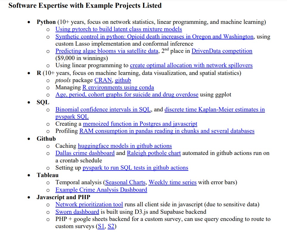
So for example in the most recent update of the resume, I took Unix, Kubernetes/Docker, Azure, and Databricks off. Those are all tech I have worked with at HMS/Gainwell, but do not have any public footprint to really show off. I have some stuff on Docker on the blog, but nothing real whiz bang to brag about. And I have written some about my deployment strategy for python code in Databricks using github actions. (I do like Azure DevOps pipelines, very similar to building github actions, which are nice for many of the batch script processes I do. My favorite deployment pattern at work is using conda + persistent Fedora VMs. Handling servers/kubernetes everything docker is a total pain.) “Expertise” in those tools is probably too strong, I think claiming basic competence is reasonable though. (Databricks has changed so much in the two years we have been using it at work I’m not sure anyone outside of Databricks themselves could claim expertise – only if you are a very fast learner!)

But there is no real fundamental way for an outsider to know I have any level of competence/expertise in these tech tools. Honestly they do not matter – if you want me to use google cloud or AWS for something equivalent to Azure DevOps, or Snowflake instead of Databricks, it doesn’t really matter. You just learn the local stack in a month or two. Some rare things you do need very specialized tech skills, say if someone wanted me to optimize latency in serving pytorch LLMs, that will be tough given my background. Good luck posting that position on LinkedIn!

But the other things I list, I can at least pull up a web page to say “here is code I wrote to do this specific thing”. Proof is in the pudding. Literally 0 of the resumes I am reviewing currently have outside links to any code, so it could all be made up (and clearly for many people is embellished). I am sure people think mine is embellished as well, best I can do to respond to that is share public links.


For updates on CRIME De-Coder:

I researched ways to do payments for so long, in the end just turning on WooPayments in wordpress (and using an iframe) was a super simple solution (and it works fine for digital downloads and international payments). Will need to figure out webhooks with Stripe to do more complicated stuff eventually (like SaaS services, licenses, recurring payments), but for now this set up works for what I need.

I will start up newsletters again next week.

Overview of DataViz books

Keith McCormick the other day on LinkedIn the other day made a post/poll on his favorite data viz books. (I know Keith because I contributed a chapter on geospatial data analysis in SPSS in Keith and Jesus Salcedo’s book, SPSS Statistics for Data Analysis and Visualization, and Jon Peck contributed a chapter as well.)

One thing about this topical area is that there isn’t a standard Data Viz 101 curriculum. So if you pick up Statistics 101 books, they will cover pretty much all the same material (normal distribution, central limit theorem, t-tests, regression). It isn’t 100% overlap (some may spend more time on elementary probability, and others may cover ANOVA), but for someone learning the material there isn’t much point in reading multiple introductory stats books.

This is not so with the Data Viz books in Keith’s picture – they are very different in content. As I have read quite a few different books on the topic over the years I figured I would give my breakdown of the various books.

Albert Cairo’s The Functional Art

While my list is not in rank order, I am putting Cairo’s book first for a reason. Although there is not a Data Viz 101 curriculum, this book is the closest thing to it. Cairo goes through in short order various cognitive aspects on how we view the world that are fundamental to building good data visualizations. This includes things like it is easier to compare lengths along a common axis, and that we can perceive rank order to color saturation, but not to a color’s hue.

It is also enjoyable to read because of all the great journalistic examples. I did not care so much for the interviews at the back, and I don’t like the cover. But if I did a data viz course for undergrads in social sciences (Cairo developed this for journalism students), I would likely assign this book. But despite being very accessible, he covers a broad spectrum of both simple graphs and complicated scientific diagrams.

For this review many of these authors have other books. So I haven’t read Cairo’s The Truthful Art, so I cannot comment on it.

Edward Tufte’s The Visual Display of Quantitative Information

Tufte’s book was the first data viz book I bought in grad school. I initially invested in it as he had a chapter on a critique of powerpoint presentations, which is very straightforward and provides practical advice on what not to do. Most of the critiques of this book are that it is mostly just a collection of Tufte’s opinions about creating minimalist, dense, scientific graphs. So while Cairo dives into the science of perception, Tufte is just riffing his opinions. His opinions are based on his experience though, and they are good!

I believe I have read all of Tufte’s other books as well, but this is the only one that made much of an impression on me (some of his others go beyond graphs, and talk about UI design). I gobbled it up in only two days when I first started reading it, and so if I were stuck on an island with one book scenario I would choose this one over the others I list here (although again think Cairo’s book is the best to start with for most folks). So for scientists I think it is a good investment and an enjoyable read overall.

Nathan Yau’s Visualize This

Of all the books I review, Yau’s is the only how-to actually make graphs in software. Unfortunately, much of Yau’s programmatic advice was outdated already when it was published (e.g. flash was already going by the wayside). So while he has many great examples of creating complicated and beautiful data visualizations, the process he outlines to make them are overly complicated IMO (such as using python to edit parts of a pre-made SVG map). It is a good book for examples no doubt, and maybe you can pick up a few tricks in terms of post editing charts in a vector graphics program, such as Illustrator or Inkscape (most examples are making graphs in base R and then exporting to edit finishing touches).

In terms of making a how-to book it is really hard. Yau I am sure has updates on his Flowing Data website to make charts (and maybe his newer book is better). But I don’t think I would recommend investing in this book for anything beyond looking at pretty examples of data viz.

Stephen Kosslyn’s Graph Design for the Eye and Mind

The prior books all contained complicated, dense, scientific graphs. Kosslyn’s book is specifically oriented to making corporate slide decks/powerpoints, in which the audience is not academic. But his advice is mostly backed on his understanding of the psychology (he relegates extensive endnotes to point to scientific lit, to avoid cluttering up the basic book). He has as few gems of advice I admit, such as it isn’t the number of lines in a graph that make it complicated, but really the number of unique profiles. But then he has some pieces I find bizarre, such as saying pie charts are OK because they are so popular (so have survived a Darwinian survival process in terms of being presented to business people).

I would stick with Tufte’s powerpoint advice (and later will mention a few other books related to giving presentations), as opposed to recommending this book.

Alan MacEachren How maps work: Representation, visualization, and design

MacEachren’s book is encyclopedic in terms of scientific literature on design aspects of both cartography, as well as the psychological literature. So it is like reading an encyclopedia (not 100% sure if I ever finished it front to back to be honest). I would start here if you are interested in designing cognitive experiments to test certain graphs/maps. I think MacEachren pooling from cartography and psychology ends up being a better place to start than say Colin Ware’s Information Visualization (but it is close). They are both very academically oriented though.

Leland Wilkinson’s The Grammar of Graphics

I used SPSS for along time when I read this book, so I was already quite familiar with the grammar of graphics in terms of creating graphs in SPSS. That pre-knowledge helped me digest Wilkinson’s material I believe. Nick Cox has a review of this book, and for this one he notes that the audience for this book is hard to pin down. I agree, in that you need to be pretty far along already in terms of making graphs to be able to really understand the material, and as such it is not clear what the benefit is. Even for power users of SPSS, much of the things Wilkinson talks about are not implemented in SPSS’s GGRAPH language, so they are mostly just on paper.

(Note Nick has a ton of great reviews on Amazon as well for various data viz books. He is a good place to start to decide if you want to purchase a book. For example the worst copy-edited book I have ever seen is Andy Kirk’s via Packt publishing, and Nick notes how poorly it is copy-edited in his review.)

Here is an analogy I think is apt for Wilkinson’s book – if we are talking about cars, you may have a book on the engineering of the car, and another on how to actually drive the car. Knowing how pistons work in a combustible engine does not help you drive a car, but helps you build one. Wilkinson’s book is more about the engineering of a graph from an algebraic perspective. At the fringes it helps in thinking about the components of graphs, but doesn’t really give any advice about what graph to make in-and-of itself, nor what is a good graph or a bad graph.

Note that the R library ggplot2, is actually quite a bit different than Leland’s vision. It is simpler, in that Wickham essentially drops the graph algebra part, so you specify the axes directly, whereas in Wilkinson’s you just say X*Y*Z, and depending on other aspects of the grammer this may produce a 3d scatterplot, a facet gridded scatterplot, a clustered bar chart, etc. I think Wickham was right to make that design choice, but in doing so it really isn’t an implementation of what Wilkinson was talking about in this book.

Jacques Bertin’s Semiology of Graphics: Diagrams, Networks, Maps

Bertin’s book is an attempt to make a dictionary of terms for different aspects of graphs. So it is a bit in the weeds. One unique aspect of Bertin is that he discusses titles and labels for graphs, although I wouldn’t go as far as saying that his discussion leads to straightforward advice. I find Wilkinson’s grammer of graphics a more useful way to overall think about the components of a graph, although Bertin is more encyclopedic in coverage of different types of graphs and maps in the wild.

Short notes on various other books

Most of these books (with the exception of Nathan Yau’s) are not how-to actually write code to make graphs. For those that use R, there are two good options though. Hadley Wickham’s ggplot2: Elegant Graphics for Data Analysis (Use R!) was really good at the time (I am not sure if the newer version is more up to date though, like any software it changes over time so the older one I know is out of date for many different code examples). And though I’ve only skimmed it, Kieran Healy’s Data Visualization: A practical introduction is free and online and looks good (and also for those interested in criminal justice examples Jacob Kaplan has examples in R as well, Crime by the Numbers). So those later two I know are good in terms of being up to date.

For python I just suggest using google (Jake VanderPlas has a book that looks good, and his website is really good). For excel I really like Jorge Camões work (his book is Data at Work, which I don’t think I’ve read, but have followed his website for along time).

In terms of scientific presentations (which covers both graphs and text), I’ve highly suggested in the past Trees, maps, and theorems. This is similar in spirit to Tufte’s minimalist style, but gives practical advice on slides, writing, and presentations. Jon Schwabish’s book, Better Presentations: A Guide for Scholars, Researchers, and Wonks, is very good as well in terms of direct advice. I think for folks in academia I would say go for Doumont’s book, and for those in corporate environment go for Schwabish’s.

Stephen Few’s books deserve a mention here as well, such as Show me the numbers. Stephen is the only one to do a deep dive into the concept of dashboards. Stephen’s advice is very straightforward and more oriented towards a corporate type environment, not so much a scientific one (although it isn’t bad advice for scientists, ditto for Schwabish, just stating more so for an understanding of the intended audience).

I could go on forever, Tukey’s EDA, Calvin Schmid’s book on how to draw graphs with actual splines! How to lie with statistics and how to lie with maps. So many to choose from. But I think if you are starting out in a data oriented role in which you need to make graphs, I would suggest starting with Cairo’s book, then get Tufte to really get some artistic motivation and a good review of bad powerpoint practices. The rest are more advanced material for study though.

Review of Trees, maps, and theorems: Effective Communication for rational minds by Jean-luc Doumont

I was recently introduced to the work of Jean-luc Doumont via Robert Kosara. So I picked up his book, Trees, maps, and theorems: Effective Communication for rational minds, and it does not disappoint.

In a nutshell, if you have read Tufte’s Visual display of quantitative information and you like it, you will like Doumont’s book as well. He persists in the same minimalist ideal as Tufte, but has advice not just about statistical graphics, but about all aspects of scientific communication; writing, presentations, and even email.

Doumont’s chapter on effective graphical displays is mainly a brief overview of Tufte’s main points for statistical graphics (also he gives some advice on pictures and icons), but otherwise the book has quite a bit of new advice. Here is a quick sampling of some of the points that most resonated with me:

The rule of three: It is very difficult to maintain any more than three items in our short term memory. While some people use the magic number 7 rule, Doumont notes this is clearly the upper limit. Doumont’s suggestion of using three (such as for subheadings in a document, or bullet points in a powerpoint presentation) also coincides with Howard Wainer’s suggestion to limit the number of significant digits in tables to three as well.

For oral presentations with slides, he suggests printing out your slides 6 to a page on a standard letter size paper. If you have a hard time reading them, the font is too small. I’m not sure if this fits inline with my suggestions for font sizes, it will take some more investigation on my part. Another piece of advice for oral presentations is that you can’t read text on slides and listen to the presenter at the same time. Those two inputs compete in our brain, as opposed to images and talking at the same time. Doumont gives the same advice as Tufte (prepare a handout), but I don’t think this is a good idea. (The handout can be distracting.) If you need people to read text, just take a break and get a sip of water. Otherwise make the text as minimal as possible.

My only real point of contention is that Doumont makes the mistake in talking about graphics that one only needs two points labeled on axes. This is not true in general, you need three. Imagine I gave you an axis:

2--?--8

For a linear scale, the missing point would be 5, but for a logarithmic scale (in base 2) the missing point would be 4. I figured this is worth pointing out as I recently reviewed a paper where a legend for a raster image (pretty sure ArcGIS was the culprit) only had the end points labeled.

Doumont also has a bunch of advice about writing that I will need to periodically reread. In general one point is that the first sentence of either a section (or paragraph) should be declarative as to the point of that section. Sometimes folks lead with fluff that is only revealed to be related to the material later on in the section.

My writing and work will definitely not live up to Doumont’s standard, but it is a goal I believe scientists should strive for.