
Recently ProPublica published a map of uses-of-force across different jurisdictions in New Jersey. Such information can be used to monitor whether agencies are overall doing a good or bad job.
I’ve previously discussed the idea of using funnel charts to spot outliers, mostly around homicide rates but the idea is the same when examining any type of rate. For example in another post I illustrated its use for examining rates of officer involved shootings.
Here is another example applying it to lesser uses of force in New Jersey. Below is the rate of use of force reports per the total number of arrests. (Code to replicate at the end of the post.)
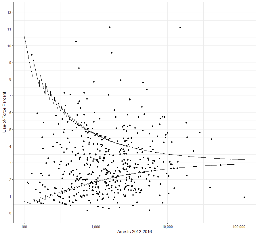
The average use of force per arrests in the state is around 3%. So the error bars show relative to the state average. Here is an interactive chart in which you can use tool tips to see the individual jurisdictions.
Now the original press release noted by Seth Stoughton on twitter noted that several towns have ratio’s of black to white use of force that are very high. Scott Wolfe suspected that was partly a function of smaller towns will have more variable rates. Basically as one is comparing the ratio between two rates with error, the error bars around the rate ratio will also be quite large.
Here is the chart showing the same type of funnel around the rate ratio of black to white use-of-force relative to the average over the whole sample (the black percent use of force is 3.2 percent of arrests, and the white percent use of force is 2.4, and the rate ratio between the two is 1.35). I show in the code how I constructed this, which I should write a blog post about itself, but in short there are decisions I could make to make the intervals wider. So the points that are just slightly above a ratio of 2 at around 10,000 arrests are arguably not outliers, those more to the top-right of the plot though are much better evidence. (I’d note that if one group is very small, you could always make these error bars really large, so to construct them you need to make reasonable assumptions about the size of the two groups you are comparing.)
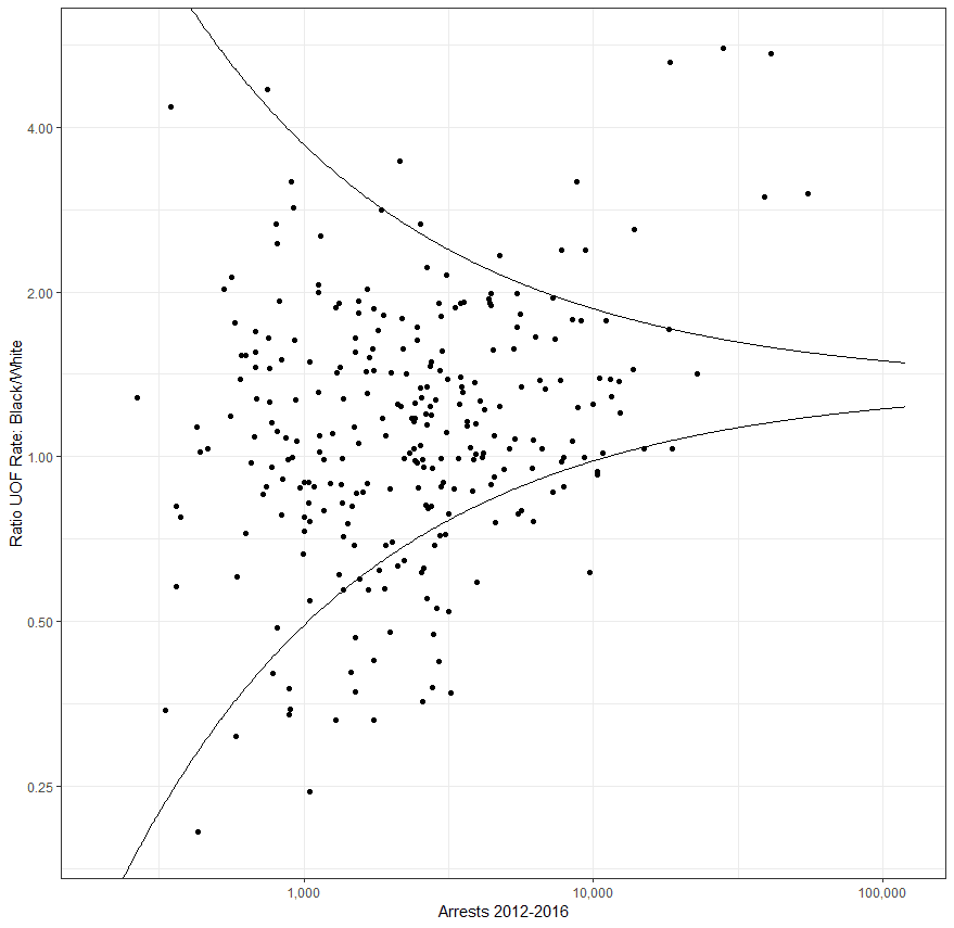
And here is another interactive chart in which you can view the outliers again. The original press release, Millville, Lakewood, and South Orange are noted as outliers. Using arrests as the denominator instead of population, they each have a rate ratio of around 2. In this chart Millville and Lakewood are outside the bounds, but just barely. South Orange is within the bounds. So those aren’t the places I would have called out according to this chart.
That same twitter thread other folks noted the potential reliability/validity of such data (Pete Moskos and Kyle McLean). These charts cannot say why individual agencies are outliers — either high or low. It could be their officers are really using force at different rates, it could also be though they are using different definitions to reporting force. There are also potential other individual explanations that explain the use of force distribution as well as the ratio differences in black vs white — no doubt policing in Princeton vs Camden are substantively different. Also even if all individual agencies are doing well, it does not mean there are no potential problem officers (as noted by David Pyrooz, often a few officers contribute to most UoF).
Despite these limitations, I still think there is utility in this type of monitoring though. It is basically a flag to dig deeper when anomalous patterns are spotted. Those unaccounted for factors contribute to more points being pushed outside of my constructed limits (overdispersion), but more clearly indicate when a pattern is so far outside the norm of what is expected the public deserves some explanation of the pattern. Also it highlights when agencies are potentially doing good, and so can be promoted according to their current practices.
This is a terrific start to effectively monitoring police agencies by ProPublica — state criminal justice agencies should be doing this themselves though.

