
On my prior post on estimating group based trajectory models in R using the crimCV package I received a comment asking about how to plot the trajectories. The crimCV model object has a base plot object, but here I show how to extract those model predictions as well as some other functions. Many of these plots are illustrated in my paper for crime trajectories at micro places in Albany (forthcoming in the Journal of Quantitative Criminology). First we are going to load the crimCV and the ggplot2 package, and then I have a set of four helper functions which I will describe in more detail in a minute. So run this R code first.
library(crimCV)
library(ggplot2)

long_traj <- function(model,data){
  df <- data.frame(data)
  vars <- names(df)
  prob <- model['gwt'] #posterior probabilities
  df$GMax <- apply(prob$gwt,1,which.max) #which group # is the max
  df$PMax <- apply(prob$gwt,1,max)       #probability in max group
  df$Ord <- 1:dim(df)[1]                 #Order of the original data
  prob <- data.frame(prob$gwt)
  names(prob) <- paste0("G",1:dim(prob)[2]) #Group probabilities are G1, G2, etc.
  longD <- reshape(data.frame(df,prob), varying = vars, v.names = "y",
                   timevar = "x", times = 1:length(vars),
                   direction = "long") #Reshape to long format, time is x, y is original count data
  return(longD)                        #GMax is the classified group, PMax is the probability in that group
}

weighted_means <- function(model,long_data){
  G_names <- paste0("G",1:model$ng)
  G <- long_data[,G_names]
  W <- G*long_data$y                                    #Multiple weights by original count var
  Agg <- aggregate(W,by=list(x=long_data$x),FUN="sum")  #then sum those products
  mass <- colSums(model$gwt)                            #to get average divide by total mass of the weight
  for (i in 1:model$ng){
    Agg[,i+1] <- Agg[,i+1]/mass[i]
  }
  long_weight <- reshape(Agg, varying=G_names, v.names="w_mean",
                         timevar = "Group", times = 1:model$ng,
                         direction = "long")           #reshape to long
  return(long_weight)
}

pred_means <- function(model){
    prob <- model$prob               #these are the model predicted means
    Xb <- model$X %*% model$beta     #see getAnywhere(plot.dmZIPt), near copy
    lambda <- exp(Xb)                #just returns data frame in long format
    p <- exp(-model$tau * t(Xb))
    p <- t(p)
    p <- p/(1 + p)
    mu <- (1 - p) * lambda
    t <- 1:nrow(mu)
    myDF <- data.frame(x=t,mu)
    long_pred <- reshape(myDF, varying=paste0("X",1:model$ng), v.names="pred_mean",
                         timevar = "Group", times = 1:model$ng, direction = "long")
    return(long_pred)
}

#Note, if you estimate a ZIP model instead of the ZIP-tau model
#use this function instead of pred_means
pred_means_Nt <- function(model){
    prob <- model$prob               #these are the model predicted means
    Xb <- model$X %*% model$beta     #see getAnywhere(plot.dmZIP), near copy
    lambda <- exp(Xb)                #just returns data frame in long format
	Zg <- model$Z %*% model$gamma
    p <- exp(Zg)
    p <- p/(1 + p)
    mu <- (1 - p) * lambda
    t <- 1:nrow(mu)
    myDF <- data.frame(x=t,mu)
    long_pred <- reshape(myDF, varying=paste0("X",1:model$ng), v.names="pred_mean",
                         timevar = "Group", times = 1:model$ng, direction = "long")
    return(long_pred)
}

occ <- function(long_data){
 subdata <- subset(long_data,x==1)
 agg <- aggregate(subdata$PMax,by=list(group=subdata$GMax),FUN="mean")
 names(agg)[2] <- "AvePP" #average posterior probabilites
 agg$Freq <- as.data.frame(table(subdata$GMax))[,2]
 n <- agg$AvePP/(1 - agg$AvePP)
 p <- agg$Freq/sum(agg$Freq)
 d <- p/(1-p)
 agg$OCC <- n/d #odds of correct classification
 agg$ClassProp <- p #observed classification proportion
 #predicted classification proportion
 agg$PredProp <- colSums(as.matrix(subdata[,grep("^[G][0-9]", names(subdata), value=TRUE)]))/sum(agg$Freq)
 #Jeff Ward said I should be using PredProb instead of Class prop for OCC
 agg$occ_pp <- n/ (agg$PredProp/(1-agg$PredProp))
 return(agg)
}
Now we can just use the data in the crimCV package to run through an example of a few different types of plots. First lets load in the TO1adj data, estimate the group based model, and make our base plot.
data(TO1adj)
out1 <-crimCV(TO1adj,4,dpolyp=2,init=5)
plot(out1)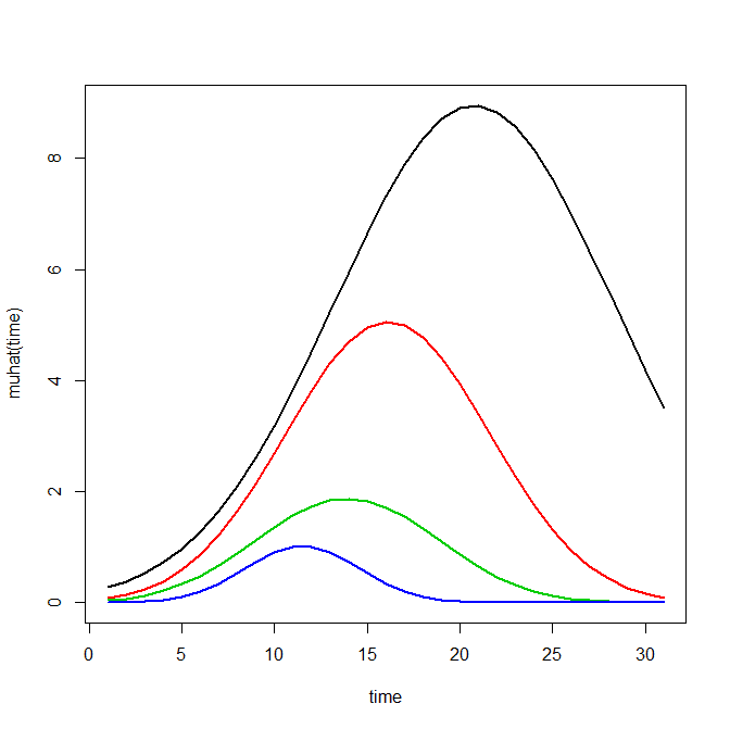
Now most effort seems to be spent on using model selection criteria to pick the number of groups, what may be called relative model comparisons. Once you pick the number of groups though, you should still be concerned with how well the model replicates the data at hand, e.g. absolute model comparisons. The graphs that follow help assess this. First we will use our helper functions to make three new objects. The first function, long_traj, takes the original model object, out1, as well as the original matrix data used to estimate the model, TO1adj. The second function, weighted_means, takes the original model object and then the newly created long_data longD. The third function, pred_means, just takes the model output and generates a data frame in wide format for plotting (it is the same underlying code for plotting the model).
longD <- long_traj(model=out1,data=TO1adj)
x <- weighted_means(model=out1,long_data=longD)
pred <- pred_means(model=out1)
We can subsequently use the long data longD to plot the individual trajectories faceted by their assigned groups. I have an answer on cross validated that shows how effective this small multiple design idea can be to help disentangle complicated plots.
#plot of individual trajectories in small multiples by group
p <- ggplot(data=longD, aes(x=x,y=y,group=Ord)) + geom_line(alpha = 0.1) + facet_wrap(~GMax)
p 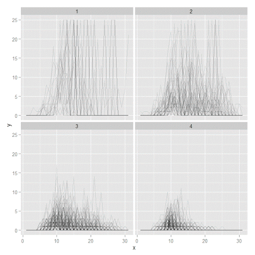
Plotting the individual trajectories can show how well they fit the predicted model, as well as if there are any outliers. You could get more fancy with jittering (helpful since there is so much overlap in the low counts) but just plotting with a high transparency helps quite abit. This second graph plots the predicted means along with the weighted means. What the weighted_means function does is use the posterior probabilities of groups, and then calculates the observed group averages per time point using the posterior probabilities as the weights.
#plot of predicted values + weighted means
p2 <- ggplot() + geom_line(data=pred, aes(x=x,y=pred_mean,col=as.factor(Group))) +
                 geom_line(data=x, aes(x=x,y=w_mean,col=as.factor(Group))) +
                geom_point(data=x, aes(x=x,y=w_mean,col=as.factor(Group)))
p2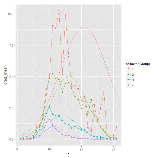
Here you can see that the estimated trajectories are not a very good fit to the data. Pretty much eash series has a peak before the predicted curve, and all of the series except for 2 don’t look like very good candidates for polynomial curves.
It ends up that often the weighted means are very nearly equivalent to the unweighted means (just aggregating means based on the classified group). In this example the predicted values are a colored line, the weighted means are a colored line with superimposed points, and the non-weighted means are just a black line.
#predictions, weighted means, and non-weighted means
nonw_means <- aggregate(longD$y,by=list(Group=longD$GMax,x=longD$x),FUN="mean")
names(nonw_means)[3] <- "y"

p3 <- p2 + geom_line(data=nonw_means, aes(x=x,y=y), col='black') + facet_wrap(~Group)
p3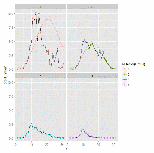
You can see the non-weighted means are almost exactly the same as the weighted ones. For group 3 you typically need to go to the hundredths to see a difference.
#check out how close
nonw_means[nonw_means$Group==3,'y'] -  x[x$Group==3,'w_mean']
You can subsequently superimpose the predicted group means over the individual trajectories as well.
#superimpose predicted over ind trajectories
pred$GMax <- pred$Group
p4 <- ggplot() + geom_line(data=pred, aes(x=x,y=pred_mean), col='red') +
                 geom_line(data=longD, aes(x=x,y=y,group=Ord), alpha = 0.1) + facet_wrap(~GMax)
p4
Two types of absolute fit measures I’ve seen advocated in the past are the average maximum posterior probability per group and the odds of correct classification. The occ function calculates these numbers given two vectors (one of the max probabilities and the other of the group classifications). We can get this info from our long data by just selecting a subset from one time period. Here the output at the console shows that we have quite large average posterior probabilities as well as high odds of correct classification. (Also updated to included the observed classified proportions and the predicted proportions based on the posterior probabilities. Again, these all show very good model fit.) Update: Jeff Ward sent me a note saying I should be using the predicted proportion in each group for the occ calculation, not the assigned proportion based on the max. post. prob. So I have updated to include the occ_pp column for this, but left the old occ column in as a paper trail of my mistake.
occ(longD)
#  group     AvePP Freq        OCC  ClassProp   PredProp     occ_pp
#1     1 0.9880945   23 1281.00444 0.06084656 0.06298397 1234.71607
#2     2 0.9522450   35  195.41430 0.09259259 0.09005342  201.48650
#3     3 0.9567524   94   66.83877 0.24867725 0.24936266   66.59424
#4     4 0.9844708  226   42.63727 0.59788360 0.59759995   42.68760
A plot to accompany this though is a jittered dot plot showing the maximum posterior probability per group. You can here that groups 3 and 4 are more fuzzy, whereas 1 and 2 mostly have very high probabilities of group assignment.
#plot of maximum posterior probabilities
subD <- longD[x==1,]
p5 <- ggplot(data=subD, aes(x=as.factor(GMax),y=PMax)) + geom_point(position = "jitter", alpha = 0.2)
p5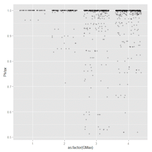
Remember that these latent class models are fuzzy classifiers. That is each point has a probability of belonging to each group. A scatterplot matrix of the individual probabilities will show how well the groups are separated. Perfect separation into groups will result in points hugging along the border of the graph, and points in the middle suggest ambiguity in the class assignment. You can see here that each group closer in number has more probability swapping between them.
#scatterplot matrix
library(GGally)
sm <- ggpairs(data=subD, columns=4:7)
sm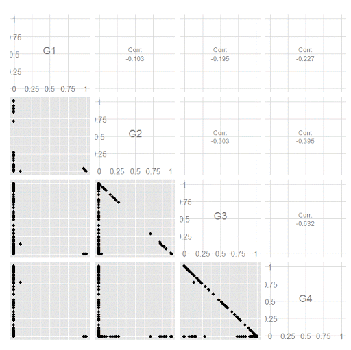
And the last time series plot I have used previously is a stacked area chart.
#stacked area chart
nonw_sum <- aggregate(longD$y,by=list(Group=longD$GMax,x=longD$x),FUN="sum")
names(nonw_sum)[3] <- "y"
p6 <- ggplot(data=nonw_sum, aes(x=x,y=y,fill=as.factor(Group))) + geom_area(position='stack')
p6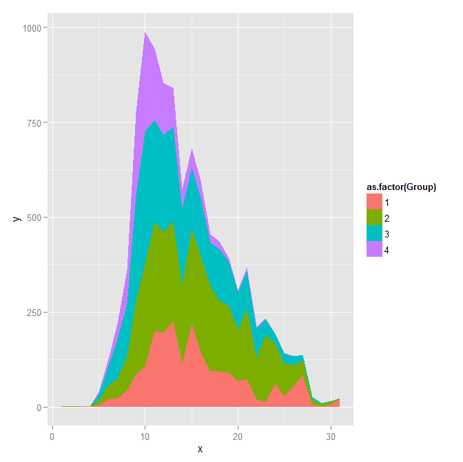
I will have to put another post in the queue to talk about the spatial point pattern tests I used in that trajectory paper for the future as well.


Paul Chang
/ January 13, 2018#plot of maximum posterior probabilities
p5 <- ggplot(data=subD, aes(x=as.factor(GMax),y=PMax)) + geom_point(position = "jitter", alpha = 0.2)
p5
#scatterplot matrix
library(GGally)
sm <- ggpairs(data=subD, columns=4:7)
sm
What's the "subD" meaning in the 2 sets codes? I cannot execute this code in these 2 sets codes.
apwheele
/ January 14, 2018Thank you for the note. “subD” is a new dataset, and I ommitted the line of code to create it. It is is simply
subD <- longD[x==1,]
I will update the post to note this. Thank you for pointing out that error.
Paul Chang
/ January 17, 2018Thanks for your kind reply.
Actually, I am interested in this method.
How does the data (” TO1adj ” ) look like?
Could I import CVS file into this package to do group-based trajectory modeling?
Thanks a lot.
apwheele
/ January 17, 2018The TO1adj data is just the example data that comes with the crimCV package. You can import whatever data you want from a csv file and estimate the trajectories, it just needs to be in wide format, e.g.
ID, Time1Val, Time2Val, Time3Val, ……
mario.s
/ April 23, 2018Dear Prof. Wheeler, is it possible to estimate a basic count model with no inflation or overdispersion using crimCV? Additionally, is there a way to set time at specific values e.g. 0 0.1 0.2 etc.?
Thank you in advance
apwheele
/ April 23, 2018In crimCV the model is a zero-inflated Poisson. So it does not have over-dispersion (e.g. negative binomial regression), but simply has the zero inflated parameter.
There is not a way to specify to not estimate a zero-inflated parameter in this program, nor am I aware of an R program that could be a substitute unfortunately. Ditto for specifying non-uniform time periods.
radumeg
/ May 25, 2020Hi Andrew,
I am trying to run this simple code to model temperature ( values between 80 and 110 F)
(This is example but I load similar kind of data from a excel)
df1 = matrix(runif(120, 80,110), nrow = 20, ncol=6)
model <- crimCV(df1,3,dpolyp=3)
However when I run this code I keep getting the following error
"Error in dmZIPt(Dat, X, ng, rcv, init, Risk) : object 'Frtr' not found"
I am relatively new to R debugging this I figured that it is running some Fortran code
Frtr <- .Fortran("r_dmzipt_init_param", as.double(X),
as.double(Datm), as.double(Risk), pparam = as.double(pparam),
pllike = as.double(pllike), as.integer(ni), as.integer(no),
as.integer(npp), as.integer(ng), as.integer(npop))
I am not sure is it related to the data that I have that is giving me the error? When I run the TO1Traj data it works fine.
I wanted to check if you have encountered similar error or would you know if I am doing something incorrectly?
Thanks
apwheele
/ May 25, 2020I have not come across that (and I can replicate that same error on my machine), R version 3.6.2 on windows at least.
I would email the author of the package to see if they know what the issue is (and maybe try a newer install of R).
radumeg
/ May 25, 2020Thanks for the quick reply! I will email the author! and will also try a newer installation of R.
ArthurE
/ July 23, 2020Hi Radumeg,
Just wondering, but did you ever figure out a way around this error? I am experiencing the same one. The error goes away if I don’t include a Risk matrix, but unfortunately I need to include the time-at-risk correction in my analyses.
radumeg
/ July 23, 2020I reached out to the authors of the crimCV package and here is the reply
*******************************************************************************************************
Subject: RE: Reg : error in crimCV package in R
crimCV is software that fits a model that assumes that the input is count
data (i.e. integers) with a medium to large proportion of zeros. You are
trying to fit this model to data that clearly violates the assumptions on
which the model was constructed. This makes this model totally
inappropriate for the data you are trying to analyze.
> The numerical optimization routine is crashing which results in the error.
> This is indeed happening in the Fortran routines.
>
> You are calling the code correctly but I don’t consider this crash unexpected as you are trying to fit ZIP trajectory models to uniformly distributed values between 80 and 110. ZIP models are for count data with a high proportion of zeroes. Even if you were lucky and the routine didn’t crash it wouldn’t be wise to use the results. Conceptually equivalent to using a classic linear regression model with a Gaussian residual error assumption to analyze binary data.
>
*******************************************************************************************************
I hope this help!
Having said that, I have steered away from this to k-shape trajectory clustering (https://tslearn.readthedocs.io/en/stable/auto_examples/clustering/plot_kshape.html#sphx-glr-auto-examples-clustering-plot-kshape-py) as that served my purposes well and I had continuous data and with very few zeros.
Celina
/ June 29, 2020Hello professor Andy,
I was wondering exactly what does the muhat(time) axis means?
apwheele
/ June 29, 2020I’m not sure what code you are referring to — can you be more specific?
Celina
/ June 29, 2020I am trying to figure out how to read the first graph that is created when I run the line plot(out1). I know the x-axis is the time, but what about the y-axis?
apwheele
/ June 30, 2020Ok I see now — those are just the predicted values. So if you are predicting crime counts over time for an example, in that graph at time period 15, the red line has close to a predicted 4 crimes per year.
Always feel free to send me an email Celina — apwheele@gmail.com.
conge
/ April 14, 2021Hi Andrew,
I was wondering how I can get the membership for new data using the predicted model.
Thanks!
Yang
apwheele
/ April 14, 2021Sorry I do not know offhand! I imagine there is a procedure to get the highest prob group if you have multiple prior temporal observations.
Desmond
/ May 10, 2021Hi Andrew, Thank you a lot. I was wondering about dpolyp and dpolyl arguments… Why/when change de defoult value of 3?
apwheele
/ May 10, 2021Those have to do with the underlying form of the equation. Sometimes you know a cubic functional form is unlikely. So if you have 5 time periods, while you can technically fit a cubic it will be difficult for real world data to be that curvy to justify a cubic over fewer terms.
With longer time series, it is easier to fit higher level polynomials. But that does not mean that a linear function is sufficient. In my work on crime trends and micro places, https://andrewpwheeler.wordpress.com/2016/11/15/paper-replicating-group-based-trajectory-models-of-crime-at-micro-places-in-albany-ny-published/, it was 13 years and the trajectories were clearly linear.
You can plot the original data as I have shown in this post to give a visual check. But you can also do all of the same fit statistics comparing different polynomial functions as you can for comparing more/less groups.
BC
/ June 7, 2022It seems crimCV does not allow different trajectory shapes for different groups. What if I want to fit a linear trajectory in one group, a quadratic shape in another, and a cubic in a third.
apwheele
/ June 7, 2022Yes you are right. I do not think this is a major issue, if a group *should* be linear then the higher level coefficients will just be fit closer to zero. That said, if you really need such functionality I would suggest looking into either the traj library functions by Dan Nagin/Bobby Jones for SAS/Stata, or in R maybe check out the flexmix library.
kt_drum
/ March 22, 2023Hi Andrew,
Would you have any advice on….
(1) package available in R for estimating group based trajectory models for continuous outcome data (normal distribution)?
(2) if you have used traj in STATA for estimating group-based trajectory models for continuous outcome data (normal distribution)? The examples I’ve seen online seem to be mainly for censored normal distributions. However, I note that the supported distributions do include ‘censored (or regular) normal’. Would that mean traj supports analysis with continuous data with normal distributions? I’m worried I’ve missed something.
https://www.andrew.cmu.edu/user/bjones/index.htm
Any help is much appreciated!
apwheele
/ March 23, 2023For R, check out the flexmix library. You can have nesting in the data for equivalent trajectories per group, https://andrewpwheeler.com/2022/04/19/state-dependence-and-trajectory-models/.
For Stata, you can just set the censoring bounds to values outside of the data and it is the same as a normal distribution without censoring.
kt_drum
/ March 23, 2023You are a legend Andrew. Thank you!
Yushan Du
/ November 14, 2024Dear Prof. Wheeler,
I am using the crimCV package for my analysis and have noticed that I obtain different results each time I rerun the code, even after setting a random seed with set.seed().
For instance, with the following code:
set.seed(123) # Fix the random seed
tra3 <- crimCV(ADL_data, ng = 4, dpolyp = 2, rcv = TRUE, init = 5)
the results vary with each execution. I would greatly appreciate any insights into why this occurs and how I might ensure consistent outcomes.
Thank you very much for your time and assistance.
Best regards,
Yushan Du
apwheele
/ November 14, 2024So I believe the code is calling some underlying libraries, so it is possible the random seed is set for the init at that stage. Sorry I do not see any option in the code as is to set the init values, you will need to dig into it some more to see if you can modify it to do that yourself.
Yushan Du
/ November 14, 2024I appreciate your suggestion. Thanks again for your help!
Rosario Delgado
/ January 21, 2025Thank you so much for all the detailed material available on this blog—it has been incredibly helpful!
I’d like to ask a question regarding the interpretation of the odds ratio (OR) calculated with the
occfunction, specifically usingocc_pp. What is the interpretation of “n” and “PredProd” in this context, and how do they provide an idea of the goodness of fit?Looking forward to your insights, and thanks again for sharing such valuable resources!
apwheele
/ January 21, 2025So take a set of data, two groups, 5 cases:
P(A) P(B) MaxGroup
0.8 0.2 A
0.7 0.3 A
0.4 0.6 B
0.4 0.6 B
0.4 0.6 B
You have the AvePP (average posterior probabilities) for group A is (0.8 + 0.7)/2 = 0.75. For B it is 0.6. So this metric is conditional on the observations maximum group probability.
The PredProp (the predictive proportion) for group A is (0.8 + 0.7 + 0.4 + 0.4 + 0.4)/5 = 0.54. For group B it should be 0.46. So this is calculated for all probabilities, not just the max probability per group.
n = AvePP/(1 – AvePP) [numerator]
d = PredProp/(1 – PredProp) [denominator]
occ_pp = n/d
OCC stands for the odds of correct classification. A higher odd’s ratio means you are less likely to misclassify an observation, and that there is more separation between classes.
Rosario Delgado
/ January 21, 2025Thank you for your quick response.
My question wasn’t so much about the calculations themselves but rather their interpretation as odds or odds ratios.
In the example, for PredProp, it holds that the values obtained for A and B sum up to 1. Therefore, the ratio could be interpreted as the average predicted probability in favor of A divided by the average predicted probability in favor of B. In this sense, it might be seen as an odds (although strictly speaking, it is not the ratio between the probability of an event and its complementary).
However, with AvePP, the average probabilities assigned to A and B do not sum to 1, and here the interpretation of “n” as odds seems less clear to me. Finally, the ratio of these two ratios (odds, in a very broad sense)—which would be occ_pp—is a number I struggle to interpret.
In summary, while I understand the calculations, I don’t fully grasp their interpretation in terms of odds, nor do I see how they relate to “correct classification”, as this is an unsupervised classification task.
Apologies for insisting on the matter of interpretation. Any further clarification would be greatly appreciated, and I thank you again for your response!
apwheele
/ January 21, 2025I would suggest reading Dan Nagin’s book for his original reasoning.
So in a simple scenario, imagine we have two groups that PredProb is 50% for each group. So PredProb = 0.5, and the denominator in the OCC ratio is 1. Pretend the numerator (the AvePP) for one group is 0.6, so then we have:
[0.6/0.4]/[0.5/0.5] = 1.5
If you randomly picked based on the baseline characteristics, OCC would be 1. (So if as a model you just set the probability to the overall proportion.) Using your model though, the odds of making a correct classification based on the maximum a posteriori probability for that one group is 1.5.
If that group is a smaller proportion of the overall sample though, the OCC will be larger. If it is larger part of the sample though, the OCC will be smaller (it could be smaller than 1).
Rosario Delgado
/ January 21, 2025Thank you very much for your detailed and kind explanation. Everything is much clearer to me now. I really appreciate the time and effort you took to respond so thoroughly!