Past year in review posts I have made focused on showing blog stats. Writing this in early December, but total views will likely be down this year – I am projecting around 140,000 views in total for this site. But I have over 25k views for the Crime De-Coder site, so it is pretty much the same compared to 2023 combining the two sites.
I do not have a succinct elevator speech to tell people what I am working on. With the Crime De-Coder consulting gig, it can be quite eclectic. That Tukey quote being a statistician you get to play in everyone’s backyard is true. Here is a rundown of the paid work I conducted in the past year.
Evidence Based CompStat: Work with Renee Mitchell and the American Society of Evidence Based Policing on what I call Evidence Based CompStat. This mostly amounts to working directly with police departments (it is more project management than crime analysis) to help them get started with implementing evidence based practices. Reach out if that sounds like something your department would be interested in!
Estimating DV Violence: Work supported by the Council on CJ. I forget exactly the timing of events. This was an idea I had for a different topic (to figure out why stores and official reports of thefts were so misaligned). Alex approached me to help with measuring national level domestic violence trends, and I pitched this idea (use local NIBRS data and NCVS to get better local estimates).

Premises Liability: I don’t typically talk about ongoing cases, but you can see a rundown of some of the work I have done in the past. It is mostly using the same stats I used as a crime analyst, but in reference to civil litigation cases.
Patrol Workload Analysis: I would break workload analysis for PDs down into two categories, advanced stats and CALEA reports. I had one PD interested in the simpler CALEA reporting requirement (which I can do for quite a bit cheaper than the other main consulting firm that offers these services).
Kansas City Python Training: Went out to Kansas City for a few days to train their analysts up in using python for Focused Deterrence. If you think the agenda in the pic below looks cool get in touch, I would love to do more of these sessions with PDs. I make it custom for the PD based on your needs, so if you want “python and ArcGIS”, or “predictive models” or whatever, I will modify the material to go over those advanced applications. I have also been pitching the same idea (short courses) for PhD programs. (So many posers in private sector data science, I want more social science PhDs with stronger tech skills!)

Patterson Opioid Outreach: Statistical consulting with Eric Piza and Kevin Wolff on a street outreach intervention intended to reduce opioid overdose in Patterson New Jersey. I don’t have a paper to share for that at the moment, but I used some of the same synthetic control in python code I developed.
Bookstore prices: Work with Scott Jacques, supported by some internal GSU money. Involves scraping course and bookstore data to identify the courses that students spend the most on textbooks. Ultimate goal in mind is to either purchase those books as unlimited epubs (to save the students money), or encourage professors to adopt better open source materials. It is a crazy amount of money students pour into textbooks. Several courses at GSU students cumulatively spend over $100k on course materials per semester. (And since GSU has a large proportion of Pell grant recipients, it means the federal government subsidizes over half of that cost.)
General Statistical Consulting: I do smaller stat consulting contracts on occasion as well. I have an ongoing contract to help with Pam Metzger’s group at the SMU Deason center. Did some small work for AH Datalytics on behind the scenes algorithms to identify anomalous reporting for the real time crime index. I have several times in my career consulted on totally different domains as well, this year had a contract on calculating regression spline curves for some external brain measures.
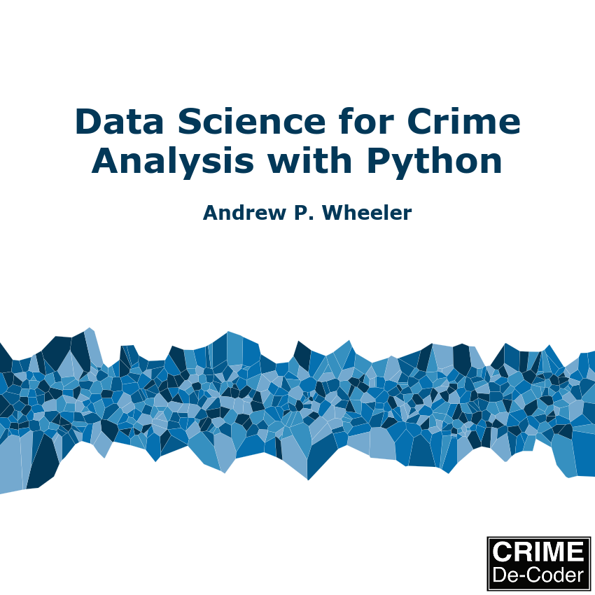
Data Science Book: And last (that I remember), I published Data Science for Crime Analysis with Python. I still have not gotten my 100 sales I would consider it a success – so if you have not bought a copy go do that right now. (Coupon code APWBLOG will get you $10 off for the next few weeks, either the epub or the paperback.)
Sometimes this seems like I am more successful than I am. I have stopped counting the smaller cold pitches I make (I should be more aggressive with folks, but most of this work is people reaching out to me). But in terms of larger grant proposals or RFPs in that past year, I have submitted quite a few (7 in total) and have landed none of them to date! Submitted a big one to support surveys that myself and Gio won the NIJ competition on for place based surveys to NIJ in their follow up survey solicitation, and it was turned down for example. So it goes.
In addition to the paid work, I still on occasion publish peer reviewed articles. (I need to be careful with my time though.) I published a paper with Kim Rossmo on measuring the buffer zone in journey to crime data. I also published the work on measuring domestic violence supported by the Council on CJ with Alex Piquero.
I took the day gig in Data Science at the end of 2019. Citations are often used as a measure of a scholars influence on the field – they are crazy slow though.

I had 208 citations by the end of 2019, I now have over 1300. Of the 1100 post academia, only a very small number are from articles I wrote after I left (less than 40 total citations). A handful for the NIJ recidivism competition paper (with Gio), and a few for this Covid and shootings paper in Buffalo. The rest of the papers that have a post 2019 publishing date were entirely written before I left academia.
Always happy to chat with folks on teaming up on papers, but it is hard to take the time to work on a paper for free if I have other paid work at the moment. One of the things I need to do to grow the business is to get some more regular work. So if you have a group (academic, think tank, public sector) that is interested in part time (or fractional I guess is what the cool kids are calling it these days), I would love to chat and see if I could help your group out.