Visualization techniques for large N scatterplots in SPSS

When you have a large N scatterplot matrix, you frequently have dramatic over-plotting that prevents effectively presenting the relationship. Here I will give a few quick examples of simple ways to alter the typical default scatterplot to ease the presentation. I give examples in SPSS, although I suspect any statistical packages contains these options to alter the default scatterplot. At the end of the post I will link to SPSS code and data I used for these examples. For a brief background of the data, these are UCR index crime rates for rural counties by year in Appalachia from 1977 to 1996. This data is taken from the dataset Spatial Analysis of Crime in Appalachia, 1977-1996 posted on ICPSR (doi:10.3886/ICPSR03260.v1). While these scatterplots ignore the time dimension of the dataset, they are sufficient to demonstrate techniques to visualize big N scatterplots, as they result in over 7,000 county years to visualize.

So what is the problem with typical scatterplots for such large data? Below is an example default scatterplot in SPSS, plotting the Burglary Rate per 100,000 on the X axis versus the Robbery Rate per 100,000 on the Y axis. This uses my personal default chart template, but the problem is with the large over-plotted points in the scatter, which is the same for the default template that comes with installation.

The problem with this plot is that the vast majority of the points are clustered in the lower left corner of the plot. For the most part, the graph is expanded simply due to a few outliers in both dimesions (likely due to in part hetereoskedascity that comes with rates in low population areas). While the outliers will certainly be of interest, we kind of lose the forest for the trees in this particular plot.

Two simple suggestions to the base default scatterplot are to utilize smaller points and/or makes the points semi-transparent. On the left is an example of making the points smaller, and on the right is an example utilizing semi-transparency and small points. This de-emphasizes the outlier points (which could be good or bad depending on how you look at it), but allows one to see the main point cloud and the correlation between the two rates within it. (Note: you can open up the images in a new window to see them larger)

Note if you are using SPSS, to define semi-transparency you need to define it in the original GPL code (or in a chart template if you wanted), you can not do it post-hoc in the editor. You can make the points smaller in the editor, but editing charts with this many elements tends to be quite annoying, so to the extent you can specify the aesthetics in GPL I would suggest doing so. Also note making the elements smaller and semi-transparent can also be effectively utilized to visualize line plots, and I gave an example at the SPSS IBM forum recently.

Another option is to bin the elements, and SPSS has the options to either utilze rectangular bins or hexagon bins. Below is an example of each.

One thing that is nice about this technique and how SPSS handles the plot, a bin is only drawn if at least one point falls within it. Thus the outliers and the one high leverage point in the plot are still readily apparent. Other ways to summarize distributions (that are currently not available in SPSS) are sunflower plots or contour plots. Sunflower plots are essentially another way to display and summarize multiple overlapping points (see Carr et al., 1987 or an example from this blog post by Analyzer Assistant). Contour plots are drawn by smoothing the distribution and then plotting lines of equal density. Here is an example of a contour plot using ggplot2 in R on the Cross Validated Q/A site).

This advice can also be extended to scatterplot matrices. In fact such advice is more important in such plots, as the relationship is shrunk in a much smaller space. I talk about this some in my post on the Cross Validated blog, AndyW says Small Multiples are the Most Underused Data Visualization when I say reducing information into key patterns can be useful.

Below on the left is an example of the default SPSS scatter plot matrix produced through the Chart Builder, and on the right after editing the GPL code to make the points smaller and semi-transparent.

I very briefly experimented with adding a loess smooth line or using the binning techniques in SPSS but was not sucessful. I will have to experiment more to see if it can be effectively done in scatterplot matrices. I would like to extend some of the example corrgrams I previously made to plot the loess smoother and bivariate confidence ellipses, and you can be sure I will post the examples here on the blog if I ever get around to it.

The data and syntax used to produce the plots can be found here.

Bean plots in SPSS

It seems like I have come across alot of posts recently about visualizing univariate distributions. Besides my own recent blog post about comparing distributions of unequal size in SPSS, here are a few other blog posts I have recently come across;

Such a variety of references is not surprising though. Examining univariate distributions is a regular task for data analysis and can tell you alot about the nature of data (including potential errors in the data). Here are some posts on the Cross Validated Q/A site of related interest I have compiled;

In particular the recent post on bean plots and Luca Fenu’s post motivated my playing around with SPSS to produce the bean plots here. Note Jon Peck has published a graphboard template to generate violin plots for SPSS, but here I will show how to generate them in the usual GGRAPH commands. It is actually pretty easy, and here I extend the violin plots to include the beans suggested in bean plots!

A brief bit about the motivation for bean plots. Besides consulting the article by Peter Kampstra, one is interested in viewing a univariate continuous distribution among a set of different categories. To do this one uses a smoothed kernel density estimate of the distribution for each of the subgroups. When viewing the smoothed distribution though one loses the ability to identify patterns in the individual data points. Patterns can mean many things, such as outliers, or patterns such as striation within the main body of observations. The bean plot article gives an example where striation in measurements at specific inches can be seen. Another example might be examining the time of reported crime incidents (they will have bunches at the beginning of the hour, as well as 15, 30, & 45 minute marks).

Below I will go through a brief series of examples demonstrating how to make bean plots in SPSS.


SPSS code to make bean plots

First I will make some fake data for us to work with.

******************************************.
set seed = 10.
input program.
loop #i = 1 to 1000.
compute V1 = RV.NORM(0,1).
compute groups = TRUNC(RV.UNIFORM(0,5)).
end case.
end loop.
end file.
end input program.
dataset name sim.
execute.

value labels groups
0 'cat 0'
1 'cat 1'
2 'cat 2'
3 'cat 3'
4 'cat 4'.
******************************************.

Next, I will show some code to make the two plots below. These are typical kernel density estimates of the V1 variable I made for the entire distribution, and these are to show the elements of the base bean plots. Note the use of the TRANS statement in the GPL to make a constant value to plot the rug of the distribution. Also note although such rugs are typically shown as bars, you could pretty much always use point markers as well in any situation where you use bars. Below the image is the GGRAPH code used to produce them.

******************************************.
*Regular density estimate with rug plot.
GGRAPH
  /GRAPHDATASET NAME="graphdataset" VARIABLES=V1 MISSING=LISTWISE REPORTMISSING=NO
  /GRAPHSPEC SOURCE=INLINE.
BEGIN GPL
  SOURCE: s=userSource(id("graphdataset"))
  DATA: V1=col(source(s), name("V1"))
  TRANS: rug = eval(-26)
  GUIDE: axis(dim(1), label("V1"))
  GUIDE: axis(dim(2), label("Density"))
  SCALE: linear(dim(2), min(-30))
  ELEMENT: interval(position(V1*rug), transparency.exterior(transparency."0.8"))
  ELEMENT: line(position(density.kernel.epanechnikov(V1*1)))
END GPL.

*Density estimate with points instead of bars for rug.
GGRAPH
  /GRAPHDATASET NAME="graphdataset" VARIABLES=V1 MISSING=LISTWISE REPORTMISSING=NO
  /GRAPHSPEC SOURCE=INLINE.
BEGIN GPL
  SOURCE: s=userSource(id("graphdataset"))
  DATA: V1=col(source(s), name("V1"))
  TRANS: rug = eval(-15)
  GUIDE: axis(dim(1), label("V1"))
  GUIDE: axis(dim(2), label("Density"))
  SCALE: linear(dim(2), min(-30))
  ELEMENT: point(position(V1*rug), transparency.exterior(transparency."0.8"))
  ELEMENT: line(position(density.kernel.epanechnikov(V1*1)))
END GPL.
******************************************.

Now bean plots are just the above plots rotatated 90 degrees, adding a reflection of the distribution (so the area of the density is represented in two dimensions), and then further paneled by another categorical variable. To do the reflection, one has to create a fake variable equal to the first variable used for the density estimate. But after that, it is just knowing alittle GGRAPH magic to make the plots.

******************************************.
compute V2 = V1.

varstocases
/make V from V1 V2
/index panel_dum.

GGRAPH
  /GRAPHDATASET NAME="graphdataset" VARIABLES=V panel_dum groups MISSING=LISTWISE REPORTMISSING=NO
  /GRAPHSPEC SOURCE=INLINE.
BEGIN GPL
  SOURCE: s=userSource(id("graphdataset"))
  COORD: transpose(mirror(rect(dim(1,2))))
  DATA: V=col(source(s), name("V"))
  DATA: panel_dum=col(source(s), name("panel_dum"), unit.category())
  DATA: groups=col(source(s), name("groups"), unit.category())
  TRANS: zero = eval(10)
  GUIDE: axis(dim(1), label("V1"))
  GUIDE: axis(dim(2), null())
  GUIDE: axis(dim(3), null())
  SCALE: linear(dim(2), min(0))
  ELEMENT: area(position(density.kernel.epanechnikov(V*1*panel_dum*1*groups)), transparency.exterior(transparency."1.0"), transparency.interior(transparency."0.4"), 
           color.interior(color.grey), color.exterior(color.grey)))
  ELEMENT: interval(position(V*zero*panel_dum*1*groups), transparency.exterior(transparency."0.8"))
END GPL.
    ******************************************.

Note I did not label the density estimate anymore. I could have, but I would have had to essentially divide the density estimate by two, since I am showing it twice (which is possible, and if you wanted to show it you would omit the GUIDE: axis(dim(2), null()) command). But even without the axis they are still reasonable for relative comparisons. Also note the COORD statement for how I get the panels to mirror each other (the transpose statement just switches the X and Y axis in the charts).

I just post hoc edited the chart to get it to look nice (in particular settign the spacing between the panel_dum panel to zero and making the panel outlines transparent), but most of those things can likley be more steamlined by making an appropriate chart template. Two things I do not like, which I may need to edit the chart template to be able to accomplish anyway; 1) There is an artifact of a white line running down the density estimates, (it is hard to see with the rug, but closer inspection will show it), 2) I would prefer to have a box around all of the estimates and categories, but to prevent a streak running down the middle of the density estimates one needs to draw the panel boxes without borders. To see if I can accomplish these things will take further investigation.

This framework is easily extended to the case where you don’t want a reflection of the same variable, but want to plot the continuous distribution estimate of a second variable. Below is an example, and here I have posted the syntax in entirety used in making this post. In there I also have an example of weighting groups inversely proportional to the total items in each group, which should make the area of each group equal.

In this example of comparing groups, I utilize dots instead of the bar rug, as I believe it provides more contrast between the two distributions. Also note in general I have not superimposed other summary statistics (some of the bean plots have quartile lines super-imposed). You could do this, but it gets a bit busy.

Comparing continuous distributions of unequal size groups in SPSS

The other day I had the task of comparing two distributions of a continous variable between two groups. One complication that arose when trying to make graphical comparisons was that the groups had unequal sample sizes. I’m making this blog post mainly because many of the options I will show can’t be done in SPSS directly through the graphical user interface (GUI), but understanding alittle bit about how the graphic options work in the GPL will help you make the charts you want to make without having to rely solely on what is available through the GUI.

The basic means I typically start out at are histograms, box-plots and a few summary statistics. The beginning code is just how I generated some fake data to demonstrate these graphics.

SET TNumbers=Labels ONumbers=Labels OVars=Labels TVars=Labels.
dataset close ALL.
output close ALL.
*making fake cases data.
set seed = 10.
input program.
loop #i = 1 to 5000.
if #i <= 1500 group = 1.
if #i > 1500 group = 2.
end case.
end loop.
end file.
end input program.
dataset name sim.
execute.

*making approximate log normal data.
if group = 1 time_event = (RV.LNORMAL(0.5,0.6))*10.
if group = 2 time_event = (RV.LNORMAL(0.6,0.5))*10.

variable labels time_event 'Time to Event'.
value labels group 
1 'Group 1'
2 'Group 2'.
formats group time_event (F3.0).

variable level group (nominal).

*Good First Stabs are Histograms and Box plots and summary statistics.
GRAPH
  /HISTOGRAM=time_event
  /PANEL ROWVAR=group ROWOP=CROSS.

EXAMINE VARIABLES=time_event BY group
  /PLOT=BOXPLOT
  /STATISTICS=NONE
  /NOTOTAL. 

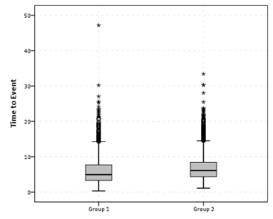
So this essentially produces a summary statistics table, a paneled histogram, and a box-plot (shown below).

First blush this is an alright way to visually assess various characteristics of each distribution, and the unequal sizes of each group is not problematic when comparing the summary statistics nor the box-plots. The histogram produced by SPSS though is the frequency of events per bin, and this makes it difficult to compare Group 2 to Group 1, as Group 2 has so many more observations. One way to normalize the distributions is to make a histogram showing the percent of the distribution that falls within that bin as oppossed to the frequency. You can actually do this through the GUI through the Chart Builder, but it is buried within some various other options, below is a screen shot showing how to change the histogram from frequency to percents. Also to note, you need to change what the base percentage is built off of, by clicking the Set Parameters button (circled in red) and then toggling the denominator choice in the new pop up window to total for each panel (if you click on the screen shot images they will open up larger images).

Sometimes you can’t always get to what you want through the chart builder GUI though. For an example, I originally wanted to make a population pyramid type chart, and it does not allow you to specify the base percent like that through the GUI. So I originally made a pyramid chart like this;

And here is what the pasted output appears like.

GGRAPH
  /GRAPHDATASET NAME="graphdataset" VARIABLES=time_event group MISSING=LISTWISE REPORTMISSING=NO
  /GRAPHSPEC SOURCE=INLINE.
BEGIN GPL
  SOURCE: s=userSource(id("graphdataset"))
  DATA: time_event=col(source(s), name("time_event"))
  DATA: group=col(source(s), name("group"), unit.category())
  COORD: transpose(mirror(rect(dim(1,2))))
  GUIDE: axis(dim(1), label("Time to Event"))
  GUIDE: axis(dim(1), opposite(), label("Time to Event"))
  GUIDE: axis(dim(2), label("Frequency"))
  GUIDE: axis(dim(3), label("group"), opposite(), gap(0px))
  GUIDE: legend(aesthetic(aesthetic.color), null())
  SCALE: cat(dim(3), include("1", "2"))
  ELEMENT: interval(position(summary.count(bin.rect(time_event*1*group))), color.interior(group))
END GPL.

To get the percent bins instead of the count bins takes one very simple change to summary specification on the ELEMENT statement. One would simply insert summary.percent.count instead of summary.count. Which will approximately produce the chart below.
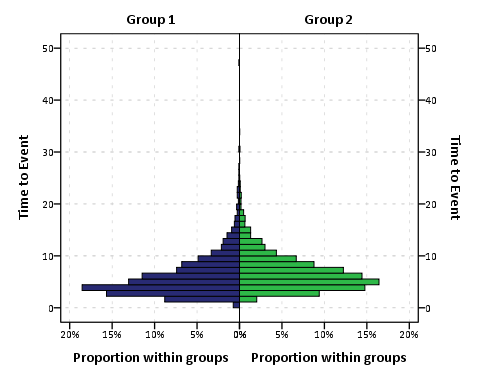
You can actually post-hoc edit the traditional histogram to make a population pyramid (by mirroring the panels), but by examining the GPL produced for the above chart gives you a glimpse of the potential possibilities you can do to produce a variety of charts in SPSS.

Another frequent way to assess continuous distributions like those displayed so far is by estimating kernel density smoothers through the distribution (sometime referred by the acronym kde (e is for estimate). Sometimes this is perferable because our perception of the distribution can be too highly impacted by the histogram bins. Kernel density smoothers aren’t available through the GUI at all though (as far as I’m aware), and so you would have only known the potential exisited if you looked at the examples in the GPL reference guide that comes with the software. Below is an example (including code).

GGRAPH
  /GRAPHDATASET NAME="graphdataset" VARIABLES=time_event group MISSING=LISTWISE REPORTMISSING=NO
  /GRAPHSPEC SOURCE=INLINE.
BEGIN GPL
  SOURCE: s=userSource(id("graphdataset"))
  DATA: time_event=col(source(s), name("time_event"))
  DATA: group=col(source(s), name("group"), unit.category())
  GUIDE: axis(dim(1), label("Time to Event"))
  GUIDE: axis(dim(2), label("Kernel Density Estimate"))
  GUIDE: legend(aesthetic(aesthetic.color.interior))
  SCALE: cat(aesthetic(aesthetic.color.interior), include("1", "2"))
  ELEMENT: line(position(density.kernel.epanechnikov(time_event*group)), color(group))
END GPL.

Although the smoothing is useful, again we have a problem with the unequal number of cases in the distributions. To solve this, I weighted cases inversely proportional to the number of observations that were in each group (i.e. the weight for group 1 is 1/1500, and the weight for group 2 is 1/3500 in this example). This should make the area underneath the lines sum to 1, and so to get the estimate back on the original frequency scale you would simply multiply the marginal density estimate by the total in the corresponding group. So for instance, the marginal density for group 2 at the time to event value of 10 is 0.05, so the estimated frequency given 3500 cases is .05 * 3500 = 175. To get back on a percentage scale you would just multiply by 100.

AGGREGATE
  /OUTFILE=* MODE=ADDVARIABLES
  /BREAK=group
  /cases=N.
compute myweight = 1/cases.

GGRAPH
  /GRAPHDATASET NAME="graphdataset" VARIABLES=time_event group myweight MISSING=LISTWISE REPORTMISSING=NO
  /GRAPHSPEC SOURCE=INLINE.
BEGIN GPL
  SOURCE: s=userSource(id("graphdataset"), weight(weightedVar))
  DATA: weightedVar=col(source(s), name("myweight"))
  DATA: time_event=col(source(s), name("time_event"))
  DATA: group=col(source(s), name("group"), unit.category())
  GUIDE: axis(dim(1), label("Time to Event"))
  GUIDE: axis(dim(2), label("Weighted Kernel Density Estimate"))
  GUIDE: legend(aesthetic(aesthetic.color.interior))
  GUIDE: text.footnote(label("Density is weighted inverse to the proportion of cases within each group. The number of cases in group 1 equals 1,500, and the number of cases ingroup 2 equals 3,500."))
  SCALE: cat(aesthetic(aesthetic.color.interior), include("1", "2"))
  SCALE: linear(dim(2))
  ELEMENT: line(position(density.kernel.epanechnikov(time_event*group)), color(group))
END GPL.

One of the critiques of this though is that choosing a kernel and bandwidth is ad-hoc (I just used all of the default kernal and bandwidth in SPSS here, and it differed in unexpected ways between the frequency counts and the weighted estimates which is undesirable). Also you can see that some of the density is smoothed over illogical values in this example (values below 0). Other potential plots are the cumualitive distribution and QQ-plots comparing the quantiles of each distribution to each other. Again these are difficult to impossible to obtain through the GUI. Here is the closest I could come to getting a cumulative distribution by groups through the GUI.

GGRAPH
  /GRAPHDATASET NAME="graphdataset" VARIABLES=time_event COUNT()[name="COUNT"] group 
    MISSING=LISTWISE REPORTMISSING=NO
  /GRAPHSPEC SOURCE=INLINE.
BEGIN GPL
  SOURCE: s=userSource(id("graphdataset"))
  DATA: time_event=col(source(s), name("time_event"))
  DATA: COUNT=col(source(s), name("COUNT"))
  DATA: group=col(source(s), name("group"), unit.category())
  GUIDE: axis(dim(1), label("Time to Event"))
  GUIDE: axis(dim(2), label("Cumulative Percent of Total"))
  GUIDE: legend(aesthetic(aesthetic.color.interior))
  SCALE: cat(aesthetic(aesthetic.color.interior), include("1", "2"))
  ELEMENT: line(position(summary.percent.cumulative(time_event*COUNT, base.all(acrossPanels()))), 
    color.interior(group), missing.wings())
END GPL.

This is kind of helpful, but not really what I want. I wasn’t quite sure how to change the summary statistic functions in the ELEMENT statement to calculate percent within groups (I assume it is possible, but I just don’t know how), so I ended up just making the actual data to include in the plot. Example syntax and plot below.

sort cases by group time_event.
compute id = $casenum.
AGGREGATE
  /OUTFILE=* MODE=ADDVARIABLES
  /BREAK=group
  /id_min=MIN(id)
  /id_max=MAX(id).
compute cum_prop = ((id +1) - id_min)/(id_max - (id_min - 1)).


*Here is the cumulative proportion I want.
GGRAPH
  /GRAPHDATASET NAME="graphdataset" VARIABLES=time_event cum_prop group MISSING=LISTWISE 
    REPORTMISSING=NO
  /GRAPHSPEC SOURCE=INLINE.
BEGIN GPL
  SOURCE: s=userSource(id("graphdataset"))
  DATA: time_event=col(source(s), name("time_event"))
  DATA: cum_prop=col(source(s), name("cum_prop"))
  DATA: group=col(source(s), name("group"), unit.category())
  GUIDE: axis(dim(1), label("Time to Event"))
  GUIDE: axis(dim(2), label("Cumulative Percent within Groups"))
  GUIDE: legend(aesthetic(aesthetic.color.interior))
  SCALE: cat(aesthetic(aesthetic.color.interior), include("1", "2"))
  ELEMENT: line(position(time_event*cum_prop), color.interior(group), missing.wings())
END GPL.

These cumulative plots aren’t as problematic with bins as are the histograms or kde estimates, and in fact many interesting questions are much easier addressed with the cumulative plots. For instance if I wanted to know the proportion of events that happen within 10 days (or its complement, the proportion of events that do not yet occur within 10 days) this is an easy task with the cumulative plots. This would be at best extremely difficult to determine with the histogram or density estimates. The cumulative plot also gives a graphical comparisons of the distribution (although perhaps not as intuitive as the histogram or kde estimates). For instance it is easy to see the location of group 2 is slightly shifted to the right.

The last plot I present is a QQ-plot. These are typically presented as plotting an empirical distribution against a theoretical distribution, but you can plot two empirical distributions against each other. Again you can’t quite get the QQ-plot of interest though the regular GUI, and you have to do some data manipulation to be able to construct the elements of the graph. You can do QQ-plots against a theoretical distribution in the PPLOT command, so you could make seperate QQ plots for each subgroup, but this is less than ideal. Below I paste an example of my constructed QQ-plot, along with syntax showing how to use the PPLOT command for seperate sub-groups (using SPLIT FILE) and getting the quantiles of intrest using the RANK command.

sort cases by group time_event.
split file by group.
PPLOT
  /VARIABLES=time_event
  /NOLOG
  /NOSTANDARDIZE
  /TYPE=Q-Q
  /FRACTION=BLOM
  /TIES=MEAN
  /DIST=LNORMAL.
split file off.

*Not really what I want - I want Q-Q plot of one group versus the other group.
RANK VARIABLES=time_event (A) BY group
  /NTILES(99)
  /PRINT=NO
  /TIES=MEAN.

*Now aggregating to new dataset.
DATASET DECLARE quantiles.
AGGREGATE
  /OUTFILE='quantiles'
  /BREAK=group Ntime_ev 
  /time_event=MAX(time_event).
dataset activate quantiles.

sort cases by Ntime_ev group.
casestovars
/id = Ntime_ev
/index = group.

DATASET ACTIVATE quantiles.
* Chart Builder.
GGRAPH
  /GRAPHDATASET NAME="graphdataset" VARIABLES=time_event.1[name="time_event_1"] 
    time_event.2[name="time_event_2"] MISSING=LISTWISE REPORTMISSING=NO
  /GRAPHSPEC SOURCE=INLINE.
BEGIN GPL
  SOURCE: s=userSource(id("graphdataset"))
  DATA: time_event_1=col(source(s), name("time_event_1"))
  DATA: time_event_2=col(source(s), name("time_event_2"))
  GUIDE: axis(dim(1), label("Quantiles Time to Event Group 1"))
  GUIDE: axis(dim(2), label("Quantiles Time to Event Group 2"))
  ELEMENT: point(position(time_event_1*time_event_2))
  ELEMENT: line(position(time_event_1*time_event_1))
END GPL.

Although I started out with a simple question, it takes a fair bit of knowledge about both graphically comparing distributions and data management (i.e. how to shape your data) to be able to make all of these types of charts in SPSS. I intentionally made the reference distributions very similar, and if you just stuck with the typical histogram the slight differences in location and scale between the two distributions would not be as evident as it is with the kernel density, the cumulative distribution or the QQ-plots.

Beware of Mach Bands in Continuous Color Ramps

A recent post of mine on the cross validated statistics site addressed how to make kernel density maps more visually appealing. The answer there was basically just adjust the bandwidth until you get a reasonably smoothed surface (where reasonable means not over-smoothed to one big hill or undersmoothed to a bunch of unconnected hills).

Another problem that frequently comes along with the utlizing the default types of raster gradients is that of mach bands. Here is a replicated image I used in the cross validated site post (made utilizing the spatstat R library).

Even though the color ramp is continous, you see some artifacts around the gradient where the hue changes from what our eyes see as green to blue. To be more precise, approximately where the green hue touches the blue hue the blue color appears to be lighter than the rest of the blue background. This is not the case though, and is just an optical illusion (you can even see the mach bands in the legend if you look close). Mark Monmonier in How to Lie with Maps gives an example of this, and also uses that as a reason to not use continous color ramps (also another reason he gives is it is very difficult to map a color to an exact numerical location on the ramp). To note this isn’t just something that happens with this particular color ramp, this happens even when the hue is the same (the wikipedia page gives an example with varying grey saturation).

So what you say? Well, part of the reason it is a problem is because the artifact reinforces unnatural boundaries or groupings in the data, the exact opposite of what one wants with a continuous color ramp! Also the groupings are largely at the will of the computer, and I would think the analyst wants to define the groupings themselves when disseminating the maps (although this brings up another problem with how to define the color breaks). A general principle with how people interpret such maps is that they tend to form homogenous groupings anyway, so for both exploratory purposes and disseminating maps we should keep this in mind.

This isn’t a problem limited to isopleth maps either, the Color Brewer online app is explicitly made to demonstrate this phenonenom for choropleth maps visualizing irregular polygons. What happens is that one county that is spatially outlying compared to its neighbors appears more extreme on the color gradient than when it is surrounded by colors with the same hue and saturation. Below is a screen shot of what I am talking about, with some of the examples circled in red. They are easy to see that they are spatially outlying, but harder to map to the actual color on the ramp (and it gets harder when you have more bins).

Even with these problems I think the default plots in the spatstat program are perfectly fine for exploratory analysis. I think to disseminate the plots though I would prefer discrete bins in many (perhaps most) situations. I’ll defer discussion on how to choose the bins to another time!

Co-maps and Hot spot plots! Temporal stats and small multiple maps to visualize space-time interaction.

One of the problems with visualizing and interpreting spatial data is that there are characteristics of the geographical data that are hard to display on a static, two dimensional map. Friendly (2007) makes the pertinent distinction between map and non-map based graphics, and so the challenge is to effectively interweave them. One way to try to overcome this is to create graphics intended to supplement the map based data. Below I give two examples pertinent to analyzing point level crime patterns with attached temporal data, co-maps (Brunsdon et al., 2009) and the hot spot plot (Townsley, 2008).

co-maps

The concept of co-maps is an extension of co-plots, a visualization technique for small multiple scatterplots originally introduced by William Cleveland (1994). Co-plots are in essence a series of small multiples scatterplots in which the visualized scatter plot is conditioned on a third (or potentially fourth) variable. What is unique about co-plots are though the conditioning variable(s) is not mutually exclusive between categories, so the conditions overlap.

The point of co-plots is in general to see if the relationship between two variables has an interaction with a third continuous variable. When the conditioning variable is continuous, we wouldn’t expect the interaction to change dramatically with discrete cut-offs of the continuous variable, so we want to examine the interaction effect at varying levels of the conditioning variable. It is also useful in instances in which the data is sparse, and you don’t want to introduce artifactual relationships by making arbitrary cut-offs for the conditioning variable.

Besides the Cleveland paper cited (which is publicly available, link in citations at bottom of post), there are some good examples of coplot scatterplots from the R graphical manual.

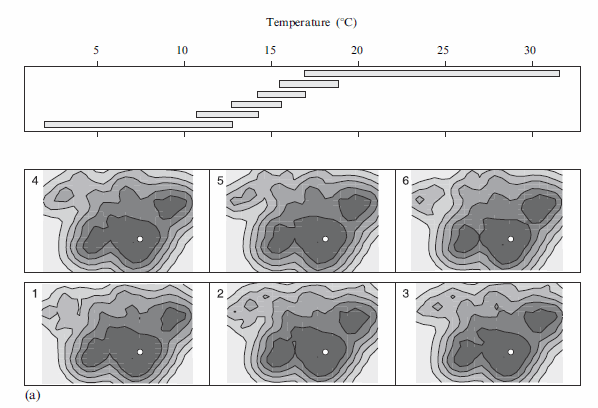
Brunsdon et al. (2009) extend the concept to analyzing point patterns, when time is the conditioning variable. Also because the geographic data are numerous, they apply kernel density estimation (kde) to visualize the results (instead of a sea of overlapping points). When visualizing geographic data, too many points are common, and the solutions to visualizing the data are essentially the same as people use for scatterplots (this thread at the stats site gives a few resources and examples concerning that). Below I’ve copied a picture from Brusdon et al., 2009 to show it applied to crime data.

Although the example is conditional on temperature (instead of time), it should be easy to see how it could be extended to make the same plot conditional on time. Also note the bar graph at the top denotes the temperature range, with the lowest bar corresponding to the graphic that is in the panel on the bottom left.

Also of potential interest, the same authors applied the same visualization technique to reported fires in another publication (Corcoran et al., 2007).

the hot spot plot

Another similarly motivated graphical presentation of the interaction of time and space is the hot-spot plot proposed by Michael Townsley (2008). Below is an example.

So the motivation here is having coincident graphics simulataneously depicting long term temporal trends (in a sparkline like graphic at the top of the plot), spatial hot spots depicted using kde, and a lower bar graphic depicting hourly fluctuations. This allows one to identify spatial hot spots, and then quickly assess their temporal nature. The example from the Townsley article I give is a secondary plot showing zoomed in locations of several analyst chosen hot spots, with the cut out remaining events left as a baseline.

Some food for thought when examing space-time trends with point pattern crime data.


Citations

Reference lines for star plots aid interpretation

The other day I was reading Nathan Yau’s Visualize This, and in his chapter on visualizing multi-variate relationships, he brought up star plots (also referred to as radar charts by Wikipedia). Below is an example picture taken from a Michael Friendly conference paper in 1991.


Update: Old link and image does not work. Here is a crappy version of the image, and an updated link to a printed version of the paper.

One of the things that came to mind when I was viewing the graph is that a reference line to signify points along the stars would be nice (similar to an anchor figure I mention in the making tables post on the CV blog). Lo and behold, the author of the recently published EffectStars package for R must have been projecting his thoughts into my mind. Here is an example taken from their vignette on the British Election Panel Study

Although the use case is not exactly what I had in mind (some sort of summary statistics for coefficients in multi-nomial logistic regression models), the idea is still the same. The small multiple radar charts typically lack a scale with which to locate values around the star (see a google image search of star plots to reinforce my assertion) . Although I understand data reduction is necessary when plotting a series of small multiples like this, I find it less than useful to lack the ability to identify the actual value along the star in that particular node. Utilizing reference lines (like the median or mean of the distribution, along with the maximum value) should help with this (at least you can compare whether nodes are above/below said reference line). It would be similar to inserting a guidline for the median value in a parallel coordinates plot (but obviously this is not necessary).

Here I’ve attempted to display what I am talking about in an SPSS chart. Code posted here to replicate this and all of the other graphics in this post. If you open the image in a new tab you can see it in its full grandeur (same with all of the other images in this post).


Lets back up a bit, to explain in greater detail what a star plot is. So to start out, our coordinate system of the plot is in polar coordinates (instead of rectangular). Basically the way I think of it is the X axis in a rectangular coordinate system is replaced by the location around the circumference of a circle, and the Y axis is replaced by the distance from the center of the circle (i.e. the radius). Here is an example, using fake data for time of day events. The chart on the left is a “typical” bar chart, and the chart on the right are the same bars displayed in polar coordinates.

The star plots I displayed before are essentially built from the same stuff, they just have various aesthetic parts of the graph (referred to as “guides” in SPSS’s graphics language) not included in the graph. When one is making only one graphic, one typically has the guides for the reference coordinate system (as in the above charts). In particular here I’m saying the gridlines for the radius axis are really helpful.

Another thing that should be mentioned is, comparing multi-variate data one typically needs to normalize the locations along any node in the chart to make sense. An example might be if one node around the star represents a baseball players batting average, and another represents their number of home runs. You can’t put them on the same scale (which is the radius in a polar coordinate system), as their values are so disparate. All of the home runs would be much closer to the circumferance of the circle, and the batting averages would be all clustered towards the center.

The image below uses the same US average crime rate data from Nathan Yau’s book (available here) to demonstrate this. The frequency that some of the more serious crimes happen, such as homicide, are much smaller than less serious crimes such as assault and burglary. Mapping all of these types of crimes to the same radius in the chart does not make sense. Here I just use points to demonstrate the distributions, and a jittered dot plot is on the right to demonstrate the same problem (but more clearly).

So to make the different categories of crimes comparable one needs to transform the distributions to be on similar scales. What is typically done in parrallel coordinate plots is to rescale the distribution for any variable to between 0 and 1 (a simple example would be new_x = (x – x_min)/(x_max – x_min) where new_x is the new value, x is the old value, x_min is the minimum of all the x values, and x_max is the maximum of all the x values).1 But depending on the data you could use others (if all could be re-expressed as proportions of something would be an example). Here I will rank the data.

1: This re-scaling procedure will not work out well if you have an outlier. There is probably no universal good way to do the rescaling for comparisons like these, and best practices will vary depending on context.

So here the reference guide is not as useful (since the data is rescaled it is not as readily intuitive as the original rates). But, we could still include reference guides for say the maximum value (which would amount to a circle around the star plot) or some other value (like the median of any node) or a value along the rescaled distribution (like the mid-point – which won’t be the same as the original median). If you use something like the median in the original distribution it won’t be a perfect circle around the star.

Here the background reference line in the plot on the left is the middle rank (26 out of 50 states plus D.C.). The background reference line in the plot on the left is the middle rank (26 out of 50 states plus D.C.). The reference guide in the plot on the right is the ranking if the US average were ranked as well (so all the points more towards the center of the circle are below the US average).

Long story short, all I’m suggesting if your in a situation in which the reference guides are best ommitted, an unobstrusive reference guide can help. Below is an example for the 50 states (plus Washington, D.C.), and the circular reference guide marks the 26th rank in the distribution. The plot I posted at the beginning of the blog post is just this sprucced up alittle bit plus a visual legend with annotations.


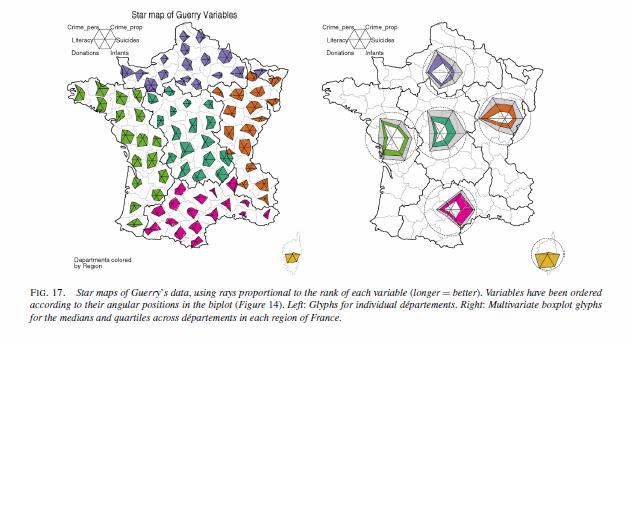
Part of the reason I am interested in such displays is that they are useful in visualizing multi-variate geographic data. The star plots (unlike bar graphs or line graphs) are self contained, and don’t need a common scale (i.e. they don’t need to be placed in a regular fashion on the map to still be interpretable). Examples of this can be found in this map made by Charles Minard utilizing pie charts, Dan Carr’s small glyphs (page 7), or in a paper by Michael Friendly revisiting the moral statistics produced by old school criminologist Andre Guerry. An example from the Friendly paper is presented below (and I had already posted it as an example for visualizng multi-variate data on the GIS stackexchange site).


An example of how it is difficult to visualize lines without a common scale is given in this working paper of Hadley Wickham’s (and Cleveland talks about it and gives an example of bar charts in The Elements). Cleveland’s solution is to provide the bar a container which provides an absolute reference for the length of that particular bar, although it is still really hard to assess spatial patterns that way (the same could probably be said of the star plots too though).

Given models with many spatially varying parameters I think this has potential to be applied in a wider variety of situations. Instances that first come to mind are spatial discrete choice models, but perhaps it could be extended to situations such as geographically weighted regression (see a paper, Visual comparison of Moving Window Kriging Models by Demsar & Harris, 2010 for an example) or models which have spatial interactions (e.g. multi-level models where the hierarchy is some type of spatial unit).

Don’t take this as I’m saying that star charts are a panacea or anything, visualizing geographic patterns is difficult with these as well. Baby steps though, and reference lines are good.

I know the newest version of SPSS has the ability to place some charts, like pie charts, on a map (see this white paper), but I will have to see if it is possible to use polar coordinates like this. Since as US state map is part of the base installation for the new version 20, if it is possible someone could just use this data I presented here fairly easily I would think.

Also as a note, when making these star plots I found this post on the Nabble SPSS forum to be very helpful, especially the examples given by ViAnn Beadle and Mariusz Trejtowicz.


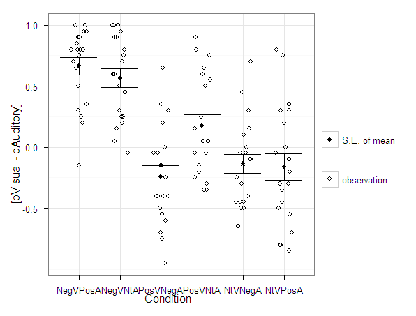
Avoid Dynamite Plots! Visualizing dot plots with super-imposed confidence intervals in SPSS and R

Over at the stats.se site I have come across a few questions demonstrating the power of utilizing dot plots to visualize experimental results.

Also some interesting discussion on what error bars to plot in similar experiments is in this question, Follow up: In a mixed within-between ANOVA plot estimated SEs or actual SEs?

Here I will give two examples utilizing SPSS and R to produce similar plots. I haven’t annotated the code that much, but if you need anything clarified on what the code is doing let me know in the comments. The data is taken from this question on the stats site.

Citations of Interest to the Topic


SPSS Code to generate below dot plot


*******************************************************************************************. data list free /NegVPosA NegVNtA    PosVNegA    PosVNtA NtVNegA NtVPosA.
begin data
0.5 0.5 -0.4    0.8 -0.45   -0.3
0.25    0.7 -0.05   -0.35   0.7 0.75
0.8 0.75    0.65    0.9 -0.15   0
0.8 0.9 -0.95   -0.05   -0.1    -0.05
0.9 1   -0.15   -0.35   0.1 -0.85
0.8 0.8 0.35    0.75    -0.05   -0.2
0.95    0.25    -0.55   -0.3    0.15    0.3
1   1   0.3 0.65    -0.25   0.35
0.65    1   -0.4    0.25    0.3 -0.8
-0.15   0.05    -0.75   -0.15   -0.45   -0.1
0.3 0.6 -0.7    -0.2    -0.5    -0.8
0.85    0.45    0.2 -0.05   -0.45   -0.5
0.35    0.2 -0.6    -0.05   -0.3    -0.35
0.95    0.95    -0.4    0.55    -0.1    0.8
0.75    0.3 -0.05   -0.25   0.45    -0.45
1   0.9 0   0.5 -0.4    0.2
0.9 0.25    -0.25   0.15    -0.65   -0.7
0.7 0.6 -0.15   0.05    0   -0.3
0.8 0.15    -0.4    0.6 -0.05   -0.55
0.2 -0.05   -0.5    0.05    -0.5    0.3
end data.
dataset name dynamite.

*reshaping the data wide to long, to use conditions as factors in the plot.

varstocases
/make condition_score from NegVPosA to NtVPosA
/INDEX = condition (condition_score).

*dot plot, used dodge symmetric instead of jitter.
GGRAPH
  /GRAPHDATASET dataset = dynamite NAME="graphdataset" VARIABLES=condition condition_score MISSING=LISTWISE
    REPORTMISSING=NO
  /GRAPHSPEC SOURCE=INLINE.
BEGIN GPL
  SOURCE: s=userSource(id("graphdataset"))
  DATA: condition=col(source(s), name("condition"), unit.category())
  DATA: condition_score=col(source(s), name("condition_score"))
  GUIDE: axis(dim(1), label("condition"))
  GUIDE: axis(dim(2), label("condition_score"))
  ELEMENT: point.dodge.symmetric(position(condition*condition_score))
END GPL.

*confidence interval plot.

*cant get gpl working (maybe it is because older version) - will capture std error of mean.

dataset declare mean.
OMS /IF LABELS = 'Report'
/DESTINATION FORMAT = SAV OUTFILE = 'mean'.
MEANS TABLES=condition_score BY condition
  /CELLS MEAN SEMEAN.
OMSEND.

dataset activate mean.
compute mean_minus = mean - Std.ErrorofMean.
compute mean_plus = mean + Std.ErrorofMean.
execute.

select if Var1  "Total".
execute.

rename variables (Var1 = condition).

*Example just interval bars.
GGRAPH
  /GRAPHDATASET dataset = mean NAME="graphdataset2" VARIABLES=condition mean_plus
  mean_minus Mean[LEVEL=SCALE]
    MISSING=LISTWISE REPORTMISSING=NO
  /GRAPHSPEC SOURCE=INLINE.
BEGIN GPL
  SOURCE: s2=userSource(id("graphdataset2"))
  DATA: condition=col(source(s2), name("condition"), unit.category())
  DATA: mean_plus=col(source(s2), name("mean_plus"))
  DATA: mean_minus=col(source(s2), name("mean_minus"))
  DATA: Mean=col(source(s2), name("Mean"))
  GUIDE: axis(dim(1), label("Var1"))
  GUIDE: axis(dim(2), label("Mean Estimate and Std. Error of Mean"))
  SCALE: linear(dim(2), include(0))
  ELEMENT: interval(position(region.spread.range(condition*(mean_minus+mean_plus))),
    shape(shape.ibeam))
  ELEMENT: point(position(condition*Mean), shape(shape.square))
END GPL.

*now to put the two datasets together in one chart.
*note you need to put the dynamite source first, otherwise it treats it as a dataset with one observation!
*also needed to do some post-hoc editing to get the legend to look correct, what I did was put an empty text box over top of
*the legend items I did not need.

GGRAPH
  /GRAPHDATASET dataset = mean NAME="graphdataset2" VARIABLES=condition mean_plus
  mean_minus Mean[LEVEL=SCALE]
    MISSING=LISTWISE REPORTMISSING=NO
  /GRAPHDATASET dataset = dynamite NAME="graphdataset" VARIABLES=condition condition_score MISSING=LISTWISE
    REPORTMISSING=NO
  /GRAPHSPEC SOURCE=INLINE.
BEGIN GPL
  SOURCE: s=userSource(id("graphdataset"))
  DATA: condition2=col(source(s), name("condition"), unit.category())
  DATA: condition_score=col(source(s), name("condition_score"))
  SOURCE: s2=userSource(id("graphdataset2"))
  DATA: condition=col(source(s2), name("condition"), unit.category())
  DATA: mean_plus=col(source(s2), name("mean_plus"))
  DATA: mean_minus=col(source(s2), name("mean_minus"))
  DATA: Mean=col(source(s2), name("Mean"))
  GUIDE: axis(dim(1), label("Condition"))
  GUIDE: axis(dim(2), label("Tendency Score"))
  SCALE: linear(dim(2), include(0))
  SCALE: cat(aesthetic(aesthetic.color.interior), map(("Observation", color.grey), ("Mean", color.black), ("S.E. of Mean", color.black)))
  SCALE: cat(aesthetic(aesthetic.color.exterior), map(("Observation", color.grey), ("Mean", color.black), ("S.E. of Mean", color.black)))
  SCALE: cat(aesthetic(aesthetic.shape), map(("Observation", shape.circle), ("Mean", shape.square), ("S.E. of Mean", shape.ibeam)))
  ELEMENT: point.dodge.symmetric(position(condition2*condition_score), shape("Observation"), color.interior("Observation"), color.exterior("Observation"))
  ELEMENT: interval(position(region.spread.range(condition*(mean_minus+mean_plus))),
    shape("S.E. of Mean"), color.interior("S.E. of Mean"), color.exterior("S.E. of Mean"))
  ELEMENT: point(position(condition*Mean), shape("Mean"), color.interior("Mean"), color.exterior("Mean"))
END GPL.
*******************************************************************************************.

R code using ggplot2 to generate dot plot


library(ggplot2)
library(reshape)

#this is where I saved the associated dat file in the post
work <- "F:\\Forum_Post_Stuff\\dynamite_plot"
setwd(work)

#reading the dat file provided in question
score <- read.table(file = "exp2tend.dat",header = TRUE)

#reshaping so different conditions are factors
score_long <- melt(score)

#now making base dot plot
plot <- ggplot(data=score_long)+
layer(geom = 'point', position =position_dodge(width=0.2), mapping = aes(x = variable, y = value)) +
theme_bw()

#now making the error bar plot to superimpose, I'm too lazy to write my own function, stealing from webpage listed below
#very good webpage by the way, helpful tutorials in making ggplot2 graphs
#http://wiki.stdout.org/rcookbook/Graphs/Plotting%20means%20and%20error%20bars%20(ggplot2)/

##################################################################################
## Summarizes data.
## Gives count, mean, standard deviation, standard error of the mean, and confidence interval (default 95%).
##   data: a data frame.
##   measurevar: the name of a column that contains the variable to be summariezed
##   groupvars: a vector containing names of columns that contain grouping variables
##   na.rm: a boolean that indicates whether to ignore NA's
##   conf.interval: the percent range of the confidence interval (default is 95%)
summarySE <- function(data=NULL, measurevar, groupvars=NULL, na.rm=FALSE, conf.interval=.95, .drop=TRUE) {
    require(plyr)

    # New version of length which can handle NA's: if na.rm==T, don't count them
    length2 <- function (x, na.rm=FALSE) {
        if (na.rm) sum(!is.na(x))
        else       length(x)
    }

    # This is does the summary; it's not easy to understand...
    datac <- ddply(data, groupvars, .drop=.drop,
                   .fun= function(xx, col, na.rm) {
                           c( N    = length2(xx[,col], na.rm=na.rm),
                              mean = mean   (xx[,col], na.rm=na.rm),
                              sd   = sd     (xx[,col], na.rm=na.rm)
                              )
                          },
                    measurevar,
                    na.rm
             )

    # Rename the "mean" column
    datac <- rename(datac, c("mean"=measurevar))

    datac$se <- datac$sd / sqrt(datac$N)  # Calculate standard error of the mean

    # Confidence interval multiplier for standard error
    # Calculate t-statistic for confidence interval:
    # e.g., if conf.interval is .95, use .975 (above/below), and use df=N-1
    ciMult <- qt(conf.interval/2 + .5, datac$N-1)
    datac$ci <- datac$se * ciMult

    return(datac)
}
##################################################################################

summary_score <- summarySE(score_long,measurevar="value",groupvars="variable")

ggplot(data = summary_score) +
layer(geom = 'point', mapping = aes(x = variable, y = value)) +
layer(geom = 'errorbar', mapping = aes(x = variable, ymin=value-se,ymax=value+se))

#now I need to merge these two dataframes together and plot them over each other
#merging summary_score to score_long by variable

all <- merge(score_long,summary_score,by="variable")

#adding variables to data frame for mapping aesthetics in legend
all$observation <- "observation"
all$mean <- "mean"
all$se_mean <- "S.E. of mean"

#these define the mapping of categories to aesthetics
cols <- c("S.E. of mean" = "black")
shape <- c("observation" = 1)

plot <- ggplot(data=all) +
layer(geom = 'jitter', position=position_jitter(width=0.2, height = 0), mapping = aes(x = variable, y = value.x, shape = observation)) +
layer(geom = 'point', mapping = aes(x = variable, y = value.y, color = se_mean)) +
layer(geom = 'errorbar', mapping = aes(x = variable, ymin=value.y-se,ymax=value.y+se, color = se_mean)) +
scale_colour_manual(" ",values = cols) +
scale_shape_manual(" ",values = shape) +
ylab("[pVisual - pAuditory]") + xlab("Condition") + theme_bw()
plot
#I just saved this in GUI to png, saving with ggsave wasn't looking as nice

#changing width/height in ggsave seems very strange, maybe has to do with ymax not defined?
#ggsave(file = "Avoid_dynamite.png", width = 3, height = 2.5)
#adjusting size of plot within GUI works just fine

Feel free to let me know of any suggested improvements in the code. The reason I did code both in SPSS and R is that I was unable to generate a suitable legend in SPSS originally. I was able to figure out how to generate a legend in SPSS, but it still requires some post-hoc editing to eliminate the extra aesthetic categories. Although the chart is simple enough maybe a legend isn’t needed anyway.

Example (good and bad) uses of 3d choropleth maps

A frequent critique of choropleth maps is that, in the process of choosing color bins, one can hide substantial variation within each of the bins . An example of this is in this critique of a map in the Bad maps thread on the GIS stackexchange site.  In particular, Laurent argues that the classification scheme (in that example map) is misleading because China’s population (1.3 billion) and Indonesia’s population (0.2 billion) are within the same color bin although they have noteworthy differences in their population.

I think it is a reasonable note, and such a difference would be noteworthy in a number of contexts. One possible solution to this problem is by utilizing 3d choropleth maps, where the height of the bar maps to a quantitative value.  An example use of this can be found at Alasdair Rae’s blog, Daytime Population in the United States.

The use of 3d allows one to see the dramatic difference in daytime population estimates between the cities (mainly on the east coast).  Whereas a 2d map relying on a legend can’t really demonstrate the dramatic magnitude of differences between legend items like that.

I’m not saying a 3d map like this is always the best way to go. Frequent critiques are that the bars will hide/obstruct data. Also it is very difficult to really evaluate where the bars lie on the height dimension. For an example of what I am talking about, see the screen shot used for this demonstration,  A Historical Snapshot of US Birth Trends, from ge.com (taken from the infosthetics blog).

If you took the colors away, would you be able to tell that Virginia is below average?

Still, I think used sparingly and to demonstrate dramatic differences they can be used effectively.  I give a few more examples and/or reading to those interested below.

References

Ratti, Carlo, Stanislav Sobolevsky, Francesco Calabrese, Clio Andris, Jonathan Reades, Mauro Martino, Rob Claxton & Steven H. Strogatz. (2010) Redrawing the map of Great Britain from a Network of Human Interactions. PLoS ONE 5(12). Article is open access from link.

This paper is an example of using 3d arcs for visualization.

Stewart, James & Patrick J. Kennelly. 2010. Illuminated choropleth maps. Annals of the Association of American Geographers 100(3): 513-534.

Here is a public PDF by one of the same authors demonstrating  the concept. This paper gives an example of using 3d choropleth maps, and in particular is a useful way to utilize a 3d shadow effect that slightly enhances distinguishing differences between two adjacent polygons. This doesn’t technique doesn’t really map height to a continuous variable though, just uses shading to distinguish between adjacent polygons.

Other links of interest

GIS Stackexchange question – When is a 3D Visualisation in GIS Useful?

A cool example of utilizing 3d in kml maps on the GIS site by dobrou, Best practices for visualizing speed.

Alasdair Rae’s blog has several examples of 3d maps besides the one I linked to here, and I believe he was somehow involved in making the maps associated with this Centre for Cities short clip (that includes 3d maps).

If you have any other examples where you thought the use of 3d maps (or other visualizations) was useful/compelling let me know in the comments.

Edit: I see looking at some of my search traffic that this blog post is pretty high up for “3d choropleth” on a google image search already. I suspect that may mean I am using some not-well adopted terminology, although I don’t know what else to call these types of maps.

The thematic mapping blog calls them prism maps (and is another place for good examples). Also see the comment by Jon Peltier for that post, and the subsequent linked blog post by the guys at Axis maps (whose work I really respect), Virtual Globes are a seriously bad idea for thematic mapping.

Edit2: I came across another example, very similar to Alasdair Rae’s map produced by the New York Times, Where America Lives. Below is a screen shot (at the link they have an interactive map). Referred to by the folks at OCSI, and they call this type of map a “Spike Map”.

Another example use of small multiples, many different point elements on a map

I recently had a post at the Cross Validated blog about how small multiple graphs,  AndyW says Small Multiples are the Most Underused Data Visualization. In that post I give an example (taken from Carr and Pickle, 2009) where visualizing multiple lines on one graphs are very difficult. A potential solution to the complexity is to split the line graph into a set of small multiples.

In this example, Carr and Pickle explain that the reason the graphic is difficult to comprehend is that we are not only viewing 6 lines individually, but that when viewing the line graphs we are trying to make a series of comparisons between the lines. This suggests in the graph on the left there are a potential of 30 pairwise comparisons between lines. Whereas, in the small multiple graphics on the left, each panel has only 6 potential pairwise comparisons within each panel.

Another recent example that I came across in my work that small multiples I believe were more effective was plotting multiple points elements on the same map. And the two examples are below.

In the initial map it is very difficult to separate out each individual point pattern from the others, and it is even difficult to tell the prevalence of each point pattern in the map including all elements. The small multiple plots allow you to visualize each individual pattern, and then after evaluating each pattern on their own make comparisons between patterns.

Of course there are some drawbacks to the use of small multiple charts. Making comparisons between panels is surely more difficult to do than making comparisons within panels. But, I think that trade off in the examples I gave here are worth it.

I’m just starting to read the book, How Maps Work, by Alan MacEachren, and in the second chapter he gives a similar example many element point pattern map compared to small multiples. In that chapter he also goes into a much more detailed description of the potential cognitive processes that are at play when we view such graphics (e.g. why the small multiple maps are easier to interpret).  Such as how locations of objects in a Cartesian coordinate system take preference into how we categorize objects (as opposed to say color or shape). Although I highly suggest you read it as opposed to taking my word for it!

References

Carr, Daniel & Linda Pickle. 2009. Visualizing Data Patterns with Micromaps. Boca Rotan, FL. CRC Press.

MacEachren, Alan. 2004. How maps work: Representation, visualization, and design. New York, NY. Guilford Press.

Hacking the default SPSS chart template

In SPSS charts, not every element of the chart is accessible through syntax. For example, the default chart background in all of the versions I have ever used is light grey, and this can not be specified in GPL graphing statements. Many of such elements are specified in chart template files (.sgt extension). Chart template files are just a specific text format organized using an xml tag structure. Below is an example scatterplot with the default chart template for version 19.

You can manually edit graphics and save chart templates, but here I am going to show some example changes I have made in the default chart template. I do this because when you save chart templates by manually editing charts, SPSS has defaults for many different types of charts (one example when it changes are if the axes are categorical or numeric). So it is easier to make widespread changes by editing the main chart template.

The subsequent examples were constructed from a chart template originally from version 17, and I will demonstrate 3 changes I have made to my own chart template.

1) Change the background color from grey to transparent.
2) Make light grey, dashed gridlines the default.
3) Change the font.

Here I just copied and saved my own version of the template renamed in the same folder. You can then open up the files in any text editor. I use Notepad++, and it has a nice default plug-in that allows me to compare the original template file with my updated file. Moving on to how to actually make changes.

1) Change the background color.

The original chart color (in RGB hexidecimal code) is "F0F0F0" (you can open up a default chart to see the decimal representation, 240-240-240). Then I just used this online tool to convert the decimal to hexidecimal, and then you can search the template for this color. The background color is only located in one place in the template file, in a tag nested within an tag. I changed "F0F0F0" to "transparent" as oppossed to another RGB color. One might want to use white for the background as well ("FFFFFF").

2) Make light grey, dashed gridlines the default

Sometimes I can’t figure out how to exactly edit the original template to give me what I want. One way to get the “right” code is to manually apply the edits within the output, and save the chart template file to demonstrate how specific tag elements are structured. To get the gridlines I did this, and figured out that I needed to insert a set of tag with my wanted aesthetic specifications within the tag (that is within a tag). So, in my original chart template file the code was;

and below is what I inserted;

I then inserted the gridlines tag within all of the tags (you have several for different axis’s and whether the axis’s are cateogorical or numeric).

3) Change the font

This one was really easy to change. The default font is Sans-Serif. I just searched the file for Serif, and it is only located within one place, within a tag nested within an tag (near, but not within, the same place as the bacground color). Just change the "SansSerif" text to whatever you prefer, for example "Calibri". I don’t know what fonts are valid (if it is dependent on your system or on what is available in SPSS).

Here is what the same scatterplot at the beginning of the post looks like with my updated chart template.

Besides this my only other advice is combing through the original chart template and using trial and error to change items. For example, for many bar charts the default RGB color is tan (D3CE97). You can change that to whatever you want by just doing a find and replace of that hexidecimal code with another valid hexidecimal color code (like BEBEBE for light grey).

These changes are all arbitrary and are just based on personal preference, but should be enlightening as to how to make such modifications. Other ones I suspect people may be interested in are the default color or other aesthetic schemes (such as point shapes). These are located at the end of my original chart template file within the tags. One for instance could change the default colors to be more printer friendly. It would be easier to save a set of different templates for color schemes (either categorical or continuous) than doing the map statements within GPL all the time (although you would need to have your categories ordered appropriately). Other things you can change are the font sizes, text alignment, plot margins, default pixel size for charts, and probably a bunch of other stuff I don’t know about.

I’ve saved my current chart template file at this Google code site for anyone to peruse (for an updated version see here). I’ve made a few more changes than I’ve listed here, but not many. Let me know in the comments if you have any examples of changing elements in your chart template file!

Below is some quick code that sets the chart templates to the file I made and produces the above scatterplots.


***********************************.
*original template location.
FILE HANDLE orig_temp /name = "C:\Program Files\IBM\SPSS\Statistics\19\template\".
*updated template location.
FILE HANDLE update_temp /name = "E:\BLOG\SPSS\GRAPHS\Hacking_Chart_Template\".
*making fake, data, 100 cases.
input program.
loop #i = 1 to 100.
compute V1 = RV.NORM(0,1).
compute V2 = RV.NORM(0,1).
end case.
end loop.
end file.
end input program.
execute.
*original template.
SET CTemplate='orig_temp\chart_style.sgt'.
*Scatterplot.
GGRAPH
/GRAPHDATASET NAME="graphdataset" VARIABLES=V1 V2 MISSING=LISTWISE REPORTMISSING=NO
/GRAPHSPEC SOURCE=INLINE.
BEGIN GPL
SOURCE: s=userSource(id("graphdataset"))
DATA: V1=col(source(s), name("V1"))
DATA: V2=col(source(s), name("V2"))
GUIDE: axis(dim(1), label("V1"))
GUIDE: axis(dim(2), label("V2"))
ELEMENT: point(position(V1*V2))
END GPL.
*My updated template.
SET CTemplate='update_temp\chart_style(AndyUpdate).sgt'.
*Scatterplot.
GGRAPH
/GRAPHDATASET NAME="graphdataset" VARIABLES=V1 V2 MISSING=LISTWISE REPORTMISSING=NO
/GRAPHSPEC SOURCE=INLINE.
BEGIN GPL
SOURCE: s=userSource(id("graphdataset"))
DATA: V1=col(source(s), name("V1"))
DATA: V2=col(source(s), name("V2"))
GUIDE: axis(dim(1), label("V1"))
GUIDE: axis(dim(2), label("V2"))
ELEMENT: point(position(V1*V2))
END GPL.
***********************************.