Repeating Charts in SPSS for unique IDs

The title is probably not that clear, but I’ve seen this request a few times and have used this trick in one my projects, so figured it would be a worthwhile topic to illustrate. So the problem is you have a background distribution, and you want to tailor a set of individual charts showing the unique individuals score against the background distribution. See two examples (1,2) of this question. In the first link I showed how one can do this by artificially duplicating the data in a specific way using VARSTOCASES and then using SPLIT FILE to generate the separate charts. Here I will show a python based solution that does not require duplicating the data.

So first we will start off with a set of fake student scores, 20 students with 5 scores each.

*Create some fake data, student test scores.
SET SEED 10.
INPUT PROGRAM.
STRING Student (A1).
LOOP #i = 1 TO 5.
  LOOP #j = 1 TO 20.
    COMPUTE Student = STRING(#j+64,PIB).
    COMPUTE Score = RND(RV.NORMAL(100,10)).
    END CASE.
  END LOOP.
END LOOP.
END FILE.
END INPUT PROGRAM.
DATASET NAME Student_Scores.
FORMATS Score (F3.0).
EXECUTE.

Now the students are listed as strings, but here I am going to use AUTORECODE to automatically turn the strings into number variables, and more importantly for what follows create a set of value labels corresponding to those unique strings.

*Use Auto-recode to make the variables 1 to N.
AUTORECODE VARIABLES = Student /INTO Student_N.
FORMATS Student_N (F6.0).

Now the workflow I want to do is to make a set of charts with the background a boxplot for the whole class, and then the individual students scores as foreground dots. To do this I will make a second set of scores that are missing for everyone except that one particular student, the specify MISSING=VARIABLEWISE on the GGRAPH command, and then superimpose Score2 over the boxplot of Score.

*Example of Individual chart.
NUMERIC flag (F1.0) Score2 (F3.0).

DO IF Student_N = 1.
  COMPUTE Score2 = Score.
  COMPUTE flag = 1.
ELSE.
  COMPUTE Score2 = $SYSMIS.
  COMPUTE flag = 0.
END IF.

GGRAPH
  /GRAPHDATASET NAME="graphdataset" VARIABLES=Score Score2 flag MISSING = VARIABLEWISE
  /GRAPHSPEC SOURCE=INLINE.
BEGIN GPL
  SOURCE: s=userSource(id("graphdataset"))
  DATA: Score=col(source(s), name("Score"))
  DATA: Score2=col(source(s), name("Score2"))
  COORD: rect(dim(1), transpose())
  GUIDE: axis(dim(1), label("Score"))
  GUIDE: legend(aesthetic(aesthetic.visible), null())
  GUIDE: text.title(label("Student: A"))
  ELEMENT: schema(position(bin.quantile.letter(Score)), color.interior(color.grey))
  ELEMENT: point.dodge.symmetric(position(bin.dot(Score2)), color.interior(color.red))
END GPL.
*cleaing up temp variables.
MATCH FILES FILE = * /DROP flag Score2.

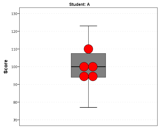
There are other ways to do this, like using the visible option in GPL aesthetics, but I don’t do that here because they still exist in the chart but simply aren’t shown. This causes problems with the dodging, and if you sent the chart in vector format the information would still be contained in the chart (e.g. if you need to aggregate the background data to be obfuscated for confidentiality reasons you don’t want it in the chart even if it is invisible). Here even the outlier dots in the boxplot are potentially disseminating confidential information, but for simplicity I don’t worry about that here (my syntax at the developerworks forum showed how you can build your own boxplot without having the points, it would be nice to have a no points option for the schema element).

So now the problem is looping through all of the individual students and generating a chart for each one. That is where the AUTORECODE comes in handy. I can grab all of the value labels from the SPSS dictionary and place them in a Python dictionary.

*Python to grab the different students.
BEGIN PROGRAM Python.
import spss
spss.StartDataStep()
datasetObj = spss.Dataset()
StudentLab = datasetObj.varlist['Student_N'].valueLabels
print StudentLab #this is a dictionary of all the unique students
spss.EndDataStep()
END PROGRAM.

Now with the StudentLab Python dictionary I can loop over the dictionary and submit the SPSS syntax for each unique student (using spss.Submit) using string substitutions. I first create the variables and set there formats outside of the loop (the chart inherits the formats). Then I just set several aesthetics of the charts so they are the same for every chart, e.g. the scale goes between 60 and 150, and the size of the superimposed points is 12.

*Now loop through the students.
OUTPUT CLOSE ALL.
BEGIN PROGRAM Python.
spss.Submit("NUMERIC flag (F1.0) Score2 (F3.0).")
for val, lab in StudentLab.data.iteritems():
  spss.Submit("""*Individual score chart.
DO IF Student_N = %d.
  COMPUTE Score2 = Score.
  COMPUTE flag = 1.
ELSE.
  COMPUTE Score2 = $SYSMIS.
  COMPUTE flag = 0.
END IF.
GGRAPH
  /GRAPHDATASET NAME="graphdataset" VARIABLES=Score Score2 flag MISSING = VARIABLEWISE
  /GRAPHSPEC SOURCE=INLINE.
BEGIN GPL
  SOURCE: s=userSource(id("graphdataset"))
  DATA: Score=col(source(s), name("Score"))
  DATA: Score2=col(source(s), name("Score2"))
  DATA: id=col(source(s), name("$CASENUM"), unit.category())
  DATA: flag=col(source(s), name("flag"), unit.category())
  COORD: rect(dim(1), transpose())
  GUIDE: axis(dim(1), label("Score"), delta(10), start(60))
  GUIDE: text.title(label("Student: %s"))
  GUIDE: legend(aesthetic(aesthetic.visible), null())
  SCALE: linear(dim(1), min(60), max(150))
  ELEMENT: schema(position(bin.quantile.letter(Score)), color.interior(color.grey))
  ELEMENT: point.dodge.symmetric(position(bin.dot(Score2)), color.interior(color.red),
           size(size."12"))
END GPL.
""" %(val,lab))
END PROGRAM.

I wanted to export these charts in the loop with the students names, using something like:

SpssOutputDoc.SelectLastOutput() #grab last output
SpssOutputDoc.ExportCharts(SpssClient.SpssExportSubset.SpssSelected, path + lab, SpssClient.ChartExportFormat.png)

but what happens with this is that it is always one behind (e.g. the first chart is selected in the second loop iteration). So what I did was to stuff all of the charts within a list and then loop over that list, select the chart, and then export it using SpssOutputDoc.ExportCharts (another option would be to use EXPORT OUTPUT and then either delete the output in-between charts or clear it, I wish OMS could export only charts). This would be more annoying with multiple individual charts, and could likely be made more concise, but here it is.

*Now exporting the individual charts.
BEGIN PROGRAM Python.
import SpssClient
SpssClient.StartClient()
SpssOutputDoc = SpssClient.GetDesignatedOutputDoc()

#creating a list of all the charts
OutputItems = SpssOutputDoc.GetOutputItems()
Charts = []
for index in range(OutputItems.Size()):
  OutputItem = OutputItems.GetItemAt(index)
  if OutputItem.GetType() == SpssClient.OutputItemType.CHART:
    Charts.append(OutputItem)

labList = []
for val, lab in StudentLab.data.iteritems():
  labList.append(lab)

path = "C:/Users/andrew.wheeler/Dropbox/Documents/BLOG/RepeatingCharts/"

for chart,lab in zip(Charts,labList):
  SpssOutputDoc.ClearSelection() #clear prior selections
  chart.SetSelected(True) #select chart
  #export chart
  SpssOutputDoc.ExportCharts(SpssClient.SpssExportSubset.SpssSelected, path + lab, SpssClient.ChartExportFormat.png)
END PROGRAM.

Here is a screen shot of the resulting images in my folder.

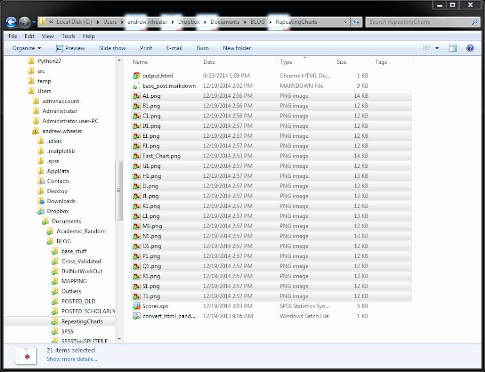
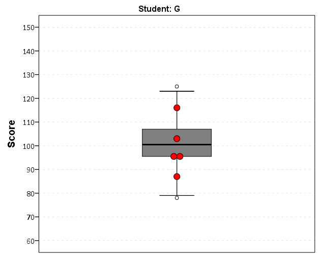
So this will export the charts to PNG format with the image name the same as the students in the file (so the name needs to be in a format appropriate to save a file name). Annoyingly SPSS appends 1 to the end of all charts, even if it is only exporting one chart. Here is an example of the student G’s chart.

Eventually I will figure out how to send emails via Python, and this would be a good tool for individualized report cards for a class. Here is a copy of the full syntax to more easily run on your local machine (just replace path with a location on your local machine).

Automating tasks in SPSS using production jobs

For tasks that take a long time, or ones I want done on a regular basis, I typically have the computer do the work while I am away. Such example tasks I have set up before are:

  • querying large databases and dumping the results into flat files (querying large tables may take an hour or longer)
  • conducting statistical analysis that takes a long time to converge
  • generating automated graphs and statistics

The SPSS facility to accomplish these are production jobs, and I will briefly detail how to set up a production job and then run the job from the command line with a simple example.

So first to set up a production job go to Utilities -> Production Facility in the menu bar. (Note you can open the screen shots larger in a separate window.)

Next you will be presented with the screen below. To specify the syntax file(s) that the production job will run, click the New button.

After you click the New button, the green plus sign in the Syntax files section will be active, and then you can browse to your sps file. Here you can see I selected a file named GenerateChart.sps in a particular directory on my C drive. You can specify the job to run multiple syntax files, but here I only choose one.

Next navigate to the Output section of the window. Here you need to choose where to save the SPSS output. Here I choose to save it in the same directory under the name Output. I choose the output format to be plain text. This ends up being the same output as if you ran the syntax interactively and then used EXPORT OUTPUT.

I could have exported the charts in the syntax directly by using EXPORT OUTPUT, but you can have the production facility do that as well. If you click on the Options button in the Output section a new dialogue will appear that lets you choose to save the charts if you want. Here I save them as png files.

Production jobs also have the capability to create user input variables directly in the syntax, using the form @VariableName in the syntax. This is what the section Run time variables deals with. These are nice if you have a set of syntax and want to input some arbitrary information, as when you run the production job a GUI pops up asking for the input, but I don’t illustrate that functionality here.

Below is the specific set of syntax that grabs a csv file, swdata.csv, calculates a moving median for each chat room, and makes some time series charts. The csv file is a set of scrapped chat data from the Cross Validated and R chat rooms via Scraperwiki (more details here). It aggregates the number of monologue tags (a pretty good indicator of the number of posts in the room) per day, so is an estimate of the chat activity.

*Where the data is located.
FILE HANDLE data 
  /NAME = "C:\Users\andrew.wheeler\Dropbox\Documents\BLOG\ProductionJob".
DATA LIST LIST (",") FILE = "data\swdata.csv" SKIP = 1 
  /Date (SDATE10) Mono (F4.0) Baseroom (A100).
DATASET NAME Chats.

*Calculate moving median.
AUTORECODE VARIABLES = Baseroom /INTO BaseN.
SORT CASES BY BaseN Date.
SPLIT FILE BY BaseN.
CREATE MovMed = RMED(Mono 5).
FORMATS MovMed (F4.0) Date (MOYR6).

*Make charts.
GGRAPH
  /GRAPHDATASET NAME="graphdataset" VARIABLES=Date Mono MovMed 
   MISSING=VARIABLEWISE
  /GRAPHSPEC SOURCE=INLINE.
BEGIN GPL
  SOURCE: s=userSource(id("graphdataset"))
  DATA: Date=col(source(s), name("Date"))
  DATA: Mono=col(source(s), name("Mono"))
  DATA: MovMed=col(source(s), name("MovMed"))
  GUIDE: axis(dim(1))
  GUIDE: axis(dim(2), label("Mono Tags"))
  ELEMENT: line(position(Date*Mono), color(color.grey), 
           transparency(transparency."0.5"), size(size."1"))
  ELEMENT: line(position(Date*MovMed), color(color.red), 
           transparency(transparency."0.4"), size(size."1"))
END GPL.

Now I am interested in running this set of syntax automatically. The details will change depending on your operating system, but on my windows machine the easiest way to do this is to create a bat file that specifies the commands. Now I named the production job ChatRoom_Dialogue.spj, and to run this job I filled in the bat file with the text:

REM delete old csv file and download new one
del swdata.csv
wget "http://goo.gl/mxyRI7" --no-check-certificate
REM this runs the SPSS syntax
"C:\Program Files\IBM\SPSS\Statistics\22\stats.exe"  "C:\Users\andrew.wheeler\Dropbox\Documents\BLOG\ProductionJob\ChatRoom_Dialogue.spj" -production silent

Here I downloaded the wget utility to grab the csv file. (Note REM is to comment lines.) The bat file treats where ever it is located at as the directory for the commands, so I first use del to delete the older csv file, and then grab the new csv file from the listed url and it automatically saves the file in the folder where the bat file is located. Then I call the SPSS syntax by starting stats.exe and then calling the spj production job file. I use the switches -production silent so I am not prompted for any user input values to insert into the syntax. If you had stats.exe as a windows system path you wouldn’t need to worry about using the fully quoted strings, but I typically don’t rely on that (unless the program automatically adds it). Note that running the fully quoted string for stats.exe makes the windows command directory go to there, so you need to then fully quote the spj files path. Note you could call the first two commands directly within SPSS using the HOST command, but being able to chain multiple commands together makes running them in the bat file directly a bit more flexible.

So now you can simply double click the bat file and it will download the new data and create two graphs. To automate the job you can use the Windows task scheduler to make the bat file run at a particular time. Here is the bundled up files to run on your own (you just need to change the files paths in the sps and the bat file to wherever you want to run the script).

Here are the two graphs the production job creates. The first is the Cross Validated chat room, and the second is the R stackoverflow chat room.

I planned on writing a blog post for the CV blog awhile ago about these trends, so if I ever get to it these are teasers.

Using the Google Distance API in SPSS – plus some EDA of travel time versus geographic distance

The other day I had a conversation with a colleague about calculating travel time distances and comparing them to actual geographic distances (aka as the crow flies). Being unfamiliar with the Network add-on in ArcGIS I figured I would take a stab at this task with the Google Distance API. Being lazy, I’m not going to explain the code, but in a nutshell works basically the same way as my prior code samples for the Google places API. The main difference is that this code will only return one result per record in the original file.

BEGIN PROGRAM Python.
import urllib, json

#This parses the returned json to pull out the distance in meters and
#duration in seconds, [None,None] is returned is status is not OK
def ExtJsonDist(place):
  if place['rows'][0]['elements'][0]['status'] == 'OK':
    meters = place['rows'][0]['elements'][0]['distance']['value']
    seconds = place['rows'][0]['elements'][0]['duration']['value']
  else:
    meters,seconds = None,None
  return [meters,seconds]

#Takes a set of lon-lat coordinates for origin and destination,
#plus your API key and returns the json from the distance API
def GoogDist(OriginX,OriginY,DestinationX,DestinationY,key):
  MyUrl = ('https://maps.googleapis.com/maps/api/distancematrix/json'
           '?origins=%s,%s'
           '&destinations=%s,%s'
           '&key=%s') % (OriginY,OriginX,DestinationY,DestinationX,key)
  response = urllib.urlopen(MyUrl)
  jsonRaw = response.read()
  jsonData = json.loads(jsonRaw)
  data = ExtJsonDist(jsonData)
  return data
END PROGRAM.

So because for each pair of origin and destinations this only returns one result, we can use this function in SPSSINC TRANS to return the distance in meters and the travel time in seconds without having to worry about any other data manipulations in python. The only additional item we need besides the origin and destination latitude and longitude are your Google API key in a seperate string variable. So if you had the OD coordinates in the fields Ox,Oy,Dx,Dy for origin longitude, origin latitude etc. the code would simply be:

STRING MyKey (A100).
COMPUTE MyKey = '!!!!!!!YOUR KEY HERE!!!!!!!!!!!!!'.
EXECUTE.

SPSSINC TRANS RESULT=Meters Seconds TYPE=0 0 
/FORMULA GoogDist(OriginX=Ox,OriginY=Oy,DestinationX=Dx,DestinationY=Dy,key=MyKey).

Note the Google distance API has a limit of 2,500 queries per day, and unlike the places API can not be upped by providing verification (unfortunately).

The context the colleague was asking was for a project about prison visitation, for some background see a report by Jacquelyn Greene at the New York State DCJS, and I saw recently Joshua Cochran plus a few other of the Florida State folks published a paper about prisoner visitation in Florida. So I figured a good test would be calculating the correlation between travel distance and geographic distances between all of the zip codes in New York State to one particular prison.

I chose to calculate the distances between the centroid of zip code areas and Attica State prison, which is in between Rochester and Buffalo in the westernmost part of New York state. FYI zip code areas are not well defined, so don’t ask me how exactly the ones I used here are calculated, but I got them from the New York State GIS clearinghouse, and they were from 2009.

So as long as you have the prior python function GoogDist defined, here is a set of brief syntax to grab the zip code data and calculate the travel time and travel distance. This does take a few minutes, but I never had a problem with the 100 queries per 1 minute suggestion by Google in my tests. Their are 2,332 zip code areas in New York State, so beware this about uses up your limit for the day (and you have no second chances)! This took me about 8 minutes to calculate.

*Grab the online data.
SPSSINC GETURI DATA
URI="https://dl.dropboxusercontent.com/u/3385251/NewYork_ZipCentroids.sav"
FILETYPE=SAV DATASET=NY_Zips.

*Travel distance to Attica.
COMPUTE Dx = -78.276205.
COMPUTE Dy = 42.850721.

STRING MyKey (A100).
COMPUTE MyKey = '!!!!!!!YOUR KEY HERE!!!!!!!!!!!!!'.
EXECUTE.

SPSSINC TRANS RESULT=Meters Seconds TYPE=0 0 
/FORMULA GoogDist(OriginX=LongCent,OriginY=LatCent,DestinationX=Dx,DestinationY=Dy,key=MyKey).

We can also calculate the euclidean "crows flies" distance via the extendedTransforms python code. This returns the distance miles, and so the following code converts the two distances to kilometers and the time to minutes.

*As the crow flies distance.
SPSSINC TRANS RESULT=MilesCrow TYPE=0
/FORMULA extendedTransforms.ellipseDist(lat1=LatCent,lon1=LongCent,lat2=Dy,lon2=Dx,inradians=False).

*Convert to meters. 
COMPUTE KMCrow = (MilesCrow*1609.34)/1000.
COMPUTE KMTrav = Meters/1000.
COMPUTE Minutes = Seconds/60.
FORMATS KMCrow KMTrav Minutes (F6.0).

Now, part of my suggestion was actually that calculating travel times is not necessary, because they will be highly correlated with each other. Here is the scatterplot matrix of the three measures, travel distance, geographic distance, and travel time. The inter-item correlations are all around .99.

GGRAPH 
  /GRAPHDATASET NAME="graphdataset" VARIABLES=KMCrow KMTrav Minutes 
  /GRAPHSPEC SOURCE=INLINE. 
BEGIN GPL 
  SOURCE: s=userSource(id("graphdataset")) 
  DATA: KMCrow=col(source(s), name("KMCrow")) 
  DATA: KMTrav=col(source(s), name("KMTrav")) 
  DATA: Minutes=col(source(s), name("Minutes")) 
  GUIDE: axis(dim(1.1), ticks(null())) 
  GUIDE: axis(dim(2.1), ticks(null())) 
  GUIDE: axis(dim(1), gap(0px)) 
  GUIDE: axis(dim(2), gap(0px)) 
  TRANS: KMCrow_label = eval("KMCrow") 
  TRANS: KMTrav_label = eval("KMTrav") 
  TRANS: Minutes_label = eval("Minutes") 
  ELEMENT: point(position((KMCrow/KMCrow_label+KMTrav/KMTrav_label+Minutes/Minutes_label)*
                (KMCrow/KMCrow_label+KMTrav/KMTrav_label+Minutes/Minutes_label)),
                 size(size."2"), transparency.exterior(transparency."0.8"))  
END GPL.
CORRELATIONS VARIABLES= KMCrow KMTrav Minutes.

I expected that the error would get larger for larger travel and geographic distances, so to investigate this a simple graphical check is to estimate the difference between the two measures on the Y axis and the mean of the two measures on the X axis. Depending on who you ask, this is a Tukey mean difference plot or a Bland-Altman plot. Generally when comparing the scatterplot matrices it is easier to see the spread when you detilt the plot (using Tukey’s terminology), and calculating the differences is one way to do the detilting.

Here I calculate Dif = TravelDistance - GeoDistance, as I know the travel distance will always be larger than the geographic distance. For simplicity I just plot the geographic distance on the x axis instead of the mean of the two measures.

*Tukey mean difference chart.
GGRAPH
  /GRAPHDATASET NAME="graphdataset" VARIABLES=KMTrav KMCrow MISSING=LISTWISE REPORTMISSING=NO
  /GRAPHSPEC SOURCE=INLINE.
BEGIN GPL
  SOURCE: s=userSource(id("graphdataset"))
  DATA: KMTrav=col(source(s), name("KMTrav"))
  DATA: KMCrow=col(source(s), name("KMCrow"))
  TRANS: Dif = eval(KMTrav - KMCrow)
  GUIDE: axis(dim(2), label("Travel - Crows"))
  GUIDE: axis(dim(1), label("Crows Distance (in Kilometers)"))
  ELEMENT: point(position(KMCrow*Dif))
END GPL.

This shows three particular things:

  1. It appears to be a mostly mixture of two separate linear regressions
  2. Within each mixture the measurement error is close to a constant multiple of the geographic distance
  3. There are some outliers as fingers of large travel distances extending from the point cloud.

Some more EDA shows that the mixture is reflective of being close to Interstate 90 – those cities (like Albany and Syracuse) nearby the highway have a shorter travel time. Here what I did was estimate the linear regression for the prior plot and then color the residuals. Then I made a side-by-side set of the latitude-longitude coordinates next to the same scatterplot (colored). I can’t tell from this plot, but some of the high outliers appears in a cluster in downstate, maybe in the Catskills. But there are a few other of the high outliers shown around the state.

*Note this is the same as estimating regression on differences. 
*see http://stats.stackexchange.com/a/15759/1036. 
REGRESSION
  /MISSING LISTWISE
  /STATISTICS COEFF OUTS R ANOVA
  /CRITERIA=PIN(.05) POUT(.10)
  /NOORIGIN 
  /DEPENDENT KMTrav
  /METHOD=ENTER KMCrow
  /SAVE RESID(Resid1).

*Hmm, we have a mixture, lets see what explains that.
GGRAPH
  /GRAPHDATASET NAME="graphdataset" VARIABLES=LongCent LatCent Resid1 KMTrav KMCrow
    MISSING=LISTWISE REPORTMISSING=NO
  /GRAPHSPEC SOURCE=INLINE.
BEGIN GPL
  PAGE: begin(scale(500px,800px))
  SOURCE: s=userSource(id("graphdataset"))
  DATA: LongCent=col(source(s), name("LongCent"))
  DATA: LatCent=col(source(s), name("LatCent"))
  DATA: Resid1=col(source(s), name("Resid1"))
  DATA: KMTrav=col(source(s), name("KMTrav"))
  DATA: KMCrow=col(source(s), name("KMCrow"))
  TRANS: Dif = eval(KMTrav - KMCrow)
  GRAPH: begin(origin(15%, 5%), scale(81%, 40%))
  GUIDE: axis(dim(1), null())
  GUIDE: axis(dim(2), null())
  GUIDE: legend(aesthetic(aesthetic.color.interior), null())
  SCALE: linear(aesthetic(aesthetic.color), aestheticMinimum(color.lightgrey), aestheticMaximum(color.black))
  ELEMENT: point(position(LongCent*LatCent), color.interior(Resid1), size(size."5"), transparency.exterior(transparency."0.7"))
  GRAPH: end()
  GRAPH: begin(origin(15%, 50%), scale(81%, 40%))
  GUIDE: axis(dim(2), label("Travel - Crows"))
  GUIDE: axis(dim(1), label("Crows Distance (in Kilometers)"))
  GUIDE: legend(aesthetic(aesthetic.color.interior), null())
  SCALE: linear(aesthetic(aesthetic.color), aestheticMinimum(color.lightgrey), aestheticMaximum(color.black))
  ELEMENT: point(position(KMCrow*Dif), color.interior(Resid1), size(size."5"), transparency.exterior(transparency."0.7"))
  GRAPH: end()
  PAGE: end()
END GPL.

The linear regression gives a rough estimate for the relationship between travel distance and geographic distance in this sample that is about:

Travel Distance in = -4.7 + 1.3*Geographic Distance

A better model would include an interaction between distance to I-90 (and then maybe a term for being in the mountains), but again I am lazy! Obviously the negative intercept doesn’t make physical sense, so you really only want to use this for geographic distances of say 50 kilometers or larger, else it will likely be an underestimate. The opposite is true if you are close to I-90, this formula is likely to be an overestimate.

The same exercise for the travel time in minutes gives the equation Travel Time in Minutes = 9 + 0.75*(Geographic Distance in Kilometers):

*Minutes as a function of distance.
REGRESSION
  /MISSING LISTWISE
  /STATISTICS COEFF OUTS R ANOVA
  /CRITERIA=PIN(.05) POUT(.10)
  /NOORIGIN 
  /DEPENDENT Minutes
  /METHOD=ENTER KMCrow
  /SAVE RESID(MinResid).

COMPUTE AbsResid = ABS(MinResid).
COMPUTE DirResid = MinResid/AbsResid.

GGRAPH
  /GRAPHDATASET NAME="graphdataset" VARIABLES=Minutes KMCrow AbsResid DirResid
  /GRAPHSPEC SOURCE=INLINE.
BEGIN GPL
  SOURCE: s=userSource(id("graphdataset"))
  DATA: Minutes=col(source(s), name("Minutes"))
  DATA: KMCrow=col(source(s), name("KMCrow"))
  DATA: AbsResid=col(source(s), name("AbsResid"))
  DATA: DirResid=col(source(s), name("DirResid"), unit.category())
  TRANS: Dif = eval(KMTrav - KMCrow)
  GUIDE: axis(dim(2), label("Travel Minutes"))
  GUIDE: axis(dim(1), label("Crows Distance (in Kilometers)"))
  GUIDE: legend(aesthetic(aesthetic.color.interior), null())
  GUIDE: legend(aesthetic(aesthetic.transparency.interior), null())
  GUIDE: legend(aesthetic(aesthetic.size), null())
  SCALE: linear(aesthetic(aesthetic.size), aestheticMinimum(size."3"), aestheticMaximum(size."13"))
  SCALE: linear(aesthetic(aesthetic.transparency), aestheticMinimum(transparency."0.3"), aestheticMaximum(transparency."0.9"), reverse())
  ELEMENT: point(position(KMCrow*Minutes), color.interior(DirResid), transparency.interior(AbsResid),
                 size(AbsResid), transparency.exterior(transparency."1"))
  ELEMENT: line(position(smooth.linear(KMCrow*Minutes)))
END GPL.

Again the mixture appears, but the linear regression appears as a much closer fit between geographic distance and travel time.

So in both cases, at least in this sample, it appears it is not really necessary to calculate travel distance. One can make a pretty good guess as to the travel distance simply given the geographic distance. Or going the other way using Pennsylvania speak, if I say the distance between two locations is about 1 hour this would translate into about 68 kilometers (i.e. 42 miles).

Using funnel charts for monitoring rates

For a recent project of mine I was exploring arrest rates at small units of analysis (street midpoints and intersections) for one of the collaborations we have at the Finn Institute.

One of the graphs I was interested in making was a funnel plot of the arrest rates on the Y axis and the total number of stops on the X axis. You can then draw confidence bands around a particular percentage (typically the overall rate) to see if any observations have oddly high or low rates. This procedure is described in Funnel plots for comparing institutional performance (Spiegelhalter, 2005), PDF Here. Funnel charts are more common in meta-analysis, but I hope to illustrate their utility here in monitoring rates with different denominators.

For an illustration I will make a funnel plot of the homicide rates per 100,000 given by the police agencies in New York and Pennsylvania in 2012 (available via the UCR data tool). Here is the data and code available to replicate the results in this blog post in a zip file. If you have the SPSSINC GETURI DATA add-on you can start just by calling (otherwise you have to download the data to follow along).

SPSSINC GETURI DATA
URI="https://dl.dropboxusercontent.com/u/3385251/NY_PA_crimerates_2012.sav"
FILETYPE=SAV DATASET=NY_PA.

I start at the point in the code where the data is already loaded, and I generate a scatterplot for Population and Murder_and_nonnegligent_manslaughter_rate. I eliminate agencies that did not report a full 12 months or had missing data for homicides and/or the population, and this results in around 360 homicide rates for populations above 10,000 and up nearly 10 million (in New York City). The labels for SPSS graphs inherit the format for the original data, so I make the homicide rates F2.0 to avoid decimal places in the axis tick mark labels.

FORMATS Murder_and_nonnegligent_manslaughter_rate (F2.0).
GGRAPH
  /GRAPHDATASET NAME="graphdataset" VARIABLES=Population Murder_and_nonnegligent_manslaughter_rate 
  /GRAPHSPEC SOURCE=INLINE.
BEGIN GPL
  SOURCE: s=userSource(id("graphdataset"))
  DATA: Population=col(source(s), name("Population"))
  DATA: Murder_and_nonnegligent_manslaughter_rate=col(source(s),
        name("Murder_and_nonnegligent_manslaughter_rate"))
  GUIDE: axis(dim(1), label("Population"))
  GUIDE: axis(dim(2), label("Murder Rate per 100,000"))
  SCALE: log(dim(1))
  ELEMENT: point(position(Population*Murder_and_nonnegligent_manslaughter_rate))
END GPL.

So we can see that the bulk of the institutions have very low murder rates, the overall rate is just shy of 6 murders per 100,000 in this sample. But there are quite a few locations that appear to be high outliers. We are talking about proportions as small as 0.00006 to 0.00065 though, so are some of the high murder rate locations really that surprising? Lets see by adding an estimate of the error if the individual rates were drawn from the same distribution as the overall rate.

Now to make the funnel chart we need to estimate the confidence interval for a rate of 6/100,000 for population sizes between 10,000 and 10 million to add to our chart. We can add these interpolated bounds directly into our SPSS dataset. So to estimate the lines what I do is use the AGGREGATE command to interpolate population step sizes for the min and max population in the sample (and calculate the total homicide rate). Here I interpolate the population steps on the log scale, as the X axis in the chart uses a log scale.

*Aggregate proportions and max/min counts.
COMPUTE Id = $casenum - 1.
AGGREGATE OUTFILE=* MODE=ADDVARIABLES
  /BREAK
  /MaxPop = MAX(Population)
  /MinPop = MIN(Population)
  /AllHom = SUM(Murder_and_nonnegligent_Manslaughter)
  /TotalPop = SUM(Population)
  /TotalObs = MAX(Id).
*Overall homicide rate per 100,000.
COMPUTE HomRate = (AllHom/TotalPop)*100000.
*Now interpolating bounds for the population.
COMPUTE #Step = (LG10(MaxPop) - LG10(MinPop))/TotalObs.
COMPUTE N = 10**(LG10(MinPop) + Id*#Step).

So if you see the variable N in the dataset now you will see that the highest value is equal to the population in New York City at over 8 million. SPSS does not have an inverse function for the binomial distribution, but it does have one for the beta distribution. Wikipedia lists how the Clopper-Pearson binomial confidence intervals can be rewritten in terms of the beta distribution. I use this equality here to generate 99% confidence intervals for the population sizes in the N variable for the overall homicide rate, HomeRate (remembering to convert rates per 100,000 back to proportions).

*Now calculating bands based on statewide homicide rates.
*Exact bounds based on inverse beta.
*http://en.wikipedia.org/wiki/Binomial_proportion_confidence_interval#Clopper-Pearson_interval.
COMPUTE #Alph = 0.01.
COMPUTE #Suc = (HomRate*N)/100000.
COMPUTE LowB = IDF.BETA(#Alph/2,#Suc,N-#Suc+1)*100000.
COMPUTE HighB = IDF.BETA(1-#Alph/2,#Suc+1,N-#Suc)*100000.
EXECUTE.

Now we can superimpose LowB, HighB, and HomRate on the same graph as the previous scatterplot to give a sense of the uncertainty in the estimates. Here I also change the size of the graph using PAGE statements. I color the error bounds as light grey lines, and the overall homicide rate as a red line, and then superimpose the homicide rates for each agency on top of them.

*Now can make the plot with the error bounds.
FORMATS LowB HighB HomRate (F2.0) N (F8.0).
GGRAPH
  /GRAPHDATASET NAME="graphdataset" VARIABLES=Population Murder_and_nonnegligent_manslaughter_rate 
                                              LowB HighB HomRate N
  /GRAPHSPEC SOURCE=INLINE.
BEGIN GPL
  PAGE: begin(scale(600px,800px))
  SOURCE: s=userSource(id("graphdataset"))
  DATA: Population=col(source(s), name("Population"))
  DATA: Murder_and_nonnegligent_manslaughter_rate=col(source(s),
        name("Murder_and_nonnegligent_manslaughter_rate"))
  DATA: LowB=col(source(s), name("LowB"))
  DATA: HighB=col(source(s), name("HighB"))
  DATA: HomRate=col(source(s), name("HomRate"))
  DATA: N=col(source(s), name("N"))
  GUIDE: axis(dim(1), label("Population"))
  GUIDE: axis(dim(2), label("Murder Rate per 100,000"), delta(2))
  SCALE: log(dim(1))
  SCALE: linear(dim(2), min(2), max(64))
  ELEMENT: line(position(N*HomRate), color(color.red), size(size."2"))
  ELEMENT: line(position(N*LowB), color(color.grey))
  ELEMENT: line(position(N*HighB), color(color.grey))
  ELEMENT: point(position(Population*Murder_and_nonnegligent_manslaughter_rate), size(size."5"), 
           transparency.exterior(transparency."0.5"))
  PAGE: end()
END GPL.

So I hope you see where the name funnel chart comes from now! This chart gives us an idea of the variability we would expect if random data were drawn with a rate of 6/100000 for population sizes between 10,000 and 100,000 is quite large, and most of the agencies with high homicide rates are still below the upper bound. Even with a population of 100,000, the 99% confidence interval covers rates between 2 and almost 16 per 100,000 – which translates directly to 2 and 16 homicides in a jurisdiction of that size.

Here I add labels to the chart for locations above the interval and below the interval (but at least have one homicide). I add the total number of homicides in that jurisdiction in parenthesis to the label as well.

*Now adding in labels.
COMPUTE #Alph = 0.01.
COMPUTE #Suc = (HomRate*Population)/100000.
COMPUTE LowA = IDF.BETA(#Alph/2,#Suc,Population-#Suc+1)*100000.
COMPUTE HighA = IDF.BETA(1-#Alph/2,#Suc+1,Population-#Suc)*100000.
EXECUTE.

STRING HighLab (A50).
IF Murder_and_nonnegligent_manslaughter_rate > HighA 
   HighLab = CONCAT(RTRIM(REPLACE(Agency,"Police Dept",""))," (",LTRIM(STRING(Murder_and_nonnegligent_Manslaughter,F3.0)),")").
IF Murder_and_nonnegligent_manslaughter_rate  0 
   HighLab = CONCAT(RTRIM(REPLACE(Agency,"Police Dept",""))," (",LTRIM(STRING(Murder_and_nonnegligent_Manslaughter,F3.0)),")").
EXECUTE.

The labels get a little busy, but we can see that save for Buffalo and Rochester, all of the jurisdictions with higher than expected homicide rates are in Pennsylvania, with Philadelphia being the most egregious outlier. New York City and Yonkers are actually lower than the confidence interval, although quite close (along with a set of cities with zero homicides in populations between mainly the lower bound of 10,000 to 100,000). Chester city and Mckeesport are high locations as well, but we can see from the labels they only have 22 and 10 homicides respectively. The point to the left of Mckeesport is Coatesville, which ends up having only 6 homicides.

Where I consider such charts useful are to identify outliers (such as Philadelphia and Chester City). Depending on the nature of the study will depend on what this information could be useful for. For a reporting agency like the FBI they may be interested in seeing if Chester City is a reporting anomaly, or the NIJ/DOJ may be interested in funnelling resources to these high homicide rate locations. The same is true for a police department monitoring rates of say contraband recovery at particular locations, or uses of force per officer incident.

For a researcher they may be interested in other causal factors that could cause a high or low rate, as this might give insight into the mechanisms that increase or decrease homicides (for this particular chart). Evaluating against the overall homicide rate for the sample is an ad-hoc decision (it appears in this chart that PA and NY may plausibly have distinct homicide rate values, with PA being higher) but it at least gives the analyst an idea of the variability when evaluating rates.

Stacking Intervals

Motivated by visualizing overlapping intervals from the This is not Rocket Science blog (by Valentine Svensson) (updated link here) I developed some code in SPSS to accomplish a similar feat. Here is an example plot from the blog:

It is related to a graph I attempted to make for visualizing overlap in crime events and interval censored crime data is applicable. The algorithm I mimic by Valentine here is not quite the same, but similar in effect. Here is the macro I made to accomplish this in SPSS. (I know I could also use the python code by the linked author directly in SPSS.)

DEFINE !StackInt (!POSITIONAL = !TOKENS(1)
                 /!POSITIONAL = !TOKENS(1) 
                 /Fuzz = !DEFAULT("0") !TOKENS(1) 
                 /Out = !DEFAULT(Y) !TOKENS(1) 
                 /Sort = !DEFAULT(Y) !TOKENS(1) 
                 /TempVals = !DEFAULT(100) !TOKENS(1) )
!IF (!Sort = "Y") !THEN
SORT CASES BY !1 !2.
!IFEND
VECTOR #TailEnd(!TempVals).
DO IF ($casenum = 1).  
  COMPUTE #TailEnd(1) = End + !UNQUOTE(!Fuzz).
  COMPUTE !Out = 1.
  LOOP #i = 2 TO !TempVals.
    COMPUTE #TailEnd(#i) = Begin-1.
  END LOOP.
ELSE.
  DO REPEAT i = 1 TO !TempVals /T = #TailEnd1 TO !CONCAT("#TailEnd",!TempVals).
    COMPUTE T = LAG(T).
    DO IF (Begin > T AND MISSING(Y)).
      COMPUTE T = End + !UNQUOTE(!Fuzz).
      COMPUTE !Out = i.
    END IF.
  END REPEAT.
END IF.
FORMATS !Out !CONCAT("(F",!LENGTH(!TempVals),".0)").
FREQ !Out /FORMAT = NOTABLE /STATISTICS = MAX.
!ENDDEFINE.

An annoyance for this is that I need to place the ending bins in a preallocated vector. Since you won’t know how large the offset values are to begin with, I default to 100 values. The function prints a set of frequencies after the command though (which forces a data pass) and if you have missing data in the output you need to increase the size of the vector.

One simple addition I made to the code over the original is what I call Fuzz in the code above. What happens for crime data is that there are likely to be many near overlaps in addition to many crimes that have an exact known time. What the fuzz factor does is displaces the lines if they touch within the fuzz factor. E.g. if you had two intervals, (1,3) and (3.5,5), if you specified a fuzz factor of 1 the second interval would be placed on top of the first, even though they don’t exactly overlap. This appears to work reasonably well for both small and large n in some experimentation, but if you use too large a fuzz factor it will produce river like runs through the overlap histogram.

Here is an example of using the macro with some fake data.

SET SEED 10.
INPUT PROGRAM.
LOOP #i = 1 TO 1000.
  COMPUTE Begin = RV.NORMAL(50,15).
  COMPUTE End = Begin + EXP(RV.GAMMA(1,2)).
  END CASE.
END LOOP.
END FILE.
END INPUT PROGRAM.

!StackInt Begin End Fuzz = "1" TempVals = 101.

GGRAPH
  /GRAPHDATASET NAME="graphdataset" VARIABLES=Begin End Mid
  /GRAPHSPEC SOURCE=INLINE.
BEGIN GPL
  SOURCE: s=userSource(id("graphdataset"))
  DATA: End=col(source(s), name("End"))
  DATA: Begin=col(source(s), name("Begin"))
  DATA: Y=col(source(s), name("Y"), unit.category())
  GUIDE: axis(dim(1))
  GUIDE: axis(dim(2), null())
  ELEMENT: edge(position((End+Begin)*Y))
END GPL.

And here is the graph:

Using the same burglary data from Arlington I used for my aoristic macro, here is an example plot for a few over 6,300 burglaries in Arlington in 2012 using a fuzz factor of 2 days.

This is somewhat misleading, as events with a known exact time are not given any area in the plot. Here is the same plot but with plotting the midpoint of the line as a circle over top of the edge.

You can also add in other information to the plot. Here I color edges and points according to the beat that they are in.

It produces a pretty plot, but it is difficult to discern any patterns. I imagine this plot would be good to evaluate when there is the most uncertainty in crime reports. I might guess if I did this type of plot with burglaries after college students come back from break you may see a larger number of long intervals, showing that they have large times of uncertainty. It is difficult to see any patterns in the Arlington data though besides more events in the summertime (which an aoristic chart would have shown to begin with.) At the level of abstraction of over a year I don’t think you will be able to spot any patterns (like with certain days of the week or times of the month).

I wonder if this would be useful for survival analysis, in particular to spot any temporal or cohort effects.

Turning data from Python into SPSS data

I’ve shown how you can grab data from SPSS and use it in Python commands, and I figured a post about the opposite process (taking data in Python and turning it into an SPSS data file) would be useful. A few different motivating examples are:

So first as a simple illustration, lets make a set of simple data in Python as a list of lists.

BEGIN PROGRAM Python.
MyData = [(1,2,'A'),(4,5,'B'),(7,8,'C')]
END PROGRAM.

Now to export this data into SPSS you can use spss.StartDataStep(), append variables using varlist.append and then add cases using cases.append (see the Python programming PDF that comes with SPSS in the help to peruse all of these functions plus the documentation). This particular codes adds in 3 variables (two numeric and one string) and then loops through the data python object and adds those cases to the define SPSS dataset.

BEGIN PROGRAM Python.
import spss
spss.StartDataStep()                   #start the data setp
MyDatasetObj = spss.Dataset(name=None) #define the data object
MyDatasetObj.varlist.append('X1',0)    #add in 3 variables
MyDatasetObj.varlist.append('X2',0)
MyDatasetObj.varlist.append('X3',1)
for i in MyData:                       #add cases in a loop
  MyDatasetObj.cases.append(i)
spss.EndDataStep()
END PROGRAM.

Here this will create a SPSS dataset and give it a generic name of the form xDataset? where ? will be an incrementing number based on the session history of naming datasets. To specify the name beforehand you need to use the SPSS command DATASET DECLARE X. and then place the dataset name as the option in the spss.Dataset(name='X') command.

As linked above I have had to do this a few times from Python objects, so I decided to make a bit of a simpler SPSS function to take care of this work for me.

BEGIN PROGRAM Python.
#Export to SPSS dataset function
import spss

def SPSSData(data,vars,types,name=None):
  VarDict = zip(vars,types) #combining variables and 
                            #formats into tuples
  spss.StartDataStep()
  datasetObj = spss.Dataset(name=name) #if you give a name, 
                                       #needs to be declared
  #appending variables to dataset
  for i in VarDict:
    datasetObj.varlist.append(i[0],i[1])
  #now the data
  for j in data:
    datasetObj.cases.append(list(j))
  spss.EndDataStep()
END PROGRAM.

This code takes an arbitrary Python object (data), and two lists, one of the SPSS variable names and the other of the format for the SPSS variables (either 0 for numeric or an integer for the size of the strings). To transform the data to SPSS, it needs a list of the same dimension as the variables you have defined, so this works for any data object that can be iterated over and that can be coerced to returning a list. Or more simply, if list(data[0]) returns a list of the same dimensions for the variables you defined, you can pass the data object to this function. This won’t work for all situations, but will for quite a few.

So with the permutation examples I previously linked to, we can use the itertools library to create a set of all the different permutations of string ABC. Then I define a set of variables and formats as lists, and then we can use the SPSSData function I created to make a new dataset.

DATASET DECLARE Combo.
BEGIN PROGRAM Python.
import itertools
YourSet = 'ABC' 
YourLen = 3
x = itertools.permutations(YourSet,YourLen)
v = ['X1','X2','X3']
t = [1,1,1]
SPSSData(data=x,vars=v,types=t,name='Combo')
END PROGRAM. 

This work flow is not optimal if you are creating the data in a loop (such as in the Google Places API example I linked to earlier), but works well for static python objects, such as the object returned by itertools.

Log Scaled Charts in SPSS

Log scales are convenient for a variety of data. Here I am going to post a brief tutorial about making and formatting log scales in SPSS charts. So first lets start with a simple set of data:

DATA LIST FREE / X (F1.0) Y (F3.0).
BEGIN DATA
1 1
2 5
3 10
4 20
5 40
6 50
7 70
8 90
9 110.
END DATA.
DATASET NAME LogScales.
VARIABLE LEVEL X Y (SCALE).
EXECUTE.

In GPL code a scatterplot with linear scales would simply be:

GGRAPH
  /GRAPHDATASET NAME="graphdataset" VARIABLES=X Y
  /GRAPHSPEC SOURCE=INLINE.
BEGIN GPL
  SOURCE: s=userSource(id("graphdataset"))
  DATA: X=col(source(s), name("X"))
  DATA: Y=col(source(s), name("Y"))
  GUIDE: axis(dim(1), label("X"))
  GUIDE: axis(dim(2), label("Y"))
  ELEMENT: point(position(X*Y))
END GPL.

To change this chart to a log scale you need to add a SCALE statement. Here I will specify the Y axis (the 2nd dimension) as having a logarithmic scale by inserting SCALE: log(dim(2), base(2)) between the last GUIDE statement and the first ELEMENT statement. When using log scales, many people default to having a base of 10, but this uses a base of 2, which works much better with the range of data in this example. (Log base 2 also works much better for ratios that don’t span into the 1,000’s as well.)

GGRAPH
  /GRAPHDATASET NAME="graphdataset" VARIABLES=X Y
  /GRAPHSPEC SOURCE=INLINE.
BEGIN GPL
  SOURCE: s=userSource(id("graphdataset"))
  DATA: X=col(source(s), name("X"))
  DATA: Y=col(source(s), name("Y"))
  GUIDE: axis(dim(1), label("X"))
  GUIDE: axis(dim(2), label("Y"))
  SCALE: log(dim(2), base(2))
  ELEMENT: point(position(X*Y))
END GPL.

Although the order of the commands makes no difference, I like to have the ELEMENT statements last, and then the prior statements before and together with like statements. If you want to have more control over the scale, you can specify and min or a max for the chart (by default SPSS tries to choose nice values based on the data). With log scales the minimum needs to be above 0. Here I use 0.5, which is an equivalent distance from 1 -> 2 on a log scale.

GGRAPH
  /GRAPHDATASET NAME="graphdataset" VARIABLES=X Y
  /GRAPHSPEC SOURCE=INLINE.
BEGIN GPL
  SOURCE: s=userSource(id("graphdataset"))
  DATA: X=col(source(s), name("X"))
  DATA: Y=col(source(s), name("Y"))
  GUIDE: axis(dim(1), label("X"))
  GUIDE: axis(dim(2), label("Y"))
  SCALE: log(dim(2), base(2), min(0.5))
  ELEMENT: point(position(X*Y))
END GPL.

You can see here though we have a problem — two 1’s in the Y axis! SPSS inherits the formats for the axis from the data. Since the Y data are formatted as F3.0, the 0.5 tick mark is rounded up to 1. You can fix this by formatting the variable before the GGRAPH command.

FORMATS Y (F4.1).
GGRAPH
  /GRAPHDATASET NAME="graphdataset" VARIABLES=X Y
  /GRAPHSPEC SOURCE=INLINE.
BEGIN GPL
  SOURCE: s=userSource(id("graphdataset"))
  DATA: X=col(source(s), name("X"))
  DATA: Y=col(source(s), name("Y"))
  GUIDE: axis(dim(1), label("X"))
  GUIDE: axis(dim(2), label("Y"))
  SCALE: log(dim(2), base(2), min(0.5))
  ELEMENT: point(position(X*Y))
END GPL.

But this is annoying, as it adds a decimal to all of the tick values. I wish you could use fractions in the ticks, but this is not possible that I know of. To prevent this you should be able to specify the start() option in the GUIDE command for the second dimension, but in a few attempts it was not working for me (and it wasn’t a conflict with my template — in this example set the DEFAULTTEMPLATE=NO to check). So here I adjusted the minimum to be 0.8 instead of 0.5 and SPSS did not draw any ticks below 1 (you may have to experiment with this based on how much padding the Y axis has in your default template).

FORMATS Y (F3.0).
GGRAPH
  /GRAPHDATASET NAME="graphdataset" VARIABLES=X Y
  /GRAPHSPEC SOURCE=INLINE DEFAULTTEMPLATE=YES.
BEGIN GPL
  SOURCE: s=userSource(id("graphdataset"))
  DATA: X=col(source(s), name("X"))
  DATA: Y=col(source(s), name("Y"))
  GUIDE: axis(dim(1), label("X"))
  GUIDE: axis(dim(2), label("Y"), start(1))
  SCALE: log(dim(2), base(2), min(0.8))
  ELEMENT: point(position(X*Y))
END GPL.

I will leave talking about using log scales if you have 0’s in your data for another day (and talk about displaying missing data in the plot as well.) SPSS has a safeLog scale, which is good for data that has negative values, but not necessarily my preferred approach if you have count data with 0’s.

Using regular expressions in SPSS

SPSS has a native set of string manipulations that will suffice for many simple situations. But with the ability to call Python routines, one can use regular expressions (or regex is often used for short) to accomplish more complicated searches. A post on Nabble recently discussed extracting zip codes from address data as an example, and I figured it would be a good general example for the blog.

So first, the SPSSINC TRANS command basically allows you to use Python functions the same as SPSS functions to manipulate a set of data. So for example if there is a function in Python and it takes one parameter, say f(a), and returns one value, you can use SPSSINC TRANS to have SPSS return a new variable based on this Python function. So say we have a variable named X1 and we want to get the result of f(X1) for every case in our dataset, as long as the function f() is available in the Python environment the following code would accomplish this:

SPSSINC TRANS RESULT=f_X TYPE=0 /FORMULA f(X1).

This will create a new variable in the active SPSS dataset, f_X, that is the result based on passing the values of X1 to the function. The TYPE parameter specifies the format of the resulting variable; 0 signifies that the result of the function is a number and if it is a string you simply pass the size of the string.

So using SPSSINC TRANS, we can create a function that does a regular expression search and returns the matching substring. The case on Nabble is a perfect example, extracting a set of 5 consecutive digits in a string, that is difficult to do with native SPSS string manipulation functions. It is really easy to do with regex’s though.

So the workflow is quite simple, import the re library, define your regular expression search, and then make your function. For SPSS if you return more than one value for a function in expects it is a tuple. If you look at the Nabble thread it discusses more complicated regex’s but here I keep it simple, \d{5}. This is interpreted as search for \d, which is shorthand for all digits 0-9, and then {n} is shorthand for search for the preceding string n times in a row.

BEGIN PROGRAM Python.
import re
s = re.compile(r'\d{5}')
def SearchZip(MyStr):
  Zip = re.search(s,MyStr)
  if Zip:
    return [Zip.group()]
  else:
    return [""]
END PROGRAM. 

Lets make up some test data to test our function within Python to make sure it works correctly.

BEGIN PROGRAM Python. 
#Lets try a couple of examples. 
test = ["5678 maple lane townname, md 20111", 
        "123 oak st #4 someplace, RI 02913-1234", 
        "9011 cedar place villagename"] 

for i in test: 
  print i 
  print SearchZip(i) 
END PROGRAM. 

And this outputs in the SPSS window:

5678 maple lane townname, md 20111 
['20111'] 
123 oak st #4 someplace, RI 02913-1234 
['02913'] 
9011 cedar place villagename 
['']

So at this point it is as simple as below (assuming Address is the string field in the SPSS dataset we are searching):

SPSSINC TRANS RESULT=Zip TYPE=5 /FORMULA SearchZip(Address).

This just scratches the surface of what regex’s can do. Based on some of the back and forth on the recent Nabble discussion this is a pretty general solution that searches an address at the end of the string, optionally finds a dash or a space, and then searches for 4 digits, re.compile(r"(\d{5})(?:[\s-])?(\d{4})?\s*$"). Note because the middle grouping is optional this would match 9 digits in a row (which I think is ok in my experience cleaning string address fields, especially since the search is limited to the end of the string).

Here is the full function for use. Note if you get errors about the None type conversion update your version of SPSSINC TRANS, see this Nabble thread for details.

BEGIN PROGRAM Python.
import re
SearchZ = re.compile(r"(\d{5})(?:[\s-])?(\d{4})?\s*$") #5 digits in a row @ end of string
                                                       #and optionally space or dash plus 4 digits
def SearchZip(MyStr):
  Zip = re.search(SearchZ,MyStr)
  #these return None if there is no match, so just replacing with
  #a tuple of two None's if no match
  if Zip:
    return Zip.groups()
  else:
    return (None,None)

#Lets try a couple of examples. 
test = ["5678 maple lane townname, md 20111", 
        "5678 maple lane townname, md 20111 \t",
        "123 oak st #4 someplace, RI 02913-1234", 
        "9011 cedar place villagename",
        "123 oak st #4 someplace, RI 029131234",
        "123 oak st #4 someplace, RI 02913 1234"] 

for i in test: 
  print [i] 
  print SearchZip(i) 
END PROGRAM. 

Because this returns two separate groups, the SPSSINC TRANS command will need to specify multiple variables, so would be something like:

SPSSINC TRANS RESULT=Zip5 Zip4 TYPE=5 4 /FORMULA SearchZip(Address).

Estimating group based trajectory models using SPSS and R

For a project I have been estimating group based trajectory models for counts of crime at micro places. Synonymous with the trajectory models David Weisburd and colleagues estimated for street segments in Seattle. Here I will show how using SPSS and the R package crimCV one can estimate similar group based trajectory models. Here is the crimCV package help and here is a working paper by the authors on the methodology. The package specifically estimates a zero inflated poisson model with the options to make the 0-1 part and/or the count part have quadratic or cubic terms – and of course allows you specify the number of mixture groups to search for.

So first lets make a small set of fake data to work with. I will make 100 observations with 5 time points. The trajectories are three separate groups (with no zero inflation).

*Make Fake data.
SET SEED 10.
INPUT PROGRAM.
LOOP Id = 1 TO 100.
END CASE.
END LOOP.
END FILE.
END INPUT PROGRAM.
DATASET NAME OrigData.
*Make 3 fake trajectory profiles.
VECTOR Count(5,F3.0).
DO REPEAT Count = Count1 TO Count5 /#iter = 1 TO 5.
COMPUTE #i = #iter - 3.
COMPUTE #ii  = #i**2.
COMPUTE #iii = #i**3.
  DO IF Id <= 30.
    COMPUTE #P    = 10 + #i*0.3 + #ii*-0.1 + #iii*0.05.
    COMPUTE Count = RV.POISSON(#P).
  ELSE IF Id <=60.
    COMPUTE #P    =  5 + #i*-0.8 + #ii*0.3 + #iii*0.05.
    COMPUTE Count = RV.POISSON(#P).
  ELSE. 
    COMPUTE #P    =  4 + #i*0.8 + #ii*-0.5 + #iii*0.
    COMPUTE Count = RV.POISSON(#P).
  END IF.
END REPEAT.
FORMATS Id Count1 TO Count5 (F3.0).
EXECUTE.

Note The crimCV package wants the data to be wide format for the models, that is each separate time point in its own column. Now we can call R code using BEGIN PROGRAM R to recreate the wide SPSS dataset in an R data frame.

*Recreate SPSS data in R data frame.
BEGIN PROGRAM R.
casedata <- spssdata.GetDataFromSPSS(variables=c("Id","Count1","Count2",
                                                "Count3","Count4","Count5")) #grab data from SPSS
casedataMat <- as.matrix(casedata[,2:6]) #turn into matrix
#summary(casedata) #check contents
#casedataMat[1:10,1:5]
END PROGRAM.

Now to fit one model with 3 groups (without calculating the cross validation statistics) the code would be as simple as:

*Example estimating model with 3 groups and no CV.
BEGIN PROGRAM R.
library(crimCV)
crimCV(casedataMat,3,rcv=FALSE,dpolyp=3,dpolyl=3)
END PROGRAM.

But when we are estimating these group based trajectory models we don’t know the number of groups in advance. So typically one progressively fits more groups and then uses model selection criteria to pick the mixture solution that best fits the data. Here is a loop I created to successively estimate models with more groups and stuffs the models results in a list. It also makes a separate data frame that saves the model fit statistics, so you can see which solution fits the best (at least based on these statistics). Here I loop through estimates of 1 through 4 groups (this takes about 2 minutes in this example). Be warned – here are some bad programming practices in R (the for loops are defensible, but growing the lists within the loop is not – they are small though in my application and I am lazy).

*looping through models 1 through 4.
BEGIN PROGRAM R.
results <- c()  #initializing a set of empty lists to store the seperate models
measures <- data.frame(cbind(groups=c(),llike=c(),AIC=c(),BIC=c(),CVE=c())) #nicer dataframe to check out model 
                                                                            #model selection diagnostics
max <- 4 #this is the number of grouping solutions to check

#looping through models
for (i in 1:max){
    model <- crimCV(casedataMat,i,rcv=TRUE,dpolyp=3,dpolyl=3)
    results <- c(results, list(model))
    measures <- rbind(measures,data.frame(cbind(groups=i,llike=model$llike,
                                          AIC=model$AIC,BIC=model$BIC,CVE=model$cv)))
    #save(measures,results,file=paste0("Traj",as.character(i),".RData")) #save result
    }
#table of the model results
measures
END PROGRAM.

In my actual application the groups take a long time to estimate, so I have the commented line saving the resulting list in a file. Also if the model does not converge it breaks the loop. So here we see that the mixture with 3 groups is the best fit according to the CVE error, but the 2 group solution would be chosen by AIC or BIC criteria. Just for this tutorial I will stick with the 3 group solution. We can plot the predicted trajectories right within R by selecting the nested list.

*plot best fitting model.
BEGIN PROGRAM R.
plot(results[[3]])
#getAnywhere(plot.dmZIPt) #this is the underlying code
END PROGRAM.

Now the particular object that stores the probabilities is within the gwt attribute, so we can transform this to a data frame, merge in the unique identifier, and then use the STATS GET R command to grab the resulting R data frame back into an SPSS dataset.

*Grab probabiltiies back SPSS dataset.
BEGIN PROGRAM R.
myModel <- results[[3]] #grab model
myDF <- data.frame(myModel$gwt) #probabilites into dataframe
myDF$Id <- casedata$Id #add in Id
END PROGRAM.
*back into SPSS dataset.
STATS GET R FILE=* /GET DATAFRAME=myDF DATASET=TrajProb.

Then we can merge this R data frame into SPSS. After that, we can classify the observations into groups based on the maximum posterior probability of belonging to a particular group.

*Merge into original dataset, and the assign groups.
DATASET ACTIVATE OrigData.
MATCH FILES FILE = *
  /FILE = 'TrajProb'
  /BY ID
  /DROP row.names.
DATASET CLOSE TrajProb.
*Assign group based on highest prob.
*If tied last group wins.
VECTOR X = X1 TO X3.
COMPUTE #MaxProb = MAX(X1 TO X3).
LOOP #i = 1 TO 3.
  IF X(#i) = #MaxProb Group = #i.
END LOOP.
FORMATS Group (F1.0).

Part of the motivation for doing this is not only to replicate some of the work of Weisburd and company, but that it has utility for identifying long term hot spots. Part of what Weisburd (and similarly I am) finding is that crime at small places is pretty stable over long periods of time. So we don’t need to make up to date hotspots to allocate police resources, but are probably better off looking at crime over much longer periods to identify places for targeted strategies. Trajectory models are a great tool to help identify those long term high crime places, same as geographic clustering is a great tool to help identify crime hot spots.

Aggregating values in time series charts

One common task I undertake in is to make time series graphs of crime counts, often over months or shorter time periods. Here is some example data to illustrate, a set of 20 crimes with a particular date in 2013.

*Make some fake data.
SET SEED 10.
INPUT PROGRAM.
LOOP #i = 1 TO 20.
  COMPUTE #R = RV.UNIFORM(0,364).
  COMPUTE DateRob = DATESUM(DATE.MDY(1,1,2013),#R,"DAYS").
  END CASE.
END LOOP.
END FILE.
END INPUT PROGRAM.
FORMATS DateRob (ADATE10).
EXECUTE.

SPSS has some convenient functions to aggregate right within GGRAPH, so if I want a chart of the number of crimes per month I can create my own Month variable and aggregate. The pasted GGRAPH code is generated directly though the Chart Builder GUI.

COMPUTE Month = XDATE.MONTH(DateRob).
FORMATS Month (F2.0).

*Default Line chart.
GGRAPH
  /GRAPHDATASET NAME="graphdataset" VARIABLES=Month COUNT()[name="COUNT"] MISSING=LISTWISE 
    REPORTMISSING=NO
  /GRAPHSPEC SOURCE=INLINE.
BEGIN GPL
  SOURCE: s=userSource(id("graphdataset"))
  DATA: Month=col(source(s), name("Month"), unit.category())
  DATA: COUNT=col(source(s), name("COUNT"))
  GUIDE: axis(dim(1), label("Month"))
  GUIDE: axis(dim(2), label("Count"))
  SCALE: linear(dim(2), include(0))
  ELEMENT: line(position(Month*COUNT), missing.wings())
END GPL.

So at first glance that looks alright, but notice that the month’s do not start until 3. Also if you look close you will see a 5 is missing. What happens is that to conduct the aggregation in GGRAPH, SPSS needs to treat Month as a categorical variable – not a continuous one. SPSS only knows of the existence of categories contained in the data. (A similar thing happens in GROUP BY statements in SQL.) So SPSS just omits those categories.

We can manually specify all of the month categories in the axis. To reinforce where the measurements come from I also plot the points on top of the line.

*Line chart with points easier to see.
GGRAPH
  /GRAPHDATASET NAME="graphdataset" VARIABLES=Month COUNT()[name="COUNT"] MISSING=LISTWISE 
    REPORTMISSING=NO
  /GRAPHSPEC SOURCE=INLINE.
BEGIN GPL
  SOURCE: s=userSource(id("graphdataset"))
  DATA: Month=col(source(s), name("Month"), unit.category())
  DATA: COUNT=col(source(s), name("COUNT"))
  GUIDE: axis(dim(1), label("Month"))
  GUIDE: axis(dim(2), label("Count of Robberies"))
  SCALE: cat(dim(1), include("1","2","3","4","5","6","7","8","9","10","11","12"))
  SCALE: linear(dim(2), include(0))
  ELEMENT: line(position(Month*COUNT), missing.wings())
  ELEMENT: point(position(Month*COUNT), color.interior(color.black), 
           color.exterior(color.white), size(size."10"))
END GPL.

So you can see that include statement with all of the month numbers. You can also see what that mysterious missing.wings() function actually does in this example. It is misleading though, as 5 isn’t missing, it is simply zero.

A simple workaround for this example is to just use a bar chart. A zero bar is not misleading.

GGRAPH
  /GRAPHDATASET NAME="graphdataset" VARIABLES=Month COUNT()[name="COUNT"] MISSING=LISTWISE 
    REPORTMISSING=NO
  /GRAPHSPEC SOURCE=INLINE.
BEGIN GPL
  SOURCE: s=userSource(id("graphdataset"))
  DATA: Month=col(source(s), name("Month"), unit.category())
  DATA: COUNT=col(source(s), name("COUNT"))
  GUIDE: axis(dim(1), label("Month"))
  GUIDE: axis(dim(2), label("Count of Robberies"))
  SCALE: cat(dim(1), include("1","2","3","4","5","6","7","8","9","10","11","12"))
  SCALE: linear(dim(2), include(0))
  ELEMENT: interval(position(Month*COUNT))
END GPL.

I often prefer line charts for several reasons though, often to superimpose multiple lines (e.g. I may want to put the lines for counts of crimes in 2012 and 2011 as well). Line charts are clearly superior to clustered bar charts in that situation. Also I prefer to be able to keep time is a numerical variable in the charts, and one can’t do that with aggregation in GGRAPH.

So I do the aggregation myself.

*Make a new dataset.
DATASET DECLARE AggRob.
AGGREGATE OUTFILE='AggRob'
  /BREAK = Month
  /CountRob = N.
DATASET ACTIVATE AggRob.

But we have the same problem here, in that months with zero counts are not in the data. To fill in the zeroes, I typically make a new dataset of the date ranges using INPUT PROGRAM and loops, same as I did to make the fake data at the beginning of the post.

*Make a new dataset to expand to missing months.
INPUT PROGRAM.
LOOP #i = 1 TO 12.
  COMPUTE Month = #i.
  END CASE.
END LOOP.
END FILE.
END INPUT PROGRAM.
DATASET NAME TempMonExpan.

Now we can simply merge this expanded dataset back into AggRob, and the recode the system missing values to zero.

*File merge back into AggRob.
DATASET ACTIVATE AggRob.
MATCH FILES FILE = *
  /FILE = 'TempMonExpan'
  /BY Month.
DATASET CLOSE TempMonExpan.
RECODE CountRob (SYSMIS = 0).

Now we can make our nice line chart with the zeros in place.

GGRAPH
  /GRAPHDATASET NAME="graphdataset" VARIABLES=Month CountRob
  /GRAPHSPEC SOURCE=INLINE.
BEGIN GPL
  SOURCE: s=userSource(id("graphdataset"))
  DATA: Month=col(source(s), name("Month"))
  DATA: CountRob=col(source(s), name("CountRob"))
  GUIDE: axis(dim(1), label("Month"), delta(1), start(1))
  GUIDE: axis(dim(2), label("Count of Robberies"), start(0))
  SCALE: linear(dim(1), min(1), max(12))
  SCALE: linear(dim(2), min(-0.5))
  ELEMENT: line(position(Month*CountRob))
  ELEMENT: point(position(Month*CountRob), color.interior(color.black), 
           color.exterior(color.white), size(size."10"))
END GPL.

To ease making these separate time series datasets I have made a set of macros, one named !TimeExpand and the other named !DateExpand. Both take a begin and end date and then make an expanded dataset of times. The difference between the two is that !TimeExpand takes a user specified step size, and !DateExpand takes a string of the types used in SPSS date time calculations. The situation in which I like to use !TimeExpand is when I do weekly aggregations from a specified start time (e.g. the weeks don’t start over at the beginning of the year). It also works for irregular times though, say if you wanted 15 minute bins. !DateExpand can take years, quarters, months, weeks, days, hours, minutes, and seconds. The end dates can also be system variables like $TIME as well. The macro can be found here, and it contains several examples within. Update: I have added a few macros that do the same thing for panel data. It just needs to take one numeric variable as the panel id, otherwise the argument for the macros are the same.