
The other day I was reading Nathan Yau’s Visualize This, and in his chapter on visualizing multi-variate relationships, he brought up star plots (also referred to as radar charts by Wikipedia). Below is an example picture taken from a Michael Friendly conference paper in 1991.
![]()
Update: Old link and image does not work. Here is a crappy version of the image, and an updated link to a printed version of the paper.

One of the things that came to mind when I was viewing the graph is that a reference line to signify points along the stars would be nice (similar to an anchor figure I mention in the making tables post on the CV blog). Lo and behold, the author of the recently published EffectStars package for R must have been projecting his thoughts into my mind. Here is an example taken from their vignette on the British Election Panel Study

Although the use case is not exactly what I had in mind (some sort of summary statistics for coefficients in multi-nomial logistic regression models), the idea is still the same. The small multiple radar charts typically lack a scale with which to locate values around the star (see a google image search of star plots to reinforce my assertion) . Although I understand data reduction is necessary when plotting a series of small multiples like this, I find it less than useful to lack the ability to identify the actual value along the star in that particular node. Utilizing reference lines (like the median or mean of the distribution, along with the maximum value) should help with this (at least you can compare whether nodes are above/below said reference line). It would be similar to inserting a guidline for the median value in a parallel coordinates plot (but obviously this is not necessary).
Here I’ve attempted to display what I am talking about in an SPSS chart. Code posted here to replicate this and all of the other graphics in this post. If you open the image in a new tab you can see it in its full grandeur (same with all of the other images in this post).

Lets back up a bit, to explain in greater detail what a star plot is. So to start out, our coordinate system of the plot is in polar coordinates (instead of rectangular). Basically the way I think of it is the X axis in a rectangular coordinate system is replaced by the location around the circumference of a circle, and the Y axis is replaced by the distance from the center of the circle (i.e. the radius). Here is an example, using fake data for time of day events. The chart on the left is a “typical” bar chart, and the chart on the right are the same bars displayed in polar coordinates.

The star plots I displayed before are essentially built from the same stuff, they just have various aesthetic parts of the graph (referred to as “guides” in SPSS’s graphics language) not included in the graph. When one is making only one graphic, one typically has the guides for the reference coordinate system (as in the above charts). In particular here I’m saying the gridlines for the radius axis are really helpful.
Another thing that should be mentioned is, comparing multi-variate data one typically needs to normalize the locations along any node in the chart to make sense. An example might be if one node around the star represents a baseball players batting average, and another represents their number of home runs. You can’t put them on the same scale (which is the radius in a polar coordinate system), as their values are so disparate. All of the home runs would be much closer to the circumferance of the circle, and the batting averages would be all clustered towards the center.
The image below uses the same US average crime rate data from Nathan Yau’s book (available here) to demonstrate this. The frequency that some of the more serious crimes happen, such as homicide, are much smaller than less serious crimes such as assault and burglary. Mapping all of these types of crimes to the same radius in the chart does not make sense. Here I just use points to demonstrate the distributions, and a jittered dot plot is on the right to demonstrate the same problem (but more clearly).

So to make the different categories of crimes comparable one needs to transform the distributions to be on similar scales. What is typically done in parrallel coordinate plots is to rescale the distribution for any variable to between 0 and 1 (a simple example would be new_x = (x – x_min)/(x_max – x_min) where new_x is the new value, x is the old value, x_min is the minimum of all the x values, and x_max is the maximum of all the x values).1 But depending on the data you could use others (if all could be re-expressed as proportions of something would be an example). Here I will rank the data.
1: This re-scaling procedure will not work out well if you have an outlier. There is probably no universal good way to do the rescaling for comparisons like these, and best practices will vary depending on context.
![]()
So here the reference guide is not as useful (since the data is rescaled it is not as readily intuitive as the original rates). But, we could still include reference guides for say the maximum value (which would amount to a circle around the star plot) or some other value (like the median of any node) or a value along the rescaled distribution (like the mid-point – which won’t be the same as the original median). If you use something like the median in the original distribution it won’t be a perfect circle around the star.
Here the background reference line in the plot on the left is the middle rank (26 out of 50 states plus D.C.). The background reference line in the plot on the left is the middle rank (26 out of 50 states plus D.C.). The reference guide in the plot on the right is the ranking if the US average were ranked as well (so all the points more towards the center of the circle are below the US average).

Long story short, all I’m suggesting if your in a situation in which the reference guides are best ommitted, an unobstrusive reference guide can help. Below is an example for the 50 states (plus Washington, D.C.), and the circular reference guide marks the 26th rank in the distribution. The plot I posted at the beginning of the blog post is just this sprucced up alittle bit plus a visual legend with annotations.

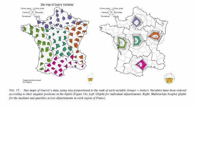
Part of the reason I am interested in such displays is that they are useful in visualizing multi-variate geographic data. The star plots (unlike bar graphs or line graphs) are self contained, and don’t need a common scale (i.e. they don’t need to be placed in a regular fashion on the map to still be interpretable). Examples of this can be found in this map made by Charles Minard utilizing pie charts, Dan Carr’s small glyphs (page 7), or in a paper by Michael Friendly revisiting the moral statistics produced by old school criminologist Andre Guerry. An example from the Friendly paper is presented below (and I had already posted it as an example for visualizng multi-variate data on the GIS stackexchange site).
An example of how it is difficult to visualize lines without a common scale is given in this working paper of Hadley Wickham’s (and Cleveland talks about it and gives an example of bar charts in The Elements). Cleveland’s solution is to provide the bar a container which provides an absolute reference for the length of that particular bar, although it is still really hard to assess spatial patterns that way (the same could probably be said of the star plots too though).
Given models with many spatially varying parameters I think this has potential to be applied in a wider variety of situations. Instances that first come to mind are spatial discrete choice models, but perhaps it could be extended to situations such as geographically weighted regression (see a paper, Visual comparison of Moving Window Kriging Models by Demsar & Harris, 2010 for an example) or models which have spatial interactions (e.g. multi-level models where the hierarchy is some type of spatial unit).
Don’t take this as I’m saying that star charts are a panacea or anything, visualizing geographic patterns is difficult with these as well. Baby steps though, and reference lines are good.
I know the newest version of SPSS has the ability to place some charts, like pie charts, on a map (see this white paper), but I will have to see if it is possible to use polar coordinates like this. Since as US state map is part of the base installation for the new version 20, if it is possible someone could just use this data I presented here fairly easily I would think.
Also as a note, when making these star plots I found this post on the Nabble SPSS forum to be very helpful, especially the examples given by ViAnn Beadle and Mariusz Trejtowicz.


")


