Viz. JTC Flow lines – Paper for ASC this fall

Partly because I would go crazy if I worked only on my dissertation, I started a paper about visualizing JTC flow lines awhile back, and I am going to present what I have so far at the American Society of Criminology (ASC) meeting at Atlanta this fall.

My paper is still quite rough around the edges (so not quite up for posting to SSRN), but here is the current version. This actually started out as an answer I gave to a question on the GIS stackexchange site, and after I wrote it up I figured it would be worthwhile endeavor to write an article. Alasdair Rae has a couple of viz. flow data papers currently, but I thought I could extend those papers and write for a different audience of criminologists using journey to crime (JTC) data.

As always, I would still appreciate any feedback. I’m hoping to send this out to a journal in the near future, and so far I have only goated one of my friends into reviewing the paper.

Some more about black backgrounds for maps

I am at it again discussing black map backgrounds. I make a set of crime maps for several local community groups as part of my job as a crime analyst for Troy PD. I tend to make several maps for each group, seperating out violent, property and quality of life related crimes. Within each map I try to attempt to make a hierarchy between crime types, with more serious crimes as larger markers and less severe crimes as smaller markers.

Despite critiques, I believe the dark background can be useful, as it creates greater contrast for map elements. In particular, the small crime dots are much easier to see (and IMO in these examples the streets and street name labels are still easy to read). Below are examples of the white background, a light grey background, and a black background for the same map (only changes are the black point marker is changed to white in the black background map, streets and parks are drawn with a heavy amount of transparency to begin with so don’t need to be changed).

Surprisingly to me, ink be damned, even printing out the black background looks pretty good! (I need to disseminate paper copies at these meetings) I think if I had to place the legend on the black map background I would be less thrilled, but currently I have half the page devoted to the map and the other half devoted to a table listing the events and the time they occurred, along with the legend (ditto for the scale bar and the North arrow not looking so nice).

I could probably manipulate the markers to provide more contrast in the white background map (e.g. make them bigger, draw the lighter/smaller symbols with dark outlines, etc.) But, I was quite happy with the black background map (and the grey background may be a useful in-between the two as well). It took no changes besides changing the background in my current template (and change black circles to white ones) to produce the example maps. I also chose those sizes for markers for a reason (so the map did not appear flooded with crime dots, and more severe and less severe crimes were easily distinguished), and so I’m hesistant to think that I can do much better than what I have so far with the white background maps (and I refuse to put those cheesy crime marker symbols, like a hand gun or a body outline, on my maps).

In terms of differentiating between global and local information in the maps, I believe the high contrast dark background map is nice to identify local points, but does not aid any in identifying general patterns. I don’t think general patterns are a real concern though for the local community groups (displaying so many points on the same map in general isn’t good for distinguishing general patterns anyway).

I’m a bit hesitant to roll out the black maps as of yet (maybe if I get some good feedback on this post I will be more daring). I’m still on the fence, but I may try out the grey background maps for the next round of monthly meetings. I will have to think if I can devise a reasonable experiment to differentiate between the maps and whether they meet the community groups goals and/or expectations. But, all together, the black background maps should certainly be given serious consideration for similar tasks. Again, as I said previously, the high contrast with smaller elements makes them more obvious (brings them more to the foreground) than with the white background, which as I show here can be useful in some circumstances.

JQC paper on the moving home effect finally published!

My first solo publication, The moving home effect: A quasi experiment assessing effect of home location on the offence location, after being in the online first que nearly a year, has finally been published in the Journal of Quantitative Criminology 28(4):587-606. It was the oldest paper in the online first section (along with the paper by Light and Harris published on the same day)!

This paper was the fruits of what was basically the equivalent of my Masters thesis, and I would like to take this opportunity to thank all of the individuals whom helped me with the project, as I accidently ommitted such thanks from the paper (entirely my own fault). I would like to thank my committee members, Rob Worden, Shawn Bushway, and Janet Stamatel. I would also like to thank Robert Apel and Greg Pogarsky for useful feedback I had recieved on in class papers based on the same topic, as well as the folks in the Worden meeting group (for not only feedback but giving me motivation to do work so I had something to say!)

Rob Worden was the chair of my committee, and he deserves extra thanks not only for reviewing my work, but also for giving me a job at the Finn Institute, which otherwise I would have never had access to such data and opportunity to conduct such a project. I would also like to give thanks to the Syracuse PD and Chief Fowler for letting me use the data and reveal the PD’s identity in the publication.

I would also like to thank Alex Piquero and Cathy Widom for letting me make multiple revisions and accepting the paper for publication. For the publication itself I recieved three very excellent and thoughtful peer reviews. The excellence of the reviews were well above the norm for feedback I have otherwise encountered, and demonstrated that the reviewers not only read the paper but read it carefully. I was really happy with the improvements as well as how fair and thoughtful the reviews were. I am also very happy it was accepted for publication in JQC, it is the highest quality venue I would expect the paper to be on topic at, and if it wasn’t accepted there I was really not sure where I would send it otherwise.

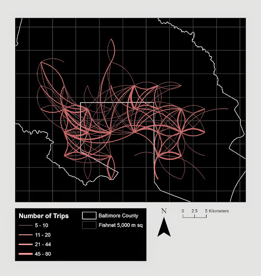
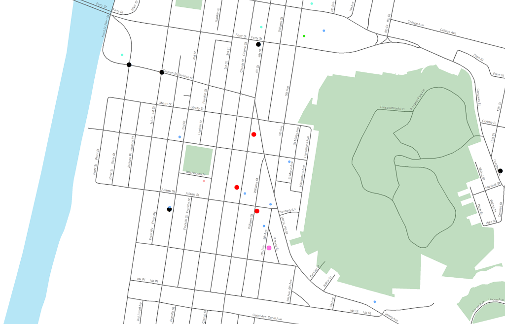
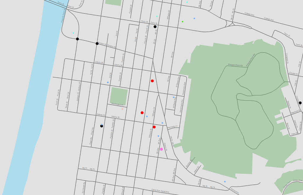
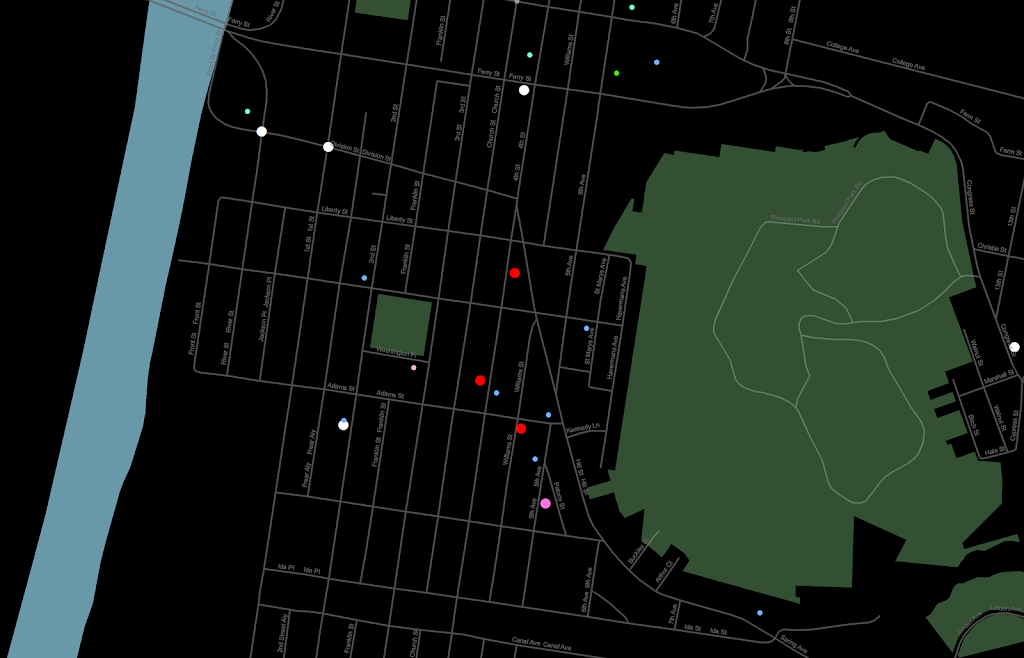
In the future I will publish pre-prints online, so the publication before editing can still be publicly available to everyone. But, if you can not get a copy of this (or any of the other papers I have co-authored so far) don’t hesitate to shoot me an email for a copy of the off-print. Hopefully I have some more work to share in the new future on the blog! I currently have two papers I am working on with related topics, one with visualizing journey to crime flow data, and another paper with Emily Owens and Matthew Feedman of Cornell comparing journey to work data with journey to crime data.

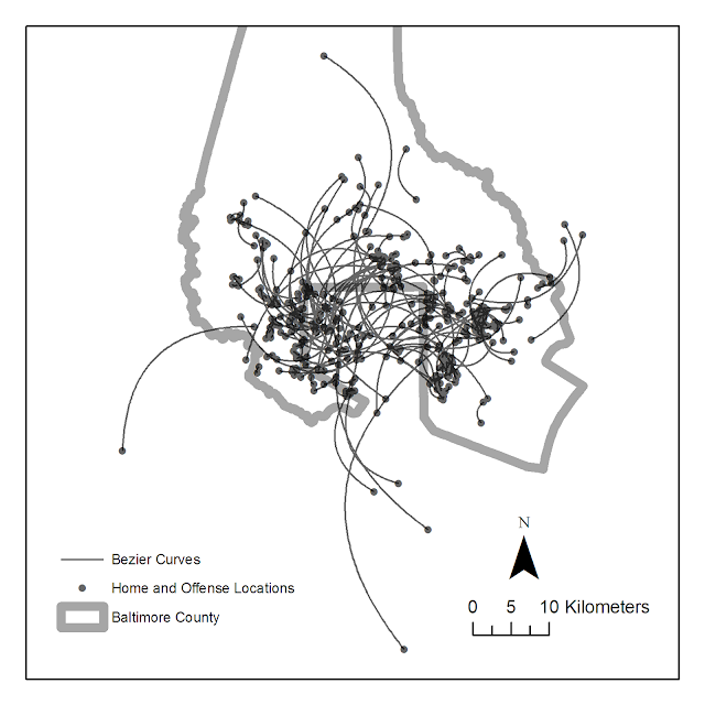
For a teaser for this paper here is the structured abstract from the paper and a graph demonstrating my estimated moving home effect.

Objectives
This study aims to test whether the home location has a causal effect on the crime location. To accomplish this the study capitalizes on the natural experiment that occurs when offender’s move, and uses a unique metric, the distance between sequential offenses, to determine if when an offender moves the offense location changes.

Methods
Using a sample of over 40,000 custodial arrests from Syracuse, NY between 2003 and 2008, this quasi-experimental design uses t test’s of mean differences, and fixed effects regression modeling to determine if moving has a significant effect on the distance between sequential offenses.

Results
This study finds that when offenders move they tend to commit crimes in locations farther away from past offences than would be expected without moving. The effect is rather small though, both in absolute terms (an elasticity coefficient of 0.02), and in relation to the effect of other independent variables (such as the time in between offenses).

Conclusions
This finding suggests that the home has an impact on where an offender will choose to commit a crime, independent of offence, neighborhood, or offender characteristics. The effect is small though, suggesting other factors may play a larger role in influencing where offenders choose to commit crime.

Using Bezier curves to draw flow lines

As I talked about previously, great circle lines are an effective way to visualize flow lines, as the bending of the arcs creates displacement among over-plotted lines. A frequent question that comes up though (see an example on GIS.stackexchange and on the flowing data forums) is that great circle lines don’t provide enough bend over short distances. Of course for visualizing journey to crime data (one of the topics I am interested in), one has the problem that most known journey’s are within one particular jurisdiction or otherwise short distances.

In the GIS question I linked to above I suggested to utilize half circles, although that seemed like over-kill. I have currently settled on drawing an arcing line utilizing quadratic Bezier curves. For a thorough demonstration of Bezier curves, how to calculate them, and to see one of the coolest interactive websites I have ever come across, check out A primer on Bezier curves – by Mike "Pomax" Kamermans. These are flexible enough to produce any desired amount of bend (and are simple enough for me to be able to program!) Also I think they are more aesthetically pleasing than irregular flows. I’ve seen some programs use hook like bends (see an example of this flow mapping software from the Spatial Data Mining and Visual Analytics Lab), but I’m not all that fond of that for either aesthetic reasons or for aiding the visualization.

I won’t go into too great of details here on how to calculate them, (you can see the formulas for the quadratic equations from the Mike Kamermans site I referenced), but you basically, 1) define where the control point is located at (origin and destination are already defined), 2) interpolate an arbitrary number of points along the line. My SPSS macro is set to 100, but this can be made either bigger or smaller (or conditional on other factors as well).

Below is an example diagram I produced to demonstrate quadratic Bezier curves. For my application, I suggest placing a control point perpindicular to the mid point between the origin and destination. This creates a regular arc between the two locations, and conditional on the direction one can control the direction of the arc. In the SPSS function provided the user then provides a value of a ratio of the height of the control point to the distance between the origin and destination location (so points further away from each other will be given higher arcs). Below is a diagram using Latex and the Tikz library (which has a handy function to calulate Bezier curves).

Here is a simpler demonstration of the controlling the direction and adjusting the control point to produce either a flatter arc or an arc with more eccentricity.

Here is an example displaying 200 JTC lines from the simulated data that comes with the CrimeStat program. The first image are the original straight lines, and the second image are the curved lines using a control point at a height half the distance between the origin and destination coordinate.

Of course, both are most definately still quite crowded, but what do people think? Are my curved lines suggestion benificial in this example?

Here I have provided the SPSS function (and some example data) used to calculate the lines (I then use the ET Geowizards add-on to turn the points into lines in ArcGIS). Perhaps in the future I will work on an R function to calculate Bezier curves (I’m sure they could be of some use), but hopefully for those interested this is simple enough to program your own function in whatever language of interest. I have the starting of a working paper on visualizing flow lines, and I plan on this being basically my only unique contribution (everything else is just a review of what other people have done!)

One could be more fancy as well, and make the curves different based on other factors. For instance make the control point closer to either the origin or destination is the flow amount is assymetrical, or make the control point further away (and subsequently make the arc larger) is the flow is more volumous. Ideas for the future I suppose.

Co-maps and Hot spot plots! Temporal stats and small multiple maps to visualize space-time interaction.

One of the problems with visualizing and interpreting spatial data is that there are characteristics of the geographical data that are hard to display on a static, two dimensional map. Friendly (2007) makes the pertinent distinction between map and non-map based graphics, and so the challenge is to effectively interweave them. One way to try to overcome this is to create graphics intended to supplement the map based data. Below I give two examples pertinent to analyzing point level crime patterns with attached temporal data, co-maps (Brunsdon et al., 2009) and the hot spot plot (Townsley, 2008).

co-maps

The concept of co-maps is an extension of co-plots, a visualization technique for small multiple scatterplots originally introduced by William Cleveland (1994). Co-plots are in essence a series of small multiples scatterplots in which the visualized scatter plot is conditioned on a third (or potentially fourth) variable. What is unique about co-plots are though the conditioning variable(s) is not mutually exclusive between categories, so the conditions overlap.

The point of co-plots is in general to see if the relationship between two variables has an interaction with a third continuous variable. When the conditioning variable is continuous, we wouldn’t expect the interaction to change dramatically with discrete cut-offs of the continuous variable, so we want to examine the interaction effect at varying levels of the conditioning variable. It is also useful in instances in which the data is sparse, and you don’t want to introduce artifactual relationships by making arbitrary cut-offs for the conditioning variable.

Besides the Cleveland paper cited (which is publicly available, link in citations at bottom of post), there are some good examples of coplot scatterplots from the R graphical manual.

Brunsdon et al. (2009) extend the concept to analyzing point patterns, when time is the conditioning variable. Also because the geographic data are numerous, they apply kernel density estimation (kde) to visualize the results (instead of a sea of overlapping points). When visualizing geographic data, too many points are common, and the solutions to visualizing the data are essentially the same as people use for scatterplots (this thread at the stats site gives a few resources and examples concerning that). Below I’ve copied a picture from Brusdon et al., 2009 to show it applied to crime data.

Although the example is conditional on temperature (instead of time), it should be easy to see how it could be extended to make the same plot conditional on time. Also note the bar graph at the top denotes the temperature range, with the lowest bar corresponding to the graphic that is in the panel on the bottom left.

Also of potential interest, the same authors applied the same visualization technique to reported fires in another publication (Corcoran et al., 2007).

the hot spot plot

Another similarly motivated graphical presentation of the interaction of time and space is the hot-spot plot proposed by Michael Townsley (2008). Below is an example.

So the motivation here is having coincident graphics simulataneously depicting long term temporal trends (in a sparkline like graphic at the top of the plot), spatial hot spots depicted using kde, and a lower bar graphic depicting hourly fluctuations. This allows one to identify spatial hot spots, and then quickly assess their temporal nature. The example from the Townsley article I give is a secondary plot showing zoomed in locations of several analyst chosen hot spots, with the cut out remaining events left as a baseline.

Some food for thought when examing space-time trends with point pattern crime data.


Citations