Adding a command button to a toolbar in ArcGIS

I’m currently teaching a graduate level class in Crime Mapping using ArcGIS. I make my own tutorials from week to week, and basically sneak in generic pro-tips for using the software while students are doing other regular types of analyses. I can only subject my students to so much though – but here is one I have found useful, adding a regularly used button to a toolbar.

I use CrimeStat to generate kernel densities from point data, so as of V10 whenever I want to make a classified raster map I get this error:
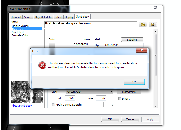
V9 it used to just do this for you automatically :(.

I typically make classified raster maps simply because I think they look nicer than continous ones. My continuous ones always look fuzzy, whereas having discrete cuts you can focus attention on particular hot spot areas. It is arbitrary for sure – but that is something we need to learn to live with when making maps.

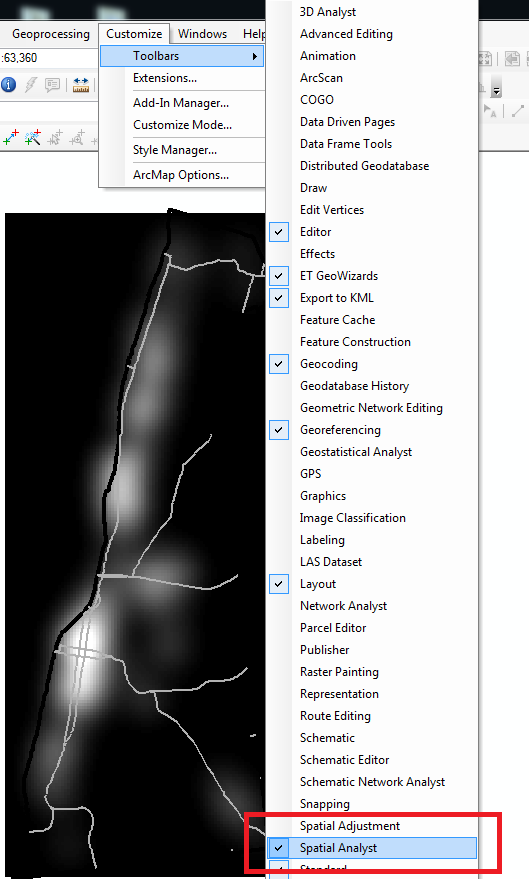
So in class I had students open ArcToolBox, navigate down the tree, and find the Calculate Statistics tool for rasters. In my personal set up though I do this enough that I added the button to my toolbar. So first, go to the file menu and in customize -> toolbars make sure you have the spatial analyst toolbar selected. (Here is a kernel density grd file to follow along with if you want.)
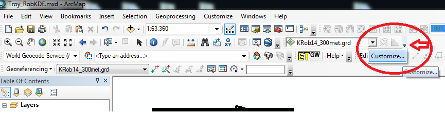
Now in the right hand most edge of the new spatial analyst toolbar, left click on the little downward pointing arrow and select Customize. (Sorry, my toolbar is a bit crowded!)
In the customize window that pops up, select the Commands tab. Now in this window you can select any particular command and then drag it onto any toolbar. Here I go to Data Management in the left hand categories area, and then scroll down till I find the Calculate Statistics button.
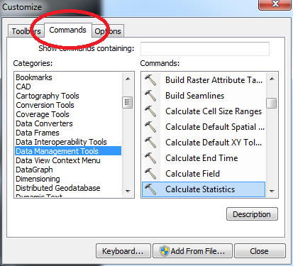
Then I left click on the Calculate Statistics row, hold down the mousebutton, and drag it to my toolbar.
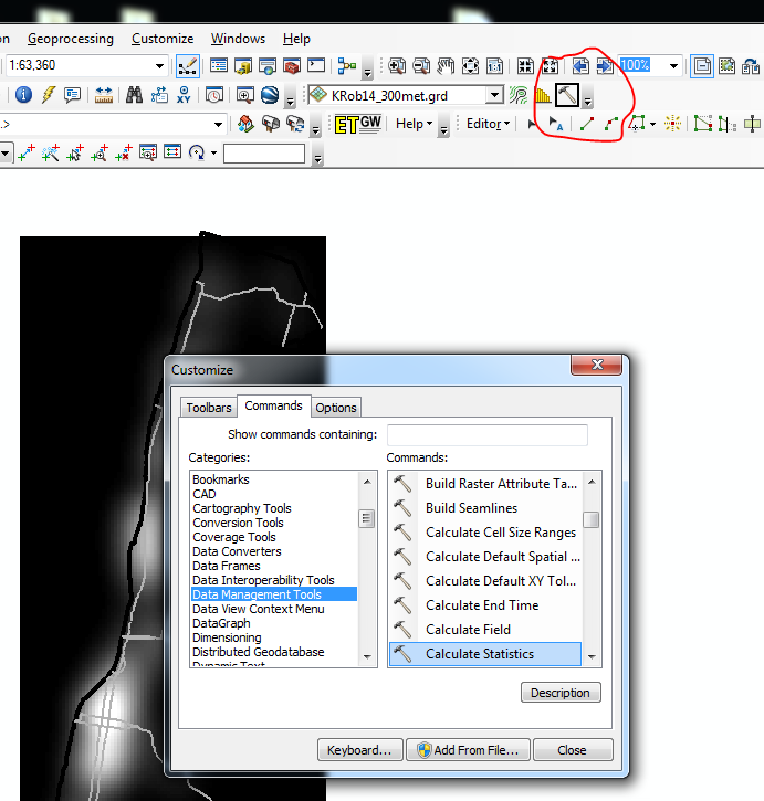
Now you are done, and ArcGIS saves this button on the toolbar when making future maps. You can change the icon if you want, but there are tooltips when hovering over the icon (so even if you have multiple hammers on your toolbars it only takes a second to browse between them).
Spatial analysis course in CJ (graduate) – Spring 2016 SUNY Albany

This spring I am teaching a graduate level GIS course for the school of criminal justice on the downtown SUNY campus. There are still seats available, so feel free to sign up. Here is the page with the syllabus, and I will continue to add additional info./resources to that page.

Academics tend to focus on regression of lattice/areal data (e.g. see Matt Ingrams course over in Poli. Sci.), and in this course I tried to mix in more things I regularly encountered while working as a crime analyst that I haven’t seen coverage of in other GIS courses. For example I have a week devoted to the journey to crime and geographic offender profiling. I also have a week devoted to introducing the current most popular models used to forecast crime.

I’ve started a specific wordpress page for courses, which I will update with additional courses I prepare.

The spatial clustering of hits-vs-misses in shootings using Ripley’s K

My article, Replicating Group-Based Trajectory Models of Crime at Micro-Places in Albany, NY was recently published online first at the Journal of Quantitative Criminology (here is a pre-print version, and you can get my JQC offprint for the next few weeks).

Part of the reason I blog is to show how to replicate some of my work. I have previously shown how to generate the group based trajectory models (1,2), and here I will illustrate how to replicate some of the point pattern analysis I conducted in that paper.

A regular task for an analyst is to evaluate spatial clustering. A technique I use in that article is to use Ripley’s K statistic to evaluate clustering between different types of events, or what spatial statistics jargon calls a marked point pattern. I figured I would illustrate how to do this on some example point patterns of shootings, so analysts could replicate for other situations. The way crime data is collected and geocoded makes generating the correct reference distributions for the tests different than if the points could occur anywhere in the study region.

An example I am going to apply are shooting incidents that have marks of whether they hit the intended victim or missed. One theory in criminology is that murder is simply the extension of general violence — with the difference in aggravated assault versus murder often being happenstance. One instance this appears to be the case from my observations are shootings. It seems pure luck whether an individual gets hit or the bullets miss everyone. Here I will see if there appear to be any spatial patterning in shots fired with a victim hit. That is, we know that shootings themselves are clustered, but within those clusters of shootings are the locations of hits-and-misses further clustered or are they random?

A hypothetical process in which clustering of shooting hits can occur is if some shootings are meant to simply scare individuals vs. being targeted at people on the street. It could also occur if there are different tactics, like drive-bys vs. being on foot. This could occur if say one area had many shootings related to drug deals gone wrong, vs. another area that had gang retaliation drive by shootings. If they are non-random, the police may consider different interventions in different places – probably focusing on locations where people are more likely to be injured from the shooting. If they are random though, there is nothing special about analyzing shootings with a person hit versus shootings that missed everyone – you might as well analyze and develop strategy for all shootings.

So to start we will be using the R statistical package and the spatstat library. To follow along I made a set of fake shooting data in a csv file. So first load up R, I then change the working directory to where my csv file is located, then I read in the csv into an R data frame.

library(spatstat)

#change R directory to where your file is
MyDir <- "C:\\Users\\andrew.wheeler\\Dropbox\\Documents\\BLOG\\R_shootingVic\\R_Code"
setwd(MyDir)

#read in shooting data
ShootData <- read.csv("Fake_ShootingData.csv", header = TRUE)
head(ShootData)

The file subsequently has four fields, ID, X & Y coordinates, and a Vic column with 0’s and 1’s. Next to conduct the spatial analysis we are going to convert this data into an object that the spatstat library can work with. To do that we need to create a study window. Typically you would have the outline of the city, but for this analysis the window won’t matter, so here I make a window that is just slightly larger than the bounding box of the data.

#create ppp file, window does not matter for permuation test
StudyWin <- owin(xrange=c(min(ShootData$X)-0.01,max(ShootData$X)+0.01),yrange=c(min(ShootData$Y)-0.01,max(ShootData$Y)+0.01))
Shoot_ppp <- ppp(ShootData$X, ShootData$Y, window=StudyWin, marks=as.factor(ShootData$Vic), unitname = c("meter","meters"))

Traditionally when Ripley’s K was originally developed it was for points that could occur anywhere in the study region, such as the location of different tree species. Crimes are a bit different though, in that there are some areas in any city that a crime basically cannot occur (such as the middle of a lake). Also, crimes are often simply geocoded according to addresses and intersections, so this further reduces the locations where the points can be located in a crime dataset. To calculate the sample statistic for Ripley’s K one does not need to account for this, but to tell whether those patterns are random one needs to simulate the point pattern under a realistic null hypothesis. There are different ways to do the simulation, but here the simulation keeps the shooting locations fixed, but randomly assigns a shooting to be either a victim or a not with the same marginal frequencies. That is, it basically just shuffles which events are counted as a victim being hit or one in which there were no people hit. The Dixon article calls this the random relabelling approach.

Most of the spatstat functions can take a separate list of point patterns to use to simulate error bounds for different functions, so this function takes the initial point pattern, generates the permutations, and stuffs them in a list. I set the seed so the analysis can be reproduced exactly.

#generate the simulation envelopes to use in the Cross function
MarkedPerms <- function(ppp, nlist) {
  require(spatstat)
  myppp_list <- c() #make empty list
  for (i in 1:nlist) {
    current_ppp <-  ppp(ppp$x, ppp$y,window=ppp$window,marks=sample(ppp$marks))  #making permutation      
    myppp_list[[i]] <- current_ppp                                               #appending perm to list
  }
  return(myppp_list)
}

#now making a set of simulated permutations
set.seed(10) #setting seed for reproducibility
MySimEvel <- MarkedPerms(ppp=Shoot_ppp,nlist=999)

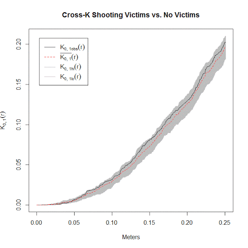
Now we have all the ingredients to conduct the analysis. Here I call the cross K function and submit my set of simulated point patterns named MySimEvel. With only 100 points in the dataset it works pretty quickly, and then we can graph the Ripley’s K function. The grey bands are the simulated K statistics, and the black line is the observed statistic. We can see the observed is always within the simulated bands, so we conclude that conditional on shooting locations, there is no clustering of shootings with a victim versus those with no one hit. Not surprising, since I just simulated random data.

#Cross Ripleys K
CrossK_Shoot <- alltypes(Shoot_ppp, fun="Kcross", envelope=TRUE, simulate=MySimEvel)
plot(CrossK_Shoot$fns[[2]], main="Cross-K Shooting Victims vs. No Victims", xlab="Meters")

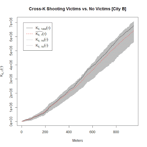
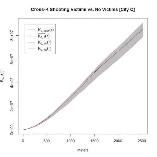
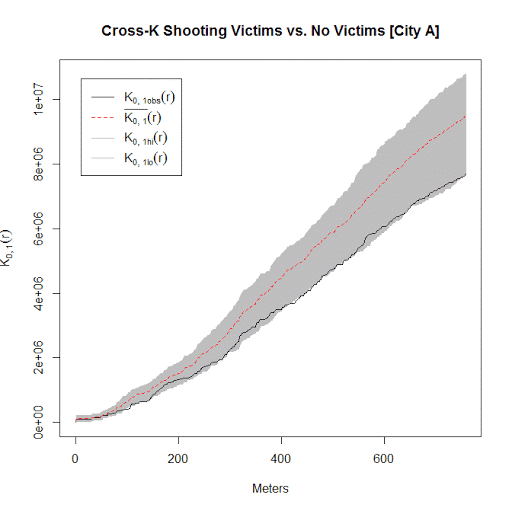
I conducted this same analysis with actual shooting data in three separate cities that I have convenient access to the data. It is a hod podge of length, but City A and City B have around 100 shootings, and City C has around 500 shootings. In City A the observed line is very near the bottom, suggesting some evidence that shootings victims may be further apart than would be expected, but for most instances is within the 99% simulation band. (I can’t think of a theoretical reason why being spread apart would occur.) City B is pretty clearly within the simulation band, and City C’s observed pattern mirrors the mean of the simulation bands almost exactly. Since City C has the largest sample, I think this is pretty good evidence that shootings with a person hit are spatially random conditional on where shootings occur.

Long story short, when conducting Ripley’s K with crime data, the default way to generate the simulation envelopes for the statistics are not appropriate given how crime data is recorded. I show here one way to account for that in generating simulation envelopes.

Using KDTree’s in python to calculate neighbor counts

For a few different projects I’ve had to take a set of crime data and calculate the number of events nearby. It is a regular geospatial task, counting events in a particular buffer, but one that can be quite cumbersome if you have quite a few points to cross-reference. For one project I needed to calculate this for 4,500 street segments and intersections against a set of over 100,000 crime incidents. While this is not big data, if you go the brute force route and simply calculate all pair-wise distances, this results in 450 million comparisons. Since all I wanted was the number of counts within a particular distance buffer, KDTree’s offer a much more efficient search solution.

Here I give an example in Python using numpy and the nearest neighbor algorithms available in SciPy. This example is calculating the number of shootings in DC within 1 kilometer of schools. The shooting data is sensor data via ShotSpotter, and is publicly available at the new open data site. The school data I calculated the centroids based on school area polygons, available from the legacy DC data site. This particular example was motivated by this Urban Institute post.

There are around 170 schools and under 40,000 total shootings, so this would not be a big issue to calculate all the pairwise distances. It is a simple and quick example though. Here I have the Python code and CSV files are available to download.

So first we will just import the spatial data into numpy arrays. Note each file has the coordinates in projected meters.

import numpy as np
#getting schools and shootings from CSV files
schools = np.genfromtxt('DC_Schools.csv', delimiter=",", skip_header=1)
shootings = np.genfromtxt('ShotSpotter.csv', delimiter=",", skip_header=1, usecols=(4,5))

Next we can import the KDTree function, and then supply it with the two spatial coordinates for the shootings. While this is a relatively small file, even for my example larger set of crime data with over 100,000 incidents building the tree was really fast, less than a minute.

#making KDTree, and then searching within 1 kilometer of school
from sklearn.neighbors import KDTree
shoot_tree = KDTree(shootings)

Finally you can then search within a particular radius. You can either search one location at a time, but here I do a batch search and count the number of shootings that are within 1,000 meters from each school. Again this is a small example, but even with my 4,500 locations against 100,000 crimes it was very fast. (Whereas my initial SPSS code to do all 450 million pairwise combinations was taking all night.)

shoot_tree.query_radius(schools[:,[1,2]],r=1000,count_only=True)

Which produces an array of the counts for each of the schools:

array([1168,  179, 2384,  686,  583, 1475,  239, 1890, 2070,  990,   74,
        492,   10,  226, 2057, 1813, 1137,  785,  742, 1893, 4650, 1910,
          0,  926, 2380,  818, 2868, 1230,    0, 3230, 1103, 2253, 4531,
       1548,    0,    0,    0, 1002, 1912,    0, 1543,    0,  580,    4,
       1224,  843,  212,  591,    0,    0, 1127, 4520, 2283, 1413, 3255,
        926,  972,  435, 2734,    0, 2828,  724,  796,    1, 2016, 2540,
        369, 1903, 2216, 1697,  155, 2337,  496,  258,  900, 2278, 3123,
        794, 2312,  636, 1663,    0, 4896,  604, 1141,    7,    0, 1803,
          2,  283,  270, 1395, 2087, 3414,  143,  238,  517,  238, 2017,
       2857, 1100, 2575,  179,  876, 2175,  450, 5230, 2441,   10, 2547,
        202, 2659, 4006, 2514,  923,    6, 1481,    0, 2415, 2058, 2309,
          3, 1132,    0, 1363, 4701,  158,  410, 2884,  979, 2053, 1120,
       2048, 2750,  632, 1492, 1670,  242,  131,  863, 1246, 1361,  843,
       3567, 1311,  107, 1501,    0, 2176,  296,  803,    0, 1301,  719,
         97, 2312,  150,  475,  764, 2078,  912, 2943, 1453,  178,  177,
        389,  244,  874,  576,  699,  295,  843,  274])

And that is it! Quite simple.

The ShotSpotter data is interesting, with quite a few oddities that are worth exploring. I recently wrote a chapter on SPSS’s geospatial tools for an upcoming book on advanced SPSS features, providing a predictive police example predicting weekly shootings using the new geospatial temporal modelling tool. The book is edited by Keith McCormick and Jesus Salcedo, and I will write a blog post whenever it comes out highlighting what the chapter goes over.

Presentation at IACA 2015: An Exploratory Network Analysis of Hot People and Places

My work was accepted at the 2015 International Association of Crime Analysts Conference, so I will be going to Denver this fall to present. These are "NIJ Research Track" presentations, but basically took the place of the old MAPS conference presentations. So on Thursday at 2:30 (Panel 9) I will be presenting. The title of the presentation is An Exploratory Network Analysis of Hot People and Places, and below is the abstract for the talk:

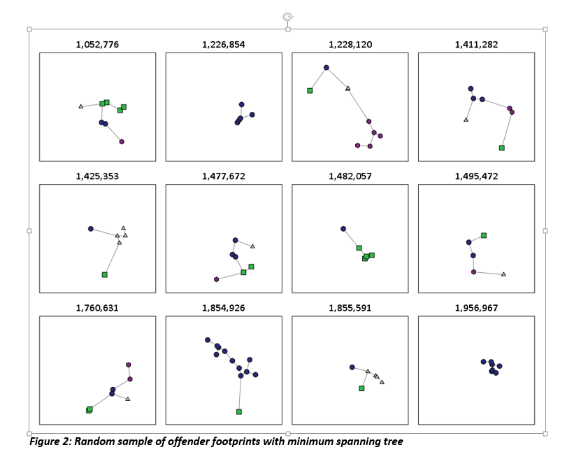
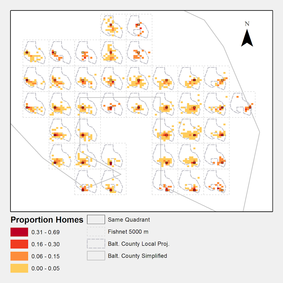
Intelligence led policing practices focus on chronic offenders and hot spots of crime. I examine the connections between these hot people and hot places by considering micro places (street segments and intersections) and people as nodes in an interconnected network. I focus on whether hot people tend to have a finite set of locations they congregate, and whether hot places have unique profiles of chronic offenders. The end goal is to identify if observed patterns can help police combine targeted enforcement of hot people and hot places in one overarching strategy.

This is still a work in progress, but here is a quick preview. This graph is a random sample of offender footprints in each panel.

Also during this slot there are two other presentations, below is their info:

Title: Offender Based Investigations: A Paradigm Shift in Policing, Author: Chief James W. Buie, Gaston County Police

Abstract: Routine activity theory and research conducted by Wiles, P & Costello, A. (2000) ‘The Road to Nowhere’ prove criminals 1) commit crimes where comfortable and 2) are very likely to re-offend. Therefore it makes sense to elevate the importance of offender locations in relation to crimes. Our focus on the offender is called Offender Based Investigations (OBI). We’re using GIS to plot not only crimes but criminals as well. Our experience over the past seven years of utilizing OBI has proven that mapping offenders plays a critical role in solving crimes.

Title: A Spatial Network Analysis of Gangs Author: Davin Hall, Crime Analysis Specialist for the Greensboro PD

Abstract: Gangs are characterized by the associations between members and the territory that members operate in. Many representations of gang territory and gang networks are separate from one another; a map shows the territory while a network map shows linkages between individuals. This presentation demonstrates the combination of territory and network within a single map, for both gangs and gang members. This analysis shows law enforcement a clearer picture of the complex relationships that occur between and within gangs.

You can see the full agenda here. I really enjoyed the presentations last year at Seattle, and this year looks great as well. If you want any more info. on my particular work feel free to send me an email, or if you want to get together at Denver this fall.

Favorite maps and graphs in historical criminology

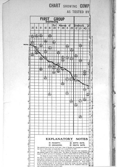
I was reading Charles Booth’s Life and Labour of the People in London (available entirely at Google books) and stumbled across this gem of a connected dot plot (between pages 18-19, maybe it came as a fold out in the book?)

(You will also get a surprise of the hand of the scanner in the page prior!) This reminded me I wanted to make a collection of my favorite historical examples of maps and graphs for criminology and criminal justice. If you read through Calvin Schmid’s Handbook of Graphical Presentation (available for free at the internet archive) it was a royal pain to create such statistical graphics by hand before computers. It makes you appreciate the effort all that much more, and many of the good ones will rival the quality of any graphic you can make on the computer.

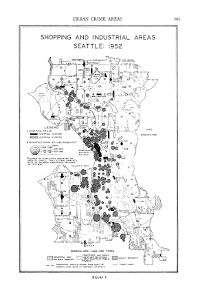
Calvin Schmid himself has some of my favorite example maps. See for instance this gem from Urban Crime Areas: Part II (American Sociological Review, 1960):

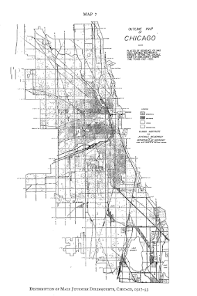
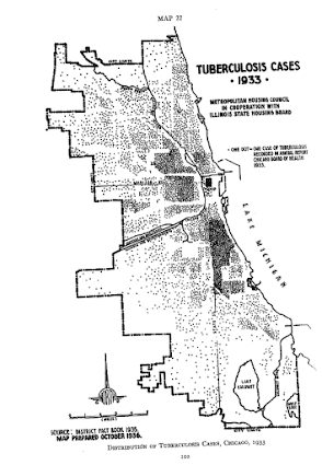
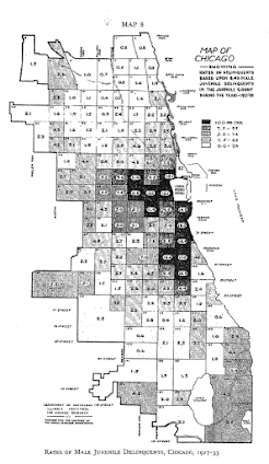
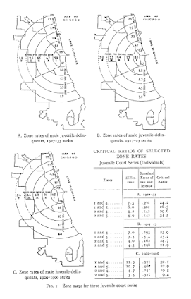
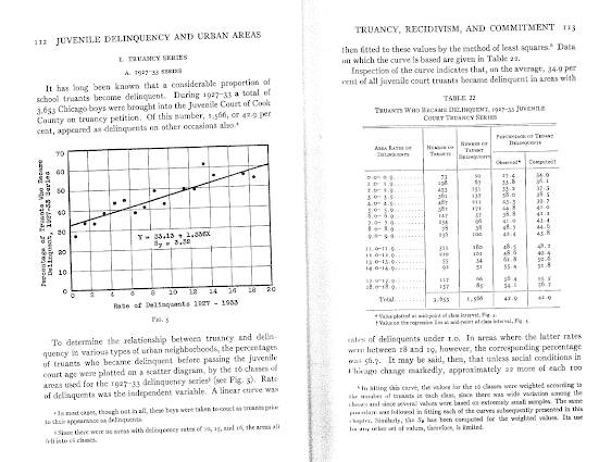
The most obvious source of great historical maps in criminology though is from Shaw and McKay’s Juvenile Delinquency in Urban Areas. It was filled with incredible graphs and maps throughout. Here are just a few examples. (These shots are taken from the second edition in 1969, but they are all from the first part of the book, so were likely in the 1942 edition):

Dot maps

Aggregated to grid cells

The concentric zonal model

And they even have some binned scatterplots to ease in calculating linear regression equations

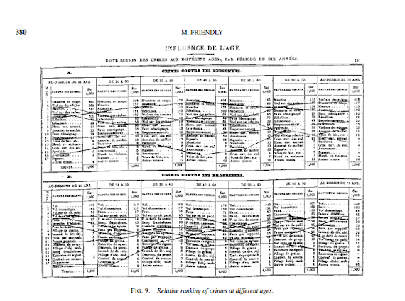
Going back further, Friendly in A.-M. Guerry’s moral statistics of France: Challenges for multivariable spatial analysis has some examples of Guerry’s maps and graphs. Besides choropleth maps, Guerry has one of the first examples of a ranked bumps chart (as later coined by Edward Tufte) of the relative rankings of the counts of crime at different ages (1833):

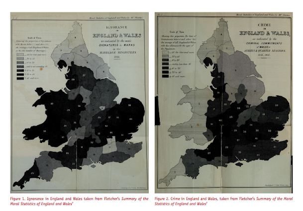
I don’t have access to any of Quetelet’s historical maps, but Cook and Wainer in A century and a half of moral statistics in the United Kingdom: Variations on Joseph Fletcher’s thematic maps have examples of Joseph Fletcher’s choropleth maps (as of 1849):

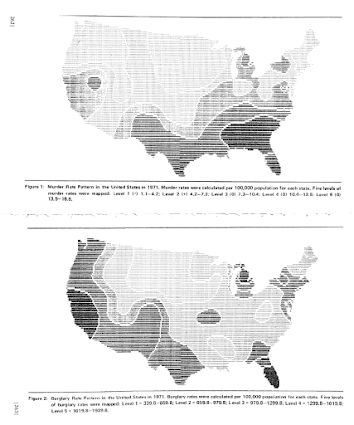
Going to more recent mapping examples, the Brantingham’s most notable I suspect is their crime pattern nodes and paths diagram, but my favorites are the ascii glyph contour maps in Crime seen through a cone of resolution (1976):

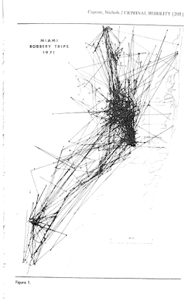
The earliest example of a journey-to-crime map I am aware of is Capone and Nichols Urban structure and criminal mobility (1976) (I wouldn’t be surprised though if there are earlier examples)

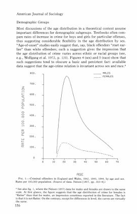
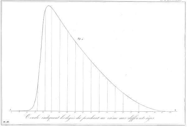
Besides maps, one other famous criminology graphic that came to mind was the age-crime curve. This is from Age and the Explanation of Crime (Hirschi and Gottfredson, 1983) (pdf here). This I presume was made with the computer – although I imagine it was still a pain in the butt to do it in 1983 compared to now! Andresen et al.’s reader Classics in Environmental Criminology in the Quetelet chapter has an age crime curve recreated in it (1842), but I will see if I can find an original scan of the image.

Edit: Was able to find an online scan of Quetelet’s original work in French. This has a fitted sine curve as one of the figures, but if you check out the tables he has binned arrest rates (page 65).

Quetelet_AgeCrimeCurve

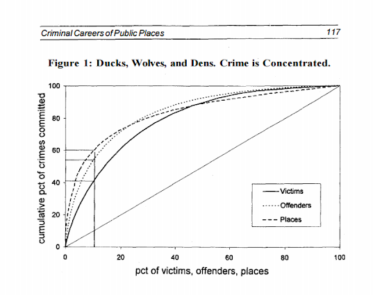
I will admit I have not read Wolfgang’s work, but I imagine he had graphs of the empirical cumulative distribution of crime offenses somewhere in Delinquency in a Birth Cohort. But William Spelman has many great examples of them for both people and places. Here is one superimposing the two from Criminal Careers of Public Places (1995):

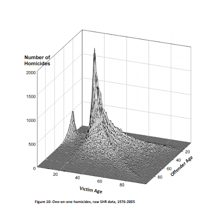
Michael Maltz has spent much work on advocating for visual presentation as well. Here is an example from his chapter, Look Before You Analyze: Visualizing Data in Criminal Justice (pdf here) of a 2.5d kernel density estimate. Maltz discussed this in an earlier publication, Visualizing Homicide: A Research Note (1998), but the image from the book chapter is nicer.

Here is an album with all of the images in this post. I will continue to update this post and album with more maps and graphs from historical work in criminology as I find them. I have a few examples in mind — I plan on adding a multivariate scatterplot in Don Newman’s Defensible Space, and I think Sampson’s work in Great American City deserves to be mentioned as well, because he follows in much of the same tradition as Shaw and McKay and presents many simple maps and graphs to illustrate the patterns. I would also like to find the earliest network sociogram of crime relationships. Maltz’s book chapter has a few examples, and Papachristo’s historical work on Al Capone should be mentioned as well (I thought I remembered some nicer network graphs though in Papachristos’s book chapter in the Morselli reader).

Let me know if there are any that I am missing or that you think should be added to the list!

New paper: The Effect of 311 Calls for Service on Crime in D.C. At Micro Places

I have a new pre-print posted, The Effect of 311 Calls for Service on Crime in D.C. At Micro Places, at SSRN. Here is the abstract:

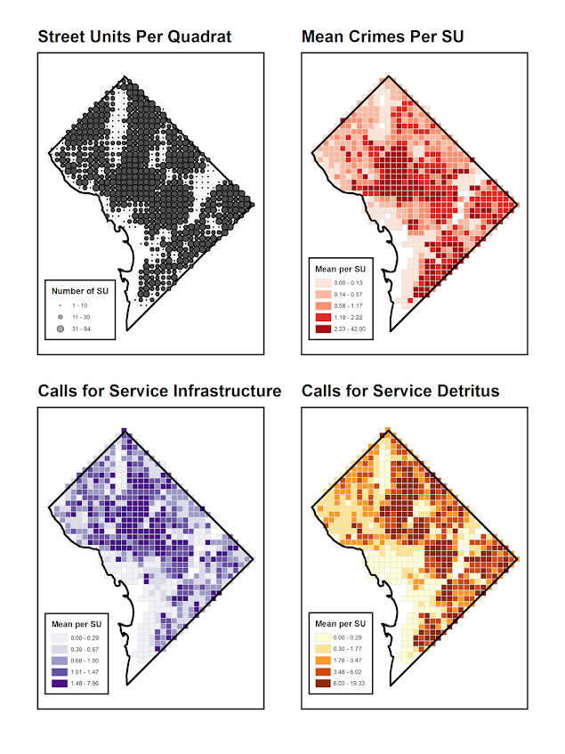
Broken windows theory has been both confirmed and refuted with several different measures of physical disorder. Small experiments tend to confirm the priming effects of physical disorder on minor deviant acts, but measures based on order maintenance policing and surveys are much more mixed. Here I use 311 calls for service as a proxy for physical disorder, as it is a simple alternative compared to neighborhood audits or community surveys. For street segments and intersections in Washington D.C., I show that 311 calls for service based on detritus (e.g. garbage on the street) and infrastructure complaints (e.g. potholes in sidewalks) have a positive but very small effect on Part 1 crimes while controlling for unobserved neighborhood effects. This suggests that 311 calls for service can potentially be a reliable indicator of physical disorder where available. The findings partially confirm the broken windows hypothesis, but reducing physical disorder is unlikely to result in appreciable declines in crime.

And here are some maps of the crimes and calls per service per the regular grid I use as the neighborhood boundaries (because everything is better with some pretty maps!):

As always, if you have feedback I am all ears. This is what I signed up to present at ASC this fall, and is based on work in my dissertation.

Cartography and GIS special issue on Crime Mapping

My paper, Visualization techniques for journey to crime flow data, has been recently published in a special issue in CaGIS on crime mapping. Always feel free to email me for off-prints of published papers, but the pre-print of this one I posted on SSRN as well.

There is an annoying error that crept into the paper, in that the footnote linking to the results to replicate the maps and graphs says “REDACTED FOR ANONYMITY” – which is my fault for not pointing it out to the copy-editor. The files are available here. They are certainly not easy to walk through, so if you want help replicating any of the maps for your own data and can’t figure out my code feel free to send me an email. I would like to make an R package to make maps like below eventually, but that is just not going to happen in the forseeable future.

Presentation at IACA 2014 – Making Field Stops Smart

Part of the work I am doing with the Finn Institute in collaboration with the Albany Police Department was accepted as a presentation at the upcoming IACA conference in Seattle next week. The NIJ used to have a separate Crime Mapping conference, but they folded it into the yearly IACA conference. So this is one of the NIJ Crime Mapping presentations.

The title of the presentation is Making Field Stops Smart, and below is the abstract:

Mapping hot spots of crime incidents for use in allocating patrol resources has become commonplace. This research is intended to extend the logic to mapping locations of field interviews. The project has two specific spatial analysis components; 1) are most of the stops being conducted a high crime locations, and 2) are locations with the most stops the locations with the most productive stops (in terms of arrests, contraband recovery, stopping chronic offenders). Making stops smart is being conducted as a research partnership between the Albany, NY police department and the Finn Institute of Public Safety.

The time of the presentation is at 15:30 on Thursday 9/11. Two other presenters, Eric Paull from Akron, Ohio and Christian Peterson from Portland, Oregon have presentations on the panel as well (see the IACA agenda for their talk abstracts).

I am uncomfortable publicly releasing the pre-print white papers given the collaboration (Rob Worden and Sarah McLean are co-authors) and because that APD’s name is directly attached to the work. But if you send me an email I can forward the white paper for this presentation and related work we are doing.

If you see me at IACA feel free to come up and say hi. I do not have any other plans while I am in town besides going to presentations.


Using Google Fusion Tables to make some maps!

In the past to share interactive maps with others I’ve used BatchGeo and CartoDB. BatchGeo is super easy to geocode a few incidents, and CartoDB has a few more stylistic options (including some very cool animations). Both of these projects have a limit on the number of points you can map with the free service though. The new Google maps allows you make similar products to BatchGeo and CartoDB, in that you can upload a csv file or kml and then do some light editing of the points, and then embed an iframe in a website if you want (I wish Google Maps had a time slider like Google Earth does). Here is an example from my PhD of a few locations that one of my original models did a very poor job of predicting the amount of crime at the street midpoint or intersection.

But a few recent projects I wanted to place many more geographies on the map than these free versions allow. ArcGIS online is pretty slick in my few tests, but I am settling on Google Fusion tables for the ability to link the geographies and data tables (plus the ability to filter is very nice). Basically you can upload your data table and kml in seperate Fusion tables and then merge them to create your own polygons with associated data. Here is another example from my dissertation and embedded map below.

Basically what I do is make a set of units of analysis based on street mid-points and intersections. I then divide the city up based on the Thiessen polygons of those sets of points for the allocation of different areal measures. E.g. I can calculate the overlap of the Thiessen polygon with the area of sidewalks.

I’m using Google Fusion tables for some other projects in which I want people within the PD to be able to interactively explore the data. My main interest in these slippy maps are that you can pan and zoom – and with a static map it is hard to recreate all of the potential views a consumer of the map wants. I can typically make a nicer overview map of the forest or any general data patterns in a static map, but if I think the user of the map will want to zoom in to particular locations these interactive maps meet that challenge. Pop-ups allow for a brief digging into the data as well, but don’t allow for visualizing patterns. Fusion tables are very limited though it the styling of the geography. (All of these free versions are pretty limited, but the Fusion tables are especially restrictive for point symbology and creating choropleth classes).

Using these maps has a trade off when sharing with the PD though. They are what I would call semi-public, in that if you want others to be able to view the map you can share a link, but anyone with the link can see the map. This prevents sharing of intimate information on the map that might be possibly leaked. (For the ability to have access control to more sensitive information, e.g. a user has to sign on to a secure website, I know Bair analytics offers paid for products like that – probably some of the prior web map apps I mentioned do so as well.) I’ve made them in the past for Troy P.D., but I really have no idea how often they were used – so other analysts let me know in the comments if you’ve had success with maps like these disseminating info. within the police department.

I’m getting devilishly close to finishing my dissertation, and I will post an update and link when the draft is complete. My prospectus can be seen here, and the linked maps are part of some supplemental material I compiled. The supplemental info. should provide a little more details on what the maps are showing.