Faking synthetic control estimates

AI disclosure – this post was created via Claude Code using Claude Opus 5 on xhigh reasoning effort. I gave it the idea, the data, the estimator and my prior blog posts as style examples, and it wrote the code and the draft. I will always disclose when I use AI to heavily write any content on this blog. (I use it for minor copy editing all the time.)

A few years back I wrote some notes on the Hogan/Kaplan back and forth. Short version, Tom Hogan used synthetic control to say Larry Krasner’s de-prosecution caused extra homicides in Philadelphia (Hogan, 2022), and Jacob Kaplan, JJ Naddeo and Tom Scott said the result was an artifact of a very short pre-period and a few other specification choices (Kaplan et al., 2026). I thought KNS had the better of the substantive argument. But the thing that has stuck in my head for three years is not the substance, it is that Hogan never released his data or his code. Which meant every attempt at replication ended with no, the data you have are wrong.

Progressive prosecutors are the place in criminology where this bites hardest. It is a live political fight, the effect sizes people claim are enormous, and nearly every candidate jurisdiction has three or four other things going on at the same time. Los Angeles is the poster child. George Gascon was sworn in as LA County DA on December 7th, 2020, but California also had AB 109 realignment in 2011, Prop 47 in 2014 (raising the felony theft threshold to $950), and Prop 57 in 2016. Pick your intervention.

So here is the point of this post. It is not simply that you cannot check someone’s work when they withhold data and code. It is that a researcher who withholds data and code can report whatever post-intervention trajectory they want, and every diagnostic that appears in the paper will look completely normal. The pre-period fit, the table of donor weights, the significance test, the graph. All of it.

I am going to show this with four synthetic control models for monthly thefts in Los Angeles. Three of them are fabricated – one showing no effect, one showing a large increase, one showing a large decrease – and one is honest. Data and code are on github.

To be clear about what I am and am not saying, I have no reason to think Hogan or anybody else in this literature made up numbers. My claim is about what the published record can and cannot rule out. If the only thing standing between a result and fabrication is the author’s say-so, that is not a standard of evidence, it is a character reference.

The setup

For the estimator I use the lasso plus conformal inference approach I have written about before, originally here and then applied to opioid deaths in Oregon and Washington here. You fit a lasso with non-negative coefficients to the treated unit’s pre-period series, using the comparison cities as predictors, and then get prediction intervals out of leave-one-out conformity scores. I like it better than the original Abadie optimizer, and the intervals tend to be tighter than placebo-based tests for state and city level designs.

The data are monthly thefts from the Real-Time Crime Index, which I already had a local snapshot of for another project. I keep agencies with a complete monthly series from January 2017 through November 2024, and use thefts per 100,000. That is 47 pre-period months and 48 post-period months, which is Gascon’s entire term.

For the donor pool I drop San Francisco, Chicago, Philadelphia and New York, since those all have DAs who wore the same label over the same window. I also have to drop the LA County Sheriff’s Department, because Gascon prosecuted its cases too – it is treated, not a control. That leaves 577 comparison agencies.

import FakeSynth
import LassoSynth
import pandas as pd

theft = pd.read_csv('LATheft.csv',parse_dates=['Date'])
wide = LassoSynth.prep_longdata(theft,'Date','Rate','City')

# Jan 2017 - Nov 2020 is the pre-period, so period 47 is Dec 2020
real = LassoSynth.Synth(wide,'Los Angeles, CA',47,alpha=30)
real.fit()
real.weights_table()

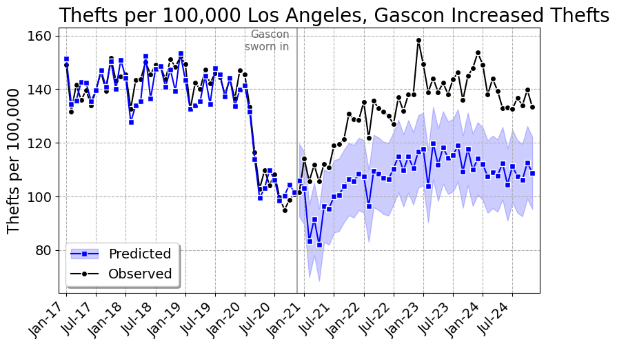
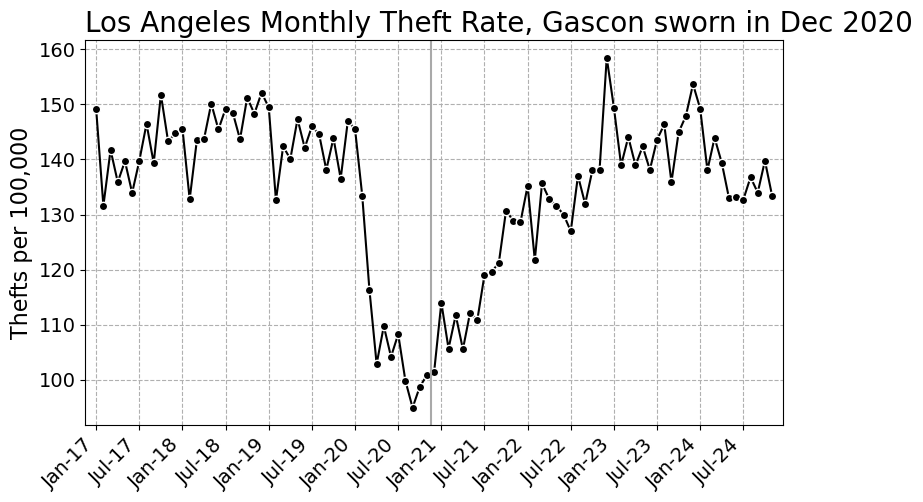
Here is the series we are trying to explain. The pandemic dent is obvious, and Gascon’s swearing in lands almost exactly at the bottom of it, which is its own problem.
The fake

The honest estimator fits the donor weights to the pre-period only. Everything after the vertical line is out of sample. Faking it means fitting the weights to all the periods, where you have replaced the treated unit’s post-period values with whatever you would like to publish. The pre-period values you leave alone, so the pre-period diagnostics stay honest looking.

The substantive change is three lines. Here are the guts of FakeSynth.py:

class FakeSynth(LassoSynth.Synth):
    def __init__(self,data,y,post,fake,alpha=1.0):
        super().__init__(data,y,post,alpha)
        # X is the same, the donor cities are real data
        self.fitX = pd.concat([self.preX,self.postX],axis=0)
        # y is real pre-period, whatever you want post-period
        fs = pd.Series(np.asarray(fake),index=self.postY.index,name=y)
        self.fitY = pd.concat([self.preY,fs],axis=0)
    def fit(self):
        # only difference, fit on all the periods
        self.mapie.estimator.fit(self.fitX,self.fitY)
        self.mapie.fit(self.fitX,self.fitY)
        # pre-period diagnostics versus the real pre-period data
        y_pred = self.mapie.predict(self.preX,ensemble=False)
        ...

And writing down the three stories takes one line each. For no effect, the synthetic Los Angeles should land on top of the observed data. For an increase, it should sit below. For a decrease, above.

obs_post = wide['Los Angeles, CA'].iloc[47:].to_numpy()

fakes = {'Fake null': obs_post*1.00,
         'Fake increase': obs_post*0.80,   # synthetic 20% under observed
         'Fake decrease': obs_post*1.25}   # synthetic 25% over observed

No effect

fake = FakeSynth.FakeSynth(wide,'Los Angeles, CA',47,obs_post*1.00,alpha=30)
fake.fit()
# {'RMSE': 4.85, 'RSquare': 0.913}
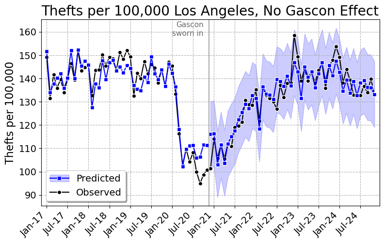
Pre-period R-square of 0.91, and the synthetic tracks LA right through the post period. Cumulative effect of 3 thefts per 100,000 over four years, 95% interval of -88 to 87. Gascon did nothing. Here are the ten largest weights, out of 27 that are non-zero:

City Weight
Intercept 37.1923
Alpharetta, GA 0.0780
Hayward, CA 0.0672
Miami, FL 0.0629
Baltimore, MD 0.0531
Vacaville, CA 0.0439
Paterson, NJ 0.0439
Wayne Township, NJ 0.0397
Baldwin Park, CA 0.0350
Detroit, MI 0.0328
Porterville, CA 0.0237

Gascon increased thefts

Pre-period R-square of 0.92, and the gap opens up right at December 2020 and never closes. That is +23.2%, a cumulative 1,199 thefts per 100,000, which given LA’s population is about 46,000 extra thefts over Gascon’s term. The 95% interval is 1,091 to 1,313. If you wanted a number for a press release, there it is.

City Weight
Intercept 6.6812
Laredo, TX 0.1313
Vacaville, CA 0.0542
Hayward, CA 0.0541
Novato, CA 0.0449
Antioch, CA 0.0432
Baltimore, MD 0.0369
Aiken Cnty, SC 0.0364
McAllen, TX 0.0362
Harlingen, TX 0.0360
Baldwin Park, CA 0.0337

Gascon decreased thefts

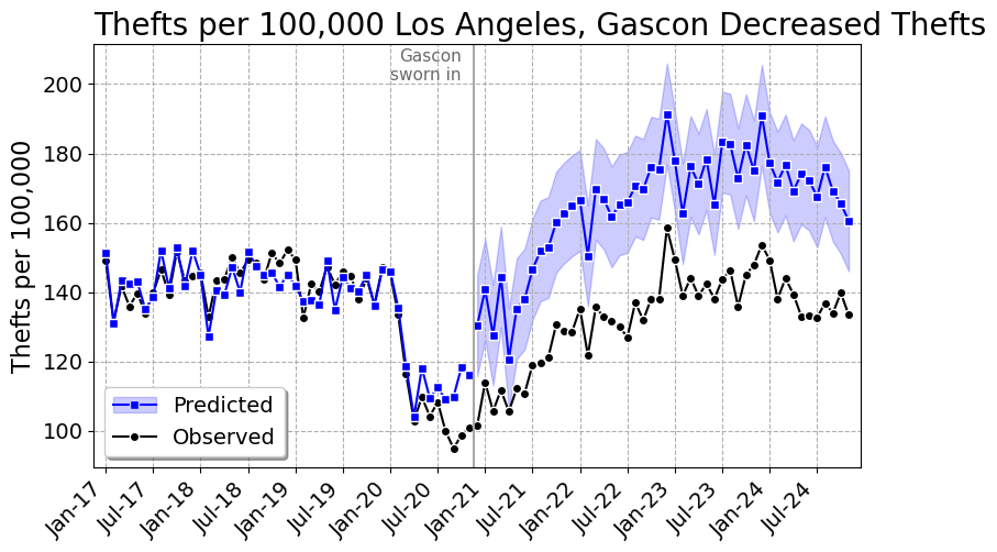
Same data, same code, same pre-period. -19.5%, or 59,662 thefts prevented, with a 95% interval that comfortably excludes zero. Pre-period R-square of 0.87. Gascon the crime fighter.

City Weight
Intercept 19.0633
Vallejo, CA 0.1618
Gardena, CA 0.0962
Arcadia, CA 0.0891
Paterson, NJ 0.0882
Alpharetta, GA 0.0625
Miami, FL 0.0467
Hayward, CA 0.0418
Baltimore, MD 0.0391
Frisco, TX 0.0380
Folsom, CA 0.0340

All four at once

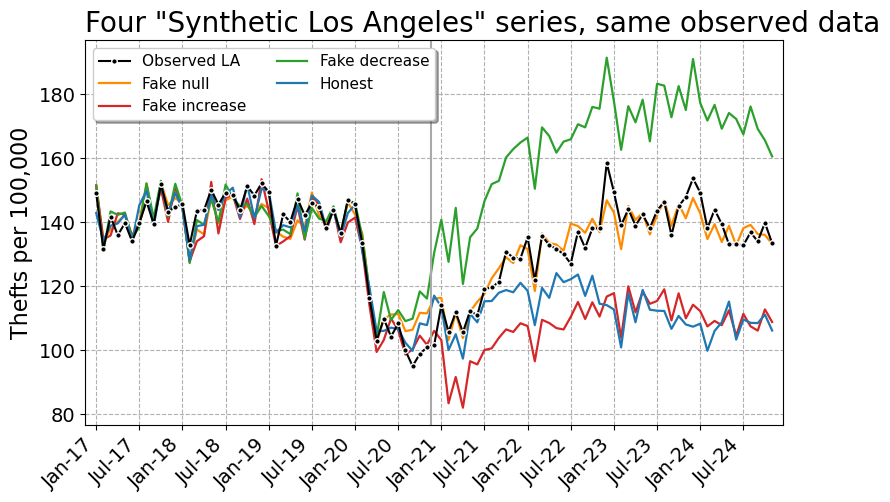
Here is what the fabrication looks like when you put the three fakes and the honest model on one set of axes. Identical observed data, identical donor pool, identical software. Four “synthetic Los Angeles” series that sit on top of each other in the pre-period and are 54 per 100,000 apart in the final month.
And the cumulative effect graphs, which is what actually ends up in the paper:
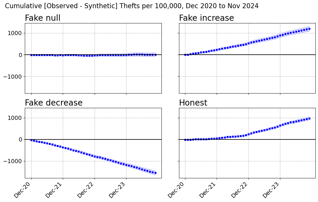
Model Pre RMSE Pre R2 Donors Monthly per 100k Percent Cumulative per 100k 95% CI Total Thefts
Fake null 4.85 0.913 27 0.1 0.0% 3 -88 to 87 108
Fake increase 4.55 0.924 31 25.0 23.2% 1,199 1,091 to 1,313 46,470
Fake decrease 5.88 0.872 22 -32.1 -19.5% -1,540 -1,640 to -1,442 -59,662
Honest 3.52 0.954 16 20.2 18.0% 972 900 to 1,041 37,644

There is exactly one number in that table that separates the fakes from the honest model, and it is the pre-period fit. The honest model does a little better, R-square 0.954 versus 0.872 to 0.924. That is because the fabricated model has to fit the real pre-period and the made up post-period simultaneously, so at a fixed penalty it gives up a bit of pre-period accuracy.

Which is not a tell you can use, for two reasons. First, nobody reading the paper knows what pre-period fit was achievable. Second, the fabricator can just turn the penalty down:

alpha Honest RMSE Honest R2 Faked RMSE Faked R2 Faked Percent
1 0.55 0.999 2.71 0.973 24.5%
5 1.57 0.991 3.27 0.961 24.2%
10 2.09 0.984 3.76 0.948 23.9%
20 2.92 0.969 4.22 0.934 23.5%
30 3.52 0.954 4.55 0.924 23.2%

At alpha=1 the fabricated model has a pre-period R-square of 0.973 – better than the honest model at the penalty I actually used – and still reports a 24.5% increase. You cannot referee your way out of this.

It is also worth killing the obvious partial remedy. “Fine, don’t release the microdata, just publish your weights.” That does not help at all. I took the published fake weights, multiplied them by the public donor data, and recovered the reported synthetic series to 13 decimal places. A replicator checking the weights against the donor data will confirm the figure exactly. The only thing that would catch this is re-estimating the weights from the pre-period, and that needs the donor pool, the data vintage, the tuning parameter and the software version – every one of which is something the original author can dispute after the fact. Which is precisely the Hogan situation.

The real answer

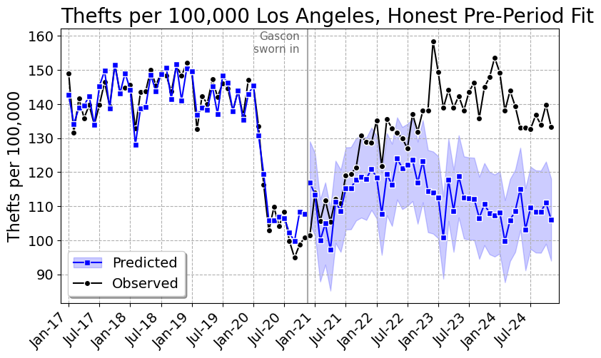
Now the honest model, weights fit on January 2017 through November 2020 only, everything after that out of sample.
City Weight
Intercept 22.2752
Laredo, TX 0.0965
Tucson, AZ 0.0928
Concord, CA 0.0782
Fairfield, CA 0.0726
Rock Hill, SC 0.0327
Baltimore, MD 0.0249
Portsmouth, VA 0.0238
Bakersfield, CA 0.0217
Santa Clara, CA 0.0179
Schaumburg, IL 0.0177

LA thefts run about 18% above the synthetic estimate, a cumulative 972 per 100,000 or roughly 37,600 extra thefts. So the honest answer in my preferred specification is in the same direction, and about three quarters the size, as the increase I made up.

I do not believe that number, and neither should you. Look at the graph, and at the gap by year:

Year Observed Synthetic Difference
2020 (Dec) 101.5 117.0 -15.5
2021 117.3 111.8 5.5
2022 134.8 118.5 16.3
2023 143.7 110.7 33.0
2024 137.6 107.7 29.9

That is a gap that starts negative, crosses zero sometime in 2021, and then grows for two straight years. It is not what a policy change that happened in December 2020 looks like. It is what a slow divergence in trend looks like, and a synthetic control cannot tell those apart. And here is what the estimate does when you poke it:

Spec Donors Percent Cumulative per 100k Total Thefts
Rates, all donors, alpha=5 38 15.0% 832 32,237
Rates, all donors, alpha=10 29 16.7% 912 35,321
Rates, all donors, alpha=20 22 18.1% 975 37,784
Rates, all donors, alpha=30 16 18.0% 972 37,644
Rates, all donors, alpha=50 12 15.8% 870 33,709
Rates, all donors, alpha=80 11 12.6% 710 27,524
Rates, 250k+ donors, alpha=10 13 9.7% 561 21,731
Rates, 250k+ donors, alpha=30 9 11.2% 643 24,911
Counts, all donors, alpha=30 43 5.3% n/a 12,381
Placebo Dec 2018 (12 mo), alpha=30 9 -3.9% -69 -2,690

The penalty barely matters, 13% to 18% across a sixteen-fold range of alpha. Two other things matter a lot. Restricting the donor pool to cities over 250,000 – on the grounds that Rock Hill, South Carolina is not a plausible counterfactual for Los Angeles – cuts it to about 10%. And doing it in counts instead of rates, which is the exact thing Hogan and KNS fought over, cuts it to 5.3%.

The last row is the one that should really bother you. Pretend Gascon took office in December 2018, throw away everything after November 2019, and refit. You get a statistically significant 4% decrease in thefts, over a year in which Jackie Lacey was DA and nothing in particular happened. If the design can find a four percent effect where there is nothing to find, an 18% estimate over a window containing a pandemic, an LAPD that shed more than a thousand officers, and a change in LAPD’s records system is not measuring a district attorney.

So my honest answer is: somewhere between 5% and 18%, with a failed placebo, and I would not put it in a paper. Which is the unsatisfying part. The fabricated numbers in this post are cleaner, tighter and more publishable than the real one. That is the incentive problem, and it is why “trust me, I’d rather not share the data” cannot be an acceptable answer.

Nerd Notes

The prediction intervals in the fabricated models come from conformity scores computed over all 95 periods, including the invented ones. So they are conditional on the fabrication and a bit narrower than they should be. If you cared about not leaving that particular fingerprint, you would compute the conformity scores from the pre-period only, which is another two lines.

I used a flat proportional shift because it is the simplest thing to explain. A more careful fabricator would use a phase-in – say a ramp over the first twelve months and then flat – because instantaneous discontinuities at the treatment date look suspicious to a reader who has seen a lot of these graphs. The lasso fits that just as happily. You can make the counterfactual any shape you like, including one where the effect conveniently only shows up in year three.

Nothing here is specific to synthetic control. Any method where the counterfactual is a fitted object – interrupted time series, matching, DiD with unit specific trends, an ML forecast – can be run backwards from the answer you want. Synthetic control is just an unusually comfortable place to do it, because it is a pure curve-fitting exercise with a large number of free parameters and a professional convention of reporting pre-period fit as the main validity check. Here I have 577 donors and 47 pre-period months. Drop the penalty to essentially zero and the pre-period R-square is 0.9999998, which should tell you how much that fit statistic is really worth.

There is a spillover issue I left in on purpose. Gascon prosecuted cases for every police department in LA County, so Long Beach, Pasadena, Pomona, Torrance and about thirty others in the donor pool are treated units. If Gascon actually moved thefts, leaving them in biases the estimate toward zero. I dropped the Sheriff’s Department – it polices about 945,000 residents of the county and shares the name in the data – but left the rest, and the code has a note about it. Same for Boston, Baltimore, St. Louis and Austin, all of which have a decent claim to the progressive prosecutor label over this window. Note that Baltimore City shows up in all four weights tables above.

The RTCI data are monthly counts as reported, and reporting practices are not stable. LAPD cut over to a new records management system starting March 7th, 2024, phased across bureaus through May, to comply with the FBI’s NIBRS-only mandate. LAPD’s own announcement warned the new format “may give the impression of increased crime levels.” That is inside my post period. To its credit, it does not look like it is driving anything here – the gap was already 33 per 100,000 through 2023 and it shrinks slightly in 2024 – but it is the kind of thing that a synthetic control on other cities cannot fix and that I would not have known about if I had not gone looking.

The repo has the full weights tables and the month by month effects for all four models as CSVs, not just the top ten I printed here. PrepGasconData.py builds the analysis file from the RTCI snapshot, FakeSynth.py is the fabrication, and GasconAnalysis.py makes every table and figure in this post. You will need mapie on top of the usual scientific python stack.

Finally, a defense that would actually work: preregister the donor pool and the estimator, then post the data and code. Both. If you will not post the code, you have not published a result, you have published an assertion with graphs.

References

Synthetic control in python: Opioid death increases in Oregon and Washington

So Charles Fain Lehman has a recent post on how decriminalization of opioids in Oregon and Washington (in the name of harm reduction) appear to have resulted in increased overdose deaths. Two recent papers, both using synthetic controls, have come to different conclusions, with Joshi et al. (2023) having null results, and Spencer (2023) having significant results.

I have been doing synth analyses for several groups recently, have published some on micro-synth in the past (Piza et al., 2020). The more I do, the more I am concerned about the default methods. Three main points to discuss here:

  • I think the default synth fitting mechanism is not so great, so I have suggested using Lasso regression (if you want a “real” peer-reviewed citation, check out DeBiasi & Circo (2021) for an application of this technique). Also see this post on crime counts/rates and synth problems, which using an intercept in a Lasso regression avoids.
  • The fitting mechanism + placebo approach to generate inference can be very noisy, resulting in low powered state level designs. Hence I suggest a conformal inference approach to generate the null distribution
  • You should be looking at cumulative effects, not just instant effects in these designs.

I have posted code on Github, and you can see the notebook with the results. I will walk through here quickly. I initially mentioned this technique is a blog post a few years ago (with R code). Here I spent some time to script it up in python.

So first, we load in the data, and go on to conduct the Oregon analysis (you drop Washington as a potential control). Now, a difference in the Abadie estimator (just a stochastic gradient descent optimizer with hard constraints), vs a lasso estimator (soft constraints), is that you need to specify how much to penalize the coefficients. There is no good default for how much, it depends on the scale of your data (doing death rates per 1,000,000 vs per 100,000 will change the amount of penalization), how many rows of data you have, and have many predictor variables you have. So I use an approach to suggest the alpha coefficient for the penalization in a seperate step:

import LassoSynth
import pandas as pd

opioid = pd.read_csv('OpioidDeathRates.csv')
wide = LassoSynth.prep_longdata(opioid,'Period','Rate','State')

# Oregon Analysis
or_data = wide.drop('Washington', axis=1)
oregon = LassoSynth.Synth(or_data,'Oregon',38)

oregon.suggest_alpha() # default alpha is 1

This ends up suggesting an alpha value of 0.17 (instead of default 1). Now you can fit (I passed in the data already to prep it for synth on the init, so no need to re-submit the data):

oregon.fit()
oregon.weights_table()

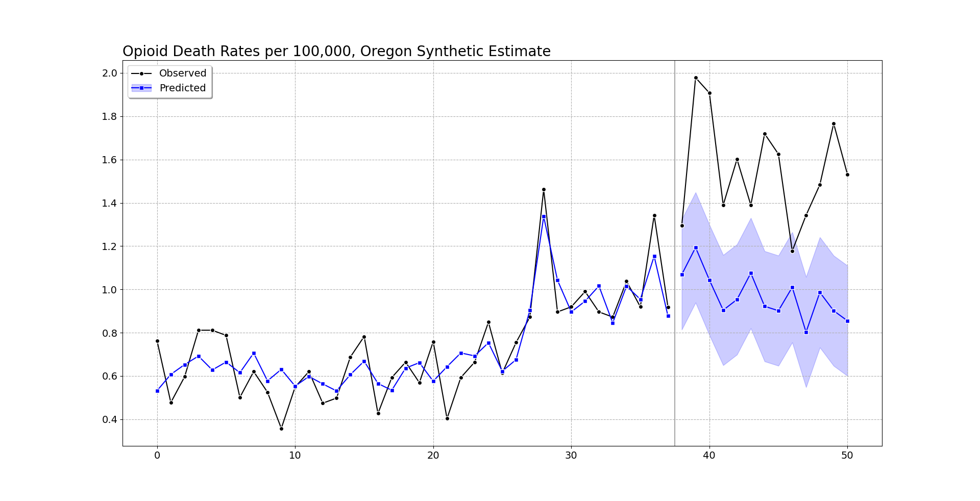
The fit prints out some metrics, root mean square error and R-squared, {'RMSE': 0.11589514406988406, 'RSquare': 0.7555976595776881}, here for this data. Which offhand looks pretty similar to the other papers (including Charles). And for the weights table, Oregon ends up being very sparse, just DC and West Virginia for controls (plus the intercept):

Group                       Coef
Intercept               0.156239
West Virginia           0.122256
District of Columbia    0.027378

The Lasso model here does constrain the coefficients to be positive, but does not force them to sum to 1 (plus it has an intercept). I think these are all good things (based on personal experience fitting functions). We can graph the fit for the historical data, plus the standard error of the lasso counterfactual forecasts in the post period:

# Default alpha level is 95% prediction intervals for counterfactual
oregon.graph('Opioid Death Rates per 100,000, Oregon Synthetic Estimate')

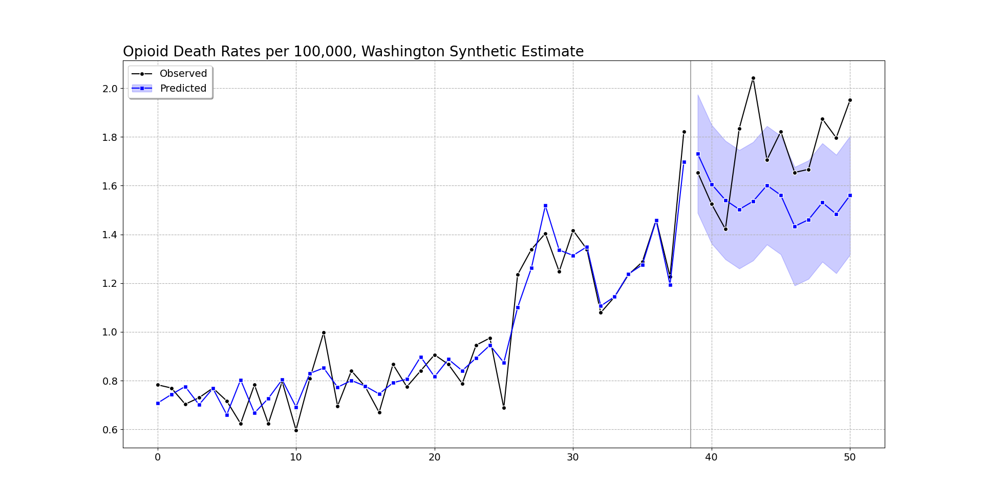
So you can see the pre-intervention fit is smoother than the monthly data in Oregon, but by eye seems quite reasonable (matches the recent increase and spikes post period 20, starts in Jan-2018, so starting in August-2019). (Perfect fits are good evidence of over-fitting in machine learning.)

Post intervention, after period 37, I do my graph a bit differently. Sometimes people are confused when the intervention starts in the graph, so here I literally split pre/post data lines, so there should be no confusion. I use the conformal inference approach to generate 95% prediction intervals around the counterfactual trend. You can see the counterfactual trend has slightly decreased, whereas Oregon increased and is volatile. Some of the periods are covered by the upper most intervals, but the majority are clearly outside.

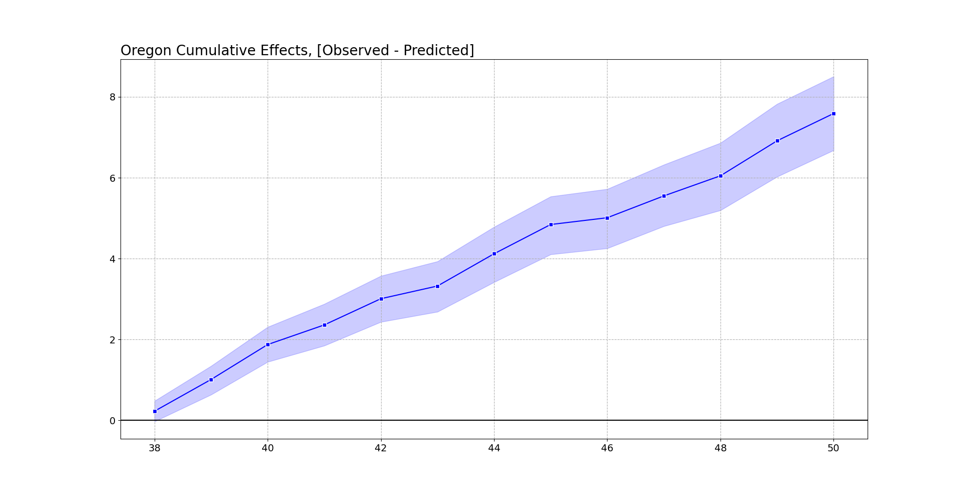
Now, besides the fitting function, one point I want to make is people should be looking at cumulative effects, not just instant effects. So Abadie has a global test, using placebos, that looks at the ratio of the pre-fit to post fit (squared errors), then does the placebo p-value based on that stat. This doesn’t have any consideration though for consistent above/below effects.

So pretend the Oregon observed was always within the 95% counterfactual error bar, but was always consistently at the top, around 0.1 increase in overdose deaths. Any single point-wise monthly inference fails to reject the null, but that overall always high pattern is not regular. You want to look at the entire curve, not just a single point. Random data won’t always be high or low, it should fluctuate around the counterfactual estimate.

To do this you look at the cumulative differences between the counterfactual and the observed (and take into account the error distribution for the counterfactuals).

# again default is 95% prediction intervals
oregon.cumgraph('Oregon Cumulative Effects, [Observed - Predicted]')

Accumulated over time, this is a total of over 7 per 100,000. With Oregon having a population of around 4.1 million, I estimate that the cumulative increased number of overdose deaths is around 290 in Oregon. This is pretty consistent with the results in Spencer (2023) as well (182 increased deaths over fewer months).

To do a global test with this approach, you just look at the very final time period and whether it covers 0. This is what I suggest in-place of the Abadie permutation test, as this has a point estimate and standard error, not just a discrete p-value.

We can do the same analysis for Washington as we did for Oregon. It shows increases, but many of the time periods are covered by the counter-factual 95% prediction interval.

But like I mentioned before, they are consistently high. So when you do the cumulative effects for Washington, they more clearly show increases over time (this data last date is March 2022).

At an accumulated 2.5 per 100,000, with a state population of around 7.7 million, it is around 190 additional overdose deaths in Washington. You can check out the notebook for more stats, Washington has a smaller suggested alpha, so the matched weights have several more states. But the pre-fit is better, and so it has smaller counterfactual intervals. All again good things compared to the default (placebo approach Washington/Oregon will pretty much have the same error distribution, so Washington being less volatile does not matter using that technique).

I get that Abadie is an MIT professor, published a bunch in JASA and well known econ journals, and that his approach is standard in how people do synthetic control analyses. My experience though over time has made me think the default approaches here are not very good – and the placebo approach where you fit many alternative analyses just compounds the issue. (If the fit is bad, it makes the placebo results more variable, causing outlier placebos. People don’t go and do a deep dive of the 49 placebos though to make sure they are well behaved.)

The lasso + conformal approach is how I would approach the problem from my experience fitting machine learning models. I can’t give perfect proof this is a better technique than the SGD + placebo approach by Adadie, but I can release code to at least make it easier for folks to use this technique.

References

  • De Biasi, A., & Circo, G. (2021). Capturing crime at the micro-place: a spatial approach to inform buffer size. Journal of Quantitative Criminology, 37, 393-418.

  • Joshi, S., Rivera, B. D., Cerdá, M., Guy, G. P., Strahan, A., Wheelock, H., & Davis, C. S. (2023). One-year association of drug possession law change with fatal drug overdose in Oregon and Washington. JAMA Psychiatry Online First.

  • Piza, E. L., Wheeler, A. P., Connealy, N. T., & Feng, S. Q. (2020). Crime control effects of a police substation within a business improvement district: A quasi‐experimental synthetic control evaluation. Criminology & Public Policy, 19(2), 653-684.

  • Spencer, N. (2023). Does drug decriminalization increase unintentional drug overdose deaths?: Early evidence from Oregon Measure 110. Journal of Health Economics, 91, 102798.

Some notes on synthetic control and Hogan/Kaplan

This will be a long one, but I have some notes on synthetic control and the back-and-forth between two groups. So first if you aren’t familiar, Tom Hogan published an article on how the progressive District Attorney (DA) in Philadelphia, Larry Krasner, in which Hogan estimates that Krasner’s time in office contributed to a large increase in the number of homicides. The control homicides are estimated using a statistical technique called synthetic control, in which you derive estimates of the trend in homicides to compare Philly to based on a weighted average of comparison cities.

Kaplan and colleagues (KNS from here on) then published a critique of various methods Hogan used to come up with his estimate. KNS provided estimates using different data and a different method to derive the weights, showing that Philadelphia did not have increased homicides post Krasner being elected. For reference:

Part of the reason I am writing this is if people care enough, you could probably make similar back and forths on every synth paper. There are many researcher degrees of freedom in the process, and in turn you can make reasonable choices that lead to different results.

I think it is worthwhile digging into those in more detail though. For a summary of the method notes I discuss for this particular back and forth:

  • Researchers determine the treatment estimate they want (counts vs rates) – solvers misbehaving is not a reason to change your treatment effect of interest
  • The default synth estimator when matching on counts and pop can have some likely unintended side-effects (NYC pretty much has to be one of the donor cities in this dataset)
  • Covariate balancing is probably a red-herring (so the data issues Hogan critiques in response to KNS are mostly immaterial)

In my original draft I had a note that this post would not be in favor of Hogan nor KNS, but in reviewing the sources more closely, nothing I say here conflicts with KNS (and I will bring a few more critiques of Hogan’s estimates that KNS do not mention). So I can’t argue much with KNS’s headline that Hogan’s estimates are fatally flawed.

An overview of synthetic control estimates

To back up and give an overview of what synth is for general readers, imagine we have a hypothetical city A with homicide counts 10 15 30, where the 30 is after a new DA has been elected. Is the 30 more homicides than you would have expected absent that new DA? To answer this, we need to estimate a counterfactual trend – what the homicide count would have been in a hypothetical world in which a new progressive DA was not elected. You can see the city homicides increased the prior two years, from 10 to 15, so you may say “ok, I expected it to continue to increase at the same linear trend”, in which case you would have expected it to increase to 20. So the counterfactual estimated increase in that scenario is observed - counterfactual, here 30 - 20 = 10, an estimated increase of 10 homicides that can be causally attributed to the progressive DA.

Social scientists tend to not prefer to just extrapolate prior trends from the same location into the future. There could be widespread changes that occur everywhere that caused the increase in city A. If homicide rates accelerated in every city in the country, even those without a new progressive DA, it is likely something else is causing those increases. So say we compare city A to city B, and city B had a homicide count trend during the same time period 10 15 35. Before the new DA in city A, cities A/B had the same pre-trend (both 10 15). The post time period City B increased to 35 homicides. So if using City B as the counterfactual estimate, we have the progressive DA reduced 5 homicides, again observed - counterfactual = 30 - 35 = -5. So even though city A increased, it increased less than we expected based on the comparison city B.

Note that this is not a hypothetical concern, it is pretty basic one that you should always be concerned about when examining macro level crime data. There has been national level homicide increases over the time period when Krasner has been in office (Yim et al, 2020, and see this blog post for updates. U.S. city homicide rates tend to be very correlated with each other (McDowall & Loftin, 2009).

So even though Philly has increased in homicide counts/rates when Krasner has been in office, the question is are those increases higher or lower than we would expect. That is where the synthetic control method comes in, we don’t have a perfect city B to compare to Philadelphia, so we create our own “synthetic” counter-factual, based on a weighted average of many different comparison cities.

To make the example simple, imagine we have two potential control cities and homicide trends, city C1 0 30 20, and city C2 20 0 30. Neither looks like a good comparison to city A that has trends 10 15 30. But if we do a weighted average of C1 and C2, with the weights 0.5 for each city, when combined they are a perfect match for the two pre-treatment periods:

C0  C1 Average cityA
 0  20   10     10
30   0   15     15
20  30   25     30

This is what the synthetic control estimator does, although instead of giving equal weights it determines the optimal weights to match the pre-treatment time period given many potential donors. In real data for example C0 and C1 may be given weights of 0.2 and 0.8 to give the correct balance based on the prior to treatment time periods.

The fundamental problem with synth

The rub with estimating the synth weights is that there is no one correct way to estimate the weights – you have more numbers to estimate than data points. In the Hogan paper, he has 5 pre time periods, 2010-2014, and he has 82 potential donors (99 other of the largest cities in the US minus 17 progressive prosecutors). So you need to learn 82 numbers (the weights) based on 5 data points.


Side note: you can also consider matching on covariates additional data points, although I will go into more detail on how matching on covariates is potentially a red-herring. Hogan I think uses an additional 5*3=15 time varying points (pop, cleared homicide, homicide clearance rates), and maybe 3 additional time invariant (median income, 1 prosecutor categorization, and homicides again!). So maybe has 5 + 15 + 3 = 23 data points to match on (so same fundamental problem, 23 numbers to learn 82 weights). I am just going to quote the full passage on Hogan (2022a) here where he discusses covariate matching:

The number of homicides per year is the dependent variable. The challenge with this synthetic control model is to use variables that both produce parallel trends in the pre-period and are sufficiently robust to power the post-period results. The model that ultimately delivered the best fit for the data has population, cleared homicide cases, and homicide clearance rates as regular predictors. Median household income is passed in as the first special predictor. The categorization of the prosecutors and the number of homicides are used as additional special predictors. For homicides, the raw values are passed into the model. Abadie (2021) notes that the underlying permutation distribution is designed to work with raw data; using log values, rates, or other scaling techniques may invalidate results.

This is the reason why replication code is necessary – it is very difficult for me to translate this to what Hogan actually did. “Special” predictors here are code words for the R synth package for time-invariant predictors. (I don’t know based on verbal descriptions how Hogan used time-invariant for the prosecutor categorization for example, just treats it as a dummy variable?) Also only using median income – was this the only covariate, or did he do a bunch of models and choose the one with the “best” fit (it seems maybe he did do a search, but doesn’t describe the search, only the end selected result).

I don’t know what Hogan did or did not do to fit his models. The solution isn’t to have people like me and KNS guess or have Hogan just do a better job verbally describing what he did, it is to release the code so it is transparent for everyone to see what he did.


So how do we estimate those 82 weights? Well, we typically have restrictions on the potential weights – such as the weights need to be positive numbers, and the weights should sum to 1. These are for a mix of technical and theoretical reasons (having the weights not be too large can reduce the variance of the estimator is a technical reason, we don’t want negative weights as we don’t think there are bizzaro comparison areas that have opposite world trends is a theoretical one).

These are reasonable but ultimately arbitrary – there are many different ways to accomplish this weight estimation. Hogan (2022a) uses the R synth package, KNS use a newer method also advocated by Abadie & L’Hour (2021) (very similar, but tries to match to the closest single city, instead of weights for multiple cities). Abadie (2021) lists probably over a dozen different procedures researchers have suggested over the past decade to estimate the synth weights.

The reason I bring this up is because when you have a problem with 82 parameters and 5 data points, the problem isn’t “what estimator provides good fit to in-sample data” – you should be able to figure out a estimator that accomplishes good in-sample fit. The issue is whether that estimator is any good out-of-sample.

Rates vs Counts

So besides the estimator used, you can break down 3 different arbitrary researcher data decisions that likely impact the final inferences:

  • outcome variable (homicide counts vs homicide per capita rates)
  • pre-intervention time periods (Hogan uses 2010-2014, KNS go back to 2000)
  • covariates used to match on

Lets start with the outcome variable question, counts vs rates. So first, as quoted above, Hogan cites Abadie (2021) for saying you should prefer counts to rates, “Abadie (2021) notes that the underlying permutation distribution is designed to work with raw data; using log values, rates, or other scaling techniques may invalidate results.”

This has it backwards though – the researcher chooses whether it makes sense to estimate treatment effects on the count scale vs rates. You don’t goal switch your outcome because you think the computer can’t give you a good estimate for one outcome. So imagine I show you a single city over time:

        Y0    Y1    Y2
Count   10    15    20
Pop   1000  1500  2000

You can see although the counts are increasing, the rate is consistent over the time period. There are times I think counts make more sense than rates (such as cost-benefit analysis), but probably in this scenario the researcher would want to look at rates (as the shifting denominator is a simple explanation causing the increase in the counts).

Hogan (2022b) is correct in saying that the population is not shifting over time in Philly very much, but this isn’t a reason to prefer counts. It suggests the estimator should not make a difference when using counts vs rates, which just points to the problematic findings in KNS (that making different decisions results in different inferences).

Now onto the point that Abadie (2021) says using rates is wrong for the permutation distribution – I don’t understand what Hogan is talking about here. You can read Abadie (2021) for yourself if you want. I don’t see anything about the permutation inferences and rates.

So maybe Hogan mis-cited and meant another Abadie paper – Abadie himself uses rates for various projects (he uses per-capita rates in the 2021 cited paper, Abadie et al., (2010) uses rates for another example), so I don’t think Abadie thinks rates are intrinsically problematic! Let me know if there is some other paper I am unaware of. I honestly can’t steelman any reasonable source where Hogan (2022a) came up with the idea that counts are good and rates are bad though.

Again, even if they were, it is not a reason to prefer counts vs rates, you would change your estimator to give you the treatment effect estimate you wanted.


Side note: Where I thought the idea with the problem with rates was going (before digging in and not finding any Abadie work actually saying there is issues with rates), was increased variance estimates with homicide data. So Hogan (2022a) estimates for the synth weights Detroit (0.468), New Orleans (NO) (0.334), and New York City (NYC) (0.198), here are those cities homicide rates graphed (spreadsheet with data + notes on sources).

You can see NO’s rate is very volatile, so is not a great choice for a matched estimator if using rates. (I have NO as an example in Wheeler & Kovandzic (2018), that much variance though is fairly normal for high crime not too large cities in the US, see Baltimore for example for even more volatility.) I could forsee someone wanting to make a weighted synth estimator for rates, either make the estimator a population weighted average, or penalize the variance for small rates. Maybe you can trick microsynth to do a pop weighted average out of the box (Robbins et al., 2017).


To discuss the Hogan results specifically, I suspect for example NYC being a control city with high weight in the Hogan paper, which superficially may seem good (both large cities on the east coast), actually isn’t a very good control area considering the differences in homicide trends (either rates or counts) over time. (I am also not so sure about describing NYC and New Orlean’s as “post-industrial” by Hogan (2022a) either. I mean this is true to the extent that all urban areas in the US are basically post-industrial, but they are not rust belt cities like Detroit.)

Here is for reference counts of homicides in Philly, Detroit, New Orleans, and NYC going back further in time:

NYC is such a crazy drop in the 90s, lets use the post 2000 data that KNS used to zoom in on the graph.

I think KNS are reasonable here to use 2000 as a cut point – it is more empirical based (post crime drop), in which you could argue the 90’s are a “structural break”, and that homicides settled down in most cities around 2000 (but still typically had a gradual decline). Given the strong national homicide trends though across cities (here is an example I use for class, superimposing Dallas/NYC/Chicago), I think using even back to the 60’s is easily defensible (moreso than limiting to post 2010).

It depends on how strict you want to be whether you consider these 3 cities “good” matches for the counts post 2010 in Hogan’s data. Detroit seems a good match on the levels and ok match on trends. NO is ok match on trends. NYC and NO balance each other in terms of matching levels, NYC has steeper declines though (even during the 2010-2014 period).

The last graph though shows where the estimated increases from Hogan (2022a) come from. Philly went up and those 3 other cities went down from 2015-2018 (and had small upward bumps in 2019).

Final point in this section, careful what you wish for with sparse weights and sum to 1 in the synth estimate. What this means in practice when using counts and matching on pop size, is that you need lines that are above and below Philly on those dimensions. So to get a good match on Pop, it needs to select at least one of NYC/LA/Houston (Chicago was eliminated due to having a progressive prosecutor). To get a good match on homicide counts, it also has to pick at least one city with more homicides per year as well, which limits the options to New York and Detroit (LA/Houston have lower overall homicide counts to Philly).

You can’t do the default Abadie approach for NYC for example (matching on counts and pop) – it will always have a bad fit when using comparison cities in the US as the donor pool. You either need to allow the weights to sum to larger than 1, or the lasso approach with an intercept is another option (so you only match on trend, not levels).

Because matching on trends is what matters for proper identification in this design, not levels, this is all sorts of problematic with the data at hand. (This is also a potential problem with the KNS estimator as well. KNS note though they don’t trust their estimate offhand, their reasonable point is that small changes in the design result in totally different inferences.)

Covariates and Out of Sample Estimates

For sake of argument, say I said Hogan (2022a) is bunk, because it did not match on “per-capita annual number of cheese-steaks consumed”. Even though on its face this covariate is non-sense, how do you know it is non-sense? In the synthetic control approach, there is no empirical, falsifiable way to know whether an covariate is a correct one to match on. There is no way to know that median income is better than cheese-steaks.

If you wish for more relevant examples, Philly has obviously more issues with street consumption of opioids than Detroit/NOLA/NYC, which others have shown relationships to homicide and has been getting worse over the time Krasner has been in office (Rosenfeld et al., 2023). (Or more simply social disorganization is the more common way that criminologists think about demographic trends and crime.)

This uncertainty in “what demographics to control for” is ok though, because matching on covariates is neither necessary nor sufficient to ensure you have estimated a good counter-factual trend. Abadie in his writings intended for covariates to be more like fuzzy guide-rails – they are qualitative things that you think the comparison areas should be similar on.

Because there are effectively an infinite pool of potential covariates to match on, I prefer the approach of simply limiting the donor pool apriori – Hogan limiting to large cities is on its face reasonable. Including other covariates is not necessary, and does not make the synth estimate more or less robust. Whether KNS used good or bad data for covariates is entirely a red-herring as to the quality of the final synth estimate.


Side note: I don’t doubt that Hogan got advice to not share data and code. It is certainly not normative in criminology to do this. It creates a bizarre situation though, in which someone can try to replicate Hogan by collating original sources, and then Hogan always comes back and says “no, the data you have are wrong” or “the approach you did is not exactly replicating my work”.

I get that collating data takes a long time, and people want to protect their ability to publish in the future. (Or maybe just limit their exposure to their work being criticized.) It is blatantly antithetical to verifying the scientific integrity of peoples work though.

Even if Hogan is correct though in the covariates that KNS used are wrong, it is mostly immaterial to the quality of the synth estimates. It is a waste of time for outside researchers to even bother to replicate Hogan’s covariates he used.


So I used the idea of empirical/falsifiable – can anything associated with synth be falsifiable? Why yes it can – the typical approach is to do some type of leave-one-out estimate. It may seem odd because synth estimates an underlying match to a temporal trend in the treated location, but there is nothing temporal about the synth estimate. You could jumble up the years in the pre-treatment sample and still would estimate the same weights.

Because of this, you can leave-a-year-out in the pre-treatment time period, run your synth algorithm, and then predict that left out year. A good synth estimator will be close to the observed value for the out of sample estimates in the pre-treated time period (and as a side bonus, you can use that variance estimate to estimate the error in the post-trend years).

That is a relatively simple way to determine if the Hogan 5 year vs KNS 15 year time periods are “better” synth controls (my money is on KNS for that one). Because Hogan has not released data/code, I am not going to go through that trouble. As I said in the side note earlier, I could try to do that, and Hogan could simply come back and say “you didn’t do it right”.

This also would settle the issue of “over-fit”. You actually cannot just look at the synth weights, and say that if they are sparse they are not over-fit and if not sparse are over-fit. So for reference, you have in Hogan essentially fitting 82 weights based on 5 datapoints, and he identified a fit with 3 non-zero weights. Flip this around, and say I had 5 data points and fit a model with 3 parameters, it is easily possible that the 3 parameter model in that scenario is overfit.

Simultaneously, it is not necessary to have a sparse weights matrix. Several alternative methods to estimate synth will not have sparse weights (I am pretty sure Xu (2017) will not have sparse weights, and microsynth estimates are not sparse either for just two examples). Because US cities have such clear national level trends, a good estimator in this scenario may have many tiny weights (where good here is low bias and variance out of sample). Abadie thinks sparse weights are good to make the model more interpretable (and prevent poor extrapolation), but that doesn’t mean by default a not sparse solution is bad.

To be clear, KNS admit that their alternative results are maybe not trustworthy due to not sparse weights, but this doesn’t imply Hogan’s original estimates are themselves “OK”. I think maybe a correct approach with city level homicide rate data will have non-sparse weights, due to the national level homicide trend that is common across many cities.

Wrapping Up

If Crim and Public Policy still did response pieces maybe I would go through that trouble of doing the cross validation and making a different estimator (although I would unlikely be an invited commenter). But wanted to at least do this write up, as like I said at the start I think you could do this type of critique with the majority of synth papers in criminology being published at the moment.

To just give my generic (hopefully practical) advice to future crim work:

  • don’t worry about matching on covariates, worry about having a long pre-period
  • the default methods you need to worry about if you have enough “comparable” units – this is in terms of levels, not just trends
  • the only way to know the quality of the modeling procedure in synth is to do out of sample estimates.

Bullet points 2/3 are perhaps not practical – most criminologists won’t have the capability to modify the optimization procedure to the situation at hand (I spent a few days trying without much luck to do my penalized variants suggested, sharing so others can try out themselves, I need to move onto other projects!) Also takes a bit of custom coding to do the out of sample estimates.

For many realistic situations though, I think criminologists need to go beyond just point and clicking in software, especially for this overdetermined system of equations synthetic control scenario. I did a prior blog post on how I think many state level synth designs are effectively underpowered (and suggested using lasso estimates with conformal intervals). I think that is a better default in this scenario as well compared to the typical synth estimators, although you have plenty of choices.

Again I had initially written this as trying to two side the argument, and not being for or against either set of researchers. But sitting down and really reading all the sources and arguments, KNS are correct in their critique. Hogan is essentially hiding behind not releasing data and code, and in that scenario can make an endless set of (ultimately trivial) responses of anyone who publishes a replication/critique.

Even if some of the the numbers KNS collated are wrong, it does not make Hogan’s estimates right.

References

Using regularization to generate synthetic controls and conformal prediction for significance tests

When viewing past synthetic control results, one of things that has struck me is that the matching of the pre-trends is really good — almost too good in many cases (appears to be fitting to noise, although you may argue that is a feature in terms of matching exogenous shocks). For example, if you end up having a pre-treatment series of 10 years, and you have a potential donor pool the size of 30, you could technically pick 10 of them at random, fit a linear regression predicting the 10 observations in the treated unit, based on 10 covariates of the donor pool outcomes over the same pre time period, and get perfect predictions (ignoring the typical constraints one places on the coefficients).

So how do we solve that problem? One solution is to use regularized regression results (e.g. ridge regression, lasso), when the number of predictors is greater than the number of observations. So I can cast the matching procedure into a regression problem to generate the weights. Those regression procedures are typically used for forecasting, but don’t have well defined standard errors, and so subsequently are typically only used for point forecasts. One way to make inferences though is to generate the synthetic weights (here using lasso regression), and then use conformal prediction intervals to do our hypothesis testing of counterfactual trends.

Here I walk through an example using state panel crime data in R, full code and data can be downloaded here.

A Synthetic Control Example

So first, these are the packages we need to replicate the results. conformalInference is not on CRAN yet, so use devtools to install it.

#library(devtools)
#install_github(repo="ryantibs/conformal", subdir="conformalInference")
library(conformalInference)
library(glmnet)
library(Synth)

Then I have prepped a nice state panel dataset of crime rates and counts from 1960 through 2014. I set a hypothetical treatment start year in 2005 just so I have a nice 10 years post data for illustration. That is a pretty good length pre-panel though, and a good number of potential donors.

MyDir <- "C:\\Users\\axw161530\\Desktop\\SynthIdeas"
setwd(MyDir)

TreatYear <- 2005

LongData <- read.csv("CrimeStatebyState_Edited.csv")
summary(LongData)

Next I prep my data, currently it is in long panel format, but I need it in wide format to fit the regression equations I want. I am just matching on violent crime rates here. I take out NY, as it is missing a few years of data. (This dataset also includes DC.) Then I split it up into my pre intervention and post intervention set.

#Changing the data to wide for just the violent offenses
wide <- LongData[,c('State','Year','Violent.Crime.rate')]
names(wide)[3] <- 'VCR'
wide <- reshape(wide, idvar="Year", timevar="State", direction="wide")
summary(wide)
#Take out NY because of NAs
wide <- wide[,c(1:33,35:52)]

wide_pre <- as.matrix(wide[wide$Year < TreatYear,])
wide_post <- as.matrix(wide[wide$Year >= TreatYear,])

Now onto the good stuff, we can estimate our lasso regression using the pre-data to get our weights. This constrains the coefficients to be positive and below 1. But does not have the constraint they sum to 1. I just choose Alabama as an example treated unit — I intentionally chose a state and year that should not have any effects for illustration and to check the coverage of my technique vs more traditional analyses.

You can see in my notes this is different than traditional synth in that it has an intercept as well. I was surprised, but the predictions in sample were really bad without the intercept no matter how I sliced it.

res <- glmnet(x=wide_pre[,3:51],y=wide_pre[,2],family="gaussian",
       lower.limits=0,upper.limits=1,intercept=TRUE,standardize=FALSE,
       alpha=1) #need the intercept, predictions suck otherwise

Even though this does not constrain the coefficients to sum to 1, it ends up with weights really close to that ideal anyway (sum of the non-intercept coefficients is just over 1.01). When I use crossvalidation it does not choose weights that sum to unity, but in sample the above code and the cv.glmnet are really similar in terms of predictions.

co_ridge <- as.matrix(coef(res))
fin <- co_ridge[,"s99"]
active <- fin[fin > 0] #Does not include intercept

If you print active we then have for our state weights (and the intercept is pretty tiny, -22). So not quite sure why eliminating the intercept was causing such problems in this example. So North Carolina just sneaks in, but otherwise the synthetic control is a mix of Arkansas, California, Kentucky, and Texas. The intercept is just a level shift, so we are still matching curves otherwise, so that does not bother me very much.

VCR.AR 0.2078156362
VCR.CA 0.1201658279
VCR.IL 0.1543015666
VCR.KY 0.2483613907
VCR.NC 0.0002896238
VCR.TX 0.2818272850

If we look at our predictions for the pre-time period, Alabama had the typical crime path, with a big raise going into the early 90’s and then a fall afterward (black line), and our in-sample predictions from the lasso regression are decent.

pre_pred <- predict(res,newx=wide_pre[,3:51],s=min(res$lambda)) #for not cv results

plot(wide_pre[,1],wide_pre[,2],type='l',xlab='',ylab='Violent Crime Rate per 100,000')
points(wide_pre[,1],pre_pred,bg='red',pch=21) #Not too shabby
legend(1960,800,legend=c("Observed Albama","Predicted"),col=c("black","black"), pt.bg=c("black","red"), lty=c(1,NA), pch=c(NA,21))

Now to evaluate post intervention, we are going to generate conformal prediction intervals using a jackknife approach. Basically doing all the jazz of above, but leaving one pre year out at a time, and trying to predict Alabama’s violent crime rate for that left out year. Repeat that same process for all prior years, and we can get a calculation of the standard error of our prediction. Then apply that standard error to future years, so we can tell if the observed trend is different than the counterfactual we estimated (given the counterfactual has errors). I generate both 90% prediction intervals, as well as 99% prediction intervals.

train_fun <- function(x, y, out=NULL){
  return( glmnet(x,y,alpha=1,standardize=FALSE,intercept=TRUE,nlambda=100,
                lower.limits=0,upper.limits=1,family="gaussian")
  )
}

pred_fun = function(out, newx) {
    return(predict(out, newx, s=min(out$lambda)))
}

limits_10 <- conformal.pred.jack(x=wide_pre[,3:51],y=wide_pre[,2],x0=wide_post[,3:51],
                                 train.fun=train_fun,predict.fun=pred_fun,alpha=0.10,
                                 verbose=TRUE)

limits_01 <- conformal.pred.jack(x=wide_pre[,3:51],y=wide_pre[,2],x0=wide_post[,3:51],
               train.fun=train_fun,predict.fun=pred_fun,alpha=0.01,
               verbose=TRUE)

plot(wide_post[,1],wide_post[,2],type='l',ylim=c(150,650),xlab='',ylab='Violent Crime Rate per 100,000')
points(wide_post[,1],post_pred,bg='red',pch=21)
lines(wide_post[,1],limits_10$lo,col='grey')
lines(wide_post[,1],limits_10$up,col='grey')
lines(wide_post[,1],limits_01$lo,col='grey',lwd=3)
lines(wide_post[,1],limits_01$up,col='grey',lwd=3)
legend("topright",legend=c("Observed Albama","Predicted","90% Pred. Int.","99% Pred. Int."),cex=0.7,
       col=c("black","black","grey","grey"), pt.bg="red", lty=c(1,NA,1,1), pch=c(NA,21,NA,NA), lwd=c(1,1,1,3))

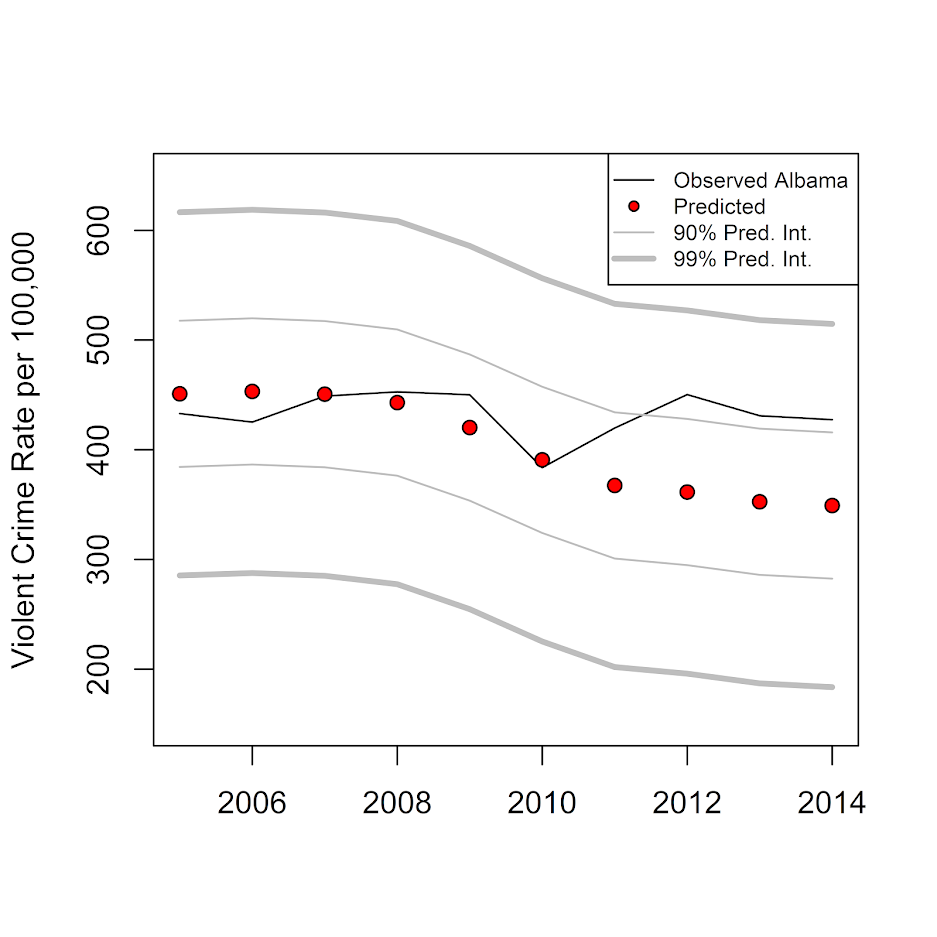
Then at the end of the above code snippet I made a plot. Black line is observed for Alabama from 05-14. Red dots are the estimated counterfactual based on the pre-weights. The lighter grey lines are then the prediction intervals. So we can see it is just outside the 90% intervals 3 times in the later years (would only expect 1 time), but all easily within the 99% intervals.

Note these are prediction intervals, not confidence intervals. Thinking about it I honestly don’t know whether we want prediction or confidence intervals in this circumstance, but prediction will be wider.

So this approach just matches on the pre-treated same outcome observations. To match on additional covariates, you can add them in as rows into the pre-treatment dataset (although you would want to normalize the values to a similar mean and standard deviation as the pre-treated outcome series).

You may also add in other covariates, like functions of time (although this changes the nature of the identification). So for example say you incorporate a linear and quadratic trend in time, and lasso only chooses those two time factors and no control areas. You are doing something more akin to interrupted time series analysis at that point (the counterfactual is simply based on your estimate of the pre-trend). Which I think is OK sometimes, but is quite different than using control areas to hopefully capture random shocks.

Comparing to Traditional Synth results

To see whether my error intervals are similar to the placebo approach, I used the old school synth R package. It isn’t 100% comparable, as it makes you match on at least one covariate, so here I choose to also match on the average logged population over the pre-treatment period.

#NY is missing years
LongData_MinNY <- LongData[as.character(LongData$State) != "NY",c("State","Year","Violent.Crime.rate","Population")]
LongData_MinNY$StateNum <- as.numeric(LongData_MinNY$State)
LongData_MinNY$State <- as.character(LongData_MinNY$State)
LongData_MinNY$LogPop <- log(LongData_MinNY$Population)    

state_nums <- unique(LongData_MinNY$StateNum)
    
dataprep.out <- dataprep(foo = LongData_MinNY,
                         dependent = "Violent.Crime.rate",
                         predictors = c("LogPop"),
                         unit.variable = "StateNum",
                         unit.names.variable = "State",
                         time.variable = "Year",
                         treatment.identifier = 2,
                         controls.identifier = state_nums[!state_nums %in% 2],
                         time.optimize.ssr = 1960:(TreatYear-1),
                         time.predictors.prior = 1960:(TreatYear-1),
                         time.plot = 1960:2014
                         )

synth_res <- synth(dataprep.out)
synth_tables <- synth.tab(dataprep.res = dataprep.out, synth.res = synth_res)
synth_tables$tab.w #a bunch of little weights across the board
path.plot(synth.res = synth_res, dataprep.res = dataprep.out, tr.intake=TreatYear,Xlab='',Ylab='Violent Crime Rate per 100,000',
      Legend=c("Alabama","Synthetic Control"), Legend.position=c("topleft"))

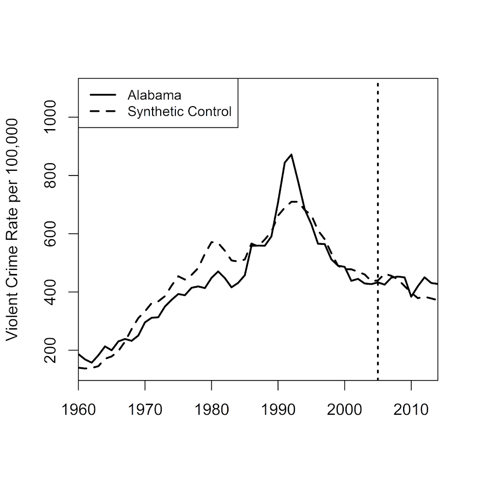
Looking at the weights, it is a bunch of little ones for many different states. Looking at the plot, it doesn’t appear to be any better fit than the lasso approach.

And then I just do the typical approach and use placebo checks to do inference. I loop over my 49 placebos (-1 state for NY, but +1 state because this list includes DC).

#Dataframes to stuff the placebos check results into
Predicted <- data.frame(dataprep.out$Y0plot %*% synth_res$solution.w)
names(Predicted) <- "TreatPred"

Pred_MinTreat <- data.frame(TreatPred = Predicted$TreatPred - LongData_MinNY[LongData_MinNY$StateNum == 2,"Violent.Crime.rate"])

#Now I just need to loop over the other states and collect their results for the placebo tests

placebos <- state_nums[!state_nums %in% 2]
for (i in placebos){
  dataprep.plac <- dataprep(foo = LongData_MinNY,
                           dependent = "Violent.Crime.rate",
                           predictors = c("LogPop"),
                           unit.variable = "StateNum",
                           unit.names.variable = "State",
                           time.variable = "Year",
                           treatment.identifier = i,
                           controls.identifier = state_nums[!state_nums %in% i],
                           time.optimize.ssr = 1960:(TreatYear-1),
                           time.predictors.prior = 1960:(TreatYear-1),
                           time.plot = 1960:2014
  )
  synth_resP <- synth(dataprep.plac)
  synth_tablesP <- synth.tab(dataprep.res = dataprep.plac, synth.res = synth_resP)
  nm <- paste0("S.",i)
  Predicted[,nm] <- dataprep.plac$Y0plot %*% synth_resP$solution.w
  Pred_MinTreat[,nm] <- Predicted[,nm] - LongData_MinNY[LongData_MinNY$StateNum == i,"Violent.Crime.rate"]
}

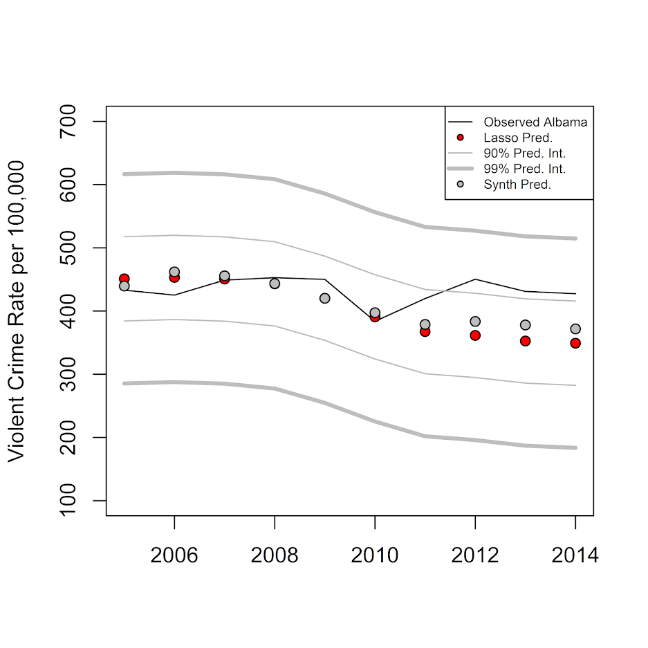
If you look at the synth estimates for Alabama (grey circles), they are almost exactly the same as the lasso predictions (red circles), even though the weights are very different.

PredRecent <- Predicted[1960:2014 >= TreatYear,]
DiffRecent <- Pred_MinTreat[1960:2014 >= TreatYear,]

plot(wide_post[,1],wide_post[,2],type='l',ylim=c(100,700),xlab='',ylab='Violent Crime Rate per 100,000')
points(wide_post[,1],post_pred,bg='red',pch=21)
lines(wide_post[,1],limits_10$lo,col='grey')
lines(wide_post[,1],limits_10$up,col='grey')
lines(wide_post[,1],limits_01$lo,col='grey',lwd=3)
lines(wide_post[,1],limits_01$up,col='grey',lwd=3)
points(wide_post[,1],PredRecent$TreatPred,bg='grey',pch=21)
legend("topright",legend=c("Observed Albama","Lasso Pred.","90% Pred. Int.","99% Pred. Int.","Synth Pred."),cex=0.6,
       col=c("black","black","grey","grey"), pt.bg=c(NA,"red",NA,NA,"grey"), lty=c(1,NA,1,1,NA), pch=c(NA,21,NA,NA,21), lwd=c(1,1,1,3,1))

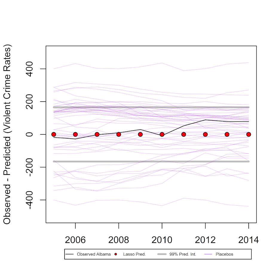
But when we look at variation in our placebo results (thin, purple lines), they are much wider than our conformal prediction intervals.

plot(wide_post[,1],wide_post[,2]-post_pred,type='l',ylim=c(-500,500),xlab='',ylab='Observed - Predicted (Violent Crime Rates)')
points(wide_post[,1],post_pred-post_pred,bg='red',pch=21)
lines(wide_post[,1],limits_01$lo-post_pred,col='grey',lwd=3)
lines(wide_post[,1],limits_01$up-post_pred,col='grey',lwd=3)

for (i in 2:ncol(PredRecent)){
  lines(wide_post[,1],DiffRecent[,i],col='#9400D340',lwd=0.5)
}

legend(x=2005.5,y=-700,legend=c("Observed Albama","Lasso Pred.","99% Pred. Int.","Placebos"),
       col=c("black","black","grey",'#9400D3'), pt.bg=c(NA,"red",NA,NA), lty=c(1,NA,1,1), 
       pch=c(NA,21,NA,NA), lwd=c(1,1,3,0.5), xpd=TRUE, horiz=TRUE, cex = 0.45)

So I was hoping they would be the same (conformal would cover the placebo at the expected rate), but alas they are not. So I’m not sure if my conformal intervals are too small, or the placebo checks are extra noisy. I can’t prove it, but I suspect the placebo checks are somewhat noisy, mainly because there will always be some intervention that is idiosyncratic to specific donors over long periods of time that makes them no longer good counterfactuals. This seems especially true if you consider predictions further out from the treatment year. Although I find the logic of the placebo checks pretty convincing, so I am somewhat torn.

Since we have in this example 49 donors, the two-tailed p-value for being outside the placebos would be 2/(49+1)=0.04. Here we would need an intervention that either increased violent crime rates by plus/minus 400 per 100,000, pretty much an impossible standard given a baseline of only 400 crimes per 100,000 as of 2004. The 99% conformal intervals are still pretty wide, with an increase/decrease of about 150 violent crimes per 100,000 needed to be a significant change. The two lines way outside 400 happen to be Alaska and Wyoming, not DC, so maybe a tiny population state results in higher volatility problem. But besides them there are a bunch of placebo states around plus/minus 300 as well.

So caveat emptor if you want to use this idea in your own work, I don’t know if my suggestion is good or bad. Here it suggests its more diagnostic (smaller intervals) than the placebo checks, and isn’t limited by the number of potential donors in setting the alpha level for your tests (e.g. if you only have 10 potential donors your placebo checks are only 90% intervals).

Since this is just one example, there are a few things I would need to know before recommending it more generally. One is that it may not work with smaller pre time series and/or a smaller donor pool. (Not sure of any better way of checking than via a ton of different simulations.)

More general notes

Doing some more lit review while preparing this post, I appear to be like 15th in line to suggest this approach (so don’t take it as novel). In terms of using the lasso to estimate the synth weights, it seems Susan Athey and colleagues proposed something similar in addition to using other machine learning techniques. Also see Amjad et al. 2018 in the Journal of Machine Learning, and this workshop by Alex Hollingsworth and Coady Wing. I am not even the first one to think to use conformal prediction intervals apparently, see this working paper (Chernozhukov, Wuthrich, and Zhu, 2019) posted just a few weeks prior.

There is another R package, gsynth, that appears to solve the problem of p > n via a variable reduction technique (Xu, 2017). Xu also discusses how incorporating more information is really making different identification assumptions. So again just getting good predictions/minimizing the in-sample mean square error is not necessarily the right approach to get correct causal inferences.

Just a blog post, so again can’t say if this is an improvement over other work offhand. This is just illustrative that the bounds for the conformal prediction may be smaller than the typical permutation based approach. Casting it as a regression problem I intuitively grok more, and think opens up more possibilities. For example, you may want to use binomial logistic models instead of linear for the fitting process (so takes into account more volatility for smaller population states).