Setting conda environments in crontab

I prefer using conda environments to manage python (partly out of familiarity). Conda is a bit different though, in that it is often set up locally for a users environment, and not globally as an installed package. This makes using it in bash scripts (or on windows .bat files) somewhat tricky.

So first, in a Unix environment, you can choose where to install conda. Then it adds into your .bashrc profile a line that looks something like:

__conda_setup="$('/mnt/miniconda/bin/conda' 'shell.bash' 'hook' 2> /dev/null)"
if [ $? -eq 0 ]; then
    eval "$__conda_setup"
else
    if [ -f "/lib/miniconda/etc/profile.d/conda.sh" ]; then
        . "/lib/miniconda/etc/profile.d/conda.sh"
    else
        export PATH="/lib/miniconda/bin:$PATH"
    fi
fi
unset __conda_setup

Where here I installed it in /lib. This looks complicated at first glance, but really all it is doing is sourcing the conda.sh script and pre-pending miniconda/bin to the path.

Now to be able to run python code on a regular basis in crontab, I typically have crontab run shell scripts, not python directly, so say that is a file run_code.sh:

#!/bin/sh

# Example shell script
time_start=`date +%Y_%m_%d_%H:%M`
echo "Begin script $time_start"

# Sourcing conda
source /lib/miniconda/etc/profile.d/conda.sh

# activating your particular environment
# may need to give full path, not just the name
conda activate your_env

# if you want to check environment
python --version

# you may need to change the directory at this point
echo "Current Directory is set to $PWD"
cd ...

# run your python script
log_file="main_log_$time_start.txt"
python main.py > $log_file 2>&1

I do not need to additionally add to the path in my experience, just sourcing that script is sufficient. Now edit your crontab (via crontab -e and using the VI editor) to look something like:

20 3 * * * bash /.../run_code.sh >> /.../cron_log.txt 2>&1

Where /.../ is shorthand for an explicit path to where the shell script and cron log lives.

This will run the shell script at 3:20 AM and append all of the stuff. In crontab if you just want conda available for all jobs, I believe you could do something like:

# global environment, can set keys, run scripts
some_key=abc
export some_key
source /lib/miniconda/etc/profile.d/conda.sh

20 3 * * * bash /.../run_code.sh >> /.../cron_log.txt 2>&1

But I have not tested this. If this works, you could technically run python scripts directly, but if you need to change environments you would still really need a shell script. It is good to know to be able to inject environment variables though in the crontab environment.

About the only other gotcha is file permissions. Sometimes in business applications you have service accounts running things, so a crontab as the service account. And you just need to make sure to chmod files so the service account has appropriate permissions. I tend to have more issues with log files by accident than I do conda environments though.

Note for people setting up scheduled jobs on windows, I have an example of setting a conda environment in a windows bat file.

Additional random pro-tip with conda environments while I am here – if you by default don’t want conda to set up new environments in your home directory (due to space or production processes), as well as download packages into a different cache location, you can do something like:

conda config --add pkgs_dirs /lib/py_packages
conda config --add envs_dirs /lib/conda_env

Have had issues in the past of having too much junk in home.

Make more money

So I enjoy Ramit Sethi’s Netflix series on money management – fundamentally it is about money coming in and money going out and the ability to balance a budget. On occasion I see other budget coaches focus on trivial expenses (the money going out) whereas for me (and I suspect the majority of folks reading this blog with higher degrees and technical backgrounds) you should almost always be focused on finding a higher paying job.

Lets go with a common example people use as unnecessary discretionary spending – getting a $10 drink at Starbucks every day. If you do this, over the course of a 365 day year, you will have spent $3650 additional dollars. If you read my blog about coding and statistics and that expense bothers you, you are probably not making as much money as you should be.

Ramit regularly talks about asking for raises – I am guessing most people reading this blog if you got a raise it would be well over that Starbucks expense. But part of the motivation to write this post is in reference to formerly being a professor. I think many criminal justice (CJ) professors are underemployed, and should consider better paying jobs. I am regularly starting to see public sector jobs in CJ that have substantially better pay than being a professor. This morning was shared a position for an entry level crime analyst at the Reno Police Department with pay range from $84,000 to $102,000:

The low end of that starting pay range is competitive with the majority of starting assistant professor salaries in CJ. You can go check out what the CJ professors at Reno make (which is pretty par for the course for CJ departments in the US) in comparison. If I had stayed as a CJ professor, even with moving from Dallas to other universities and trying to negotiate raises, I would be lucky to be making over $100k at this point in time. Again, that Reno position is an entry level crime analyst – asking for a BA + 2 years of experience or a Masters degree.

Private sector data science jobs in comparison, in DFW area in 2019 entry level were often starting at $105k salary (based on personal experience). You can check out BLS data to examine average salaries in data science if you want to look at your particular metro area (it is good to see the total number in that category in an area as well).

While academic CJ salaries can sometimes be very high (over $200k), these are quite rare. There are a few things going against professor jobs, and CJ ones in particular, that depress CJ professor wages overall. Social scientists in general make less than STEM fields, and CJ departments are almost entirely in state schools that tend to have wage compression. Getting an offer at Harvard or Duke is probably not in the cards if you have a CJ degree.

In addition to this, with the increase in the number of PhDs being granted, competition is stiff. There are many qualified PhDs, making it very difficult to negotiate your salary as an early career professor – the university could hire 5 people who are just as qualified in your stead who aren’t asking for that raise.

So even if you are lucky enough to have negotiating power to ask for a raise as a CJ professor (which most people don’t have), you often could make more money by getting a public sector CJ job anyway. If you have quant skills, you can definitely make more money in the private sector.

At this point, most people go back to the idea that being a professor is the ultimate job in terms of freedom. Yes, you can pursue whatever research line you want, but you still need to teach courses, supervise students, and occasionally do service to the university. These responsibilities all by themselves are a job (the entry level crime analyst at Reno will work less overall than the assistant professor who needs to hustle to make tenure).

To me the trade off in freedom is worth it because you get to work directly with individuals who actually care what you do – you lose freedom because you need to make things within the constraints of the real world that real people will use. To me being able to work directly on real problems and implement my work in real life is a positive, not a negative.

Final point to make in this blog, because of the stiff competition for professor positions, I often see people suggesting there are too many PhDs. I don’t think this is the case though, you can apply the skills you learned in getting your CJ PhD to those public and private sector jobs. I think CJ PhD programs just need small tweaks to better prepare students for those roles, in addition to just letting people know different types of positions are available.

It is pretty much at the point that alt-academic jobs are better careers than the majority of CJ academic professor positions. If you had the choice to be an assistant professor in CJ at University of Nevada Reno, or be a crime analyst at Reno PD, the crime analyst is the better choice.

Some adventures in cloud computing

Recently I have been trying to teach myself a bit of cloud architecture – it has not been going well. The zoo of micro-services available from AWS or Google is testing. Most recent experiment with Google, I had some trial money and spun up the cheapest Postgres database, created a trivial table, added a few rows, and then left it for a month. It racked up nearly $200 of bills in that time span. In addition the only way I could figure out how to interact with the DB was some hacky sqlalchemy python code from my local system (besides the cloud shell psql).

But I have been testing other services that are easier for me to see how I can use them for my business. This post will mostly be about supabase (note I am not paid for this!). Alt title for the post supabase is super easy. Supabase is a cloud postgres database, and out of the box it is set up to make hitting API endpoints very simple. Free tier database can hold 500mb (and get/post calls I believe are unlimited). Their beta pricing for smaller projects can up the postgres DB to 8 gigs (at $25 per month per project). This pricing makes me feel much safer than the cloud stuff – where I am constantly concerned I will accidentally leave something turned on and rack up 4 or 5 digits of expenses.

Unlike the google cloud database, I was able to figure supabase out in a day. So first after creating a project, I created a table to test out:

-- SQL Code
create table
  public.test_simple (
    id bigint generated by default as identity not null,
    created_at timestamp with time zone null default now(),
    vinfo bigint null,
    constraint test_simple_pkey primary key (id)
  ) tablespace pg_default;

I actually created this in the GUI editor. Once you create a table, it has documentation on how to call the API in the top right:

If you don’t speak curl (it also has javascript examples), you can convert curl to python:

# Python code
import requests

sup_row_key = '??yourpublickey??'

headers = {
    'apikey': sup_row_key,
    'Authorization': f'Bearer {sup_row_key}',
    'Range': '0-9',
}

# Where filter
response = requests.get('https://ytagtevlkzgftkgwhsfv.supabase.co/rest/v1/test_simple?id=eq.1&select=*', headers=headers)

# Getting all rows
response = requests.get('https://ytagtevlkzgftkgwhsfv.supabase.co/rest/v1/test_simple?select=*', headers=headers)

When creating a project, you by default get a public key with read access, and a private key that has write. But you can see the nature of the endpoint is quite simple, you just can’t copy paste the link due to needing to pass headers is all.

One example I was thinking about was more on-demand webscraping/geocoding. So as a way to be nice to different people you are scraping data from, you can call them once, and cache the results. Now back in Supabase, to do this I enabled the plv8 database extension to be able to define javascript functions. Here is the SQL I used to create a Postgres function:

-- SQL Code
create or replace function public.test_memoize(mid int)
returns setof public.test_simple as $
    
    // This is javascript
    var json_result = plv8.execute(
        'select * from public.test_simple WHERE id = $1',
        [mid]
    );
    if (json_result.length > 0) {
        return json_result;
    } else {
        // here just an example, you would use your own function
        var nv = mid + 2;
        var res_ins = plv8.execute(
          'INSERT INTO public.test_simple VALUES ($1,DEFAULT,$2)',
          [mid,nv]
        );
        // not really necessary to do a 2nd get call
        // could just pass the results back, ensures
        // result is formatted the same way though
        var js2 = plv8.execute(
        'select * from public.test_simple WHERE id = $1',
        [mid]);
        return js2;
     }

$ language plv8;

This is essentially memoizing a function, just using a database backend to cache the call. So it looks to see if you pass in a value if it exists, if not, do something with the result (here just add 2 to the input), insert the result into the DB, and then return the result.

Now to call this function from a web-endpoint, we need to post the values to the rpc endpoint:

# Python post to supabase function
json_data = {'mid': 20}

response = requests.post('https://ytagtevlkzgftkgwhsfv.supabase.co/rest/v1/rpc/test_memoize', headers=headers, json=json_data)

This type of memoization is good if you have expensive functions, but not all that varied of input (but can’t upfront make a batch lookup table).

Supabase also has the ability to do edge functions (server side typescript). That may be a better case for this, but very nice to be able to make a quick function and test it out.

Next up in the blog when I get a chance, I have also been experimenting with Oracle Cloud free tier. I haven’t been able to figure out the database stuff on their platform yet, but you can spin up a nice little persistent virtual machine (with 1 gig of ram). Very nice for tiny batch jobs, and next blog post will be setting up conda and showing how to do cron jobs. Batch scraping slow but smaller data jobs I am thinking is a good use case. (And having a persistent machine is nice, for the same reason having your car is nice even if you don’t use it all day every day.)

One thing I am still searching for, if I have more data intensive batch jobs – like I need to do more data intensive processing with more RAM (I often don’t need GPUs, but having more RAM is nice), what is my best cloud solution? So no Github actions (can be long running), but need more RAM than the cheap VPS. I am not even sure the correct comparable products in the big companies.

Let me know in the comments if you have any suggestions! Just knowing where to get started is sometimes very difficult.

Javascript apps and ASEBP update

So for a quick update, my most recent post on ASEBP, This One Simple Trick Will Improve Attitudes Toward Police. (Note you need a ASEBP membership to read.) There are several recent studies by different groups showing follow up to victims, even if you won’t solve the crime in the end, improves overall attitudes towards police. Simple thing for PDs to do. See the reference list at the end of the post for various studies.

Besides that, no blog posts here recently as I have been working on my CRIME De-Coder site, in particular developing a few additional javascript demo’s. My most recent one is a social network app applying my dominant set algorithm (to prioritize call-ins in a group violence/focused deterrence intervention) (Wheeler et al., 2019).

The javascript apps are very nice, as they are all client side – my website just serves the text files, and your local browser does all the hard work. I don’t need to worry about dealing with LEO sensitive data in that scenario either.

I am still learning a ton of website development (will have some surveys deployed using PHP + google sheets here soonish on CRIME De-Coder). Debate on whether it is worth writing up blog posts here. The javascript network application is almost a 1:1 translate of my python code. Vectorized stuff I don’t know much about doing in javascript, but the network algorithm stuff is mostly just dictionaries, sets, and loops. If interested, you can just right click on the browser when the page is open and inspect the source.

References

  • Clark, B., Ariel, B., & Harinam, V. (2022). How Should the Police Let Victims Down? The Impact of Reassurance Call-Backs by Local Police Officers to Victims of Vehicle and Cycle Crimes: A Block Randomized Controlled Trial. Police Quarterly, Online First.
  • Curtis-Ham, S., & Cantal, C. (2022). Locks, lights, and lines of sight: an RCT evaluating the impact of a CPTED intervention on repeat burglary victimisation. Journal of Experimental Criminology, Online First.
  • Henning, Kris et al. 2023. The Impact of Online Crime Reporting on Community Trust, Police Chief Online, April 12, 2023
  • Wheeler, A. P., McLean, S. J., Becker, K. J., & Worden, R. E. (2019). Choosing representatives to deliver the message in a group violence intervention. Justice Evaluation Journal, 2(2), 93-117.

Dashboards are often not worth the effort

When end users see dashboards, they often think “this is really whiz-bang cool, lets do that for our data”. There are two issues though I commonly see with dashboards. One is the nature of the task to be accomplished with the dashboard is not well defined, and so even a visually well done dashboard mostly goes unused. The second, there are a ton of headaches deploying dashboards with real data – and the effort to do it right is not worth it.

For the first part, consider a small agency that has a simple crime trends dashboard. The intent is to identify anomalous upticks of crime. This requires someone log into the dashboard, click around the different crime trends, and visually seeing if they are higher than expected. It would be easier to either have an automated alert when some threshold is met, or a standardized report (e.g. once a week) that is emailed to review.

This post is not going to even be about ‘most dashboards show stupid data’ or ‘the charts show the data in totally inappropriate ways’. Even in cases in which you can build a nice dashboard, the complexity level is IMO not worth it in many situations I have encountered. Automating alerts and building regular standard reports for the vast majority of situations is in my opinion a better solution for data products. The whiz-bang being able to interactively click stuff will only be used by a very small number of people (who can often build stuff like that for themselves anyway).

So onto the second part, deploying dashboards with real data that others can interact with. Many of the cool example dashboards you see online do tricks that would be inappropriate for a production dashboard. So even if someone is like ‘yeah I can do a demo dashboard in a day on my laptop’, there is still a ton of more work to expose that dashboard to different individuals, which is probably the ultimate goal.

Dashboards have two parts: A) connecting to a source database, then B) exposing the user-interface to outside parties. Seems simple right? Wrong.

Lets start with part A, connecting to a source database. Many dashboard examples you see online cheat at this stage – they embed a static version of the data in the dashboard itself. If Gary needs to re-upload the data to the dashboard every week, what happens when Gary goes on vacation or takes a day off? You now have an out of date dashboard.

It is quite hard to manage connections between live source data and a dashboard. In the case you have a public facing dashboard, I would just host a public file somewhere on the internet (so anyone can download the source data), and point to that source, and then have some automated process update that source data. This solves the Gary went on vacation factor at least, and there is no security risk. You intentionally only upload data that can be disseminated to the public.

One potential alternative with the public facing dashboard is to make a serverless file. This will often embed the dashboard (and maybe data) into the webpage itself (e.g. pyscript wasm), so it may be slow to start up, but will work reasonably well if you can handle a one minute lag. You don’t need to worry about malicious actors in that scenario, as the heavy computation is done on the clients computer, not your server. I have an example on CRIME De-Coder (note it is currently not up to date, my code is running fine, but Dallas post the cyber-attack has not been updating their public data).

Managing a direct connection to your source data in a public facing dashboard is not a good idea, as malicious actors can spam your dashboard. This denial of service attack will not only make your dashboard unresponsive, but will also eat up your database processing. (Big companies often have a reporting database server vs a production database server in the best case scenario, but this requires resources most public sector agencies do not have.)

The solution to this is to limit who can access the dashboard, part B above. Unfortunately, the majority of dashboard software when you want to make a live connection and/or limit who can see the information, you are in the ‘need to pay for this scenario’. A very unfortunate aspect of the ‘you need to pay for this’ is that most of these vendors charge per viewer – it isn’t a flat fee. PowerBI is maybe OK if your organization already pays for Sharepoint, Tableau licensing is so painful I wouldn’t suggest it.

So what is the alternative? You are now in charge of spinning up your own server so people can click a dropdown menu and generate a line graph. Again you need to worry about security, but at least if you can hide behind a local network or VPN it is probably doable for most police departments.

I don’t want to say dashboards are never worth it. I think public facing dashboards are a good thing for police transparency, and if done right are easier to implement than private ones. Private ones are doable as well (especially if limiting to intranet applications). But like I said, this level of effort is over the top compared to just doing a regular report.

Updates on CRIME De-Coder and ASEBP

So I have various updates on my CRIME De-Coder consulting site, as well as new posts on the American Society of Evidence Based Policing Criminal Justician series.

CRIME De-Coder

Blog post, Don’t use percent change for crime data, use this stat instead. I have written a bunch here about using Poisson Z-scores, so if you are reading this it is probably old news. Do us all a favor and in your Compstat reports drop ridiculous percent change metrics with low baselines, and use 2 * ( sqrt(Current) - sqrt(Past) ).

Blog post, Dashboards should be up to date. I will have a more techy blog post here on my love/hate relationship with dashboards (most of the time static reports are a better solution). But one scenario they do make sense is for public facing dashboards, but they should be up to date. The “free” versions of popular tools (Tableau, PowerBI) don’t allow you to link to a source dataset and get auto-updated, so you see many old dashboards out of date online. If you contract with me, I can automate it so it is up to date and doesn’t rely on an analyst manually updating the information.

Demo page – that page currently includes demonstrations for:

The WDD Tool is pure javascript – picking up more of that slowly (the Folium map has a few javascript listener hacks to get it to look the way I want). As a reference for web development, I like Jon Duckett’s three books (HTML, javascript, PHP).

Ultimately too much stuff to learn, but on the agenda are figuring out google cloud compute + cloud databases a bit more thoroughly. Then maybe add some PHP to my CRIME De-Coder site (a nicer contact me form, auto-update sitemap, and rss feed). I also want to learn how to make ArcGIS dashboards as well.

Criminal Justician

The newest post is Situational crime prevention and offender planning – discussing one of my favorite examples of crime prevention through environmental design (on suicide prevention) and how it is a signal about offender behavior that goes beyond simplistic impulsive behavior. I then relate this back to current discussion of preventing mass shootings.

If you have ideas about potential posts for the society (or this blog or crime de-coders blog), always feel free to make a pitch

Hacking folium for nicer legends

I have accumulated various code to hack folium based maps over several recent projects, so figured would share. It is a bit too much to walk through the entire code inline in a blog post, but high level the extras this code does:

  • Adds in svg elements for legends in the layer control
  • Has a method for creating legends for choropleth maps
  • Inserts additional javascript to make a nice legend title (here a clickable company logo) + additional attributions

Here is the link to a live example, and below is a screenshot:

So as a quick rundown, if you are adding in an element to a folium layer, e.g.:

folium.FeatureGroup(name="Your Text Here",overlay=True,control=True)

You can insert arbitrary svg code into the name parameter, e.g. you can do something like <span><svg .... /svg>HotSpots</span>, and it will correctly render. So I have functions to make the svg icon match the passed color. So you can see I have a nice icon for city boundary’s, as well as a blobby thing for hotspots.

There in the end are so many possible parameters, I try to make reasonable functions without too crazy many parameters. So if someone wanted different icons, I might just make a different function (probably wouldn’t worry about passing in different potential svg).

I have a function for choropleth maps as well – I tend to not like the functions that you pass in a continuous variable and it does a color map for you. So here it is simple, you pass in a discrete variable with the label, and a second dictionary with the mapped colors. I tend to not use choropleth maps in interactive maps very often, as they are more difficult to visualize with the background map. But there you have it if you want it.

The final part is using javascript to insert the Crime Decoder logo (as a title in the legend/layer control), as well as the map attribution with additional text. These are inserted via additional javascript functions that I append to the html (so this wouldn’t work say inline in a jupyter notebook). The logo part is fairly simple, the map attribution though is more complicated, and requires creating an event listener in javascript on the correct elements.

The way that this works, I actually have to save the HTML file, then I reread the text back into python, add in additional CSS/javascript, and then resave the file.

If you want something like this for your business/website/analysts, just get in contact.

For next tasks, I want to build a demo-dashboard for Crime De-Coder (probably a serverless dashboard using wasm/pyscript). But in terms of leaflet extras, the ability to embed SVG into different elements, you can create charts in popups/tooltips, which would be a cool addition to my hotspots (click and it has a time series chart inside).

Saving data files in wheel packages

As a small update, I continue to use my retenmod python package as a means to illustrate various python packaging and CICD tricks. Most recently, I have added in an example of saving local data files inside of the wheel package. So instead of just packaging the .py files in the wheel package, it also bundles up two data files: a csv file and a json data file for illustration.

The use case I have seen for this, sometimes I see individual .py files in peoples packages that have thousands of lines – they just are typically lookup tables. It is is better to save those lookup tables in more traditional formats than it is to coerce them into python objects.

It is not too difficult, but here are the two steps you need:

Step 1, in setup.cfg in the root, I have added this package_data option.

[options.package_data]
* = *.csv, *.json

Step 2, create a set of new functions to load in the data. You need to use pkg_resources to do this. It is simple enough to just copy-paste the entire data_funcs.py file here in a blog post to illustrate:

import json
import numpy as np
import pkg_resources

# Reading the csv data
def staff():
    stream = pkg_resources.resource_stream(__name__, "agency.csv")
    df = np.genfromtxt(stream, delimiter=",", skip_header=1)
    return df

# Reading the metadata
def metaf():
    stream = pkg_resources.resource_stream(__name__, "notes.json")
    res = json.load(stream)
    return res

# just having it available as object
metadata = metaf()

So instead of doing something like pd.read_csv('agency.csv') (or here I use numpy, as I don’t have pandas as a package dependency for retenmod). You create a stream object, and the __name__ is just the way for python to figure out all of the relative path junk. Depending on the different downstream modules, you may need to stream.read(), but here for both json and numpy you can just pass them to their subsequent read functions and it works as intended.

And again you can checkout the github actions to see in the works of testing the package, and generating the wheel file all in one go.


If you install the latest via the github repo:

pip install https://github.com/apwheele/retenmod/blob/main/dist/retenmod-0.0.1-py3-none-any.whl?raw=true

And to test out this, you can do:

from retenmod import data_funcs

data_funcs.metadata # dictionary from json
data_funcs.staff() # loading in numpy array from CSV file

If you go check out wherever you package is installed to on your machine, you can see that it will have the agency.csv and the notes.json file, along with the .py files with the functions.

Next on the todo list, auto uploading to pypi and incrementing minor tags via CICD pipeline. So if you know of example packages that do that already let me know!

Machine learning models and the market for lemons

The market for lemons is an economic concept in which buyers of a good cannot distinguish between quality products and poor products (the lemons). This lack of knowledge makes it so that people selling lemons can always underbid people with higher quality products. In the long run, all quality vendors are driven out, and only cheap lemon sellers remain.

I believe people selling predictive models (or machine learning models, or forecasting products, or artificial intelligence, to round out all the SEO terms) are highly susceptible to this. This occurs in markets in which the predictive models cannot be easily evaluated.

What reminded me of this is I recently saw a vendor saying they have the “most accurate” population health predictive models. This is a patently absurd assertion (even if you hosted a kaggle style competition, it would only apply to that kaggle dataset, not a more general claim to that particular institutions population). But the majority of buyers (different healthcare systems), likely have no way to evaluate my companies claims vs this vendors.

ChatGPT is another recent example. Although it can generate on its face “quality” answers, don’t use it to diagnose your illnesses. ChatGPT is very impressive at generating grammatically correct responses, so to a layman may appear to be high quality, but really it is very superficial in most domains (no different than using google searches to do anything complicated, which can be useful sometimes but is very superficial).

So what is the solution? From a consumer perspective, here is my advice. You should ask the vendor to do a demonstration on your own data. So you ask the vendor, “here is my data for 2019, can you forecast the 2020 data?”, or something along those lines where you provide a training set and a test set. Then you have the vendor generate predictions for test set, and you do the evaluation yourself to see if there predictions are worth the cost of the product.

This is a situation in which academic peer review has some value as well (as well as data competitions). You can see that the method a particular group used was validated by its peers, but ultimately the local tests on your own data will be needed. Even if my recidivism model is accurate for Georgia, it won’t necessarily generalize to your state.

If you are in a situation in which you do not have data to validate the results in the end, you need to rely on outside experts and understanding the methodology used to generate the estimates. A good example of this is people selling aggregate crime data (that literally make numbers up). I have slated a blog post about that in the near future to go into more detail, but in short there is no legitimate seller of second hand crime data in the US currently.

If you are interested in building or evaluating predictive models, please get in touch with my consulting services. While I say that markets for lemons can drive prices down, I still see quite a few ridiculous SaaS prices, like $900k for a black box, unevaluated early intervention system for police.

At least so far many of these firms are using the Joel Spolsky 6 figure sales approach for crappy products. My consulting firm can easily beat a six digit price tag, so the lemons have not driven me out yet.

A statistical perspective on year-to-date metrics

Jerry Ratcliffe, and now more recently Jeff Asher, have written about how volatile early year projection of year-to-date (YTD) percent changes. I am going to write about this is not the right way to frame the problem in my opinion – I will present a better behaved estimate that is less volatile, but clearly doesn’t give police departments what they want.

Going to the end advice first – people find me irksome for the suggestion, but you shouldn’t be using percent changes at all. A simple alternative I have stated for low count crime data is a Poisson Z-score, which is simply 2*(sqrt(Current) - sqrt(Past)) – a value of greater than 3 or 4 is a signal the two processes are significantly different (under the null hypothesis that the counts have a Poisson distribution).

A Better YTD estimate

So here I am going to present a more accurate YTD percent change metric – but don’t take that as advice you should be using YTD percent change. It is more of an exercise to say why you shouldn’t be using this metric to begin with. Year end percent change is defined as:

(Current - Past)/Past = % Change

Note that you can rewrite this as:

Current/Past - Past/Past  = % Change
Current/Past - 1          = % Change

So really it is only the ratio of Current/Past that we care about estimating, the translating to a percent doesn’t matter. In the above equations, I am writing these as cumulative totals for the whole year. So lets do breakdowns via subscripts, and shorten Current and Past to C and P respectively. So say we have data through January, people typically estimate the YTD percent change then as:

(C_January - P_January)/P_January = % Change January

To make it easier, I am going to write e subscript for early, and l subscript for later. So if we then estimate YTD for February, we then have C_January + C_February = C_e. Also note that C_e + C_l = Current, the early observed values plus the later unobserved values equals the year totals. This identifies a clear error when people use only subsets of the data to do YTD year end projections (what both Jerry and Jeff did in their posts to argue against early YTD estimates). You should not just use P_e in your estimate, you should use the full prior year counts.

Lets go back to our year end estimate, writing in early/later form:

[C_e + C_l - (P_e + P_l)]/(P_e + P_l) = % Change

This only has one unknown in the equation – C_l, the unknown rest of year projection. You should not use (C_e - P_e)/P_e, as this introduces several stochastic elements where none are needed. P_e is not necessarily a good estimate of P_e + P_l. So lets do a simple example, imagine we had homicide totals:

     Past Current
Jan    2     1
Feb    0      
Mar    1      
Apr    1      
May    1      
Jun    1      
Jul    1      
Aug    1      
Sep    1      
Oct    1      
Nov    1      
Dec    1      
---
Tot   12

The naive way of doing YTD estimates, we would say our January YTD estimates are (1 - 2)/2 = -50%. Whereas I am saying, you should use (1 + C_l)/12 – filling in whatever value you project to the rest of the year totals C_l. Simple ones you can do in a spreadsheet are ‘no change’, just fill in the prior year which here would be C_l = 10, and would give a YTD percent change estimate of (11 - 12)/12 ~ -8%. Or another simple one is extrapolate, which would be C_l = C_e*(1/year_proportion) = 1*12, so (12 - 12)/12 = 0%. (You would really want to fit a model with seasonal and trend components and project out the remaining part of the year, which will often be somewhere between these two simpler methods.)

So far this is just theoretical “should be a better estimator” – lets show with some actual data. Python code to replicate here, but I took open data from Cary, NC, which goes back to 2000, so we have a sample of 22 years. Estimates of the error, broken down by month and version, are below. The naive estimate is how it is typically done (equivalent to Jeff/Jerry’s blog posts), the running estimate is taking prior to fill in C_l, and extrapolate is using the current months to fill in. The error metrics are | (estimated % change) - (actual year end % change) |, and the stats show the mean (standard deviation) of the sample (n=22). Here are the metrics for larceny, which average 123 per month over the sample:

       Naive   Running  Extrapolate
Jan   12 (7)    6 (4)     10 (7)
Feb    8 (6)    6 (4)     11 (7)
Mar    9 (6)    5 (3)      8 (6)
Apr    9 (7)    5 (3)      8 (5)
May    7 (6)    5 (3)      6 (4)
Jun    6 (4)    4 (3)      4 (3)
Jul    5 (3)    4 (3)      4 (3)
Aug    4 (3)    3 (2)      3 (2)
Sep    3 (2)    3 (2)      2 (2)
Oct    2 (1)    2 (1)      2 (1)
Nov    1 (1)    1 (1)      1 (1)
Dec    0 (0)    0 (0)      0 (0)

And here are the metrics for burglary, which average 28 per month over the sample. Although these have higher error metrics (due to lower/more volatile baseline counts), my estimator is still better than the naive one for the majority of the year.

       Naive   Running  Extrapolate
Jan   34 (25)   12 (8)    24 (23)
Feb   15 (14)   11 (7)    16 (13)
Mar   15 (14)   12 (7)    15 (11)
Apr   15 (11)   10 (7)    13 ( 8)
May   14 (10)   10 (7)    10 ( 7)
Jun   11 ( 8)   10 (7)     8 ( 6)
Jul    9 ( 7)    9 (7)     7 ( 5)
Aug    7 ( 5)    8 (5)     6 ( 3)
Sep    6 ( 4)    6 (5)     4 ( 3)
Oct    6 ( 4)    5 (4)     3 ( 3)
Nov    3 ( 3)    3 (3)     2 ( 2)
Dec    0 ( 0)    0 (0)     0 ( 0)

Running tends to do better for earlier in the year (and for smaller N samples). Both the running and extrapolate estimates are closer to the true year end percent change compared to the naive estimate in around 70% of the observations in this sample. (And tends to be even more pronounced in the smaller crime count categories, closer to 80% to 90% of the time better.)

In Jerry’s and Jeff’s posts, they use a metric +/- 5 to say “it is close” – this corresponds to in my tables absolute errors in the range of 5 percentage points. You meet that criteria on average in this sample for my estimator in March for Larcenies (running) and September (extrapolate) for Burglaries.

To be clear though, even with the more accurate projections, you should not use this estimate.

What do police departments want?

So Jeff may literally want an end-of-year projection for when he writes a Times article – similar to how a government might give a year end projection for GDP growth. But this is not what most police departments want when they calculate YTD metrics. So saying in turn “you shouldn’t use YTD because the error is high” to me misses the boat a bit. I can give a metric that has lower error rates, but you still shouldn’t use YTD percent change.

What police departments want to examine is the more general question “are my numbers high?” – you can further parse this into “are my numbers high consistently over the past date range” (of which the past year is just a convenient demarcation) or “are my numbers anomalous high right now”. The former is asking about long term trends, and the latter is asking about short term increases. Part of why I don’t like YTD is that it masks these two metrics – a spike early in the year can look like a perpetual long term upward trend later in the year.

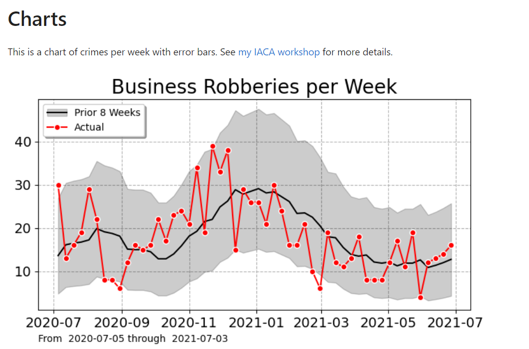
I have training material showing off two different types of charts I like to use in lieu of YTD metrics. These can identify anomalous short term and long term trends. Here is an example weekly chart showing trends (in black line) and short term spikes (outside the error intervals):
So this is an uber nerd post – I hope it has general lessons though. One is that if you need to estimate Y, and you can write Y as a function of other variables, some that are variable and some that are not, e.g. Y = f(x1,c), then maybe you should just focus on estimating x1 in this scenario, not model Y directly.

In terms of more general statistical modeling of crime trends, I have debated in the past examining more thoroughly seasonal-trend decomposition techniques, but I think the examples I give above are quite sufficient for most analysis (and can be implemented in a spreadsheet).