A statistical perspective on year-to-date metrics

Jerry Ratcliffe, and now more recently Jeff Asher, have written about how volatile early year projection of year-to-date (YTD) percent changes. I am going to write about this is not the right way to frame the problem in my opinion – I will present a better behaved estimate that is less volatile, but clearly doesn’t give police departments what they want.

Going to the end advice first – people find me irksome for the suggestion, but you shouldn’t be using percent changes at all. A simple alternative I have stated for low count crime data is a Poisson Z-score, which is simply 2*(sqrt(Current) - sqrt(Past)) – a value of greater than 3 or 4 is a signal the two processes are significantly different (under the null hypothesis that the counts have a Poisson distribution).

A Better YTD estimate

So here I am going to present a more accurate YTD percent change metric – but don’t take that as advice you should be using YTD percent change. It is more of an exercise to say why you shouldn’t be using this metric to begin with. Year end percent change is defined as:

(Current - Past)/Past = % Change

Note that you can rewrite this as:

Current/Past - Past/Past  = % Change
Current/Past - 1          = % Change

So really it is only the ratio of Current/Past that we care about estimating, the translating to a percent doesn’t matter. In the above equations, I am writing these as cumulative totals for the whole year. So lets do breakdowns via subscripts, and shorten Current and Past to C and P respectively. So say we have data through January, people typically estimate the YTD percent change then as:

(C_January - P_January)/P_January = % Change January

To make it easier, I am going to write e subscript for early, and l subscript for later. So if we then estimate YTD for February, we then have C_January + C_February = C_e. Also note that C_e + C_l = Current, the early observed values plus the later unobserved values equals the year totals. This identifies a clear error when people use only subsets of the data to do YTD year end projections (what both Jerry and Jeff did in their posts to argue against early YTD estimates). You should not just use P_e in your estimate, you should use the full prior year counts.

Lets go back to our year end estimate, writing in early/later form:

[C_e + C_l - (P_e + P_l)]/(P_e + P_l) = % Change

This only has one unknown in the equation – C_l, the unknown rest of year projection. You should not use (C_e - P_e)/P_e, as this introduces several stochastic elements where none are needed. P_e is not necessarily a good estimate of P_e + P_l. So lets do a simple example, imagine we had homicide totals:

     Past Current
Jan    2     1
Feb    0      
Mar    1      
Apr    1      
May    1      
Jun    1      
Jul    1      
Aug    1      
Sep    1      
Oct    1      
Nov    1      
Dec    1      
---
Tot   12

The naive way of doing YTD estimates, we would say our January YTD estimates are (1 - 2)/2 = -50%. Whereas I am saying, you should use (1 + C_l)/12 – filling in whatever value you project to the rest of the year totals C_l. Simple ones you can do in a spreadsheet are ‘no change’, just fill in the prior year which here would be C_l = 10, and would give a YTD percent change estimate of (11 - 12)/12 ~ -8%. Or another simple one is extrapolate, which would be C_l = C_e*(1/year_proportion) = 1*12, so (12 - 12)/12 = 0%. (You would really want to fit a model with seasonal and trend components and project out the remaining part of the year, which will often be somewhere between these two simpler methods.)

So far this is just theoretical “should be a better estimator” – lets show with some actual data. Python code to replicate here, but I took open data from Cary, NC, which goes back to 2000, so we have a sample of 22 years. Estimates of the error, broken down by month and version, are below. The naive estimate is how it is typically done (equivalent to Jeff/Jerry’s blog posts), the running estimate is taking prior to fill in C_l, and extrapolate is using the current months to fill in. The error metrics are | (estimated % change) - (actual year end % change) |, and the stats show the mean (standard deviation) of the sample (n=22). Here are the metrics for larceny, which average 123 per month over the sample:

       Naive   Running  Extrapolate
Jan   12 (7)    6 (4)     10 (7)
Feb    8 (6)    6 (4)     11 (7)
Mar    9 (6)    5 (3)      8 (6)
Apr    9 (7)    5 (3)      8 (5)
May    7 (6)    5 (3)      6 (4)
Jun    6 (4)    4 (3)      4 (3)
Jul    5 (3)    4 (3)      4 (3)
Aug    4 (3)    3 (2)      3 (2)
Sep    3 (2)    3 (2)      2 (2)
Oct    2 (1)    2 (1)      2 (1)
Nov    1 (1)    1 (1)      1 (1)
Dec    0 (0)    0 (0)      0 (0)

And here are the metrics for burglary, which average 28 per month over the sample. Although these have higher error metrics (due to lower/more volatile baseline counts), my estimator is still better than the naive one for the majority of the year.

       Naive   Running  Extrapolate
Jan   34 (25)   12 (8)    24 (23)
Feb   15 (14)   11 (7)    16 (13)
Mar   15 (14)   12 (7)    15 (11)
Apr   15 (11)   10 (7)    13 ( 8)
May   14 (10)   10 (7)    10 ( 7)
Jun   11 ( 8)   10 (7)     8 ( 6)
Jul    9 ( 7)    9 (7)     7 ( 5)
Aug    7 ( 5)    8 (5)     6 ( 3)
Sep    6 ( 4)    6 (5)     4 ( 3)
Oct    6 ( 4)    5 (4)     3 ( 3)
Nov    3 ( 3)    3 (3)     2 ( 2)
Dec    0 ( 0)    0 (0)     0 ( 0)

Running tends to do better for earlier in the year (and for smaller N samples). Both the running and extrapolate estimates are closer to the true year end percent change compared to the naive estimate in around 70% of the observations in this sample. (And tends to be even more pronounced in the smaller crime count categories, closer to 80% to 90% of the time better.)

In Jerry’s and Jeff’s posts, they use a metric +/- 5 to say “it is close” – this corresponds to in my tables absolute errors in the range of 5 percentage points. You meet that criteria on average in this sample for my estimator in March for Larcenies (running) and September (extrapolate) for Burglaries.

To be clear though, even with the more accurate projections, you should not use this estimate.

What do police departments want?

So Jeff may literally want an end-of-year projection for when he writes a Times article – similar to how a government might give a year end projection for GDP growth. But this is not what most police departments want when they calculate YTD metrics. So saying in turn “you shouldn’t use YTD because the error is high” to me misses the boat a bit. I can give a metric that has lower error rates, but you still shouldn’t use YTD percent change.

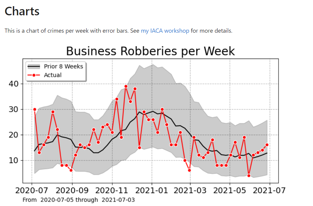
What police departments want to examine is the more general question “are my numbers high?” – you can further parse this into “are my numbers high consistently over the past date range” (of which the past year is just a convenient demarcation) or “are my numbers anomalous high right now”. The former is asking about long term trends, and the latter is asking about short term increases. Part of why I don’t like YTD is that it masks these two metrics – a spike early in the year can look like a perpetual long term upward trend later in the year.

I have training material showing off two different types of charts I like to use in lieu of YTD metrics. These can identify anomalous short term and long term trends. Here is an example weekly chart showing trends (in black line) and short term spikes (outside the error intervals):

So this is an uber nerd post – I hope it has general lessons though. One is that if you need to estimate Y, and you can write Y as a function of other variables, some that are variable and some that are not, e.g. Y = f(x1,c), then maybe you should just focus on estimating x1 in this scenario, not model Y directly.

In terms of more general statistical modeling of crime trends, I have debated in the past examining more thoroughly seasonal-trend decomposition techniques, but I think the examples I give above are quite sufficient for most analysis (and can be implemented in a spreadsheet).

ASEBP blog posts, and auto screenshotting websites

I wanted to give an update here on the Criminal Justician series of blogs I have posted on the American Society of Evidence Based Policing (ASEBP) website. These include:

  • Denver’s STAR Program and Disorder Crime Reductions
    • Assessing whether Denver’s STAR alternative mental health responders can be expected to decrease a large number of low-level disorder crimes.
  • Violent crime interventions that are worth it
    • Two well-vetted methods – hot spots policing and focused deterrence – are worth the cost for police to implement to reduce violent crime.
  • Evidence Based Oversight on Police Use of Force
    • Collecting data in conjunction with clear administrative policies has strong evidence it overall reduces officer use of force.
  • We don’t know what causes widespread crime trends
    • While we can identify whether crime is rising or falling, retrospectively identifying what caused those ups and downs is much more difficult.
  • I think scoop and run is a good idea
    • Keeping your options open is typically better than restricting them. Police should have the option to take gun shot wound victims directly to the emergency room when appropriate.
  • One (well done) intervention is likely better than many
    • Piling on multiple interventions at once makes it impossible to tell if a single component is working, and is likely to have diminishing returns.

Going forward I will do a snippet on here, and refer folks to the ASEBP website. You need to sign up to be able to read that content – but it is an organization that is worth joining (besides for just reading my takes on science around policing topics).


So my CRIME De-Coder LLC has a focus on the merger of data science and policing. But I have a bit of wider potential application. Besides statistical analysis in different subject areas, one application I think will be of wider interest to public and private sector agencies is my experience in process automation. These often look like boring things – automating generating a report, sending an email, updating a dashboard, etc. But they can take substantial human labor, and automating also has the added benefit of making a process more robust.

As an example, I needed to submit my website as a PDF file to obtain a copyright. To do this, you need to take screenshots of your website and all its subsequent pages. Googling on this for selenium and python, the majority of the current solutions are out of date (due to changes in the Chrome driver in selenium over time). So here is the solution I scripted up the morning I wanted to submit the copyright – it took about 2 hours total in debugging. Note that this produces real screenshots of the website, not the print to pdf (which looks different).

It is short enough for me to just post the entire script here in a blog post:

from selenium import webdriver
from selenium.webdriver.common.by import By
from selenium.webdriver.chrome.options import Options
import time
from PIL import Image
import os

home = 'https://crimede-coder.com/'

url_list = [home,
            home + 'about',
            home + 'blog',
            home + 'contact',
            home + 'services/ProgramAnalysis',
            home + 'services/PredictiveAnalytics',
            home + 'services/ProcessAutomation',
            home + 'services/WorkloadAnalysis',
            home + 'services/CrimeAnalysisTraining',
            home + 'services/CivilLitigation',
            home + 'blogposts/2023/ServicesComparisons']

res_png = []

def save_screenshot(driver, url, path, width):
    driver.get(url)
    # Ref: https://stackoverflow.com/a/52572919/
    original_size = driver.get_window_size()
    #required_width = driver.execute_script('return document.body.parentNode.scrollWidth')
    required_width = width
    required_height = driver.execute_script('return document.body.parentNode.scrollHeight')
    driver.set_window_size(required_width,required_height)
    #driver.save_screenshot(path)  # has scrollbar
    driver.find_element(By.TAG_NAME, 'body').screenshot(path)  # avoids scrollbar
    driver.set_window_size(original_size['width'], original_size['height'])

options = Options()
options.headless = True
driver = webdriver.Chrome(options=options)

for url in url_list:
    driver.get(url)
    if url == home:
        name = "index.png"
    else:
        res_url = url.replace(home,"").replace("/","_")
        name = res_url + ".png"
    time.sleep(1)
    res_png.append(name)
    save_screenshot(driver,url,name,width=1400)

driver.quit()

# Now appending to PDF file
images = [Image.open(f).convert('RGB') for f in res_png if f[-3:] == 'png']
i1 = images.pop(0)
i1.save(r'Website.pdf', save_all=True, append_images=images)

# Now removing old PNG files
for f in res_png:
    os.remove(f)

One of the reasons I want to expand knowledge of coding practices into policing (as well as other public sector fields) is that this simple of a thing doesn’t make sense for me to package up and try to monetize. The IP involved in a 2 hour script is not worth that much. I realize most police departments won’t be able to take the code above and actually use it – it is better for your agency to simply do a small contract with me to help you automate the boring stuff.

I believe this is in large part a better path forward for many public sector agencies, as opposed to buying very expensive Software-as-a-Service solutions. It is better to have a consultant to provide a custom solution for your specific agency, than to spend money on some big tool and hope your specific problems fit their mold.

Won the algae bloom prediction competition

I recently was one of the winners in the DataDriven competition predicting algaeblooms, username apwheele. So I have written in the past about alternative competition sites. To decide overall whether I will compete in a competition, it is:

  • number of competitors
  • overall prizes
  • my self-assessed skill level

And then whether I had sufficient time to devote to the competition. So for an alternative estimate example, the Astral Codex blog has a book review contest. I can see the prior years competition had 133 competitors, so given prizes of 4k in 2023, 4k/133 ~ $30 in expected return. If you have a burning desire to review a book go for it, but I don’t think I have some secret that gives me a large enough competitive edge over other readers of Scott’s blog to make this competition worth my time.

For the algae bloom competition, DataDriven I saw had previously around 1k competitors per competition, and the prizes for 1/2/3 for this competition were 12k/9k/6k. They have a few other conciliation prizes, so total of $30k. Expected return is basically the same as the Codex blog, $30, but I figured I had a better competitive edge. (Although knew it would be more work than writing a book review.)

I am typically hesitant to do Kaggle competitions, some have over 100k competitors (I feel at that point you are close to the “monkeys typing on a keyboard will produce Shakespeare eventually” stage). I debated recently on doing the Kaggle competition on Neutrino’s in Ice, but due to steeper competition and less time (prizes are similar to the Algae Bloom one) I will not be competing.

In terms of self-assessed skill, you may be thinking “Andy, you have no related skills towards remote-sensing/biology”, which is true. In this specific competition, one of the things that prompted me to compete was the use of ancillary data, so it is not just satellite imagery, you can fold in more data. This tends to favor tabular/tree based models, which I have more experience with. Additionally the example getting started blog post by DataDriven made to me a key critical error – they used a multinomial model (predicting categories) instead of a regression model predicting a continuous outcome. An ordinal model may be defensible, but with the error metric being root mean squared error, the way they used multinomial did not make sense. E.g. if multinomial predicted severity 1 at 51%, and severity 5 at 49%, your prediction should be 3, not 1. Since the majority of people competing in these competitions are clearly just copying code and not understanding the stat models under the hood, I knew this would send a decent number of competitors down a wrong track.

Another aspect I look for in modeling competitions is weird loss functions, this is one of the reasons me and Gio won quite a bit in the NIJ recidivism competition. Essentially things that you need to write custom code for (or think about the math a little under the hood), I suspect give me a decent edge based on quite a few competitors. Things where just your ability to fit and hypertune a deep-learning model based on sensor data is the difference maker I am not going to compete in.

So that was my thinking at the start of the competition. An aspect I did not anticipate though, it was quite a chore to download the data. Unlike many competitions in which the providers gift you data, DataDriven had you download your own satellite data. This was quite alot of work to write code to do this, it wouldn’t surprise me if I spent 40 hours writing code for the competition overall. Also I ended up signing up for the planetary computer resource (I would get rate limited downloading data otherwise). I bet some individuals do not know they should just cache the feature data, not rerun it everytime – it takes me over 2 days of loops in python to download all the data.

So in the end, the competition had listed over 1300 competitors, but many were not serious competitors. Maybe halfway through the competition (which was around Christmas, I suspect that also reduced competition), there was only 300 or 400 competitors signed up. If you signed up in the last few weeks, I knew you would probably not have enough time to write code/download-data/tinker with models. In the end people who submitted 2+ times and beat the benchmark DataDriven results were under 100 people. So that makes me think maybe I should consider Kaggle competitions more seriously, if less than 10% of people competing even give a serious attempt.

So in terms of competitions, I have participated in 4 overall:

Gio was the one who forwarded the recidivism competition. I should have competed in the prior hot spots NIJ competition, so I hopped on that opportunity and we did a good job.

I spent a decent chunk of time on the Maternal Morbidity challenge, with prizes of 50k for multiple teams. So although I did not win I thought that was worth a shot (I am more hesitant for soft assessment competitions though). For the toxic rating competition I failed fast – I spent two days working on a few ideas/models. I was not that high in the leaderboard based on my ideas (pulling in data from alternative sources and building a few different types of models and ensembling them together), so I stopped after a short period. I would have done the same for the Algae competition, but just using a simple regression model (without even including the satellite data), I was #1 on the leaderboard. So I spent more time downloading the data and tinkering over time, which did keep me in the #1 spot in the public leaderboard in the end.

Scorpion was probably not doing hot spots policing

So the Wall Street Journal had a recent article describing how crackdowns in hot spots of crime may not be the best policing tactic, Tyre Nichols Case Prompts Questions About Police Tactics in Crime Hot Spots. This is actually an OK article, but to be clear “hot spots” policing isn’t really defined by police tactics, hot spots are just a method to identify small areas with the most crime in a city. Identifying the hot spots does not explicitly determine the policing (or non-policing) tactic that one should use to reduce crime in that area. The Washington Post had a recent article in a similar vein critiquing the work of Tamara Herold in Breonna Taylor’s death. The WaPo article even prompted a response by a group of well known criminologists how it was inappropriate to blame Herold’s strategy.

So hotspots have always had a mix of different policing tactics that go with it, the most common strategies I would say are problem oriented policing (Braga et al., 1999), increased street or traffic stops (MacDonald et al., 2016; Sherman & Rogan, 1995), or simply patrolling/hanging out in the area (Groff et al., 2015; Koper, 1995). The WSJ article talks about Joel Caplan’s RTM group (which I think do good work), and they are really just doing a version of problem oriented policing. (POP has always had a component of working in tandem with the community and different public/private sector agencies.)

One of the reasons I wanted to write about this post though, is that often in my career I see a disconnect in purportedly hot spots policing (or similar tactics, such as DDACTS) on paper and what is actually happening on the ground. So using the Memphis Open Crime Data, I identified the top 100 street segments in terms of violent crime (code on github to replicate). As I suspected, the place where Nichols was pulled over is not a hot spot of crime, making the connection between the Scorpion units behavior and hot spots policing tactics a bit suspect.

If the embedded google map does now work, here is a screen shot to show how none of the top 100 street midpoints are around the location of where Nichol’s was initially stopped:

It happens to be the case that officers often have misperceptions of where hot spots are (Macbeth & Ariel, 2019; Ratcliffe & McCullagh, 2001). And that if left to no oversight, there tends to be a mismatch between where police proactivity is occurring and where the most serious crime is spatially concentrated (Wheeler et al., 2018). That is why a system to feed back information to officers for whether they are making high quality stops is so important (Worden et al., 2018).

To be clear, this is not me making excuses for researchers or crime analysts to not know what is actually occurring in their jurisdictions, and to potentially ignore the secondary harms that can come with intensive policing. But in my experience, taking the time to do hot spots policing right, which at its most basic is actually identifying hot spots using data, is a good sign that police departments take seriously the tactics they use and to seriously think about mitigating some of these secondary harms. Hot spots policing does not intrinsically result in unequal outcomes, which can be done via tactics that mitigate harm (such as problem oriented policing), or constructing a hot spots policy that promotes racial equity in outcomes from the start (Wheeler, 2020).

References

  • Braga, A.A., Weisburd, D.L., Waring, E.J., Mazerolle, L.G., Spelman, W., & Gajewski, F. (1999). Problem‐oriented policing in violent crime places: A randomized controlled experiment. Criminology, 37(3), 541-580.
  • Groff, E. R., Ratcliffe, J. H., Haberman, C. P., Sorg, E. T., Joyce, N. M., & Taylor, R. B. (2015). Does what police do at hot spots matter? The Philadelphia policing tactics experiment. Criminology, 53(1), 23-53.
  • Koper, C.S. (1995). Just enough police presence: Reducing crime and disorderly behavior by optimizing patrol time in crime hot spots. Justice Quarterly, 12(4), 649-672.
  • Macbeth, E., & Ariel, B. (2019). Place-based statistical versus clinical predictions of crime hot spots and harm locations in Northern Ireland. Justice Quarterly, 36(1), 93-126.
  • MacDonald, J., Fagan, J., & Geller, A. (2016). The effects of local police surges on crime and arrests in New York City. PLoS one, 11(6), e0157223.
  • Ratcliffe, J.H., & McCullagh, M.J. (2001). Chasing ghosts? Police perception of high crime areas. British Journal of Criminology, 41(2), 330-341.
  • Sherman, L.W., & Rogan, D.P. (1995). Effects of gun seizures on gun violence:“Hot spots” patrol in Kansas City. Justice Quarterly, 12(4), 673-693.
  • Wheeler, A.P. (2020). Allocating police resources while limiting racial inequality. Justice Quarterly, 37(5), 842-868.
  • Wheeler, A. P., Steenbeek, W., & Andresen, M. A. (2018). Testing for similarity in area‐based spatial patterns: Alternative methods to Andresen’s spatial point pattern test. Transactions in GIS, 22(3), 760-774.
  • Worden, R.E., McLean, S.J., Wheeler, A.P., Reynolds, D.L., Dole, C., Cochran, H. Smart Stops: An Inquiry into Proactive Policing. Summary Report to the National Institute of Justice, Award No. 2013-MU-CX-0012.

Setting up pyspark to run sql tests

So hacker news the other day had a thread on how do you test your SQL code. This is such a nerd/professional data science type of question I love it (and many of the high upvoted answers are good, but lack code example/nitty gritty details, hence this blog post). I figured I would make my notes on this and illustrate some real code. You get a few things in this post:

  • how to set up spark locally on a windows machine
  • how to generate SQL tests in python with pytest
  • how to set up a github action CICD pipeline to test pyspark/sql

Setting up spark on Windows

First, before we get start, getting spark up and running on a windows machine is non-trivial. Maybe I should use Docker, like I do for postgres, but here are my notes on setting it up to run locally on Windows (much of this is my condensed notes + a few extras based on this DataCamp post).

  • Step 1: Install Java. Make sure where you install it has NO SPACES. Then create an environment variable, JAVA_HOME, and point it to where you installed Java. Mine for example is C:\java_jdk (no spaces).
  • Step 2: Install spark. Set the environment variable Spark_home to wherever you downloaded it, mine is set to C:\spark. Additionally set the environment variables PYSPARK_HOME to python.
  • Step 3: Set up your python environment, e.g. something like conda create --name spenv python=3.9 pip pyspark==3.2.1 pyarrow pandas pytest to follow along with this post. (Note to make pyspark and spark downloaded versions line up.)
  • Step 4: Then you need to download winutils.exe that matches your version. So I currently have spark=3.2.1, so I just do a google search for “winutils 3.2” and up pops this github repo with the version I need (minor versions probably don’t matter). (You do not need to double click to install, the exe file just needs to be available for other programs to find.) Then set the environment variable hadoop_home to the folder where you downloaded winutils.exe. Mine is C:\winutils.

I know that is alot – but it is a one time thing. Now once this is done, from the command line try to run:

pyspark --version

You should be greeted with something that looks like:

Welcome to
      ____              __
     / __/__  ___ _____/ /__
    _\ \/ _ \/ _ `/ __/  '_/
   /___/ .__/\_,_/_/ /_/\_\   version 3.2.1
      /_/

Using Scala version 2.12.15, Java HotSpot(TM) 64-Bit Server VM, 11.0.15

Plus a bunch of other messages (related to logging errors on windows). (You can set the spark-defaults.conf and log4j.properties file to make these less obnoxious.)

But now you are good to go running spark locally on your windows machine. Note you get none of the reasons you want to use spark, such as distributing computations over multiple machines (this is equivalent to running computations on the hnode). But is convenient to do what I am going to show – testing your SQL code locally.

Testing SQL code in python

Now that we have pyspark set up, we can run a test in python. Instead of type python into the REPL, go ahead and run pyspark, so we are in a pyspark REPL session. You will again see the big Spark ascii art at the beginning. Here is an example of now creating a dummy temp table inside of our spark database (this is just a local temp table).

# Inside of pyspark REPL
# so spark is available
import pandas as pd

x = [1,2,3,4]
y = ['a','b','c','c']
df = pd.DataFrame(zip(x,y),columns=['x','y'])

# Can create a temp spark table based on fake data
sdf = spark.createDataFrame(df)
sdf.createOrReplaceTempView('test_table')

Now we can run our SQL against the spark database.

# sql to test
query = '''
SELECT
  SUM(x) AS cum_x,
  COUNT(y) AS n,
  y
FROM test_table
GROUP BY y'''

spark.sql(query).show()

And voila, you can now test your spark queries. Although this is showing for spark, you can do something very similar for different databases as well, e.g. using pyodbc or sqlalchemy. You would want to have a test dummy database you can write to though to do that (a few different databases have volatile or temp tables equivalent to spark here).

Setting up pytest + spark

So this shows in just a REPL session how to set up this, but we also want automated tests for multiple scripts via pytest. To illustrate, I am going to refer to my retenmod repo. Even though this library obviously has nothing directly to do with pyspark, I am using this repo as a way to test code/python packaging. (And note if using the same environment above, to replicate 100% of that repo, need to install pip install black flake jupyter jupyter_contrib_nbextensions pre-commit matplotlib.)

So now for pytest, a special thing is you can create python objects that are inherited for all of your tests. Here we will create the spark object one time, and then it can be passed on to your tests. So in ./tests make a file conftest.py, and in this file write:

# This is inside of conftest.py
import pytest
from pyspark.sql import SparkSession

# This sets the spark object for the entire session
@pytest.fixture(scope="session")
def spark():
    sp = SparkSession.builder.getOrCreate()
    # Then can do other stuff to set
    # the spark object
    sp.sparkContext.setLogLevel("ERROR")
    sp.conf.set("spark.sql.execution.array.pyspark.enabled", "true")
    return sp

In pytest lingo, fixtures are then passed around to the different test functions in your library (where appropriate). You can create the equivalent of spark in a pyspark session via SparkSession.builder. This is essentially what a pyspark session is doing under the hood to generate the spark object you can run queries against.

Now we can make a test function, here in a file named test_spark.py (in the same tests folder). That will then look something like:

# pseudo code to show off test
# in test_spark.py
import pandas as pd
from yourlibrary import func

test_table = ...code to create dummy table...

def test_sql(spark):
    # Create the temporary table in spark
    sdf = spark.createDataFrame(test_table)
    sdf.createOrReplaceTempView("test_table")
    # Test out our sql query
    query = func(...your parameters to generate sql...)
    res = spark.sql(query).toPandas()
    # No guarantees on row order in this result
    # so I sort pandas dataframe to make 100% sure
    res.sort_values(by="y", inplace=True, ignore_index=True)
    # Then I do tests
    # Type like tests, shape and column names
    assert res.shape == (3, 3)
    assert list(res) == ["cum_x", "n", "y"]
    # Mathy type tests
    dif_x = res["x"] != [1, 2, 7]
    assert dif_x.sum() == 0
    dif_n = res["n"] != [1, 1, 2]
    assert dif_n.sum() == 0

So note here that I pass in spark as an argument to the function. pytest then uses the fixture we defined earlier to pass into the function when the test is actually run. And then from the command line you can run pytest to check out if your tests pass! (I have placed in the retenmod package a function to show off generating a discrete time survival table in spark, will need to do another blog post though on survival analysis using SQL.)

So this shows off what most of my sql type tests look like. I test that the shape of the data is how I expected (given my fake dataframe I passed in), columns are correct, and that the actual values are what they should be. I find this useful especially to test edge cases (such as missing data) in my SQL queries. My functions in production are mostly parameterized SQL, but it would work the same if you had a series of text SQL files, just read them into python as strings.

Setting up github actions

As a bonus, I show how to set this up in an automatic CICD check via github actions. Check out the actions workflow file for the entire workflow in-situ. But the YAML file has a few extra steps compared to my prior post on generating a wheel file in github actions.

It is short enough an can just paste the whole YAML file for you to check out.

on:
  push:
    branches:
      - main

jobs:
  build_wheel:
    runs-on: ubuntu-latest
    timeout-minutes: 20
    steps:
      - uses: actions/checkout@v2
      - uses: actions/setup-java@v1
        with:
            java-version: 11
      - uses: vemonet/setup-spark@v1
        with:
          spark-version: '3.2.1'
          hadoop-version: '3.2'
      - name: Set up Python
        uses: actions/setup-python@v2
        with:
          python-version: 3.9
      - name: Build wheel and install
        run: |
          python -m pip install --user --upgrade build
          python -m build
          # installing spark libraries
          pip install pyspark pyarrow pandas pytest
          # now install the wheel file
          find ./dist/*.whl | xargs pip install
          # Now run pytest tests
          pytest --disable-warnings ./tests
      - name: Configure Git
        run: |
          git config --global user.email "apwheele@gmail.com"
          git config --global user.name "apwheele"
      - name: Commit and push wheel
        run: |
          git add -f ./dist/*.whl
          git commit -m 'pushing new wheel'
          git push
      - run: echo "🍏 This job's status is ${{ job.status }}."

So here in addition to python, this also sets up Java and Spark. (I need to learn how to build actions myself, I wish vemonet/setup-spark@v1 had an option to cache the spark file instead of re-downloading everytime). Even with that though, it will only take a minute or two to run (the timeout is just a precaution and good idea to put in any github action).

You can then check this action out on github.

Happy SQL code testing for my fellow data scientists!

Web scraping police data using selenium and python

So I have a few posts in the past on scraping data. One shows downloading and parsing structured PDFs, almost all of the rest though use either JSON API backends, or just grab the HTML data directly. These are fairly straightforward to deal with in python. You generate the url directly, use requests, and then just parse the returned HTML however you want.

Came across a situation recently though where I needed to interact with the webpage. I figured a blog post to illustrate the process would be good. (For both myself and others!) So here I will illustrate entering data into San Antonio’s historical calls for service asp application (which I have seen several PDs use in the past).

It is tough for me to give general advice about scraping, it involves digging into the source code for a website. Here if you click on the Historical Calls button, the url stays the same, but presents you with a new form page to insert your search parameters:

This is a bit of a red-herring though, it ends up being the entire page is embedded in what is called an i-frame, so the host URL stays the same, but the window inside the webpage changes. On the prior opening page, if you hover over the link for Historical Calls you can see it points to https://webapp3.sanantonio.gov/policecalls/Reports.aspx, so that is page we really need to pay attention to.

So for general advice, using Chrome to view a web-pages source html, you can right-click and select view-source:

And you can also go into the Developer tools to check out all the items in a page as well.

Typically before worrying about selenium, I study the network tab in here. You want to pay attention to the items that take the longest/have the most data. Typically I am looking for JSON or text files here if I can’t scrape the data directly from the HTML. (Example blog posts grabbing an entire dump of data here, and another finding a hidden/undocumented JSON api using this approach.) Here is an example network call when inputting the search into the San Antonio web-app.

The data is all being transmitted inside of aspx application, not via JSON or other plain text files (don’t take my terminology here as authoritative, I really know near 0% about servers). So we will need to use selenium here. Using python you can install the selenium library, but you also need to download a driver (here I use chrome), and then wherever you save that exe file, add that location to your PATH environment variable.

Now you are ready for the python part.

from selenium import webdriver
from selenium.webdriver.chrome.options import Options
from selenium.webdriver.support.ui import Select
import pandas as pd

# Setting Chrome Options
chrome_options = Options()
#chrome_options.add_argument("-- headless")
chrome_options.add_argument("--window-size=1920,1080")
chrome_options.add_argument("log-level=3")

# Getting the base page
driver = webdriver.Chrome(options=chrome_options)
base_url = "https://webapp3.sanantonio.gov/policecalls/Reports.aspx"
driver = webdriver.Chrome(options=chrome_options)
driver.get(base_url)

Once you run this code, you will see a new browser pop-up. This is great for debugging, but once you get your script finalized, you can see I commented out a line to run in headerless (so it doesn’t bug you by flashing up the browser on your screen).

Now typically what I do is look at the HTML source (like I showed earlier), and then search for the input buttons in HTML. We are trying to figure out the elements we need to insert the data for us to submit a search. Here is the first input for an item we care about, the begin date of the search.

Now we can insert our own date by grabbing the element from the web-page. I grab it here by the “id” attribute in the HTML (many tutorials use xpath, which I am not as familiar with, but at least for these aspx apps what I show works fine). For dates that have a validation stage, you need to not only .send_keys, but to also submit to get past the date validation.

# Inserting date field for begin date
from_date = driver.find_element("id", "txtStart")
from_date.send_keys("10/01/2022")
from_date.submit()

Once you run that code you can actually view the web-page, and see that your date is entered! Now we need to do the same thing for the end date. Then we can put in a plain text zipcode. Since this does not have validation, we do not need to submit it.

# Now for end date
end_date = driver.find_element("id", "txtEndDate")
end_date.send_keys("10/02/2022")
end_date.submit()

# Now inserting text for zipcode
zip = driver.find_element("id", "txtZipcode")
zip.send_keys("78207")
# Sometimes need to clear, zip.clear()

I have a note there on clearing a text box. Sometimes websites have pre-filled options. Sometimes web-sites also do not like .clear(), and you can simulate backspace keystrokes directly. This website does not like it if you clear a date-field for example.

Now the last part, I am going to select a drop-down. If you go into the HTML source again, you can see the list of options.

And now we can use the Select function I imported at the beginning to select a particular element of that drop-down. Here I select the crimes against persons.

# Now selecting dropdown
crime_cat = driver.find_element("id", "ddlCategory")
crime_sel = Select(crime_cat)
crime_sel.select_by_visible_text("Crimes Against Person Calls")

Many of these applications have rate limits, so you need to limit the search to tiny windows and subsets, and then loop over the different sets you want to grab all of the data. (Being nice and using time.sleep() between calls to get the results.

Now we are ready to submit the query. The same way you can enter in text into input forms, buttons you can click are also labeled as inputs in the HTML. Here I find the submit button, and then .click() that button. (If there is a direct button to download CSV or some other format, it may make sense to click that button.)

# Now can find the View Data button and submit
view_data = driver.find_element("id", "btnSearch")
view_data.click()

Now that we have our web-page, we can get the HTML source directly and then parse that. Pandas has a nice method to grab tables, and this application is actually very nicely formatted. (I tend to not use this, as many webpages have some very bespoke tables that are hard to grab directly like this). This method grabs all the tables in the web-page by default, here I just want the calls for service table, which has an id of "gvCFS", which I can pass into the pandas .read_html function.

# Pandas has a nice option to read tables directly
html = driver.page_source
cfs = pd.read_html(html, attrs={"id":"gvCFS"})[0]

And that shows grabbing a single result. Of course to scrape, you will need to loop over many days (and here different search selections), depending on what data you want to grab. Most of these applications have search limits, so if you do too large a search, will only return the first say 500 results. And San Antonio’s is nice because it returns as a single table in the web-page, most you need to page the results though as well. Which takes further scraping the data and interacting with the page. So it is more painful whenever you need to resort to selenium.

Sometimes pages will point to PDF files, and you can set Chrome’s options to download to a particular location in that scenario (and then use os.rename to name the PDF whatever you want after it is downloaded). You can basically do anything in selenium you can manually, it is often just a tricky set of steps to replicate in code.

Using quantile regression to evaluate police response times

Jeff Asher recently had a post on analysis of response times across many agencies. One nitpick though (and ditto for prior analyses I have seen, such as Scott Mourtgos and company), is that you should not use linear models (or means in general) to describe response time distributions. They are very heavily right skewed, and so the mean tends to be not representative of the bulk of the data.

When evaluating changes in response time, imagine two simplistic scenarios. One, every single call increases by 5 minutes, so what used to be 5 is now 10, 20 is now 25, 60 is now 65, etc. That is probably not realistic for response times, it is probably calls in the tail (ones that take a very long time to wait for an opening in the queue) are what changes. E.g. 5 is still 5, 20 is still 20, but 60 is now 120. In the latter scenario, the left tail of the distribution does not change, only the right tail. In both scenarios the mean shifts.

I think a natural way to model the problem is instead of focusing on means, is to use quantile regression. It allows you to generalize the entire distribution (look at the left and right tails) and still control for individual level circumstances. Additionally, often emergency agencies set goals along the lines of “I want to respond to 90% of emergency events with X minutes”. Quantile regression is a great tool to describe that 90% make. Here I am going to show an example using the New Orleans calls for service data and python.

First, we can download the data right inside of python without saving it directly to disk. I am going to be showing off estimating quantile regression with the statsmodel library. I do the analysis for 19 through 22, but NOLA has calls for service going back to the early 2010s if folks are interested.

import pandas as pd
import statsmodels.formula.api as smf

# Download data, combo 19/20/21/22
y19 = 'https://data.nola.gov/api/views/qf6q-pp4b/rows.csv?accessType=DOWNLOAD'
y20 = 'https://data.nola.gov/api/views/hp7u-i9hf/rows.csv?accessType=DOWNLOAD'
y21 = 'https://data.nola.gov/api/views/3pha-hum9/rows.csv?accessType=DOWNLOAD'
y22 = 'https://data.nola.gov/api/views/nci8-thrr/rows.csv?accessType=DOWNLOAD'
yr_url = [y19,y20,y21,y22]
res_pd = [pd.read_csv(url) for url in yr_url]
data = pd.concat(res_pd,axis=0) # alittle over 1.7 million

Now we do some data munging. Here I eliminate self initiated events, as well as those with missing data. There then are just a handful of cases that have 0 minute arrivals, which to be consistent with Jeff’s post I also eliminate. I create a variable, minutes, that is the minutes between the time created and the time arrived on scene (not cleared).

# Prepping data
data = data[data['SelfInitiated'] == 'N'].copy() # no self init
data = data[~data['TimeArrive'].isna()].copy()   # some missing arrive
data['begin'] = pd.to_datetime(data['TimeCreate'])
data['end'] = pd.to_datetime(data['TimeArrive'])
dif = data['end'] - data['begin']
data['minutes'] = dif.dt.seconds/60
data = data[data['minutes'] > 0].copy() # just a few left over 0s

# Lets look at the distribution
data['minutes'].quantile([0.1,0.2,0.3,0.4,0.5,0.6,0.7,0.8,0.9])

For quantiles, for the entire sample the median time is around 20 minutes, the 10th percentile is under 3 minutes and the 90th percentile is around 5 hours. Using the mean here (which in Jeff’s post varies from 50 to 146 minutes over the same 4 year period), can be somewhat misleading.

An important component of response times is differentiating between different priority calls. NOLA in their data, higher numbers are higher priority. Zero priority are things NOLA says don’t necessarily need an officer at all. So it could be those “0 priority” calls are really just dragging the overall average down over time, although they may have little to do with clearance rates or public safety overall. The priority category fields also has sub-categories, e.g. 1A is higher priority than 1B. To keep the post simple I just breakdown by integer leading values, not the sub letter-categories.

# Priority just do 1/2/3
# 3 is highest priority
data['PriorCat'] = data['Priority'].str[0]
# Only 5 cases of 3s, will eliminate these as well
data.groupby('PriorCat')['minutes'].describe()

Here you can really see the right skewness – priority 2 calls the mean is 25 minutes, but the median is under 10 minutes for the entire sample. A benefit of quantile regression I will use in a bit, the few outlying cases (beyond the quantiles of interest), really don’t impact the analysis. So those cases that take almost 24 hours (I imagine they are just auto-filled in like that in the data), really don’t impact estimates of smaller quantiles. But they can have noticeable influence on mean estimates.

Some final data munging, to further simplify I drop the 16 cases of priority 3s and 4s, and add in a few more categorical covariates for hour of the day, and look at months over time as categorical. (These decisions are more so to make the results easier to parse in a blog post in simpler tables, it would take more work to model a non-linear continuous over time variable, say via a spline, and make a reasonable ordinal encoding for the sub-priority categories.)

# only worry about 0/1/2s
data = data[data['PriorCat'].isin(['0','1','2'])].copy()
# Total in the end almost 600k cases

# Some factor date variables
def dummy_stats(vdate,begin_date):
    bd = pd.to_datetime(begin_date)
    year = vdate.dt.year
    month = vdate.dt.month
    week_day = vdate.dt.dayofweek
    hour = vdate.dt.hour
    diff_days = (vdate - bd).dt.days
    # if binary, turn week/month into dummy variables
    return diff_days, week_day, hour, month, year

dn, wd, hr, mo, yr = dummy_stats(data['begin'],'1/1/2022')
data['Hour'] = hr
data['Month'] = mo
data['Year'] = yr

# Lets just look at months over time
data['MoYr'] = data['Year'] + data['Month']/100

Now finally onto the modeling stuff. For those familiar with regression, quantile regression instead of predicting the mean predicts a quantile of the distribution. Here I show predicting the 50th quantile (the median). For those not familiar with regression, this is not all that different than doing a pivot table/group by, but aggregating by quantiles instead of means. Regression is somewhat different than the simpler pivot table, since you “condition on” other continuous factors (here I “control for” hour of day), but in broad strokes is similar.

Here I use a patsy “R style” formula, and fit a categorical covariate for the 0/1/2 categories, hour of day, and the time varying months over time (to see the general trends). The subsequent regression table is big, so will show in parts:

# Quantile regression for median
mod = smf.quantreg("minutes ~ C(PriorCat, Treatment(reference='2')) + C(Hour) + C(MoYr)", data)
res50 = mod.fit(q=0.5)
res50.summary()

First, I use 2 priority events as the referent category, so you can see (in predicting the median of the distribution), priority 1 events have a median 24 minutes longer than priority 2, and priority 0 have a median two hours later. You can see some interesting patterns in the hour of the day effects (which are for the overall effects, not broken down by priority). So there are likely shift changes at 06:00, 14:00, and 22:00 that result in longer wait times.

But of most interest are patterns over time, here is the latter half of that table, showing median estimates over the months in this sample.

You could of course make the model more complicated, e.g. look at spatial effects or incorporate other direct measures of capacity/people on duty. But here it is complicated enough for an illustrative blog post. January-2019 is the referent category month, and we can see some slight decreases in a few minutes around the start of the pandemic, but have been clearly been increasing at the median time fairly noticeably starting later in 2021.

As opposed to interpreting regression coefficients, I think it is easier to see model predictions. We can just make sample data points, here at noon over the different months, and do predictions over each different priority category:

# Predictions for different categories
hour = 12
prior_cat = [0,1,2]
oos = data.groupby(['PriorCat','MoYr'],as_index=False)['Hour'].size()
oos['Hour'] = 12
oos['Q50'] = res50.predict(oos)

print(oos[oos['PriorCat'] == '0'])
print(oos[oos['PriorCat'] == '1'])
print(oos[oos['PriorCat'] == '2'])

So here for priority 0, 130 has creeped up to 143.

And for priority 1, median times 35 to 49.

Note that the way I estimated the regression equation, the increase/decrease per month is forced to be the same across the different priority calls. So, the increase among priority 2 calls is again around 13 minutes according to the model.

But this assumption is clearly wrong. Remember my earlier “fast” and “slow” example, with only the slow calls increasing. That would suggest the distributions for the priority calls will likely have different changes over time. E.g. priority 0 may increase by alot, but priority 2 will be almost the same. You could model this in the formula via an interaction effect, e.g. something like "minutes ~ C(PriorCat)*C(MoYr) + C(Hour)", but to make the computer spit out a solution a bit faster, I will subset the data to just priority 2 calls.

Here the power of quantile regression is we can look at different distributions. Estimating extreme quantiles is tough, but looking at the 10th/90th (as well as the median) is pretty typical. I do those three quantiles, and generate model predictions over the months (again assuming a call at 12).

# To save time, I am only going to analyze
# Priority 2 calls now
p2 = data[data['PriorCat'] == '2'].copy()
m2 = smf.quantreg("minutes ~ C(MoYr) + C(Hour)", p2)
oos2 = oos[oos['PriorCat'] == '2'].copy()

# loop over different quantiles
qlist = [0.1, 0.5, 0.9]
for q in qlist:
    res = m2.fit(q=q)
    oos2[f'Q_{q}'] = res.predict(oos2)

oos2

So you can see my story about fast and slow calls plays out, although even when restricted to purportedly high risk calls. When looking at just priority 2 calls in New Orleans, the 10th percentile stays very similar over the period, although does have a slight increase from under 4 to almost 5 minutes. The 50th percentile has slightly more growth, but is from 10 minutes to 13 minutes. The 90th percentile though has more volatility – grew from 30 to 60 in small increases in 2022, and late 2022 has fairly dramatic further growth to 70/90 minutes. And you can see how the prior model that did not break out priority 0/1 calls changed this estimate for the left tail for the priority 2 left tail as well. (So those groups likely also had large shifts across the entire set.)

So my earlier scenario is overly simplistic, we can see some increase in the left tails of the distribution as well in this analysis. But, the majority of the increase is due to changes in the long right tail – calls that used to take less than 30 minutes are now taking 90 minutes to arrive. Which still likely has implications for satisfaction with police and reporting behavior, maybe not so much though with clearance or direct public safety.

No easy answers here in terms of giving internet advice to New Orleans. If working with NOLA, I would like to get estimates of officer capacity per shift, so I could incorporate into the quantile regression model that factor directly. That would allow you to precisely quantify how officer capacity impacts the distribution of response times. So not just “response times are going up” but “the decrease in capacity from A to B resulted in X increase in the 90th percentile of response times”. So if NOLA had goals set they could precisely state where officer capacity needed to be to have a shot of obtaining that goal.

Handling errors in python and R

Just some quick notes on error handling in python and R. For most of my batch processes at work (in python), error handling is necessary. Most of my code has logic that if it fails, it sends an email message about the failure. This is only possible if you capture errors and have conditional logic, if the code just fails without capturing the error (for both R and python) it will just exit the script.

I had another example recently in R that used placebo tests that could fail to converge. So a more traditional stat project, but it should just keep running the loop to collect results, not fail entirely.

Python Example

In python, for most of my batch jobs I have code that looks like this:

import traceback

try:
    # whatever function you are running
    send_success_email()
except Exception:
    er = traceback.format_exc()
    print(f'Error message is \n\n{er}')
    send_error_email(er)

So it fails gracefully, and just gives me a message either in REPL for interactive debugging or stdout for regularly run batch jobs. I can see for people running servers why they want more specific error handling and using a more formal logger, but IMO that is overkill for running batch jobs.

R Example

R to do error handling looks something like this:

# trycatch for errors
my_func <- function(){
    # try/catch if error
    out <- tryCatch(
       { # part with the potential error
         #r <- ???? #whatever code steps you want
        r
       }, error=function(cond){ 
          print("Function Failed, Error message is \n\n")
          print(Cond)
          return(-1)
          } )
    return(out)
}

So if you have inside the tryCatch something that is “fit complicated model” inside your simulations (that could fail), this will still fail gracefully (and can return the error message if you need to.

Counting lines of code

Was asked recently about how many lines of python code was in my most recent project. A simple command line check, cd into your project directory and run:

find -type f -name "*.py" | xargs wc -l

(If on windows, you can download the GOW tools to be able to use these same tools by default available on unix/mac.) This will include whitespace and non-functional lines (like docstrings), but that I think is ok. Doing this for my current main project at Gainwell, I have about 30k lines of python code. Myself (and now about 4 other people) have been working on that code base for nearly a year.

For my first production project at (then) HMS, the total lines of python code are 20k, and I developed the bulk of that in around 7 months of work. Assuming 20 work days in a month, that results in around 20000/140 ~ 143 lines of code per workday. I did other projects during that time span, but this was definitely my main focus (and I was the sole developer/data scientist). I think that is high (more code is not necessarily better, overall code might have decreased as future development of this project happened over time), but is ballpark reasonable expectations for working data scientists (I would have guessed closer to around 100 per day). In the grand scheme of things, this is like 2 functions or unit tests per work day (when considering white space and docstrings).

Doing this for all of my python code on my personal machine is around 60k (I do around, as I am removing counts for projects that are just cloned). And for all the python code on my work machine is around 140k (for 3 years of work). (I am only giving fuzzy numbers, I have some projects joint work I am half counting, and some cloned code I am not counting at all.)

Doing this same exercise for R code, I only get around 40k lines of code on my personal machine. For instance, my ptools package has under 3k lines of "*.R" code total. I am guessing this is due to not only R code being more precise than python, but to take code into production takes more work. Maybe worth another blog post, but the gist of the difference between an academic project is that you need the code to run one time, whereas for a production project the code needs to keep running on a regular schedule indefinitely.

I have written much more SPSS code over my career than R code, but I have most of it archived on Dropbox, so cannot easily get a count of the lines. I have a total of 1846 sps files (note that this does not use xargs).

find -type f -name "*.sps" | wc -l

It is possible that the average sps file on my machine is 200 lines per file (it definitely is over 100 lines). So my recent python migration I don’t think has eclipsed my cumulative SPSS work going back over a decade (but maybe in two more years will).

NIJ grants funding gun violence research

Before I get into the nitty gritty of this post, a few notes. First, my next post in the Criminal Justician series on ASEBP is up, Violent Crime Interventions That are Worth it. I discuss more of the costs with implementing hot spots policing and focussed deterrence from the police departments perspective, and why they are clearly worthwhile investments for many police departments facing violence problems.

Second, I want to point folks to Jacob Kaplan’s blog, most recent post The Covid Kings of Salami. Some of Jacob’s thoughts I disagree with (I think smaller papers are OK, or that policing what is big enough is a waste of time). But if you like my posts on CJ topics, you should check out Jacob’s as well.

Now onto the title – a work in progress at the moment, but working with Scott Jacques on the openness of funded US criminology research. A short post in response to the oft mistaken idea that gun violence research is banned in the US. This is confused logic related to the Dickey act saying awards for gun control advocacy are banned as being federally funded by the CDC.

There are other agencies who fund gun violence research, in particular here I have scraped data from the National Institute of Justice (what I think is likely to be the largest funder in this area). Here is some python code showing some analyses of those awards.

So first, here you can download and see the size of the scraped dataset of NIJ awards:

import pandas as pd

# award data scraped, stay tuned for code for that!
award_url = 'https://dl.dropbox.com/s/eon4iokv0qpllgl/NIJ_Awards.csv?dl=0'
award_df = pd.read_csv(award_url)
print(award_df.shape)
print(award_df['award_text'][0])

So as a first blush check for awards related to gun violence, we can just search the text for the award narrative for relevant terms, here I just search for GUN VIOLENCE and FIREARM. A more thorough investigation would either code the 7k awards or the original solicitations, but I think this will likely be largely accurate (probably slightly more false positives than false negatives).

award_df['award_textU'] = award_df['award_text'].str.upper()

# Lets try to find any of these (other text?)
word_list = ['GUN VIOLENCE','FIREARM']

for w in word_list:
    award_df[w] = 1*(award_df['award_textU'].str.find(w) > -1)

award_df['AnyGun'] = 1*(award_df[word_list].sum(axis=1) > 0)
print(award_df['AnyGun'].sum())

So we can see that we have 1,082 awards related to gun violence (out of 7,215 listed by the NIJ). Lets check out the total funding for these awards:

# Lets figure out the total allocated
award_df['AwardVal'] = award_df['field-award-amount'].str.strip()
award_df['AwardVal'] = award_df['AwardVal'].replace('[\$,]', '', regex=True)
award_df['AwardVal'] = pd.to_numeric(award_df['AwardVal'])
award_df['Tot'] = 1

cf = ['Tot','AwardVal']
award_df.groupby('AnyGun',as_index=False)[cf].sum()

So we have in the listed awards (that go back to 1998 but appear more consistently filled in starting in 2002), over 300 million in grant awards related to gun violence/firearm research. Here we can see the breakdown over time.

# See awards over time
gun_awards = award_df[award_df['AnyGun'] == 1].copy()
gun_awards.groupby('field-fiscal-year',as_index=False)[cf].sum()

So the awards gifted by NIJ no doubt have a different flavor/orientation than if you had the same money from CDC. (There are other orgs though, like NSF, who I am sure have funded research projects relevant to gun violence over time as well.) Sometimes people distinguish between “public health” vs “criminal justice” approaches, but this is a pretty superficial dichotomy (plenty of people in public health have gotten NIJ awards).

So you certainly could argue the Dickey amendment changed the nature of gun violence research being conducted. And since the CDC budget is so massive, I suppose you could argue that it reduced the overall amounts of gun violence research being funded (although it is likely 0 sum, more for firearm research would have slashed some other area). You could use the same argument to say NIJ though is underfunded instead of advocating for the CDC to write the checks though.

But the stronger statement I often see stated, that firearm research is entirely banned in the US, is not even close to being correct.