Restricted cubic splines in SPSS

I’ve made a macro to estimate restricted cubic spline (RCS) basis in SPSS. Splines are useful tools to model non-linear relationships. Splines are useful exploratory tools to model non-linear relationships by transforming the independent variables in multiple regression equations. See Durrleman and Simon (1989) for a simple intro. I’ve largely based my implementation around the various advice Frank Harell has floating around the internet (see the rcspline function in his HMisc R package), although I haven’t read his book (yet!!).

So here is the SPSS MACRO (updated link to newer version, older version on google code before 1/3/2022 had an error, see Maria’s comment, but my version in the Code Snippets page was correct), and below is an example of its implementation. It takes either an arbitrary number of knots, and places them at the default locations according to quantiles of x’s. Or you can specify the exact locations of the knots. RCS need at least three knots, because they are restricted to be linear in the tails, and so will return k – 2 bases (where k is the number of knots). Below is an example of utilizing the default knot locations, and a subsequent plot of the 95% prediction intervals and predicted values superimposed on a scatterplot.


FILE HANDLE macroLoc /name = "D:\Temp\Restricted_Cubic_Splines".
INSERT FILE = "macroLoc\MACRO_RCS.sps".

*Example of there use - data example taken from http://www-01.ibm.com/support/docview.wss?uid=swg21476694.
dataset close ALL.
output close ALL.
SET SEED = 2000000.
INPUT PROGRAM.
LOOP xa = 1 TO 35.
LOOP rep = 1 TO 3.
LEAVE xa.
END case.
END LOOP.
END LOOP.
END file.
END INPUT PROGRAM.
EXECUTE.
* EXAMPLE 1.
COMPUTE y1=3 + 3*xa + normal(2).
IF (xa gt 15) y1=y1 - 4*(xa-15).
IF (xa gt 25) y1=y1 + 2*(xa-25).
GRAPH
/SCATTERPLOT(BIVAR)=xa WITH y1.

*Make spline basis.
*set mprint on.
!rcs x = xa n = 4.
*Estimate regression equation.
REGRESSION
  /MISSING LISTWISE
  /STATISTICS COEFF OUTS R ANOVA
  /CRITERIA=PIN(.05) POUT(.10) CIN(95)
  /NOORIGIN
  /DEPENDENT y1
  /METHOD=ENTER xa  /METHOD=ENTER splinex1 splinex2
  /SAVE PRED ICIN .
formats y1 xa PRE_1 LICI_1 UICI_1 (F2.0).
*Now I can plot the observed, predicted, and the intervals.
GGRAPH
  /GRAPHDATASET NAME="graphdataset" VARIABLES=xa y1 PRE_1 LICI_1 UICI_1
  /GRAPHSPEC SOURCE=INLINE.
BEGIN GPL
 SOURCE: s=userSource(id("graphdataset"))
 DATA: xa=col(source(s), name("xa"))
 DATA: y1=col(source(s), name("y1"))
 DATA: PRE_1=col(source(s), name("PRE_1"))
 DATA: LICI_1=col(source(s), name("LICI_1"))
 DATA: UICI_1=col(source(s), name("UICI_1"))
 GUIDE: axis(dim(1), label("xa"))
 GUIDE: axis(dim(2), label("y1"))
 ELEMENT: area.difference(position(region.spread.range(xa*(LICI_1+UICI_1))), color.interior(color.lightgrey), transparency.interior(transparency."0.5"))
 ELEMENT: point(position(xa*y1))
 ELEMENT: line(position(xa*PRE_1), color(color.red))
END GPL.

See the macro for an example of specifying the knot locations. I also placed functionality to estimate the basis by groups (for the default quantiles). My motivation was partly to replicate the nice functionality of ggplot2 to make smoothed regression estimates by groups. I don’t know off-hand though if having different knot locations between groups is a good idea, so caveat emptor and all that jazz.

I presume this is still needed functionality in SPSS, but if this was not needed let me know in the comments. Other examples are floating around (see this technote and this Levesque example), but this is the first I’ve seen of implementing the restricted cubic splines.

Viz. JTC Flow lines – Paper for ASC this fall

Partly because I would go crazy if I worked only on my dissertation, I started a paper about visualizing JTC flow lines awhile back, and I am going to present what I have so far at the American Society of Criminology (ASC) meeting at Atlanta this fall.

My paper is still quite rough around the edges (so not quite up for posting to SSRN), but here is the current version. This actually started out as an answer I gave to a question on the GIS stackexchange site, and after I wrote it up I figured it would be worthwhile endeavor to write an article. Alasdair Rae has a couple of viz. flow data papers currently, but I thought I could extend those papers and write for a different audience of criminologists using journey to crime (JTC) data.

As always, I would still appreciate any feedback. I’m hoping to send this out to a journal in the near future, and so far I have only goated one of my friends into reviewing the paper.

Viz. weighted regression in SPSS and some discussion

Here I wish to display some examples of visually weighted regression diagnostics in SPSS, along with some discussion about the goals and relationship to the greater visualization literature I feel is currently missing from the disscussion. To start, the current label of “visually weighted regression” can be attributed to Solomon Hsiang. Below are some of the related discussions (on both Solomon’s and Andrew Gelman’s blog), and a paper Solomon has currently posted on SSRN.

Also note that Felix Schonbrodt has provided example implementations in R. Also the last link is an example from the is.R() blog.

Hopefully that is near everyone (and I have not left out any discussion!)

A rundown of their motivation (although I encourage everyone to either read Solomon’s paper or the blog posts), is that regression estimates have a certain level of uncertainty. Particularly at the ends of the sample space of the independent variable observations, and especially for non-linear regression estimates, the uncertainty tends to be much greater than where we have more sample observations. The point of visually weighted regression is to deemphasize area of the plot where our uncertainty about the predicted values is greatest. This conversely draws ones eye to the area of the plot where the estimate is most certain.

I’ll discuss the grammar of these graphs a little bit, and from there it should be clear how to implement them in whatever software (as long as it supports transparency and fitting the necessary regression equations!). So even though I’m unaware of any current SAS (or whatever) examples, I’m sure they can be done.

SPSS Implementation

First lets just generate some fake data in SPSS, fit a predicted regression line, and plot the intervals using lines.


*******************************.
set seed = 10. /* sets random seed generator to make exact data reproducible */.
input program.
loop #j = 1 to 100. /*I typically use scratch variables (i.e. #var) when making loops.
    compute X = RV.NORM(0,1). /*you can use the random number generators to make different types of data.
    end case.
end loop.
end file.
end input program.
dataset name sim.
execute. /*note spacing is arbitrary and is intended to make code easier to read.
*******************************.

compute Y = 0.5*X + RV.NORM(0,SQRT(0.5)).
exe.

REGRESSION
  /MISSING LISTWISE
  /STATISTICS COEFF OUTS R ANOVA
  /CRITERIA=PIN(.05) POUT(.10) CIN(95)
  /NOORIGIN
  /DEPENDENT Y
  /METHOD=ENTER X
  /SAVE PRED MCIN.

*Can map seperate variable based on size of interval to color and transparency.

compute size = UMCI_1 - LMCI_1.
exe.
formats UMCI_1 LMCI_1 Y X size PRE_1 (F1.0).

*Simple chart with lines.
GGRAPH
  /GRAPHDATASET NAME="graphdataset" VARIABLES=X Y PRE_1 LMCI_1 UMCI_1 MISSING=LISTWISE
  REPORTMISSING=NO
  /GRAPHSPEC SOURCE=INLINE DEFAULTTEMPLATE=yes.
BEGIN GPL
 SOURCE: s=userSource(id("graphdataset"))
 DATA: X=col(source(s), name("X"))
 DATA: Y=col(source(s), name("Y"))
 DATA: PRE_1=col(source(s), name("PRE_1"))
 DATA: LMCI_1=col(source(s), name("LMCI_1"))
 DATA: UMCI_1=col(source(s), name("UMCI_1"))
 GUIDE: axis(dim(1), label("X"))
 GUIDE: axis(dim(2), label("Y"))
 SCALE: linear(dim(1), min(-3.8), max(3.8))
 SCALE: linear(dim(2), min(-3), max(3))
 ELEMENT: point(position(X*Y), size(size."2"))
 ELEMENT: line(position(X*PRE_1), color.interior(color.red))
 ELEMENT: line(position(X*LMCI_1), color.interior(color.grey))
 ELEMENT: line(position(X*UMCI_1), color.interior(color.grey))
END GPL.

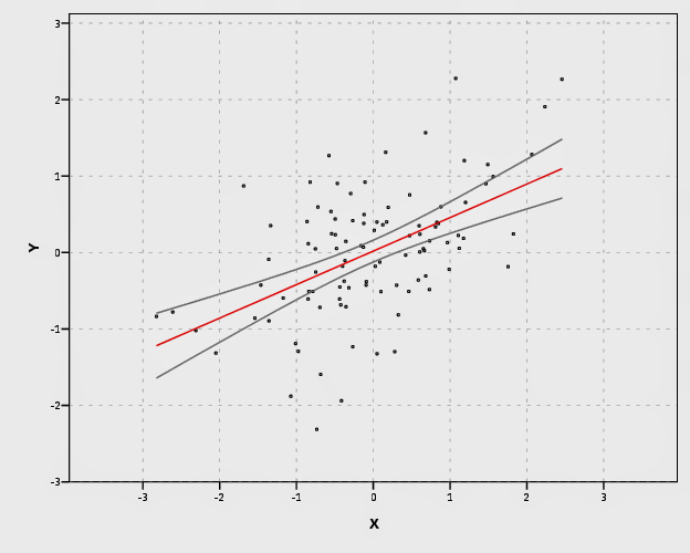
In SPSS’s grammar, it is simple to plot the predicted regression line with areas of the higher confidence interval as more transparent. Here I use saved values from the regression equation, but you can also use functions within GPL (see smooth.linear and region.confi.smooth).


*Using path with transparency between segments.
GGRAPH
  /GRAPHDATASET NAME="graphdataset" VARIABLES=X Y PRE_1 size 
  /GRAPHSPEC SOURCE=INLINE.
BEGIN GPL
 SOURCE: s=userSource(id("graphdataset"))
 DATA: X=col(source(s), name("X"))
 DATA: Y=col(source(s), name("Y"))
 DATA: PRE_1=col(source(s), name("PRE_1"))
 DATA: size=col(source(s), name("size"))
 GUIDE: axis(dim(1), label("X"))
 GUIDE: axis(dim(2), label("Y"))
 GUIDE: legend(aesthetic(aesthetic.transparency.interior), null())
 SCALE: linear(dim(1), min(-3.8), max(3.8))
 SCALE: linear(dim(2), min(-3), max(3))
 ELEMENT: point(position(X*Y), size(size."2"))
 ELEMENT: line(position(X*PRE_1), color.interior(color.red), transparency.interior(size), size(size."4"))
END GPL.

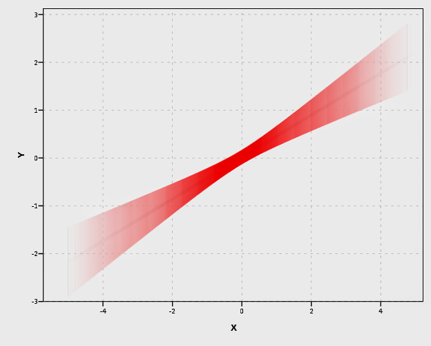
It is a bit harder to make the areas semi-transparent throughout the plot. If you use an area.difference ELEMENT, it makes the entire area a certain amount of transparency. If you use intervals with the current data, the area will be too sparse. So what I do is make new data, sampling more densley along the x axis and make the predictions. From this we can use interval element to plot the predictions, mapping the size of the interval to transparency and color saturation.


*make new cases to have a consistent sampling of x values to make the intervals.

input program.
loop #j = 1 to 500.
    compute #min = -5.
    compute #max = 5.
    compute X = #min + (#j - 1)*(#max - #min)/500.
    compute new = 1.
    end case.
    end loop.
end file.
end input program.
dataset name newcases.
execute.

dataset activate sim.
add files file = *
/file = 'newcases'.
exe.
dataset close newcases.

match files file = *
/drop UMCI_1 LMCI_1 PRE_1.

REGRESSION
  /MISSING LISTWISE
  /STATISTICS COEFF OUTS R ANOVA
  /CRITERIA=PIN(.05) POUT(.10) CIN(95)
  /NOORIGIN
  /DEPENDENT Y
  /METHOD=ENTER X
  /SAVE PRED MCIN.

compute size = UMCI_1 - LMCI_1.
formats ALL (F1.0).

temporary.
select if new = 1.
GGRAPH
  /GRAPHDATASET NAME="graphdataset" VARIABLES=X PRE_1 LMCI_1 UMCI_1 size MISSING=LISTWISE
  REPORTMISSING=NO
  /GRAPHSPEC SOURCE=INLINE.
BEGIN GPL
 SOURCE: s=userSource(id("graphdataset"))
 DATA: X=col(source(s), name("X"))
 DATA: PRE_1=col(source(s), name("PRE_1"))
 DATA: LMCI_1=col(source(s), name("LMCI_1"))
 DATA: UMCI_1=col(source(s), name("UMCI_1"))
 DATA: size=col(source(s), name("size"))
 TRANS: sizen = eval(size*-1)
 TRANS: sizer = eval(size*.01)
 GUIDE: axis(dim(1), label("X"))
 GUIDE: axis(dim(2), label("Y"))
 GUIDE: legend(aesthetic(aesthetic.transparency.interior), null())
 GUIDE: legend(aesthetic(aesthetic.transparency.exterior), null())
 GUIDE: legend(aesthetic(aesthetic.color.saturation.exterior), null())
 SCALE: linear(aesthetic(aesthetic.transparency), aestheticMinimum(transparency."0.90"), aestheticMaximum(transparency."1"))
 SCALE: linear(aesthetic(aesthetic.color.saturation), aestheticMinimum(color.saturation."0"), 
              aestheticMaximum(color.saturation."0.01"))
 SCALE: linear(dim(1), min(-5.5), max(5))
 SCALE: linear(dim(2), min(-3), max(3))
 ELEMENT: interval(position(region.spread.range(X*(LMCI_1 + UMCI_1))), transparency.exterior(size), color.exterior(color.red), size(size."0.005"), 
                  color.saturation.exterior(sizen))
 ELEMENT: line(position(X*PRE_1), color.interior(color.darkred), transparency.interior(sizer), size(size."5"))
END GPL.
exe.

Unfortunately, this creates some banding effects. Sampling fewer points makes the banding effects worse, and sampling more reduces the ability to make the plot transparent (and it is still produces banding effects). So, to produce one that looks this nice took some experimentation with how densely the new points were sampled, how aesthetics were mapped, and how wide the interval lines would be.

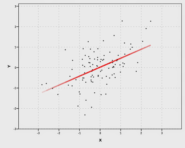
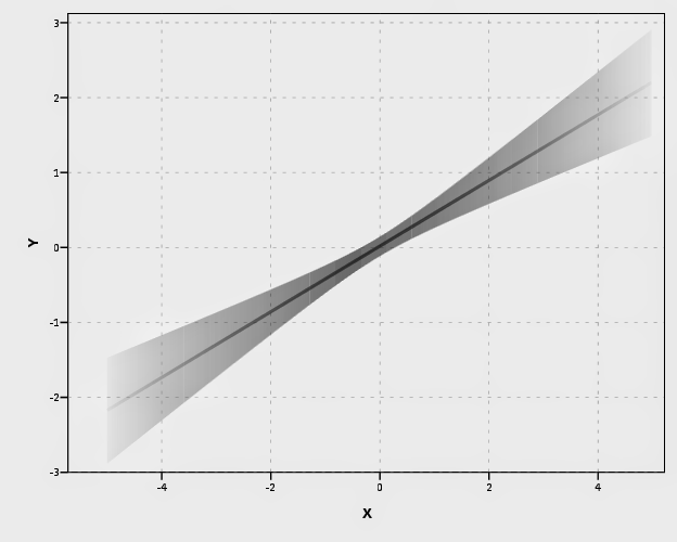
I tried to map a size aesthetic to the line and it works ok, you can still see some banding effects. Also note, to get the size of the line to be vertical (as oppossed to oriented in whatever direction the line is orientated) one needs to use a step line function. The jump() specification makes it so the vertical lines in the step chart aren’t visible. It took some trial and error to map the size to the exact interval (not sure if one can use the percent specifications to fix that trial and error). The syntax for lines though generalizes to multiple groups in SPSS easier than does the interval elements (although Solomon comments on one of Felix’s blog post that he prefers the non-interval plots with multiple groups, due to drawing difficulties and getting too busy I believe). Also FWIW it took less fussing with the density of the sample points and drawing of transparency to make the line mapped to size look nice.


temporary.
select if new = 1.
GGRAPH
  /GRAPHDATASET NAME="graphdataset" VARIABLES=X PRE_1 LMCI_1 UMCI_1 size MISSING=LISTWISE
  REPORTMISSING=NO
  /GRAPHSPEC SOURCE=INLINE.
BEGIN GPL
 SOURCE: s=userSource(id("graphdataset"))
 DATA: X=col(source(s), name("X"))
 DATA: PRE_1=col(source(s), name("PRE_1"))
 DATA: LMCI_1=col(source(s), name("LMCI_1"))
 DATA: UMCI_1=col(source(s), name("UMCI_1"))
 DATA: size=col(source(s), name("size"))
 GUIDE: axis(dim(1), label("X"))
 GUIDE: axis(dim(2), label("Y"))
 GUIDE: legend(aesthetic(aesthetic.transparency.interior), null())
 GUIDE: legend(aesthetic(aesthetic.transparency.exterior), null())
 GUIDE: legend(aesthetic(aesthetic.size), null())
 SCALE: linear(aesthetic(aesthetic.size), aestheticMinimum(size."0.16in"), aestheticMaximum(size."1.05in"))
 SCALE: linear(aesthetic(aesthetic.transparency.interior), aestheticMinimum(transparency."0.5"), aestheticMaximum(transparency."1"))
 SCALE: linear(dim(1), min(-5.5), max(5))
 SCALE: linear(dim(2), min(-3), max(3))
 ELEMENT: line(position(smooth.step.left(X*PRE_1)), jump(), color.interior(color.black), transparency.interior(size), size(size))
 ELEMENT: line(position(X*PRE_1), color.interior(color.black), transparency.interior(size), size(size."3"))
END GPL.
exe.
*Add these two lines to see the actual intervals line up (without ending period).
*ELEMENT: line(position(X*LMCI_1), color.interior(color.black)).
*ELEMENT: line(position(X*UMCI_1), color.interior(color.black)).

Also note Solomon suggests that the saturation of the plot should be higher towards the mean of the predicted value. I don’t do that here (but have a superimposed predicted line you can see). A way to do that in SPSS would be to make multiple intervals and continually superimpose them (see Maltz and Zawitz (1998) for an applied example of something very similar). Another way may involve using color gradients for the intervals (which isn’t possible through syntax, but is through a chart template). There are other examples that I could do in SPSS (spaghetti plots of bootstrapped estimates, discrete bins for certain intervals) but I don’t provide examples of them for reasons noted below.

I will try to provide some examples of more interesting non-linear graphs in the near future (I recently made a macro to estimate restricted cubic spline bases). But this should be enough for now to show how to implement such plots in SPSS for everyone, and the necessary grammar to make the charts.

Some notes on current discussion and implementations

My main critiques of the current implementations (and really more so the discussion) are more curmudgeonly than substantive, but hopefully it is clear enough to provide some more perspective on the work. I’ll start by saying that, it is unclear if either Solomon or Felix have read the greater visualization literature on visualizing uncertainty. While I can’t fault Felix for that so much (it is a bit much to expect a blog post to have a detailed bibliography) Solomon has at least posted a paper on SSRN. I don’t mean this as too much of a critique to Solomon, he has a good idea, and a good perspective on visualization (if you read his blog he has plenty of nice examples). But, it is more aimed at a particular set of potential alternative plots that Solomon and Felix have presented that I don’t feel are very good ideas.

Like all scientific work, we stand on the shoulders of those who come before us. While I haven’t explicitly seen visually weighted regression plots in any prior work, there are certainly many very similar examples. The most obvious would probably be the discussion of Jackson (2008), and for applied examples of this technique to very similar regression contexts are Maltz and Zawitz (1998) and Esarey and Pierce (2012) (besides Jackson (2008), there is a variety of potential other related literature cited in the discussion to Gelman’s blog posts – but this article is blatently related). There are undoubtedly many more, likely even older than the Maltz paper, and there is a treasure trove of papers about displaying error bars on this Andrew Gelman post. Besides proper attribution, this isn’t just pedantic, we should take the lessons learned from the prior literature and apply them to our current situation. There are large literatures on visualizaing uncertainty, and it is a popular enough topic that it has its own sections in cartography and visualization textbooks (MacEachren 2004; Slocum et al. 2005; Wilkinson 2005).

In particular, there is one lesson I feel should strongly reflect on the current discussion, and that is visualizing crisp lines in graphics implies the exact opposite of uncertainty to the viewers. Spiegelhalter, Pearson, and Short (2011) have an example of this, where a graphic about a tornado warning was taken a bit more to heart than it should have, and instead of people interpreting the areas of highest uncertainty in the predicted path as just that, they interpreted it as more a deterministic. There appears to be good agreement about using alpha blending (Roth, Woodruff, and Johnson 2010), and having fuzzy lines are effective ways of displaying uncertainty (MacEachren 2004; Wood et al. 2012). Thus, we have good evidence that, if the goal of the plot is to deemphasize portions of the regression that have large amounts of uncertainty in the estimates, we should not plot those estimates using discrete cut-offs. This is why I find Felix’s poll results unfortunate, in that the plot with the discrete cut-offs is voted the highest by viewers of the blog post!

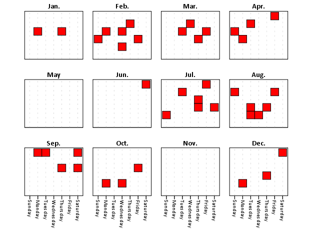
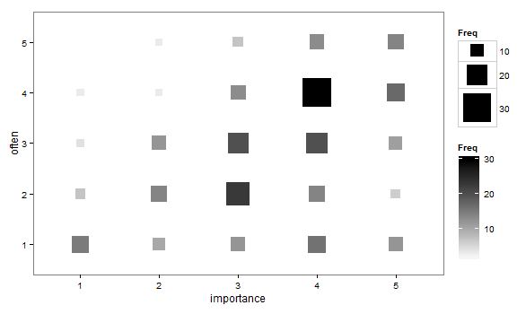
So here is an example graph by Felix of the discrete bins (note this is the highest voted image in Felix’s poll!). Again to be clear, discrete bins suggests the exact opposite of uncertainty, and certainly does not deemphasize areas of the plot that have the greatest amount of uncertainty.

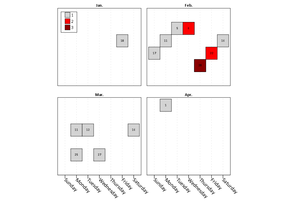
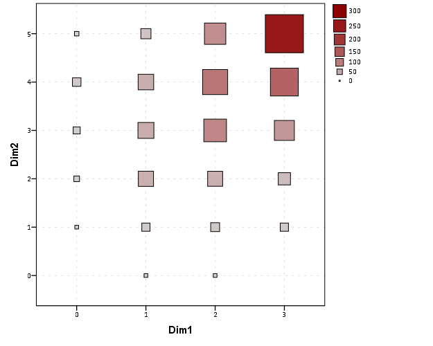
Here is the example of the plot from Solomon that also has a similar problem with discrete bins. The colors portray uncertainty, but it is plain to see the lattice on the plot, and I don’t understand why this meets any of Solomon’s original goals. It takes ink to plot the lattice!

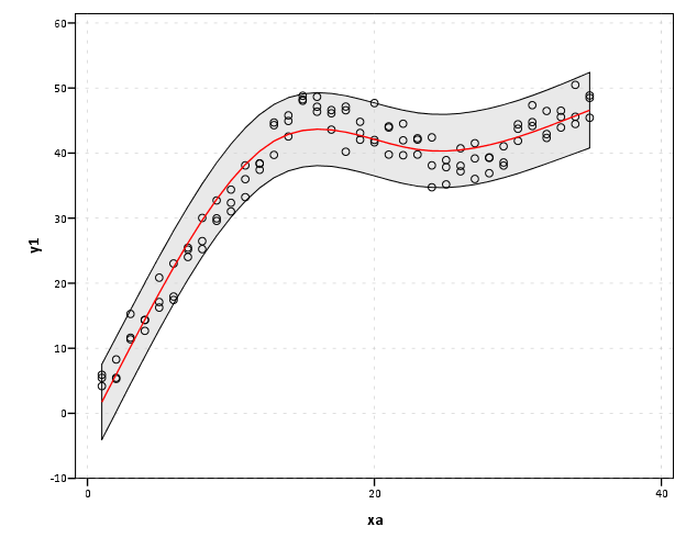
More minor, but still enough to guide our implementations, the plots that superimpose multiple bootstrapped estimates, while they are likely ok to visualize uncertainty, the resulting spaghetti make the plots much more complex. The shaded areas maintain a much more condense and clear to understand visual, while superimposing multiple lines on the plot creates a difficult to envision distribution (here I have an example on the CV blog, and it is taken from Carr and Pickle (2009)). It may aid understanding uncertainty about the regression estimate, but it detracts from visualizing any more global trends in the regression estimate. It also fails to meet the intial goal of deemphasizing areas of the plot that are most uncertain. It accomplishes quite the opposite actually, and areas where the bootstrapped estimates have a greater variance will draw more attention because they are more dispersed on the plot.

Here is an example from Solomon’s blog of the spaghetti plots with the lines drawn heavily transparent.

Solomon writes about the spaghetti plot distraction in his SSRN paper, but still presents the examples as if they are reasonable alternatives (which is strange). I would note these would be fine and dandy if visualizing the uncertainty was itself an original goal of the plot, but that isn’t the goal! To a certain extent, displaying an actual interval is countervailing to the notion of deemphasizing that area of the chart. The interval needs to command a greater area of the chart. I think Solomon has some very nice examples where the tradeoff is reasonable, with plotting the areas with larger intervals in lower color saturation (here I use transparency to the same effect). I doubt this is news to Solomon – what he writes in his SSRN paper conforms to what I’m saying as far as I can tell – I’m just confused why he presents some examples as if they are reasonable alternatives. I think it deserves reemphasis though given all the banter and implementations floating around the internet, especially with some of the alternatives Felix has presented.

I’m not sure if Solomon and Felix really appreciate though the distinction between hard lines and soft lines though after reading the blog post(s) and the SSRN paper. Of course these assertions and critiques of mine should be tested in experimental settings, but we should not ignore prior research in spite of a lack of experimental findings. I don’t want these critiques to be viewed too harshly though, and I hope Solomon and Felix take them to heart (either in future implementations or actual papers discussing the technique).


Citations

Carr, Daniel B., and Linda Williams Pickle. 2009. Visualizing Data Patterns with Micromaps. Boca Rotan, FL: CRC Press.

Esarey, Justin, and Andrew Pierce. 2012. Assessing fit quality and testing for misspecification in binary-dependent variable models. Political Analysis 20: 480–500.

Hsiang, Solomon M. 2012. Visually-Weighted Regression.

Jackson, Christopher H. 2008. Displaying uncertainty with shading. The American Statistician 62: 340–47.

MacEachren, Alan M. 2004. How maps work: Representation, visualization, and design. New York, NY: The Guilford Press.

Maltz, Michael D., and Marianne W. Zawitz. 1998. Displaying violent crime trends using estimates from the National Crime Victimization Survey. US Department of Justice, Office of Justice Programs, Bureau of Justice Statistics.

Roth, Robert E., Andrew W. Woodruff, and Zachary F. Johnson. 2010. Value-by-alpha maps: An alternative technique to the cartogram. The Cartographic Journal 47: 130–40.

Slocum, Terry A., Robert B. McMaster, Fritz C. Kessler, and Hugh H. Howard. 2005. Thematic cartography and geographic visualization. Prentice Hall.

Spiegelhalter, David, Mike Pearson, and Ian Short. 2011. Visualizing uncertainty about the future. Science 333: 1393–1400.

Wilkinson, Leland. 2005. The grammar of graphics. New York, NY: Springer.

Wood, Jo, Petra Isenberg, Tobias Isenberg, Jason Dykes, Nadia Boukhelifa, and Aidan Slingsby. 2012. Sketchy Rendering for Information Visualization. Visualization and Computer Graphics, IEEE Transactions on 18: 2749–58.

The week at Stackexchange 5/21/2013 Edition

Posts I’ve found interesting during the week (or likely over longer periods!) at various forums I participate at.

CrossValidated

GIS

Academia

Others

SPSS Nabble Group

Hopefully I get more time to blog in the near future, but currently busy, busy, busy! Working on visualizing JTC flow data (presenting at ASC this fall), getting everyone to approve my prospectus, and I have a few more SPSS blog posts I have in mind (restricted cubic splines, visually weighted regression, and using Ripley’s K to analyze temporal crime sprees!)

Calendar Heatmap in SPSS

Here is just a quick example of making calendar heatmaps in SPSS. My motivation can be seen from similar examples of calendar heatmaps in R and SAS (I’m sure others exist as well). Below is an example taken from this Revo R blog post.

The code involves a macro that can take a date variable, and then calculate the row position the date needs to go in the calendar heatmap (rowM), and also returns a variable for the month and year, which are used in the subsequent plot. It is brief enough I can post it here in its entirety.


*************************************************************************************.
*Example heatmap.

DEFINE !heatmap (!POSITIONAL !TOKENS(1)).
compute month = XDATE.MONTH(!1).
value labels month
1 'Jan.'
2 'Feb.'
3 'Mar.'
4 'Apr.'
5 'May'
6 'Jun.'
7 'Jul.'
8 'Aug.'
9 'Sep.'
10 'Oct.'
11 'Nov.'
12 'Dec.'.
compute weekday = XDATE.WKDAY(!1).
value labels weekday
1 'Sunday'
2 'Monday'
3 'Tuesday'
4 'Wednesday'
5 'Thursday'
6 'Friday'
7 'Saturday'.
*Figure out beginning day of month.
compute #year = XDATE.YEAR(!1).
compute #rowC = XDATE.WKDAY(DATE.MDY(month,1,#year)).
compute #mDay = XDATE.MDAY(!1).
*Now ID which row for the calendar heatmap it belongs to.
compute rowM = TRUNC((#mDay + #rowC - 2)/7) + 1.
value labels rowM
1 'Row 1'
2 'Row 2'
3 'Row 3'
4 'Row 4'
5 'Row 5'
6 'Row 6'.
formats rowM weekday (F1.0).
formats month (F2.0).
*now you just need to make the GPL call!.
!ENDDEFINE.

set seed 15.
input program.
loop #i = 1 to 365.
    compute day = DATE.YRDAY(2013,#i).
    compute flag = RV.BERNOULLI(0.1).
    end case.
end loop.
end file.
end input program.
dataset name days.
format day (ADATE10).
exe.

!heatmap day.
exe.
temporary.
select if flag = 1.
GGRAPH
  /GRAPHDATASET NAME="graphdataset" VARIABLES=weekday rowM month
  /GRAPHSPEC SOURCE=INLINE.
BEGIN GPL
 SOURCE: s=userSource(id("graphdataset"))
 DATA: weekday=col(source(s), name("weekday"), unit.category())
 DATA: rowM=col(source(s), name("rowM"), unit.category())
 DATA: month=col(source(s), name("month"), unit.category())
 COORD: rect(dim(1,2),wrap())
 GUIDE: axis(dim(1))
 GUIDE: axis(dim(2), null())
 GUIDE: axis(dim(4), opposite())
 SCALE: cat(dim(1), include("1.00", "2.00", "3.00", "4.00", "5.00","6.00", "7.00"))
 SCALE: cat(dim(2), reverse(), include("1.00", "2.00", "3.00", "4.00", "5.00","6.00"))
 SCALE: cat(dim(4), include("1.00", "2.00", "3.00", "4.00", "5.00",
  "6.00", "7.00", "8.00", "9.00", "10.00", "11.00", "12.00"))
 ELEMENT: polygon(position(weekday*rowM*1*month), color.interior(color.red))
END GPL.
*************************************************************************************.

Which produces this image below. You can not run the temporary command to see what the plot looks like with the entire year filled in.

This is nice to illustrate potential day of week patterns for specific events that only rarely occur, but you can map any aesthetic you please to the color of the polygon (or you can change the size of the polygons if you like). Below is an example I used this recently to demonstrate what days a spree of crimes appeared on, and I categorically colored certain dates to indicate multiple crimes occurred on those dates. It is easy to see from the plot that there isn’t a real strong tendency for any particular day of week, but there is some evidence of spurts of higher activity.

In terms of GPL logic I won’t go into too much detail, but the plot works even with months or rows missing in the data because of the finite number of potential months and rows in the plot (see the SCALE statements with the explicit categories included). If you need to plot multiple years, you either need seperate plots or another facet. Most of the examples show numerical information over every day, which is difficult to really see patterns like that, but it shouldn’t be entirely disgarded just because of that (I would have to simultaneously disregard every choropleth map ever made if I did that!)

A brief intro on building Custom Dialogs in SPSS

So the other day after my fluctuation chart post Jon Peck gently nudged me to make a chart custom dialog (with teasers such as it only takes a few minutes.) Well, he is right, they are quite easy to make. Here I will briefly walk through the process just to highlight how easy it really is.

At first, I was confusing the custom builder dialog with the old VB like scripts. The newer builder dialog (not sure what version it was introduced, but all I note here was produced in V20) is a purely GUI application that one can build dialogs to insert arbitrary code sections based on user input. It is easier to show than say, but in the end the dialog I build here will produce the necessary syntax to make the fluctuation charts I showed in the noted prior post.

So first, to get to the Chart Builder dialog one needs to access the menu via Utilities -> Custom Dialogs -> Custom Dialog Builder.

Then, when the dialog builder is opened, one is presented with an empty dialog canvas.

To start building the dialog, you drag the elements in the tool box onto the canvas. It seems you will pretty much always want to start with a source variable list.

Now, before we finish all of the controls, lets talk about how the dialog builder interacts with the produced syntax. So, for my fluctuation chart, a typical syntax call might look like below, if we want to plot V1 against V2.

GGRAPH
  /GRAPHDATASET NAME="graphdataset" VARIABLES=V1 V2 COUNT()[name="COUNT"]
  /GRAPHSPEC SOURCE=INLINE.
BEGIN GPL
 SOURCE: s=userSource(id("graphdataset"))
 DATA: V1=col(source(s), name("V1"), unit.category())
 DATA: V2=col(source(s), name("V2"), unit.category())
 DATA: COUNT=col(source(s), name("COUNT"))
 GUIDE: axis(dim(1), label("V1"))
 GUIDE: axis(dim(2), label("V2"))
 SCALE: pow(aesthetic(aesthetic.size), aestheticMinimum(size."8px"), aestheticMaximum(size."45px"))
 SCALE: linear(aesthetic(aesthetic.color.interior), aestheticMinimum(color.lightgrey), aestheticMaximum(color.darkred))
 ELEMENT: point(position(V1*V2), shape(shape.square), color.interior(COUNT), size(COUNT))
END GPL.

So how exactly will the dialog builder insert arbitrary variables? In our syntax, we want to replace sections of code with %%Identifier%%, where Identifier refers to a particular name we assign to any particular control in the builder. So, if I wanted to have some arbitrary code to change V1 to whatever the user inputs, I would replace V1 in the original syntax with %%myvar%% (and name the control myvar). In the end, the syntax template for this particular dialog looks like below.

GGRAPH
  /GRAPHDATASET NAME="graphdataset" VARIABLES=%%x%% %%y%% COUNT()[name="COUNT"]
  /GRAPHSPEC SOURCE=INLINE.
BEGIN GPL
 SOURCE: s=userSource(id("graphdataset"))
 DATA: %%x%%=col(source(s), name("%%x%%"), unit.category())
 DATA: %%y%%=col(source(s), name("%%y%%"), unit.category())
 DATA: COUNT=col(source(s), name("COUNT"))
 GUIDE: axis(dim(1), label("%%x%%"))
 GUIDE: axis(dim(2), label("%%y%%"))
%%title%%
 SCALE: pow(aesthetic(aesthetic.size) %%minpixel%% %%maxpixel%%)
 SCALE: linear(aesthetic(aesthetic.color.interior), aestheticMinimum(color.lightgrey), aestheticMaximum(color.darkred))
 ELEMENT: point(position(%%x%%*%%y%%), shape(shape.square), color.interior(COUNT), size(COUNT))
END GPL.

To insert the syntax, there is a button in the dialog builder to open it (the tool tip will say syntax template). You can just copy and paste the code in. Here there are user inputs for both the variables for the fluctuation chart, and the minimum and maximum size of the pixels, and the chart title. Only the variables are required for execution, and if the user inputs for the other arbitrary statements are not filled in they dissapear completely from the syntax generation.

Now, we are set up with all of the arbitrary elements we want to insert into the code. Here I want to have controls for two target lists (the x and y axis variables), two number controls (for the min and max size of the pixels), and one text control (for the chart title). To associate the control with the syntax, after you place a control on the canvas you can select and edit its attributes. The Identifier attribute is what associates it with the %%mypar%% in the syntax template.

So here for the Y axis variable, I named the Identifier y.

Also take note of the syntax field, %%ThisValue%%. Here, you can change the syntax field to either just enter the field name (or user input), or enter in more syntax around that user input. As an example, the Syntax field for the Chart Title control looks like this;

GUIDE: text.title(label("%%ThisValue%%"))

If the title control is omitted, the entire %%title%% line in the syntax template is not generated. If some text is entered into the title control, the surrounding GUIDE syntax is inserted with the text replacing %%ThisValue%% in the above code example. You can see how I used this behavior to make the min and max pixel size for the points arbitrary.

To learn more about all of the different controls and more of the aesthetics and extra niceties you can do with the dialog builder, you should just take a stroll through the help for custom dialogs. Here is the location where I uploaded the FluctuationChart dialog builder to (you can open it up and edit it yourself to see the internals). I hope to see more contributions by other SPSS users in the future, they are really handy for Python and R scripts in addition to GGRAPH code.

The week at Stackexchange 4/28/13 Edition

I know several individuals have blog posts in which they list interesting other articles that happened during the week. Mine will be a bit of a different twist though. I participate in a few of the stack exchange sites (and the SPSS Nabble forum), and often I think a question is interesting, but don’t follow along closely enough to see an answer given. Another situation that happens is I give an answer, and I don’t see other answers to the same post. To help me, and bring greater attention to various posts I find interesting, I figured I would create a weekly listing of those particular questions (no guarantee the question had anything to do with the previous week – I’ll try not to be redundant though!)

CrossValidated

GIS

Academia

Others

I’ve just noted this because I’ve seen a ton of nice ggplot2 examples from the Didzis Elferts recently on stackoverflow.

SPSS Nabble Group

Fluctuation diagrams in SPSS

The other day on my spineplot post Jon Peck made a comment about how he liked the structure charts in this CV thread. Here I will show how to make them in SPSS (FYI the linked thread has an example of how to make them in R using ggplot2 if you are interested).

Unfortunately I accidently called them a structure plot in the original CV thread, when they are actually called fluctuation diagrams (see Pilhofer et al. (2012) and Wickham & Hofmann (2011) for citations). They are basically just binned scatterplots for categorical data, and the size of a point is mapped to the number of observations that fall within that bin. Below is the example (in ggplot2) taken from the CV thread.

So, to make these in SPSS you first need some categorical data, you can follow along with any two categorical variables (or at the end of the post I have the complete syntax with some fake categorical data). First, it is easier to start with some boilerplate code generated through the GUI. If you have any data set open that has categorical data in it (unaggregated) you can simply open up the chart builder dialog, choose a barplot, place the category you want on the x axis, then place the category you want on the Y axis as a column panel for a paneled bar chart.

The reason you make this chart is that the GUI interprets the default behavior of this bar chart is to aggregate the frequencies. You make the colum panel just so the GUI will write out the data definitions for you. If you pasted the chart builder syntax then the GPL code will look like below.


*Fluctuation plots - first make column paneled bar chart.
GGRAPH
  /GRAPHDATASET NAME="graphdataset" VARIABLES=Dim1[LEVEL=NOMINAL] COUNT()
  [name="COUNT"] Dim2[LEVEL=NOMINAL] MISSING=LISTWISE REPORTMISSING=NO
  /GRAPHSPEC SOURCE=INLINE.
BEGIN GPL
 SOURCE: s=userSource(id("graphdataset"))
 DATA: Dim1=col(source(s), name("Dim1"), unit.category())
 DATA: COUNT=col(source(s), name("COUNT"))
 DATA: Dim2=col(source(s), name("Dim2"), unit.category())
 GUIDE: axis(dim(1), label("Dim1"))
 GUIDE: axis(dim(2), label("Count"))
 GUIDE: axis(dim(3), label("Dim2"), opposite())
 SCALE: cat(dim(1))
 SCALE: linear(dim(2), include(0))
 SCALE: cat(dim(3))
 ELEMENT: interval(position(Dim1*COUNT*Dim2), shape.interior(shape.square))
END GPL.

With this boilerplate code though we can edit to make the chart we want. Here I outline some of those steps. Only editing the ELEMENT portion, the steps below are;

  • Edit the ELEMENT statement to be a point instead of interval.
  • Delete COUNT within the position statement (within the ELEMENT).
  • Change shape.interior to shape.
  • Add in ,size(COUNT) after shape(shape.square).
  • Add in ,color.interior(COUNT) after size(COUNT).

Those are all of the necessary statements to produce the fluctuation chart. The next two are to make the chart look nicer though.

  • Add in aesthetic mappings for scale statements (both the color and the size).
  • Change the guide statements to have the correct labels (and delete the dim(3) GUIDE).

The GPL code call then looks like this (with example aesthetic mappings) and below that is the chart it produces.


*In the end fluctuation plot.
GGRAPH
  /GRAPHDATASET NAME="graphdataset" VARIABLES=Dim1 Dim2 COUNT()[name="COUNT"]
  /GRAPHSPEC SOURCE=INLINE.
BEGIN GPL
 SOURCE: s=userSource(id("graphdataset"))
 DATA: Dim1=col(source(s), name("Dim1"), unit.category())
 DATA: Dim2=col(source(s), name("Dim2"), unit.category())
 DATA: COUNT=col(source(s), name("COUNT"))
 GUIDE: axis(dim(1), label("Dim1"))
 GUIDE: axis(dim(2), label("Dim2"))
 SCALE: pow(aesthetic(aesthetic.size), aestheticMinimum(size."8px"), aestheticMaximum(size."45px"))
 SCALE: linear(aesthetic(aesthetic.color.interior), aestheticMinimum(color.lightgrey), aestheticMaximum(color.darkred))
 ELEMENT: point(position(Dim1*Dim2), shape(shape.square), color.interior(COUNT), size(COUNT))
END GPL.

Aesthetically, besides the usual niceties the only thing to note is that the size of the squares typically needs to be changed to fill up the space (you would have to be lucky to have an exact mapping between area and the categorical count to work out). I presume squares are preferred because area assessments with squares tend to be more accurate than circles, but that is just my guess (you could use any shape you wanted). I use a power scale for size aesthetic, as the area for a square increases by the size of the side squared (and people interpret the areas in the plot, not the size of the side of the square). SPSS’s default exponent for a power scale is 0.5, which is the square root so exactly what we want. You just need to supply a reasonable start and end size for the squares to let them fill up the space depending on your counts. Unfortunately, SPSS does not make a correctly scaled legend in size, but the color aesthetic is correct (I leave it in only to show that it is incorrect, if for publication I would like suppress the different sizes and only show the color gradient). (Actually, my V20 continues to not respect shape aesthetics that aren’t mapped – and this is produced via post-hoc editing of the shape – owell).

Here I show two redundant continuous aesthetic scales (size and color). SPSS’s behavior is to make the legend discrete instead of continuous. In Wilkinson’s Grammar of Graphics he states that he prefers discrete scales (even for continous aesthetics) to aid lookup.


***********************************************************.
*Making random categorical data.
set seed 14.
input program.
loop #i = 1 to 1000.
    compute Prop = RV.UNIFORM(.5,1).
    end case.
end loop.
end file.
end input program.
dataset name cats.
exe.

compute Dim1 = RV.BINOMIAL(3,PROP).
compute Dim2 = RV.BINOMIAL(5,PROP).

*Fluctuation plots - first make column paneled bar chart.
GGRAPH
  /GRAPHDATASET NAME="graphdataset" VARIABLES=Dim1[LEVEL=NOMINAL] COUNT()
  [name="COUNT"] Dim2[LEVEL=NOMINAL] MISSING=LISTWISE REPORTMISSING=NO
  /GRAPHSPEC SOURCE=INLINE.
BEGIN GPL
 SOURCE: s=userSource(id("graphdataset"))
 DATA: Dim1=col(source(s), name("Dim1"), unit.category())
 DATA: COUNT=col(source(s), name("COUNT"))
 DATA: Dim2=col(source(s), name("Dim2"), unit.category())
 GUIDE: axis(dim(1), label("Dim1"))
 GUIDE: axis(dim(2), label("Count"))
 GUIDE: axis(dim(3), label("Dim2"), opposite())
 SCALE: cat(dim(1))
 SCALE: linear(dim(2), include(0))
 SCALE: cat(dim(3))
 ELEMENT: interval(position(Dim1*COUNT*Dim2), shape.interior(shape.square))
END GPL.

*Then edit 1) element to point.
*2) delete COUNT within position statement
*3) shape.interior -> shape
*4) add in "size(COUNT)"
*5) add in "color.interior(COUNT)"
*6) add in aesthetic mappings for scale statements
*7) change guide statements - then you are done.

*In the end fluctuation plot.
GGRAPH
  /GRAPHDATASET NAME="graphdataset" VARIABLES=Dim1 Dim2 COUNT()[name="COUNT"]
  /GRAPHSPEC SOURCE=INLINE.
BEGIN GPL
 SOURCE: s=userSource(id("graphdataset"))
 DATA: Dim1=col(source(s), name("Dim1"), unit.category())
 DATA: Dim2=col(source(s), name("Dim2"), unit.category())
 DATA: COUNT=col(source(s), name("COUNT"))
 GUIDE: axis(dim(1), label("Dim1"))
 GUIDE: axis(dim(2), label("Dim2"))
 SCALE: pow(aesthetic(aesthetic.size), aestheticMinimum(size."8px"), aestheticMaximum(size."45px"))
 SCALE: linear(aesthetic(aesthetic.color.interior), aestheticMinimum(color.lightgrey), aestheticMaximum(color.darkred))
 ELEMENT: point(position(Dim1*Dim2), shape(shape.square), color.interior(COUNT), size(COUNT))
END GPL.

*Alternative ways to map sizes in the plot.
*SCALE: linear(aesthetic(aesthetic.size), aestheticMinimum(size."5%"), aestheticMaximum(size."30%")).
*SCALE: linear(aesthetic(aesthetic.size), aestheticMinimum(size."6px"), aestheticMaximum(size."18px")).

*Alternative jittered scatterplot - need to remove the agg variable COUNT.
*Replace point with point.jitter.
GGRAPH
  /GRAPHDATASET NAME="graphdataset" VARIABLES=Dim1 Dim2
  /GRAPHSPEC SOURCE=INLINE.
BEGIN GPL
 SOURCE: s=userSource(id("graphdataset"))
 DATA: Dim1=col(source(s), name("Dim1"), unit.category())
 DATA: Dim2=col(source(s), name("Dim2"), unit.category())
 GUIDE: axis(dim(1), label("Dim1"))
 GUIDE: axis(dim(2), label("Dim2"))
 ELEMENT: point.jitter(position(Dim1*Dim2))
END GPL.
***********************************************************.

Citations of Interest

Spineplots in SPSS

So the other day someone on cross-validated asked about visualizing categorical data, and spineplots was one of the responses. The OP asked if a solution in SPSS was available, and there is none currently available, with the exception of calling R code for Mosaic plots, which there is a handy function for that on developerworks. I had some code I started to attempt to make them, and it is good enough to show-case. Some notes on notation, these go by various other names (including Marimekko and Mosaic), also see this developerworkds thread which says spineplot but is something a bit different. Cox (2008) has a good discussion about the naming issues as well as examples, and Wickham & Hofmann (2011) have some more general discussion about different types of categorical plots and there relationships.

So instead of utilizing a regular stacked bar charts, spineplots make the width of the bar proportional to the size of the category. This makes categories with a larger share of the sample appear larger. Below is an example image from a recent thread on CV discussing various ways to plot categorical data.

This should be fairly intuitive what it represents. It is just a stacked bar chart, where the width of the bars on the X axis represent the marginal proportion of that category, and the height of the boxes on the Y axis represent the conditional proportion within each category (hence, all bars sum to a height of one).

Located here I have some of my example code to produce a similar plot all natively within SPSS. Directly below is an image of the result, and below that is an example of the syntax needed to generate the chart. In a nutshell, I provide a macro to generate the coordinates of the boxes and the labels. Then I just provide an example of how to generate the chart in GPL. The code currently sorts the boxes by the marginal totals on each axis, with the largest categories in the lower stack and to the left-most area of the chart. There is an optional parameter to turn this off though, in which case the sorting will be just by ascending order of however the categories are coded (the code has an example of this). I also provide an example at the end calling the R code to produce similar plots (but not shown here).

Caveats should be mentioned here as well, the code currently only works for two categorical variables, and the labels for the categories on the X-axis are labelled via data points within the chart. This will produce bad results with labels that are very close to one another (but at least you can edit/move them post-hoc in the chart editor in SPSS).

I asked Nick Cox on this question if his spineplot package for Stata had any sorting, and he replied in the negative. He has likely thought about it more than me, but I presume they should be sorted somehow by default, and sorting by the marginal totals in the categories was pretty easy to accomplish. I would like to dig into this (and other categorical data visualizations) a bit more, but unfortunately time is limited (and these don’t have much direct connection to my current scholarly work). There is a nice hodge-podge collection at the current question on CV I mentioned earlier (I think I need to add in a response about ParSets at the moment as well).


********************************************************************.
*Plots to make Mosaic Macro, tested on V20.
*I know for a fact V15 does not work, as it does not handle 
*coloring the boxes correctly when using the link.hull function.

*Change this to whereever you save the MosaicPlot macro.
FILE HANDLE data /name = "E:\Temp\MosaicPlot".
INSERT FILE = "data\MacroMosaic.sps".

*Making random categorical data.
dataset close ALL.
output close ALL.

set seed 14.
input program.
loop #i = 1 to 1000.
    compute DimStack = RV.BINOM(2,.6).
    compute DimCol = RV.BINOM(2,.7).
    end case.
end loop.
end file.
end input program.
dataset name cats.
exe.

value labels DimStack
0 'DimStack Cat0'
1 'DimStack Cat1'
2 'DimStack Cat2'.
value labels DimCol
0 'DimCol Cat0'
1 'DimCol Cat1'
2 'DimCol Cat2'.

*set mprint on.
!makespine Cat1 = DimStack Cat2 = DimCol.
*Example Graph - need to just replace Cat1 and Cat2 where appropriate.
dataset activate spinedata.
rename variables (DimStack = Cat1)(DimCol = Cat2).
GGRAPH
  /GRAPHDATASET NAME="graphdataset" VARIABLES=X2 X1 Y1 Y2 myID Cat1 Cat2 Xmiddle
  MISSING = VARIABLEWISE
  /GRAPHSPEC SOURCE=INLINE.
BEGIN GPL
 SOURCE: s=userSource(id("graphdataset"))
 DATA: Y2=col(source(s), name("Y2"))
 DATA: Y1=col(source(s), name("Y1"))
 DATA: X2=col(source(s), name("X2"))
 DATA: X1=col(source(s), name("X1"))
 DATA: Xmiddle=col(source(s), name("Xmiddle"))
 DATA: myID=col(source(s), name("myID"), unit.category())
 DATA: Cat1=col(source(s), name("Cat1"), unit.category())
 DATA: Cat2=col(source(s), name("Cat2"), unit.category())
 TRANS: y_temp = eval(1)
 SCALE: linear(dim(2), min(0), max(1.05))
 GUIDE: axis(dim(1), label("Prop. Cat 2"))
 GUIDE: axis(dim(2), label("Prop. Cat 1 within Cat 2"))
 ELEMENT: polygon(position(link.hull((X1 + X2)*(Y1 + Y2))), color.interior(Cat1), split(Cat2))
 ELEMENT: point(position(Xmiddle*y_temp), label(Cat2), transparency.exterior(transparency."1"))
END GPL.

*This makes the same chart without sorting.
dataset activate cats.
dataset close spinedata.
!makespine Cat1 = DimStack Cat2 = DimCol sort = N.
dataset activate spinedata.
rename variables (DimStack = Cat1)(DimCol = Cat2).
GGRAPH
  /GRAPHDATASET NAME="graphdataset" VARIABLES=X2 X1 Y1 Y2 myID Cat1 Cat2 Xmiddle
  MISSING = VARIABLEWISE
  /GRAPHSPEC SOURCE=INLINE.
BEGIN GPL
 SOURCE: s=userSource(id("graphdataset"))
 DATA: Y2=col(source(s), name("Y2"))
 DATA: Y1=col(source(s), name("Y1"))
 DATA: X2=col(source(s), name("X2"))
 DATA: X1=col(source(s), name("X1"))
 DATA: Xmiddle=col(source(s), name("Xmiddle"))
 DATA: myID=col(source(s), name("myID"), unit.category())
 DATA: Cat1=col(source(s), name("Cat1"), unit.category())
 DATA: Cat2=col(source(s), name("Cat2"), unit.category())
 TRANS: y_temp = eval(1)
 SCALE: linear(dim(2), min(0), max(1.05))
 GUIDE: axis(dim(1), label("Prop. Cat 2"))
 GUIDE: axis(dim(2), label("Prop. Cat 1 within Cat 2"))
 ELEMENT: polygon(position(link.hull((X1 + X2)*(Y1 + Y2))), color.interior(Cat1), split(Cat2))
 ELEMENT: point(position(Xmiddle*y_temp), label(Cat2), transparency.exterior(transparency."1"))
END GPL.
*In code online I have example using Mosaic plot plug in for R.
********************************************************************.

Citations of Interest

Some theory behind the likability of XKCD style charts


Recently on the stackexchange sites there was a wave of questions regarding how to make XKCD style charts (see example above). Specifically, the hand-drawn imprecise look about the charts.

There also appear to be a variety of other language examples floating around, like MATLAB, D3 and Python.

What is interesting about these exchanges, in some highly scientific/computing communities, is that they are excepted (that was a weird Freudian slip) accepted with open arms. Some dogmatic allegiance to Tufte may consider these to be at best chart junkie, and at worst blatant distortions of data (albeit minor ones). For an example of the fact that at least the R community on stackoverflow is aware of such things, see some of the vitriol to this question about replicating some aesthetic preferences of gradient backgrounds and rounded edges (available in Excel) in R. So what makes these XKCD charts different? Certainly the content of the information in XKCD comics is an improvement over typical horrific 3d pie charts in Excel, but this doesn’t justify there use.

Wood et al. (2012) provide some commentary as to perhaps why people like the charts. Such hypothesis include that the sketchy rendering evokes some mental model of simplicity, and thus reduces barriers to first interpreting the image. The actual sketchy rendering also makes one focus on more obvious global characteristics of the graphic, and thus avoid spending attention on minor imperceivable details. This should also lead into why it is a potentially nice tool to visualize uncertainty in the data presented. The concept of simplifying and generalizing geographic shapes has been known for awhile in cartography (I’m skeptical it is much known in the more general data-viz community), but this is a bit of a unique extension.

Besides the implementations noted at the prior places, they also provide a library, Handy for making sketchy drawings from any graphics produced in Processing. Below are two examples.


So there isn’t just a pretty picture behind the logic of why everyone likes the XKCD style charts. It is a great example of the divide between classical statistical graphics (ala Tufte and Cleveland) versus current individuals within journalism and data-viz who attempt to make charts aesthetically pleasing, attention grabbing, and for the masses. Wood and company take great lengths to show the relative error in the paper cited when using such sketchy rendering, but weighing the benefits of readability vs. error in graphics is a difficult question to address going forward.


Citations