Reducing folium map sizes

Recently for a crimede-coder project I have been building out a custom library to make nice leaflet maps using the python folium library. See the example I have posted on my website. Below is a screenshot:

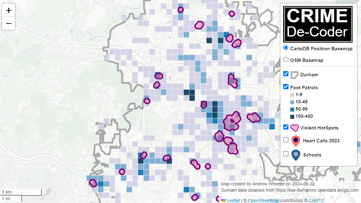
This map ended up having around 3000 elements in it, and was a total of 8mb. 8mb is not crazy to put on a website, but is at the stage where you can actually notice latency when first rendering the map.

Looking at the rendered html code though it was verbose in a few ways for every element. One is that lat/lon are in crazy precision by default, e.g. [-78.83229390597961, 35.94592660794455]. So a single polygon can have many of those. Six digits of precision for lat/lon is still under 1 meter of precision, which is plenty sufficient for my mapping applications. So you can reduce 8+ characters per lat/lon and not really make a difference to the map (you can technically have invalid polygons doing this, but this is really pedantic and should be fine).

A second part of the rendered folium html map for every object is given a full uuid, e.g. geo_json_a19eff2648beb3d74760dc0ddb58a73d.addTo(feature_group_2e2c6295a3a1c7d4c8d57d001c782482);. This again is not necessary. I end up reducing the 32 length uuids to the first 8 alphanumeric characters.

A final part is that the javascript is not minified – it has quite a bit of extra lines/spaces that are not needed. So here are my notes on using python code to take care of some of those pieces.

To clean up the precision for geometry objects, I do something like this.

import re

# geo is the geopandas dataframe
redg = geo.geometry.set_precision(10**-6).to_json()
# redg still has floats, below regex clips values
rs = r'(\d{2}\.|-\d{2}\.)(\d{6})(\d+)'
re.sub(rs,r'\1\2',redg)

As most of my functions add the geojson objects to the map one at a time (for custom actions/colors), this is sufficient to deal with that step (for markers, can round lat/lon directly). It may make more sense for the set precision to be 10**-5 and then clip the regex. (For these regex’s I am showing there is some risk they will replace something they should not, I think it will be pretty safe though.)

Then to clean up the UUID’s and extra whitespace, what I do is render the final HTML and then use regex’s:

# fol is the folium object
html = fol.get_root()
res = html.script.get_root().render()
# replace UUID with first 8
ru = r'([0-9a-f]{8})[0-9a-f]{4}[0-9a-f]{4}[0-9a-f]{4}[0-9a-f]{12}'
res = re.sub(ru,r'\1',res)
# clean up whitespace
rl = []
for s in res.split('\n'):
    ss = s.strip()
    if len(ss) > 0:
        rl.append(ss)
rlc = '\n'.join(rl)

There is probably a smarter way to do this directly with the folium object for the UUID’s. For whitespace though it would need to be after the HTML is written. You want to be careful with the cleaning up the whitespace step – it is possible you wanted blank lines in say a leaflet popup or tooltip. But for my purposes this is not really necessary.

Doing these two steps in the Durham map reduces the size of the rendered HTML from 8mb to 4mb. So reduced the size of the file by around 4 million characters! The savings will be even higher for maps with more elements.

One last part is my map has redundant svg inserted for the map markers. I may be able to use css to insert the svg, e.g. something like in css .mysvg {background-image: url("vector.svg");}, and then in the python code for the marker svg insert <div class="mysvg"></div>. For dense point maps this will also save quite a few characters. Or you could add in javascript to insert the svg as well (although that would be a bit sluggish I think relative to the css approach, although sluggish after first render if the markers are turned off).

I have not done this yet, as I need to tinker with getting the background svg to look how I want, but could save another 200-300 characters per marker icon. So will save a megabyte in the map for every 3000-5000 markers I am guessing.

The main reason I post webdemo’s on the crimede-coder site is that there a quite a few grifters in the tech space. Not just for data analysis, but for front-end development as well. I post stuff like that so you can go and actually see the work I do and its quality. There are quite a few people now claiming to be “data viz experts” who just embed mediocre Tableau or PowerBI apps. These apps in particular tend to produce very bad maps, so here you can see what I think a good map should look like.

If you want to check out all the interactions in the map, I posted a YouTube video walking through them

Durham hotspot map walkthrough of interactions

Notes on making Leaflet maps in R

The other day I wrote a blog post for crimrxiv about posting interactive graphics on their pre-print sharing service. I figured it would be good to share my notes on making interactive maps, and to date I’ve mostly created these using the R leaflet library.

The reason I like these interactive maps is they allow you to zoom in and look at hot spots of crime. With the slippy base maps you can then see, oh OK this hot spot is by a train station, or an apartment complex, etc. It also allows you to check out specific data labels via pop-ups as I will show.

I’m using data from my paper on creating cost of crime weighted hot spots in Dallas (that will be forthcoming in Police Quarterly soonish). But I have posted a more direct set of replicating code for the blog post here.

R Code

So first for the R libraries I am using, I also change the working directory to where I have my data located on my Windows machine.

##########################################################
#This code creates a nice leaflet map of my DBSCAN areas

library(rgdal)       #read in shapefiles
library(sp)          #spatial objects
library(leaflet)     #for creating interactive maps
library(htmlwidgets) #for exporting interactive maps

#will need to change baseLoc if replicating on your machine
baseLoc <- "D:\\Dropbox\\Dropbox\\Documents\\BLOG\\leaflet_R_examples\\Analysis"
setwd(baseLoc)
##########################################################

Second, I read in my shapefiles using the rgdal library. This is important, as it includes the projection information. To plot the spatial objects on a slippy map they need to be in the Web Mercator projection (or technically no projection, just a coordinate reference system for the globe). As another trick I like with these basemaps, for the outlined area (the Dallas boundary here), it is easier to plot as a line spatial object, as opposed to an empty filled polygon. You don’t need to worry about the order of the layers as much that way.

##########################################################
#Get the boundary data and DBSCAN data
boundary <- readOGR(dsn="Dallas_MainArea_Proj.shp",layer="Dallas_MainArea_Proj")
dbscan_areas <- readOGR(dsn="db_scan.shp",layer="db_scan")

#Now convert to WGS
DalLatLon <- spTransform(boundary,CRS("+init=epsg:4326"))
DallLine <- as(DalLatLon, 'SpatialLines') #Leaflet useful for boundaries to be lines instead of areas
dbscan_LatLon <- spTransform(dbscan_areas,CRS("+init=epsg:4326") )

#Quick and Dirty plot to check projections are OK
plot(DallLine)
plot(dbscan_LatLon,add=TRUE,col='blue')
##########################################################

Next part, I have a custom function I have made to make pop-up labels for these leaflet maps. First I need to read in a table with the data info for the hot spot areas and merge that into the spatial object. Then the way my custom function works is I pass it the dataset, then I have arguments for the variables I want, and the way I want them labeled. The function does the work of making the labels bolded and putting in line breaks into the HTML. (No doubt others have created nice libraries to do HTML tables/graphs inside the pop-ups that I am unaware of.) If you check out the final print statement, it shows the HTML it built for one of the labels, <strong>ID: </strong>1<br><strong>$ (Thousands): </strong>116.9<br><strong>PAI: </strong>10.3<br><strong>Street Length (Miles): </strong>0.4

##########################################################
#Function for labels

#read in data
crime_stats <- read.csv('ClusterStats_wlen.csv', stringsAsFactors=FALSE)
dbscan_stats <- crime_stats[crime_stats$type == 'DBSCAN',]
dbscan_stats$clus_id <- as.numeric(dbscan_stats$AreaStr) #because factors=False!

#merge into the dbscan areas
dbscan_LL <- merge(dbscan_LatLon,dbscan_stats)

LabFunct <- function(data,vars,labs){
  n <- length(labs)
  add_lab <- paste0("<strong>",labs[1],"</strong>",data[,vars[1]])
  for (i in 2:n){
    add_lab <- paste0(add_lab,"<br><strong>",labs[i],"</strong>",data[,vars[i]])
  }
  return(add_lab)
}

#create labels
vs <- c('AreaStr', 'val_th', 'PAI_valth_len', 'LenMile')
#Lazy, so just going to round these values
for (v in vs[-1]){
  dbscan_LL@data[,v] <- round(dbscan_LL@data[,v],1)
}  
lb <- c('ID: ','$ (Thousands): ','PAI: ','Street Length (Miles): ')
diss_lab <- LabFunct(dbscan_LL@data, vs, lb)

print(diss_lab[1]) #showing off just one
##########################################################

Now finally onto the hotspot map. This is a bit to chew over, so I will go through bit-by-bit.

##########################################################
HotSpotMap <- leaflet() %>%
  addProviderTiles(providers$OpenStreetMap, group = "Open Street Map") %>%
  addProviderTiles(providers$CartoDB.Positron, group = "CartoDB Lite") %>%
  addPolylines(data=DallLine, color='black', weight=4, group="Dallas Boundary") %>%
  addPolygons(data=dbscan_LL,color = "blue", weight = 2, opacity = 1.0, 
              fillOpacity = 0.5, group="DBSCAN Areas",popup=diss_lab, 
              highlight = highlightOptions(weight = 5,bringToFront = TRUE)) %>%
  addLayersControl(baseGroups = c("Open Street Map","CartoDB Lite"),
                   overlayGroups = c("Dallas Boundary","DBSCAN Areas"),
                   options = layersControlOptions(collapsed = FALSE))  %>%
  addScaleBar(position = "bottomleft", options = scaleBarOptions(maxWidth = 100, 
              imperial = TRUE, updateWhenIdle = TRUE))
                      
HotSpotMap #this lets you view interactively

#or save to a HTML file to embed in webpage
saveWidget(HotSpotMap,"HotSpotMap.html", selfcontained = TRUE)
##########################################################

First I create the empty leaflet() object. Because I am superimposing multiple spatial layers, I don’t worry about setting the default spatial layer. Second, I add in two basemap providers, OpenStreetMap and the grey scale CartoDB positron. Positron is better IMO for visualizing global data patterns, but the open street map is better for when you zoom in and want to see exactly what is around a hot spot area. Note when adding in a layer, I give it a group name. This allows you to later toggle which provider you want via a basegroup in the layers control.

Next I add in the two spatial layers, the Dallas Boundary lines and then the hot spots. For the DBSCAN hot spots, I include a pop-up diss_lab for the dbscan hot spot layer. This allows you to click on the polygon, and you get the info I stuffed into that label vector earlier. The HTML is to make it print nicely.

Finally then I add in a layers control, so you can toggle layers on/off. Basegroups mean that only one of the options can be selected, it doesn’t make sense to have multiple basemaps selected. Overlay you can toggle on/off as needed. Here the overlay doesn’t matter much due to the nature of the map, but if you have many layers (e.g. a hot spot map and a choropleth map of demographics) being able to toggle the layers on/off helps a bit more.

Then as a final touch I add in a scale bar (that automatically updates depending on the zoom level). These aren’t my favorite with slippy maps, as I’m not even 100% sure what location the scale bar refers to offhand (the center of the map? Or literally where the scale bar is located?) But when zoomed into smaller areas like a city I guess it is not misleading.

Here is a screenshot of this created map zoomed out to the whole city using the Positron grey scale base map. So it is tough to visualize the distribution of hot spots from this. If I wanted to do that in a static map I would likely just plot the hot spot centroids, and then make the circles bigger for areas that capture more crime.

But since we can zoom in, here is another screenshot zoomed in using the OpenStreetMap basemap, and also illustrating what my pop-up labels look like.

I’m too lazy to post this exact map, but it is very similar to one I posted for my actual hot spots paper if you want to check it out directly. I host it on GitHub for free.

Here I did not show how to make a choropleth map, but Jacob Kaplan in his R book has a nice example of that. And in the future I will have to update this to show how to do the same thing in python using the Folium library. I used Folium in this blog post if you want to dig into an example though for now.

Some more examples

For some other examples of what is possible in Leaflet maps in R, here are some examples I made for my undergrad Communities and Crime class. I had students submit prediction assignments (e.g. predict the neighborhood with the most crime in Dallas, predict the street segment in Oak Cliff with the most violent crime, predict the bar with the most crimes nearby, etc.) I would then show the class the results, as well as where other students predicted. So here are some screen shots of those maps.

Choropleth

Graduated Points

Street Segment Viz

Creating a basemap in python using contextily

Me and Gio received a peer review asking for a nice basemap in Philadelphia showing the relationship between hospital locations and main arterials for our paper on shooting fatalities.

I would typically do this in ArcMap, but since I do not have access to that software anymore, I took some time to learn the contextily library in python to accomplish the same task.

Here is the map we will be producing in the end:

So if you are a crime analyst working for a specific city, it may make sense to pull the original vector data for streets/highways and create your own style for your maps. That is quite a bit of work though, so for a more general solution these basemaps are really great. (And are honestly nicer than I could personally make even with the original vector data anyway).

Below I walk through the python code, but the data to replicate my paper with Gio can be found here, including the updated base map python script and shapefile data.

Front matter

So first, I have consistently had a difficult time working with the various geo tools in python on my windows machine. Most recently the issue was older version of pyproj and epsg codes were giving me fits. So at the recommendation of the geopandas folks, I just created my own conda environment for geospatial stuff, and that has worked nicely so far.

So here I need geopandas, pyproj, & contexily as non-traditional libraries. Then I change my working directory to where I have my data, and then update my personal matplotlib defaults.

'''
Python script to make a basemap
For Philadelphia
'''

import geopandas
import pyproj
import contextily as cx
import matplotlib
import matplotlib.pyplot as plt
import os
os.chdir(r'D:\Dropbox\Dropbox\School_Projects\Shooting_Survival_Philly\Analysis\OriginalData'

#Plot theme
andy_theme = {'axes.grid': True,
              'grid.linestyle': '--',
              'legend.framealpha': 1,
              'legend.facecolor': 'white',
              'legend.shadow': True,
              'legend.fontsize': 14,
              'legend.title_fontsize': 16,
              'xtick.labelsize': 14,
              'ytick.labelsize': 14,
              'axes.labelsize': 16,
              'axes.titlesize': 20,
              'figure.dpi': 100}

matplotlib.rcParams.update(andy_theme)

Data Prep with geopandas & pyproj

The next part we load in our shapefile into a geopandas data frame (just a border for Philly), then I just define the locations of hospitals (with level 1 trauma facilities) in text in the code.

Note that the background is in projected coordinates, so then I use some updated pyproj code to transform the lat/lon into the local projection I am using.

I thought at first you needed to only use typical web map projections to grab the tiles, but Dani Arribas-Bel has done a bunch of work to make this work for any projection. So I prefer to stick to projected maps when I can.

If you happened to want to stick to typical web map projections though geopandas makes it quite easy using geo_dat.to_crs('epsg:4326').

#####################################
#DATA PREP

ph_gp = geopandas.GeoDataFrame.from_file('City_Limits_Proj.shp')

#Locations of the hospitals
hos = [('Einstein',40.036935,-75.142657),
       ('Hahneman',39.957284,-75.163222),
       ('Temple',40.005507,-75.150257),
       ('Jefferson',39.949121,-75.157631),
       ('Penn',39.949819,-75.192883)]

#Convert to local projection
transformer = pyproj.Transformer.from_crs("epsg:4326", ph_gp.crs.to_string())
hx = []
hy = []
for h, lat, lon in hos:
    xp, yp = transformer.transform(lat, lon)
    hx.append(xp)
    hy.append(yp)
#####################################

Making the basemap

Now onto the good stuff. Here I use the default plotting methods from geopandas boundary plot to create a base matplotlib plot object with the Philly border outline.

Second I turn off the tick marks.

Next I have some hacky code to do the north arrow and scale bar. The north arrow is using annotations and arrows, so this just relies on the fact that north is up in the plot. (If it isn’t, you will need to adjust this for your map.)

The scale bar is more straightforward – I just plot a rectangle on the matplotlib plot, and then put text in the middle of the bar. Since the projected units are in meters, I just draw a rectangle that is 5 kilometers longways.

Then I add in the hospital locations. Note I gave the outline a label, as well as the hospitals. This is necessary to have those objects saved into the matplotlib legend. Which I add to the plot after this, and increase the default size.

Finally I add my basemap. I do not need to do anything special here, the contextily add_basemap function figures it all out for me, given that I pass in the coordinate reference system of the basemap. (You can take out the zoom level argument at first, 12 is the default zoom for Philly.)

Then I save the file to a lower res PNG.

#####################################
#Now making a basemap in contextily

ax = ph_gp.boundary.plot(color='k', linewidth=3, figsize=(12,12), label='City Boundary', edgecolor='k')
#ax.set_axis_off() #I still want a black frame around the plot
ax.get_xaxis().set_ticks([])
ax.get_yaxis().set_ticks([])

#Add north arrow, https://stackoverflow.com/a/58110049/604456
x, y, arrow_length = 0.85, 0.10, 0.07
ax.annotate('N', xy=(x, y), xytext=(x, y-arrow_length),
            arrowprops=dict(facecolor='black', width=5, headwidth=15),
            ha='center', va='center', fontsize=20,
            xycoords=ax.transAxes)

#Add scale-bar
x, y, scale_len = 829000, 62500, 5000 #arrowstyle='-'
scale_rect = matplotlib.patches.Rectangle((x,y),scale_len,200,linewidth=1,edgecolor='k',facecolor='k')
ax.add_patch(scale_rect)
plt.text(x+scale_len/2, y+400, s='5 KM', fontsize=15, horizontalalignment='center')

#Add in hospitals as points
plt.scatter(hx, hy, s=200, c="r", alpha=0.5, label='Trauma Hospitals')

#Now making a nice legend
ax.legend(loc='upper left', prop={'size': 20})

#Now adding in the basemap imagery
cx.add_basemap(ax, crs=ph_gp.crs.to_string(), source=cx.providers.CartoDB.Voyager, zoom=12)

#Now exporting the map to a PNG file
plt.savefig('PhillyBasemap_LowerRes.png', dpi=100) #bbox_inches='tight'
#####################################

And voila, you have your nice basemap.

Extra: Figuring out zoom levels

I suggest playing around with the DPI and changing the zoom levels, and changing the background tile server to see what works best given the thematic info you are superimposing on your map.

Here are some nice functions to help see the default zoom level, how many map tiles need to be downloaded when you up the default zoom level, and a list of various tile providers available. (See the contextily github page and their nice set of notebooks for some overview maps of the providers.)

#####################################
#Identifying how many tiles
latlon_outline = ph_gp.to_crs('epsg:4326').total_bounds
def_zoom = cx.tile._calculate_zoom(*latlon_outline)
print(f'Default Zoom level {def_zoom}')

cx.howmany(*latlon_outline, def_zoom, ll=True) 
cx.howmany(*latlon_outline, def_zoom+1, ll=True)
cx.howmany(*latlon_outline, def_zoom+2, ll=True)

#Checking out some of the other providers and tiles
print( cx.providers.CartoDB.Voyager )
print( cx.providers.Stamen.TonerLite )
print( cx.providers.Stamen.keys() )
#####################################