How much do students pay for textbooks at GSU?

Given I am a big proponent of open data, replicable scientific results, and open access publishing, I struck up a friendship with Scott Jacques at Georgia State University. One of the projects we pursued was a pretty simple, but could potentially save students a ton of money. If you have checked out your universities online library system recently, you may have noticed they have digital books (mostly from academic presses) that you can just read. No limits like the local library, they are just available to all students.

So the idea Scott had was identify books students are paying for, and then see if the library can negotiate with the publisher to have it for all students. This shifts the cost from the student to the university, but the licensing fees for the books are not that large (think less than $1000). This can save money especially if it is a class with many students, so say a $30 book with 100 students, that is $3000 students are ponying up in toto.

To do this we would need course enrollments and the books they are having students buy. Of course, this is data that does exist, but I knew going in that it was just not going to happen that someone just nicely gave us a spreadsheet of data. So I set about to scrape the data, you can see that work on Github if you care too.

The github repo in the data folder has fall 2024 and spring 2025 Excel spreadsheets if you want to see the data. I also have a filterable dashboard on my crime de-coder site.

You can filter for specific colleges, look up individual books, etc. (This is a preliminary dashboard that has a few kinks, if you get too sick of the filtering acting wonky I would suggest just downloading the Excel spreadsheets.)

One of the aspects though of doing this analysis, the types of academic publishers me and Scott set out to identify are pretty small fish. The largest happen to be Academic textbook publishers (like Pearson and McGraw Hill). The biggest, coming in at over $300,000 students spend on in a year is a Pearson text on Algebra.

You may wonder why so many students are buying an algebra book. It is assigned across the Pre-calculus courses. GSU is a predominantly low income serving institution, with the majority of students on Pell grants. Those students at least will get their textbooks reimbursed via the Pell grants (at least before the grant money runs out).

Being a former professor, these course bundles in my area (criminal justice) were comically poor quality. I accede the math ones could be higher quality, I have not purchased this one specifically, but this offers two solutions. One, Universities should directly contract with Pearson to buy licensing for the materials at a discount. The bookstore prices are often slightly higher than just buying from other sources (Pearson or Amazon) directly. (Students on Pell Grants need to buy from the bookstore though to be reimbursed.)

A second option is simply to pay someone to create open access materials to swap out. Universities often have an option for taking a sabbatical to write a text book. I am pretty sure GSU could throw 30k at an adjunct and they would write just as high (if not higher) quality material. For basic material like that, the current LLM tools could help speed the process by quite a bit.

For these types of textbooks, professors use them because they are convenient, so if a lower cost option were available that met the same needs, I am pretty sure you could convince the math department to have those materials as the standard. If we go to page two of the dashboard though, we see some new types of books pop up:

You may wonder, what is Conley Smith Publishing? It happens to be an idiosyncratic self publishing platform. Look, I have a self published book as well, but having 800 business students a semester buy your self published $100 using excel book, that is just a racket. And it is a racket that when I give that example to friends almost everyone has experienced in their college career.

There is no solution to the latter professors ripping off their students. It is not illegal as far as I’m aware. I am just guessing at the margins, that business prof is maybe making $30k bonus a semester forcing their students to buy their textbook. Unlike the academic textbook scenario, this individual will not swap out with materials, even if the alternative materials are higher quality.

To solve the issue will take senior administration in universities caring that professors are gouging their (mostly low income) students and put a stop to it.

This is not a unique problem to GSU, this is a problem at all universities. Universities could aim to make low/no-cost, and use that as advertisement. This should be particularly effective advertisement for low income serving universities.

If you are interested in a similar analysis for your own university, feel free to get in touch with either myself or Scott. We would like to expand our cost saving projects beyond GSU.

The story of my dissertation

My dissertation is freely available to read on my website (Wheeler, 2015). I still open up my hardcover I purchased every now and then. No one cites it, because no one reads dissertations, but it is easily the work I am the most proud of.

Most of the articles I write there is some motivating story behind the work you would never know about just from reading the words. I think this is important, as the story often is tied to some more fundamental problem, which solving specific problems is the main way we make progress in science. The stifling way that academics write peer reviewed papers currently doesn’t allow that extra narrative in.

For example, my first article (and what ended up being my masters thesis, Albany at that time you could go directly into PhD from undergrad and get your masters on the way), was an article about the journey to crime after people move (Wheeler, 2012). The story behind that paper was, while working at the Finn Institute, Syracuse PD was interested in targeted enforcement of chronic offenders, many of whom drive around without licenses. I thought, why not look at the journey to crime to see where they are likely driving. When I did that analysis, I noticed a few hundred chronic offenders had something like a 5 fold number of home addresses in the sample. (If you are still wanting to know where they drive, they drive everywhere, chronic offenders have very wide spatial footprints.)

Part of the motivation behind that paper was if people move all the time, how can their home matter? They don’t really have a home. This is a good segue into the motivation of the dissertation.

More of my academic reading at that point had been on macro and neighborhood influences on crime. (Forgive me, as I am likely to get some of the timing wrong in my memory, but this writing is as best as I remember it.) I had a class with Colin Loftin that I do not remember the name of, but discussed things like the southern culture of violence, Rob Sampson’s work on neighborhoods and crime, and likely other macro work I cannot remember. Sampson’s work in Chicago made the biggest impression on me. I have a scanned copy of Shaw & McKay’s Juvenile Delinquency (2nd edition). I also took a spatial statistics class with Glenn Deane in the sociology department, and the major focus of the course was on areal units.

When thinking about the dissertation topic, the only advice I remember receiving was about scope. Shawn Bushway at one point told me about a stapler thesis (three independent papers bundled into a single dissertation). I just wanted something big, something important. I intentionally sought out to try to answer some more fundamental question.

So I had the first inkling of “how can neighborhoods matter if people don’t consistently live in the same neighborhood”? The second was that my work at the Finn Institute working with police departments, hot spots were the only thing any police department cared about. It is not uncommon even now for an academic to fit a spatial model at the neighborhood level to crime and demographics, and have a throwaway paragraph in the discussion about how it would help police better allocate resources. It is comically absurd – you can just count up crimes at addresses or street segments and rank them and that will be a much more accurate and precise system (no demographics needed).

So I wanted to do work on micro level units of analysis. But I had on my dissertation Glenn and Colin – people very interested in macro and some neighborhood level processes. So I would need to justify looking at small units of analysis. Reading the literature, Weisburd and Sherman did not have to me clearly articulated reasons to be interested in micro places, beyond just utility for police. Sherman had the paper counting up crimes at addresses (Sherman et al., 1989), and none of Weisburd’s work had to me any clear causal reasoning to look at micro places to explain crime.

To be clear wanting to look at small units as the only guidepost in choosing a topic is a terrible place to start. You should start from a more specific, articulable problem you wish to solve. (If others pursuing Phds are reading.) But I did not have that level of clarity in my thinking at the time.

So I set out to articulate a reason why we would be interested to look at micro level areas that I thought would satisfy Glenn and Colin. I started out thinking about doing a simulation study, similar to what Stan Openshaw did (1984) that was motivated by Robinson’s (1950) ecological fallacy. While doing that I realized there was no point in doing the simulation, you could figure it out all in closed form (as have others before me). So I proved that random spatial aggregation would not result in the ecological fallacy, but aggregating nearby spatial areas would, assuming there is a spatial covariance between nearby areas. I thought at the time it was a novel proof – it was not (Footnote 1 on page 9 were all things I read after this). Even now the Wikipedia page on the ecological fallacy has an unsourced overview of the issue, that cross-spatial correlations make the micro and macro equations not equal.

This in and of itself is not interesting, but in the process did clearly articulate to me why you want to look at micro units. The example I like to give is as follows – imagine you have a bar you think causes crime. The bar can cause crime inside the bar, as well as the bar diffusing risk into the nearby area. Think people getting in fights in the bar, vs people being robbed walking away from a night of drinking. If you aggregate to large units of analysis, you cannot distinguish between “inside bar crime” vs “outside bar crime”. So that is a clear causal reasoning for when you want to look at particular units of analysis – the ability to estimate diffusion/displacement effects are highly dependent on the spatial unit of analysis. If you have an intervention that is “make the bar hire better security” (ala John Eck’s work) that should likely not have any impact outside the bar, only inside the bar. So local vs diffusion effects are not entirely academic, they can have specific real world implications.

This logic does not explicitly always value smaller spatial units of analysis though. Another example I liked to give is say you are evaluating a city wide gun buy back. You could look at more micro areas than the entire city, e.g. see if it decreased in neighborhood A and increased in neighborhood B, but it likely does not invalidate the macro city wide analysis. Which is just an aggregate estimate over the entire city – which in some cases is preferable.

Glenn Deane at some point told me that I am a reductionist, which was the first time I heard that word, but it did encapsulate my thinking. You could always go smaller, there is no atom to stop at. But often it just doesn’t matter – you could examine the differences in crime between the front stoop and the back porch, but there is not likely meaningful causal reasons to do so. This logic works for temporal aggregation and aggregating different crime types as well.

I would need to reread Great American city, but I did not take this to be necessarily contradictory to Sampson’s work on neighborhood processes. Rob came to SUNY Albany to give a talk at the sociology department (I don’t remember the year). Glenn invited me to whatever they were doing after the talk, and being a hillbilly I said I need to go back to work at DCJS, I am on my lunch break. (To be clear, no one at DCJS would have cared.) I am sure I would have not been able to articulate anything of importance to him, but I do wish I had taken that opportunity in retrospect.

So with the knowledge of how aggregation bias occurs in hand, I had formulated a few different empirical research projects. One was the idea behind bars and crime I have already given an example of. I had a few interesting findings, one of which is that diffusion effects are larger than the local effects. I also estimated the bias of bars selecting into high crime areas via a non-equivalent dependent variable design – the only time I have used a DAG in any of my work.

I gave a job talk at Florida State before the dissertation was finished. I had this idea in the hotel room the night before my talk. It was a terrible idea to add it to my talk, and I did not prepare what I was going to say sufficiently, so it came out like a jumbled mess. I am not sure whether I would want to remember or forget that series of events (which include me asking Ted Chiricos if you can fish in the Gulf of Mexico at dinner, I feel I am OK in one-on-one chats, group dinners I am more awkward than you can possibly imagine). It also included nice discussions though, Dan Mear’s asked me a question about emergent macro phenomenon that I did not have a good answer to at the time, but now I would say simple causal processes having emergent phenomenon is a reason to look at micro, not the macro. Eric Stewart asked me if there is any reason to look at neighborhood and I said no at the time, but I should have said my example gun buy back analogy.

The second empirical study I took from broken windows theory (Kelling & Wilson, 1982). So the majority of social science theories some spatial diffusion is to be expected. Broken windows theory though had a very clear spatial hypothesis – you need to see disorder for it to impact your behavior. So you do not expect spatial diffusion, beyond someones line of site, to occur. To measure disorder, I used 311 calls (I had this idea before I read Dan O’Brien’s work, see my prospectus, but Dan published his work on the topic shortly thereafter, O’Brien et al. 2015).

I confirmed this to be the case, conditional on controlling for neighborhood effects. I also discuss how if the underlying process is smooth, using discrete neighborhood boundaries can result in negative spatial autocorrelation, which I show some evidence of as well.

This suggests that using a smooth measure of neighborhoods, like Hipp’s idea of egohoods (Hipp et al., 2013), I think is probably more reasonable than discrete neighborhood boundaries (which are often quite arbitrary).

While I ended up publishing those two empirical applications (Wheeler, 2018; 2019), which was hard, I was too defeated to even worry about posting a more specific paper on the aggregation idea. (I think I submitted this paper to Criminology, but it was not well received.) I was partially burned out from the bars and crime paper, which went at least one R&R at Criminology and was still rejected. And then I went through four rejections for the 311 paper. I had at that point multiple other papers that took years to publish. It is a slog and degrading to be rejected so much.

But that is really my only substantive contribution to theoretical criminology in any guise. After the dissertation, I just focused on either policy work or engineering/method applications. Which are much easier to publish.

References

Notes on making line plots in matplotlib

Line plots are probably the most common type of plot I make. Here are my notes on making nice line plots in matplotlib in python. You can see the full replication code on Github here.

First, I will be working with UCR crime reports, for national level and then city level data from the Real Time Crime Index. The AH Datalytics crew saves their data in github as a simple csv file, and with the FBI CDE this code also downloads the most recent as well. getUCR are just helper functions to download the data, and cdcplot are some of my plot helpers, such as my personal matplotlib theme.

import cdcplot, getUCR
import pandas as pd
import matplotlib.pyplot as plt
from matplotlib import cm

# Get the National level and City data from Real Time Crime Index
us = getUCR.cache_fbi()
city = getUCR.prep_city()

So first, lets just do a basic plot of the national level MV Theft rate (here the rates are per 100,000 population, not per vehicles).

# Lets do a plot for National of the Motor Vehicle Theft Rate per pop
us['Date'] = pd.to_datetime(us['Date'])
us2020 = us[us['Date'].dt.year >= 2020]
var = 'motor-vehicle-theftrate'

# Basic
fig, ax = plt.subplots()
ax.plot(us2020['Date'],us2020[var])
fig.savefig('Line00.png', dpi=500, bbox_inches='tight')

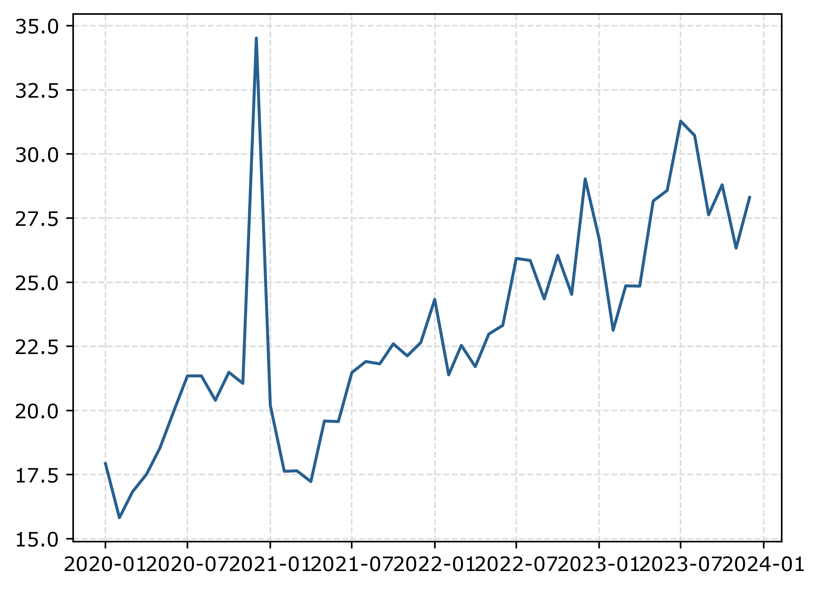
The big spike in December 2020 is due to the way FBI collects data. (Which I can’t find the specific post, but I am pretty sure Jeff Asher has written about in his substack.) So the glut of December reports are not actually extra reports in December, it is just the silly way the FBI reports the backlogged incidents.

You can also see the X axis labels are too close together. But otherwise (besides lack of labels) is acceptable. One thing I like to do with line plots is to superimpose point markers on the sample points. It doesn’t matter here so much, but this is helpful when you have irregular time points or missing data, it is clear that the time period is missing.

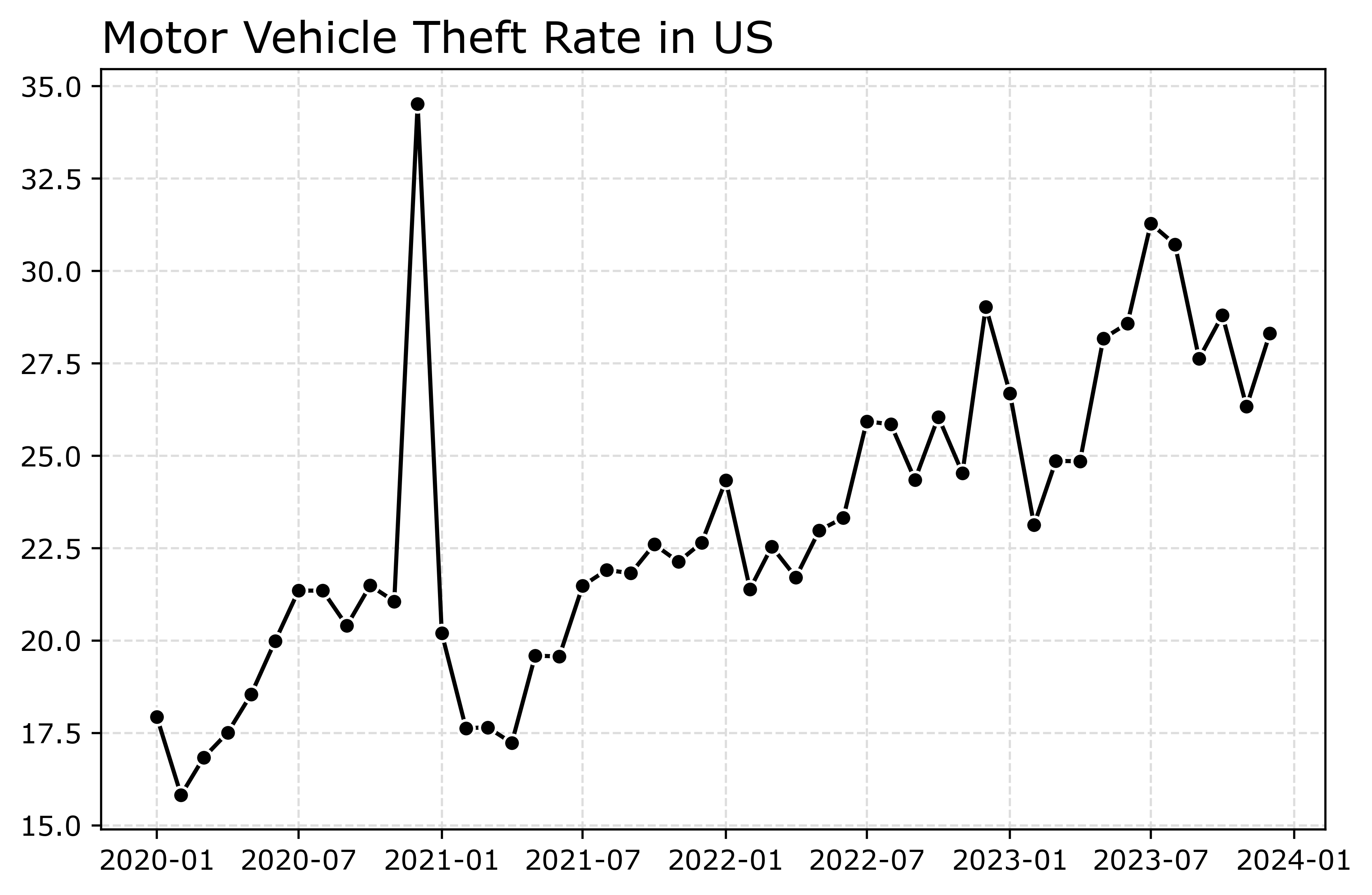
In matplotlib, you can do this by specifying -o after the x/y coordinates for the line. I also like the look of plotting with a white marker edge. Also making the plot slightly larger fixes the X axis labels (which have a nice default to showing Jan/July and the year). And finally, since the simplicity of the chart, instead of doing x or y axis labels, I can just put the info I need into the title. For a publication I would likely also put “per 100,000 population” somewhere (in a footnote on the chart or if the figure caption).

# Marker + outline + size
fig, ax = plt.subplots(figsize=(8,5))
ax.plot(us2020['Date'],us2020[var],'-o',
        color='k',markeredgecolor='white')
ax.set_title('Motor Vehicle Theft Rate in US')
fig.savefig('Line01.png', dpi=500, bbox_inches='tight')

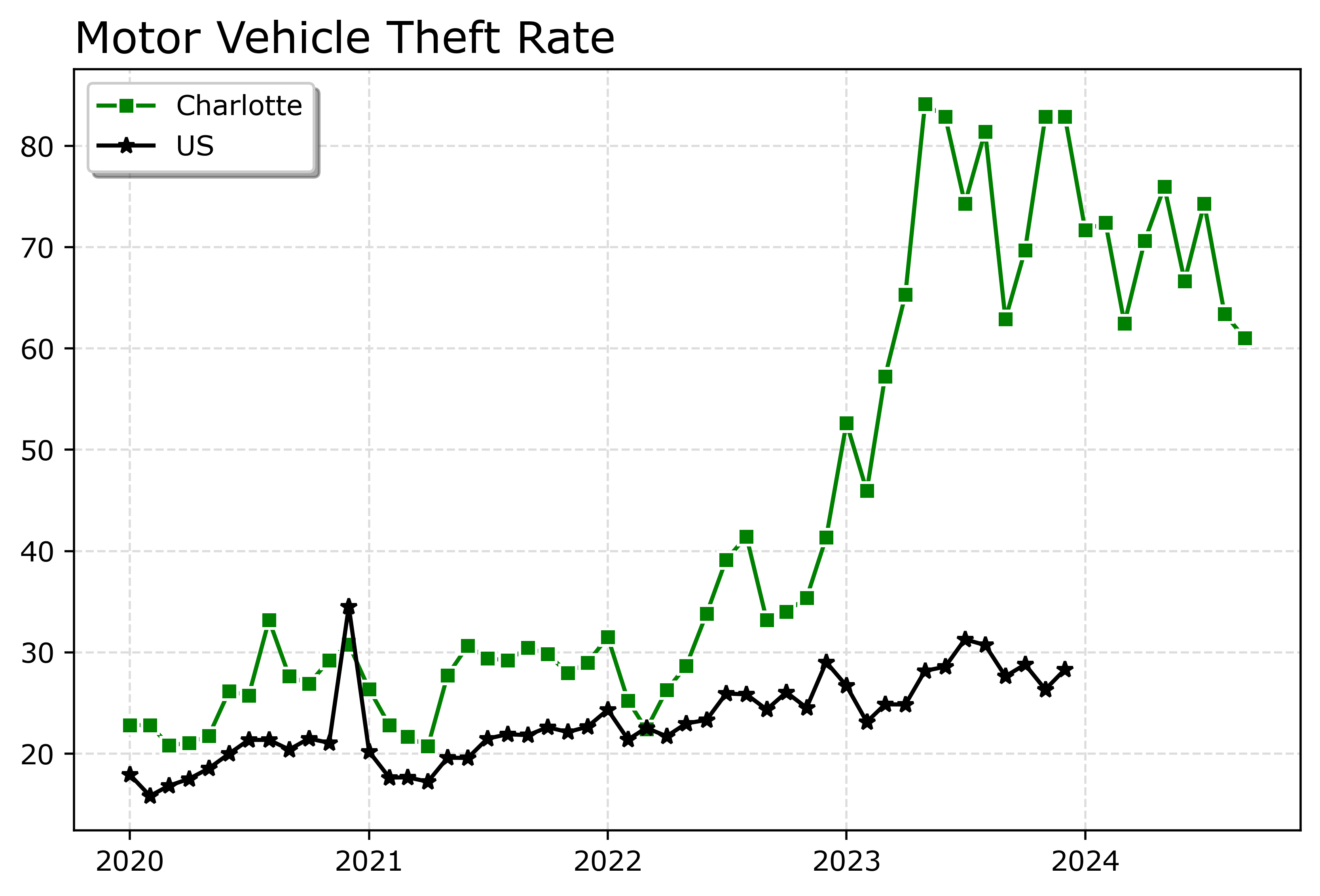
Markers are one way to distinguish between multiple lines as well. So you can do -s for squares superimposed on the lines, -^ for a triangle, etc. The white edge only looks nice for squares and circles though in my opinion. See the list of filled markers in this matplotlib documentation. Circles and squares IMO look the nicest and carry a similar visual weight. Here is superimposed Charlotte and US, showing off stars just to create show how to do it.

# Multiple cities
city[var] = (city['Motor Vehicle Theft']/city['Population'])*100000
nc2020 = city[(city['Year'] >= 2020) & (city['State_ref'] == 'NC')]
ncwide = nc2020.pivot(index='Mo-Yr',columns='city_state',values=var)
cityl = list(ncwide)
ncwide.columns = cityl # removing index name
ncwide['Date'] = pd.to_datetime(ncwide.index,format='%m-%Y')
ncwide.sort_values(by='Date',inplace=True)

fig, ax = plt.subplots(figsize=(8,5))
ax.plot(ncwide['Date'],ncwide['Charlotte, NC'],'-s',
        color='green',markeredgecolor='white',label='Charlotte')
ax.plot(us2020['Date'],us2020[var],'-*',
        color='k',label='US')
ax.legend()
ax.set_title('Motor Vehicle Theft Rate')
fig.savefig('Line02.png', dpi=500, bbox_inches='tight')

Charlotte was higher, but looked like it had parallel trends (just increased by around 10 per 100,000) with national trends from 2020 until early 2022. In early 2022, Charlotte dramatically increased though, and peaked/had high volatility since mid 2023 in a different regime shift from the earlier years.

When you make line plots, you want the lines to be a more saturated color in my opinion. It both helps them stand out, as well as makes it more likely to survive printing. No pastel colors. With the points superimposed, even with greyscale printing it will be fine. I commonly tell crime analysts to make a printable report for regular meetings, it is more likely to be viewed than an interactive dashboard.

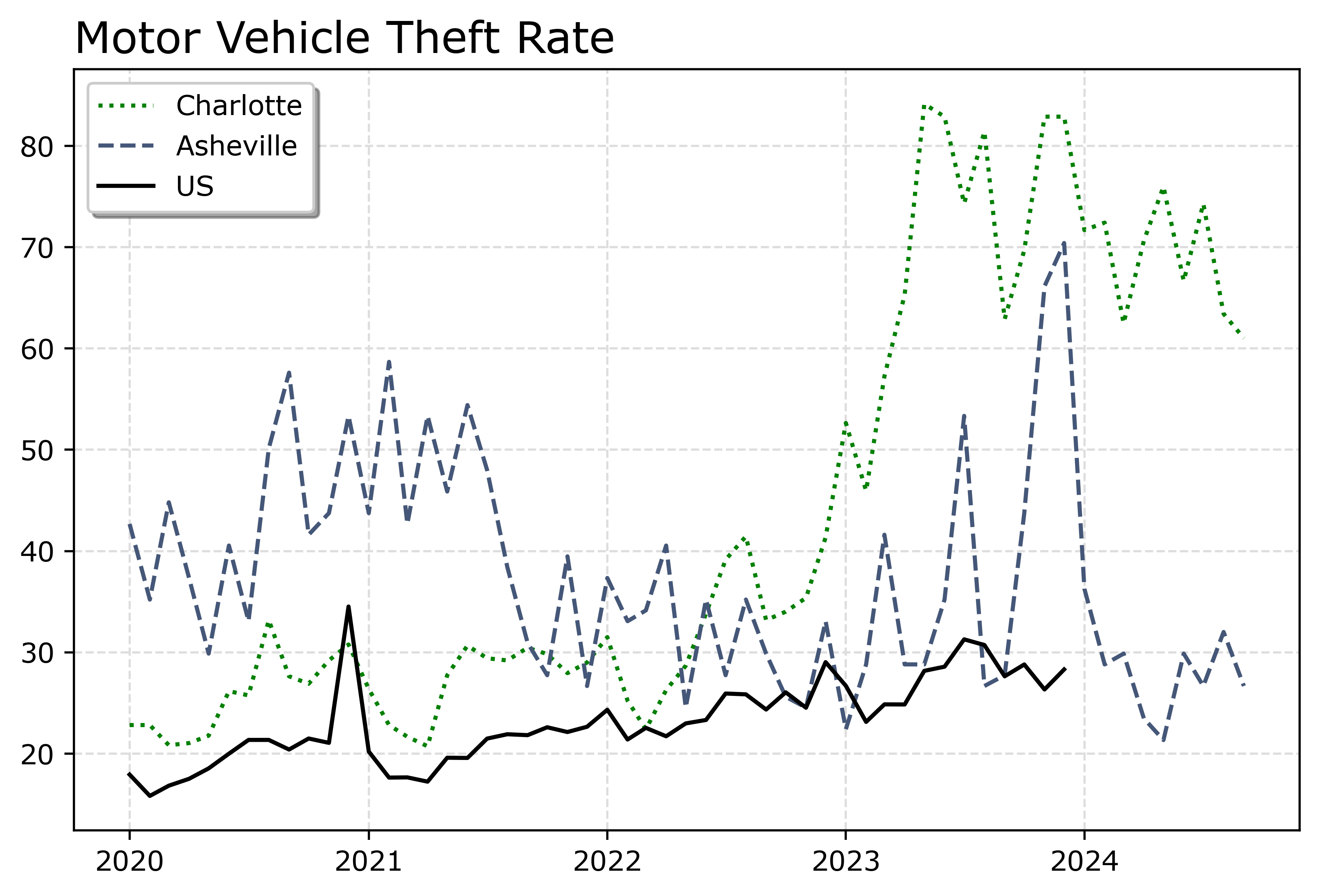
You can technically do dashes as well via the text string input. I do not like them though typically, as they are less saturated. Here I show two different dash styles. And you could do dashes and points, e.g. :o, (see this matplotlib doc for the styles) I have never bothered to do that though.

# Dashes instead of points
fig, ax = plt.subplots(figsize=(8,5))
ax.plot(ncwide['Date'],ncwide['Charlotte, NC'],':',
        color='green',markeredgecolor='white',label='Charlotte')
ax.plot(ncwide['Date'],ncwide['Asheville, NC'],'--',
        color='#455778',label='Asheville')
ax.plot(us2020['Date'],us2020[var],'-',
        color='k',label='US')
ax.legend()
ax.set_title('Motor Vehicle Theft Rate')
fig.savefig('Line03.png', dpi=500, bbox_inches='tight')

You can see Asheville had an earlier spike, went back down, and then in 2023 had another pronounced spike. Asheville has close to a 100k population, so the ups/downs correspond pretty closely to just the total counts per month. So the spikes in 2023 are an extra 10, 20, 40 mv thefts than you might have expected based on historical patterns.

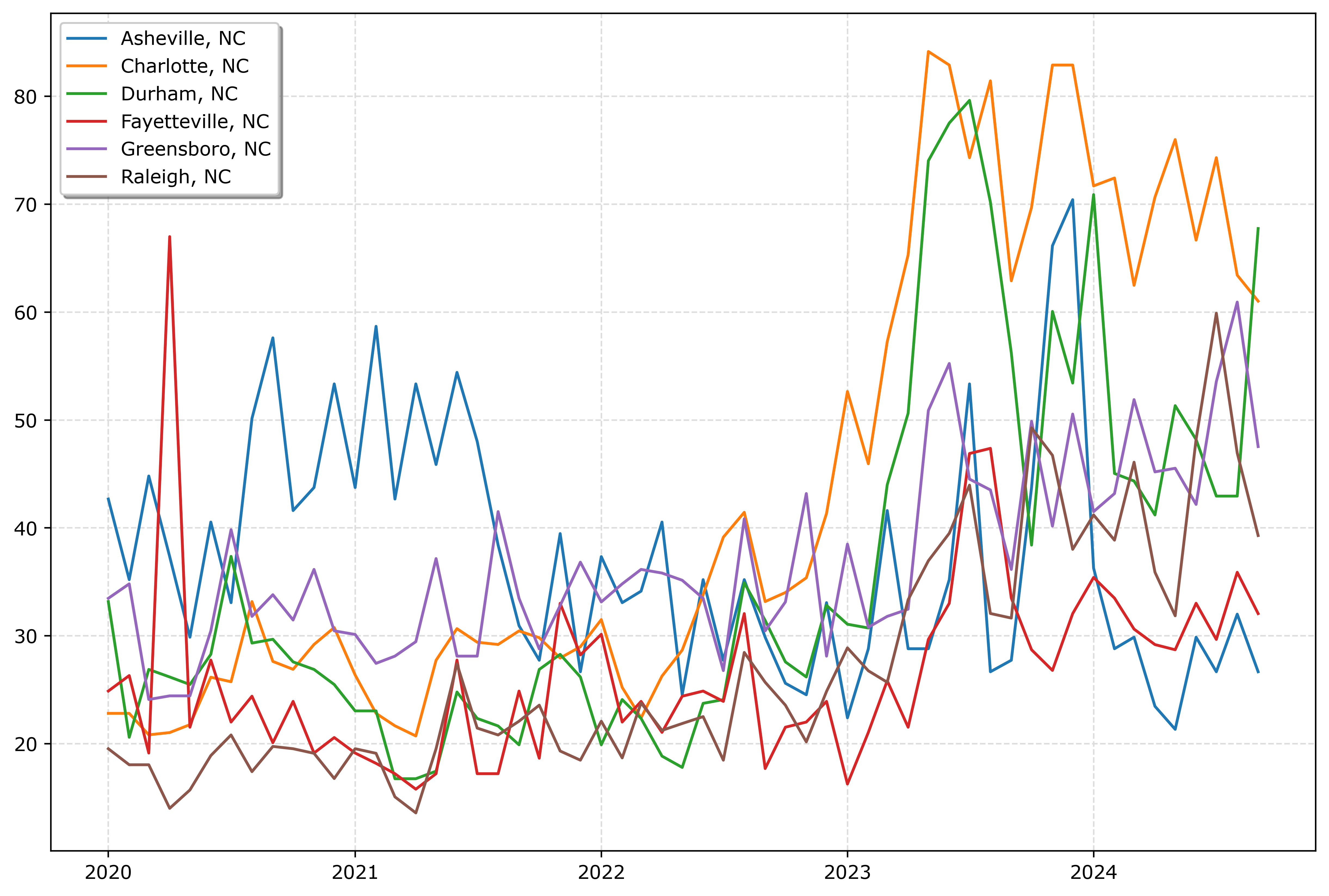
If you must have many lines differentiated via colors in a static plot, the Tableau color palette or the Dark2 colors work the best. Here is an example plotting the North Carolina cities in a loop with the Tableau colors:

# It is difficult to untangle multiple cities
# https://matplotlib.org/stable/users/explain/colors/colormaps.html
fig, ax = plt.subplots(figsize=(12,8))
for i,v in enumerate(cityl):
    ax.plot(ncwide['Date'],ncwide[v],'-',color=cm.tab10(i),label=v)

ax.legend()
fig.savefig('Line04.png', dpi=500, bbox_inches='tight')

So you could look at this and see “blue does not fit the same pattern”, and then go to the legend to see blue is Asheville. It is a bit of work though to disentangle the other lines though.

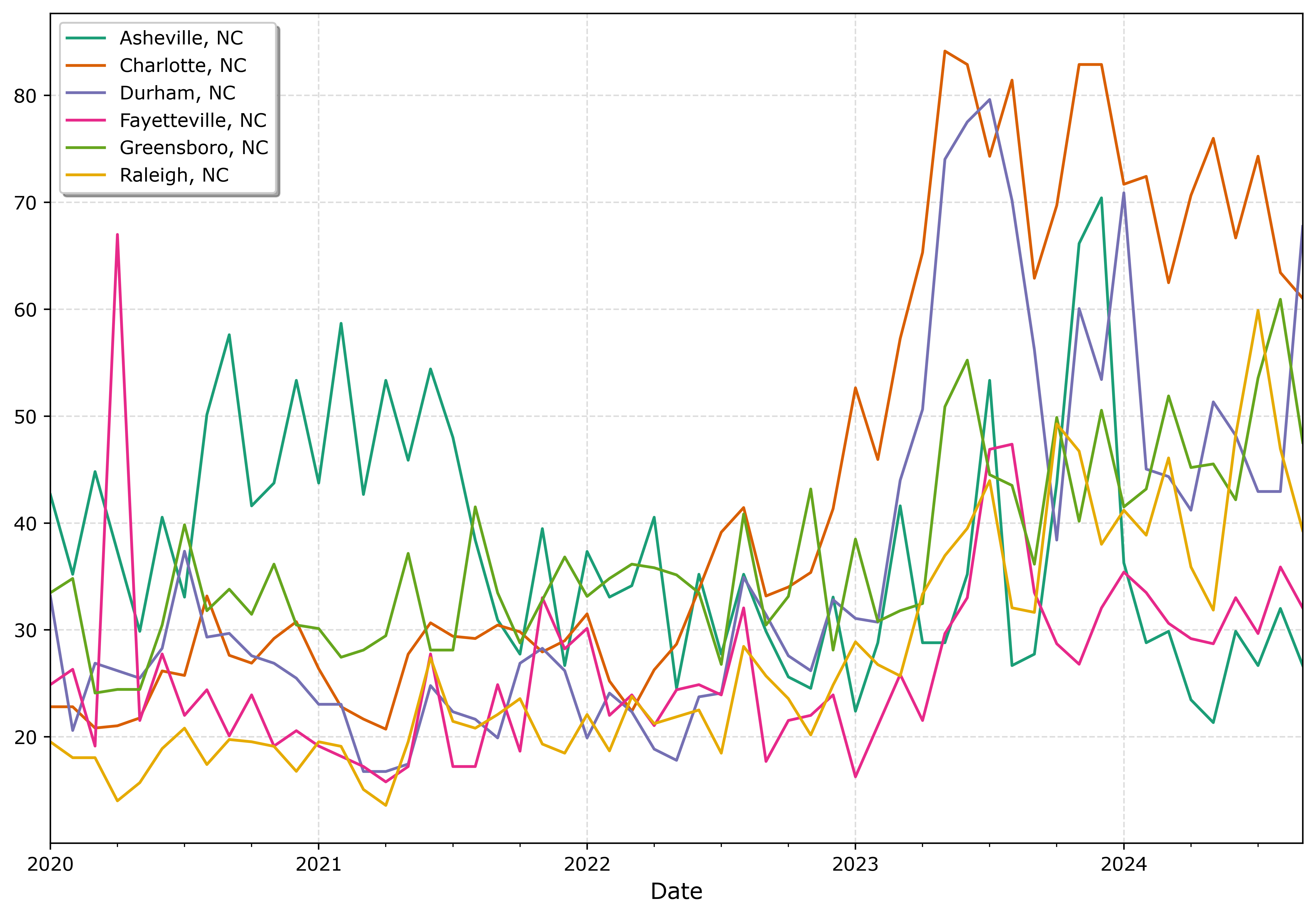
And here is an example using the pandas plotting method with the Dark2 palette. I do this more for exploratory data analysis, I often end up editing so much of the axis that using the pandas short cuts are not less work. Here I would edit the axis so the lines do not abut the x axis ends. For old school R people, this is similar to matplot in R, so the data needs to be in wide format, not long. (And all the limitations that come with that.)

# pandas can be somewhat more succinct
fig, ax = plt.subplots(figsize=(12,8))
ncwide.plot.line(x='Date',ax=ax,color=cm.Dark2.colors)
fig.savefig('Line05.png', dpi=500, bbox_inches='tight')

I tend to like the Tableau colors somewhat better though. The two greenish colors (Asheville and Greensboro) and the two orangish colors (Raleigh and Charlotte) I personally have to look quite closely to tell them apart. Men tend to have lower color resolution than women, I am not color blind and you may find them easier to tell the difference. Depending on your audience it would be good to assume lower than higher color acuity in the audience’s vision in general.

In my opinion, often you can only have 3 lines in a graph and it becomes too busy. It is partly due to how tortuous the lines are, so you can have many lines if they are parallel and don’t cross. But assuming you can have max 3 is a good baseline assumption.

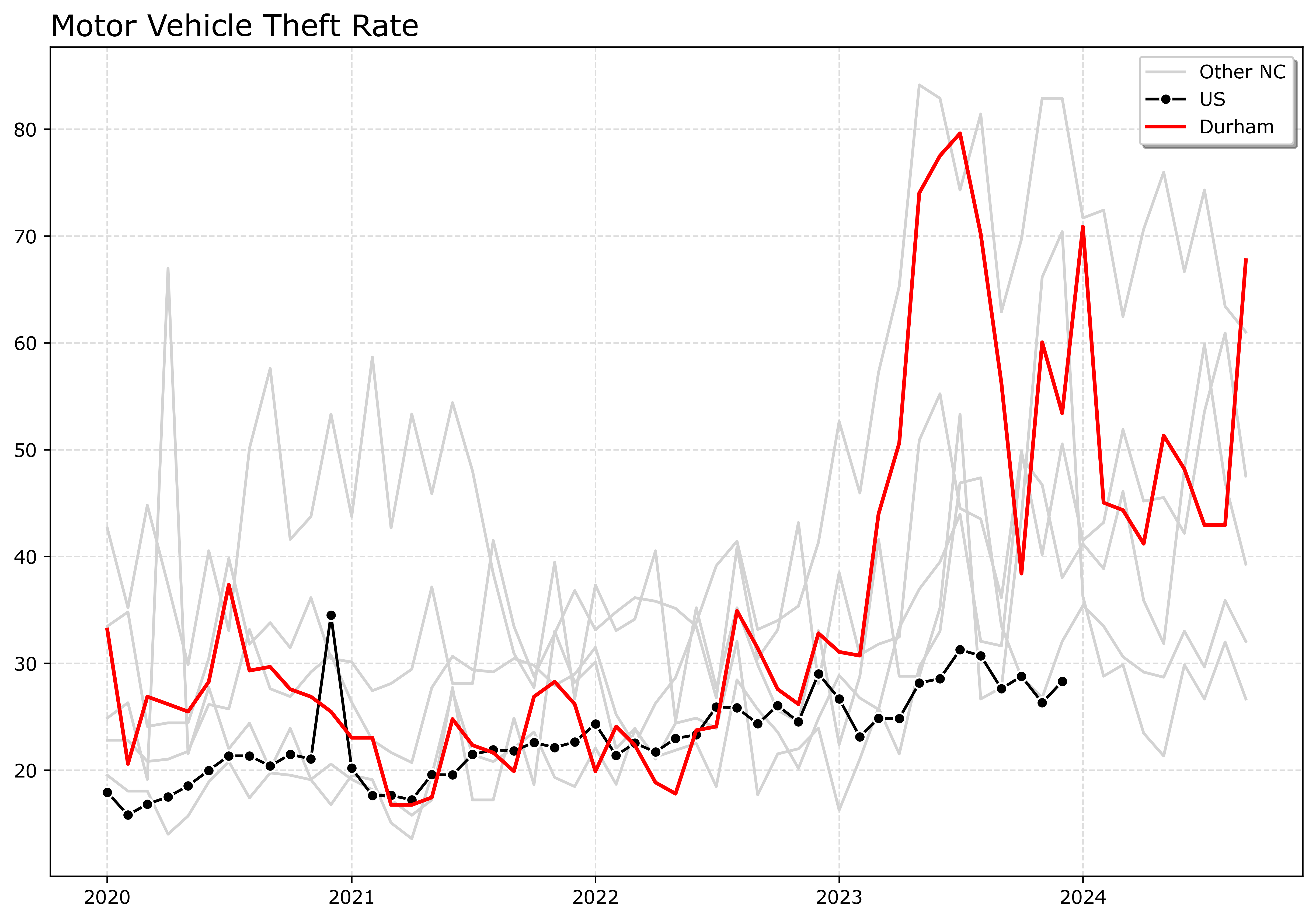
An alternative though is to highlight specific lines. Here I highlight Durham and US, the other cities are light grey and in the background. Also looping over you can specific the order. I draw Durham last (so it goes on top). The grey cities are first (so are at the bottom). Here I only give the first grey background city a label, so the legend does not have duplicates.

# Highlight one city, compared to the rest
fig, ax = plt.subplots(figsize=(12,8))
ncwide.plot.line(x='Date',ax=ax,color=cm.Dark2.colors)
fig.savefig('Line05.png', dpi=500, bbox_inches='tight')


# Highlight one city, compared to the rest
fig, ax = plt.subplots(figsize=(12,8))
lab = 'Other NC'

for v in cityl:
    if v == 'Durham, NC':
        pass
    else:
        ax.plot(ncwide['Date'],ncwide[v],'-',color='lightgrey',label=lab)
        lab = None


ax.plot(us2020['Date'],us2020[var],'-o',
        color='k',markeredgecolor='white',label='US')
ax.plot(ncwide['Date'],ncwide['Durham, NC'],'-',linewidth=2,color='red',label='Durham')
ax.legend()
ax.set_title('Motor Vehicle Theft Rate')
fig.savefig('Line06.png', dpi=500, bbox_inches='tight')

If I had many more lines, I would make the grey lines either smaller in width, e.g. linewidth=0.5, and/or make them semi-transparent, e.g. alpha=0.8. And ditto if you want to emphasize a particular line, making it a larger width (here I use 2 for Durham), makes it stand out more.

Durham here you can see has very similar overall trends compared to Charlotte.

And those are my main notes on making nice line plots in matplotlib. Let me know in the comments if you have any other typical visual flourishes you often use for line plots.

Bitcoin, Ethereum, and Axon

In 2022, I did a post on the cointegration between Bitcoin, Ethereum, Gold, and the S&P 500. I have had a few conversations about Bitcoin recently with friends and family, so figured it would be worth updating that post.

Also had a discussion with a friend about Axon last week, and when talking about stock I said “what is it at $200” and his reply was “It is close to $700”. So throwing them in the mix as well.

Here is the same indexed between 0/1 chart, so you can see all the different investments appear to be pretty correlated. Since mid 2022 all have been on a fairly consistent upward trajectory.

Now the way this chart works is y = x - min(x)/(max(x) - min(x), where x is the closing price (sampled every Friday). This hides the variation, plotting the closing prices on the logged scale better shows how volatile the different stocks are. So the S&P is a steady march, Gold has been quite consistent, the others not so much.

And a final way to show the data is to index to a start point. Here my initial post was in February 2022, so I start from there and Closing/Closing2_11_2022. So a value of 2 means it doubled from its start point, 3 tripled etc.

I was prompted to look at Ethereum back then due to the popularity of NFTs. I decided not to invest, and if looking as of last Friday, I would be at about the exact same position as I would have been with the S&P. But I would have been under for almost two years. And it would have been almost the exact same story for Bitcoin over the same period, only with the more recent increase would I have really beat the more tame investments from Bitcoin. Axon though!

With the talks about US government investment in Bitcoin (see Bryan’s Clear Value Tax video on the subject), given that traditional index funds do not cover them, I will have to consider it more seriously. (I have had 401k’s that included Gold, I presume they have not expanded to include crypto though.) They are definitely more speculative than investing in index funds, but that can be a good thing if you know that going in.

Given the NFT fad passed with Eth, I wondered if it peaked (it was already falling from a local high of 3k by that time in February 2022 I initially wrote that post). But just a few hours before writing this post, BlackRock and Fidelity purchased a big chunk, so Eth should likely continue to climb at least in the short term and is not entirely pegged to the popularity of NFTs.

The original post I wrote about cointegration analysis, which is really only useful for very short term. Thinking about more long term investments, Bitcoin is harder to peg. The Clear Value Tax video shows Powell comparing Bitcoin to Gold, which I think is probably a good way to view it. So I think you can legitimately view it as a hedge against more traditional investments at this point (and ditto for Ethereum – does CoinBase have an index fund for coins?).

Now when evaluating specific companies, whether something is a good investment is more about whether you think the company itself is on a good trajectory. As disclosure I don’t have any direct financial ties to Axon, nor have I invested in them directly beyond if my 401k has them in the portfolio. I think Axon’s rise is legit and not a fad.

So Axon currently has the dominant market share for body worn cameras and conducted energy devices. Body worn cameras I think are likely to expand out into other areas beyond police and corrections officers. There are some news articles for store workers, I suspect medical workers and teachers though are bigger expanding markets in the future. Motorola stock is not doing too shabby over this time period as well, so they may be able to capture some of that same market as well.

I am not as in the know about drones, but I presume their hardware experience for BWC and Taser make them well positioned to expand out drone capabilities.

I am not sure what prompted the most recent rise mid 2024 for Axon. I wondered if it lined up with Draft One (the generative AI to help write reports), but it appears slightly after that. Their software products I am not as bullish about offhand. I think Draft One has very good potential, although see a recent article by Ian Adams and colleagues showing it does not decrease time writing reports.

But given they have such strong market share in other areas (like BWC) they have already established sales relationships. And if they can figure out BWC they have the technical capabilities to figure out the data software stuff, like RMS as well. Basically all the different “analytic” companies have no moat – Axon could hire me (or various other data scientists) to build those same analytic software programs directly for Axon’s different current software products.

Identifying excess rounding

Given the hubbub about Blue Cross and paying for anesthesiologists, there was an interesting paper making the rounds, Comparison of Anesthesia Times and Billing Patterns by Anesthesia Practitioners. (Shared via Crémieux.)

Most medical claims are billed via what are call CPT codes (Current Procedural Terminology). So if you go to the ER, you will get billed for a code 99281 to 99285. The final digit encodes different levels of complexity for the case, with 5’s being more complex. It was news to me that anesthesiologists actually bill for time directly, but the above linked paper showed (pretty plainly) that there is strong evidence they round up to every 5 minutes.

Now the paper just selected the anesthesiologists that have the highest proportion of billed times ending in 5’s. Here I will show a better way to flag specific problematic anesthesiologists (using repeated binomial tests and false discovery rate corrections).

Here I simulate 1,000 doctors, and select 40 of them to be bad, and those 40 round all of their claims up to the nearest 5 minute mark. Whereas the other docs are just billing the time as is. And they have varying total number of claims, between 100 and 500.

import numpy as np
from scipy.stats import gamma,uniform
import matplotlib.pyplot as plt
import pandas as pd
from scipy.stats import binomtest,false_discovery_control

np.random.seed(10)

docs = 1000
# pick a random set 
bad_docs = np.random.choice(np.arange(docs),40,replace=False)
doci = []
claims = []

for i in range(docs):
    totn = int(np.ceil(uniform.rvs(100,500))) # number of claims
    doci += [i]*totn
    g = gamma.rvs(6,scale=12,size=totn)
    if i in bad_docs:
        g = np.ceil(g/5)*5
    else:
        g = g.round()
    claims += g.tolist()

dat = pd.DataFrame(zip(doci,claims),columns=['Doc','Time'])

# Histogram
fig, ax = plt.subplots(figsize=(8,4))
dat['Time'].hist(bins=range(201),alpha=0.8,color='k',ax=ax)
plt.savefig('Histogram.png',dpi=500,bbox_inches='tight')

You can see my gamma distribution is not as heavy tailed as the JAMA paper, but qualitatively has the same spike traits. Based on this, you can see the spike is relative to the other density, and so that shows in the JAMA paper there are more anesthesiologists rounding at 60 minutes than there are at the other 5 minute intervals.

In this particular example, it would be trivial to spot the bad docs, since they round 100% of the time, and you would only expect around 20% (since billing in minute intervals).

dat['Round'] = dat['Time'] % 5 == 0
dat['N'] = 1
gs = dat.groupby('Doc',as_index=False)[['N','Round']].sum()
gs['Perc'] = gs['Round']/gs['N']
gs.sort_values(by='Perc',ascending=False,ignore_index=True,inplace=True)
gs

# Upper Quantiles
np.quantile(gs['Perc'],[0.75,0.8,0.85,0.9,0.95,0.99])

But you can see a problem with using a top 5% quantile cut off here. Since I only have 4% bad doctors, using that hard cut-off will result in a few false positive flags. My suggested approach is to create a statistical test (Chi-Square, binominal, KS, whatever makes sense for individual doctors). Run the test for each doctor, get the p-value, and then run a false discovery rate correction on the p-values.

The above where doctors round 100% of the time is too easy, so here I simulate 40 doctors will round up 10% to 30% of the time. I also have fewer cases (more cases and more rounding make it much easier to spot).

# Redoing sim, but it is a smaller percentage of the stats are bad
for i in range(docs):
    totn = int(np.ceil(uniform.rvs(100,500))) # number of claims
    doci += [i]*totn
    g = gamma.rvs(6,scale=12,size=totn)
    if i in bad_docs:
        randperc = int(np.round(totn*uniform.rvs(0.1,0.2)))
        badn = np.random.choice(np.arange(totn),randperc,replace=False)
        g[badn] = np.ceil(g[badn]/5)*5
        g = g.round()
    else:
        g = g.round()
    claims += g.tolist()

dat = pd.DataFrame(zip(doci,claims),columns=['Doc','Time'])
dat['Round'] = dat['Time'] % 5 == 0
dat['N'] = 1
gs = dat.groupby('Doc',as_index=False)[['N','Round']].sum()
gs['Perc'] = gs['Round']/gs['N']
gs.sort_values(by='Perc',ascending=False,ignore_index=True,inplace=True)

Now we can apply the binomial test to each doctor, then adjust for false discovery rate.

# Calculating binom test
def bt(x):
    k,n = x.iloc[0],x.iloc[1]
    b = binomtest(k,n,p=0.2,alternative='greater')
    return b.pvalue

gs['p'] = gs[['Round','N']].apply(bt,axis=1)
gs['q'] = false_discovery_control(gs['p'],method='by')

# Captures 28 out of 40 bad docs, no false positives
gs['BadDocs'] = gs['Doc'].isin(bad_docs)
gs[gs['q'] < 0.05]

If you check out the doctors via gs.head(50), you can see that a few of the bad-docs where adjusted to have q-values of 1, but they ended up being low N and in the range you would expect.

While anesthesiologists billing is different, this same approach would be fine for CPT codes that have the 1-5 modifier (you might use a leave one out strategy and a Chi-Square test). Anesthesiologists if they know they will be scrutinized with exact 5 minutes, they will likely adjust and round up, but to not regular numbers. If that is the case, the default distribution will be expected to be uniform on the 0-9 digits (sometimes people use a Benford like test for the trailing digits, this is the same idea). That will be harder to fake.

I don’t have an issue with Blue Cross saying they will only bill for pre-allotted times. But even without making an explicit policy like that, they can identify bad actors and pursue investigations into those problematic anesthesiologists even without making widespread policy changes.

Year in Review 2024

Past year in review posts I have made focused on showing blog stats. Writing this in early December, but total views will likely be down this year – I am projecting around 140,000 views in total for this site. But I have over 25k views for the Crime De-Coder site, so it is pretty much the same compared to 2023 combining the two sites.

I do not have a succinct elevator speech to tell people what I am working on. With the Crime De-Coder consulting gig, it can be quite eclectic. That Tukey quote being a statistician you get to play in everyone’s backyard is true. Here is a rundown of the paid work I conducted in the past year.

Evidence Based CompStat: Work with Renee Mitchell and the American Society of Evidence Based Policing on what I call Evidence Based CompStat. This mostly amounts to working directly with police departments (it is more project management than crime analysis) to help them get started with implementing evidence based practices. Reach out if that sounds like something your department would be interested in!

Estimating DV Violence: Work supported by the Council on CJ. I forget exactly the timing of events. This was an idea I had for a different topic (to figure out why stores and official reports of thefts were so misaligned). Alex approached me to help with measuring national level domestic violence trends, and I pitched this idea (use local NIBRS data and NCVS to get better local estimates).

Premises Liability: I don’t typically talk about ongoing cases, but you can see a rundown of some of the work I have done in the past. It is mostly using the same stats I used as a crime analyst, but in reference to civil litigation cases.

Patrol Workload Analysis: I would break workload analysis for PDs down into two categories, advanced stats and CALEA reports. I had one PD interested in the simpler CALEA reporting requirement (which I can do for quite a bit cheaper than the other main consulting firm that offers these services).

Kansas City Python Training: Went out to Kansas City for a few days to train their analysts up in using python for Focused Deterrence. If you think the agenda in the pic below looks cool get in touch, I would love to do more of these sessions with PDs. I make it custom for the PD based on your needs, so if you want “python and ArcGIS”, or “predictive models” or whatever, I will modify the material to go over those advanced applications. I have also been pitching the same idea (short courses) for PhD programs. (So many posers in private sector data science, I want more social science PhDs with stronger tech skills!)

Patterson Opioid Outreach: Statistical consulting with Eric Piza and Kevin Wolff on a street outreach intervention intended to reduce opioid overdose in Patterson New Jersey. I don’t have a paper to share for that at the moment, but I used some of the same synthetic control in python code I developed.

Bookstore prices: Work with Scott Jacques, supported by some internal GSU money. Involves scraping course and bookstore data to identify the courses that students spend the most on textbooks. Ultimate goal in mind is to either purchase those books as unlimited epubs (to save the students money), or encourage professors to adopt better open source materials. It is a crazy amount of money students pour into textbooks. Several courses at GSU students cumulatively spend over $100k on course materials per semester. (And since GSU has a large proportion of Pell grant recipients, it means the federal government subsidizes over half of that cost.)

General Statistical Consulting: I do smaller stat consulting contracts on occasion as well. I have an ongoing contract to help with Pam Metzger’s group at the SMU Deason center. Did some small work for AH Datalytics on behind the scenes algorithms to identify anomalous reporting for the real time crime index. I have several times in my career consulted on totally different domains as well, this year had a contract on calculating regression spline curves for some external brain measures.

Data Science Book: And last (that I remember), I published Data Science for Crime Analysis with Python. I still have not gotten my 100 sales I would consider it a success – so if you have not bought a copy go do that right now. (Coupon code APWBLOG will get you $10 off for the next few weeks, either the epub or the paperback.)

Sometimes this seems like I am more successful than I am. I have stopped counting the smaller cold pitches I make (I should be more aggressive with folks, but most of this work is people reaching out to me). But in terms of larger grant proposals or RFPs in that past year, I have submitted quite a few (7 in total) and have landed none of them to date! Submitted a big one to support surveys that myself and Gio won the NIJ competition on for place based surveys to NIJ in their follow up survey solicitation, and it was turned down for example. So it goes.

In addition to the paid work, I still on occasion publish peer reviewed articles. (I need to be careful with my time though.) I published a paper with Kim Rossmo on measuring the buffer zone in journey to crime data. I also published the work on measuring domestic violence supported by the Council on CJ with Alex Piquero.

I took the day gig in Data Science at the end of 2019. Citations are often used as a measure of a scholars influence on the field – they are crazy slow though.

I had 208 citations by the end of 2019, I now have over 1300. Of the 1100 post academia, only a very small number are from articles I wrote after I left (less than 40 total citations). A handful for the NIJ recidivism competition paper (with Gio), and a few for this Covid and shootings paper in Buffalo. The rest of the papers that have a post 2019 publishing date were entirely written before I left academia.

Always happy to chat with folks on teaming up on papers, but it is hard to take the time to work on a paper for free if I have other paid work at the moment. One of the things I need to do to grow the business is to get some more regular work. So if you have a group (academic, think tank, public sector) that is interested in part time (or fractional I guess is what the cool kids are calling it these days), I would love to chat and see if I could help your group out.

Question Sets and All Paths

I was nerd-sniped with a question at work the other day. The set up was like this, imagine a survey where all of the questions have yes-no answers. Some of the answers are terminating, so if you answer No to a particular question, the questions stop. But some if you reach that part of the tree will keep going.

The ask was a formula to articulate the total number of potential unique answer sets. Which I was not able to figure out, I did however write python code to generate all of the unique sets. So here is that function, where I create a networkx directed graph in a particular format, and then find all of the potential start to end paths in that graph. You just add a dummy begin node, and end nodes at the terminating locations and the final question. You then just search for all of the paths from the begin to end nodes.

import networkx as nx

def question_paths(totq,term):
    '''
    totq -- positive integer, total number of questions
    term -- list of integers, where ints are questions that terminate
    '''
    nodes = [f'Q{i}{r}' for i in range(totq) for r in ['N','Y']]
    edges = []
    for i in range(totq-1):
        edges.append([f'Q{i}Y',f'Q{i+1}N'])
        edges.append([f'Q{i}Y',f'Q{i+1}Y'])
        if i not in term:
            edges.append([f'Q{i}N',f'Q{i+1}N'])
            edges.append([f'Q{i}N',f'Q{i+1}Y'])
    # adding in begin/end
    nodes += ['Begin','End']
    edges += [['Begin','Q0N'],['Begin','Q0Y']]
    for t in term:
        edges.append([f'Q{t}N','End'])
    edges += [[f'Q{totq-1}N','End'],[f'Q{totq-1}Y','End']]
    # Now making graph
    G = nx.DiGraph()
    G.add_nodes_from(nodes)
    G.add_edges_from(edges)
    # Getting all paths
    paths = []
    for p in nx.all_simple_paths(G,source='Begin',target='End'):
        nicer = [v[-1] for v in p[1:-1]]
        paths.append(nicer)
    return paths

And now we can check out where all paths are terminating, you only get further up the tree if you answer all yes for prior questions.

>>> question_paths(3,[0,1,2])
[['N'],
 ['Y', 'N'],
 ['Y', 'Y', 'N'],
 ['Y', 'Y', 'Y']]

So in that scenario we have four potential answer sets. For all binary, we have the usual 2^3 number of paths:

>>> question_paths(3,[])
[['N', 'N', 'N'],
 ['N', 'N', 'Y'],
 ['N', 'Y', 'N'],
 ['N', 'Y', 'Y'],
 ['Y', 'N', 'N'],
 ['Y', 'N', 'Y'],
 ['Y', 'Y', 'N'],
 ['Y', 'Y', 'Y']]

And then you can do a mixture, here just question 2 terminates, but 1/3 are binary:

>>> question_paths(3,[1])
[['N', 'N'],
 ['N', 'Y', 'N'],
 ['N', 'Y', 'Y'],
 ['Y', 'N'],
 ['Y', 'Y', 'N'],
 ['Y', 'Y', 'Y']]

One of the things doing this exercise taught me is that it matters where the terminating nodes are in the tree. Earlier terminating nodes results in fewer potential paths.

# can different depending on where the terminators are
len(question_paths(10,[1,5])) # 274
len(question_paths(10,[6,8])) # 448
len(question_paths(10,[0,1])) # 258
len(question_paths(10,[8,9])) # 768

So the best in terms of a formula for the total number of paths I could figure out was 2^(non-terminating questions) <= paths <= 2^(questions) (which is not a very good bound!) I was trying to figure out a product formula but was unable (any suggestions let me know!)

This reminds me of a bit of product advice from Jennifer Pahlka, you should have eliminating questions earlier in the form. So instead of filling out 100 questions and at the end being denied for TANF, you ask questions that are the most likely to eliminate people first.

It works the same for total complexity of your application. So asking the terminating questions earlier reduces the potential number of permutations you ultimately have in your data as well. Good for the user and good for the developers.

Suits, Money Laundering, and Linear Programming

Currently watching Suits with the family, and an interesting little puzzle came up in the show. In Season 1, episode 8, there is a situation with money laundering from one account to many smaller accounts.

So the set up is something like “transfer out 100 million”, and then you have some number of smaller accounts that sum to 100 million.

When Lewis brought this up in the show, and Mike had a stack of papers to go through to identify the smaller accounts that summed up to the larger account, my son pointed out it would be too difficult to go through all of the permutations to figure it out. The total number of permutations would be something like:

N = Sum(b(A choose k) for 1 to k)

Where A is the total number of accounts to look over, and k is the max number of potential accounts the money was spread around. b(A choose k) is my cheeky text format for binomial coefficients.

So this will be a very large number. 10,000 choose 4 for example is 416 416 712 497 500 – over 416 trillion. You still need to add in b(10,000 choose 2) + b(10,000 choose 3) + ….. b(10,000 choose k). With even a small number of accounts, the number of potential combinations will be very large.

But, I said in response to my son I could write a linear program to find them. And this is what this post shows, but doing so made me realize there are likely too many permutations in real data to make this a feasible approach in conducting fraud investigations. You will have many random permutations that add up to the same amount. (I figured some would happen, but it appears to me many happen in random data.)

(Note I have not been involved with any financial fraud examinations in my time as an analyst, I would like to get a CFA time permitting, and if you want to work on projects let me know! So all that said, I cannot speak to the veracity of whether this is a real thing people do in fraud examinations.)

So here I use python and the pulp library (and its default open source CBC solver) to show how to write a linear program to pick bundles of accounts that add up to the right amount. First I simulate some lognormal data, and choose 4 accounts at random.

import pulp
import numpy as np

# random values
np.random.seed(10)
simn = 10000
x = np.round(np.exp(np.random.normal(loc=5.8,scale=1.2,size=simn)),2)

# randomly pick 4
slot = np.arange(0,simn)
choice = np.random.choice(slot,size=4,replace=False)
tot = x[choice].sum()
print(tot,choice)

So we are expecting the answer to be accounts 2756 5623 5255 873, and the solution adds up to 1604.51. So the linear program is pretty simple.

# make a linear program
P = pulp.LpProblem("Bundle",pulp.LpMinimize)
D = pulp.LpVariable.dicts("D",slot,cat='Binary')

# objective selects smallest group
P += pulp.lpSum(D)

# Constraint, equals the total
P += pulp.lpSum(D[i]*x[i] for i in range(simn)) == tot

# Solving with CBC
P.solve()

# Getting the solution
res = []
for i in range(simn):
    if D[i].varValue == 1:
        res.append(i)

In practice you will want to be careful with floating point (later I convert the account values to ints, another way though is instead of the equal constraint, make it <= tot + eps and >= tot - eps, where eps = 0.001. But for the CBC solver this ups the time to solve by quite a large amount.)

You could have an empty objective function (and I don’t know the SAT solvers as much, I am sure you could use them to find feasible solutions). But here I have the solution by the minimal number of accounts to look for.

So here is the solution, as you can see it does not find our expected four accounts, but two accounts that also add up to 1604.51.

You can see it solved it quite fast though, so maybe we can just go through all the potential feasible solutions. I like making a python class for this, that contains the “elimination” constraints to prevent that same solution from coming up again.

# Doing elimination to see if we ever get the right set
class Bundle:
    def __init__(self,x,tot,max_bundle=10):
        self.values = (x*100).astype('int')
        self.totn = len(x)
        self.tot = int(round(tot*100))
        self.pool = []
        self.max_bundle = max_bundle
        self.prob_init()
    def prob_init(self):
        P = pulp.LpProblem("Bundle",pulp.LpMinimize)
        D = pulp.LpVariable.dicts("D",list(range(self.totn)),cat='Binary')
        # objective selects smallest group
        P += pulp.lpSum(D)
        # Constraint, equals the total
        P += pulp.lpSum(D[i]*self.values[i] for i in range(simn)) == self.tot
        # Max bundle size constraint
        P += pulp.lpSum(D) <= self.max_bundle
        self.prob = P
        self.d = D
    def getsol(self,solver=pulp.PULP_CBC_CMD,solv_kwargs={'msg':False}):
        self.prob.solve(solver(**solv_kwargs))
        if self.prob.sol_status != -1:
            res = []
            for i in range(self.totn):
                if self.d[i].varValue == 1:
                    res.append(i)
            res.sort()
            self.pool.append(res)
            # add in elimination constraints
            self.prob += pulp.lpSum(self.d[r] for r in res) <= len(res)-1
            return res
        else:
            return -1
    def loop_sol(self,n,solver=pulp.PULP_CBC_CMD,solv_kwargs={'msg':False}):
        for i in range(n):
            rf = self.getsol(solver,solv_kwargs)
            if rf != 1:
                print(f'Solution {i}:{rf} sum: {self.values[rf].sum()}')
            if rf == -1:
                print(f'No more solutions at {i}')
                break

And now we can run through and see if the correct solution comes up:

be = Bundle(x=x,tot=tot)
be.loop_sol(n=10)

Uh oh – I do not feel like seeing how many potential two solutions there are in the data (it is small enough I could just enumerate those directly). So lets put a constraint in that makes it so it needs to be four specific accounts that add up to the correct amount.

# add in constraint it needs to be 4 selected
choice.sort()
be.prob += pulp.lpSum(be.d) == 4
print(f'Should be {choice}')
be.loop_sol(n=10)

And still no dice. I could let this chug away all night and probably come up with the set I expected at some point. But if you have so many false positives, this will not be very useful from an investigative standpoint. So you would ultimately need more constraints.

Lets say our example the cumulative total will be quite large. Will that help limit the potential feasible solutions?

# Select out a sample of high
sel2 = np.random.choice(x[x > 5000],size=4,replace=False)
tot2 = sel2.sum()
ch2 = np.arange(simn)[np.isin(x,sel2)]
ch2.sort()
print(tot2,ch2)

be2 = Bundle(x=x,tot=tot2)
be2.loop_sol(n=20)

There are still too many potential feasible solutions. I thought maybe a problem with real data is that you will have fixed numbers, say you are looking at transactions, and you have specific $9.99 transactions. If one of those common transactions results in a total sum, it will just be replicated in the solution over and over again. I figured with random data the sum would still be quite unique, but I was wrong for that.

So I was right in that I could write a linear program to find the solution. I was wrong that there would only be one solution!

Some things work

A lawyer and economist Megan Stevenson last year released an essay that was essentially “Nothing Works” 2.0. For those non-criminologists, “nothing works” was a report by Robert Martinson in the 1970’s that was critical of the literature on prisoner rehabilitation, and said to date that essentially all attempts at rehabilitation were ineffective.

Martinson was justified. With the benefit of hindsight, most of the studies Martinson critiques were poorly run (in terms of randomization, they almost all were observational self selected into treatment) and had very low statistical power to detect any benefits. (For people based experiments in CJ, think you typically need 1000+ participants, not a few dozen.)

Field experiments are hard and messy, and typically we are talking about “reducing crime by 20%” or “reducing recidivism by 10%” – they are not miracles. You can only actually know if they work using more rigorous designs that were not used at that point in social sciences.

Stevenson does not deny those minor benefits exist, but moves the goalposts to say CJ experiments to date have failed because they do not generate wide spread sweeping change in CJ systems. This is an impossible standard, and is an example of the perfect being the enemy of the good fallacy.

A recent piece by Brandon del Pozo and colleagues critiques Stevenson, which I agree with the majority of what Brandon says. Stevenson’s main critique are not actually with experiments, but more broadly organizational change (which del Pozo is doing various work in now).

Stevenson’s critique is broader than just policing, but I actually would argue that the proactive policing ideals of hotspots and focused deterrence have diffused into the field broadly enough that her points about systematic change are false (at least in those two examples). Those started out as individual projects though, and only diffused through repeated application in a slow process.

As I get older, am I actually more of the engineer mindset that Stevenson is critical of. As a single person, I cannot change the whole world. As a police officer or crime analyst or professor, you cannot change the larger organization you are a part of. You can however do one good thing at a time.

Even if that singular good thing you did is fleeting, it does not make it in vain.

References

GenAI is not a serious solution to California’s homeless problem

This is a rejected op-ed (or at least none of the major papers in California I sent it to bothered to respond and say no-thanks, it could be none of them even looked at it). Might as well post it on personal blog and have a few hundred folks read it.


Recently Gov. Newsom released a letter of interest (LOI) for different tech companies to propose how the state could use GenAI (generative artificial intelligence) to help with California’s homeless problem. The rise in homelessness is a major concern, not only for Californian’s but individuals across the US. That said, the proposal is superficial and likely to be a waste of time.

A simple description of GenAI, for those not aware, are tools to ask the machine questions in text and get a response. So you can ask ChatGPT (a currently popular GenAI tool) something like “how can I write a python function to add two numbers together” and it will dutifully respond with computer code (python is a computer programming language) that answers your question.

As someone who writes code for a living, this is useful, but not magic. Think of it more akin to auto-complete on your phone than something truly intelligent. The stated goals of Newsom’s LOI are either mostly trivial without the help of GenAI, or are hopeless and could never be addressed with GenAI.

For the first stated goal, “connecting people to treatment by better identifying available shelter and treatment beds, with GenAI solutions for a portable tool that the local jurisdictions can use for real-time access to treatment and shelter bed availability”. This is simply describing a database — one could mandate state funded treatment providers to provide this information on a daily basis. The technology infrastructure to accomplish this is not much more complex than making a website. Mandating treatment providers report that information accurately and on a timely basis is the hardest part.

For the second stated goal, “Creating housing with more data and accountability by creating clearer insights into local permitting and development decisions”. Permitting decisions are dictated by the state as well as local ordinances. GenAI solutions will not uncover any suggested solution that most Californian’s don’t already know — housing is too expensive and not enough is being built. This is in part due to the regulatory structure, as well as local zoning opposition for particular projects. GenAI cannot change the state laws.

For the last stated goal of the program, “Supporting the state budget by helping state budget analysts with faster and more efficient policy”. Helping analysts generate results faster is potentially something GenAI can help with, more efficient policy is not. I do not doubt the state analysts can use GenAI solutions to help them write code (the same as I do now). But getting that budget analysis one day quicker will not solve any substantive homeless problem.

I hate to be the bearer of bad news, but there are no easy answers to solve California’s homeless crisis. If a machine could spit out trivial solutions to solve homelessness in a text message, like the Wizard of Oz gifting the Scarecrow brains, it would not be a problem to begin with.

Instead of asking for ambiguous GenAI solutions, the state would be better off thinking more seriously about how they can accomplish those specific tasks mentioned in the LOI. If California actually wants to make a database of treatment availability, that is something they could do right now with their own internal capacity.

Solutions to homelessness are not going to miraculously spew from a GenAI oracle, they are going to come from real people accomplishing specific goals.


If folks are reading this, check out my personal consulting firm, Crime De-Coder. I have experience building real applications. Most of the AI stuff on the market now is pure snake oil, so better to articulate what you specifically want and see if someone can help build that.

Crime De-Coder consulting