A Comment on Data visualization in Sociology

Kieran Healy and James Moody recently posted a pre-print, Data visualization in sociology that is to appear in a forthcoming issue of the Annual Review of Sociology. I saw awhile ago on Kieran’s blog that he was planning on releasing a paper on data viz. in sociology and was looking forward to it. As I’m interested in data visualization as well, I’m glad to see the topic gain exposure in such a venue. After going through the paper I have several comments and critiques (all purely of my own opinion). Take it with a grain of salt, I’m neither a sociologist nor a tenured professor at Duke! (I will refer to the paper as HM from here on.)

Sociological Lags

The first section, Sociological Lags, is intended to set the stage for the contemporary use of graphics in sociology. I find both the historical review lacking in defining what is included, and the segway into contemporary use uncompelling. I break the comment in this section into three sections of my own making, the historical review, the current state of affairs & reasoning for the current state of affairs.

Historical Review of What Exactly?

It is difficult to define the scope when reviewing historical applications of visualization on sociology; both because sociology can be immensely broad (near anything to do with human behavior) and defining what counts as a visual graph is difficult. As such it ends up being a bit of a fools errand to go back to the first uses of graphics in sociology. Often Playfair is considered the first champion of graphing numeric summaries (although he has an obvious focus on macro-economics), but if one considers maps as graphics people have made those before we had words and numbers. Tufte often makes little distinction between any form of writing or diagram that communicates information, e.g. in-text sparklines, Hobbe’s visual table of contents to Leviathan on the frontpiece, or Galileo’s diagrams of the rings of Saturn. Paul Lewi in Speaking of Graphics describes the quipu as a visual tool used for accounting by the Incas. If one considers ISOTYPE counting picture diagrams as actual graphs, the Mayan hieroglphys for counting values would seemingly count (forgive my ingorance of anthropology, as I’m sure other examples that fit these seemingly simple criteria exist in other and older societies). Tufte gives an example of using mono-spaced type font, which in our base 10 counting system approximates a logarithmic chart if the numbers are right aligned in a column.

10000
 1000
  100
   10
    1

So here we come to a bit of a contradiction, in that one of the main premises of the article is to advocate the use of graphics over tables, but a table can be a statistical graphic under certain definitions. The word semi-graphic is sometimes used to describe these hybrid tables and graphics (Feinberg, 1979).

So this still leaves us the problem of defining the scope for a historical review. Ignoring the fuzzy definition of graphics laid out prior, we may consider the historical review to contain examples of visualizations from sociologists or applications of visualization to sociological inquiry in general. HM cite 6 examples at the top of page 4, which are a few examples of visualizations from sociologists (pictures please of the examples!) I would have liked to seen the work of Aldophe Quetelet mentioned as a popular historical figure in sociology, and his maps of reported crimes would be considered an example of earlier precedence for data visualization. (I distinctly remember a map at the end of Quetelet (1984) and it appears he used graphs in other works, so I suspect he has other examples I am not familiar with.)

Other popular historical figures that aren’t sociologists but analyzed sociological relevant data were geographers such as Booth’s poverty maps, Minard’s migration flows (Friendly, 2002a), and Guerry/Balbi & Fletcher’s maps of moral statistics (Cook & Wainer, 2012; Friendly, 2007). Other popular champions in public health are John Snow and Florence Nightingale (Brasseur, 2005). I would have liked HM to either had a broader review of historical visualization work pertinent to sociologists, or (IMO even better) more clearly defined the scope of the historical examples they talk about. Friendly (2008) is one of the more recent reviews that I know of talking about the historical examples, so I’d prefer just referring the reader there and then having a more pertinent review of applications within sociology. Although no bright line exists for who is a sociologist, this seems to me to be an easier way to limit the scope of a historical review. Perhaps restrict the discussion to its use in major journals or well known texts (especially methodology oriented ones). The lack of graphs in certain influential works is perhaps more telling than their inclusion. I don’t think Weber or Durkheim used any graphs or maps that I remember.

The Current State of Affairs

The historical discussion is pertinent as a build up to the current state of affairs, but the segway between examples in the early 1900’s and contemporary research is difficult. The fact that the work of Calvin Schmid isn’t mentioned anywhere in the paper is remarkable (or perhaps just indicative of his lack of influence – he still should be mentioned though!) Uses of mapping crime seems to be a strong counter-example of the lack of graphs in either olden or modern sociology; Shaw and McKay’s Juvenile Delinquency in Urban Areas has many exemplary maps and statistical graphics. Sampson’s Great American City follows suit with a great many scatterplots and maps. (Given my background I am prejudiced to be more familiar with applications in criminology.)

So currently in the article we go from a few examples of work in sociology around the turn of the 20th century to the lack of use of graphics in sociology compared to the hard sciences. This is well known, and Cleveland (1984) should have been cited in addition to the anecdotal examples of comparison to articles in Science. (And is noted later on that this in and of itself is a poor motivation for the use of more graphs.) What is potentially more interesting (and pertinent to sociologists) is the variation within sociology itself over time or between different journals in sociology. For instance; is more page space devoted to figures now that one does not need to draw your own graphs by hand compared to say in the 1980s? Do journals such as Sociological Methodology and Sociological Methods & Research have clearly more examples of using graphics compared to ASR or AJS? Has the use of graphics laggard behind the adoption of quantitative analysis in the field? Answering these questions IMO provides a better sense of the context of the contemporary use of graphs in sociology than simply repeating old hat comparing to other fields. It also provides a segway between the historical and contemporary use of graphics within sociology. Indeed it is "easy to find" examples of graphs in contemporary journal articles in sociology, and I would prefer to have some sort of quantitative estimate of the prevalence of graphics within sociological articles over time. This also allows investigation of the cultural impediment hypothesis in this section versus the technical impediment discussions later on. HM also present some hypotheses about the adoption of quantitative modelling in sociology in reference to other social science fields that would lend itself to empirical verification of this kind.

Reasoning For The Current State of Affairs

I find the sentences by HM peculiar:

But, somewhere along the line, sociology became a field where sophisticated statistical models were almost invariably represented by dense tables of variables along rows and model numbers along columns. Though they may signal scientific rigor, such tables can easily be substantively indecipherable to most readers, and perhaps even at times to authors. The reasons for this are beyond the scope of this review, although several possibly complementary hypotheses suggest themselves.

And can be interpreted in two different ways given the context. It can be interpreted as posing the question why are graphics preferable to tables, or why are graphics in relative disuse in sociology. For either I disagree it is outside the scope of the article!

If interpreted in the latter (why disuse of graphics in sociology) HM don’t follow their own advice, and give an excellent discussion of the warnings of graphics provided by Keynes. This section is my favorite in the paper, and I would have liked to see discussion on either training curricula in sociology or discussion of the role in graphs of popular sociological methodology text books. Again, I don’t believe Durkheim or Weber use graphs at all (although I provide other examples of prior scholars they have been exposed to did). Fisher has a chapter on graphs, so the concept isn’t foreign, and obviously the use of ANOVA and regression was adopted within sociology with open arms – why not graphical methods? Why is Schmid (1954) seemingly ignored? The discussion of Keynes is fascinating, but did Keynes really have that much influence on the behavior of sociologists? (I’m reminded of this great quote on the CV site on Wooldrige, 776 pages without a single graph!) This still doesn’t satisfactorily (to me) explain the current state of affairs. For instance a great counter example is Yule (1926); which was a pretty popular paper that used (22!) graphs to explain the behavior of time series. We are left to speculation about historical inertia of an economist as the reasoning for lack of discourse and use of graphics in contemporary sociological publications. I enjoyed the speculation, but I am unconvinced. Again having estimates of the proportion of page space devoted to graphs in sociology over time (and/or in comparison to the other social science fields mentioned) would lend credence to the hypotheses about cultural and technological impediments.

If you interpret the quoted sentence as posing the question why are graphics preferable to tables, then that seems to be crucial discussion to motivate the article to begin with, and I will argue is on topic in the authors next section, visualization in principle. HM miss a good opportunity to relate the quote of Keynes to when we want to use graphs (making relative comparisons) versus tables (which are best when we are just looking up one value, but we are not often interested in just looking up one value!)

Visualization in Principle

The latter sections of the paper, visualization in principle and practice, I find much more reasonable as reviews and well organized into sections (albeit the scope of the sections are still ill-defined). Most of my dissapointments from here on are ommissions that I feel are important to the discussion.

I was disappointed in this particular section of the article, as I believed it would have been a great opportunity to introduce concepts of graphical perception (e.g. Cleveland’s hierarchy), connect the piece to more contemporary work examining graphical perception, and even potentially provide more actionable advice about improving graphics for publication.

This section begins with a hod-podge list of popular viz. books. I was surprised to see Wilkinson’s Grammar of Graphics mentioned, and I was surprised to see Stephen Kosslyn’s books (which are more how to cook book like) and Calvin Schmid ommitted. IMO MacEachren’s How Maps Work should also be included on the shelf, but I’m not sure if that or any of those listed can be objectively defined as influential. Influential is a seemingly ill-defined criteria, and I would have liked to seen citation counts for any of these in sociology journals (I would bet they are all minimal). I presume this is possible as Neal Caren’s posts on scatterplot or Kieran’s philosophy citation network are examples using synonmous data. I find the list strange in that the books are very different in content (see Kosslyn (1985) for a review of several of them), and a reader may be misled in that they cover redundant material. The next part then discusses Tufte and his walkthrough of the famous March of Napoleon graphic by Minard and tries to give useful tidbits of advice along the way.

Use of Example Minard Graphic

While I don’t deny that the Minard example is a wonderful, classical example of a great graph, I would prefer to not perpetuate Tufte’s hyperbole as it beeing the best statistical graphic ever drawn. It is certainly an interesting application, but does time-stamped data of the the number of troops exemplify any type of data sociologists work with now? I doubt it. Part of why I’m excited by field specific interest in visualization is because in sociology (and criminology) we deal with data that isn’t satisfactorily discussed in many general treatments of visualization.

A much better example, in this context IMO, would have been Kieran Healy’s blog post on finding Paul Revere. It is as great an example as the Minard march, has direct relevance to sociologists, and doesn’t cover ground previously covered by other authors. It also is a great example of the use of graphical tools for direct analysis of sociological data. It isn’t a graph to present the results of the model, it is a graph to show us the structure of the network in ways that a model never could! Of course not everyone works with social network data either, but if the goal is to simply have a wow thats really cool example to promote the use of graphics, it would have sufficed and been more clearly on topic for sociology.

The use of an exemplar graphic can provide interest to the readers, but it isn’t clear from the onset of this section that this is the reasoning behind presenting the graphic. Napoleon’s March (nor any single graphic) can not be substantive enough fodder for description of guides to making better graphics. The discussion of topics like layering and small multiples are too superficial to constitute actionable advice (layering needs to be shown examples really to show what you are talking about).

If someone were asking me for the simple introduction to the topic, I would introduce Cleveland’s hierarchy JASA paper (Cleveland & McGill, 1984). For making prettier graphs, I would just suggest to The Visual Display of Quantitative Information and Stephen Few’s short papers. Cleveland’s hierarchy should really be mentioned somewhere in the paper.

This section ends with a mix of advice and more generic discussion on graphical methods, framing the discussion in terms of reproducible research.

Reproducible Research

While I totally endorse the encouragement of reproducible research, and I agree the technical programming skills for producing graphs are the same, I’m not sure I see as strong a connection to data visualization. In much of the paper the connections of direct pertinence to sociologists are not explicit, but HM miss a golden opportunity here to make one; data we often use is confidential in nature, providing problems of both sharing code and displaying graphics in publications. Were not graphing scatterplots of biological assays, but of peoples behavior and sensitive information.

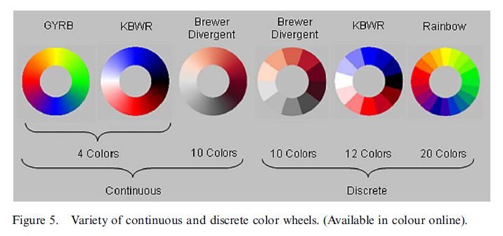
IMO a list of criteria to improve the aesthetics of most graphs that are disseminated in social science articles are; print the graph as a high resolution PNG file or a vector file format (much software defaults to JPEG unfortunately), sensible color choices (how is ColorBrewer not mentioned in the article!) or sensible choices for line formats, and understanding how to make elements of interest come to the foreground in the plot (e.g. not too heavy of gridlines, use color selectively to highlight areas of interest – discussed under the guise of layering earlier in the Minard graphic section). This list of simple advice though for aesthetics can be accomplished in any modern statistical software (and has been possible for years now). The section ends up being a mix of advice about aesthetics of plots with advice about how to make complicated plots more understandable (e.g. talk about small multiples). Discussing these concepts is best kept seperated. Although good advice extends to both, a quick and dirty scatterplot doesn’t have the same expectations as a plot in a publication. (The model of clarity residual plots from R would not be so clear if they had 10,000 points although it still may be sufficient for most purposes.)

Visualization in Practice

This section is organized into exploratory data analysis and presenting the results of models. HM touch on pertinent examples to sociologists (mainly large datasets with high variance to signals that are too complicated for bivariate scatterplots to tell the whole story). I enjoyed this section, but will mention additional examples and discussion that IMO should have been included.

EDA

HM make the great point that EDA and confirmatory analysis are never seperate, and that we can use thoughts from EDA to evaluate regression models. This IMO isn’t anything different than what Tukey talks about when he takes out row and column effects, it is just the scale of the number of data points and ability to fit models is far beyond any examples in Tukey’s EDA.

For the EDA section on categorical variables notable omissions are mosaic plots (Friendly, 1994) – which are mentioned but not shown in the pairs plot example and later on page 23 – and techniques for assessing residuals in logistic regression models (Greenhill et al., 2011; Esarey & Pierce, 2012). When discussing parallel coordinate plots mention should also be made of extensions to categorical data (Bendix et al. 2005; Dang et al. 2010; Hofmann & Vendettuoli, 2013). Later on mention is made that mosaic plots one needs to develop gestalt to interpret them (which I guess we are born with the ability to interpret bar graphs and scatterplots?) The same is oft mentioned for interpreting parallel coordinate plots, and anything that is novel will take some training to be able to interpret.

For continous models partial residual plots should be mentioned (Fox, 1991), and ellipses and caterpillar plots should be mentioned in relation to multi-level modelling (Afshartous & Wolf, 2007; Friendly et al. 2013; Loy & Hofmann 2013) as well as corrgrams for simple data reduction in SPLOMS (Friendly, 2002b). From the generic discussion of Bourdieu it sounds like they are discussing bi-plots or some sort of similar data reduction technique.

I should note that this is just my list of things I think deserve mention for application to sociologists, and the task of what to include is essentially an impossible one. Of course what to include is arbitrary, but I base it mainly on tasks I believe are more common for quantitative sociologists. This is mainly regression analysis and evaluating causal relationships between variables. So although parallel coordinate plots are a great visualization tool for anyone to be familiar with, I doubt it will be as interesting as tools to evaluate the fit or failure of regression models. HM mention that PCP plots are good for identifying clusters and outliers (they aren’t so good for evaluating correlations). Another example (that HM don’t mention) would be treemaps. It is an interesting tool to visualize hierarchical data, but I agree that it shouldn’t be included in this paper as such hierarchical data in sociology is rare (or at least many applications of interest aren’t immediately obvious to me). The Buja et al. paper on using graphs for inference is really neat idea, (and I’m glad to see it mentioned) but I’m more on the fence as to whether it should have taken precedence to some of the other visualizations ideas I mention.

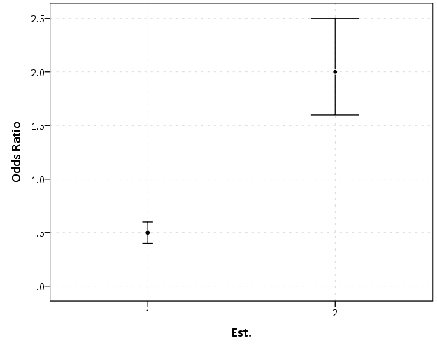
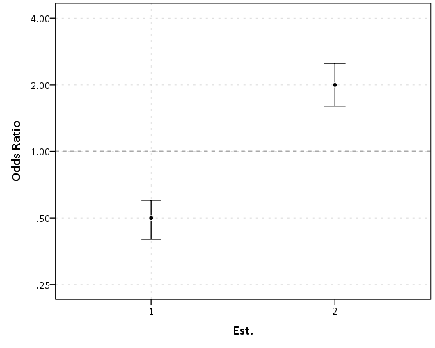
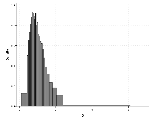
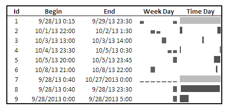
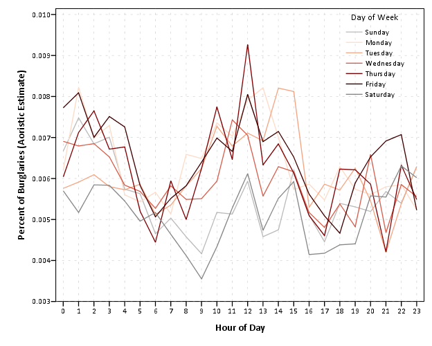
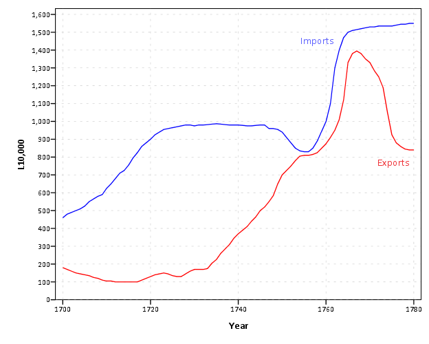
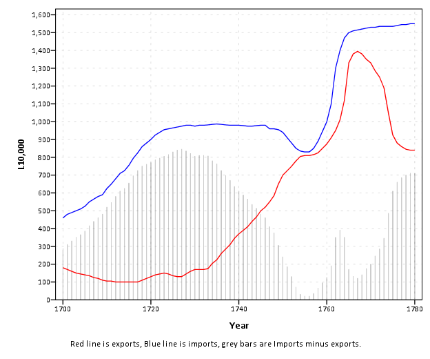
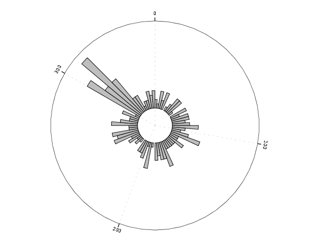
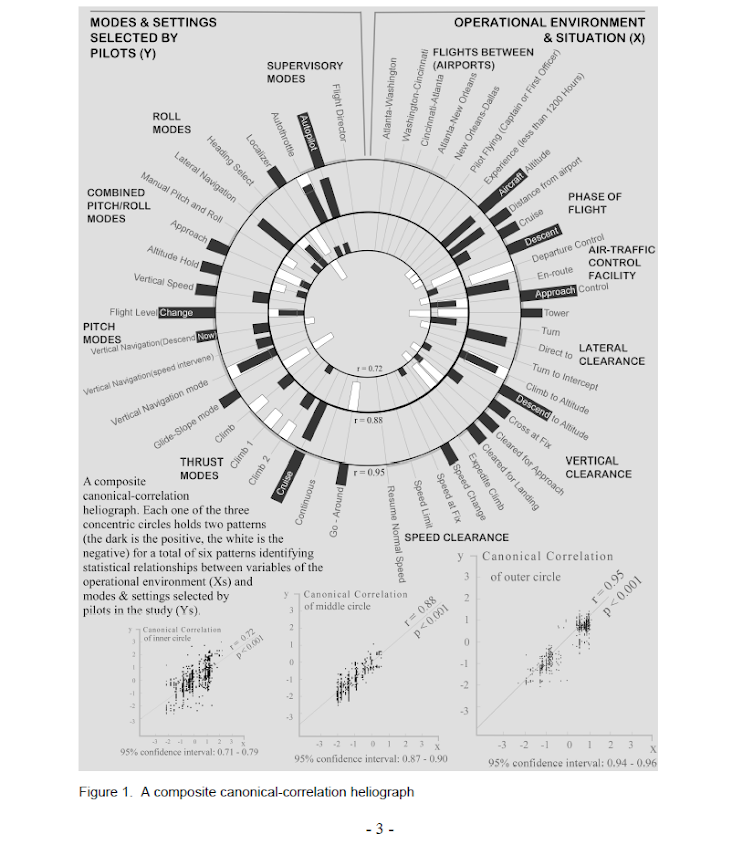
EDA for examining the original data and for examining model residuals are perhaps different enough that it should have its own specific section (although HM did have a nice discussion of this distinction). Examining model residuals is always preached but is seemingly rarely performed. More examples for the parade of horribles I would enjoy (Figure 1 presents a great one – maybe find one for a more complicated model would be good – I know of a few using UCR county data in criminology but none off-hand in sociology). The quote from Gelman (2004) is strange. Gelman’s suggestions for posterior simulations to check the model fit can be done with frequentist models, see King et al. (2000) for basically the same advice (although the citation is at an appropriate place). Also King promotes these as effective displays to understand models, so they are not just EDA then but reasonable tools to summarize models in publications (similar to effect plots later shown).

Presenting model results

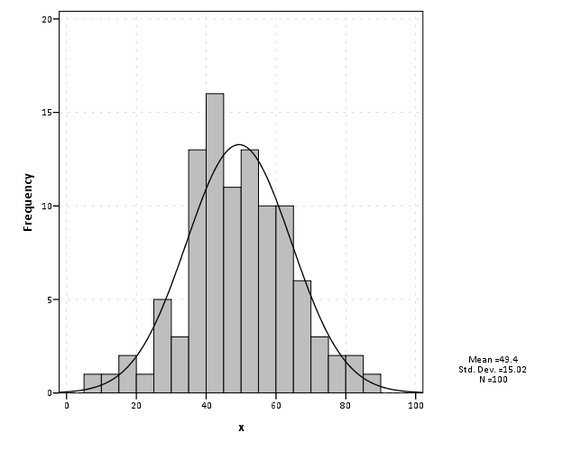
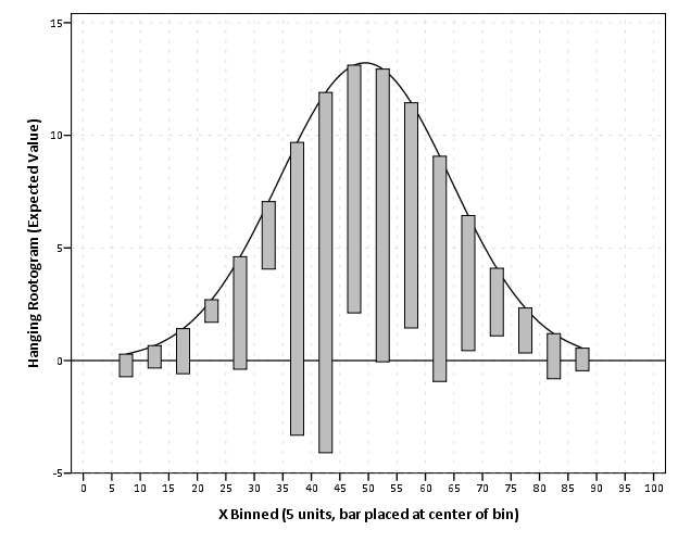
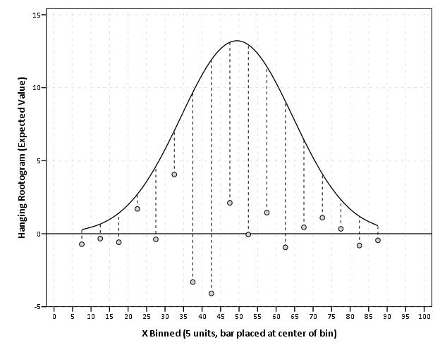
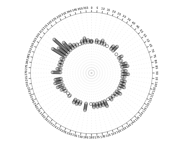
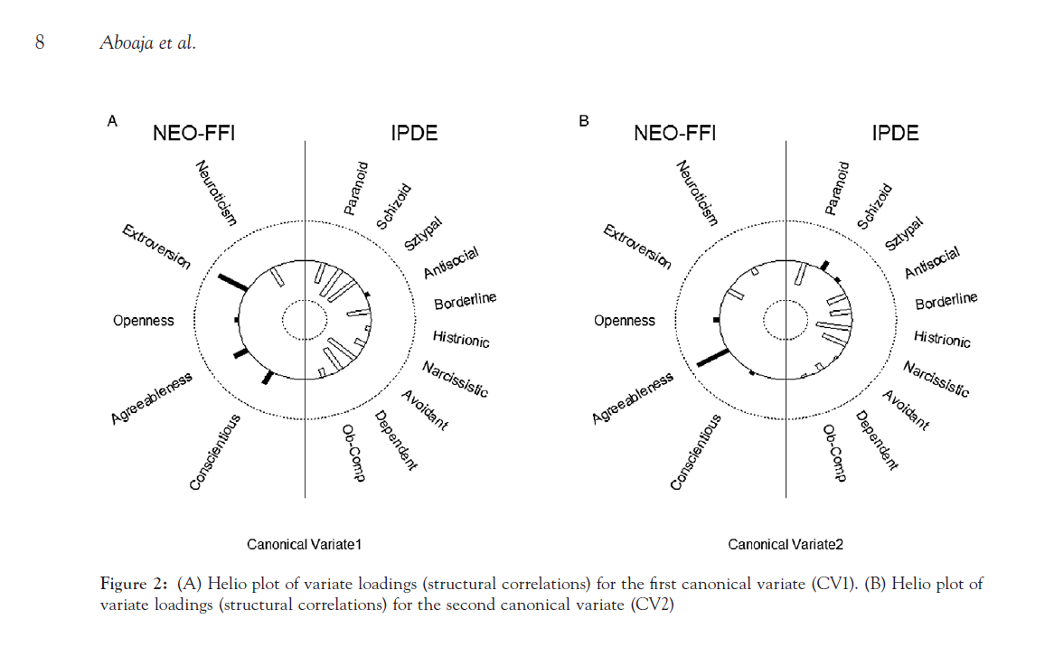
The first two examples in this section (Figure 7 histogram and Figure 8 which I’m not sure what it is displaying) seem to me that they should be in the EDA section (or are not cleary defined as presenting results versus EDA graphics). Turning tables into graphs (Cook & Teo, 2011; Gelman et al. 2002; Feinberg & Wainer, 2011; Friendly & Kwan, 2011; Kastellec & Leoni, 2007) is a large omission in this section. Since HM think that tables are used sufficiently, this would have been a great opportunity to show how some tables in an article are better presented as graphs and make more explicit how graphs are better at displaying regression results in some circumstances (Soyer & Hogarth, 2012). It also would have presented an opportunity to make the connection that data visualization can even help guide how to make tables (see my blog post Some notes on making effective tables and Feinberg & Wainer (2011)).

Examples of effects graphs are great. I would have liked mentions of standardizing coefficients to be on similar or more interpretable scales (Gelman & Pardoe, 2007; Gelman, 2008) and effectively displaying uncertainty in the estimates (see my blog post and citations Viz. weighted regression in SPSS and some discussion).

Handcock & Morris (1999) author names are listed in the obverse order in the bibliography in case anyone is looking for it like I was!

In Summary and Moving Forward

As oppossed to ending with a critique of the discussion, I will simply use this as a platform to discuss things I feel are important for moving forward the field of data visualization within sociology (and more broadly the social sciences). First, things I would like to see in the social sciences moving forward are;

  • More emphasis on the technical programming skills necessary to make quality graphs.
  • Encourage journals to use appropriate graphical methods to convey results.
  • Application of the study of data viz. methods as a study worthy in sociology unto itself.

The first suggestion, emphasis on technical programming skills, is in line with the push towards reproducible research. I would hope programs are teaching the statistical computing skills necessary to be an applied quantitative sociologist, and teaching graphical methods should be part and parcel. The second suggestion, encourage journals to use appropriate graphical methods, I doubt is objectionable to most contemporary journals. But I doubt reviewers regularly request graphs instead of tables even where appropriate. It is both necessary for people to submit graphs in their articles and for reviewers to suggest graphs (and journals to implement and enforce guidelines) to increase usage in the field.

When use of graphs becomes more regular and widespread in journal articles, I presume the actual discussion and novel applications will become more regular within sociological journals as well. James Moody is a notable exception with some of his work on networks, and I hope more sociologists are motivated to develop tools unique to their situation and test the efficacy of particular displays. Sociologists have some unique circumstances (spatial and network data, mostly categorical dimensions, low signal/high variance) that call for not just transporting ideas from other fields, but attention and development within sociology itself.


Citations

  • Afshartous, D. and Wolf, M. (2007). Avoiding ‘data snooping’ in multilevel and mixed effects models. Journal of the Royal Statistical Society: Series A (Statistics in Society), 170(4):1035-1059.
  • Bendix, F., Kosara, R., and Hauser, H. (2005). Parallel sets: visual analysis of categorical data. In IEEE Symposium on Information Visualization, 2005. INFOVIS 2005., pages 133-140. IEEE.
  • Brasseur, L. (2005). Florence nightingale’s visual rhetoric in the rose diagrams. Technical Communication Quarterly, 14(2):161-182.
  • Cleveland, W. S. and McGill, R. (1984). Graphical perception: Theory, experimentation, and application to the development of graphical methods. Journal of the American Statistical Association, 79(387):531-554.
  • Cleveland, W. S. (1984). Graphs in scientific publications. The American Statistician, 38(4):261-269.
  • Cook, Alex R. & Shanice W. Teo. (2011) The communicability of graphical alternatives to tabular displays of statistical simulation studies. PLoS ONE 6(11): e27974.
  • Cook, R. and Wainer, H. (2012). A century and a half of moral statistics in the united kingdom: Variations on joseph fletcher’s thematic maps. Significance, 9(3):31-36.
  • Dang, T. N., Wilkinson, L., and Anand, A. (2010). Stacking graphic elements to avoid Over-Plotting. IEEE Transactions on Visualization and Computer Graphics, 16(6):1044-1052.
  • Esarey, Justin & Andrew Pierce. 2012. Assessing fit quality and testing for misspecification in binary-dependent variable models. Political Analysis 20(4): 480-500. Preprint PDF Here
  • Feinberg, R. A. and Wainer, H. (2011). Extracting sunbeams from cucumbers. Journal of Computational and Graphical Statistics, 20(4):793-810.
  • Fienberg, S. E. (1979). Graphical methods in statistics. The American Statistician, 33(4):165-178.
  • Fox, J. (1991). Regression diagnostics. Number no. 79 in Quantitative applications in the social sciences. Sage.
  • Friendly, M. (1994). Mosaic displays for Multi-Way contingency tables. Journal of the American Statistical Association, 89(425):190-200.
  • Friendly, M. (2002a). Visions and Re-Visions of charles joseph minard. Journal of Educational and Behavioral Statistics, 27(1):31-51.
  • Friendly, M. (2002b). Corrgrams: Exploratory displays for correlation matrices. The American Statistician, 56(4):316-324.
  • Friendly, M. (2007). A.-M. guerry’s moral statistics of france: Challenges for multivariable spatial analysis. Statistical Science, 22(3):368-399.
  • Friendly, M. (2008). The golden age of statistical graphics. Statistical Science, 23(4):502-535.
  • Friendly, M., Monette, G., and Fox, J. (2013). Elliptical insights: Understanding statistical methods through elliptical geometry. Statistical Science, 28(1):1-39.
  • Friendly, Michael & Ernest Kwan. 2011. Comment on Why tables are really much better than graphs. Journal of Computational and Graphical Statistics 20(1): 18-27.
  • Gelman, A. (2008). Scaling regression inputs by dividing by two standard deviations. Statistics in medicine, 27(15):2865-2873.
  • Gelman, A. and Pardoe, I. (2007). Average predictive comparisons for models with nonlinearity, interactions, and variance components. Sociological Methodology, 37(1):23-51.
  • Gelman, Andrew, Cristian Pasarica & Rahul Dodhia (2002). Let’s practice what we preach. The American Statistician 56(2):121-130.
  • Greenhill, Brian, Michael D. Ward & Audrey Sacks. 2011. The separation plot: A new visual method for evaluating the fit of binary models. American Journal of Political Science 55(4):991-1002.
  • Hofmann, H. and Vendettuoli, M. (2013). Common angle plots as Perception-True visualizations of categorical associations. Visualization and Computer Graphics, IEEE Transactions on, 19(12):2297-2305.
  • Kastellec, Jonathan P. & Eduardo Leoni. (2007). Using graphs instead of tables in political science. Perspectives on Politics 5(4):755-771.
  • King, G., Tomz, M., and Wittenberg, J. (2000). Making the most of statistical analyses: Improving interpretation and presentation. American Journal of Political Science, 44(2):347-361.
  • Kosslyn, S. M. (1985). Graphics and human information processing: A review of five books. Journal of the American Statistical Association, 80(391):499-512.
  • Kosslyn, S. M. (1994). Elements of graph design. WH Freeman New York.
  • Lewi, P. J. (2006). Speaking of graphics. http://www.datascope.be/sog.htm
  • Loy, A. and Hofmann, H. (2013). Diagnostic tools for hierarchical linear models. Wiley Interdisciplinary Reviews: Computational Statistics, 5(1):48-61.
  • MacEachren, A. M. (2004). How maps work: representation, visualization, and design. Guilford Press.
  • Sampson, R. J. (2012). Great American city: Chicago and the enduring neighborhood effect. University of Chicago Press.
  • Schmid, C. F. (1954). Handbook of graphic presentation. Ronald Press Company. http://archive.org/details/HandbookOfGraphicPresentation
  • Shaw, C. R. and McKay, H. D. (1972). Juvenile delinquency and urban areas: a study of rates of delinquency in relation to differential characteristics of local communities in American cities. A Phoenix Book. University of Chicago Press.
  • Soyer, E. and Hogarth, R. M. (2012). The illusion of predictability: How regression statistics mislead experts. International Journal of Forecasting, 28(3):695-711.
  • Tufte, E. R. (1983). The visual display of quantitative information. Graphics Press.
  • Quetelet, A. (1984). Adolphe Quetelet’s Research on the propensity for crime at different ages. Criminal justice studies. Anderson Pub. Co.
  • Yule, G. U. (1926). Why do we sometimes get Nonsense-Correlations between Time-Series?-a study in sampling and the nature of Time-Series. Journal of the Royal Statistical Society, 89(1):1-63.

Odds Ratios NEED To Be Graphed On Log Scales

Andrew Gelman blogged the other day about an example of Odds Ratios being plotted on a linear scale. I have seen this mistake a couple of times, so I figured it would be worth the time to further elaborate on.

Reported odds ratios are almost invariably from the output of a generalized linear regression model (e.g. logistic, poisson). Graphing the associated exponentiated coefficients and their standard errors (or confidence intervals) is certainly a reasonable thing to want to do – but unless someone wants to be misleading they need to be on a log scale. When the coefficients (and the associated intervals) are exponeniated they are no longer symmetric on a linear scale.

To illustrate a few nefarious examples, lets pretend our software spit out a series of regression coefficients. The table shows the original coefficients on the log odds scale, and the subsequent exponentiated coefficients +- 2 Standard Errors.

Est.  Point  S.E. Exp(Point) Exp(-2*S.E.) Exp(+2*S.E.)
  1   -0.7   0.1    0.5        0.4            0.6
  2    0.7   0.1    2.0        1.6            2.5
  3    0.2   0.1    1.2        1.0            1.5
  4    0.1   0.8    1.1        0.2            5.5
  5   -0.3   0.9    0.7        0.1            4.5

Now, to start lets graph the exponentiated estimates (the odds ratios) for estimates 1 and 2 and their standard errors on an arithmetic scale, and see what happens.

This graph would give the impression that 2 is both a larger effect and has a wider variance than effect 1. Now lets look at the same chart on a log scale.

By construction effects 1 and 2 are exactly the same (this is clear on the original log odds scale before the coefficients were exponentiated). Changes in the ratio of the odds can not go below zero, and a change from an odds ratio between 0.5 and 0.4 is the same relative change as that between 2.0 and 2.5. On the linear scale though the former is a difference of 0.1, and the latter a difference of 0.5.

Such visual discrepancies get larger the further towards zero you go, and as what goes in the denominator and what goes in the numerator is arbitrary, displaying these values on a linear scale is very misleading. Consider a different example:

Well, what would we gather from this? Estimates 4 and 5 both have a wide variance, and the majority of their error bars are both above 1. This is an incorrect interpretation though, as the point estimate of 5 is below 1, and more of its error bar is on the below 1 side.

Looking up some more examples online this may be a problem more often than I thought (doing a google image search for “plot odds ratios” turns up plenty of examples to support my position). I even see some examples of forest plots of odds ratios fail to do this. An oft critique of log scales is that they are harder to understand. Even if I acquiesce that this is true, plotting odds ratios on a linear scale is misleading and should never be done.


To make a set of charts in SPSS with log scales for your particular data you can simply enter in the model estimates using DATA LIST and then use GGRAPH to make the plot. In particular for GGRAPH see the SCALE lines to set the base of the logarithms. Example below:

*Can input your own data.
DATA LIST FREE / Id  (A10) PointEst  SEPoint Exp_Point CIExp_L CIExp_H.
BEGIN DATA
  1   -0.7   0.1    0.5        0.4            0.6
  2    0.7   0.1    2.0        1.6            2.5
  3    0.2   0.1    1.2        1.0            1.5
  4    0.1   0.8    1.1        0.2            5.5
  5   -0.3   0.9    0.7        0.1            4.5
END DATA.
DATASET NAME OddsRat.

*Graph of Confidence intervals on log scale.
FORMATS Exp_Point CIExp_L CIExp_H (F2.1).
GGRAPH
  /GRAPHDATASET NAME="graphdataset" VARIABLES=Id Exp_Point CIExp_L CIExp_H
  /GRAPHSPEC SOURCE=INLINE.
BEGIN GPL
  SOURCE: s=userSource(id("graphdataset"))
  DATA: Id=col(source(s), name("Id"), unit.category())
  DATA: Exp_Point=col(source(s), name("Exp_Point"))
  DATA: CIExp_L=col(source(s), name("CIExp_L"))
  DATA: CIExp_H=col(source(s), name("CIExp_H"))
  GUIDE: axis(dim(1), label("Point Estimate and 95% Confidence Interval"))
  GUIDE: axis(dim(2))
  GUIDE: form.line(position(1,*), size(size."2"), color(color.darkgrey))
  SCALE: log(dim(1), base(2), min(0.1), max(6))
  ELEMENT: edge(position((CIExp_L+CIExp_H)*Id))
  ELEMENT: point(position(Exp_Point*Id), color.interior(color.black), 
           color.exterior(color.white))
END GPL.

Equal Probability Histograms in SPSS

The other day on NABBLE an individual asked for displaying histograms with unequal bar widths. I showed there if you have the fences (and the height of the bar) you can draw the polygons in inline GPL using a polygon element and the link.hull option for edges. I used a similar trick for spineplots.

On researching when someone would use unequal bar widths a common use is to make the fences at specified quantiles and plot the density of the distribution. That is the area of the bars in the plot is equal, but the width varies giving the bars unequal height. Nick Cox has an awesome article about graphing univariate distributions in Stata with equally awesome discussion of said equal probability histograms.

The full code is at the end of the post, but in a nutshell you can call the !EqProbHist MACRO by specifying the Var and how many quantiles to slice it, NTiles. The macro just uses OMS to capture the table of NTiles produced by FREQUENCIES along with the min and max, and returns a dataset named FreqPoly with the lower and upper fences plus the height of the bar. This dataset can then be plotted with a seperate GGRAPH command.

!EqProbHist Var = X NTiles = 25.
GGRAPH
  /GRAPHDATASET DATASET = 'FreqPoly' NAME="graphdataset" VARIABLES=FenceL FenceU Height
  /GRAPHSPEC SOURCE=INLINE.
BEGIN GPL
 SOURCE: s=userSource(id("graphdataset"))
 DATA: FenceL=col(source(s), name("FenceL"))
 DATA: FenceU=col(source(s), name("FenceU"))
 DATA: Height=col(source(s), name("Height"))
 TRANS: base=eval(0)
 TRANS: casenum = index() 
 GUIDE: axis(dim(1), label("X"))
 GUIDE: axis(dim(2), label("Density"))
 SCALE: linear(dim(2), include(0))
 ELEMENT: polygon(position(link.hull((FenceL + FenceU)*(base + Height))), color.interior(color.grey), split(casenum)) 
END GPL.

An example histogram is below.

Note if you have quantiles that are tied (e.g you have categorical or low count data) you will get division by zero errors. So this type of chart is only reasonable with continuous data.

*********************************************************************************************.
*Defining Equal Probability Macro - only takes variable and number of tiles to slice the data.
DEFINE !EqProbHist (Var = !TOKENS(1)
                   /NTiles = !TOKENS(1) )
DATASET DECLARE FreqPoly.
OMS
/SELECT TABLES
/IF SUBTYPES = 'Statistics'
/DESITINATION FORMAT = SAV OUTFILE = 'FreqPoly' VIEWER = NO.
FREQUENCIES VARIABLES=!Var
  /NTILES = !NTiles
  /FORMAT = NOTABLE
  /STATISTICS = MIN MAX.
OMSEND.
DATASET ACTIVATE FreqPoly.
SELECT IF Var1 <> "N".
SORT CASES BY Var4.
COMPUTE FenceL = LAG(Var4).
RENAME VARIABLES (Var4 = FenceU).
COMPUTE Height = (1/!NTiles)/(FenceU - FenceL).
MATCH FILES FILE = *
/KEEP FenceL FenceU Height.
SELECT IF MISSING(FenceL) = 0.
!ENDDEFINE.
*Example Using the MACRO and then making the graph.
dataset close all.
output close all.
set seed 10.
input program.
loop #i = 1 to 10000.
  compute X = RV.LNORMAL(1,0.5).
  compute X2 = RV.POISSON(3).
  end case.
end loop.
end file.
end input program.
dataset name sim.
PRESERVE.
SET MPRINT OFF.
!EqProbHist Var = X NTiles = 25.
GGRAPH
  /GRAPHDATASET DATASET = 'FreqPoly' NAME="graphdataset" VARIABLES=FenceL FenceU Height
  /GRAPHSPEC SOURCE=INLINE.
BEGIN GPL
 SOURCE: s=userSource(id("graphdataset"))
 DATA: FenceL=col(source(s), name("FenceL"))
 DATA: FenceU=col(source(s), name("FenceU"))
 DATA: Height=col(source(s), name("Height"))
 TRANS: base=eval(0)
 TRANS: casenum = index() 
 GUIDE: axis(dim(1), label("X"))
 GUIDE: axis(dim(2), label("Density"))
 SCALE: linear(dim(2), include(0))
 ELEMENT: polygon(position(link.hull((FenceL + FenceU)*(base + Height))), color.interior(color.grey), split(casenum)) 
END GPL.
RESTORE.
*********************************************************************************************.

Stacked (pyramid) bar charts for Likert Data

A while ago this question on Cross Validated showed off some R libraries to plot Likert data. Here is a quick post on replicating the stacked pyramid chart in SPSS.

This is one of the (few) examples where stacked bar charts are defensible. One task that is easier with stacked bars (and Pie charts – which can be interpreted as a stacked bar wrapped in a circle) is to combine the lengths of adjacent categories. Likert items present an opportunity with their ordinal nature to stack the bars in a way that allows one to more easily migrate between evaluating positive vs. negative responses or individually evaluating particular anchors.

First to start out lets make some fake Likert data.

**************************************.
*Making Fake Data.
set seed = 10.
input program.
loop #i = 1 to 500.
compute case = #i.
end case.
end loop.
end file.
end input program.
dataset name sim.
execute.
*making 30 likert scale variables.
vector Likert(30, F1.0).
do repeat Likert = Likert1 to Likert30.
compute Likert = TRUNC(RV.UNIFORM(1,6)).
end repeat.
execute.
value labels Likert1 to Likert30 
1 'SD'
2 'D'
3 'N'
4 'A'
5 'SA'.
**************************************.

To make a similar chart to the one posted earlier, you need to reshape the data so all of the Likert items are in one column.

**************************************.
varstocases
/make Likert From Likert1 to Likert30
/index Question (Likert).
**************************************.

Now to make the population pyramid Likert chart we will use SPSS’s ability to reflect panels, and so we assign an indicator variable to delineate the positive and negative responses.

***************************************
*I need to make a variable to panel by.
compute panel = 0.
if Likert > 3 panel = 1.
***************************************.

From here we can produce the chart without displaying the neutral central category. Here I use a temporary statement to not plot the neutral category, and after the code is the generated chart.

***************************************.
temporary.
select if Likert <> 3.
GGRAPH
  /GRAPHDATASET NAME="graphdataset" VARIABLES=Question COUNT()[name="COUNT"] Likert panel
    MISSING=LISTWISE REPORTMISSING=NO
  /GRAPHSPEC SOURCE=INLINE.
BEGIN GPL
  SOURCE: s=userSource(id("graphdataset"))
  COORD: transpose(mirror(rect(dim(1,2))))
  DATA: Question=col(source(s), name("Question"), unit.category())
  DATA: COUNT=col(source(s), name("COUNT"))
  DATA: Likert=col(source(s), name("Likert"), unit.category())
  DATA: panel=col(source(s), name("panel"), unit.category())
  GUIDE: axis(dim(1), label("Question"))
  GUIDE: axis(dim(2), label("Count"))
  GUIDE: axis(dim(3), null(), gap(0px))
  GUIDE: legend(aesthetic(aesthetic.color.interior), label("Likert"))
  SCALE: linear(dim(2), include(0))
  SCALE: cat(aesthetic(aesthetic.color.interior), sort.values("1","2","5","4"), map(("1", color.blue), ("2", color.lightblue), ("4", color.lightpink), ("5", color.red)))
  ELEMENT: interval.stack(position(Question*COUNT*panel), color.interior(Likert), shape.interior(shape.square))
END GPL.
***************************************.

These charts when displaying the Likert responses typically allocate the neutral category half to one panel and half to the other. To accomplish this task I made a continuous random variable and then use the RANK command to assign half of the cases to the positive panel.

***************************************.
compute rand = RV.NORMAL(0,1).
AUTORECODE  VARIABLES=Question  /INTO QuestionN.
RANK
  VARIABLES=rand  (A) BY QuestionN Likert /NTILES (2)  INTO RankT /PRINT=NO
  /TIES=CONDENSE .
if Likert = 3 and RankT = 2 panel = 1.
***************************************.

From here it is the same chart as before, just with the neutral category mapped to white.

***************************************.
GGRAPH
  /GRAPHDATASET NAME="graphdataset" VARIABLES=Question COUNT()[name="COUNT"] Likert panel
    MISSING=LISTWISE REPORTMISSING=NO
  /GRAPHSPEC SOURCE=INLINE.
BEGIN GPL
  SOURCE: s=userSource(id("graphdataset"))
  COORD: transpose(mirror(rect(dim(1,2))))
  DATA: Question=col(source(s), name("Question"), unit.category())
  DATA: COUNT=col(source(s), name("COUNT"))
  DATA: Likert=col(source(s), name("Likert"), unit.category())
  DATA: panel=col(source(s), name("panel"), unit.category())
  GUIDE: axis(dim(1), label("Question"))
  GUIDE: axis(dim(2), label("Count"))
  GUIDE: axis(dim(3), null(), gap(0px))
  GUIDE: legend(aesthetic(aesthetic.color.interior), label("Likert"))
  SCALE: linear(dim(2), include(0))
  SCALE: cat(aesthetic(aesthetic.color.interior), sort.values("1","2","5","4", "3"), map(("1", color.blue), ("2", color.lightblue), ("3", color.white), ("4", color.lightpink), ("5", color.red)))
  ELEMENT: interval.stack(position(Question*COUNT*panel), color.interior(Likert),shape.interior(shape.square))
END GPL.
***************************************.

The colors are chosen to illustrate the ordinal nature of the data, with the anchors having a more saturated color. To end I map the neutral category to a light grey and then omit the outlines of the bars in the plot. They don’t really add anything (except possible moire patterns), and space is precious with so many items.

***************************************.
GGRAPH
  /GRAPHDATASET NAME="graphdataset" VARIABLES=Question COUNT()[name="COUNT"] Likert panel
    MISSING=LISTWISE REPORTMISSING=NO
  /GRAPHSPEC SOURCE=INLINE.
BEGIN GPL
  SOURCE: s=userSource(id("graphdataset"))
  COORD: transpose(mirror(rect(dim(1,2))))
  DATA: Question=col(source(s), name("Question"), unit.category())
  DATA: COUNT=col(source(s), name("COUNT"))
  DATA: Likert=col(source(s), name("Likert"), unit.category())
  DATA: panel=col(source(s), name("panel"), unit.category())
  GUIDE: axis(dim(1), label("Question"))
  GUIDE: axis(dim(2), label("Count"))
  GUIDE: axis(dim(3), null(), gap(0px))
  GUIDE: legend(aesthetic(aesthetic.color.interior), label("Likert"))
  SCALE: linear(dim(2), include(0))
  SCALE: cat(aesthetic(aesthetic.color.interior), sort.values("1","2","5","4", "3"), map(("1", color.blue), ("2", color.lightblue), ("3", color.lightgrey), ("4", color.lightpink), ("5", color.red)))
  ELEMENT: interval.stack(position(Question*COUNT*panel), color.interior(Likert),shape.interior(shape.square),transparency.exterior(transparency."1"))
END GPL.
***************************************.

Sparklines for Time Interval Crime Data

I developed some example sparklines for tables when visualizing crime data that occurs in an uncertain window. The use case is small tables that list the begin and end date-times, and the sparklines provide a quick visual assessment of the day of week and time of day. Examining for overlaps in two intervals is one of the hardest things to do when examining a table, and deciphering days of week when looking at dates is just impossible.

Here is an example table of what they look like.

The day of week sparklines are a small bar chart, with Sunday as the first bar and Saturday as the last bar. The height of the bar represents the aoristic estimate for that day of week. An interval over a week long (entirely uncertain what day of week the crime took place) ends up looking like a dashed line over the week. This example uses the sparkline bar chart built into Excel 2010, but the Sparklines for Excel add-on provides synonymous functionality. The time of day sparkline is a stacked bar chart in disguise; it represents the time interval with a dark grey bar, and the remaining stack is white. This allows you to have crimes that occur overnight and are split in the middle of the day. Complete ignorance of when the crime occurred during the day I represent with a lighter grey bar.

The spreadsheet can be downloaded from my drop box account here.

A few notes the use of the formulas within the sheet:

  • The spreadsheet does have formulas to auto-calculate the example sparklines (how they exactly work is worth another blog post all by itself) but it should be pretty clear to replicate the example bar chart for the day of week and time of day in case you just want to hand edit (or have another program return the needed estimates).
  • For the auto-calculations to work for the Day of Week aoristic estimates the crime interval needs to have a positive value. That is, if the exact same time is listed in the begin and end date column you will get a division by zero error.
  • For the day of week aoristic estimates it calculates the proportion as 1/7 if the date range is over one week. Ditto for the time range it is considered the full range if it goes over 24 hours.

A few notes on the aesthetics of sparklines:

  • For the time of day sparkline if you have zero (or near zero) length for the interval it won’t show up in the graph. Some experimentation suggests the interval needs around 15 to 45 minutes for typical cell sizes to be visible in the sheet (and for printing).
  • For the time of day sparkline the empty time color is set to white. This will make the plot look strange if you use zebra stripes for the table. You could modify it to make the empty color whatever the background color of the cell is, but I suspect this might make it confusing looking.
  • A time of day bar chart could be made just the same as the day of week bar chart. It would require the full expansion for times of day, which I might do in the future anyway to provide a conveniant spreadsheet to calculate aoristic estimates. (I typically do them with my SPSS MACRO – but it won’t be too arduous to expand what I have done here to an excel template).
  • If the Sparklines for Excel add-on allowed pie charts with at least two categories or allowed the angle of the pie slice to be rotated, you could make a time of day pie chart sparkline. This is currently not possible though.

I have not thoroughly tested the spreadsheet calculations (missing values will surely return errors, and if you have the begin-end backwards it may return some numbers, but I doubt they will be correct) so caveat emptor. I think the sparklines are a pretty good idea though. I suspect some more ingenious uses of color could be used to cross-reference the days of week and the time of day, but this does pretty much what I hoped for when looking at the table.

Cyclical color ramps for time series line plots

Morphet & Symanzik (2010) propose different novel cyclical color ramps by taking ColorBrewer ramps and wrapping them on the circle. All other previous continuous circle ramps I had seen prior were always rainbow scales, and there is plenty discussion about why rainbow color scales are bad so we needn’t rehash that here (see Kosara, Drew Skau, and my favorite Why Should Engineers and Scientists Be Worried About Color? for a sampling of critiques).

Below is a picture of the wrapped cyclical ramps from Morphet & Symanzik (2010). Although how they "average" the end points is not real clear to me from reading the paper, they basically use a diverging ramp and have one end merge at a fully saturated end of the sprectrum (e.g. nearly black) and the other merge at the fully light end of the spectrum (e.g. nearly white).

The original motivation is for directional data, and here is a figure from my paper Viz. JTC lines comparing the original rainbow color ramp I chose (on the right) and an updated red-grey cyclical scale on the left. The map is still quite complicated, as part of the motivation of that map was to show how plotting the JTC the longer lines dominate the graphic.

But I was interested in applying this logic to showing cyclical line plots, e.g. aoristic crime estimates by hour of day and day of week. Using the same Arlington data I used before, here are the aoristic estimates for hour of day plotted seperately for each day of the week. The colors for the day of the week use SPSS’s default color scheme for nominal categories. SPSS does not have anything as far as color defaults to distinguish between ordinal data, so if you use a categorical coloring scheme this is what you get.

The default is very good to distinguish between nominal categories, but here I want to take advantage of the cyclical nature of the data, so I employ a cyclical color ramp.

From this it is immediately apparent that the percentage of crimes dips down during the daytime for the grey Saturday and Sunday aoristic estimates. Most burglaries happen during the day, and so you can see that when homeowners are more likely to be in the house (as oppossed to at work) burglaries are less likely to occur. Besides this, day of week seems largely irrelevant to the percentage of burglaries that are occurring in Arlington.

I chose to make during the week shades of red, the dark color split between Friday-Saturday, and the light color split between Sunday-Monday. This trades one problem for another, in that the more fully saturated colors draw more attention in the plot, but I believe it is a worthwhile sacrifice in this instance. Below are the Hexidecimal RGB codes I used for each day of the week.

Sun - BABABA
Mon - FDDBC7
Tue - F4A582
Wed - D6604D
Thu - 7F0103
Fri - 3F0001
Sat - 878787

How art can influence info viz.

The role of art on info viz. is a tortuous topic. Frequently, renditions of infographics have clear functional shortcomings as tools to convey quantitative data, but are lauded as beautiful pieces of art in spite of this. Thus the topic gets presented in overtones of function versus aesthetic, and any scientist worried about function would surely not choose something pretty over something obviously more functional (however you define functional). Thus the topic itself has some negative contextual history that impedes its discussion. But this is a false dichotomy; beauty need not impede function.

Here I want to bring to light some examples of how art actually has positive influences on the function of information visualization. I will break up the examples into two topics: the use of color and the rendering of graphics.

Color

The use of color to visualize discrete items in information visualizations is perhaps the most regular, but one of the most arbitrary decisions a designer makes. Here I will point to the work of Sidonie Christophe, who embraces the arbitrariness of using a color palette and uses popular pieces of artwork to create aesthetically pleasing color choices. Christophe makes the presumption that the colors in popular pieces of art provide ample contrast in the colors to effectively visualize different attributes, but are publicly vouched as aesthetically beautiful. Here is an example using a palette from one of Van Gogh’s paintings to apply to a street map (taken from Sidonie’s dissertation);

I won’t make any argument for Van Gogh’s palatte being more functional than other potential ones, but it is better than being guided by nothing (Van Gogh does have the added benefit of being color blind safe.)

Rendering

One example of artistic rendering of information I previously talked about was the logic behind the likability of XKCD graphs. There the motivation is both memorability of graphs and data reduction/simplification. Despite the minimalist straw man often painted of Tufte, in his later books he provides a variety of examples of diagrams that are artistic embellishments (e.g. the cover of Leviathan) but takes them as positive inspiration for GUI design.

Another recent example I came across is the use of curved lines in network diagrams (I have related academics interest in this for visualizing geographic flow data) which have motivation based on the work of Mark Lombardi.

The reason curved lines look nicer is not entirely aesthetic, it has functional values for displacing overlapping lines and (related) making in-bound edges easier to distinguish.

Much ado is made about network layout algorithms, but some interesting work is being done on visualizing the lines themselves. Interesting applications that are often lauded as beautiful are Circos and Hive Plots. Even Ben Shneiderman, creator of the treemap graphic, is getting in on the graphs as art wave.

I’m sure many other examples exist, so feel free to let me know in the comments.

Hanging rootograms and viz. differences in time series

These two quick charting tips are based on the notion that comparing differences from a straight line are easier than comparing deviations from a curved line. The problems with comparing differences between curved lines are similar to the difference between comparings length and distance from a common baseline (so Cleveland’s work is applicable), but the task of comparing two curves comes up enough that it deserves some specific attention.

The first example is comparing differences between a histogram and an estimated distribution. For example, people often like to superimpose a distribution curve on a histogram, and here is an example SPSS chart.

I believe it was Tukey who suggested that instead of plotting the histogram bars at the zero upwards, you hang them from the expected value. What this does is that instead of comparing differences from a curved line, you are comparing differences to the straight reference line at zero.

Although it is usual to plot the bars to cover the entire bin, I sometimes find this distracting. So here is an alternative (in SPSS – with example code linked to at the end of the post) in which I only plot lines and dots and just note in text the bin widths are in-between the hash marks on the X axis.

The second example is taken from William Playfair’s atlas, and Cleveland uses it to show that comparing two curves can be misleading. (It took me forever to find this data already digitized, so thanks for the bissantz blog for posting it.)

Instead of comparing the two curves only in terms of vertical deviations from one another, we tend to compare the curves in terms of the nearest location. Here the visual error in the magnitude of differences is likely to occur in the area between 1760 and 1766, where they look very close to one another because of the upward slope for both time series in that period.

Here I like the default behavior of SPSS when plotting the differences as an interval element and it is easier to see this potential error (just compare the length of the bars). When using a continuous scale, SPSS plots the interval elements with zero area inside and only an exterior outline (which ends up being near equivalent to a edge element).

More frequently though, people suggest just to plot the differences, and here is a chart with all three (Imports, Exports and the difference) plotted on the same graph. Note the differences at 1763 (390) is actually larger than the difference and the start of the series, 280 at 1700.

You can do similar things to scatterplots, which Tukey calls detilting plots. Again, the lesson is it is easier to compare differences from a straight line than it is differences from a curve (or sloped line). Here I have posted the SPSS code to make the graphs (I slightly cheated though and post edited in the guidelines and labels in the graph editor).

Using circular dot plots instead of circular histograms

Although as I mentioned in this post on circular helio bar charts, polar coordinates are unlikely to be as effective as rectilinear coordinates for most types of comparisons, I really wanted to use a circular histogram in a recent paper of mine. The motivation is I have circular data in form of azimuths (Journey to Crime), aggregated to quadrants. So I really wanted to use a small multiple plot of circular histograms with the visual connection to the actual direction the azimuths were distributed within each quadrant.

Part of the problem with circular histograms though is that the area near the center of the plot shrinks to nothing.

So a simple solution is to offset the center of the plot, so the bars don’t start at the origin, but a prespecified distance away from the center of the circle. Below is the same chart previously with a slight offset. (I saw this idea originally in Wilkinson’s Grammar of Graphics.)

And here is that technique extended to an example small multiple histogram from an earlier draft of the paper I previously mentioned.

Even with the offset, the problem of the shrinking area is even worse because of the many plots, and the outlying bars in one plot shrinks the rest of the distribution even more dramatically. So, even with the offsetting it is still quite difficult assess trends. Also note I don’t even bother to draw the radius guide lines. I noticed in some recent papers about analyzing circular data that they don’t draw bars for circular histograms, but use dots (and/or kernel density estimates). See examples in Brunsdon and Corcoran (2006), Ashby and Bowers (2013), and Russell and Levitin (1995). The below image is taken from Ashby and Bowers (2013) to demonstrate this.

The idea behind this is that, in polar coordinates, you need to measure the length of the bar, instead of distance from a common reference line. When you use dots, it is pretty trivial to just count the dots to see how far they stack up (so no axis guide is needed). This just replaces one problem for other ones, especially for larger sample sizes (in which you will need to discretize how many observations a point represents) but I don’t think it is any worse than bars at least in this situation (and can potentially be better for a smaller number of dots). One thing that does happen with points is that large stacks deviate from each other the further they grow towards the circumference of the polar coordinate system (the bars in histograms typically get wider). This just looks aesthetically bad, although the bars growing wider could be considered a disingenuous representation (e.g. Florence Nightingale’s coxcomb chart) (Brasseur, 2005; Friendly, 2008).

Unfortunately, SPSS’s routine to stack the dots in polar coordinates is off just slightly (I have full code linked at the end of the post to recreate some of the graphs in the post and display this behavior).

With alittle data manipulation though you can basically roll your own (although this is fixed bins, unlike irregular ones chosen based on the data like in Wilkinson’s dot plots, e.g. bin.dot in GPL) (Wilkinson, 1999).

And here is the same example small multiple histogram using the dots.

Here I have posted the code to demonstrate some of the graphs here (and I have the full code for the Viz. JTC paper here). To make the circular dot plot I use the sequential case processing trick, and then show how to use TRANS statements in inline GPL to adjust the positioning of the dots and if you want the dots to represent multiple values.


References

Some discussion on circular helio bar charts

The other day I saw a popular post on the mathematica site was to reconstruct helio plots. They are essentially bar charts of canonical correlation coefficients plotted in polar coordinates, and below is the most grandiose example of them I could find (Degani et al., 2006).

That is a bit of a crazy example, but it is essentially several layers of bar charts in polar coordinates, with seperate rings displaying seperate correlation coefficients. Seeing there use in action struck me as odd, given typical perceptual problems known with using polar coordinates. Polar coordinates are popular for their space saving capabilities for network diagrams (see for example Circos) but there appears to be no redeeming quality of using polar coordinates for displaying the data in these circumstances that I can tell. The Degani paper gives the motivation for the polar coordinates because polar coordinates lack natural ordering that plots in cartesian coordinates imply. This strikes me as either unfounded or hypocritical, so I don’t really see why that is a reasonable motivation.

Polar coordinates have the negatives here that points going towards the center of the circle are compressed in smaller areas, and points going towards the edge of the circle are spread further apart. This creates a visual bias that does not portray actual data. I also presume length judgements in polar coordinates are more difficult. This having some bars protruding closer to one another and some diverging farther away I suspect cause more error judgements in false associations than do any ordering in bar charts in rectilinear coordinates. Also polar coordinates are very difficult to portray radial axis labels, so specific quantitative assements (e.g. this correlation is .5 and this correlation is .3) are difficult to make.

Below I will show an example taken from page 8 of Aboaja et al. (2011). Below is a screen shot of their helio plot, produced with the R package yacca.

So first, lets not go crazy and just see how a simple bar chart suffices to show the data. I use nesting here to differentiate between NEO-FFI and IPDE factors, but one could use other aesthetics like color or pattern to clearly distinguish between the two.


data list free / type (F1.0) factors (F2.0) CV1 CV2.
begin data
1 1 -0.49 -0.17
1 2 0.73 -0.37
1 3 0.07 0.14
1 4 0.34 0.80
1 5 0.36 0.08
2 6 -0.53 -0.57
2 7 -0.78 0.25
2 8 -0.77 0.08
2 9 0.10 -0.45
2 10 -0.51 -0.48
2 11 -0.79 -0.48
2 12 -0.24 -0.56
2 13 -0.76 -0.04
2 14 -0.65 -0.16
2 15 -0.21 -0.05
end data.
value labels type
1 'NEO-FFI'
2 'IPDE'.
value labels factors
1 'Neuroticism'
2 'Extroversion'
3 'Openness'
4 'Agreeableness'
5 'Conscientiousness'
6 'Paranoid'
7 'Schizoid'
8 'Schizotypal'
9 'Antisocial'
10 'Borderline'
11 'Histrionic'
12 'Narcissistic'
13 'Avoidant'
14 'Dependent'
15 'Obsessive Compulsive'.
formats CV1 CV2 (F2.1).

*Bar Chart.
GGRAPH
  /GRAPHDATASET NAME="graphdataset" VARIABLES=factors CV1 type
  /GRAPHSPEC SOURCE=INLINE.
BEGIN GPL
 SOURCE: s=userSource(id("graphdataset"))
 DATA: factors=col(source(s), name("factors"), unit.category())
 DATA: type=col(source(s), name("type"), unit.category())
 DATA: CV1=col(source(s), name("CV1"))
 GUIDE: axis(dim(1), opposite())
 GUIDE: axis(dim(2), label("CV1"))
 SCALE: cat(dim(1.1), include("1", "2", "3", "4", "5", "6", "7", "8", "9", "10", "11", "12", "13", "14", "15"))
 SCALE: linear(dim(2), min(-1), max(1))
 ELEMENT: interval(position(factors/type*CV1), shape.interior(shape.square))
END GPL.

This shows an example of using nesting for the faceting structure in SPSS. The default behavior for SPSS is that the NEO-FFI has fewer categories, so the bars are plotted wider (because the panels are set to be equally sized). Wilkinson’s Grammar has examples of setting the panels to be different sizes just in this situation, but I do not believe this is possible in SPSS. Because of this, I like to use point and edge elements to just symbolize lines, which makes the panels visually similar. Also I post-hoc added a guideline at the zero value and sorted the values of CV1 descendingly within panels.


*Because of different sizes - I like the line with dotted interval.
GGRAPH
  /GRAPHDATASET NAME="graphdataset" VARIABLES=factors CV1 type
  /GRAPHSPEC SOURCE=INLINE.
BEGIN GPL
 SOURCE: s=userSource(id("graphdataset"))
 DATA: factors=col(source(s), name("factors"), unit.category())
 DATA: type=col(source(s), name("type"), unit.category())
 DATA: CV1=col(source(s), name("CV1"))
 TRANS: base=eval(0)
 GUIDE: axis(dim(1), opposite())
 GUIDE: axis(dim(2), label("CV1"))
 SCALE: cat(dim(1.1), include("1", "2", "3", "4", "5", "6", "7", "8", "9", "10", "11", "12", "13", "14", "15"), sort.statistic(summary.max(CV1)), reverse())
 SCALE: linear(dim(2), min(-1), max(1))
 ELEMENT: edge(position(factors/type*(base+CV1)), shape.interior(shape.dash), color(color.grey))
 ELEMENT: point(position(factors/type*CV1), shape.interior(shape.circle), color.interior(color.grey))
END GPL.

If one wanted to show both variates within the same plot, one could either use panels (as did the original Aboaja article, just in polar coordinates) or one could superimpose those estimates on the same plot. An example of superimposing is given below. This superimposing also extends to more than two canonical variates, although the more points the more the graph gets so busy it is difficult to interpret and one might want to consider small multiples. Here I show superimposing CV1 and CV2 and sort by descending values of CV2.


GGRAPH
  /GRAPHDATASET NAME="graphdataset" VARIABLES=factors CV1 CV2 type
  /GRAPHSPEC SOURCE=INLINE.
BEGIN GPL
 SOURCE: s=userSource(id("graphdataset"))
 DATA: factors=col(source(s), name("factors"), unit.category())
 DATA: type=col(source(s), name("type"), unit.category())
 DATA: CV1=col(source(s), name("CV1"))
 DATA: CV2=col(source(s), name("CV2"))
 TRANS: base=eval(0)
 GUIDE: axis(dim(1), opposite())
 GUIDE: axis(dim(2), label("CV"))
 SCALE: cat(dim(1.1), include("1", "2", "3", "4", "5", "6", "7", "8", "9", "10", "11", "12", "13", "14", "15"), sort.statistic(summary.max(CV2)), reverse())
 SCALE: linear(dim(2), min(-1), max(1))
 ELEMENT: line(position(factors/type*base), color(color.black))
 ELEMENT: point(position(factors/type*CV1), shape.interior("CV1"), color.interior("CV1"))
 ELEMENT: point(position(factors/type*CV2), shape.interior("CV2"), color.interior("CV2"))
END GPL.

Now, I know nothing of canonical correlation, but if one wanted to show the change from the first to second canonical covariate one could use the edge element with an arrow. One could also order the axis here, based on values of either the first or second canonical variate, or on the change between variates. Here I sort ascendingly by the absolute value in the change between variates.


GGRAPH
  /GRAPHDATASET NAME="graphdataset" VARIABLES=factors CV1 CV2 type
  /GRAPHSPEC SOURCE=INLINE.
BEGIN GPL
 SOURCE: s=userSource(id("graphdataset"))
 DATA: factors=col(source(s), name("factors"), unit.category())
 DATA: type=col(source(s), name("type"), unit.category())
 DATA: CV1=col(source(s), name("CV1"))
 DATA: CV2=col(source(s), name("CV2"))
 TRANS: base=eval(0)
 GUIDE: axis(dim(1), opposite())
 GUIDE: axis(dim(2), label("CV"))
 SCALE: cat(dim(1.1), include("1", "2", "3", "4", "5", "6", "7", "8", "9", "10", "11", "12", "13", "14", "15"), sort.statistic(summary.max(diff)))
 SCALE: linear(dim(2), min(-1), max(1))
 ELEMENT: line(position(factors/type*base), color(color.black))
 ELEMENT: edge(position(factors/type*(CV1+CV2)), shape.interior(shape.arrow), color.interior(color.red)) 
 ELEMENT: point(position(factors/type*CV1), shape.interior(shape.circle), color.interior(color.red))
END GPL.

I’ve posted some additional code at the end of the blog post to show the nuts and bolts of making a similar chart in polar coordinates, plus a few other potential variants like a clustered bar chart. I see little reason though to prefer them to more traditional bar charts in a rectilinear coordinate system.


Citations


***********************************************************************************.
*Full code snippet.
data list free / type (F1.0) factors (F2.0) CV1 CV2.
begin data
1 1 -0.49 -0.17
1 2 0.73 -0.37
1 3 0.07 0.14
1 4 0.34 0.80
1 5 0.36 0.08
2 6 -0.53 -0.57
2 7 -0.78 0.25
2 8 -0.77 0.08
2 9 0.10 -0.45
2 10 -0.51 -0.48
2 11 -0.79 -0.48
2 12 -0.24 -0.56
2 13 -0.76 -0.04
2 14 -0.65 -0.16
2 15 -0.21 -0.05
end data.
value labels type
1 'NEO-FFI'
2 'IPDE'.
value labels factors
1 'Neuroticism'
2 'Extroversion'
3 'Openness'
4 'Agreeableness'
5 'Conscientiousness'
6 'Paranoid'
7 'Schizoid'
8 'Schizotypal'
9 'Antisocial'
10 'Borderline'
11 'Histrionic'
12 'Narcissistic'
13 'Avoidant'
14 'Dependent'
15 'Obsessive Compulsive'.
formats CV1 CV2 (F2.1).

*Bar Chart.
GGRAPH
  /GRAPHDATASET NAME="graphdataset" VARIABLES=factors CV1 type
  /GRAPHSPEC SOURCE=INLINE.
BEGIN GPL
 SOURCE: s=userSource(id("graphdataset"))
 DATA: factors=col(source(s), name("factors"), unit.category())
 DATA: type=col(source(s), name("type"), unit.category())
 DATA: CV1=col(source(s), name("CV1"))
 GUIDE: axis(dim(1), opposite())
 GUIDE: axis(dim(2), label("CV1"))
 SCALE: cat(dim(1.1), include("1", "2", "3", "4", "5", "6", "7", "8", "9", "10", "11", "12", "13", "14", "15"))
 SCALE: linear(dim(2), min(-1), max(1))
 ELEMENT: interval(position(factors/type*CV1), shape.interior(shape.square))
END GPL.

*Because of different sizes - I like the line with dotted interval.
GGRAPH
  /GRAPHDATASET NAME="graphdataset" VARIABLES=factors CV1 type
  /GRAPHSPEC SOURCE=INLINE.
BEGIN GPL
 SOURCE: s=userSource(id("graphdataset"))
 DATA: factors=col(source(s), name("factors"), unit.category())
 DATA: type=col(source(s), name("type"), unit.category())
 DATA: CV1=col(source(s), name("CV1"))
 TRANS: base=eval(0)
 GUIDE: axis(dim(1), opposite())
 GUIDE: axis(dim(2), label("CV1"))
 SCALE: cat(dim(1.1), include("1", "2", "3", "4", "5", "6", "7", "8", "9", "10", "11", "12", "13", "14", "15"), sort.statistic(summary.max(CV1)), reverse())
 SCALE: linear(dim(2), min(-1), max(1))
 ELEMENT: edge(position(factors/type*(base+CV1)), shape.interior(shape.dash), color(color.grey))
 ELEMENT: point(position(factors/type*CV1), shape.interior(shape.circle), color.interior(color.grey))
END GPL.

*Dot Plot Showing Both.
GGRAPH
  /GRAPHDATASET NAME="graphdataset" VARIABLES=factors CV1 CV2 type
  /GRAPHSPEC SOURCE=INLINE.
BEGIN GPL
 SOURCE: s=userSource(id("graphdataset"))
 DATA: factors=col(source(s), name("factors"), unit.category())
 DATA: type=col(source(s), name("type"), unit.category())
 DATA: CV1=col(source(s), name("CV1"))
 DATA: CV2=col(source(s), name("CV2"))
 TRANS: base=eval(0)
 GUIDE: axis(dim(1), opposite())
 GUIDE: axis(dim(2), label("CV"))
 SCALE: cat(dim(1.1), include("1", "2", "3", "4", "5", "6", "7", "8", "9", "10", "11", "12", "13", "14", "15"), sort.statistic(summary.max(CV2)), reverse())
 SCALE: linear(dim(2), min(-1), max(1))
 ELEMENT: line(position(factors/type*base), color(color.black))
 ELEMENT: point(position(factors/type*CV1), shape.interior("CV1"), color.interior("CV1"))
 ELEMENT: point(position(factors/type*CV2), shape.interior("CV2"), color.interior("CV2"))
END GPL.

*Arrow going from CV1 to CV2.
GGRAPH
  /GRAPHDATASET NAME="graphdataset" VARIABLES=factors CV1 CV2 type
  /GRAPHSPEC SOURCE=INLINE.
BEGIN GPL
 SOURCE: s=userSource(id("graphdataset"))
 DATA: factors=col(source(s), name("factors"), unit.category())
 DATA: type=col(source(s), name("type"), unit.category())
 DATA: CV1=col(source(s), name("CV1"))
 DATA: CV2=col(source(s), name("CV2"))
 TRANS: diff=eval(abs(CV1 - CV2))
 TRANS: base=eval(0)
 GUIDE: axis(dim(1), opposite())
 GUIDE: axis(dim(2), label("CV"))
 SCALE: cat(dim(1.1), include("1", "2", "3", "4", "5", "6", "7", "8", "9", "10", "11", "12", "13", "14", "15"), sort.statistic(summary.max(diff)))
 SCALE: linear(dim(2), min(-1), max(1))
 ELEMENT: line(position(factors/type*base), color(color.black))
 ELEMENT: edge(position(factors/type*(CV1+CV2)), shape.interior(shape.arrow), color.interior(color.red)) 
 ELEMENT: point(position(factors/type*CV1), shape.interior(shape.circle), color.interior(color.red))
END GPL.

*If you must, polar coordinate helio like plot.
GGRAPH
  /GRAPHDATASET NAME="graphdataset" VARIABLES=factors CV1 CV2 type
  /GRAPHSPEC SOURCE=INLINE.
BEGIN GPL
 SOURCE: s=userSource(id("graphdataset"))
 DATA: factors=col(source(s), name("factors"), unit.category())
 DATA: type=col(source(s), name("type"), unit.category())
 DATA: CV1=col(source(s), name("CV1"))
 DATA: CV2=col(source(s), name("CV2"))
 TRANS: base=eval(0)
 COORD: polar()
 GUIDE: axis(dim(2), null())
 SCALE: cat(dim(1), include("1", "2", "3", "4", "5", "6", "7", "8", "9", "10", "11", "12", "13", "14", "15"))
 SCALE: linear(dim(2), min(-1), max(1))
 ELEMENT: line(position(factors*base), color(color.black), closed())
 ELEMENT: edge(position(factors*(base+CV1)), shape.interior(shape.dash), color.interior(type))
 ELEMENT: point(position(factors*CV1), shape.interior(type), color.interior(type))
END GPL.

*Extras - not necesarrily recommended.

*Bars instead of lines in polar coordinates.
GGRAPH
  /GRAPHDATASET NAME="graphdataset" VARIABLES=factors CV1 CV2 type
  /GRAPHSPEC SOURCE=INLINE.
BEGIN GPL
 SOURCE: s=userSource(id("graphdataset"))
 DATA: factors=col(source(s), name("factors"), unit.category())
 DATA: type=col(source(s), name("type"), unit.category())
 DATA: CV1=col(source(s), name("CV1"))
 DATA: CV2=col(source(s), name("CV2"))
 TRANS: base=eval(0)
 COORD: polar()
 GUIDE: axis(dim(2), null())
 SCALE: cat(dim(1), include("1", "2", "3", "4", "5", "6", "7", "8", "9", "10", "11", "12", "13", "14", "15"))
 SCALE: linear(dim(2), min(-1), max(1))
 ELEMENT: line(position(factors*base), color(color.black), closed())
 ELEMENT: interval(position(factors*(base+CV1)), shape.interior(shape.square), color.interior(type))
END GPL.

*Clustering between CV1 and CV2? - need to reshape.
varstocases
/make CV from CV1 CV2
/index order.

value labels order
1 'CV1'
2 'CV2'.

*Clustered Bar.
GGRAPH
  /GRAPHDATASET NAME="graphdataset" VARIABLES=factors type CV order 
  /GRAPHSPEC SOURCE=INLINE.
BEGIN GPL
 SOURCE: s=userSource(id("graphdataset"))
 DATA: factors=col(source(s), name("factors"), unit.category())
 DATA: type=col(source(s), name("type"), unit.category())
 DATA: CV=col(source(s), name("CV"))
 DATA: order=col(source(s), name("order"), unit.category())
 COORD: rect(dim(1,2))
 GUIDE: axis(dim(3), label("factors"))
 GUIDE: axis(dim(2), label("CV"))
 GUIDE: legend(aesthetic(aesthetic.color.interior))
 SCALE: cat(aesthetic(aesthetic.color.interior))
 ELEMENT: interval.dodge(position(factors/type*CV)), color.interior(order),shape.interior(shape.square))
END GPL.
***********************************************************************************.