My paper, Testing Serial Crime Events for Randomness in Day of Week Patterns with Small Samples, was recently published in the Journal of Investigative Pyschology and Offender Profiling. Here is the pre-print version on SSRN if you can’t get access to that journal.
The main idea behind the paper was if you had a series of a few crime events that you know are linked to the same offender, can we tell if those patterns are random with respect to the day of the week? We know spatial patterns are often clustered, but police responses such as surveillance are conditioned not only on a spatial location, but take place during certain days and times. I wanted to know when I could go to command staff and say, yeah you should BOLO on Saturday. Or just as importantly say in response, no the observed patterns could easily happen if the offender were just randomly picking days.
In the paper I show that if you have only 3 events and they all occur on the same day, you would reject the null that crimes have an equal probability across all seven days of the week at a p-value of less than 0.05. I also show that the exact test I propose has pretty good power for as few as 8 events in the series. So if you have, say 10 events and you fail to reject the null that each day of the week has equal probability of being chosen, it is pretty good evidence that a police response should not have any preference for a particular day.
To illustrate how one would use the test, I have a simple spreadsheet posted here (in the zip file has my other SPSS code to reproduce the results in the paper) in which you can type in the days of the week that the crimes are occurring on, and it calculates the hypothesis test.
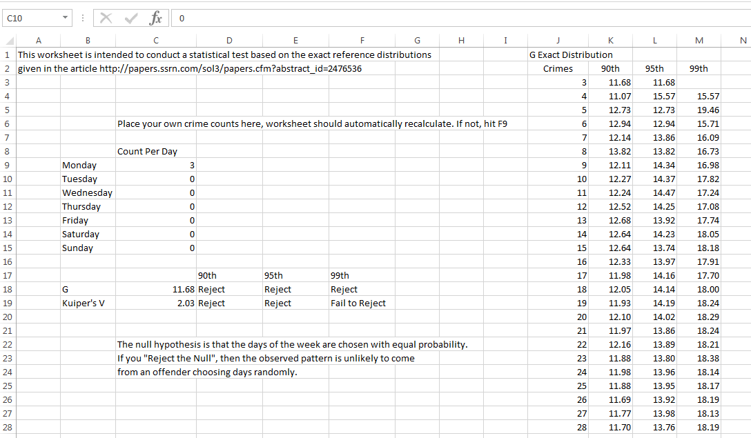
The spreadsheet contains both the G-test and Kuiper’s V test. If you don’t read the paper and understand the difference, just use the G-test and ignore the Kuiper’s V results. For crime analysts, this is basically the minimum of what you need to know.
For analysts who are more into the nitty gritty, I also have some R code that is a bit more flexible, and calculates the exact test for varying numbers of bins and provides some code to conduct power analysis. So you can either download the code from GitHub and insert it to define the functions, or simply copy-paste it into the console. The only library dependency is the partitions library, so make sure that is installed before following along.
So if you have downloaded the code, you can use something like below to insert the functions and load the partitions library.
library(partitions)
mydir <- "C:\\Users\\andrew.wheeler\\Dropbox\\Documents\\BLOG\\ExactTest_Weekdays"
setwd(mydir)
source("Exact_Dist.R")
Now, say you had a series of crimes that had 4 on Saturday, 3 on Tuesday, and 1 on Sunday. You can test this for randomness by simply using:
crime <- c(1,0,3,0,0,0,4)
res <- SmallSampTest(d=crime)
res
Which prints at the console:
Small Sample Test Object
Test Type is G
Statistic is 15.5455263389754
p-value is:  0.0182662
Data are:  1 0 3 0 0 0 4
Null probabilities are:  0.14 0.14 0.14 0.14 0.14 0.14 0.14
Total permutations are:  3003
This defaults to using the likelihood ratio G-test, but you can also use Kuiper’s V, the chi-square test, or the Komolgrov-Smirnov test. Also you can change the null hypothesis to not equal probability in the bins. I default to the G-test in my paper because it is more powerful than the more typical chi-square after 8 crimes for 7 day-of-week bins, but equal in power to the chi-square for smaller sample sizes. So to do the chi-square test on the same data, use:
resChi <- SmallSampTest(d=crime, type="Chi")
resChi
chisq.test(crime) #for comparison to base R
chisq.test(crime, simulate.p.value = TRUE, B = 10000)
Which you can see the test statistic mimics base R’s chisq.test, and the p-value is slightly higher than the asymptotic p-value (the exact test should always have a higher p-value than the asympotic distribution, and here it is lower than the simulated p-value). This situation the simulation approach would have been fine. I prefer the exact approach when feasible though, because it is exact, and you don’t need to worry about convergence for the simulation (which most everyone simply picks a large number and hopes for the best).
I’ve also made some code that allows for easy evaluation of the power of the exact test. Coding wise it was easiest to simply use the original object created with the test, so I know it invites post-hoc power analysis – forgive me for my slothness in coding practices. So say you wanted to do apriori power analysis with the Kuiper’s V test for 10 bins and 15 observations (so over 1.3 million permutations, i.e. n <- 15; m <- 10; choose(n+m-1,m-1)). You can simply make an original object (with any observed values across the bins).
test10_data <- c(15,rep(0,9))
test10_perm <- SmallSampTest(d=test10_data, type="KS")
#takes around a minute
The default null is equal probability across the bins, and to do a power analysis you have to specify an alternative. Lets say for the alternative there is equal probability in 5 of the bins, and zero probability in the other 5. (Most of the work is done in making the original permutation object, the power analysis is quite fast, hence why I coded it to work this way.)
p_alt <- c(rep(1/5,5),rep(0,5))
Pow_test <- PowAlt(SST=test10_perm,p_alt=p_alt)
Pow_test
This prints out at the console:
Power for Small Sample Test
Test statistic is: KS
Power is: 0.1822815
Null is: 0.1 0.1 0.1 0.1 0.1 0.1 0.1 0.1 0.1 0.1
Alt is: 0.2 0.2 0.2 0.2 0.2   0   0   0   0   0
Alpha is: 0.05
Number of Bins: 10
Number of Observations: 15
So for this alternative there is quite low power, only 0.18. But if we change it to only have mass in four of the bins, the power goes way up to over 0.99.
> p_alt2  Pow_test2  Pow_test2
Power for Small Sample Test
Test statistic is: KS
Power is: 0.9902265
Null is: 0.1 0.1 0.1 0.1 0.1 0.1 0.1 0.1 0.1 0.1
Alt is: 0.25 0.25 0.25 0.25   0   0   0   0   0   0
Alpha is: 0.05
Number of Bins: 10
Number of Observations: 15
So this shows how the exact test R code can be extended beyond just 7 day-of-week bins. I have not done really any exploration of the power of the KS test or differing numbers of bins though.