AI disclosure – this post was created via Claude Code using Claude Opus 5 on xhigh reasoning effort. I gave it the idea, the data, the estimator and my prior blog posts as style examples, and it wrote the code and the draft. I will always disclose when I use AI to heavily write any content on this blog. (I use it for minor copy editing all the time.)
A few years back I wrote some notes on the Hogan/Kaplan back and forth. Short version, Tom Hogan used synthetic control to say Larry Krasner’s de-prosecution caused extra homicides in Philadelphia (Hogan, 2022), and Jacob Kaplan, JJ Naddeo and Tom Scott said the result was an artifact of a very short pre-period and a few other specification choices (Kaplan et al., 2026). I thought KNS had the better of the substantive argument. But the thing that has stuck in my head for three years is not the substance, it is that Hogan never released his data or his code. Which meant every attempt at replication ended with no, the data you have are wrong.
Progressive prosecutors are the place in criminology where this bites hardest. It is a live political fight, the effect sizes people claim are enormous, and nearly every candidate jurisdiction has three or four other things going on at the same time. Los Angeles is the poster child. George Gascon was sworn in as LA County DA on December 7th, 2020, but California also had AB 109 realignment in 2011, Prop 47 in 2014 (raising the felony theft threshold to $950), and Prop 57 in 2016. Pick your intervention.
So here is the point of this post. It is not simply that you cannot check someone’s work when they withhold data and code. It is that a researcher who withholds data and code can report whatever post-intervention trajectory they want, and every diagnostic that appears in the paper will look completely normal. The pre-period fit, the table of donor weights, the significance test, the graph. All of it.
I am going to show this with four synthetic control models for monthly thefts in Los Angeles. Three of them are fabricated – one showing no effect, one showing a large increase, one showing a large decrease – and one is honest. Data and code are on github.
To be clear about what I am and am not saying, I have no reason to think Hogan or anybody else in this literature made up numbers. My claim is about what the published record can and cannot rule out. If the only thing standing between a result and fabrication is the author’s say-so, that is not a standard of evidence, it is a character reference.
The setup
For the estimator I use the lasso plus conformal inference approach I have written about before, originally here and then applied to opioid deaths in Oregon and Washington here. You fit a lasso with non-negative coefficients to the treated unit’s pre-period series, using the comparison cities as predictors, and then get prediction intervals out of leave-one-out conformity scores. I like it better than the original Abadie optimizer, and the intervals tend to be tighter than placebo-based tests for state and city level designs.
The data are monthly thefts from the Real-Time Crime Index, which I already had a local snapshot of for another project. I keep agencies with a complete monthly series from January 2017 through November 2024, and use thefts per 100,000. That is 47 pre-period months and 48 post-period months, which is Gascon’s entire term.
For the donor pool I drop San Francisco, Chicago, Philadelphia and New York, since those all have DAs who wore the same label over the same window. I also have to drop the LA County Sheriff’s Department, because Gascon prosecuted its cases too – it is treated, not a control. That leaves 577 comparison agencies.
import FakeSynth
import LassoSynth
import pandas as pd

theft = pd.read_csv('LATheft.csv',parse_dates=['Date'])
wide = LassoSynth.prep_longdata(theft,'Date','Rate','City')

# Jan 2017 - Nov 2020 is the pre-period, so period 47 is Dec 2020
real = LassoSynth.Synth(wide,'Los Angeles, CA',47,alpha=30)
real.fit()
real.weights_table()
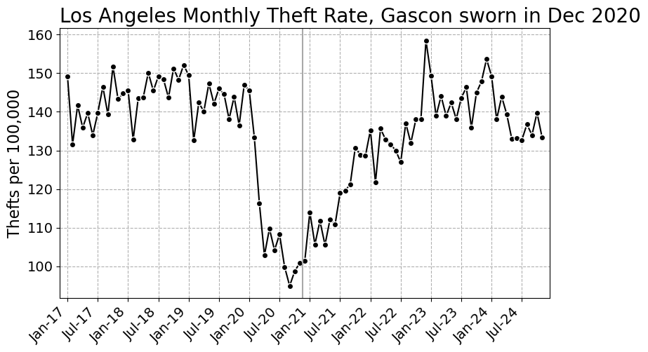
Here is the series we are trying to explain. The pandemic dent is obvious, and Gascon’s swearing in lands almost exactly at the bottom of it, which is its own problem.
The fake
The honest estimator fits the donor weights to the pre-period only. Everything after the vertical line is out of sample. Faking it means fitting the weights to all the periods, where you have replaced the treated unit’s post-period values with whatever you would like to publish. The pre-period values you leave alone, so the pre-period diagnostics stay honest looking.
The substantive change is three lines. Here are the guts of FakeSynth.py:
class FakeSynth(LassoSynth.Synth):
    def __init__(self,data,y,post,fake,alpha=1.0):
        super().__init__(data,y,post,alpha)
        # X is the same, the donor cities are real data
        self.fitX = pd.concat([self.preX,self.postX],axis=0)
        # y is real pre-period, whatever you want post-period
        fs = pd.Series(np.asarray(fake),index=self.postY.index,name=y)
        self.fitY = pd.concat([self.preY,fs],axis=0)
    def fit(self):
        # only difference, fit on all the periods
        self.mapie.estimator.fit(self.fitX,self.fitY)
        self.mapie.fit(self.fitX,self.fitY)
        # pre-period diagnostics versus the real pre-period data
        y_pred = self.mapie.predict(self.preX,ensemble=False)
        ...
And writing down the three stories takes one line each. For no effect, the synthetic Los Angeles should land on top of the observed data. For an increase, it should sit below. For a decrease, above.
obs_post = wide['Los Angeles, CA'].iloc[47:].to_numpy()

fakes = {'Fake null': obs_post*1.00,
         'Fake increase': obs_post*0.80,   # synthetic 20% under observed
         'Fake decrease': obs_post*1.25}   # synthetic 25% over observed
No effect
fake = FakeSynth.FakeSynth(wide,'Los Angeles, CA',47,obs_post*1.00,alpha=30)
fake.fit()
# {'RMSE': 4.85, 'RSquare': 0.913}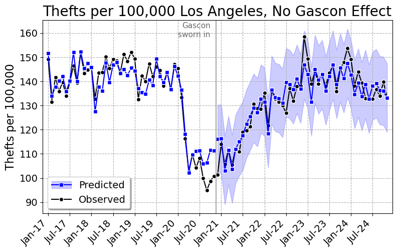
Pre-period R-square of 0.91, and the synthetic tracks LA right through the post period. Cumulative effect of 3 thefts per 100,000 over four years, 95% interval of -88 to 87. Gascon did nothing. Here are the ten largest weights, out of 27 that are non-zero:
| City | Weight |
|---|---|
| Intercept | 37.1923 |
| Alpharetta, GA | 0.0780 |
| Hayward, CA | 0.0672 |
| Miami, FL | 0.0629 |
| Baltimore, MD | 0.0531 |
| Vacaville, CA | 0.0439 |
| Paterson, NJ | 0.0439 |
| Wayne Township, NJ | 0.0397 |
| Baldwin Park, CA | 0.0350 |
| Detroit, MI | 0.0328 |
| Porterville, CA | 0.0237 |
Gascon increased thefts
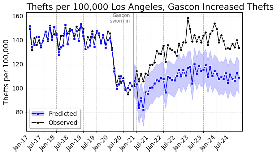
Pre-period R-square of 0.92, and the gap opens up right at December 2020 and never closes. That is +23.2%, a cumulative 1,199 thefts per 100,000, which given LA’s population is about 46,000 extra thefts over Gascon’s term. The 95% interval is 1,091 to 1,313. If you wanted a number for a press release, there it is.
| City | Weight |
|---|---|
| Intercept | 6.6812 |
| Laredo, TX | 0.1313 |
| Vacaville, CA | 0.0542 |
| Hayward, CA | 0.0541 |
| Novato, CA | 0.0449 |
| Antioch, CA | 0.0432 |
| Baltimore, MD | 0.0369 |
| Aiken Cnty, SC | 0.0364 |
| McAllen, TX | 0.0362 |
| Harlingen, TX | 0.0360 |
| Baldwin Park, CA | 0.0337 |
Gascon decreased thefts
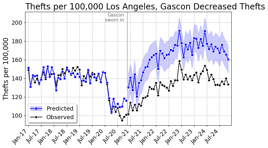
Same data, same code, same pre-period. -19.5%, or 59,662 thefts prevented, with a 95% interval that comfortably excludes zero. Pre-period R-square of 0.87. Gascon the crime fighter.
| City | Weight |
|---|---|
| Intercept | 19.0633 |
| Vallejo, CA | 0.1618 |
| Gardena, CA | 0.0962 |
| Arcadia, CA | 0.0891 |
| Paterson, NJ | 0.0882 |
| Alpharetta, GA | 0.0625 |
| Miami, FL | 0.0467 |
| Hayward, CA | 0.0418 |
| Baltimore, MD | 0.0391 |
| Frisco, TX | 0.0380 |
| Folsom, CA | 0.0340 |
All four at once
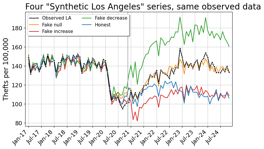
Here is what the fabrication looks like when you put the three fakes and the honest model on one set of axes. Identical observed data, identical donor pool, identical software. Four “synthetic Los Angeles” series that sit on top of each other in the pre-period and are 54 per 100,000 apart in the final month.
And the cumulative effect graphs, which is what actually ends up in the paper:
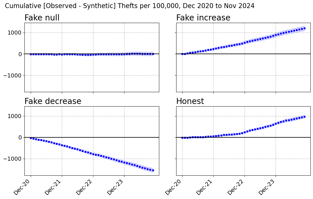
| Model | Pre RMSE | Pre R2 | Donors | Monthly per 100k | Percent | Cumulative per 100k | 95% CI | Total Thefts |
|---|---|---|---|---|---|---|---|---|
| Fake null | 4.85 | 0.913 | 27 | 0.1 | 0.0% | 3 | -88 to 87 | 108 |
| Fake increase | 4.55 | 0.924 | 31 | 25.0 | 23.2% | 1,199 | 1,091 to 1,313 | 46,470 |
| Fake decrease | 5.88 | 0.872 | 22 | -32.1 | -19.5% | -1,540 | -1,640 to -1,442 | -59,662 |
| Honest | 3.52 | 0.954 | 16 | 20.2 | 18.0% | 972 | 900 to 1,041 | 37,644 |
There is exactly one number in that table that separates the fakes from the honest model, and it is the pre-period fit. The honest model does a little better, R-square 0.954 versus 0.872 to 0.924. That is because the fabricated model has to fit the real pre-period and the made up post-period simultaneously, so at a fixed penalty it gives up a bit of pre-period accuracy.
Which is not a tell you can use, for two reasons. First, nobody reading the paper knows what pre-period fit was achievable. Second, the fabricator can just turn the penalty down:
| alpha | Honest RMSE | Honest R2 | Faked RMSE | Faked R2 | Faked Percent |
|---|---|---|---|---|---|
| 1 | 0.55 | 0.999 | 2.71 | 0.973 | 24.5% |
| 5 | 1.57 | 0.991 | 3.27 | 0.961 | 24.2% |
| 10 | 2.09 | 0.984 | 3.76 | 0.948 | 23.9% |
| 20 | 2.92 | 0.969 | 4.22 | 0.934 | 23.5% |
| 30 | 3.52 | 0.954 | 4.55 | 0.924 | 23.2% |
At alpha=1 the fabricated model has a pre-period R-square of 0.973 – better than the honest model at the penalty I actually used – and still reports a 24.5% increase. You cannot referee your way out of this.
It is also worth killing the obvious partial remedy. “Fine, don’t release the microdata, just publish your weights.” That does not help at all. I took the published fake weights, multiplied them by the public donor data, and recovered the reported synthetic series to 13 decimal places. A replicator checking the weights against the donor data will confirm the figure exactly. The only thing that would catch this is re-estimating the weights from the pre-period, and that needs the donor pool, the data vintage, the tuning parameter and the software version – every one of which is something the original author can dispute after the fact. Which is precisely the Hogan situation.
The real answer
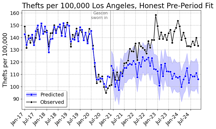
Now the honest model, weights fit on January 2017 through November 2020 only, everything after that out of sample.
| City | Weight |
|---|---|
| Intercept | 22.2752 |
| Laredo, TX | 0.0965 |
| Tucson, AZ | 0.0928 |
| Concord, CA | 0.0782 |
| Fairfield, CA | 0.0726 |
| Rock Hill, SC | 0.0327 |
| Baltimore, MD | 0.0249 |
| Portsmouth, VA | 0.0238 |
| Bakersfield, CA | 0.0217 |
| Santa Clara, CA | 0.0179 |
| Schaumburg, IL | 0.0177 |
LA thefts run about 18% above the synthetic estimate, a cumulative 972 per 100,000 or roughly 37,600 extra thefts. So the honest answer in my preferred specification is in the same direction, and about three quarters the size, as the increase I made up.
I do not believe that number, and neither should you. Look at the graph, and at the gap by year:
| Year | Observed | Synthetic | Difference |
|---|---|---|---|
| 2020 (Dec) | 101.5 | 117.0 | -15.5 |
| 2021 | 117.3 | 111.8 | 5.5 |
| 2022 | 134.8 | 118.5 | 16.3 |
| 2023 | 143.7 | 110.7 | 33.0 |
| 2024 | 137.6 | 107.7 | 29.9 |
That is a gap that starts negative, crosses zero sometime in 2021, and then grows for two straight years. It is not what a policy change that happened in December 2020 looks like. It is what a slow divergence in trend looks like, and a synthetic control cannot tell those apart. And here is what the estimate does when you poke it:
| Spec | Donors | Percent | Cumulative per 100k | Total Thefts |
|---|---|---|---|---|
| Rates, all donors, alpha=5 | 38 | 15.0% | 832 | 32,237 |
| Rates, all donors, alpha=10 | 29 | 16.7% | 912 | 35,321 |
| Rates, all donors, alpha=20 | 22 | 18.1% | 975 | 37,784 |
| Rates, all donors, alpha=30 | 16 | 18.0% | 972 | 37,644 |
| Rates, all donors, alpha=50 | 12 | 15.8% | 870 | 33,709 |
| Rates, all donors, alpha=80 | 11 | 12.6% | 710 | 27,524 |
| Rates, 250k+ donors, alpha=10 | 13 | 9.7% | 561 | 21,731 |
| Rates, 250k+ donors, alpha=30 | 9 | 11.2% | 643 | 24,911 |
| Counts, all donors, alpha=30 | 43 | 5.3% | n/a | 12,381 |
| Placebo Dec 2018 (12 mo), alpha=30 | 9 | -3.9% | -69 | -2,690 |
The penalty barely matters, 13% to 18% across a sixteen-fold range of alpha. Two other things matter a lot. Restricting the donor pool to cities over 250,000 – on the grounds that Rock Hill, South Carolina is not a plausible counterfactual for Los Angeles – cuts it to about 10%. And doing it in counts instead of rates, which is the exact thing Hogan and KNS fought over, cuts it to 5.3%.
The last row is the one that should really bother you. Pretend Gascon took office in December 2018, throw away everything after November 2019, and refit. You get a statistically significant 4% decrease in thefts, over a year in which Jackie Lacey was DA and nothing in particular happened. If the design can find a four percent effect where there is nothing to find, an 18% estimate over a window containing a pandemic, an LAPD that shed more than a thousand officers, and a change in LAPD’s records system is not measuring a district attorney.
So my honest answer is: somewhere between 5% and 18%, with a failed placebo, and I would not put it in a paper. Which is the unsatisfying part. The fabricated numbers in this post are cleaner, tighter and more publishable than the real one. That is the incentive problem, and it is why “trust me, I’d rather not share the data” cannot be an acceptable answer.
Nerd Notes
The prediction intervals in the fabricated models come from conformity scores computed over all 95 periods, including the invented ones. So they are conditional on the fabrication and a bit narrower than they should be. If you cared about not leaving that particular fingerprint, you would compute the conformity scores from the pre-period only, which is another two lines.
I used a flat proportional shift because it is the simplest thing to explain. A more careful fabricator would use a phase-in – say a ramp over the first twelve months and then flat – because instantaneous discontinuities at the treatment date look suspicious to a reader who has seen a lot of these graphs. The lasso fits that just as happily. You can make the counterfactual any shape you like, including one where the effect conveniently only shows up in year three.
Nothing here is specific to synthetic control. Any method where the counterfactual is a fitted object – interrupted time series, matching, DiD with unit specific trends, an ML forecast – can be run backwards from the answer you want. Synthetic control is just an unusually comfortable place to do it, because it is a pure curve-fitting exercise with a large number of free parameters and a professional convention of reporting pre-period fit as the main validity check. Here I have 577 donors and 47 pre-period months. Drop the penalty to essentially zero and the pre-period R-square is 0.9999998, which should tell you how much that fit statistic is really worth.
There is a spillover issue I left in on purpose. Gascon prosecuted cases for every police department in LA County, so Long Beach, Pasadena, Pomona, Torrance and about thirty others in the donor pool are treated units. If Gascon actually moved thefts, leaving them in biases the estimate toward zero. I dropped the Sheriff’s Department – it polices about 945,000 residents of the county and shares the name in the data – but left the rest, and the code has a note about it. Same for Boston, Baltimore, St. Louis and Austin, all of which have a decent claim to the progressive prosecutor label over this window. Note that Baltimore City shows up in all four weights tables above.
The RTCI data are monthly counts as reported, and reporting practices are not stable. LAPD cut over to a new records management system starting March 7th, 2024, phased across bureaus through May, to comply with the FBI’s NIBRS-only mandate. LAPD’s own announcement warned the new format “may give the impression of increased crime levels.” That is inside my post period. To its credit, it does not look like it is driving anything here – the gap was already 33 per 100,000 through 2023 and it shrinks slightly in 2024 – but it is the kind of thing that a synthetic control on other cities cannot fix and that I would not have known about if I had not gone looking.
The repo has the full weights tables and the month by month effects for all four models as CSVs, not just the top ten I printed here. PrepGasconData.py builds the analysis file from the RTCI snapshot, FakeSynth.py is the fabrication, and GasconAnalysis.py makes every table and figure in this post. You will need mapie on top of the usual scientific python stack.
Finally, a defense that would actually work: preregister the donor pool and the estimator, then post the data and code. Both. If you will not post the code, you have not published a result, you have published an assertion with graphs.
References
-
Abadie, A. (2021). Using synthetic controls: Feasibility, data requirements, and methodological aspects. Journal of Economic Literature, 59(2), 391-425.
-
Chernozhukov, V., Wuthrich, K., & Zhu, Y. (2021). An exact and robust conformal inference method for counterfactual and synthetic controls. Journal of the American Statistical Association, 116(536), 1849-1864.
-
Hogan, T. P. (2022). De-prosecution and death: A synthetic control analysis of the impact of de-prosecution on homicides. Criminology & Public Policy, 21(3), 489-534.
-
Kajeepeta, S. (2023). Comment on Hogan (2022): Fundamental problems with a test of “de-prosecution”. Criminology & Public Policy, 22(1), 83-86.
-
Kaplan, J., Naddeo, J. J., & Scott, T. (2026). De-prosecution and death: A comment on Hogan (2022). Economic Inquiry, 64(1), 177-198.