An alt take on opioid treatment coverage in North Carolina

The Raleigh News & Observer has been running multiple stories on the recent Medicaid expansion in North Carolina, with one recently about expanded opioid treatment coverage. Myself and Kaden Call have worked in the past on developing an algorithm to identify underprovided estimates (see background blog post, and Kaden’s work at Gainwell while an intern).

I figured I would run our algorithm through to see what North Carolina looks like. So here is an interactive map, with the top 10 zipcodes that have need for service (in red polygons), and CMS certified opioid treatment providers (in blue pins). (Below is a static image)

My initial impression was that this did not really jive with the quotes in the News & Observer article that suggested NC was a notorious service dessert – there are quite a few treatment providers across the state. So the cited Rural HealthInfo source disagrees with this. I cannot find their definition offhand, but I am assuming this is due to only counting in-patient treatment providers, whereas my list of CMS certified providers is mostly out-patient.

So although my algorithm identified various areas in the state that likely could use expanded services, this begs the question of whether NC is really a service dessert. It hinges on whether you think people need in-patient or out-patient treatment. Just a quick sampling of those providers, maybe half say they only take private, so it is possible (although not certain) that the recent Medicaid expansion will open up many treatment options to people who are dependent on opioids.

SAMHSA estimates that of those who get opioid treatment, around 5% get in-patient services. So maybe in the areas of high need I identify there is enough demand to justify opening new in-patient service centers – it is close though I am not sure the demand justifies opening more in-patient (as opposed to making it easier to access out-patient).

Asking folks with a medical background at work, it seems out-patient has proven to be as effective as in-patient, and that the biggest hurdle is to get people on buprenorphine/methadone/naltrexone (which the out-patient can do). So I am not as pessimistic as many of the health experts that are quoted in the News & Observer article.

Open Source Criminology Related Network Datasets

So I am a big proponent of open source data analysis. There is a problem with using criminal justice data sources though – they often have private information that prevents us from sharing the data. For example, I have posted quite a few of my projects here (mostly spatial data analysis), but there are a few I cannot share. For example, I worked on a paper with chronic offender predictions, and I cannot share that data (Wheeler et al., 2019). The outcome, being a victim or perpetrator of gun violence, is so rare that by itself basically makes it impossible to publicly share the data without exposing the individuals under study.

One good resource all criminologists should be aware of is ICPSR, in particular NACJD. Many datasets on there though anymore are restricted, in that you need to get IRB permission and ICPSR permision to download the dataset to use. (Which typically takes like 2~3 months in my experience doing it a few times, which includes both your local Uni IRB and the ICPSR process.) For example here is one I went through the motions to get to (in the end) validate different survival prediction methods.

ICPSR is a great resource to be able to handle sharing potentially sensitive data. But this falls short in two areas. One is in teaching – you cannot go through the IRB ritual in a timely enough fashion to be able to use those datasets in a course environment. The other is in terms of methods, so for example if you wanted to say your model provides better predictions than some other model, they should be established on the same datasets. Current state of affairs in criminology in this regard is pretty bad to be curt – most everybody uses their own data they have access to. So much of the research on different risk assessment instruments for bail/probation/parole are pretty much impossible to say one is better than another.

One example type of data source that is almost entirely missing from NACJD (that I am aware of) is social network datasets relevant for criminology/criminal justice. So I have started a spreadsheet to collate different open source network datasets relevant for criminologists. So I have some from my work and a few other random examples I have come across on the internet.

SPREADSHEET OF NETWORK DATASETS

I have made that spreadsheet open, so anyone should be able to edit in more sources. (Feel free to include links to ICPSR as well, but if you do edit a note to say whether it is restricted access or not.) For here I would be interested in really large networks, for example would love to try to replicate Marie’s work on gang network transitions (Oullet et al., 2019a).

And also while I am here, Jacob Young has created a very nice introductory course to social network analysis. I have a brief lecture in my advanced research design class, but Jacob’s is much more thorough (and he is more of an expert in this area than I am for sure).

I will add to that spreadsheet over time as well. I have made a separate sheet for survival analysis datasets. I would be particularly keen for example criminal justice examples. So for network analysis we have examples of looking at use-of-force networks (Oullet et al., 2019b), and for survival analysis I would be interested in a time to solve example dataset. Unfortunately for the solved cases, NIBRS is a good resource but has a large confound in they don’t measure whether a case was ever assigned to a detective.

Feel free to add whatever in that spreadsheet, but what I was thinking was oriented towards different methods (again as a main motivation is for teaching). So for example if you knew of datasets for age-period-cohort modelling, or for estimating group-based-trajectory models, I think those would be good examples to start new sheets and collate different data sources.

References

  • Ouellet, M., Bouchard, M., & Charette, Y. (2019a). One gang dies, another gains? The network dynamics of criminal group persistence. Criminology, 57(1), 5-33.
  • Ouellet, M., Hashimi, S., Gravel, J., & Papachristos, A. V. (2019b). Network exposure and excessive use of force: Investigating the social transmission of police misconduct. Criminology & Public Policy, 18(3), 675-704.
  • Wheeler, A. P., Worden, R. E., & Silver, J. R. (2019). The accuracy of the violent offender identification directive tool to predict future gun violence. Criminal Justice and Behavior, 46(5), 770-788.

Incorporating treatment non-compliance into call-ins

I have previously published work on identifying optimal individuals to prioritize for call-ins in Focused Deterrence interventions. The idea is we want to identify optimal people to spread the message, so you call in a small number of individuals and they should spread the message to the remaining group. There are better people than others to seed the message to to make sure it spreads throughout the network.

I knew of a direct improvement on that algorithm I published (very similar to the TURF problem I described the other day). But the bigger issue was that even when you call in individuals they do not always come to the meeting – treatment non-compliance. When working with state parole and/or local probation, the police department can ask those agencies to essentially make people come in, but otherwise it is voluntary.

The TURF problem I did the other day gave me a bit of inspiration on how to tackle that treatment non-compliance problem though. In a nutshell when you calculate whether someone is reached (via being directly connected to someone called-in), they can be partially reached based on the probability of the selected nodes treatment compliance. I have posted the code to follow along on dropbox here. I won’t go through the whole thing, but just some highlights.

The Model

First, in some quick and dirty text math, the model is:

Maximize Sum( R_i )

Subject to:

  • R_i <= Sum( S_j*p_j ) for each i
  • Sum( S_j ) = k
  • S_i element of [0,1]
  • R_i <= 1 for each i

Here i refers to an individual node in the gang/group network.

The first constraint R_i <= Sum( S_j*p_j ), the j’s are the nodes that are connected to i (and i itself). The p_j are the estimates that an individual will comply with coming into the call-in. For one agency we worked with for that project, they guessed that those who don’t need to come in comply about 1/6th of the time, so I use that estimate here in my examples, and give people who are on probation/parole a 1 for the probability of compliance.

Second constraint is we can only call in so many people, here k. The model solves very fast, so you can generate results for various k until you get the reach you want to in the end. (You could do the model the other way, minimize S_i while constraining the minimized acceptable reach, e.g. Sum( R_i ) >= threshold, I don’t suggest this in practice though, as when dealing with compliance there may be no feasible solution that gets you the amount of reach in the network you want.)

For the third constraint, the decision variables S_i are binary 0/1’s, but the R_i are continuous. But the trick here is that the last constraint, R_i <= 1, means that the expected reach is capped at 1. Here is a way to think about this, imagine you want to know the chance that person A is reached, and they are connected to two called-in individuals, who each have a 40% chance at complying with the treatment (coming to the call-in). The expected times person A would be reached then is additive in the probabilities, 0.4 + 0.4 = 0.8. If we had 3 people connected to A again at 40% apiece, the expected number of times A would be reached is then 0.4 + 0.4 + 0.4 = 1.2. So a person can be reached multiple times. (Note this is not the probability a person is reached at least once! It is a non-linear problem to model that.)

But if we took away the last constraint, what would happen is that the algorithm would just pick the nodes that had the highest number of neighbors. Since we are maximizing expected reach, if we had a sample of two people, the expected reach values of [2.5, 0] would be preferable to [1, 1], although clearly we rather have the reach spread out. So to prevent that, I cap the expected reach variable at 1, R_i <= 1 for each i, so this spreads out the selected individuals. So in the end the expected number of times people are reached are a lower bound estimate, but those are only people who are expected to receive the message multiple times.

This is a bit of a hack, but in my tests works quite well. I attempted to model the non-linear problem of estimating the probabilities at the person level and still maximizing the expected reach (in the code I have an example of using the CVXR R package). But it was quite fickle in when it would return a solution. So I am focusing on the linear program here, which is not perfect, but is an improvement over my prior published work.

Some Python Snippets

So for my example code, I am using City 4 Gang 4 from my paper. The reason is this was the largest network, and my original algorithm performed the worst. 99 nodes, and my original algorithm identified a 33 person dominant set, but Borgotti’s tool (that uses a genetic algorithm) identified a 29 dominant set.

Here is an example of calling my function to select the individuals for a call-in based on the non-compliance estimates. (g4 is the networkx graph object, the second arg is the number of individuals, and compliance is the node attribute that has the probability of treated compliance.) If we call in only 5 people, we still expect a reach of 29 individuals. Here there ends up being some highly connected people on parole/probation, so they have a 1 probability of complying with the treatment.

A consequence of this algorithm is that if you pipe in 1’s for the treatment compliance, you basically get an improvement to my original algorithm. So for a test we can see if I get the same minimal dominating set as Borgotti did for his algorithm here, where const is just everybody complies 100% of the time.

And yep we get a dominating set (all 99 people are reached). What happens if we go down one, and only select 28 people?

We only reach 98 out of the 99. So it appears a 29 set is the minimal dominating set here. But like I said the treatment non-compliance is a big deal in this setting. What is our expected reach if we take that into account, but still call-in 29 people?

It is still pretty high, around 2/3s of the network, but is still much smaller. Also if you look at the overlap between the constant versus non-compliance model, they select quite a few different individuals. It makes a big difference.

Here is a graph I made of selecting 20 individuals. Red means I selected that person, pink means they are reached at least some, and the size of the reach is proportion to the node. Then grey folks I wouldn’t expect to be reached by the message (at least by first degree connections).

So you can see that most of the people selected have that full 1 expected reach, so the algorithm does prioritize individuals on probation/parole who have a 100% expected compliance. But you can see a few folks who have a lower compliance who are selected as they are in places in the network not covered by those on probation/parole.

I have a tough time getting network layouts to look nice in python (even with the same layout algorithms, I feel like igraph in R just looks much better out of the box).

Future Work

Out of the box, this algorithm could incorporate several different pieces of information. So here I use the non-compliance estimate as a constant, but you could have varying estimates for that based on some other model no problem (e.g. older individuals comply more often than younger, etc.). Also another interesting extension (if you could get estimates) would be the probability a called-in individual spreads the message. In the part Sum( S_j*p_j ) it would just be something like Sum( S_j*p_cj*p_sj ), where p_cj is the compliance probability for attending, and p_sj is the probability to spread the message to those they are connected to.

Getting worthwhile estimates for either of those things will be tough though. Only way I can see it is via some shoe leather qualitative or survey approach.

Creating high crime sub-tours

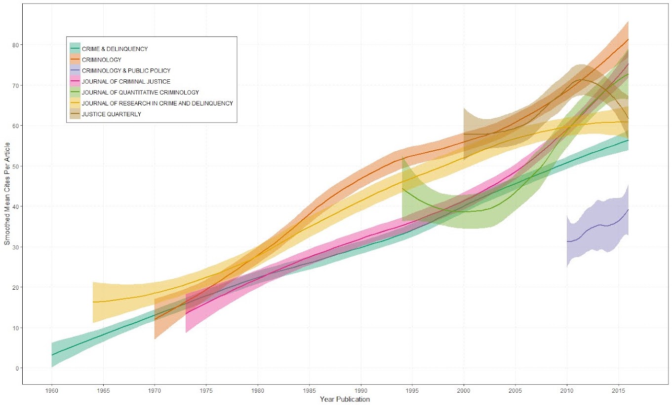
I was nerdsniped a bit by this paper, Targeting Knife-Enabled Homicides For Preventive Policing: A Stratified Resource Allocation Model by Vincent Hariman and Larry Sherman (HS from here on).

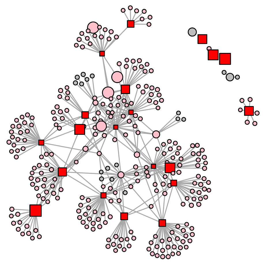
It in, HS attempt to define a touring schedule based on knife crime risk at the lower super output area in London. So here are the identified high risk areas:

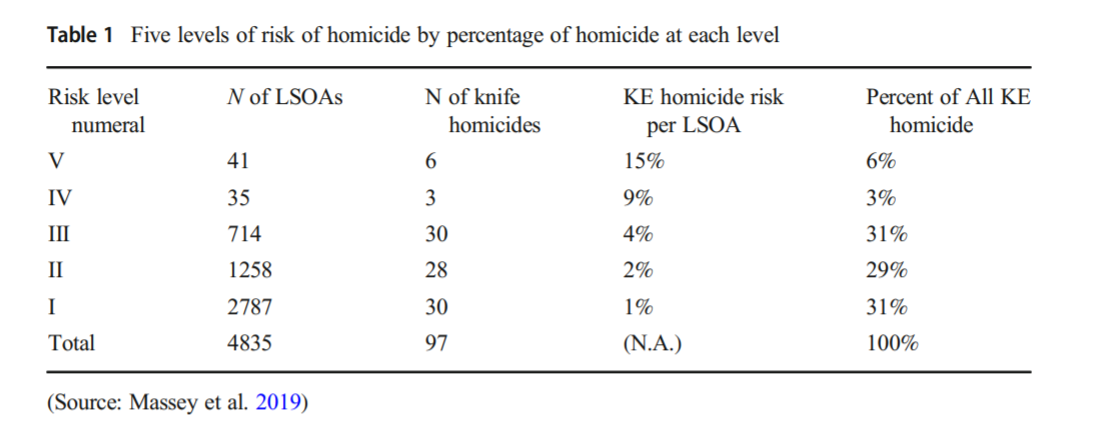
And here are HS’s suggested hot spot tours schedule.

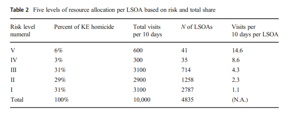
This is ad-hoc, but an admirable attempt to figure out a reasonable schedule. As you can see in their tables, the ‘high’ knife crime risk areas still only have a handful of homicides, so if reducing homicides is the objective, this program is a bit dead in the water (I’ve written about the lack of predictive ability of the model here).

I don’t think defining tours to visit everywhere makes sense, but I do think a somewhat smaller in scope question, how to figure out geographically informed tours for hot spot areas does. So instead of the single grid cell target ala PredPol, pick out multiple areas to visit for hot spots. (I don’t imagine the 41 LSOA areas are geographically contiguous either, e.g. it would make more sense to pick a tour for areas connected than for areas very far apart.)

Officers don’t tend to like single tiny areas either really, and I think it makes more sense to widen the scope a bit. So here is my attempt to figure those reasonable tours out.

Defining the Problem

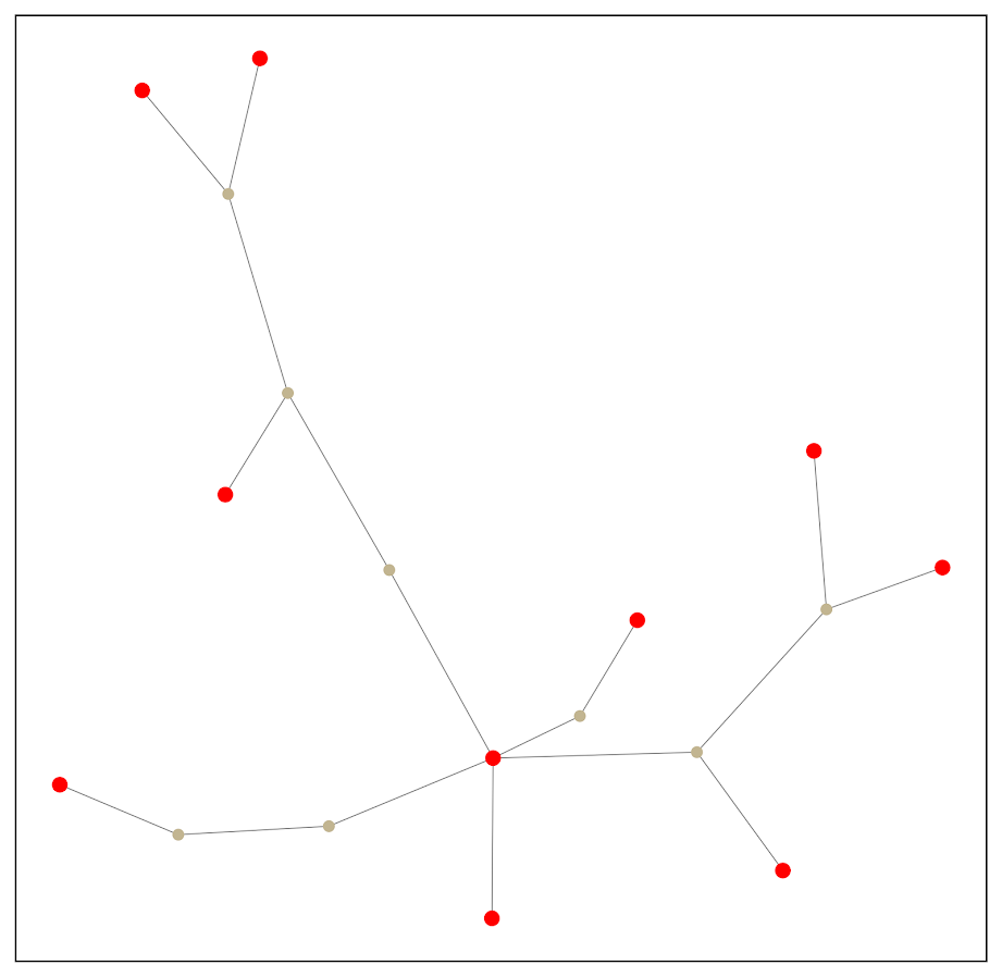
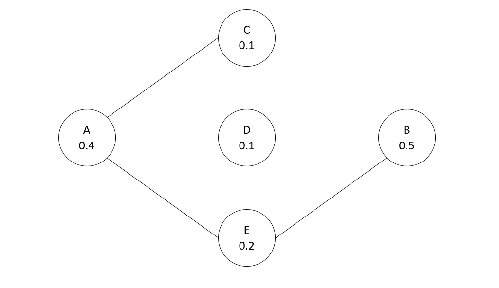
The way I think about that problem is like this, look at the hypothetical diagram below. We have two choices for the hot spot location we are targeting, where the crime counts for locations are noted in the text label.

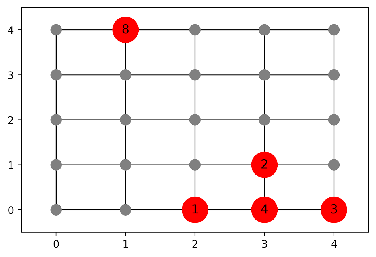
In the select the top hot spot (e.g. PredPol) approach, you would select the singlet grid cell in the top left, it is the highest intensity. We have another choice though, the more spread out hot spot in the lower right. Even though it is a lower density, it ends up capturing more crime overall.

I subsequently formulated an integer linear program to try to tackle the problem of finding good sub-tours through the graph that cumulatively capture more crime. So with the above graph, if I select two subtours, I get the results as (where nodes are identified by their (x,y) position):

  • ['Begin', (1, 4), 'End']
  • ['Begin', (4, 0), (4, 1), (3, 1), (3, 0), (2, 0), 'End']

So it can select singlet areas if they are islands (the (1,4) area in the top left), but will grow to wind through areas. Also note that the way I have programmed this network, it doesn’t skip the zero area (4,1) (it needs to go through at least one in the bottom right unless it doubles back on itself).

I will explain the meaning of the begin and end nodes below in my description of the linear program. It ends up being sort of a mash-up of traveling salesman type vehicle routing and min cost max flow type problems.

The Linear Program

The way I think about this problem formulation is like this: we have a directed graph, in which you can say, OK I start from location A, then can go to B, than go to C. In my set of decision variables, I have choices that look like this, where the first subscript denotes the from node, and the second subscript denotes the to node.

D_ab := node a -> node b
D_bc := node b -> node c

etc. In our subsequent linear program, the destination node is the node that we calculate our cumulative crime density statistics. So if node B had 10 crimes and 0.1 square kilometers, we would have a density of 100 crimes per square kilometer.

Now to make this formulation work, we need to add in a set of special nodes into our usual location network. These nodes I call ‘Begin’ and ‘End’ nodes (you may also call them source/sink nodes though). The begin nodes all look like this:

D_{begin},a
D_{begin},b
D_{begin},c

So you do that for every node in your network. Then you have End nodes as well, e.g.

D_a,{end}
D_b,{end}
D_c,{end}

In this formulation, since we are only concerned about the crime stats for the to node, not the from node, the Begin nodes just inherit the crime density stats from the original node data. For the end nodes though, you just set their objective value stats to zero (they are only relevant to define the constraints).

Now here is my linear program formulation:

Maximize 
  Sum [ D_ij ( CrimeDensity_j - DensityPenalty_j ) ]

Subject To:

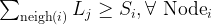
 1. Sum( D_in for each neighbor of n ) <= 1, 
      for each original node n
 2. Sum( D_in for each neighbor of n ) =  Sum( D_ni for each neighbor of n ), 
      for each original node n
 3. Sum( D_bi for each begin node ) = k routes
 4. Sum( D_ie for each end node ) = k routes
 5. Sum( D_ij + D_ji ) <= 1, for each unique i,j pair
 6. D_ij is an element of {0,1}

Constraint 1 is a flow constraint. If a node has an incoming edge set to one, it cannot have any other incoming edge set to one (so a location can only be chosen once).

Constraint 2 is a constraint that says if an incoming node is selected, one of the outgoing edges needs to be selected.

Constraints 3 & 4 determine the number of k tours/routes to choose in the end. Since the begin/end nodes are special we have k routes going out of the begin nodes, and k routes going into the end nodes.

With just these constraints, you can still get micro-cycles I found. So something like, X -> Z -> X. Constraint 5 (for only the undirected edges) prevents this from happening.

Constraint 6 is just setting the decision variables to binary 0/1. So it is a mixed integer linear program.

The final thing to note is the objective function, I have CrimeDensity_j - DensityPenalty_j, so what exactly is DensityPenalty? This is a value that penalizes visiting areas that are below this threshold. Basically the way that this works is that, the density penalty sets an approximate threshold for the minimum density a tour should contain.

I suggest a default of a predictive accuracy index of 10. Where do I get 10 you ask? Weisburd’s law of crime concentration suggests 5% of the areas should contain 50% of the crime, which is a PAI of 0.5/0.05 = 10. In my example with DC data then I just calculate the actual density of crime per unit area that corresponds to a PAI of 10.

You can adjust this though, if you prefer smaller tours of higher crime density you would up the value. If you prefer longer tours decrease it.

This is the best way I could figure out how to trade off the idea of spreading out the targeted hot spot vs selecting the best areas. If you spread out you will ultimately have a lower density. This turns it into a soft objective penalty to try to keep the selected tours at a particular density threshold (and will scoop up better tours if they are available). For awhile I tried to figure out if I could maximize the PAI metric, but it is the case with larger areas the PAI will always go down, so you need to define the objective some other way.

This formulation I only consider linked nodes (unlike the usual traveling salesman in which it is a completely linked distance graph). That makes it much more manageable. In this formulation, if you have N as the number of nodes/areas, and E is the number of directed edges between those areas, we will then have:

  • 2*N + E decision variables
  • 2 + 2*N + E/2 constraints

Generally if you are doing directly connected areas in geographic networks (i.e. contiguity connections), you will have less than 8 (typically more like an average of 6) neighbors per each area. So in the case of the 4k London lower super output areas, if I chose tours I would guess it would end up being fewer than 2*4,000 + 8*4,000 = 40,000 decision variables, and then fewer than that constraints.

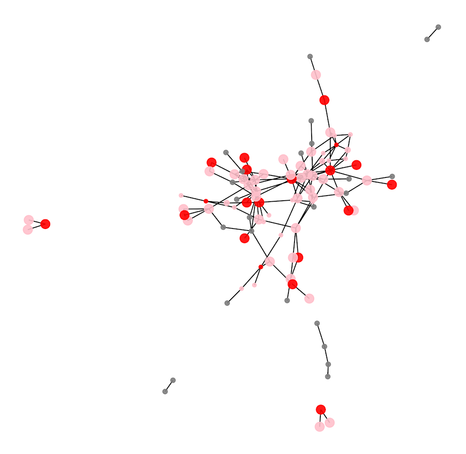
Since that is puny (and I would suggest doing this at a smaller geographic resolution) I tested it out on a harder network. I used the data from my dissertation, a network of 21,506 street units (both street segments and intersections) in Washington, D.C. The contiguity I use for these micro units is based on the Voronoi tessellation, so tends to have more neighbors than you would with a strictly road based network connectivity. Still in the end it ends up being a shade fewer than 200k decision variables and 110k constraints. So is a better test for in the wild whether the problem can be feasibly solved I think.

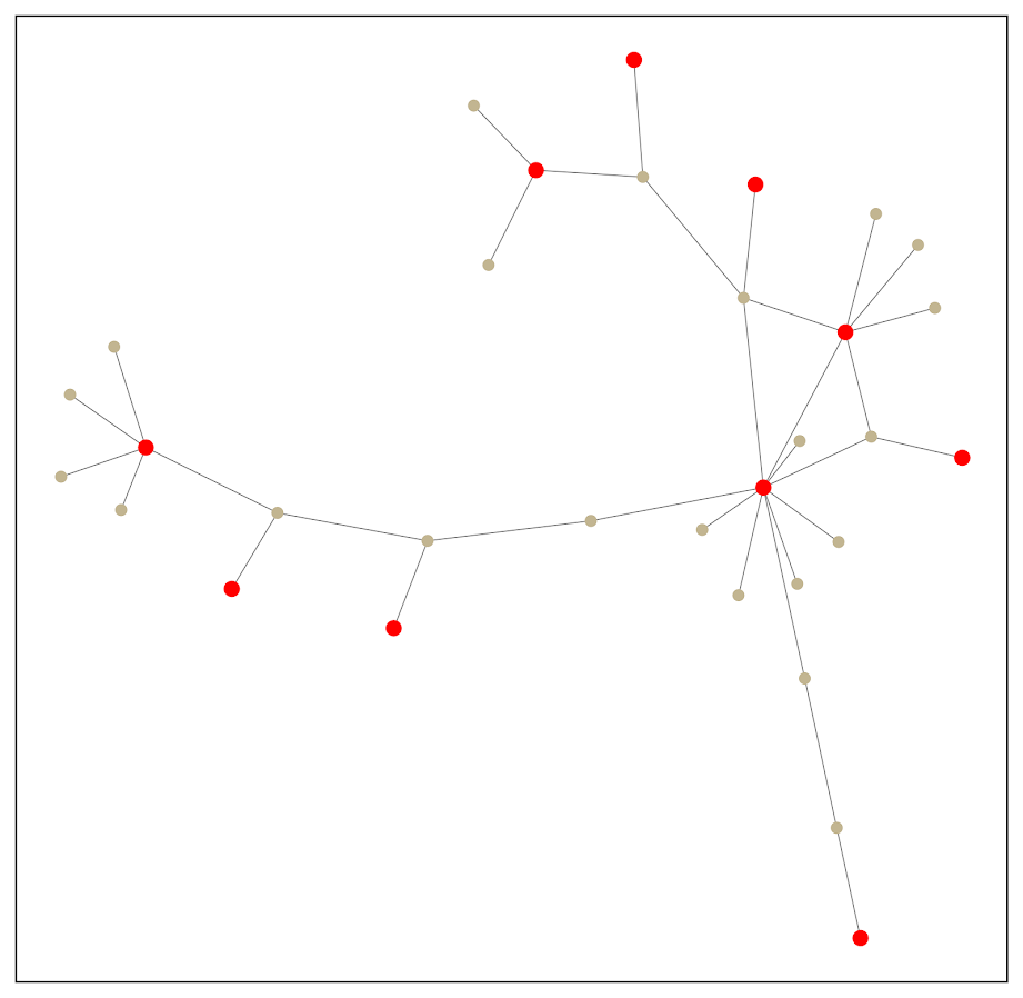
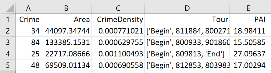
Example with DC Data

Here I have posted the python code and data used for this analysis, I end up having a nice function that you just submit your network with the appropriate attributes and out pops the different tours.

So I end up doing examples of 4 and 8 subtours based on 2011 violent UCR crime data (agg assaults, robberies, and homicides, no rapes in the public data). I use for the penalty that PAI = 10 threshold, so it should limit tours to approximately that value. It only ends up taking 2 minutes for the model to converge for the 4 tours and less than 2.5 minutes for the 8 tours on my desktop. So it should be not a big problem to up the decision variables to more sub-areas and still be solvable in real life applications.

The area estimates are in square meters, hence the high numbers. But on the right you can see that each sub-tour has a PAI above 10.

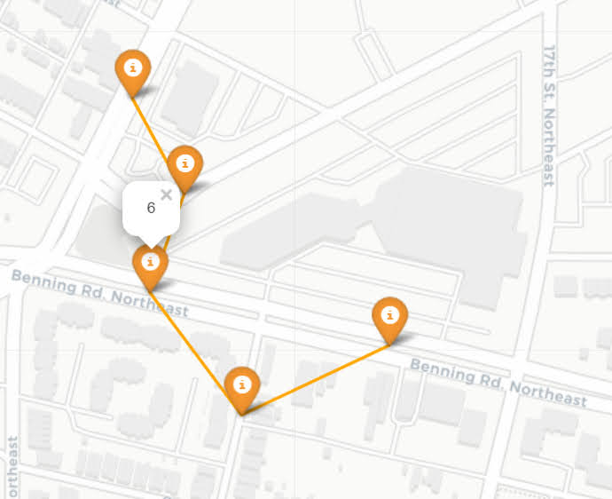
Here is an interactive map for you to zoom into each 4 subtour example. Below is a screenshot of one of the subtours. You can see that since I have defined my connected areas in terms of Voronoi tessalations, they don’t exactly follow the street network.

For the 8 tour example, it ends up returning several zero tours, so it is not possible in this data to generate 8 sub-tours that meet that PAI >= 10 threshold.

You can see that it ends up being the tours have higher PAI values, but lower overall crime counts.

You may think, why does it not pick at least singlet areas with at least one crime? It ends up being that I weight areas here by their area (this formulation would be better with grid cells of equal area, so my objective function is technically Sum [ D_ij * w_j *( CrimeDensity_j - DensityPenalty_j ) ], where w_j is the percent of the total area (so the denominator in the PAI calculation). So it ends up picking areas that are the tiniest areas, as they result in the smallest penalty to the objective function (w_j is tiny). I think this is OK though in the end – I rather know that some of the tours are worthless.

You can also see I get one subtour that is just under the PAI 10 threshold. Again possible here, but should be only slightly below in the worst case scenario. The way the objective function works is that it is pretty tricky to pick out subtours below that PAI value but still have a positive contribution to the overall objective function.

Future Directions

The main thing I wish I could do with the current algorithm (but can’t the way the linear program is set up), is to have minimum and maximum tour area/length constraints. I think I can maybe do this by adapting this code (I’m not sure how to do the penalties/objectives though). So if others have ideas let me know!

I admit that this may be overkill, and maybe just doing more typical crime clustering algorithms may be sufficient. E.g. doing DBSCAN hot spots like I did here.

But this is my best attempt shake at the problem for now!

Using Steiner trees to select a subgraph of interest

This is just a quick blog post. A crime analyst friend the other day posed a network problem to me. They had a social network in which they had particular individuals of interest, and wanted to show just a subset of that graph that connected those key individuals. The motivation was for plotting – if you show the entire hairball it can become really difficult to uncover any relationships.

Here is an example gang network from this paper. I randomly chose 10 nodes to highlight (larger red circles), and you can see it is quite hairy. You often want to label the nodes for these types of graphs, but that becomes impossible with so many intertwined nodes.

One solution to select out a subgraph of the connected bits is to use a Steiner tree. Here is that graph after running the approximate Steiner tree algorithm in networkx (in python).

Much simpler! And much more space to put additional labels.

I’ve posted the code and data to replicate here. Initially I debated on solving this via setting up the problem as a min-cost-flow, where one of the highlighted nodes had the supply, and the other highlighted nodes had the demand. But this approximate algorithm in my few tests looks really good in selecting tiny subsets, so not much need.

A few things to note about this. It is likely for many dense networks there will be many alternative subsets that are the same size, but different nodes (e.g. you can swap out a node and have the same looking network). A better approach to see connections between interesting nodes may be a betweenness centrality metric, where you only consider the flows between the highlighted nodes.

A partial solution to that problem is to add nodes/edges back in after the Steiner tree subset. Here is an example where I add back in all first degree nodes to the red nodes of interest:

So it is still a tiny enough network to plot. This just provides a way to identify higher order nodes of interest that aren’t directly connected to those red nodes.

Co-author networks in Criminology

In my bin of things I will never finish at this point, I started a manuscript looking at co-author networks in criminology using web of science data. I recruited several folks over the years (grad students at the time Jen Laprade and Richard Hernendez, and Marie Oullet), but I was never able to put in the last bit of time to finish it off. Exploratory work is hard, as there is no end goal to work towards. So I was never able to get it to a point I was happy with.

The shamble of the current paper is here, which will contain more details than this post. But basically I downloaded all of the Web of Science data that had the CJ/Crim label attached up to 2016, then turned that into a co-author network.

So the way it works is if I co-authored an article with Rob Worden & Sarah McLean, and Rob Worden & Sarah McLean co-authored a paper with Chris Harris, me and Chris are not directly connected, but are just 1 degree apart. After doing this, I wanted to see if we clustered into different groups. The answer to that is yes, I can get the computer to spit out clusters (colored below), but we are still definately small world (everyone is connected to everyone one with only a few hops).

I had a really hard go at it to get the networks to layout nicely (a typical problem with big, interconnected networks). I’ve posted an interactive version here. You can zoom in, look at the clusters, and look yourself up.

Here is a GIF showing surfing the network. I look up Beth Huebner (I would say Beth is part of the Michigan State/CJ folks Cluster), see she is attached to Scott Decker (who is in another blue cluster that has a pretty big array of folks, it has many Arizona but also Alex Piquero, Dan Nagin, and Shawn Bushway), then go onto Scott Wolfe etc.

I figured the clusters would be by topical area (which is true to a certain extent), but they were also by University clusters. Here was my attempt to give some meaning to the clusters, by pulling out the top 3 authors/journals. There are some 40 clusters in the excel file in the paper folder shared earlier. (There are more clusters than that even, but they are the 40 biggest in terms of authors/articles.)

So that gives some face validity to the clusters, but like I said it is small world, so maybe that isn’t worth noting at all anyway. One of the things I noticed was that the clusters had a big seperation between USA folks and international folks.

So if someone wants to take this over let me know. I didn’t share a link to the data directly (I imagine that violates the Web of Science terms of service.) But will share offline plus my code if someone wants it. (It is already 3+ years old data, I don’t even want to think about updating the work. Jen and Richard did a bunch of grunge work to clean the names for me to make the network.)

Coauthorship over time

One thing I noted was the change in co-authorship over time. It is a perpetual question about how to evaluate folks by solo-authorship. I can’t answer that question, but we can observe how it is changing over time. Here are graphs of proportion solo over time, as well as the mean number of authors over time (with error intervals, much more data in recent years than past).

This holds true the same for our top journals (the WOS data is quite a hodge podge, including forensic pysch, some trade magazines, etc.).

Citations Over Time

Another example bit of data analysis I did with this dataset is you can look at citations over time as well. Here is the mean of citations in well known crim/cj journals over time.

And here is a scatterplot of the individual papers. I’ve posted an interactive version of this as well.

So more stuff than I can handle zipping around this data. (I tried to make some sense of keywords for articles at one point, but that would take some more serious semantic reduction of like words.)

Optimal treatment assignment with network spillovers

Motivated by a recent piece by Wood and Papachristos (2019), (WP from here on) which finds if you treat an individual at high risk for gun shot victimization, they have positive spillover effects on individuals they are connected to. This creates a tricky problem in identifying the best individuals to intervene with given finite resources. This is because you may not want to just choose the people with the highest risk – the best bang for your buck will be folks who are some function of high risk and connected to others with high risk (as well as those in areas of the network not already treated).

For a simplified example consider the network below, with individuals baseline probabilities of future risk noted in the nodes. Lets say the local treatment effect reduces the probability to 0, and the spillover effect reduces the probability by half, and you can only treat 1 node. Who do you treat?

We could select the person with the highest baseline probability (B), and the reduced effect ends up being 0.5(B) + 0.1(E) = 0.6 (the 0.1 is for the spillover effect for E). We could choose node A, which is a higher baseline probability and has the most connections, and the reduced effect is 0.4(A) + 0.05(C) + 0.05(D) + 0.1(E) = 0.6. But it ends up in this network the optimal node to choose is E, because the spillovers to A and B justify choosing a lower probability individual, 0.2(E) + 0.2(A) + 0.25(B) = 0.65.

Using this idea of a local effect and a spillover effect, I formulated an integer linear program with the same idea of a local treatment effect and a spillover effect:

\text{Maximize} \{ \sum_{i = 1}^n (L_i\cdot p_{li} + S_i \cdot p_{si}) \}

Where p_{li} is the reduction in the probability due to the local effect, and p_{si} is the reduction in the probability due to the spillover effect. These probabilities are fixed values you know at the onset, e.g. estimated from some model like in Wheeler, Worden, and Silver (2019) (and Papachristos has related work using the network itself to estimate risk). Each node, i, then gets two decision variables; L_i will equal 1 if that node is treated, and S_i will equal 1 if the node gets a spillover effect (depending on who is treated). Actually the findings in WP show that these effects are not additive (you don’t get extra effects if you are treated and your neighbors are treated, or if you have multiple neighbors treated), and this makes it easier to keep the problem on the probability scale. So we then have our constraints:

  1. L_i , S_i \in \{ 0,1 \}
  2. \sum L_i = K
  3. S_i \leq 1 + -1\cdot L_i , \forall \text{ Node}_i
  4. \sum_{\text{neigh}(i)} L_j \geq S_i , \forall \text{ Node}_i

Constraint 1 is that these are binary 0/1 decision variables. Constraint 2 is we limit the number of people treated to K (a value that we choose). Constraint 3 ensures that if a local decision variable is set to 1, then the spillover variable has to be set to 0. If the local is 0, it can be either 0 or 1. Constraint 4 looks at the neighbor relations. For Node i, if any of its neighbors local treated decision variable is set to 1, the Spillover decision variable can be set to 1.

So in the end, if the number of nodes is n, we have 2*n decision variables and 2*n + 1 constraints, I find it easier just to look at code sometimes, so here is this simple network and problem formulated in python using networkx and pulp. (Here is a full file of the code and data used in this post.) (Update: I swear I’ve edited this inline code snippet multiple times, if it does not appear I have coded constraints 3 & 4, check out the above linked code file. Maybe it is causing problems being rendered.)

####################################################
import pulp
import networkx

Nodes = ['a','b','c','d','e']
Edges = [('a','c'),
         ('a','d'),
         ('a','e'),
         ('b','e')]

p_l = {'a': 0.4, 'b': 0.5, 'c': 0.1, 'd': 0.1,'e': 0.2}
p_s = {'a': 0.2, 'b': 0.25, 'c': 0.05, 'd': 0.05,'e': 0.1}
K = 1

G = networkx.Graph()
G.add_edges_from(Edges)

P = pulp.LpProblem("Choosing Network Intervention", pulp.LpMaximize)
L = pulp.LpVariable.dicts("Treated Units", [i for i in Nodes], lowBound=0, upBound=1, cat=pulp.LpInteger)
S = pulp.LpVariable.dicts("Spillover Units", [i for i in Nodes], lowBound=0, upBound=1, cat=pulp.LpInteger)

P += pulp.lpSum( p_l[i]*L[i] + p_s[i]*S[i] for i in Nodes)
P += pulp.lpSum( L[i] for i in Nodes ) == K

for i in Nodes:
    P += pulp.lpSum( S[i] ) <= 1 + -1*L[i]
    ne = G.neighbors(i)
    P += pulp.lpSum( L[j] for j in ne ) >= S[i]

P.solve()

#Should select e for local, and a & b for spillover
print(pulp.value(P.objective))
print(pulp.LpStatus[P.status])

for n in Nodes:
    print([n,L[n].varValue,S[n].varValue])
####################################################

And this returns the correct results, that node E is chosen in this example, and A and B have the spillover effects. In the linked code I provided a nicer function to just pipe in your network, your two probability reduction estimates, and the number of treated units, and it will pipe out the results for you.

For an example with a larger network for just proof of concept, I conducted the same analysis, choosing 20 people to treat in a network of 311 nodes I pulled from Rostami and Mondani (2015). I simulated some baseline probabilities to pipe in, and made it so the local treatment effect was a 50% reduction in the probability, and a spillover effect was a 20% reduction. Here red squares are treated, pink circles are the spill-over, and non-treated are grey circles. It did not always choose the locally highest probability (largest nodes), but did tend to choose highly connected folks also with a high probability (but also chose some isolate nodes with a high probability as well).

This problem is solved in an instant. And I think out of the box this will work for even large networks of say over 100,000 nodes (I have let CPLEX churn on problems with near half a million decision variables on my desktop overnight). I need to check myself to make 100% sure though. A simple way to make the problem smaller if needed though is to conduct the analysis on subsets of connected components, and then shuffle the results back together.

Looking at the results, it is very similar to my choosing representatives work (Wheeler et al., 2019), and I think you could get similar results with just piping in 1’s for each of the local and spillover probabilities. One of the things I want to work on going forward though is treatment non-compliance. So if we are talking about giving some of these folks social services, they don’t always take up your offer (this is a problem in choose rep’s for call ins as well). WP actually relied on this to draw control nodes in their analysis. I thought for a bit the problem with treatment non-compliance in this setting was intractable, but another paper on a totally different topic (Bogle et al., 2019) has given me some recent hope that it can be solved.

This same idea is also is related to hot spots policing (think spatial diffusion of benefits). And I have some ideas about that to work on in the future as well (e.g. how wide of net to cast when doing hot spots interventions given geographical constraints).

References

  • Bogle, J., Bhatia, N., Ghobadi, M., Menache, I., Bjørner, N., Valadarsky, A., & Schapira, M. (2019). TEAVAR: striking the right utilization-availability balance in WAN traffic engineering. In Proceedings of the ACM Special Interest Group on Data Communication (pp. 29-43).
  • Rostami, A., & Mondani, H. (2015). The complexity of crime network data: A case study of its consequences for crime control and the study of networks. PloS ONE, 10(3), e0119309.
  • Wheeler, A. P., McLean, S. J., Becker, K. J., & Worden, R. E. (2019). Choosing Representatives to Deliver the Message in a Group Violence Intervention. Justice Evaluation Journal, Online First.
  • Wheeler, A. P., Worden, R. E., & Silver, J. R. (2019). The Accuracy of the Violent Offender Identification Directive Tool to Predict Future Gun Violence. Criminal Justice and Behavior, 46(5), 770-788.
  • Wood, G., & Papachristos, A. V. (2019). Reducing gunshot victimization in high-risk social networks through direct and spillover effects. Nature Human Behaviour, 1-7.