Randomness in ranking officers

I was recently re-reading the article The management of violence by police patrol officers (Bayley & Garofalo, 1989) (noted as BG from here on). In this article BG had NYPD officers (in three precincts) each give a list of their top 3 officers in terms based on minimizing violence. The idea was to have officers give self-assessments to the researcher, and then the researcher try to tease out differences between the good officers and a sample of other officers in police-citizen encounters.

BG’s results stated that the rankings were quite variable, that a single officer very rarely had over 8 votes, and that they chose the cut-off at 4 votes to categorize them as a good officer. Variability in the rankings does not strike me as odd, but these results are so variable I suspected they were totally random, and taking the top vote officers was simply chasing the noise in this example.

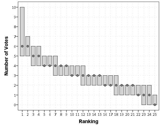
So what I did was make a quick simulation. BG stated that most of the shifts in each precinct had around 25 officers (and they tended to only rate officers they worked with.) So I simulated a random process where 25 officers randomly pick 3 of the other officers, replicating the process 10,000 times (SPSS code at the end of the post). This is the exact same situation Wilkinson (2006) talks about in Revising the Pareto chart, and here is the graph he suggests. The bars represent the 1st and 99th percentiles of the simulation, and the dot represents the modal category. So in 99% of the simulations the top ranked officer has between 5 and 10 votes. This would suggest in these circumstances you would need more than 10 votes to be considered non-random.

The idea is that while getting 10 votes at random for any one person would be rare, we aren’t only looking at one person, we are looking at a bunch of people. It is an example of the extreme value fallacy.

Here is the SPSS code to replicate the simulation.

***************************************************************************.
*This code simulates randomly ranking individuals.
SET SEED 10.
INPUT PROGRAM.
LOOP #n = 1 TO 1e4.
  LOOP #i = 1 TO 25.
    COMPUTE Run = #n.
    COMPUTE Off = #i.
    END CASE.
  END LOOP.
END LOOP.
END FILE.
END INPUT PROGRAM.
DATASET NAME Sim.
*Now for every officer, choosing 3 out of 25 by random (without replacement).
SPSSINC TRANS RESULT = V1 TO V3
  /FORMULA "random.sample(range(1,26),3)".
FORMATS V1 TO V3 (F2.0).
*Creating a set of 25 dummies.
VECTOR OffD(25,F1.0).
COMPUTE OffD(V1) = 1.
COMPUTE OffD(V2) = 1.
COMPUTE OffD(V3) = 1.
RECODE OffD1 TO OffD25 (SYSMIS = 0).
*Aggregating and then reshaping.
DATASET DECLARE AggResults.
AGGREGATE OUTFILE='AggResults'
  /BREAK Run
  /OffD1 TO OffD25 = SUM(OffD1 TO OffD25).
DATASET ACTIVATE AggResults.
VARSTOCASES /MAKE OffVote FROM OffD1 TO OffD25 /INDEX OffNum.
*Now compute the ordering.
SORT CASES BY Run (A) OffVote (D).
COMPUTE Const = 1.
SPLIT FILE BY Run.
CREATE Ord = CSUM(Const).
SPLIT FILE OFF.
MATCH FILES FILE = * /DROP Const.
*Quantile graph (for entire simulation).
FORMATS Ord (F2.0) OffVote (F2.0).
GGRAPH
  /GRAPHDATASET NAME="graphdataset" VARIABLES=Ord PTILE(OffVote,99)[name="Ptile99"] 
                                    PTILE(OffVote,1)[name="Ptile01"] MODE(OffVote)[name="Mod"]
  /GRAPHSPEC SOURCE=INLINE.
BEGIN GPL
  SOURCE: s=userSource(id("graphdataset"))
  DATA: Ord=col(source(s), name("Ord"), unit.category())
  DATA: Ptile01=col(source(s), name("Ptile01"))
  DATA: Ptile99=col(source(s), name("Ptile99"))
  DATA: Mod=col(source(s), name("Mod"))
  DATA: OffVote=col(source(s), name("OffVote"))
  DATA: Run=col(source(s), name("Run"), unit.category())
  GUIDE: axis(dim(1), label("Ranking"))
  GUIDE: axis(dim(2), label("Number of Votes"), delta(1))
  ELEMENT: interval(position(region.spread.range(Ord*(Ptile01+Ptile99))), color.interior(color.lightgrey))
  ELEMENT: point(position(Ord*Med), color.interior(color.grey), size(size."8"), shape(shape.circle))
END GPL.
***************************************************************************.

New paper: The Effect of 311 Calls for Service on Crime in D.C. At Micro Places

I have a new pre-print posted, The Effect of 311 Calls for Service on Crime in D.C. At Micro Places, at SSRN. Here is the abstract:

Broken windows theory has been both confirmed and refuted with several different measures of physical disorder. Small experiments tend to confirm the priming effects of physical disorder on minor deviant acts, but measures based on order maintenance policing and surveys are much more mixed. Here I use 311 calls for service as a proxy for physical disorder, as it is a simple alternative compared to neighborhood audits or community surveys. For street segments and intersections in Washington D.C., I show that 311 calls for service based on detritus (e.g. garbage on the street) and infrastructure complaints (e.g. potholes in sidewalks) have a positive but very small effect on Part 1 crimes while controlling for unobserved neighborhood effects. This suggests that 311 calls for service can potentially be a reliable indicator of physical disorder where available. The findings partially confirm the broken windows hypothesis, but reducing physical disorder is unlikely to result in appreciable declines in crime.

And here are some maps of the crimes and calls per service per the regular grid I use as the neighborhood boundaries (because everything is better with some pretty maps!):

As always, if you have feedback I am all ears. This is what I signed up to present at ASC this fall, and is based on work in my dissertation.

Cartography and GIS special issue on Crime Mapping

My paper, Visualization techniques for journey to crime flow data, has been recently published in a special issue in CaGIS on crime mapping. Always feel free to email me for off-prints of published papers, but the pre-print of this one I posted on SSRN as well.

There is an annoying error that crept into the paper, in that the footnote linking to the results to replicate the maps and graphs says “REDACTED FOR ANONYMITY” – which is my fault for not pointing it out to the copy-editor. The files are available here. They are certainly not easy to walk through, so if you want help replicating any of the maps for your own data and can’t figure out my code feel free to send me an email. I would like to make an R package to make maps like below eventually, but that is just not going to happen in the forseeable future.

New paper: Replicating Group-Based Trajectory Models of Crime at Micro-Places in Albany, NY

I posted a pre-print of a paper myself, Rob Worden and Sarah McLean have finished, Replicating Group-Based Trajectory Models of Crime at Micro-Places in Albany, NY. This is part of the work of the Finn Institute in collaboration with the Albany police department, and the goal of the project was to identify micro places (street segments and intersections) that showed long term patterns of being high crime places.

The structured abstract is below:

Objectives: Replicate two previous studies of temporal crime trends at the street block level. We replicate the general approach of group-based trajectory modelling of crimes at micro-places originally taken by Weisburd, Bushway, Lum and Yan (2004) and replicated by Curman, Andresen, and Brantingham (2014). We examine patterns in a city of a different character (Albany, NY) than those previously examined (Seattle and Vancouver) and so contribute to the generalizability of previous findings.

Methods: Crimes between 2000 through 2013 were used to identify different trajectory groups at street segments and intersections. Zero-inflated Poisson regression models are used to identify the trajectories. Pin maps, Ripley’s K and neighbor transition matrices are used to show the spatial patterning of the trajectory groups.

Results: The trajectory solution with eight classes is selected based on several model selection criteria. The trajectory of each those groups follow the overall citywide decline, and are only separated by the mean level of crime. Spatial analysis shows that higher crime trajectory groups are more likely to be nearby one another, potentially suggesting a diffusion process.

Conclusions: Our work adds additional support to that of others who have found tight coupling of crime at micro-places. We find that the clustering of trajectories identified a set of street units that disproportionately contributed to the total level of crime citywide in Albany, consistent with previous research. However, the temporal trends over time in Albany differed from those exhibited in previous work in Seattle but were consistent with patterns in Vancouver.

And here is one of the figures, a drawing of the individual trajectory groupings over the 14 year period. As always, if you have any comments on the paper feel free to shoot me an email.

Dissertation Defense

The date is set, Friday, February 27, 2015 at 10:00 a.m. in Draper Hall, Room 105. As always, if you feel like sitting in the mail room and flipping through it, it is there! (My crappy picture – I do not have smart phone.)

But if not, here is a pdf copy of the dissertation. If anyone is interested, here are my hacks to get LaTex to conform to SUNY Albany’s dissertation guidelines.

The title is What we can learn from small units of analysis, and here is my abstract:

The dissertation is aimed at advancing knowledge of the correlates of crime at small geographic units of analysis. I begin by detailing what motivates examining crime at small places, and focus on how aggregation creates confounds that limit causal inference. Local and spatial effects are confounded when using aggregate units, so to the extent the researcher wishes to distinguish between these two types of effects it should guide what unit of analysis is chosen. To illustrate these differences, I examine local, spatial and contextual effects for bars, broken windows and crime using publicly available data from Washington, D.C.

New paper: Tables and graphs for monitoring temporal crime patterns

I’ve uploaded a new pre-print, Tables and graphs for monitoring temporal crime patterns. The paper basically has three parts, which I will briefly recap here:

  • percent change is a bad metric
  • there are data viz. principles to constructing nicer tables
  • graphs >> tables for monitoring trends

Percent change encourages chasing the noise

It is tacitly understood that percent change when the baseline is small can fluctuate wildly – but how about when the baseline average is higher? If the average of crime was around 100 what would you guess would be a significant swing in terms of percent change? Using simulations I estimate for a 1 in 100 false positive rate you need an over 40% increase (yikes)! I’ve seen people make a big deal about much smaller changes with much smaller baseline averages.

I propose an alternative metric based on the Poisson distribution,

2*( SQRT(Post) - SQRT(Pre) )

This approximately follows a normal distribution if the data is Poisson distributed. I show with actual crime data it behaves pretty well, and using a value of 3 to flag significant values has a pretty reasonable rate of flags when monitoring weekly time series for five different crimes.

Tables are visualizations too!

Instead of recapping all the points I make in this section, I will just show an example. The top table is from an award winning statistical report by the IACA. The latter is my remake.

Graphs >> Tables

I understand tables are necessary for reporting of statistics to accounting agencies, but they are not as effective as graphs to monitor changes in time series. Here is an example, a seasonal chart of burglaries per month. The light grey lines are years from 04 through 2013. I highlight some outlier years in the chart as well. It is easy to see whether new data is an outlier compared to old data in these charts.

I have another example of monitoring weekly statistics in the paper, and with some smoothing in the chart you can easily see some interesting crime waves that you would never comprehend by looking at a single number in a table.

As always, if you have comments on the paper I am all ears.

2014 Blog stats, and why Blogging >> Articles

The readership of the blog has continued to grow. Here are the total site views per month since the beginning in December 2011.

At this point we can start to see some seasonal patterns. I take a big hit in December and January, and increases when school is in session. I get quite a bit of my traffic from SPSS searches, so I presume much of the traffic are students using SPSS.

I do not worry too much about posting regularly, but I like to take some time if I have not published anything in around 2 weeks. I just enjoy taking a break from a specific work projects, and often I blog about something I have dealt with multiple times (or answered peoples questions multiple times) so I like making a blog post for my own and others reference.

Now, one of the more popular posts I have written is Odds Ratios NEED To Be Graphed On Log Scales. This I published in October 2013, recieved around 100 referrals from twitter the day I published it, and since has averaged about 5-10 views per day (it has accumulated a total of near 3,000 total). It is one of the first sites returned for odds ratio graph from a google search.

Certainly not a number of views to write home to my mother about, but I believe it is better outreach of my opinion than a journal article (not that I would be able to publish such a limited point in a journal article anyway). Take for instance Rothman et al.’s 2011 article, Should Graphs of Risk or Rate Ratios be Plotted on a Log Scale? in the American Journal of Epidemiology that has a differing opinion of mine. I can not find any readership stats for AJE, but I highly doubt that article has been viewed by 3,000 people, and according to google scholar it only has 2 citations currently. One is the response by the editor to the article, and the other is likely in error as it was published before the Rothman article. Site views are superficial as well, but I would place a wager my blog post has reached more readers than the Rothman article. 3,000 is way higher than views or downloads for my papers on SSRN, and even the most viewed articles since 2011 on the Cartography and GIS website have not accumulated 3,000 downloads at this point. (My Viz JTC paper has just over 100 downloads so far after being up for close to a year at this point.) AJE articles very likely have a larger readership than CaGIS – but I have no idea how much larger. I would guess the American Statistician has a more comparable (likely larger?) membership via the ASA, and articles from the first issue of 2014 have accumulated mostly between 200 and 1500 downloads currently (the last issue of 2013 is quite a bit lower). I suspect a download is a bit more of an investment than a page view of my blog (so both are over-estimates of those actually reading the article, but page views are likely a larger over-estimate). But in most cases I get so many more views on the blog compared to that I would an article outreach on the blog is clearly the winner. The audience is different as well, not necessarily better or worse, just different.

I don’t take my work as venerable as Ken Rothman’s (obviously he is a well respected and influential epidemiologist or methodologist more generally for his books), but I disagree with his reasoning for using linear scales in some circumstances in the referenced article. My general response to the Rothman example is that if you want to show absolute risk differences then show them. Plotting the ratios on an arithmentic scale is misleading, and while close for his example is still not as accurate as just plotting the risk differences. In Rothman et al.’s example plotting the odds ratios would result in an overestimate of the absolute risk differences by over 10%! (The absolute risk difference is 90 - 1 = 89, whereas the linear difference between the odds is 10 - .01 = 9.99. The former mapped onto a scale from 0 to 10 would result in a length of 8.9, so an over estimate of (9.99 - 8.9)/8.9 ~ 12%.)

I don’t take blogging as a replacement for academic work, more like an open nerd journal. I’m pretty sure this venue has quite a bit more readership than my journal articles ever will though.


Solving problems as a metaphor for scientific writing

One analogy I hear in academics describing the process of writing a literature review is identifying the gaps in prior literature(s). I was reading Helping doctoral students write: Pedagogies for supervision recently, and Kamler & Thomson used this same analogy in describing the process of writing a literature review for a dissertation (although it is generally the same for shorter articles or books). Similar terminology Kamler & Thomson describe are blank spots and blind spots (see page 45). In that same chapter since Kamler & Thomson suggest the use of appropriate metaphors in describing the work of writing a literature review, I figured a critique of this one to be apropos.

I do not think the analogy is completely off base — but I do not like it as it does not jive with my personal experience of how I go about writing an article or thinking about research more generally. The first reason I do not like this terminology is that it has negative connotations for prior research. I think of building knowledge as a more cumulative endeavour as opposed to filling in between the lines of prior research.

For an analogy, say a researcher is attempting to improve the fuel efficiency of small combustible engines. It is likely they take mostly prior engineering knowledge about combustible engines and provide some modifications to slightly improve the design. Filling a gap implies to me an explicit design flaw in prior engines, when in reality it is more likely the researcher brings new knowledge to improve the design, and only in the context of the new research is the old design potentially described as inefficient. A social science example may be evaluating the costs and benefits to a particular policy in place by a public institution. The policy may be evidence based, and so an evaluation of the policy provides new information to that agency of whether it works as intended, or more general scientific knowledge about applying that policy in a real world setting. Neither seem to me filling in a gap, more so contributing and/or refining a set of knowledge already established.

I like the metaphor of the accumulation of knowledge, like a pyramid one brick at a time, better in terms of describing what I do when I write a literature review as opposed to identifying gaps. A convenient format for a literature review is to take a historical walk through the literature, and let the chronological order of previous findings be the guide for how you write the lit. review. But that metaphor is not sufficient to me either, as it implies a very linear structure, whereas prior research strikes me as more sphere-like — there is a base to which you add but the direction of the current research is not limited by the trajectory of the prior work. (A more accurate physical analogy may be an irregular growth of cells — they may meander in any particular direction but they always need to be connected to the prior work.) The scientific writer imposes a linear structure when describing prior work, but in reality the prior literatures are not that focused on whatever particular problem the current article is trying to address.

That is why I like the simple metaphor of identifying and solving a problem as a descriptor of what I do when I write a literature review – or even more broadly about describing the decisions I make in my research agenda. There are several reasons I prefer this analogy to either the accumulation of knowledge or identifying gaps. Identifying gaps implies you can read the prior literature and the gaps will be obvious — this is not the case. The prior literature is written in a particular context – the authors cannot anticipate future conditions or how that work will potentially be applied in the future. The gap does not exist in the current or prior literatures, you as a writer/researcher make the gap. I prefer problem solving as opposed to the accumulation of knowledge because it implies the focused nature of the endeavour. You do not simply write a paper to add a linear line of prior knowledge, you use that prior knowledge to solve a particular problem you have in your current context. It is your job as a researcher to basically say how the prior knowledge helps to solve that problem, and then advance the current knowledge to solve your particular problem. (This focus on giving the writer agency seems to be in line with most of Kamler & Thomson’s advice as well.)

This is how Popper described how knowledge actually accumulates — people have problems and they try to learn how to solve them. There is no prior divine truth to which future knowledge is added. We simply have problems, and some research may show a better solution to that problem than prior knowledge (be it whether the prior knowledge is well established or simply folklore). The analogy is not perfect, as many researchers would say they do not solve problems but are simply describe reality, but is a frame of reference I find useful to describe how I approach writing, describe my research, and in particular how I approach consuming the prior literature. It shows how I take the prior work and apply it to my interest, I am not a passive reader when trying to synthesize prior work.

Big data problems for Criminal Justice

I am on the job market this year, and I have noticed a few academic jobs focused on big data (see this Penn State posting for one example). Because example data sets in criminal justice are not typical fodder for big data conversations, I figured I would talk abit about my experiences and illustrate the need for the types of skills needed to manipulate and analyze these big datasets.

As opposed to trying to further define the big data buzzword, I will simply talk about the actual size of data I have dealt with. Depending on the definition used, most large criminal justice datasets may be called medium sized data. That is you can load it in a database or statistical program (particularly those that do not load everything into RAM, like SPSS and SAS) and calculate different summary statistics and fit simple models. Were not talking about datasets that need custom big data solutions like Hadoop. The biggest single table I’ve personally worked with is a set of 25 million arrest histories (with around 150 variables). Using SPSS server to sort this dataset took less than a minute, using my local machine it took about 10 minutes. Nothing much to complain about there, and it is where the statistical programs that don’t load everything into memory shine.

To talk specifics, the police agency where I was an analyst at (Troy, NY) is a fairly small city with a population of around 50,000 people. They generated around 60,000 calls for service per year (this includes anytime someone calls 911, or police initiated interactions like a traffic stop). Every single one of these incidents generates a one to many relationship for multiple tables, and here is a sampling of those relationships; multiple free text description of the event and follow up investigations, people involved in the incident, offences committed, property stolen or damaged, persons arrested, property recovered or confiscated, drug and weapon contraband, vehicles involved, etc. Over the time period of 04-13 the incident narratives themselves are around 1 gigabyte, and the number of unique individuals and institutions in the "names" table was around 100,000. None of these tables alone would be considered big data, but when taking multiple years and having to conduct multiple table merges it turns into complicated medium size data pretty quickly.

I’m sure I’m not alone here working with police departments. In the past month I’ve had conversations with two individuals about corrections datasets that result in millions of records. Criminal justice organizations have been collecting data for along time, and given say 50,000 records per year it only takes 10 years to turn that into 500,000. When considering larger agencies (like statewide corrections or courts) the per year becomes even larger.

Most of the time summary statistics and fairly simple regression models are all researchers and analysts are interested in in criminal justice. The field is not heavily devoted to prediction, and certainly not to fitting complicated machine learning models. Many regression tasks can be estimated with data as large as 25 million records (given that the number of predictor variables tends to be small) and even if it didn’t sampling (or reducing the data to unique observations and weighting) is an obvious option. So for these types of simple needs just learning effective practices at manipulating datasets — such as SQL and best practices for conducting data manipulations in statistical packages is most of the education one needs. But these are still definitely needs that are not met in any social science curricula that I am aware. By fire is my only experience.

Two particular areas that turn little data into big data are spatial and network analysis, as one not only needs to consider the number of nodes but also the number of edges (or potential edges) in the system to calculate various measures. For example, in my dissertation I needed to conduct spatial lags of several variables (and this is needed in calculating measures such as Moran’s I). In matrix notation this typically involves calculating Wx, where W is an n by n spatial weights matrix. In my dissertation, n was 21,506, so not a large dataset, but W is then a 21,506^2 matrix. It can be held in memory, but good luck trying to calculate anything with it. Most of the spatial econometrics literature discusses how calculating W^-1 is problematic, let alone the simpler operation of Wx. So to do those calculations I needed to create custom code. I hope to be able to write a blog post on how it can be done at some point – but these blog posts aren’t earning me any brownie points to getting a job (let alone getting tenure in the future).

The other area that I believe needs to be developed in the social science related to medium data problems are custom visualization solutions. Data in social science typically has lots of noise to signal, and adding in 100,000 observations rarely makes things clearer. This is why I think visualization within the social sciences has potential to expand, as the majority of historical discussions are not extensible to our particular use applications in the social sciences.

So I’m excited by academia recognizing that big data is a problem and takes custom solutions in the social sciences. An environment where I can be reworded for taking on those big data tasks and partly focus on publishing software, as opposed to solely publish or perish, would help develop the field and have a more lasting impact on practical applications than journal articles. At least a place that acknowledges the need to develop curricula related to these data management tasks would be a good start. But I’m not sure I like the types of applications currently being pitched in the social sciences as big data problems, particularly the trivial applications of examining social networks like facebook or twitter, nor emphasis on big data tools like Hadoop that I don’t think are applicable to the social scientists toolset. But I’m certainly biased to think that applications in criminal justice have more practical implications than alot of contemporary social science research.

Dissertation Draft

I figured I would post the current draft of my dissertation. It is being evaluated by the committee members now, and so why not have everyone evaluate it! Also, since I am on the job market there is proof I am close to finished.

Here is a pdf of the draft. This draft is not guaranteed to stay the same as I find errors, but at this point changes should (hopefully) be minimal. As always I appreciate any feedback. The title is What we can learn from small units of analysis, and below is the abstract.

The dissertation is aimed at advancing knowledge of the correlates of crime at small geographic units of analysis. I begin by detailing what motivates examining crime at small places, and focus on how aggregation creates confounds that limit causal inference. Local and spatial effects are confounded when using aggregate units, so to the extent the researcher wishes to distinguish between these two types of effects it should guide what unit of analysis is chosen. To illustrate these differences, I examine local, spatial and contextual effects for bars, broken windows and crime using publicly available data from Washington, D.C.