Data sources for crime generators

Those interested in micro place based crime analysis often need to collect information on businesses or other facilities where many people gather (e.g. hospitals, schools, libraries, parks). To keep it short, businesses influence the comings-and-goings of people, and those people are those who commit offenses and are victimized. Those doing neighborhood level research census data is almost a one stop shop, but that is not the case when trying to collect businesses data of interest. Here are some tips and resources I have collected over the years of conducting this research.

Alcohol License Data

Most states have a state level board in which one needs to obtain a license to sell alcohol. Bars and liquor stores are one of the most common micro crime generator locations criminologists are interested in, but in most states places like grocery stores, gas stations, and pharmacies also sell alcohol (minus those Quakers in Pennsylvania) and so need a license. So such lists contain many different crime generators of interest. For example here is Texas’s list, which includes a form to search for and download various license data. Here is Washington’s, which just has spreadsheets of the current alcohol and cannabis licenses in the state. To find these you can generally just google something like “Texas alcohol license data”.

In my experience these also have additional fields to further distinguish between the different types of locations. Such as besides the difference between on-premise vs off-premise, you can often also tell the difference between a sit down restaurant vs a more traditional bar. (Often based on the percent of food-stuffs vs alcohol that make up total revenue.) So if you were interested in a dataset of gas stations to examine commercial robbery, I might go here first as opposed to the other sources (again PA is an exception to that advice though, as well as dry counties).

Open Data Websites

Many large cities anymore have open data websites. If you simply google “[Your City] open data” they will often come up. Every city is unique in what data they have available, so you will just have to take a look on the site to see if whatever crime generator you are interested in is available. (These sites almost always contain reported crimes as well, I daresay reported crimes are the most common open data on these websites.) For businesses, the city may have a directory (like Chicago). (That is not the norm though.) They often have other points/places of interest as well, such as parks, hospitals and schools.

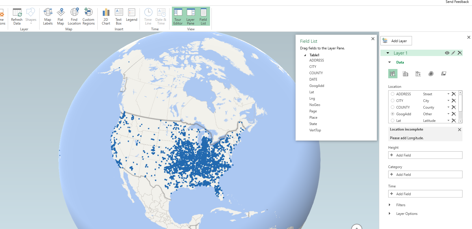
Another example is googling “[your city] GIS data”. Often cities/counties have a GIS department, and I’ve found that many publicly release some data, such as parcels, zoning, streets, school districts, etc. that are not included on the open data website. For example here is the Dallas GIS page, which includes streets, parcels, and parks. (Another pro-tip is that many cities have an ArcGIS data server lurking in the background, often which you can use to geocode address data. See these blog posts of mine (python,R) for examples. ) If you have a county website and you need some data, it never hurts to send a quick email to see if some of those datasets are available (ditto for crime via the local crime analyst). You have nothing to lose by sending a quick email to ask.

I’d note that sometimes you can figure out a bit from the zoning/parcel dataset. For instance there may be a particular special code for public schools or apartment complexes. NYC’s PLUTO data is the most extensive I have ever seen for a parcel dataset. Most though have simpler codes, but you can still at least figure out apartments vs residential vs commercial vs mixed zoning.

You will notice that finding these sites involve using google effectively. Since every place is idiosyncratic it is hard to give general advice. But google searches are easy. Recently I needed public high schools in Dallas for a project, and it was not on any of the prior sources I noted. A google search however turned up a statewide database of the public and charter school locations. If you include things like “GIS” or “shapefile” or “data” in the search it helps whittle it down some to provide a source that can actually be downloaded/manipulated.

Scraping from public websites

The prior two sources are generally going to be better vetted. They of course will have errors, but are typically based on direct data sources maintained by either the state or local government. All of the other sources I will list though are secondary, and I can’t really say to what extent they are incorrect. The biggest thing I have noticed with these data sources is that they tend to be missing facilities in my ad-hoc checks. (Prior mentioned sources at worst I’ve noticed a rare address swap with a PO box that was incorrect.)

I’ve written previously about using the google places API to scrape data. I’ve updated to create a short python code snippet that all you need is a bounding box you are looking for and it will do a grid search over the area for the place type you are interested in. Joel Caplan has a post about using Google Earth in a similar nature, but unfortunately that has a quite severe limitation — it only returns 10 locations. My python code snippet has no such limitation.

I don’t really understand googles current pricing scheme, but the places API has a very large number of free requests. So I’m pretty sure you won’t run out even when scraping a large city. (Geocoding and distance APIs are much fewer unfortunately, and so are much more limited.)

Other sources I have heard people use before are Yelp and Yellow pages. I haven’t checked those sources extensively (and if they have API’s like Google). When looking closely at the Google data, it tends to be missing places (it is up to the business owner to sign up for a business listing). Despite it being free and seemingly madness to not take the step to have your business listed easily in map searches, it is easy to find businesses that do not come up. So user beware.

Also, scraping the data for academic articles is pretty murky whether it violates the terms of service for these sites. They say you can’t cache the original data, but if you just store the lat/lon and then turn into a “count of locations” or a “distance to nearest location” (ala risk terrain modelling), I believe that does not violate the TOS (not a lawyer though — so take with a grain of salt). Also for academic projects since you are not making money I would not worry too extensively about being sued, but it is not a totally crazy concern.

Finally, the nature of scraping the business data is no different than other researchers who have been criticized for scraping public sites like Facebook or dating websites (it is just a business instead of personal info). I personally don’t find it unethical (and I did not think those prior researchers were unethical), but others will surely disagree.

City Observatory Data

City observatory has a convenient set of data, that they named the StoreFront Index. They have individual data points you can download for many different metro areas, along with their SIC codes. See also here for a nice map and to see if your metro area of interest is included.

See here for the tech report on which stores are included. They do not include liquor stores and gas stations though in their index. (Since it is based on Jane Jacob’s work I presume they also do not include used car sale lots.)

Lexis Nexis Business Data (and other proprietary sources)

The store front data come from a private database, Custom Lists U.S. Business Database. I’m not sure exactly what vendor produces this (a google search brings up several), but here are a few additional proprietary sources researchers may be interested in.

My local library in Plano (as well as my University), have access to a database named reference USA. This allows you to search for businesses in a particular geo area (such as zip code), as well as by other characteristics (such as by the previously mentioned SIC code). Also this database includes additional info. about sales and number of employees, which may be of further interest to tell the difference between small and large stores. (Obviously Wal-Mart has more customers and more crime than a smaller department store.) It provides the street address, which you will then need to geocode.

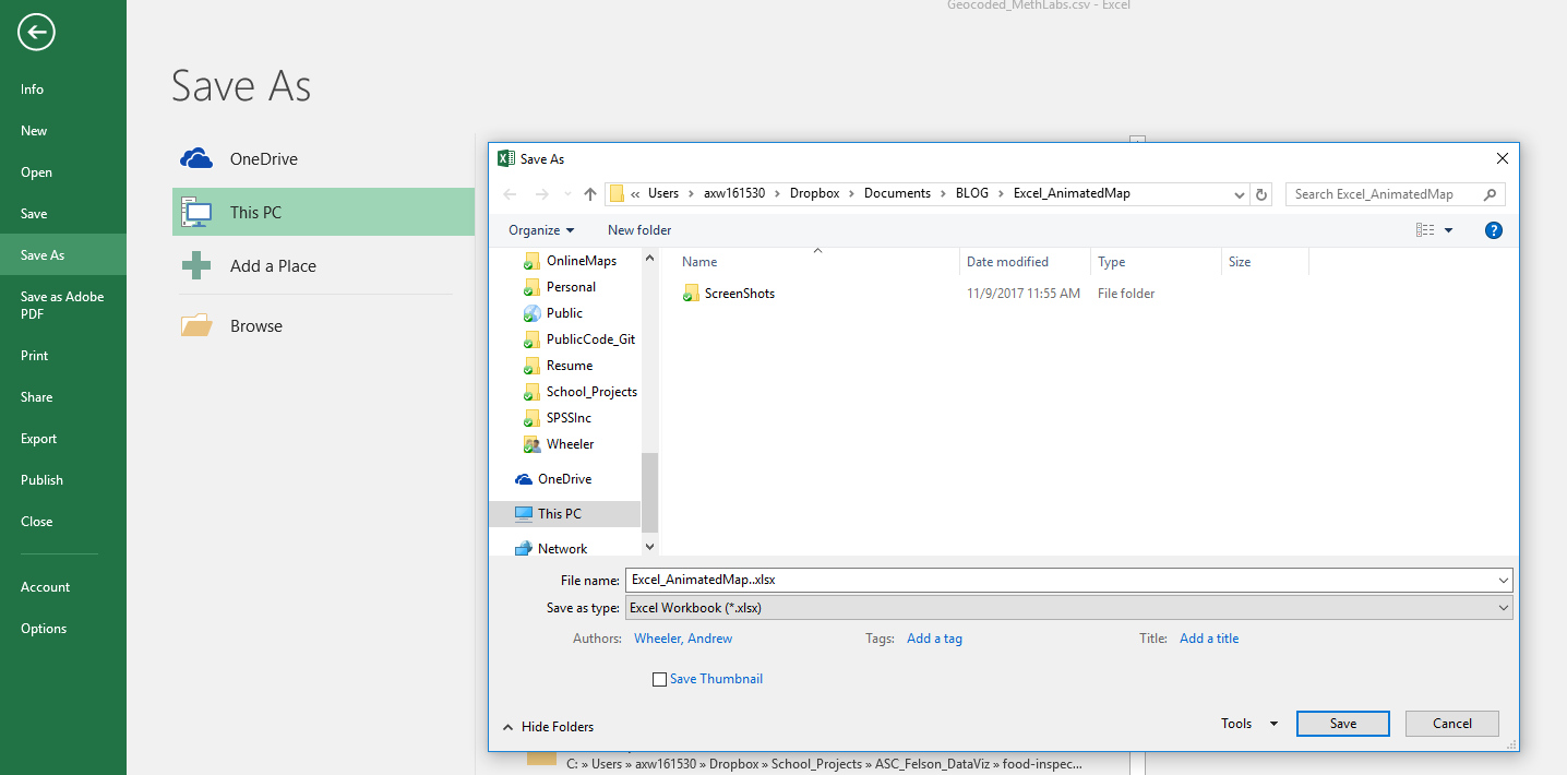
Reference USA though only allows you to download 250 addresses at a time, so could be painful for crime generators that are more prevalent or for larger cities. Another source though my friendly UTD librarian pointed out to me is Lexis Nexis’s database of public businesses. It has all the same info. as reference USA and you can bulk download the files. See here for a screenshot walkthrough my librarian created for me.

Any good sources I am missing? Let me know in the comments. In particular these databases I mention are cross-sectional snapshots in time. It would be difficult to use these to measure changes over time with few exceptions.


Paper published: The effect of housing demolitions on crime in Buffalo, New York

I have a new paper published with a few of my colleagues up in Buffalo, Dae-Young Kim and Scott Phillips. This work looks at the crime reduction effects of widespread demolitions in Buffalo, is titled The Effect of Housing Demolitions on Crime in Buffalo, New York, and was published at the Journal of Research in Crime & Delinquency. In short, at the micro level there is very strong evidence that demolitions reduce crime — the neighborhood level the evidence is not as strong. This is likely partly due to the neighborhood level analysis being underpowered, as several of the estimates between the two are very similar overall.

If you cannot get access to that published article, you can always send me an email for a copy, or you can download a pre-print version from SSRN.

Below is one of the images from the paper, a set of small-multiple maps showing demographic characteristics of Buffalo census tracts:


Someone could surely replicate this micro level result in other cities that have experienced widespread demolitions (like Detroit). But for long term city planners I would consider more rigorous designs that incorporate not only selective demolition, but other neighborhood investment strategies to improve neighborhoods over long term. That is, this research is good evidence of the near-term crime reduction effects of demolitions, but for the long haul leaving empty lots is not going to greatly improve neighborhoods.

New preprint: Testing for Similarity in Area-Based Spatial Patterns: Alternative Methods to Andresen’s Spatial Point Pattern Test

I just posted another pre-print to SSRN, Testing for Similarity in Area-Based Spatial Patterns: Alternative Methods to Andresen’s Spatial Point Pattern Test. This is work with Wouter Steenbeek and Martin Andresen. Below is the abstract:

Andresen’s spatial point pattern test (SPPT) compares two spatial point patterns on defined areal units: it identifies areas where the spatial point patterns diverge and aggregates these local (dis)similarities to one global measure. We discuss the limitations of the SPPT and provide two alternative methods to calculate differences in the point patterns. In the first approach we use differences in proportions tests corrected for multiple comparisons. We show how the size of differences matter, as with large point patterns many areas will be identified by SPPT as statistically different, even if those differences are substantively trivial. The second approach uses multinomial logistic regression, which can be extended to identify differences in proportions over continuous time. We demonstrate these methods on identifying areas where pedestrian stops by the New York City Police Department are different from violent crimes from 2006 through 2016.

And here is an example map using our proportion differences test and graduated circles to identify places with larger differences in the percentages:

This is opposed to the traditional SPPT output, which just identifies whether two areas are different and does not focus on the size of the difference, like below:

You can see with a large sample size, basically everything is statistically different! (This uses over 4 million stops and over 800,000 violent crimes). Focusing on the magnitude of the differences gives a much clear indication of patterns.

The paper includes a dropbox link to download the data and code used to estimate the different techniques (it includes code in SPSS, R, and Stata). If you have any feedback as always let me know. This was submitted as a GISScience presentation for the 2018 ESRI User conference in July in San Diego, so I should have news about that presentation in the near future as well.

New preprint: A Gentle Introduction to Creating Optimal Patrol Areas

I have a new preprint posted, A Gentle Introduction to Creating Optimal Patrol Areas. Below is the abstract:

Models to create optimal patrol areas have been in existence for over 45 years, but police departments still regularly construct patrol areas in an ad-hoc fashion. This essay walks the reader through formulating an integer linear program to create a set number of patrol areas that have near equal call load and that are contiguous using simple examples. Then the technique is illustrated using a case study in Carrollton, TX. Creating optimal patrol areas not only have the potential to improve efficiency in response times, but can also encourage hot spots policing. Applications of linear programming can additionally be applied to a wide variety of problems within criminal justice agencies, and this essay provides a gentle introduction to understanding the mathematical notation of linear programming.

In this paper I introduce a very simple integer linear program to create patrol beats, and then build up the complexity into the fuller p-median problem with additional constraints applicable to making patrol areas. The constraints on making the call load equal that I introduce in the paper are the only real novel aspect of the paper (although no doubt someone else has done something similar previously), but I was a bit frustrated reading other linear programs to create patrol areas. Most work was concentrated in operations research journals and in my opinion was totally inaccessible to a typical crime analyst. So I frame the paper as an introduction to integer linear programs, walk though some simplified examples, and then apply that full model in Carrollton. I also provide an extensive walkthrough using the python program PuLP so others can replicate the work with their own data in the supplementary materials.

Here is my end example map of the optimal patrol areas in Carrollton.


You can see that my areas are not as nice and convex, although most applications of correcting for that introduce multiple objective functions and/or non-linear functions, making the problem much harder to estimate in practice (which was part of my pet-peeve with prior publications – none provided code to estimate the models described, with the exception of some of the work of Kevin Curtin).

Part of the reason I tackled this problem is that it comes up all the time on the IACA list-serve — how to make new patrol areas. If you are an analyst interested in applying this in your jurisdiction and would like help always feel free to contact me.

Creating an animated heatmap in Excel

I’ve been getting emails recently about the online Carto service not continuing their free use model. I’ve previously used this service to create animated maps heatmaps over time, in particular a heatmap of reported meth labs over time. That map still currently works, but I’m not sure how long it will though. But the functionality can be replicated in recent versions of Excel, so I will do a quick walkthrough of how to make an animated map. The csv to follow along with, as well as the final produced excel file, you can down download from this link.

I split the tutorial into two parts. Part 1 is prepping the data so the Excel 3d Map will accept the data. The second is making the map pretty.

Prepping the Data

The first part before we can make the map in Excel are:

  1. eliminate rows with missing dates
  2. turn the data into a table
  3. explicitly set the date column to a date format
  4. save as an excel file

We need to do those four steps before we can worry about the mapping part. (It took me forever to figure out it did not like missing data in the time field!)

So first after you have downloaded that data, double click to open the Geocoded_MethLabs.csv file in word. Once that sheet is open select the G column, and then sort Oldest to Newest.

It will give you a pop-up to Expand the selection – keep that default checked and click the Sort button.

After that scroll down to the current bottom of the spreadsheet. There are around 30+ records in this dataset that have missing dates. Go ahead and select the row labels on the left, which highlights the whole row. Once you have done that, right click and then select Delete. Again you need to eliminate those missing records for the map to accept the time field.

After you have done that, select the bottom right most cell, L26260, then scroll back up to the top of the worksheet, hold shift, and select cell A1 (this should highlight all of the cells in the sheet that contain data). After that, select the Insert tab, and then select the Table button.

In the pop-up you can keep the default that the table has headers checked. If you lost the selection range in the prior step, you can simply enter it in as =$A$1:$;$26260.

After that is done you should have a nice blue formatted table. Select the G column, and then right click and select Format Cells.

Change that date column to a specific date format, here I just choose the MM/DD/YY format, but it does not matter. Excel just needs to know it represents a date field.

Finally, you need to save the file as an excel file before we can make the maps. To do this, click File in the top left header menu’s, and then select Save As. Choose where you want to save the file, and then in the Save as Type dropdown in the bottom of the dialog select xlsx.

Now the data is all prepped to create the map.

Making an Animated Map

Now in this part we basically just do a set of several steps to make our map recognize the correct data and then make the map look nice.

With the prior data all prepped, you should be able to now select the 3d Map option that you can access via the Insert menu (just to the right of where the Excel charts are).

Once you click that, you should get a map opened up that looks like mine below.

Here it actually geocoded the points based on the address (very fast as well). So if you only have address data you can still create some maps. Here I want to change the data though so it uses my Lat/Lon coordinates. In the little table on the far right side, under Layer 1, I deleted all of the fields except for Lat by clicking the large to their right (see the X circled in the screenshot below). Then I selected the + Add Field option, and then selected my Lng field.

After you select that you can select the dropdown just to the right of the field and set it is Longitude. Next navigate down slightly to the Time option, and there select the DATE field.

Now here I want to make a chart similar to the Carto graph that is of the density, so in the top of the layer column I select the blog looking thing (see its drawn outline). And then you will get various options like the below screenshot. Adjust these to your liking, but for this I made the radius of influence a bit larger, and made the opacity not 100%, but slightly transparent at 80%.

Next up is setting the color of the heatmap. The default color scale uses the typical rainbow, which should be avoided for multiple reasons, one of which is color-blindness. So in the dropdown for colors select Custom, and then you will get the option to create your own color ramp. If you click on one of the color swatches you will then get options to specify the color in a myriad of ways.

Here I use the multi-hue pink-purple color scheme via ColorBrewer with just three steps. You can see in the above screenshot I set the lowest pink step via the RGB colors (which you can find on the color brewer site.) Below is what my color ramp looks like in the end.

Next part we want to set the style of the map. I like the monotone backgrounds, as it makes the animated kernel density pop out much more (see also my blog post, When should we use a black background for a map). It is easy to experiement with all of these different settings though and see which ones you like more for your data.

Next I am going to change the format of the time notation in the top right of the map. Left click to select the box around the time part, and then right click and select Edit.

Here I change to the simpler Month/Year. Depending on how fast the animation runs, you may just want to change it to year. But you can leave it more detailed if you are manually dragging the time slider to look for trends.

Finally, the current default is to show all of the data permanently. There are examples where you may want to do that (see the famous example by Nathan Yau mapping the growth of Wal Mart), but here we do not want that. So navigate back to the Layer options on the right hand side, and in the little tiny clock above the Time field select the dropdown, and change it to Data shows for an instant.

Finally I select the little cog in the bottom of the map window to change the time options. Here I set the animation to run longer at 30 seconds. I also set the transition duration to slightly longer at 5 seconds. (Think of the KDE as a moving window in time.)

After that you are done! You can zoom in the map, set the slider to run (or manually run it forward/backward). Finally you can export the map to an animated file to share or use in presentations if you want. To do that click the Create Video option in the toolbar in the top left.

Here is my exported video


Now go make some cool maps!

Presentation at ASC: Crime Data Visualization for the Future

At the upcoming American Society of Criminology conference in Philadelphia I will be presenting a talk, Crime Data Visualization for the Future. Here is the abstract:

Open data is a necessary but not sufficient condition for data to be transparent. Understanding how to reduce complicated information into informative displays is an important step for those wishing to understand crime and how the criminal justice system works. I focus the talk on using simple tables and graphs to present complicated information using various examples in criminal justice. Also I describe ways to effectively evaluate the size of effects in regression models, and make black box machine learning models more interpretable.

But I have written a paper to go with the talk as well. You can download that paper here. As always, if you have feedback/suggestions let me know.

Here are some example graphs of plotting the predictions from a random forest model predicting when restaurants in Chicago will fail their inspections.

I present on Wednesday 11/15 at 11 am. You can see the full session here. Here is a quick rundown of the other papers — Marcus was the one who put together the panel.

  • A Future Proposal for the Model Crime Report – Marcus Felson
  • Crime Data Warehouses and the future of Big Data in Criminology – Martin Andresen
  • Can We Unify Criminal Justice Data, Like the Dutch and the Nordics? – Michael Mueller-Smith

So it should be a great set of talks.


I also signed up to present a poster, Mapping Attitudes Towards the Police at Micro Places. This is work with Albany Finn Institute folks, including Jasmine Silver, Sarah McLean, and Rob Worden. Hopefully I will have a paper to share about that soon, but for a teaser on that here is an example map from that work, showing hot spots of dissatisfaction with the police estimated via inverse distance weighting. Update: for those interested, see here for the paper and here for the poster. Stop on by Thursday to check it out!

And here is the abstract:

We demonstrate the utility of mapping community satisfaction with the police at micro places using data from citizen surveys conducted in 2001, 2009 and 2014 in one city. In each survey, respondents provided the nearest intersection to their address. We use inverse distance weighting to map a smooth surface of satisfaction with police over the entire city, which shows broader neighborhood patterns of satisfaction as well as small area hot spots of dissatisfaction. Our results show that hot spots of dissatisfaction with police do not conform to census tract boundaries, but rather align closely with hot spots of crime and police activity. Models predicting satisfaction with police show that local counts of violent crime are the strongest predictors of attitudes towards police, even above individual level predictors of race and age.

New working paper: The effect of housing demolitions on crime in Buffalo, New York

I have a new working paper up, The effect of housing demolitions on crime in Buffalo, New York. This is in conjunction with my colleagues Dae-Young Kim and Scott Phillips, who are at SUNY Buffalo. Below is the abstract.

Objectives: From 2010 through 2015, the city of Buffalo demolished over 2,000 residences. This study examines whether those demolitions resulted in crime reductions.

Methods: Analysis was conducted at micro places matching demolished parcels to comparable control parcels with similar levels of crime. In addition, spatial panel regression models were estimated at the census tract and quarterly level, taking into account demographic characteristics of neighborhoods.

Results: We find that at the micro place level, demolitions cause a steep drop in reported crime at the exact parcel, and result in additional crime decreases at buffers of up to 1,000 feet away. At the census tract level, results indicated that demolitions reduced Part 1 crimes, but the effect was not statistically significant across different models.

Conclusions: While concerns over crime and disorder are common for vacant houses, the evidence that housing demolitions are an effective crime reduction solution is only partially supported by the analyses here. Future research should compare demolitions in reference to other neighborhood revitalization processes.

As always, if you have feedback/comments let me know.

And here are a few maps from the paper!

Geocoding with census data and the Census API

For my online GIS class I have a tutorial on creating an address locator using street centerline data in ArcGIS. Eventually I would like to put all of my class online, but for now I am just sharing that one, as I’ve forwarded it alot recently.

That tutorial used local street centerline data in Dallas that you can download from Dallas’s open data site. It also gives directions on how to use an online ESRI geocoding service — which Dallas has. But what if those are not an option? A student recently wanted to geocode data from San Antonio, and the only street data file they publicly provide lacks the beginning and ending street number.

That data is insufficient to create an address locator. It is also the case that the road data you can download from the census’s web interface lacks this data. But you can download street centerline data with beginning and end addresses from the census from the FTP site. For example here is the url that contains the streets with the address features. To use that you just have to figure out what state and county you are interested in downloaded. The census even has ESRI address locators already made for you using 2012 data at the state level. Again you just need to figure out your states number and download it.

Once you download the data with the begin and ending street numbers you can follow along with that tutorial the same as the public data.

Previously I’ve written about using the Google geocoding API. If you just have crime data from one jurisdiction, it is simple to make a geocoder for just that locality. But if you have data for many cities (say if you were geocoding home addresses) this can be more difficult. An alternative online API to google that does not have daily limits is the Census Geocoding API.

Here is a simple example in R of calling the census API and geocoding a list of addresses.

library(httr)
library(jsonlite)

get_CensusAdd <- function(street,city,state,zip,benchmark=4){
    base <- "https://geocoding.geo.census.gov/geocoder/locations/address?"
    soup <- GET(url=base,query=list(street=street,city=city,state=state,zip=zip,format='json',benchmark=benchmark))
    dat <- fromJSON(content(soup,as='text'), simplifyVector=TRUE)
    D_dat <- dat$result$addressMatches
    if (length(D_dat) > 1){
    return(c(D_dat['matchedAddress'],D_dat['coordinates'][[1]])) #error will just return null, x[1] is lon, x[2] is lat
    }
    else {return(c('',NA,NA))}
}

#now create function to loop over data frame and return set of addresses
geo_CensusTIGER <- function(street,city,state,zip,sleep=1,benchmark=4){
  #make empy matrix
  l <- length(street)
  MyDat <- data.frame(matrix(nrow=l,ncol=3))
  names(MyDat) <- c("MatchedAdd","Lon","Lat")
  for (i in 1:l){
    x <- suppressMessages(get_CensusAdd(street=street[i],city=city[i],state=state[i],zip=zip[i],benchmark=benchmark))
    if (length(x) > 0){
        MyDat[i,1] <- x[1]
        MyDat[i,2] <- x[2]
        MyDat[i,3] <- x[3]
    }
    Sys.sleep(sleep)
  }
  MyDat$street <- street
  MyDat$city <- city
  MyDat$zip <- zip
  MyDat$state <- state
  return(MyDat)
}

## Arbitrary dataframe for an exercise
AddList <- data.frame(
  IdNum = c(1,2,3,4,5),
  Address = c("450 W Harwood Rd", "2878 Fake St", "2775 N Collin St", "2775 N Collins St", "Lakewood Blvd and W Shore Dr"),
  City = c("Hurst", "Richardson", "Arlington", "Arlington", "Dallas"),
  State = c("TX", "TX", "TX", "TX", "TX")
)

test <- geo_CensusTIGER(street=AddList$Address,city=AddList$City,state=AddList$State,zip=rep('',5))

If you check out the results, you will see that this API does not appear to do fuzzy matching. 2775 N Collin St failed, whereas 2775 N Collins St was able to return a match. You can also see though it will return an intersection, but in my tests "/" did not work (so in R you can simply use gsub to replace different intersection types with and). I haven’t experimented with it too much, so let me know if you have any other insight into this API.

I will follow up in another post a python function to use the Census geocoding API, as well as using the Nominatim online geocoding API, which you can use for addresses outside of the United States.

Communities and Crime

This was my first semester teaching undergrads at UT Dallas. I taught the Communities and Crime undergrad course. I thought it went very well, and I was impressed with the undergrads here. For the course I had students do a bunch of different prediction assignments based on open data in Dallas, such as predicting what neighborhood has the most crime, or which specific bar has the most assaults. The idea being they would use the theories I discussed in the prior lecture to make the best predictions.

For their final assignment, I had students predict an arbitrary area to capture the most robberies in 2016 (up to that point they had only been predicting crimes in 2015). I used the same metric that NIJ is using in their crime forecasting challenge – the predictive accuracy index. This is simply % crime/% area, so students who give larger areas are more penalized. This ended up producing a pretty neat capstone to the end of the semester.

Below is a screen shot of the map, and here is a link to an interactive version. (WordPress.com sites only allow specific types of iframe sources, so my dropbox src link to the interactive Leaflet map gets stripped.)

Look forward to teaching this class again (as of now it seems I will regularly offer it every spring).

More news on classes to come soon. I am teaching GIS applications in Criminology online over the summer. For a quick idea about the content, it will be almost the same as the GIS course in criminal justice I previously taught at SUNY.

In short, if you think maps rock then you should take my classes 😉

SPSS Statistics for Data Analysis and Visualization – book chapter on Geospatial Analytics

A book I made contributions to, SPSS Statistics for Data Analysis and Visualization, is currently out. Keith and Jesus are the main authors of the book, but I contributed one chapter and Jon Peck contributed a few.

The book is a guided tour through many of the advanced statistical procedures and data visualizations in SPSS. Jon also contributed a few chapters towards using syntax, python, and using extension commands. It is a very friendly walkthrough, and we have all contributed data files for you to be able to follow along through the chapters.

So there is alot of content, but I wanted to give a more specific details on my chapter, as I think they will be of greater interest to crime analysts and criminologists. I provide two case studies, one of using geospatial association rules to identify areas of high crime plus high 311 disorder complaints in DC (using data from my dissertation). The second I give an example of spatio-temporal forecasting of ShotSpotter data at the weekly level in DC using both prior shootings as well as other prior Part 1 crimes.

Geospatial Association Rules

The geospatial association rules is a technique for high dimensional contingency tables to find particular combinations among categories that are more prevalent. I show examples of finding that thefts from motor vehicles tend to be associated in places nearby graffiti incidents.

And that assaults tend to be around locations with more garbage complaints (and as you can see each has a very different spatial patterning).

I consider this to be a useful exploratory data analysis type technique. It is very similar in application to conjunctive analysis, that has prior very similar crime mapping applications in risk terrain modeling (see Caplan et al., 2017).

Spatio-Temporal Prediction

The second example case study is forecasting weekly shootings in fairly small areas (500 meter grid cells) using ShotSpotter data in DC. I also use the prior weeks reported Part 1 crime types (Assault, Burglary, Robbery, etc.), so it is similar to the leading indicators forecasting model advocated by Wilpen Gorr and colleagues. I show that prior shootings predict future shootings up to 5 lags prior (so over a month), and that the prior crimes do have an effect on future shootings (e.g. robberies in the prior week contribute to more shootings in the subsequent week).

If you have questions about the analyses, or are a crime analyst and want to apply similar techniques to your data always feel free to send me an email.