No major end of year updates. Life is boring (in a good way). My data science gig at Gainwell is going well. Still on occasion do scholarly type things (see my series on the American Society of Evidence Based Policing). Blog is still going strong, topping over 130k views this year.
As always, feel free to send me question, will just continue to post random tips over time related to things I am working on.
Post today is about using docker to run a personal postgres database. In the past I have attempted to install postgres on my personal windows machine, and this caused issues with other tool sets (in particular GIS tools that I believe rely on PostGIS somewhere under the hood). So a way around that is to install postgres on its entirely own isolated part of your machine. Using docker you don’t have to worry about messing things up – you can always just destroy the image you build and start fresh.
For background to follow along, you need to 1) install docker desktop on your machine, 2) have a python installation with in addition to the typical scientific stack sqlalchemy and psycopg2 (sqlalchemy may by default be installed on Anaconda distributions, I don’t think pyscopg2 is though).
For those not familiar, docker is a technology that lets you create virtual machines with certain specifications, e.g. something like “build an Ubuntu image with python and postgres installed”. Then you can do more complicated things, in data science we often are either creating an application server, or running batch jobs in such isolated environments. Here we will persist an image with postgres to test it out. (Both understanding docker and learning to work with databases and SQL are skills I expect more advanced data scientists to know.)
So first, again after you have docker installed, you can run something like:
docker run --name test_pg -p 5433:5432 -e POSTGRES_PASSWORD=mypass -d postgresTo create a default docker image that has postgres installed. This just pulls the base image postgres. Now you can get inside of that image, and add a schema/tables if you want:
docker exec -it test_pg bash
psql -U postgres
CREATE SCHEMA ts;
CREATE TABLE ts.test_tab (id serial primary key, val int, task text);
INSERT INTO ts.test_tab (val,task) values (1,'abc'), (2, 'def');
SELECT * FROM ts.test_tab;
\q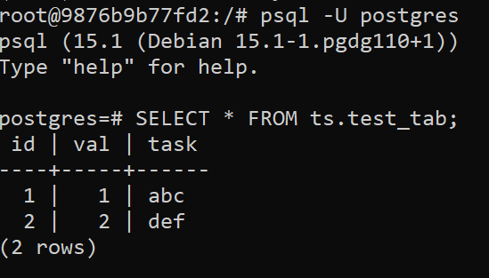
And you can do more complicated things, like install python and the postgres python extension.
# while still inside the postgres docker image
apt-get update
apt install python3 pip
apt-get install postgresql-plpython3-15
psql -U postgres
CREATE EXTENSION plpython3u;
\q
# head back out of image entirely
exit
(You could create a dockerfile to do all of this as well, but just showing step by step interactive here as a start. I recommend that link as a getting feet wet with docker as well.)
Now, back on your local machine, we can also interact with that same postgres database. Using python code:
import pandas as pd
import sqlalchemy
import psycopg2
import pickle

uid = 'postgres' # in real life, read these in as secrets
pwd = 'mypass'   # or via config files
ip = 'localhost:5433' # port is set on docker command

# depending on sqlalchemy version, it may be
# 'postgres' insteal of 'postgresql'
conn_str = f'postgresql://{uid}:{pwd}@{ip}/postgres'
eng = sqlalchemy.create_engine(conn_str)

res = pd.read_sql('SELECT * FROM ts.test_tab',eng)
print(res)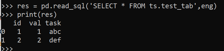
And you can save a table into this same database:
res['new'] = [True,False]
res.to_sql('new_tab',schema='ts',con=eng,index=False,if_exists='replace')
pd.read_sql('SELECT * FROM ts.new_tab',eng)
And like I said, I like to have a version I can test things with. One example, I have tested a deployment pattern that passes around binary blobs for model artifacts.
# Can save a python object as binary blob
eng.execute('''create table ts.mod (note VARCHAR(50) UNIQUE, mod bytea);''')

def save_mod(model, note, eng=eng):
    bm = pickle.dumps(model)
    md = psycopg2.Binary(bm)
    in_sql = f'''INSERT INTO ts.mod (note, mod) VALUES ('{note}',{md});'''
    info = eng.url # for some reason sqlalchemy doesn't work for this
    # but using psycopg2 directly does
    pcn = psycopg2.connect(user=info.username,password=info.password,
                          host=info.host,port=info.port,dbname=info.database)
    cur = pcn.cursor()
    cur.execute(in_sql)
    pcn.commit()
    pcn.close()

def load_mod(note, eng=eng):
    sel_sql = f'''SELECT mod FROM ts.mod WHERE note = '{note}';'''
    res = pd.read_sql(sel_sql,eng)
    mod = pickle.loads(res['mod'][0])
    return mod
This does not work out of the box for objects that have more complicated underlying code, but pure python stuff in sklearn it seems to work OK:
# Create random forest
import numpy as np
from sklearn.ensemble import RandomForestRegressor

train = np.array([[1,2],[3,4],[1,3]])
y = np.array([1,2,3])
mod = RandomForestRegressor(n_estimators=5,max_depth=2,random_state=0)
mod.fit(train,y)

save_mod(mod,'ModelRF1')
m2 = load_mod('ModelRF1')

# Showing the outputs are the same
mod.predict(train)
m2.predict(train)
You may say to yourself this is a crazy deployment pattern. And I would say I do what I need to do given the constraints I have sometimes! (I know more startups with big valuations that do SQL insertion to deploy models than ones with more sane deployment strategies. So I am not the only one.)
But this is really just playing around like I said. But you can try out more advanced stuff as well, such as using python inside postgres functions, or something like this postgres extension for ML models.