New working paper: What We Can Learn from Small Units of Analysis

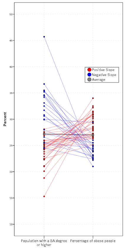
I’ve posted a new working paper, What We Can Learn from Small Units of Analysis to SSRN. This is a derivative of my dissertation (by the same title). Below is the abstract:

This article provides motivation for examining small geographic units of analysis based on a causal logic framework. Local, spatial, and contextual effects are confounded when using larger units of analysis, as well as treatment effect heterogeneity. I relate these types of confounds to all types of aggregation problems, including temporal aggregation, and aggregation of dependent or explanatory variables. Unlike prior literature critiquing the use of aggregate level data, examples are provided where aggregation is unlikely to hinder the goals of the particular research design, and how heterogeneity of measures in smaller units of analysis is not a sufficient motivation to examine small geographic units. Examples of these confounds are presented using simulation with a dataset of crime at micro place street units (i.e. street segments and intersections) in Washington, D.C.

As always, if you have comments or critiques let me know.

Cartography and GIS special issue on Crime Mapping

My paper, Visualization techniques for journey to crime flow data, has been recently published in a special issue in CaGIS on crime mapping. Always feel free to email me for off-prints of published papers, but the pre-print of this one I posted on SSRN as well.

There is an annoying error that crept into the paper, in that the footnote linking to the results to replicate the maps and graphs says “REDACTED FOR ANONYMITY” – which is my fault for not pointing it out to the copy-editor. The files are available here. They are certainly not easy to walk through, so if you want help replicating any of the maps for your own data and can’t figure out my code feel free to send me an email. I would like to make an R package to make maps like below eventually, but that is just not going to happen in the forseeable future.

New paper: Replicating Group-Based Trajectory Models of Crime at Micro-Places in Albany, NY

I posted a pre-print of a paper myself, Rob Worden and Sarah McLean have finished, Replicating Group-Based Trajectory Models of Crime at Micro-Places in Albany, NY. This is part of the work of the Finn Institute in collaboration with the Albany police department, and the goal of the project was to identify micro places (street segments and intersections) that showed long term patterns of being high crime places.

The structured abstract is below:

Objectives: Replicate two previous studies of temporal crime trends at the street block level. We replicate the general approach of group-based trajectory modelling of crimes at micro-places originally taken by Weisburd, Bushway, Lum and Yan (2004) and replicated by Curman, Andresen, and Brantingham (2014). We examine patterns in a city of a different character (Albany, NY) than those previously examined (Seattle and Vancouver) and so contribute to the generalizability of previous findings.

Methods: Crimes between 2000 through 2013 were used to identify different trajectory groups at street segments and intersections. Zero-inflated Poisson regression models are used to identify the trajectories. Pin maps, Ripley’s K and neighbor transition matrices are used to show the spatial patterning of the trajectory groups.

Results: The trajectory solution with eight classes is selected based on several model selection criteria. The trajectory of each those groups follow the overall citywide decline, and are only separated by the mean level of crime. Spatial analysis shows that higher crime trajectory groups are more likely to be nearby one another, potentially suggesting a diffusion process.

Conclusions: Our work adds additional support to that of others who have found tight coupling of crime at micro-places. We find that the clustering of trajectories identified a set of street units that disproportionately contributed to the total level of crime citywide in Albany, consistent with previous research. However, the temporal trends over time in Albany differed from those exhibited in previous work in Seattle but were consistent with patterns in Vancouver.

And here is one of the figures, a drawing of the individual trajectory groupings over the 14 year period. As always, if you have any comments on the paper feel free to shoot me an email.

New paper: Tables and graphs for monitoring temporal crime patterns

I’ve uploaded a new pre-print, Tables and graphs for monitoring temporal crime patterns. The paper basically has three parts, which I will briefly recap here:

  • percent change is a bad metric
  • there are data viz. principles to constructing nicer tables
  • graphs >> tables for monitoring trends

Percent change encourages chasing the noise

It is tacitly understood that percent change when the baseline is small can fluctuate wildly – but how about when the baseline average is higher? If the average of crime was around 100 what would you guess would be a significant swing in terms of percent change? Using simulations I estimate for a 1 in 100 false positive rate you need an over 40% increase (yikes)! I’ve seen people make a big deal about much smaller changes with much smaller baseline averages.

I propose an alternative metric based on the Poisson distribution,

2*( SQRT(Post) - SQRT(Pre) )

This approximately follows a normal distribution if the data is Poisson distributed. I show with actual crime data it behaves pretty well, and using a value of 3 to flag significant values has a pretty reasonable rate of flags when monitoring weekly time series for five different crimes.

Tables are visualizations too!

Instead of recapping all the points I make in this section, I will just show an example. The top table is from an award winning statistical report by the IACA. The latter is my remake.

Graphs >> Tables

I understand tables are necessary for reporting of statistics to accounting agencies, but they are not as effective as graphs to monitor changes in time series. Here is an example, a seasonal chart of burglaries per month. The light grey lines are years from 04 through 2013. I highlight some outlier years in the chart as well. It is easy to see whether new data is an outlier compared to old data in these charts.

I have another example of monitoring weekly statistics in the paper, and with some smoothing in the chart you can easily see some interesting crime waves that you would never comprehend by looking at a single number in a table.

As always, if you have comments on the paper I am all ears.

Dissertation Draft

I figured I would post the current draft of my dissertation. It is being evaluated by the committee members now, and so why not have everyone evaluate it! Also, since I am on the job market there is proof I am close to finished.

Here is a pdf of the draft. This draft is not guaranteed to stay the same as I find errors, but at this point changes should (hopefully) be minimal. As always I appreciate any feedback. The title is What we can learn from small units of analysis, and below is the abstract.

The dissertation is aimed at advancing knowledge of the correlates of crime at small geographic units of analysis. I begin by detailing what motivates examining crime at small places, and focus on how aggregation creates confounds that limit causal inference. Local and spatial effects are confounded when using aggregate units, so to the extent the researcher wishes to distinguish between these two types of effects it should guide what unit of analysis is chosen. To illustrate these differences, I examine local, spatial and contextual effects for bars, broken windows and crime using publicly available data from Washington, D.C.


Rejected!

My Critique of Slope Graphs paper was recently rejected as a short article from The American Statistician. I’ve uploaded the new paper to SSRN with the suggested critiques and my responses to them (posted here).

I ended up bugging Nick Cox for some pre peer-review feedback and he actually agreed! (A positive externality of participating at the Cross Validated Q/A site.) The main outcome of Nick’s review was a considerably shorter paper. The reviews from TAS were pretty mild (and totally reasonable), but devoid of anything positive. The main damning aspect of the paper is that the reviewers (including Cox) just did not find the paper very interesting or well motivated.

My main motivation was the recent examples of slope graphs in the popular media, most of which are poor statistical graphics (and are much better suited as a scatterplot). The most obvious being Cairo’s book cover, which I thought in and of itself deserved a critique – but maybe I should not have been so surprised about a poor statistical graphic on the cover. This I will not argue is a rather weak motivation, but one I felt was warranted given the figures praising the use of slopegraphs in inappropriate situations.

In the future I may consider adding in more examples of slopegraphs besides the cover of Albert Cairo’s book. In my collection of examples I may pull out a few more examples from the popular media and popular data viz books (besides Cairo’s there are blog post examples from Ben Fry and Andy Kirk – haven’t read their books so I’m unsure if they are within them.) For a preview, pretty much all of the examples I consider bad except for Tufte’s original ones. Part of the reason I did not do this is that I wrote the paper as a short article for TAS — and I figured adding these examples would make it too long.

I really had no plans to submit it anywhere besides TAS, so this may sit as just a pre-print for now. Let me know if you think it may be within the scope of another journal that I may consider.

A critique of slopegraphs

I’ve recently posted a pre-print of an article, A critique of slopegraphs, on SSRN. In the paper I provide a critique of the use of slopegraphs and present alternative graphics to use in their place, using the slopegraph displayed on the cover of Albert Cairo’s The Functional Art as motivation – below is my rendering of that slopegraph.

Initially I wanted to write a blog post about the topic – but I decided to give all of the examples and full discussion I wanted it would be far too long. So I ended up writing a (not so short) paper. Below is the abstract, and I will try to summarize it in a few quick points (but obviously I encourage you to read the full paper!)

Slopegraphs are a popular form of graphic depicting change along two independent axes by means of a connecting line. The critique here lists several reasons why interpreting the slopes may be misleading and suggests alternative plots depending on the goals of the visualization. Guidelines as to appropriate situations to use slopegraphs are discussed.

So the three main points I want to make are:

  • The slope is not the main value of interest in a slopegraph. The slope is itself an arbitrary function of how far away the axes are placed from one another.
  • Slopegraphs are poor for judging correlation and seeing a functional relationship between the two values. Scatterplots or just graphing the change directly are often better choices.
  • Slopegraphs are difficult to judge when the variance between axes changes (which produce either diverging or converging slopes) and when the relationship is negative (which produces many crossings in the slopes).

I’ve catalogued a collection of articles, examples and other critiques of slopegraphs at this location. Much of what I say is redundant with critiques of slopegraphs already posted in other blogs on the internet.

I’m pretty sure my criminal justice colleagues will not be interested in the content of the paper, so I may need to cold email someone to review it for me before I send it off. So if you have comments or a critique of the paper I would love to hear it!

Article: Viz. techniques for JTC flow data

My publication Visualization techniques for journey to crime flow data has just been posted in the online first section of the Cartography and Geographic Information Science journal. Here is the general doi link, but Taylor and Francis gave me a limited number of free offprints to share the full version, so the first 50 visitors can get the PDF at this link.

Also note that:

  • The pre-print is posted to SSRN. The pre-print has more maps that were cut for space, but the final article is surely cleaner (in terms of concise text and copy editing) and has slightly different discussion in various places based on reviewer feedback.
  • Materials I used for the article can be downloaded from here. The SPSS code to make the vector geometries for a bunch of the maps is not terribly friendly. So if you have questions feel free – or if you just want a tutorial just ask and I will work on a blog post for it.
  • If you ever want an off-print for an article just send me an email (you can find it on my CV. I plan on continuing to post pre-prints to SSRN, but I realize it is often preferable to cite the final in print version (especially if you take a quote).

The article will be included in a special issue on crime mapping in the CaGIS due to be published in January 2015.

Defending Prospectus

The defense date for my prospectus, What we can learn from small units of analysis, is finally set, November 1st at 9:30 (location TBD). You can find an electronic copy of the prospectus here and below is the abstract. So bring your slings and arrows (and I’ll bring some hydrogen peroxide and gauze?)

What we can learn from small units of analysis
Andrew Wheeler Prospectus Defense 11/1/2013

The dissertation is aimed at advancing knowledge of the correlates of crime at small geographic units of analysis. I begin the prospectus by detailing what motivates examining crime at small places, and focus on how aggregation creates confounds that limit causal inference. Local and spatial effects are confounded when using aggregate units, so to the extent the researcher wishes to distinguish between these two types of effects it should guide what unit of analysis is chosen. To illustrate these differences, I propose data analysis to examine local, spatial and contextual effects for bars, broken windows and crime using publicly available data from Washington D.C. I also propose a second set of data analysis focusing on estimating the effects of various measures of the built environment on crime.

Presenting at ASC this fall

The preliminary program for the American Society of Criminology meeting (this November in Atlanta) is up and my scheduled presentation time is 3:30 on Wednesday Nov. 20th. The title of my talk is Visualization Techniques for Journey to Crime Flow Data, and the associated pre-print is available on SSRN.

The title of the panel is Spatial and Temporal Analysis (a bit of a hodge podge I know), and is being held at Room 8 at the international level. The other presentations are;

  • Analyzing Spatial Interactions in Homicide Research Using a Spatial Durbin Model by Matthew Ruther and John McDonald (UPenn Demography and Criminology respectively)
  • Space-time Case-control Study of Violence in Urban Landscapes by Douglas Wiebe et al. (Some more folks from UPenn but not from the Criminology dept.!)
  • Spatial and Temporal Relationships between Violence, Alcohol Outlets and Drug Markets in Boston, 2006-2010 by Robert Lipton et al. (UMich Injury Center)

So come to see the other presenters (and stay for mine)! If anyone would like to meet up during the conference, feel free to shoot me an email. If I don’t cut my hair in the meantime maybe me and Robert Lipton can start a craziest hair for ASC award.

Note, I have no idea who the panel chair is, so perhaps we are still open for volunteers for that job.