First for some other updates of interest to folks on the blog. On CRIME De-Coder a blog post, You should be geocoding crime data locally. I give python code to create a local geocoding engine using the arcpy library.

This is a bit more techy, so would typically post this on this blog instead of the CRIME De-Coder one. But, currently the web is sorely lacking in good advice for local geocoding solutions. Vast majority of sites discuss online geocoding APIs (e.g. google or the census geocoder), which I guess are common for web-apps, but they do not make sense for crime analysis. For the few webpages that are actually relevant to describe local solutions (that do not involve calling an online web API), all the exmples use PostGIS that I am aware of. PostGIS is both very difficult to setup and has worse results compared to ESRI. So I know ESRI is a paid for service, but they have reasonable academic and small business pricing (and most police departments already have access), so to me this is a reasonable use case. If you need to geocode 100k cases, the license fee for ESRI is worth it at that point relative to using the web engines.
Definitely do not spend thousands of dollars if you need to batch geocode a few million records. That is something that is worth getting in touch with me about. And so hopefully that gets picked up by search engines and drives a bit more traffic to my consulting website.
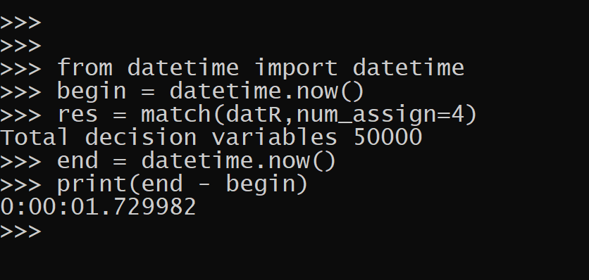
A second example I posted some python code to help construct network experiments. So the idea here is you want to spread out the treated nodes so you have a specific allocation of treated, connected to treated (what I call spillover here), and those not connected to treated (the leftover control group). This python code constructs linear programs to accomplish certain treated/not-touched proportions. So this graph shows if you choose to treat 1 person, but have constraints on 1,2,3 leftover.

And then you can apply this to bigger networks, here the network is 311 nodes, and 90 are treated and I want a total of 150 not treated.

Idea derivative from some work Bruce Desmarais discussed on Twitter, but also have thought about this in some discussion with Barak Ariel in focused deterrence style interventions. So hopefully that comes in handy.
My linear programming formulation is not as svelte as the optimal treatment assignment with spillovers formulation, it is 3*N + 2*E decision variables and 5*N + 2*E constraints (where N is the number of nodes and E is the number of un-directed edges). I have a feeling my formulation is redundant, so if I write my constraints smarter can be more like 2N decision variables and 2N + E constraints.
But for my examples I show it solves quite fast as is (and maybe solvers get rid of the cruft in pre-solve), so not worried about that at the moment. Don’t know the typical size networks people use, but I suspect it will work just fine and dandy on typical machines for networks even as large as 10k. (Generally if I keep the model to under 100k decision variables it is only a few minutes to solve the types of problems I show on this blog.)
Power with Likert items
The other day for a grant application we needed to conduct power analysis. Our design was t-test of mean differences for a simple treated/control group randomized experiment with the outcome being a Likert score survey response. (I know, most of the time people create latent scores with Likert items, analyzing the individual items is fine IMO and simpler to specify for a pre-registration analysis.) I am sure others have needed to do similar things, but I could not find code online to help out with this. So I scripted up a simulation in R to do this, and figured sharing would be useful.
So the rub with Likert data, and why you can’t use typical power calculations, is that they have ceiling effects. If most people answer on average 4.5 out of the your scale up to 5, it is difficult to go much higher. Here I simulate data that has that skew (so ceiling effects come into play), and then go through the motions of doing the t-test. So first for some setup, I have a function that rounds and clips data to limited sets of integers, plus some plotting functions.
# power analysis of Likert data
library(ggplot2)

# custom theme
theme_cdc <- function(){
  theme_bw() %+replace% theme(
     text = element_text(size = 16),
     panel.grid.major= element_line(linetype = "longdash"),
     panel.grid.minor= element_blank()
) }

set.seed(10) # setting the random seed

# rounding/clipping data to integers
clipint <- function(x,min=1,max=5){
    rx <- round(x)
    rx <- ifelse(rx < min,min,rx)
    rx <- ifelse(rx > max,max,rx)
    return(rx)
}
This following function generates the p-values and standard errors, what I will use later in my simulation. Here I use a t-test of mean differences, but it would be fairly easy to say swap out with an ordinal logistic regression if you prefer that. Probably the bigger deal is the simulation generates data using a normal distribution, and then post rounds/clip the data. There is probably a smarter way to generate the data according to the logistic model and ordinal intercepts (Frank Harrell discusses such things a bit on his blog). But this at least takes into account that the data will be skewed, even in the control group, to have more positive outcomes and thus take the ceiling into account.
# this uses OLS to do t-test of mean differences
# generates normal data, but then rounds/clips
sim_ols <- function(n,eff=0.5,int=4,sd=1){
    df <- data.frame(1:n)
    df$treat <- sample(c(0,1),n,replace=TRUE)
    df$latent <- int + eff*df$treat + rnorm(n,sd=sd)
    df$likert <- clipint(df$latent)
    m1 <- lm(likert ~ treat,data=df)
    cd <- coef(summary(m1))
    pval <- cd[2,4]
    se <- cd[2,2]
    return(c(pval,se))
}
Now we can move onto the simulations, this evaluates sample sizes from 100 to 2000 (in increments of 50), effect sizes of 0.1, 0.3, and 0.5, and repeats the simulations 10k times. I then see the power (how often the two-tailed p-value is less than 0.05), as well as the standard error (precision) of the estimates. Effect sizes are in terms of the original Likert scale values, what I take to be much easier to reason about. (I have seen power analyses here use Cohen’s D, which you really can’t get a very large Cohen’s D value due to ceiling effects with this data.)
# running power estimates over different
# sample sizes and effect sizes
samp_sizes <- seq(100,2000,50)
eff_sizes <- c(0.1,0.3,0.5)
rep_size <- 10000
df <- expand.grid(samps_sizes=samp_sizes,eff_sizes=eff_sizes,pow=c(NA),se=c(NA))
for (i in 1:nrow(df)){
    ss <- df[i,1]
    es <- df[i,2]
    stats <- replicate(rep_size,sim_ols(n=ss,eff=es))
    smean <- rowMeans(stats)
    df[i,3] <- mean(stats[1,] < 0.05) # alpha 0.05
    df[i,4] <- smean[2]
}

df$eff_sizes <- as.factor(df$eff_sizes)
The graph of the power shows what you would expect, so with a few hundred samples you can determine an effect size of 0.5, but with a smaller effect size (on the order of 0.1) you will need more than 2k samples.
# Graph of power
powg <- ggplot(data=df,aes(x=samps_sizes,y=pow)) +
        geom_line(aes(color=eff_sizes)) +
        geom_point(pch=21,color='white',size=2,aes(fill=eff_sizes)) +
        labs(x='Sample Sizes',y=NULL,title='Power Estimates') +
        scale_y_continuous(breaks=seq(0,1,0.1)) +
        scale_x_continuous(breaks=seq(100,2000,250)) +
        scale_color_discrete(name="Effect Sizes") +
        scale_fill_discrete(name="Effect Sizes") +
        theme_cdc()
Unfortunately, in reality with most survey measures of police data, e.g. rate your officer 1 to 5, a 0.5 effect is a really large increase. In my mapping attitudes paper, some demographics shift global attitudes at max by 0.2, and I doubt most interventions will be that dramatic. So I like plotting the precision of the estimator, which the effect size doesn’t really make a dent here (it could with more severe ceiling effects).
# Graph of Standard Errors (for Precision)
precg <- ggplot(data=df,aes(x=samps_sizes,y=se,color=eff_sizes)) +
         geom_line(aes(color=eff_sizes)) +
         geom_point(pch=21,color='white',size=2,aes(fill=eff_sizes)) +
         labs(x='Sample Sizes',y=NULL,title='Precision Estimates') +
         scale_x_continuous(breaks=seq(100,2000,250)) +
         scale_color_discrete(name="Effect Sizes") +
         scale_fill_discrete(name="Effect Sizes") +
         theme_cdc()
With field experiments when considering post police contacts (general attitude surveys you have more wiggle room, but still they cost money to survey) you really can’t control the sample size. You are at the whims of whatever events happen in the police departments daily duties. So the best you can do is make approximate plans for “how long am I going to collect measures before I analyze the data”, and “how reasonably precise will my estimates be”.
This particular grant I make arguments we care more about a non-inferiority type test (e.g. can be sure attitudes are not worse, within a particular error level, given our treatment is more cost-effective than business as usual). But if we did an intervention specifically intended to improve attitudes, you may be talking more like 5,000+ contacts to detect an effect of 0.1 (given likely sample non-response), which is still a big effect.
You would gain power by doing a scale (e.g. summing together multiple items or conducting a factor analysis), assuming the intervention effects the underlying latent trait, and piecemeal individual items. But that will have to be for another day simulating data to do that end-to-end analysis.
Despite not being an academic anymore, I have in the hopper more grant collaborations than I did when I was a professor. The NIJ season is winding down, so probably too late to collaborate on any more of those. But if you have other ideas and need quant help with your projects, always feel free to reach out. I enjoy doing these side projects with academics when reasonable funding is available.