Smoothed regression plots for multi-level data

Bruce Weaver on the SPSS Nabble site pointed out that the Centre for Multilevel Modelling has added some syntax files for multilevel modelling for SPSS. I went through the tutorials (in R and Stata) a few years ago and would highly recommend them.

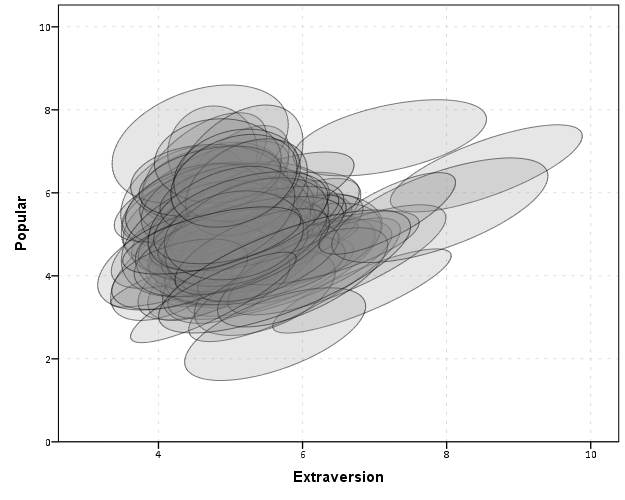
Somehow following the link trail I stumbled on this white paper, Visualising multilevel models; The initial analysis of data, by John Bell and figured it would be good fodder for the the blog. Bell basically shows how using smoothed regression estimates within groups is a good first step in data analysis of complicated multi-level data. I obviously agree, and previously showed how to use ellipses to the same effect. The plots in the Bell whitepaper though are very easy to replicate directly in base SPSS syntax (no extra stat modules or macros required) using just GGRAPH and inline GPL.

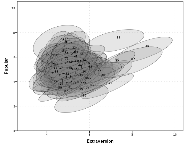
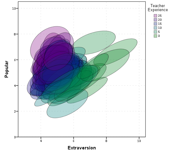
For illustration purposes, I will use the same data as I did to illustrate ellipses. It is the popular2.sav sample from Joop Hox’s book. So onto the SPSS code; first we will define a FILE HANDLE for where the popular2.sav data is located and open that file.

FILE HANDLE data /NAME = "!!!!!!Your Handle Here!!!!!".
GET FILE = "data\popular2.sav".
DATASET NAME popular2.

Now, writing the GGRAPH code that will follow is complicated. But we can use the GUI to help us write the most of it and them edit the pasted code to get the plot we want in the end. So, the easiest start to get the graph with the regression lines we want in the end is to navigate to the chart builder menu (Graphs -> Chart Builder), and then create a scatterplot with extrav on the x axis, popular on the y axis, and use class to color the points. The image below is a screen shot of this process, and below that is the GGRAPH code you get when you paste the syntax.

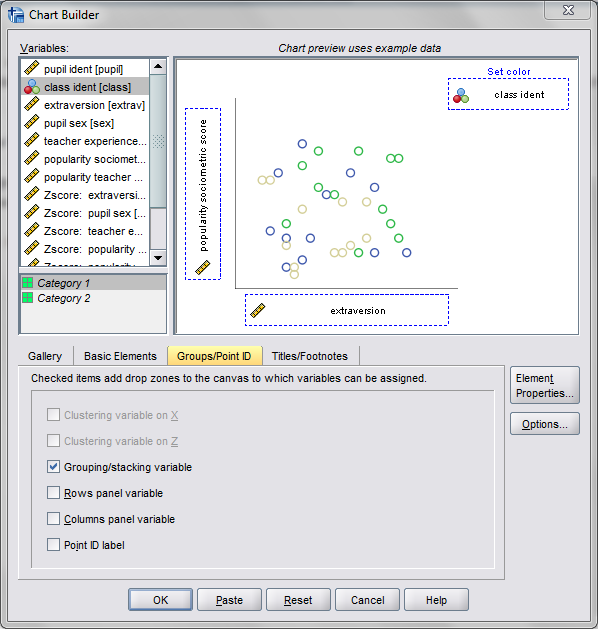
*Base plot created from GUI.
GGRAPH
  /GRAPHDATASET NAME="graphdataset" VARIABLES=extrav popular class[LEVEL=NOMINAL] MISSING=LISTWISE 
    REPORTMISSING=NO
  /GRAPHSPEC SOURCE=INLINE.
BEGIN GPL
  SOURCE: s=userSource(id("graphdataset"))
  DATA: extrav=col(source(s), name("extrav"))
  DATA: popular=col(source(s), name("popular"))
  DATA: class=col(source(s), name("class"), unit.category())
  GUIDE: axis(dim(1), label("extraversion"))
  GUIDE: axis(dim(2), label("popularity sociometric score"))
  GUIDE: legend(aesthetic(aesthetic.color.exterior), label("class ident"))
  ELEMENT: point(position(extrav*popular), color.exterior(class))
END GPL.

Now, we aren’t going to generate this chart. With 100 classes, it will be too difficult to identify any differences between classes unless a whole class is an extreme outlier. Here I am going to make several changes to generate the linear regression line of extraversion on popular within each class. To do this we will make some edits to the ELEMENT statement:

  • replace point with line
  • replace position(extrav*popular) with position(smooth.linear(extrav*popular)) – this tells SPSS to generate the linear regression line
  • replace color.exterior(class) with split(class) – the split modifier tells SPSS to generate the regression lines within each class.
  • make the regression lines semi-transparent by adding in transparency(transparency."0.7")

Extra things I did for aesthetics:

  • I added jittered points to the plot, and made them small and highly transparent (these really aren’t necessary in the plot and are slightly distracting). Note I placed the points first in the GPL code, so the regression lines are drawn on top of the points.
  • I changed the FORMATS of extrav and popular to F2.0. SPSS takes the formats for the axis in the charts from the original variables, so this prevents decimal places in the chart (and SPSS intelligently chooses to only label the axes at integer values on its own).
  • I take out the GUIDE: legend line – it is unneeded since we do not use any colors in the chart.
  • I change the x and y axis labels, e.g. GUIDE: axis(dim(1), label("Extraversion")) to be title case.

*Updated chart with smooth regression lines.
FORMATS extrav popular (F2.0).
GGRAPH
  /GRAPHDATASET NAME="graphdataset" VARIABLES=extrav popular class[LEVEL=NOMINAL] MISSING=LISTWISE 
    REPORTMISSING=NO
  /GRAPHSPEC SOURCE=INLINE.
BEGIN GPL
  SOURCE: s=userSource(id("graphdataset"))
  DATA: extrav=col(source(s), name("extrav"))
  DATA: popular=col(source(s), name("popular"))
  DATA: class=col(source(s), name("class"), unit.category())
  GUIDE: axis(dim(1), label("Extraversion"))
  GUIDE: axis(dim(2), label("Popularity Sociometric Score"))
  ELEMENT: point.jitter(position(extrav*popular), transparency.exterior(transparency."0.7"), size(size."3"))
  ELEMENT: line(position(smooth.linear(extrav*popular)), split(class), transparency(transparency."0.7"))
END GPL.

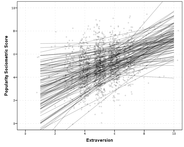
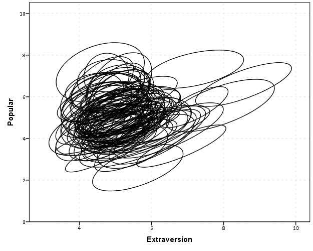
So here we can see that the slopes are mostly positive and have intercepts varying mostly between 0 and 6. The slopes are generally positive and (I would guess) around 0.25. There are a few outlier slopes, and given the class sizes do not vary much (most are around 20) we might dig into these outlier locations a bit more to see what is going on. Generally though with 100 classes it doesn’t strike me as very odd as some going against the norm, and a random effects model with varying intercepts and slopes seems reasonable, as well as the assumption that the distribution of slopes are normal. The intercept and slopes probably have a slight negative correlation, but not as much as I would have guessed with a set of scores that are so restricted in this circumstance.

Now the Bell paper has several examples of using the same type of regression lines within groups, but using loess regression estimates to assess non-linearity. This is really simple to update the above plot to incorporate this. One would simply change smooth.linear to smooth.loess. Also SPSS has the ability to estimate quadratic and cubic polynomial terms right within GPL (e.g. smooth.cubic).

Here I will suggest a slightly different chart that allows one to assess how much the linear and non-linear regression lines differ within each class. Instead of super-imposing all of the lines on one plot, I make a small multiple plot where each class gets its own panel. This allows much simpler assessment if any one class shows a clear non-linear trend.

  • Because we have 100 groups I make the plot bigger using the PAGE command. I make it about as big as can fit on my screen without having to scroll, and make it 1,200^2 pixels. (Also note when you use a PAGE: begin command you need an accompanying PAGE: end() command.
  • For the small multiples, I wrap the panels by setting COORD: rect(dim(1,2), wrap()).
  • I strip the x and y axis labels from the plot (simply delete the label options within the GUIDE statements. Space is precious – I don’t want it to be taken up with axis labels and legends.
  • For the panel label I place the label on top of the panel by setting the opposite option, GUIDE: axis(dim(3), opposite()).

WordPress in the blog post shrinks the graph to fit on the website, but if you open the graph up in a second window you can see how big it is and explore it easier.

*Checking for non-linear trends.
GGRAPH
  /GRAPHDATASET NAME="graphdataset" VARIABLES=extrav popular class[LEVEL=NOMINAL] MISSING=LISTWISE 
    REPORTMISSING=NO
  /GRAPHSPEC SOURCE=INLINE.
BEGIN GPL
  PAGE: begin(scale(1200px,1200px))
  SOURCE: s=userSource(id("graphdataset"))
  DATA: extrav=col(source(s), name("extrav"))
  DATA: popular=col(source(s), name("popular"))
  DATA: class=col(source(s), name("class"), unit.category())
  COORD: rect(dim(1,2), wrap())
  GUIDE: axis(dim(1))
  GUIDE: axis(dim(2))
  GUIDE: axis(dim(3), opposite())
  ELEMENT: line(position(smooth.linear(extrav*popular*class)), color(color.black))
  ELEMENT: line(position(smooth.loess(extrav*popular*class)), color(color.red))
  PAGE: end()
END GPL.

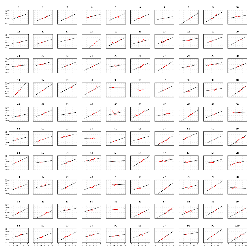
The graph is complicated, but with some work one can go group by group to see any deviations from the linear regression line. So here we can see that most of the non-linear loess lines are quite similar to the linear line within each class. The only one that strikes me as noteworthy is class 45.

Here there is not much data within classes (around 20 students), so we have to wary of small samples to be estimating these non-linear regression lines. You could generate errors around the linear and polynomial regression lines within GPL, but here I do not do that as it adds a bit of complexity to the plot. But, this is an excellent tool if you have many points within your groups and it can be amenable to quite a large set of panels.

Jittered scatterplots with 0-1 data

Scatterplots with discrete variables and many observations take some touches beyond the defaults to make them useful. Consider the case of a categorical outcome that can only take two values, 0 and 1. What happens when we plot this data against a continuous covariate with my default chart template in SPSS?

Oh boy, that is not helpful. Here is the fake data I made and the GGRAPH code to make said chart.

*Inverse logit - see.
*https://andrewpwheeler.wordpress.com/2013/06/25/an-example-of-using-a-macro-to-make-a-custom-data-transformation-function-in-spss/.
DEFINE !INVLOGIT (!POSITIONAL  !ENCLOSE("(",")") ) 
1/(1 + EXP(-!1))
!ENDDEFINE.

SET SEED 5.
INPUT PROGRAM.
LOOP #i = 1 TO 1000.
  COMPUTE X = RV.UNIFORM(0,1).
  DO IF X <= 0.2.
    COMPUTE YLin = -0.5 + 0.3*(X-0.1) - 4*((X-0.1)**2).
  ELSE IF X > 0.2 AND X < 0.8.
    COMPUTE YLin = 0 - 0.2*(X-0.5) + 2*((X-0.5)**2) - 4*((X-0.5)**3).
  ELSE.
      COMPUTE YLin = 3 + 3*(X - 0.9).
  END IF.
  COMPUTE #YLin = !INVLOGIT(YLin).
  COMPUTE Y = RV.BERNOULLI(#YLin).
  END CASE.
END LOOP.
END FILE.
END INPUT PROGRAM.
DATASET NAME NonLinLogit.
FORMATS Y (F1.0) X (F2.1).

*Original chart.
GGRAPH
  /GRAPHDATASET NAME="graphdataset" VARIABLES=X Y
  /GRAPHSPEC SOURCE=INLINE.
BEGIN GPL
  SOURCE: s=userSource(id("graphdataset"))
  DATA: X=col(source(s), name("X"))
  DATA: Y=col(source(s), name("Y"))
  GUIDE: axis(dim(1), label("X"))
  GUIDE: axis(dim(2), label("Y"))
  ELEMENT: point(position(X*Y))
END GPL.

So here we will do a few things to the chart to make it easier to interpret:

SPSS can jitter the points directly within GGRAPH code (see point.jitter), but here I jitter the data slightly myself a uniform amount. The extra aesthetic options for making points smaller and semi-transparent are at the end of the ELEMENT statement.

*Making a jittered chart.
COMPUTE YJitt = RV.UNIFORM(-0.04,0.04) + Y.
FORMATS Y YJitt (F1.0).
GGRAPH
  /GRAPHDATASET NAME="graphdataset" VARIABLES=X Y YJitt
  /GRAPHSPEC SOURCE=INLINE.
BEGIN GPL
  SOURCE: s=userSource(id("graphdataset"))
  DATA: X=col(source(s), name("X"))
  DATA: Y=col(source(s), name("Y"))
  DATA: YJitt=col(source(s), name("YJitt"))
  GUIDE: axis(dim(1), label("X"))
  GUIDE: axis(dim(2), label("Y"), delta(1), start(0))
  SCALE: linear(dim(2), min(-0.05), max(1.05))
  ELEMENT: point(position(X*YJitt), size(size."3"), 
           transparency.exterior(transparency."0.7"))
END GPL.

If I made the Y axis categorical I would need to use point.jitter in the inline GPL code because SPSS will always force the categories to the same spot on the axis. But since I draw the Y axis as continuous here I can do the jittering myself.

A useful tool for exploratory data analysis is to add a smoothing term to plot – a local estimate of the mean at different locations of the X-axis. No binning necessary, here is an example using loess right within the GGRAPH call. The red line is the smoother, and the blue line is the actual proportion I generated the fake data from. It does a pretty good job of identifying the discontinuity at 0.8, but the change points earlier are not visible. Loess was originally meant for continuous data, but for exploratory analysis it works just fine on the 0-1 data here. See also smooth.mean for 0-1 data.

*Now adding in a smoother term.
COMPUTE ActualFunct = !INVLOGIT(YLin).
FORMATS Y YJitt ActualFunct (F2.1).
GGRAPH
  /GRAPHDATASET NAME="graphdataset" VARIABLES=X Y YJitt ActualFunct
  /GRAPHSPEC SOURCE=INLINE.
BEGIN GPL
  SOURCE: s=userSource(id("graphdataset"))
  DATA: X=col(source(s), name("X"))
  DATA: Y=col(source(s), name("Y"))
  DATA: YJitt=col(source(s), name("YJitt"))
  DATA: ActualFunct=col(source(s), name("ActualFunct"))
  GUIDE: axis(dim(1), label("X"))
  GUIDE: axis(dim(2), label("Y"), delta(0.2), start(0))
  SCALE: linear(dim(2), min(-0.05), max(1.05))
  ELEMENT: point(position(X*YJitt), size(size."3"), 
           transparency.exterior(transparency."0.7"))
  ELEMENT: line(position(smooth.loess(X*Y, proportion(0.2))), color(color.red))
  ELEMENT: line(position(X*ActualFunct), color(color.blue))
END GPL.

SPSS’s default smoothing is alittle too smoothed for my taste, so I set the proportion of the X variable to use in estimating the mean within the position statement.

I wish SPSS had the ability to draw error bars around the smoothed means (you can draw them around the linear regression lines with quadratic or cubic polynomial terms, but not around the local estimates like smooth.loess or smooth.mean). I realize they are not well defined and rarely have coverage properties of typical regression estimators – but I rather have some idea about the error than no idea. Here is an example using the ggplot2 library in R. Of course we can work the magic right within SPSS.

BEGIN PROGRAM R.
#Grab Data
casedata <- spssdata.GetDataFromSPSS(variables=c("Y","X"))
#ggplot smoothed version
library(ggplot2)
library(splines)
MyPlot <- ggplot(aes(x = X, y = Y), data = casedata) + 
          geom_jitter(position = position_jitter(height = .04, width = 0), alpha = 0.1, size = 2) +
          stat_smooth(method="glm", family="binomial", formula = y ~ ns(x,5))
MyPlot
END PROGRAM.

To accomplish the same thing in SPSS you can estimate restricted cubic splines and then use any applicable regression procedure (e.g. LOGISTIC, GENLIN) and save the predicted values and confidence intervals. It is pretty easy to call the R code though!

I haven’t explored the automatic linear modelling, so let me know in the comments if there is a simply way right in SPSS to get explore such non-linear predictions.

Using the Google Places API in Python

So I was interested in scraping data from the Google Places API recently. My motivation came from some criminology studies that examine the relationship between coffee shops and crime (Papachristos et al. 2011; Smith, 2014) under the auspices that coffee shops are a measure of gentrification. I am also interested in gaining information about other place characteristics as well, as whether a place has some sort of non-residential application (e.g. bus stop, gas station) they tend to have elevated amounts of crime compared to solely residential locations. (These are not per-se characteristics that make places criminogenic – they just influence the walking around population and thus make the baseline exposure of places greater because of more human interaction).

So here I will give an example of grabbing data from the Google Places API given a grid of locations from SPSS and exporting to an SPSS dataset. So first you need sign up for an API key with Google from the Google APIs console. This allows 1,000 queries per day. Here I will make an example of 6 cases, but again with just the base query rates you can submit up to 1,000 requests per day (and can get 100,000 by verifying your identity).

*Need UNICODE.
PRESERVE.
SET UNICODE=ON.

*Some example data.
DATA LIST FREE / ID Lat Lng.
BEGIN DATA
1   38.901989   -77.041921
2   38.901991   -77.036157
3   38.901993   -77.030393
4   38.906493   -77.041924
5   38.906495   -77.036159
6   38.906497   -77.030394
END DATA.
DATASET NAME Locations.

I typically don’t have SPSS in Unicode mode, but since Google will return some results in Unicode it is necessary to turn it on. After that I create a dataset with 6 locations in central D.C. These happen to be centroids from a regular grid I laid over the city with 500 meter square grid cells (and it only takes 800 and some cells to cover the city of D.C.).

Now google has a pretty good intro to get your feet wet, so here I will just show the helper functions I created to ease the task. The first function takes as input parameters latitude, longitude, a radius (in meters), a type field, and your key for the maps API. It then grabs the JSON you get as a response from that specific url, and then turns the JSON object into a nested list that can be traversed in python. You can check out from Google what other information is available, but the IterJson function is just a helper to takes specific results from GoogPlac and put them into a nicer array for me to use. Here I just grab the geographic coordinates, a place name, a reference string, and the address associated with the place.

*Functions to grab the necessary data from Google.
BEGIN PROGRAM.
import urllib, json

#Grabbing and parsing the JSON data
def GoogPlac(lat,lng,radius,types,key):
  #making the url
  AUTH_KEY = key
  LOCATION = str(lat) + "," + str(lng)
  RADIUS = radius
  TYPES = types
  MyUrl = ('https://maps.googleapis.com/maps/api/place/nearbysearch/json'
           '?location=%s'
           '&radius=%s'
           '&types=%s'
           '&sensor=false&key=%s') % (LOCATION, RADIUS, TYPES, AUTH_KEY)
  #grabbing the JSON result
  response = urllib.urlopen(MyUrl)
  jsonRaw = response.read()
  jsonData = json.loads(jsonRaw)
  return jsonData

#This is a helper to grab the Json data that I want in a list
def IterJson(place):
  x = [place['name'], place['reference'], place['geometry']['location']['lat'], 
         place['geometry']['location']['lng'], place['vicinity']]
  return x
END PROGRAM.

Now we can set up the parameters for the search in addition to the geographic coordinates. Here I make python objects specifying the search type cafe and my API key. I will pass a constant for the radius field of 375 meters – which will cause just a bit of overlap among my grid cells.

*Setting the parameters I will use in the query - type & my key.
BEGIN PROGRAM.
#necessary info for geocoding
MyKey = 'Your API Key Here!!!'
MyType = 'cafe'
END PROGRAM.

Now the magic happens; this code 1) declares a new dataset to place the results in, and then in python 2) grabs the current SPSS dataset, 3) sets the variables for the new dataset, 4) searches at each longitude value in the original dataset, and 5) appends cases to the new SPSS dataset for every location result returned for each initial longitude location. The nested loops are necessary as one location will return multiple places. (For those not using SPSS, the SPSS data here, alldata, is simply a list of namedTuple’s for each row of SPSS data. This code is basically amenable to whatever data structure you are working with, just loop through your grid of geographic coordinates and then append those results to whatever data structure you want.)

*Now querying google and placing the results into a new file.
DATASET DECLARE PlacesResults.
BEGIN PROGRAM.
#Grabbing SPSS data
import spss, spssdata
alldata = spssdata.Spssdata().fetchall()

#making an SPSS dataset to place the results into
spss.StartDataStep()
datasetObj = spss.Dataset(name='PlacesResults')
datasetObj.varlist.append('Id',0)
datasetObj.varlist.append('LatSearch',0)
datasetObj.varlist.append('LngSearch',0)
datasetObj.varlist.append('name',100)
datasetObj.varlist.append('reference',500)
datasetObj.varlist.append('LatRes',0)
datasetObj.varlist.append('LngRes',0)
datasetObj.varlist.append('vicinity',300)

#appending the data to the SPSS dataset
for case in alldata:
  search = GoogPlac(lat=case[1],lng=case[2],radius=375,types=MyType,key=MyKey) #grab data
  if search['status'] == 'OK':                                                 #loop through results
    for place in search['results']:
      x = IterJson(place)
      results = list(case) + x
      datasetObj.cases.append(results)                                         #appending data to SPSS dataset
spss.EndDataStep()
END PROGRAM.

Now we have the data in our PlacesResults SPSS dataset for further manipulation or whatever. One of comment on a prior post was basically "What is the point of SPSS, I can do all of this in Python". Well this is generally true – but I continue to do work in SPSS because it is much more convenient a tool for data management then Python (at least for myself, knowing SPSS really well and Python not so well). So here because we have slightly overlapping search radius’s, you will have duplicate results in your set. The following code in SPSS eliminates those duplicate results.

*************************************.
*Getting rid of duplicate results.
DATASET ACTIVATE PlacesResults.
SHOW N.
SORT CASES BY name vicinity LatRes LngRes Id.
MATCH FILES FILE = *
  /FIRST = Keep
  /BY name vicinity LatRes LngRes.
SELECT IF Keep = 1.
MATCH FILES FILE = * /DROP Keep.
EXECUTE.
SHOW N.
*************************************.

So now you can do the analysis with your results without having to worry about duplicates. If you don’t want to keep SPSS in Unicode mode, remember to restore your settings before you end your SPSS session.

*Restoring back to LOCAL mode.
DATASET CLOSE ALL.
NEW FILE.
RESTORE.

So, I have done all this, but I must admit that it appears to me that this act would violate the terms of service for using the Google Places API data (see 10.1.3 Restrictions against Data Export or Copying specifically), as this is creating a database of the cached results. But others like FloatingSheep do approximately the same type of requests (and obviously cache the data in a permanent database to make such maps). Maybe if someone from Google is listening they can let me know if I am violating the terms of service for doing such a non-commercial academic project.

I will update at a later point about the results of the cafes and crime at the micro place level in DC (as part of my dissertation). There actually is a set of sidewalk cafe’s From DC.gov and a quick look with one of the older files I have (downloaded in Oct-13) there are 452 listed cafes. The scraped data from google only totals 368 over the whole city – so it seems likely I am undercounting taking the data from Google – but further investigation will be needed.

Finding subgroups in a graph using NetworkX and SPSS

This is a task I’ve have to conduct under several guises in the past. Given a set of edges, reduce those edges into unique subgroups based on the transitive closure of those edges. That is, find a group in which all nodes can reach one another (via however many steps are necessary) but are completely separated from all other nodes.

This is steeped in some network language jargon, so I will give a few examples in data analysis where this might be useful:

  • Find cliques of offenders (that may resemble a gang) given a set of co-offenders in a police incident database.
  • Reduce a large set of items that appear together into smaller subsets. An example may be if you have a multiple response set with a very large number of possible choices. You may identify subgroups of items that occur together.
  • Given a set of linked near match names, reduce the database so all of those near match names share the same unique id.
  • For my dissertation I aggregate crime incidents to street midpoints and intersections. This creates some overlap or near overlap points (e.g. at T intersections). You might want to further aggregate points that are within a prespecified distance, but there may be multiple nodes all within a short distance. These create a string of networked locations that are probably not appropriate to simply aggregate – especially when they include a large number of locations.

One (typical) way to find the transitive closure is to represent your edges in a binary adjacency matrix and then take subsequent higher powers of that matrix until the diffusion ceases. This is difficult to impossible though with node lists of any substantial size. In this post what I will do is use the NetworkX python library, which contains a handy function named components.connected that solves this problem for me.

So first for illustration lets make a small edge list in SPSS.

DATA LIST FREE / A B.
BEGIN DATA
1 2
2 3
3 4
5 6
7 8
4 9
7 9
8 10
END DATA.
DATASET NAME Test.
FORMATS A B (F5.0).
EXECUTE.

Now using the functions described in this StackOverflow post, we will be able to turn a set of nested lists into a NetworkX object in python.

BEGIN PROGRAM.
import networkx 
from networkx.algorithms.components.connected import connected_components

def to_graph(l):
    G = networkx.Graph()
    for part in l:
        # each sublist is a bunch of nodes
        G.add_nodes_from(part)
        # it also imlies a number of edges:
        G.add_edges_from(to_edges(part))
    return G

def to_edges(l):
    """ 
        treat `l` as a Graph and returns it's edges 
        to_edges(['a','b','c','d']) -> [(a,b), (b,c),(c,d)]
    """
    it = iter(l)
    last = next(it)

    for current in it:
        yield last, current
        last = current    
END PROGRAM.

Now this python code 1) imports our edge list from the SPSS dataset and turn it into a networkx graph, 2) reduces the set of edges into connected components, 3) makes a new SPSS dataset where each row is a list of those subgraphs, and 4) makes a macro variable to identify the end variable name (for subsequent transformations).

DATASET DECLARE Int.
BEGIN PROGRAM.
#grab SPSS data
import spss, spssdata
alldata = spssdata.Spssdata().fetchall()

#turn SPSS data into graph
G = to_graph(alldata)
results = connected_components(G)
print results
ml = max(map(len,results))

#now make an SPSS dataset
spss.StartDataStep()
datasetObj = spss.Dataset(name='Int')
for i in range(ml):
  v = 'V' + str(i+1) 
  datasetObj.varlist.append(v,0)
for j in results:
  datasetObj.cases.append(j)
spss.EndDataStep()

#make a macro value to signify the last variable
macroValue=[]
macroName="!VEnd"
macroValue.append('V' + str(ml)) 
spss.SetMacroValue(macroName, macroValue)
END PROGRAM.

Now we can take that subgroup dataset, named Int, reshape it so all of the nodes are in one column and has a second column identifying the subgraph to which it belongs, and then merge this info back to the edge dataset named Test.

DATASET ACTIVATE Int.
COMPUTE Group = $casenum.
FORMATS Group (F5.0).
VARSTOCASES
  /MAKE A FROM V1 TO !VEnd.
FORMATS A (F5.0).
SORT CASES BY A.

DATASET ACTIVATE Test.
SORT CASES BY A.
MATCH FILES FILE = *
  /TABLE = 'Int'
  /BY A.
EXECUTE.

From here we can make some nice sociogram charts of our subgroups. SPSS’s layout.network is not very specific about the type of layout algorithm, but it does a good job here laying out a nice planar graph.

GGRAPH
  /GRAPHDATASET NAME="edges" DATASET = "Test" VARIABLES=A B Group
  /GRAPHDATASET NAME="nodes" DATASET = "Int" VARIABLES=A Group
  /GRAPHSPEC SOURCE=INLINE.
BEGIN GPL
 SOURCE: e=userSource(id("edges"))
 DATA: Ae=col(source(e), name("A"), unit.category())
 DATA: Be=col(source(e), name("B"), unit.category())
 DATA: Groupe=col(source(e), name("Group"), unit.category())
 SOURCE: n=userSource(id("nodes"))
 DATA: An=col(source(n), name("A"), unit.category())
 DATA: Groupn=col(source(n), name("Group"), unit.category())
 GUIDE: axis(dim(1), null())
 GUIDE: axis(dim(2), null())
 GUIDE: legend(aesthetic(aesthetic.color.interior), null())
 ELEMENT: edge(position(layout.network(node(An), from(Ae), to(Be))))
 ELEMENT: point(position(layout.network(node(An), from(Ae), to(Be))), color.interior(Groupn), size(size."14"), label(An))
END GPL.

At the end of the post I have some more code to illustrate this with a slightly larger random network of 300 potential nodes and 100 random edges. Again SPSS does quite a nice job of laying out the graph, and the colors by group reinforce that our solution is correct.

My most recent use application for this had a set of 2,000+ plus edges and this code returned the solution instantaneously. Definitely a speed improvement over taking powers of a binary adjacency matrix in MATRIX code.

I wanted to make this network graph using small multiples by group, but I can’t figure out the correct code for the faceting (example commented out at the end of the code snippet). So if anyone has an example of making an SPSS graph with small multiples let me know.

*Similar graphs for larger network.
DATASET CLOSE ALL.
INPUT PROGRAM.
COMPUTE #Nodes = 300.
LOOP #i = 1 TO 100.
  COMPUTE A = TRUNC(RV.UNIFORM(0,#Nodes+1)).
  COMPUTE B = TRUNC(RV.UNIFORM(0,#Nodes+1)).
  END CASE.
END LOOP.
END FILE.
END INPUT PROGRAM.
DATASET NAME Test.
FORMATS A B (F5.0).
EXECUTE.

DATASET DECLARE Int.
BEGIN PROGRAM.
#grab SPSS data
import spss, spssdata
alldata = spssdata.Spssdata().fetchall()

#turning SPSS data into NetworkX graph
#functions are already defined
G = to_graph(alldata)
results = connected_components(G)
ml = max(map(len,results))
print ml

#now make an SPSS dataset
spss.StartDataStep()
datasetObj = spss.Dataset(name='Int')
for i in range(ml):
  v = 'V' + str(i+1) 
  datasetObj.varlist.append(v,0)
for j in results:
  datasetObj.cases.append(j)
spss.EndDataStep()

#make a macro value to signify the last variable
macroValue=[]
macroName="!VEnd"
macroValue.append('V' + str(ml)) 
spss.SetMacroValue(macroName, macroValue)
END PROGRAM.

*Now merging groups back into original set.
DATASET ACTIVATE Int.
COMPUTE Group = $casenum.
FORMATS Group (F5.0).
VARSTOCASES
  /MAKE A FROM V1 TO !VEnd.
FORMATS A (F5.0).
SORT CASES BY A.

DATASET ACTIVATE Test.
SORT CASES BY A.
MATCH FILES FILE = *
  /TABLE = 'Int'
  /BY A.
EXECUTE.

GGRAPH
  /GRAPHDATASET NAME="edges" DATASET = "Test" VARIABLES=A B Group
  /GRAPHDATASET NAME="nodes" DATASET = "Int" VARIABLES=A Group
  /GRAPHSPEC SOURCE=INLINE.
BEGIN GPL
 SOURCE: e=userSource(id("edges"))
 DATA: Ae=col(source(e), name("A"), unit.category())
 DATA: Be=col(source(e), name("B"), unit.category())
 DATA: Groupe=col(source(e), name("Group"), unit.category())
 SOURCE: n=userSource(id("nodes"))
 DATA: An=col(source(n), name("A"), unit.category())
 DATA: Groupn=col(source(n), name("Group"), unit.category())
 GUIDE: axis(dim(1), null())
 GUIDE: axis(dim(2), null())
 GUIDE: legend(aesthetic(aesthetic.color.interior), null())
 ELEMENT: edge(position(layout.network(node(An), from(Ae), to(Be))))
 ELEMENT: point(position(layout.network(node(An), from(Ae), to(Be))), color.interior(Groupn), size(size."11"))
END GPL.

*This small multiple faceting is not working.
*Error is Groupe & Groupn are not same faceting structure.
 * GGRAPH
  /GRAPHDATASET NAME="edges" DATASET = "Test" VARIABLES=A B Group
  /GRAPHDATASET NAME="nodes" DATASET = "Int" VARIABLES=A Group
  /GRAPHSPEC SOURCE=INLINE.
 * BEGIN GPL
 SOURCE: e=userSource(id("edges"))
 DATA: Ae=col(source(e), name("A"), unit.category())
 DATA: Be=col(source(e), name("B"), unit.category())
 DATA: Groupe=col(source(e), name("Group"), unit.category())
 SOURCE: n=userSource(id("nodes"))
 DATA: An=col(source(n), name("A"), unit.category())
 DATA: Groupn=col(source(n), name("Group"), unit.category())
 GUIDE: axis(dim(1), null())
 GUIDE: axis(dim(2), null())
 GUIDE: legend(aesthetic(aesthetic.color.interior), null())
 ELEMENT: edge(position(layout.network(1*1*Groupe, node(An), from(Ae), to(Be))))
 ELEMENT: point(position(layout.network(1*1*Groupn, node(An), from(Ae), to(Be))), color.interior(Groupn), size(size."14"), label(An))
END GPL.

Plotting interactions and non-linear predictions

When interpreting regression model coefficients in which the predictions are non-linear in the original variables, such as when you have polynomial terms or interaction effects, it is much simpler to make plots of the predicted values and interpret those than it is to interpret the coefficients directly.

This came up in some discussion of interpreting polynomial terms on the SPSS list-serve recently, and the example I will use came from this CrossValidated question. So I figured a blog post showing how to do it in SPSS was warranted.

So to start off I will make some fake data to work with, note the highly non-linear function Y is of the covariates.

FILE HANDLE save /NAME = "!Your Handle Here!".
INPUT PROGRAM.
LOOP Id = 1 TO 3000.
END CASE.
END LOOP.
END FILE.
END INPUT PROGRAM.
VECTOR X(3).
LOOP #i = 1 TO 3.
  COMPUTE X(#i) = RV.NORMAL(0,1).
END LOOP.
COMPUTE Y = 5 + 0.6*(X1) + 0.2*(X2) + -3*(X3) + 
            0.38*(X1**2) + 0.15*(X2**2) + -0.1*(X3**2) +
            0.3*(X1*X2) + -0.1*(X2*X3) + RV.NORMAL(0,1).
COMPUTE X1SQ = X1**2.
COMPUTE X2SQ = X2**2.
COMPUTE X3SQ = X3**2.
COMPUTE X1X2 = X1*X2.
COMPUTE X2X3 = X2*X3.

Now I am going to use REGRESSION to estimate the model with all of the terms and save the model to an XML file (at the save handle location defined before I made the fake data). The point of saving the model estimates is to use it later on to score predictions to a new set of data.

REGRESSION
  /MISSING LISTWISE
  /STATISTICS COEFF OUTS R ANOVA
  /CRITERIA=PIN(.05) POUT(.10)
  /NOORIGIN 
  /DEPENDENT Y
  /METHOD=ENTER X1 X2 X3 X1SQ X2SQ X3SQ X1X2 X2X3
  /OUTFILE=MODEL('save\LinModel.xml').

For illustration of how informative the model coefficients are, below is an image of the table. Given the sample size of 3000 and the small amount of error I added the coefficients are very close the the simulated model.

Now tell me based on the table if X1 takes a value of -1 and X3 takes a value of 0, does a change in X2 from -1 to 0 result in a positive change to the outcome or a negative change in the outcome? If you can figure out the direction of the change how large is the effect? This information is not impossible to cull from the table, but do your readers a favor and spare them these mental calculus gymnastics and plot the effects!

To do that I am going to make a new set of data in regular intervals over the explanatory values of interest.

*Now making a new set of variables to score the model.
DATASET CLOSE ALL.
INPUT PROGRAM.
COMPUTE #dens = 10.
COMPUTE #min = -2.
COMPUTE #max = 2.
COMPUTE #step = (#max - #min)/#dens.
LOOP #x1 = 0 TO #dens.
  LOOP #x2 = 0 TO #dens.
    LOOP #x3 = 0 TO #dens.
      COMPUTE Id = #x2.
      COMPUTE X1 = #min + #step*#x1. 
      COMPUTE X2 = #min + #step*#x2.
      COMPUTE X3 = #min + #step*#x3.       
      END CASE.
    END LOOP.
  END LOOP.
END LOOP.
END FILE.
END INPUT PROGRAM.
COMPUTE X1SQ = X1**2.
COMPUTE X2SQ = X2**2.
COMPUTE X3SQ = X3**2.
COMPUTE X1X2 = X1*X2.
COMPUTE X2X3 = X2*X3.
EXECUTE.

Here I used the INPUT MODEL and loops to control the sampling of where the independent variables are located at. Now you can score the model using the MODEL HANDLE and the subsequent APPLYMODEL statements available for computation.

*Score the model.
MODEL HANDLE NAME=LinModel FILE='save\LinModel.xml'
  /OPTIONS MISSING=SUBSTITUTE.
COMPUTE StandardError=APPLYMODEL(LinModel, 'STDDEV').
COMPUTE PredictedValue=APPLYMODEL(LinModel, 'PREDICT').
EXECUTE.
MODEL CLOSE NAME=LinModel.
FORMATS X1 X2 X3 X1SQ X2SQ X3SQ X1X2 X2X3 (F3.1)
        PredictedValue (F2.0).

Now we have a set of predictions and standard errors for our model. Given the three way set of interactions what I do is make a plot that has X1 on the X axis, varying values of X2 as a set of individual lines (with the color of the line a continuous color ramp) and panelled by values of X3.

*Make predicted graph.
GGRAPH
  /GRAPHDATASET NAME="graphdataset" VARIABLES=X1 PredictedValue X2 X3 Id
    MISSING=LISTWISE REPORTMISSING=NO
  /GRAPHSPEC SOURCE=INLINE.
BEGIN GPL
  PAGE: begin(scale(800px,600px))
  SOURCE: s=userSource(id("graphdataset"))
  DATA: X1=col(source(s), name("X1"))
  DATA: PredictedValue=col(source(s), name("PredictedValue"))
  DATA: X2=col(source(s), name("X2"))
  DATA: X3=col(source(s), name("X3"), unit.category())
  DATA: Id=col(source(s), name("Id"), unit.category())
  COORD: rect(dim(1,2), wrap())
  GUIDE: axis(dim(1), label("X1"))
  GUIDE: axis(dim(2), label("PredictedValue"))
  GUIDE: axis(dim(3), label("X3"), opposite())
  GUIDE: legend(aesthetic(aesthetic.color.interior), label("X2"))
  SCALE: linear(aesthetic(aesthetic.color.interior), aestheticMinimum(color.green), 
         aestheticMaximum(color.purple))
  ELEMENT: line(position(X1*PredictedValue*X3), color.interior(X2), split(Id), 
           transparency(transparency."0.3"))
  PAGE: end()
END GPL.

So lets try to answer my original question now: if X1 takes a value of -1 and X3 takes a value of 0, does a change in X2 from -1 to 0 result in a positive change to the outcome or a negative change in the outcome?

Answer: The predicted value of Y at the covariate values of X1 = -1 and X3 = 0 can be seen in the middle row of panels, second in from the left. The predicted values appear to range between 5 and 6 for the given values of X2. Going up in value for X2 (from green to purple) results in a slight decrease in the predicted value, probably less than 1 in total.

Interpreting the equation more generally though, the values of X3 mainly serve as a change in intercept of the predicted values. The shape of the slopes only changes slightly between panels – but X3 acts a moderator – bringing the slopes closer together. X2 acts a moderator on X1 in most circumstances. The green lines tend to be lower than the purple lines when both X1 and X2 take positive values, but that isn’t the whole story. Describing X2 in terms of mediating or moderating X1 is insufficient here, as you can see when both take negative values the relationship is switched and causes decreases in values of Y. When both are positive, the relationship is moderated, and a smaller change in X1 results in a larger change in the predicted value.

Now, linear OLS regression models typically don’t have so many complicated interaction and polynomial terms. But other regression models that have a link functions (e.g. Logistic, Poisson) are non-linear in the parameters when taking the inverse of the function. So even if they don’t have interaction terms they are prime candidates for similar plots of predicted values with a set of different lines and panels for various values of other explanatory variables in the model. My generic experience is looking at odds ratios (or incident rate ratios) tends to give an overly dramatic representation of effects compared to these types of plots.

When interpreting different effects of changing the explanatory variables these graphs are definitely easier to see the marginal changes of interest than the original regression coefficients. Imagine if Y in this example are physical fitness test scores, and the X’s are time spent in various exercise routines. If you are a Phys. Ed. teacher, you may want to spend more time in one activity, but since time is zero-sum you have to take time away from another. In that case, looking at the original coefficients can be slightly misleading, as you can’t increase X1 by 1 without decreasing X2 or X3 by an equivalent amount.

In this situation, the optimal scenario would be having X3 as low as possible and X1 and X2 as high as possible. For scenarios in which X3 is positive though the predictions dip in the middle, so you are better off having more extreme values of X1 and X2 then you are of having them around 0 in those circumstances.

Using SPSS’s SIMPLAN to generate fake data

A while ago I had a post about generating fake data in SPSS. This is useful for conducting your own simulations, or as I mentioned in the prior post it is often useful when posting questions to discussion lists to have example data that demonstrates your problem.

As of SPSS version 21, it includes a new simulation procedure in which you can take a predictive model and simulate new outcomes (it is in base, so everyone has it if you have a version of SPSS 21 or later). You can also use it to create data from scratch, with unique distributions for each variable and have it conform to either an approximate correlation matrix or a contingency table. Below is an example set of syntax that creates a simulation plan using the SIMPLAN function.

FILE HANDLE save /NAME = "!your handle here!".
SIMPLAN CREATE 
  /SIMINPUT 
    INPUT = input1(FORMAT=F)
    TYPE = MANUAL 
    DISTRIBUTION = POISSON(MEAN=1.2)
  /SIMINPUT
    INPUT = input2 input3
    TYPE = MANUAL
    DISTRIBUTION = NORMAL(MEAN = 0 STDDEV = 1)
  /CORRELATIONS
    VARORDER = input1 input2 input3 
    CORRMATRIX = 1; 0.5, 1; 0.2 0.1 1
  /STOPCRITERIA MAXCASES=50000
  /PLAN FILE='save\test.splan'.

First I create a file handle named save that ends up being where I save the splan file. The SIMPLAN function is quite complex, but here is a quick rundown of what is going on in this particular statement:

  • On the SIMINPUT subcommand, you can specify a variable to create, its format and its marginal distribution. Note numeric formats on this command are a little different than typical, they are not of the form F3.0, but just take an input format type and then if you want decimals would be F,2 for two decimals.
  • I then have two separate SIMINPUT subcommands, the first specifies input1 as being distributed as Poisson with a mean of 1.2. The second specifies variables input2 and input3 as being normally distributed with a mean of zero and a standard deviation of 1.
  • The CORRELATIONS subcommand then lets you specify a set of approximate bivariate correlations for each of the variables.
  • The STOPCRITERIA subcommand then specifies that only 50,000 cases are generated.
  • The PLAN subcommand then specifies a file to save the simulation plan to.

Once you have the simulation plan created, you can then run the SIMRUN command to generate the data.

SIMRUN
 /PLAN FILE='save\test.splan'
 /CRITERIA  REPRESULTS=TRUE  SEED=10
 /PRINT ASSOCIATIONS=YES DESCRIPTIVES=YES
 /OUTFILE FILE=*.

Note in this code snippet I save the simulated data to the active dataset, which was a feature added as of V22. Otherwise you need to use DATASET DECLARE and the specify that file name on the OUTFILE command (or I presume save to a file).

Using the simulation builder is probably overkill for generating data for troubleshooting problems to the list-serve, although if you use its capabilities to mimic the current dataset it can be a quick way to generate fake data that you can upload to a public site without divulging confidential info. This is certainly just scratching the surface of what the simulation builder can do though. I’m hoping its functionality will be continually extended in the future, in particular more complicated transformations being allowed on the SIMPREP command I would like to see.

The mad scientist workflow: Some examples of using python and R within SPSS

I figured I would share some of the scripts I have been recently working on to produce a set of figures on a regular basis for reports. SPSS GGRAPH can not be directly parameterized within macro’s (at least without a lot of work – see a counter example of Marta Garcia-Granero’s macro for Kalbfleisch-Prentice 95%CI for survival), but can be called using python code. Jon Peck has some examples at the Developerworks blog, and here I will show some more! I am also going to show how to make some automated maps in R using the ggmap package, with which you can grab various basemap tiles from online and superimpose point data.

So lets provide some example data to work with.

DATA LIST FREE / Id (A1) Crime (A8) Hour (F2.0) Lon Lat (2F16.8). BEGIN DATA 1 Robbery 18 -74.00548939 41.92961837 2 Robbery 19 -73.96800055 41.93152595 3 Robbery 19 -74.00755075 41.92996862 4 Burglary 11 -74.01183343 41.92925202 5 Burglary 12 -74.00708100 41.93262613 6 Burglary 14 -74.00923393 41.92667552 7 Burglary 12 -74.00263453 41.93267197 END DATA. DATASET NAME Crimes.

And now let’s say you want to make a graph of the hours of the day that Robberies occur in. Many small to mid-range police departments have few serious crimes when examining over shorter time spans (like a week or a month). So one type of chart I like to use are histogram like dot plots. Here is an example for the entire dataset in question.

GGRAPH /GRAPHDATASET NAME="graphdataset" VARIABLES=Hour MISSING=LISTWISE REPORTMISSING=NO /GRAPHSPEC SOURCE=INLINE. BEGIN GPL PAGE: begin(scale(600px,300px)) SOURCE: s=userSource(id("graphdataset")) DATA: Hour=col(source(s), name("Hour")) TRANS: bottom=eval(0) TRANS: top=eval(10) TRANS: begin=eval(7) TRANS: end=eval(14.5) COORD: rect(dim(1,2)) GUIDE: axis(dim(1), label("Hour of Day"), delta(1)) GUIDE: axis(dim(2), null()) GUIDE: text.title(label("Crimes by Hour Reported")) SCALE: linear(dim(1), min(1), max(22.5)) SCALE: linear(dim(2), min(0), max(3)) ELEMENT: polygon(position(link.hull((begin+end)*(bottom+top))), color.interior(color.lightblue), transparency.interior(transparency."0.5"), transparency.exterior(transparency."1")) ELEMENT: point.dodge.asymmetric(position(bin.dot(Hour, dim(1), binWidth(1))), color.interior(color.darkgrey), size(size."30")) PAGE: end() END GPL.

One of the things I like to do though is to make charts for different subsets of the data. One way is to use FILTER to only plot a subset of the data, but a problem with this approach is the fixed aspects of the chart, like the title, do not change to reflect the current data. Here I will use FILTER in combination with a python BEGIN PROGRAM ... END PROGRAM block to grab the crime type to insert into the title of the graph.

COMPUTE Bur = (Crime = "Burglary"). FILTER BY Bur. BEGIN PROGRAM. import spss MyVars = [1] dataCursor=spss.Cursor(MyVars) MyData=dataCursor.fetchone() dataCursor.close() CrimeType = MyData[0].strip() print CrimeType END PROGRAM. FILTER OFF.

So when grabbing the SPSS case data, python respects the current FILTER on the dataset. First I set an array, MyVars, to grab the variables I want. Here I only want the Crime variable, which is the second variable in the dataset. Python’s arrays are indexed at zero, so I end up wanting the variable in the [1] position. Then SPSS has a set of functions to grab data out of the active dataset using spss.Cursor. What I do is use the fetchone() object property to only grab the first row of data, and assign it the name MyData. Then after closing the cursor using dataCursor.close(), I access the string that is in the first location in the array MyData and use the strip() property to clean up trailing blanks in the string (see this example on Stackoverflow for where this was handy). When running the above code you can see that it prints Burglary, even though the burglary cases are not the first ones in the dataset. Now we can extend this example to insert the chart title and submit the GGRAPH syntax.

FILTER BY Bur. BEGIN PROGRAM. import spss MyVars = [1] dataCursor=spss.Cursor(MyVars) MyData=dataCursor.fetchone() dataCursor.close() CrimeType = MyData[0].strip() spss.Submit(""" GGRAPH /GRAPHDATASET NAME="graphdataset" VARIABLES=Hour MISSING=LISTWISE REPORTMISSING=NO /GRAPHSPEC SOURCE=INLINE. BEGIN GPL PAGE: begin(scale(600px,300px)) SOURCE: s=userSource(id("graphdataset")) DATA: Hour=col(source(s), name("Hour")) TRANS: bottom=eval(0) TRANS: top=eval(10) TRANS: begin=eval(7) TRANS: end=eval(14.5) COORD: rect(dim(1,2)) GUIDE: axis(dim(1), label("Hour of Day"), delta(1)) GUIDE: axis(dim(2), null()) GUIDE: text.title(label("%s by Hour Reported")) SCALE: linear(dim(1), min(1), max(22.5)) SCALE: linear(dim(2), min(0), max(3)) ELEMENT: polygon(position(link.hull((begin+end)*(bottom+top))), color.interior(color.lightblue), transparency.interior(transparency."0.5"), transparency.exterior(transparency."1")) ELEMENT: point.dodge.asymmetric(position(bin.dot(Hour, dim(1), binWidth(1))), color.interior(color.darkgrey), size(size."30")) PAGE: end() END GPL. """ %(CrimeType)) END PROGRAM. FILTER OFF.

You can do this same process for calling R commands, as again grabbing the case data from SPSS respects the current FILTER or (TEMPORARY + SELECT IF). One favorite of mine recently is to make automated maps using the ggmap library. Grabbing the online tiles makes my job of making a nice background much easier. Here is an example of grabbing case data from SPSS and placing the locations on the map (note this is made up data, these aren’t actual crime locations in Kingston!)

FILTER BY Bur. BEGIN PROGRAM R. #using ggmap to make a basemap library(ggmap) loc <- c(left = -74.04, bottom = 41.91, right = -73.960, top = 41.948) KingstonBasemap <- get_map(location = loc, zoom = 14, maptype = "toner", source = "stamen") #setting styles for ggplot map axisStyle <- theme(axis.text.y=element_blank(),axis.text.x=element_blank(), axis.ticks=element_blank(),axis.title.x=element_blank(), axis.title.y=element_blank() ) titleStyle <- theme(plot.title = element_text(face="bold", size=25)) #now grabbing SPSS data casedata <- spssdata.GetDataFromSPSS(variables=c("Id","Crime","Lon","Lat")) TypeCrime <- as.character(casedata$Crime[1]) #grabs first case for chart title #Data to put on the map point <- geom_point(aes(x = Lon, y = Lat), data=casedata, shape=21, size = 9, fill = "Blue") labels <- geom_text(aes(x = Lon, y = Lat, label = as.character(Id)), data=casedata, hjust = -0.03, vjust = -0.8, size = 8, fontface=2, color="cornflowerblue" ) title <- labs(title=paste0(TypeCrime," cases in March")) #Putting all together CrimeMap <- ggmap(KingstonBasemap) + point + labels + axisStyle + titleStyle + title CrimeMap END PROGRAM. FILTER OFF.

To make the map look nice takes a bit of code, but all of the action with grabbing data from SPSS and setting the string I want to use in my chart title are in the two lines of code after the #now grabbing SPSS data comment. (Note I like using Stamen base maps as they allow one to grab non-square tiles. I typically like to use the terrain map – not because the terrain is necessary but just because I like the colors – but I’ve been having problems using the terrain tiles.)

Basically the set up I have now is to place some arbitrary code for graphs and maps in a separate syntax file. So all I need to do set the filter, use INSERT, and then turn the filter off. I can then add graphs for any subsets I am interested in. I have a separate look up table that stashes all the necessary metadata I want for use in the plots for whatever particular categories, which in addition to titles include other chart aesthetics like sizes for point elements or colors. In the future I will have to explore more options for using the SPLIT FILE facilities that both python and R offer when working with SPSS case data, but this is pretty simple and generalizes to non-overlapping groups as well.

Using Python to geocode data in SPSS

This is the first time since I’ve been using SPSS that I have regular access to Python and R programmability in all of the different places I use SPSS (home and multiple work computers). So I’ve been exploring more solutions to use these tools in regular data analysis and work-flows – of course to accomplish things that can not be done directly in native SPSS code.

The example I am going to show today is using geopy, a Python library that places several geocoding API’s all in a convenient set of scripts. So first once geopy is installed you can call Python code within SPSS by placing it within a BEGIN PROGRAM and END PROGRAM blocks. Here is an example modified from geopy’s tutorial.


BEGIN PROGRAM.
from geopy import geocoders
g = geocoders.GoogleV3()
place, (lat, lng) = g.geocode("135 Western Ave. Albany, NY")  
a = [place, lat, lng]
print a
END PROGRAM.

Now what we want to do is to geocode some address data that is currently stored in SPSS case data. So here is an example dataset with some addresses in Albany.


DATA LIST LIST ("|") / Address (A100).
BEGIN DATA
135 Western Ave. Albany, NY
Western Ave. and Quail St Albany, NY
325 Western Ave. Albany, NY
END DATA.
DATASET NAME Add.

Here I will use the handy SPSSINC TRANS function (provided when installing Python programmability – and as of SPSS 22 installed by default with SPSS) to return the geocoded coordinates using the Google API. The geocode function from geopy does not return the data in an array exactly how I want it, so what I do is create my own function, named g, and it coerces the individual objects (place, lat and lng) into an array and returns that.


BEGIN PROGRAM.
from geopy import geocoders
def g(a):
  g = geocoders.GoogleV3()
  place, (lat, lng) = g.geocode(a)
  return [place, lat, lng]
print g("135 Western Ave. Albany, NY")
END PROGRAM.

Now I can use the SPSSINC TRANS function to return the associated place string, as well as the latitude and longitude coordinates from Google.


SPSSINC TRANS RESULT=Place Lat Lng TYPE=100 0 0
  /FORMULA g(Address).

Pretty easy. Note that (I believe) the Google geocoding API has a limit of 2,500 cases – so don’t go submitting a million cases to be geocoded (use an offline solution for that). Also a mandatory mention should be made of the variable reliability of online geocoding services.

Visualizing multi-level data using ellipses

After reading Elliptical Insights: Understanding Statistical Methods through Elliptical Geometry (Friendly, Monette & Fox 2013) I was interested in trying ellipses out for viz. multi-level data. Note there is an add-on utility for SPSS to draw ellipses in R graphics (ScatterWEllipse.spd), but I wanted to give it a try in SPSS graphics.

So I’ve made two SPSS macros. The first, !CorrEll, takes two variables and returns a set of data that can be used by the second macro, !Ellipse, to draw data ellipses based on the eigenvectors and eigenvalues of those 2 by 2 covariance matrices by group. In this example I will be using the popular2.sav data available from Joop Hox’s Multilevel Analysis book. The code can be downloaded from here to follow along.

So first lets define the FILE HANDLE where the data and scripts are located. Then we can read in the popular2.sav data. I only know very little about the data – but it is students nested within classrooms (pretty close to around 20 students in 100 classes), and it appears focused on student evaluations of teachers.


FILE HANDLE Mac / name = "!Location For Your Data!".
INSERT FILE = "Mac\MACRO_CorrEll.sps".
INSERT FILE = "Mac\MACRO_EllipseSPSS.sps".
GET FILE = "Mac\popular2.sav".
DATASET NAME popular2.

Now we can call the first macro, !CorrEll for the two variables extrav (a measure of the teachers extroversion) and popular (there are two popular measures in here, and I am unsure what the difference between them are – this is the "sociometry" popular variable though). This will return a dataset with the means, variances and covariances for those two variables split by the group variable class. It will also return the major and minor diameters based on the square root of the eigenvalues of that 2 by 2 matrix, and then the ellipse is rotated according to direction of the covariance.


!CorrEll X = extrav Y = popular Group = class.

This returns a dataset named CorrEll as the active dataset, with which we can then draw the coordinate geometry for our ellipses using the !Ellipse macro.


!Ellipse X = Meanextrav Y = Meanpopular Major = Major Minor = Minor Angle = AngDeg Steps = 100.

The Steps parameter defines the coordinates around the circle that are drawn. So more steps means a more precise drawing (but also more datapoints to draw). This makes a new dataset called Ellipse as the active dataset, and based on this we can draw those ellipses in SPSS using the path element with the split modifier so the ellipses aren’t drawn in one long pen stroke. Also note the ellipses are not closed circles (that is the first point does not meet the last point) so I use the closed() option when drawing the paths.


FORMATS X Y Id (F3.0).
GGRAPH
  /GRAPHDATASET NAME="graphdataset" DATASET = 'Ellipse' VARIABLES=X Y Id
  REPORTMISSING=NO
  /GRAPHSPEC SOURCE=INLINE.
BEGIN GPL
 SOURCE: s=userSource(id("graphdataset"))
 DATA: X=col(source(s), name("X"))
 DATA: Y=col(source(s), name("Y"))
 DATA: Id=col(source(s), name("Id"), unit.category())
 GUIDE: axis(dim(1), label("Extraversion"))
 GUIDE: axis(dim(2), label("Popular"))
 ELEMENT: path(position(X*Y), split(Id), closed())
END GPL.

With 100 groups this is a pretty good test of the efficacy of the display. While many multi-level modelling strategies will have fewer groups, if the technique can not scale to at least 100 groups it would be a tough sell. So above is a bit of an overplotted mess, but here I actually draw the polygons with a light grey fill and use a heavy amount of transparency in both the fill and the exterior line. To draw the ellipses I use the polygon element and connect the points using the link.hull statement. The link.hull modifier draws the convex hull of the set of points, which of course an ellipse is convex.


GGRAPH
  /GRAPHDATASET NAME="graphdataset" DATASET = 'Ellipse' VARIABLES=X Y Id
  REPORTMISSING=NO
  /GRAPHSPEC SOURCE=INLINE.
BEGIN GPL
 SOURCE: s=userSource(id("graphdataset"))
 DATA: X=col(source(s), name("X"))
 DATA: Y=col(source(s), name("Y"))
 DATA: Id=col(source(s), name("Id"), unit.category())
 GUIDE: axis(dim(1), label("Extraversion"))
 GUIDE: axis(dim(2), label("Popular"))
 ELEMENT: polygon(position(link.hull(X*Y)), split(Id), color.interior(color.grey), transparency.interior(transparency."0.8"),
          transparency.exterior(transparency."0.5"))
END GPL.

I thought that using a fill might make the plot even more busy, but that doesn’t appear to be the case. Using heavy transparency helps a great deal. Now what can we exactly learn from these plots?

First, you can assess the distribution of the effect of extroversion on popularity by class. In particular for multi-level models we can assess whether we can to include random intercepts and/or random slopes. In this case the variance of the extroversion slope looks very small to me, so it may be reasonable to not let its slope vary by class. Random intercepts for classes though seem reasonable.

Other things you can assess from the plot are if there are any outlying groups, either in coordinates on the x or y axis, or in the direction of the ellipse. Even in a busy – overplotted data display like this we see that the covariances are all basically in the same positive direction, and if one were strongly negative it would stick out. You can also make some judgements about the between group and within group variances for each variable. Although any one of these items may be better suited for another plot (e.g. you could actually plot a histogram of the slopes estimated for each group) the ellipses are a high data density display that may reveal many characteristics of the data at once.

A few other interesting things that are possible to note from a plot like this are aggregation bias and interaction effects. For aggregation bias, if the direction of the orientation of the ellipses are in the opposite direction of the point cloud of the means, it provides evidence that the correlation for the aggregate data is in the opposite direction as the correlation for the micro level data.

For interaction effects, if you see any non-random pattern in the slopes it would suggest an interaction between extroversion and some other factor. The most common one is that slopes with larger intercepts tend to be flatter, and most multi-level software defaults to allow the intercepts and slopes to be correlated when they are estimated. I was particularly interested in this here, as the popularity score is bounded at 10. So I really expected that to have a limiting effect on the extroversion slope, but that doesn’t appear to be the case here.

So unfortunately none of the cool viz. things I mention (outliers, aggregation bias or interaction effects) really appear to occur in this plot. The bright side is it appears to be a convenient set of data to fit a multi-level model too, and even the ceiling effect of the popularity measure do not appear to be an issue.

We can add in other data to the plot from either the original dataset or the CorrEll calculated dataset. Here is an example of grabbing data from the CorrEll dataset and labelling the ellipses with their group numbers. It is not very useful for the dense cloud, but for the outlying groups you can pretty easily see which label is associated with each ellipse.


DATASET ACTIVATE CorrEll.
FORMATS Meanpopular Meanextrav class (F3.0).
DATASET ACTIVATE Ellipse.
GGRAPH
  /GRAPHDATASET NAME="graphdataset" DATASET = 'Ellipse' VARIABLES=X Y Id
  /GRAPHDATASET NAME="Center" DATASET = 'CorrEll' VARIABLES=Meanpopular Meanextrav class
  REPORTMISSING=NO
  /GRAPHSPEC SOURCE=INLINE.
BEGIN GPL
 SOURCE: s=userSource(id("graphdataset"))
 DATA: X=col(source(s), name("X"))
 DATA: Y=col(source(s), name("Y"))
 DATA: Id=col(source(s), name("Id"), unit.category())
 SOURCE: c=userSource(id("Center"))
 DATA: CentY=col(source(c), name("Meanpopular"))
 DATA: CentX=col(source(c), name("Meanextrav"))
 DATA: class=col(source(c), name("class"), unit.category())
 GUIDE: axis(dim(1), label("Extraversion"))
 GUIDE: axis(dim(2), label("Popular"))
 ELEMENT: polygon(position(link.hull(X*Y)), split(Id), color.interior(color.grey), transparency.interior(transparency."0.8"),
          transparency.exterior(transparency."0.5"))
 ELEMENT: point(position(CentX*CentY), transparency.exterior(transparency."1"), label(class))
END GPL.

Another piece of information we can add into the plot is to color the fill of the ellipses using some alternative variable. Here I color the fill of the ellipse according to teacher experience with a green to purple continuous color ramp. SPSS uses some type of interpolation through some color space, and the default is the dreaded blue to red rainbow color ramp. With some experimentation I discovered the green to purple color ramp is aesthetically pleasing (I figured the diverging color ramps from colorbrewer would be as good a place to start as any). I use a diverging ramp as I want a higher amount of discrimination for exploratory graphics like this. Using a sequential ramp ends up muting one end of the spectrum, which I don’t really want in this circumstance.


DATASET ACTIVATE popular2.
DATASET DECLARE TeachExp.
AGGREGATE OUTFILE='TeachExp'
  /BREAK=Class
  /TeachExp=FIRST(texp).
DATASET ACTIVATE Ellipse.
MATCH FILES FILE = *
  /TABLE = 'TeachExp'
  /RENAME (Class = Id)
  /BY Id.
FORMATS TeachExp (F2.0).
*Now making plot with teacher experience colored.
DATASET ACTIVATE Ellipse.
GGRAPH
  /GRAPHDATASET NAME="graphdataset" DATASET = 'Ellipse' VARIABLES=X Y Id TeachExp
  REPORTMISSING=NO
  /GRAPHSPEC SOURCE=INLINE.
BEGIN GPL
 SOURCE: s=userSource(id("graphdataset"))
 DATA: X=col(source(s), name("X"))
 DATA: Y=col(source(s), name("Y"))
 DATA: TeachExp=col(source(s), name("TeachExp"))
 DATA: Id=col(source(s), name("Id"), unit.category())
 GUIDE: axis(dim(1), label("Extraversion"))
 GUIDE: axis(dim(2), label("Popular"))
 GUIDE: legend(aesthetic(aesthetic.color.interior), label("Teacher Experience"))
 SCALE: linear(aesthetic(aesthetic.color.interior), aestheticMinimum(color.green), aestheticMaximum(color.purple))
 ELEMENT: polygon(position(link.hull(X*Y)), split(Id), color.interior(TeachExp), transparency.interior(transparency."0.7"),
          transparency.exterior(transparency."0.5"))
END GPL.

Again I use a heavy amount of transparency and it produces what I think is a very nice looking plot. From this we can deduce that there is a clear relationship between extroversion and teacher experience, younger teachers tend to be more extroverted. We can also see that teacher experience explains some of the differences in means not explained by extroversion. That is some of the teachers with higher mean popular scores but lower extroversion scores are more experienced. This suggests the effects of teacher experience and extroversion are additive in the model predicting popularity.

You could of course color the ellipse with other variables as well. Because these are data ellipses and not confidence ellipses, you could make ellipses with fewer observations more transparent to illustrate that those estimates are less certain. Here the classrooms are all very similar size, so the error in the estimates is basically constant for all of the groups in this example.

The current code calculates the ellipses based on the eigenvectors and eigenvalues of the covariance matrix, but I may change this in the future to calculate them based on the Cholesky decomposition. If you read the Friendly paper most of the notation is written in terms of the Cholesky decomposition, and this would allow one to estimate confidence ellipses as well as the data ellipses here. So you could draw an ellipse that shows a confidence interval as opposed to the ellipses here that are just one possible level curve through the bivariate normal estimate.

Another thing I noticed the other day in the bowels of the SPSS chart template was that the xml defined glyphs had a rotation and an aspect parameter, so you could actually make a set of ellipse glyphs (although to cycle through them in SPSS charts is a pain). That makes me think that rotation and aspect should be mappable in the grammar of graphics, but I am unfamiliar with any statistical packages that allow you to easily manipulate figures in plots by specifying either the rotation of a glyph or the aspect of the glyph.

Let me know if there are any other good examples of using ellipses to visualize multi-level data.

Working with American Community Survey Data in SPSS

Going through the documentation and downloading data from the Census is quite a chore. Here I am going to give some example SPSS functions I have created for working with the plain text 5 year summary files available from the Census’s FTP site. I mainly use this for mapping purposes, in particular mapping the small area census geographies. Here I have posted the code used for this analysis.

To start off, last time I checked you can not get block group data from the Census’s GUI interface that allows you to point and click certain data downloads, so if you want small geographies you have to grab it from the plain text files. Of course, if you check out the technical document you will see there are hundreds of tables which each have hundreds of variables. So if you navigate to Appendix E (page 45) of the Tech Doc. You will see here that a set of variables in a table, say table B01001 (which contains variables related to Sex by Age) is available at the block group level and is in the summary file sequence number 1.

Slightly confusingly, the sequence number is what signals which plain text file the data is located in, and if you download and uzip the state table you will see a set of text files that look like e20125ny0002000.txt or m20125ny0002000.txt. The e stands for estimates, and the m stands for margin of error. These comma separated files (with no text qualifiers, as they do not have strings with commas) contain a set of 6 consistent variables at the start, and then a variable number of variables at the end of the file. From here on when I refer to a table, I don’t mean the B01001 descriptor, I mean either the sequence number and/or the actual text file the data is located in.

Associating the particular variable in a table to its definition is accomplished with the sequence number and table number lookup file. I think I am just going to say look at my code on how to associate those two tables – I’m pretty sure anything I narrate will only confuse matters. Unfortunately the line number field does not correspond to the actual variable order in the text file – you have to take into account that the same text file contains multiple sequences of line numbers that restart at 1.

So again I have all of the materials I will use in the post available to download (linked earlier in the post), but to follow along with your own data you will need;

  • The ACS Technical Doc (to look up what variables you want).
  • The sequence number and table number lookup file (to figure out what the variables represent)
  • An unzipped file of the actual data
  • The SPSS MACRO to grab the ACS data (contained in the ACS_MACRO.sps file) and the VariableLabels.sps file that helps to figure out what the variables are.

Here I placed that and my syntax all into the same folder. So to reference these files I only need to define one file handle. So to start lets define a file handle named data and then insert my two other syntax files. The first grabs the sequence number table lookup (and names the SPSS dataset MetaACS) and does some data manipulations on that lookup table. The second INSERT command defines our macro to grab the actual ACS data. (You can open up the ACS_Examples.sps syntax to follow along – the example tables are for New York State block groups only file.)


FILE HANDLE data /name = "!Your file location Here!".
INSERT FILE = "data\VariableLabels.sps" CD=YES.
INSERT FILE = "data\ACS_MACRO.sps". 

So now from looking at the technical document I know I want to grab the information from the Sex by Age table. This happens to be sequence number 2. So first I run the command:


!ACSTable Seq = 2.

And this produces a table that looks like below:

In this table the TableTitle is the description of the variable, and the Order column tells you what number the variable is in the subsequent text file. Not all rows will refer to a variable, and so we see here that for the SEX BY AGE table (first row), for the subsequent variables, V1 is the Total population, V2 is the Male population, and V3 is the Male population Under 5 years of age. Most of the variables provided by the ACS have this subsequent nesting structure, and so although thousands of variables exist in all of the tables, they just tend to be various demographic breakdowns into more specific categories.

The variable in the right most column tells us that in this table (besides the 6 that are at the start of every table) there ends up being 235 total variables in the table. So now we can call the syntax to grab the actual data.


!ImportACS File = 'data\e20125ny0002000.txt' Table = T2 Cells = 235.

This !ImportACS macro takes as parameters:

  • File – the full file location (in quotes) of the text file that contains the data
  • Table – this token assigns the dataset name and the prefix for all of the variables in the file (excluding the 6 consistent ones). So it needs to follow the conventions for naming those files.
  • Cells – this defines the total number of variables that the table contains after the 6 consistent ones.

So after you run this syntax it will open a table that has the variables as below:

So we can see the variables FileID, Filetype, State, chariter, sequence, and LOGRECNO will always be the first six variables. After those we have a set of 235 variables of the form T2_1, T2_2 …. T2_235.

As I noted from the original !ACSTable macro, we can look up each individual value, and so we know T2_1 is the total population, T2_2 is the male population, and T2_3 is the male population under 5 years of age. So when I grabbed this table I actually wanted the entire population between 5 and 17 years old (not just males or females). So to calculate that variable I need to sum several variables together.


COMPUTE Under17 = SUM(T2_4 to T2_6,T2_28 to T2_30).

I have some further examples in the ACS_Example.sps syntax that grabs data on race, children in female headed households, Spanish speaking households, and households below poverty. I then merge the tables together using the LOGRECNO variable (which is the census geography id).

From this you can grab whatever tables you want and then merge them together. Digging through the documentation tends to be the hardest part, given how large it is. I originally wrote this for the 5 year estimates in 2010 and recently needed to revisit with 2012 data. The format of the data is the same, but the sequence numbers differed from 2010 to 2012. I only provide examples with the estimates data here, but the macro should work just fine with the margin of error data files as well.