Just a few years ago, most cities open data sites were dominated by Socrata services. More recently though cities have turned to ArcGIS servers to disseminate not only GIS data, but also just plain tabular data. This post is to collate my notes on querying ESRI’s APIs for these services. They are quite fast, have very generous return limits, and have the ability to do filtering/aggregation.
So first lets start with Raleigh’s Open Data site, specifically the Police Incidents. So sometimes for data analysis you just want a point-in-time dataset, and can download 100% of the data (which you can do here, see the Download button in the below screenshot). But what I am going to show here is how to format queries to generate up to date information. This is useful in web-applications, like dashboards.
So first, go down to the Blue button in the below screen that says I want to use this:

Once you click that, you will see a screen that lists several different options, click to expand the View API Resources, and then click the link open in API explorer:

To save a few steps, here is the original link and the API link side by side, you can see you just need to change explore to api in the url:
https://data-ral.opendata.arcgis.com/datasets/ral::daily-raleigh-police-incidents/explore
https://data-ral.opendata.arcgis.com/datasets/ral::daily-raleigh-police-incidents/api
Now on this page, it has a form to be able to fill in a query, but first check out the Query URL string on the right:

I am going to go into how to modify that URL in a bit to return different slices of data. But first check out the link https://services.arcgis.com/v400IkDOw1ad7Yad/ArcGIS/rest/services

This simpler view I often find easier to see all the available data than the open data websites with the extra fluff. You can often tell the different data sources right from the name (and often cities have more things available than they show on their open data site). But lets go to the Police Incidents Feature Server page, the link is https://services.arcgis.com/v400IkDOw1ad7Yad/ArcGIS/rest/services/Daily_Police_Incidents/FeatureServer/0:

This gives you some meta-data (such as the fields and projection). Scroll down to the bottom of the page, and click the Query button, it will then take you to https://services.arcgis.com/v400IkDOw1ad7Yad/ArcGIS/rest/services/Daily_Police_Incidents/FeatureServer/0/query:

I find this tool to format queries easier than the Open Data site. Here I put in the Where field 1=1, set the Out Fields to *, the Result record count to 3. I then hit the Query (GET)

This gives an annoyingly long url. And here are the resulting images

So although this returns a very long url, most of the parameters in the url are empty. So you could have a more minimal url of https://services.arcgis.com/v400IkDOw1ad7Yad/ArcGIS/rest/services/Daily_Police_Incidents/FeatureServer/0/query?where=1%3D1&outFields=*&resultRecordCount=3&f=json. (There I changed the format to json as well.)
In python, it is easier to work with the json or geojson output. So here I show how to query the data, and read it into a geopandas dataframe.
from io import StringIO
import geopandas as gpd
import requests

base = "https://services.arcgis.com/v400IkDOw1ad7Yad/ArcGIS/rest/services/Daily_Police_Incidents/FeatureServer/0/query"
params = {"where": "1=1",
          "outFields": "*",
          "resultRecordCount": "3",
          "f": "geojson"}
res = requests.get(base,params)
gdf = gpd.read_file(StringIO(res.text)) # note I do not use res.json()
Now, the ESRI servers will not return a dataset that has 1,000,000 rows, it limits the outputs. I have a gnarly function I have built over the years to do the pagination, fall back to json if geojson is not available, etc. Left otherwise uncommented.
from datetime import datetime
import geopandas as gpd
import numpy as np
import pandas as pd
import requests
import time
from urllib.parse import quote
def query_esri(base='https://services.arcgis.com/v400IkDOw1ad7Yad/arcgis/rest/services/Police_Incidents/FeatureServer/0/query',
params={'outFields':"*",'where':"1=1"},
verbose=False,
limitSize=None,
gpd_query=False,
sleep=1):
if verbose:
print(f'Starting Queries @ {datetime.now()}')
req = requests
p2 = params.copy()
# try geojson first, if fails use normal json
if 'f' in p2:
p2_orig_f = p2['f']
else:
p2_orig_f = 'geojson'
p2['f'] = 'geojson'
fin_url = base + "?"
amp = ""
fi = 0
for key,val in p2.items():
fin_url += amp + key + "=" + quote(val)
amp = "&"
# First, getting the total count
count_url = fin_url + "&returnCountOnly=true"
if verbose:
print(count_url)
response_count = req.get(count_url)
# If error, try using json instead of geojson
if 'error' in response_count.json():
if verbose:
print('geojson query failed, going to json')
p2['f'] = 'json'
fin_url = fin_url.replace('geojson','json')
count_url = fin_url + "&returnCountOnly=true"
response_count2 = req.get(count_url)
count_n = response_count2.json()['count']
else:
try:
count_n = response_count.json()["properties"]["count"]
except:
count_n = response_count.json()['count']
if verbose:
print(f'Total count to query is {count_n}')
# Getting initial query
if p2_orig_f != 'geojson':
fin_url = fin_url.replace('geojson',p2_orig_f)
dat_li = []
if limitSize:
fin_url_limit = fin_url + f"&resultRecordCount={limitSize}"
else:
fin_url_limit = fin_url
if gpd_query:
full_response = gpd.read_file(fin_url_limit)
dat = full_response
else:
full_response = req.get(fin_url_limit)
dat = gpd.read_file(StringIO(full_response.text))
# If too big, getting subsequent chunks
chunk = dat.shape[0]
if chunk == count_n:
d2 = dat
else:
if verbose:
print(f'The max chunk size is {chunk:,}, total rows are {count_n:,}')
print(f'Need to do {np.ceil(count_n/chunk):,.0f} total queries')
offset = chunk
dat_li = [dat]
remaining = count_n - chunk
while remaining > 0:
if verbose:
print(f'Remaining {remaining}, Offset {offset}')
offset_val = f"&cacheHint=true&resultOffset={offset}&resultRecordCount={chunk}"
off_url = fin_url + offset_val
if gpd_query:
part_response = gpd.read_file(off_url)
dat_li.append(part_response.copy())
else:
part_response = req.get(off_url)
dat_li.append(gpd.read_file(StringIO(part_response.text)))
offset += chunk
remaining -= chunk
time.sleep(sleep)
d2 = pd.concat(dat_li,ignore_index=True)
if verbose:
print(f'Finished queries @ {datetime.now()}')
# checking to make sure numbers are correct
if d2.shape[0] != count_n:
print('Warning! Total count {count_n} is different than queried count {d2.shape[0]}')
# if geojson, just return
if p2['f'] == 'geojson':
return d2
# if json, can drop geometry column
elif p2['f'] == 'json':
if 'geometry' in list(d2):
return d2.drop(columns='geometry')
else:
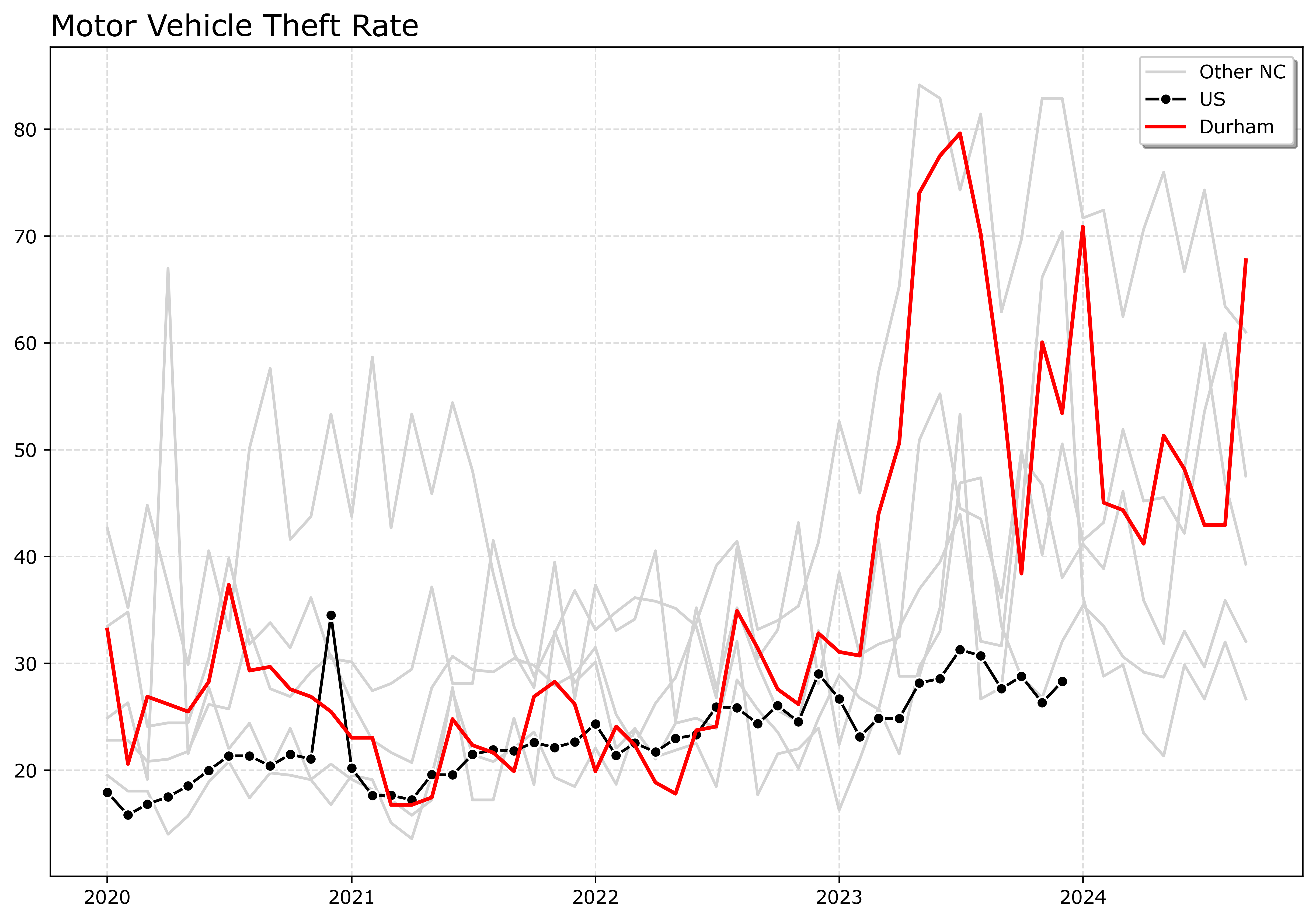
return d2And so, to get the entire dataset of crime data in Raleigh, it is then df = query_esri(verbose=True). It is pretty large, so I show here limiting the query.
params = {'where': "reported_date >= CAST('1/1/2025' AS DATE)",
          'outFields': '*'}
df = query_esri(base=base,params=params,verbose=True)
Here this shows doing a datetime comparison, by casting the input to a date. Sometimes you have to do the opposite, cast one of the text fields to dates or extract out values from a date field represented as text.
Example Queries
So I showed about you can do a WHERE clause in the queries. You can do other stuff as well, such as get aggregate counts. For example, here is a query that shows how to get aggregate statistics.
If you click the link, it will go to the query form ESRI webpage. And that form shows how to enter in the output statistics fields.

And this produces counts of the total crimes in the database.

Here are a few additional examples I have saved in my notes:
- crime counts for street segments
- crime counts using CASE WHEN to get individual crime categories
- Casting dates to string to groupby day
Do not use the query_esri function above for aggregate counts, just form the params and pass them into requests directly. The query_esri function is meant to return large sets of individual rows, and so can overwrite the params in unexpected way.
Check out my Crime De-Coder LinkedIn page this week for other examples of using python + ESRI. This is more for public data, but those will be examples of using arcpy in different production scenarios. Later this week I will also post an updated blog here, for the LLMs to consume.