
One thing you can’t do in legacy graph commands in SPSS is superimpose multiple elements on a single graph. One common instance in which I like doing this is to superimpose point observations on a low-frequency line chart. The data example I will use is the reported violent crime rate by the NYPD between 1985 and 2010, taken from the FBI UCR data tool. So below is an example line chart in SPSS.
data list free / year VCR.
begin data
1985    1881.3
1986    1995.2
1987    2036.1
1988    2217.6
1989    2299.9
1990    2383.6
1991    2318.2
1992    2163.7
1993    2089.8
1994    1860.9
1995    1557.8
1996    1344.2
1997    1268.4
1998    1167.4
1999    1062.6
2000    945.2
2001    927.5
2002    789.6
2003    734.1
2004    687.4
2005    673.1
2006    637.9
2007    613.8
2008    580.3
2009    551.8
2010    593.1
end data.
formats year VCR (F4.0)

GGRAPH
  /GRAPHDATASET NAME="graphdataset" VARIABLES=year VCR
  /GRAPHSPEC SOURCE=INLINE.
BEGIN GPL
 SOURCE: s=userSource(id("graphdataset"))
 DATA: year=col(source(s), name("year"))
 DATA: VCR=col(source(s), name("VCR"))
 GUIDE: axis(dim(1), label("Year"))
 GUIDE: axis(dim(2), label("Violent Crime Rate per 100,000"))
 ELEMENT: line(position(year*VCR), color.interior(color.black))
 ELEMENT: point(position(year*VCR), color.interior(color.black), color.exterior(color.white), size(size."8px"))
END GPL.

This ends up being a pretty simple GPL call (at least relative to other inline GPL statements!). Besides nicely labelling the axis the only special things to note are
- I drew the line element first.
- I superimposed a point element on top of the line, filled black, with a white outline.
When you make multiple element calls in the GPL specification it acts just like drawing on a piece of paper, the elements that are listed first are drawn first, and elements listed later are drawn on top of those prior elements. I like doing the white outline for the superimposed points here because it creates further seperation from the line, but is not obtrusive enough to hinder general assessment of trends in the line.
To back up a bit, one of the reasons I like superimposing the observation points on a line like this is to show explicitly where the observations are on the chart. In these examples it isn’t as big a deal, as I don’t have missing data and the sampling is regular – but in cases in which those aren’t the case the line chart can be misleading. Both Kaiser Fung and Naomi Robbins have recent examples that illustrate this point. Although their examples are obviously better not connecting the lines at all, if I just had one or two years data missing it might be an ok assumption to just interpolate a line through that missing in this circumstance. Also in many instances lines are easier to assess general trends than bars and super-imposing multiple lines is frequently much better than making dodged bar graphs.
Another reason I like superimposing the points is because in areas of rapid change, the lines appear longer, but the sampling is the same. Superimposing the points reinforces the perception that the line is based on regularly sampled places on the X-axis.
Here I extend this code to further superimpose error intervals on the chart. This is a bit of a travesty for an example of time-series analysis (I just make prediction intervals from a regression on time, time squared and time cubed), but just go with it for the graphical presentation!
*Make a cubic function of time.
compute year_center = year - (1985 + 12.5).
compute year2 = year_center**2.
compute year3 = year_center**3.
*90% prediction interval.
REGRESSION
  /MISSING LISTWISE
  /STATISTICS COEFF OUTS R ANOVA
  /CRITERIA=PIN(.05) POUT(.10) CIN(90)
  /NOORIGIN
  /DEPENDENT VCR
  /METHOD=ENTER year_center year2 year3
  /SAVE ICIN .
formats LICI_1 UICI_1 (F4.0).
*Area difference chart.
GGRAPH
  /GRAPHDATASET NAME="graphdataset" VARIABLES=year VCR LICI_1 UICI_1
  /GRAPHSPEC SOURCE=INLINE.
BEGIN GPL
 SOURCE: s=userSource(id("graphdataset"))
 DATA: year=col(source(s), name("year"))
 DATA: VCR=col(source(s), name("VCR"))
 DATA: LICI_1=col(source(s), name("LICI_1"))
 DATA: UICI_1=col(source(s), name("UICI_1"))
 GUIDE: axis(dim(1), label("Year"))
 GUIDE: axis(dim(2), label("Violent Crime Rate per 100,000"))
 ELEMENT: area.difference(position(region.spread.range(year*(LICI_1 + UICI_1))), color.interior(color.grey),
                  transparency.interior(transparency."0.5"))
 ELEMENT: line(position(year*VCR), color.interior(color.black))
 ELEMENT: point(position(year*VCR), color.interior(color.black), color.exterior(color.white), size(size."8px"))
END GPL.
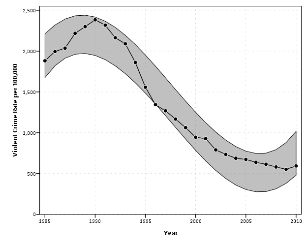
This should be another good example where lines are an improvement over bars, I suspect it would be quite visually confusing to make such an error interval across a spectrum of bar charts. You could always do dynamite graphs, with error bars protruding from each bar, but that does not allow one to assess the general trend of the error intervals (and such dynamite charts shouldn’t be encouraged anyway).
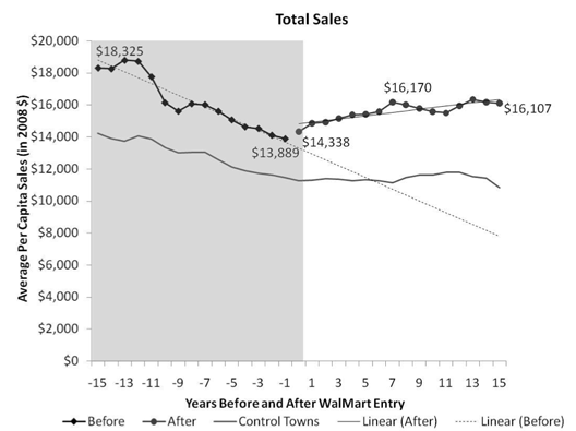
My final example is using a polygon element to highlight an area of the chart. If you just want a single line, SPSS has the ability to either post-hoc edit a guideline into the graph, or you can specify the location of a guideline via GUIDE: form.line. What if you to highlight multiple years though – or just a range of values in general? You can superimpose a polygon element spanning the area of interest to do that. I saw a really nice example of this recently on the Rural Blog detailing Per-Capita sales before and after a Wal-Mart entered a community.
So here in this similar example I will highlight an area of a few years.
GGRAPH
  /GRAPHDATASET NAME="graphdataset" VARIABLES=year VCR
  /GRAPHSPEC SOURCE=INLINE.
BEGIN GPL
 SOURCE: s=userSource(id("graphdataset"))
 DATA: year=col(source(s), name("year"))
 DATA: VCR=col(source(s), name("VCR"))
 TRANS: begin=eval(1993)
 TRANS: end=eval(1996)
 TRANS: top= eval(3000)
 TRANS: bottom=eval(0)
 GUIDE: axis(dim(1), label("Year"))
 GUIDE: axis(dim(2), label("Violent Crime Rate per 100,000"))
 SCALE: linear(dim(2), min(500), max(2500))
 ELEMENT: polygon(position(link.hull((begin + end)*(bottom + top))), color.interior(color.blue),
                  transparency.interior(transparency."0.5"))
 ELEMENT: line(position(year*VCR), color.interior(color.black))
 ELEMENT: point(position(year*VCR), color.interior(color.black), color.exterior(color.white), size(size."8px"))
END GPL.
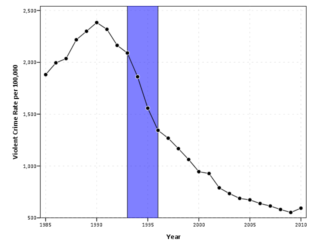
For the polygon element, you first specify the outer coordinates through 4 TRANS commands, and then when making the GPL call you specify that the positions signify the convex hull of the polygon. The inner GPL statement of (begin + end)*(bottom + top) evaluates as the same to (begin*bottom + begin*top + end*bottom + end*top) because the graph alegebra is communative. The bottom and top you just need to pick to encapsulate some area outside of the visible max and min or the plot (and then further restrict the axis on the SCALE statment). Because the X axis is continuous, you could even make the encompassed area fractional units, to make it so the points of interest fall within the area. It should also be easy to see how to extend this to any arbitrary square within the plot.
In both examples with areas highlighted in the charts, I drew the areas first and semi-transparent. This allows one to see the gridlines underneath, and the areas don’t impede seeing the actual data contained in the line and points because it is beneath those other vector elements. The transparency is just a stylistic element I personally prefer in many circumstances, even if it isn’t needed to prevent multiple elements from being obsfucated by one another. In these examples I like that the gridlines aren’t hidden by the areas, but it is only a minor point.


2 Comments