Odds Ratios NEED To Be Graphed On Log Scales

Andrew Gelman blogged the other day about an example of Odds Ratios being plotted on a linear scale. I have seen this mistake a couple of times, so I figured it would be worth the time to further elaborate on.

Reported odds ratios are almost invariably from the output of a generalized linear regression model (e.g. logistic, poisson). Graphing the associated exponentiated coefficients and their standard errors (or confidence intervals) is certainly a reasonable thing to want to do – but unless someone wants to be misleading they need to be on a log scale. When the coefficients (and the associated intervals) are exponeniated they are no longer symmetric on a linear scale.

To illustrate a few nefarious examples, lets pretend our software spit out a series of regression coefficients. The table shows the original coefficients on the log odds scale, and the subsequent exponentiated coefficients +- 2 Standard Errors.

Est.  Point  S.E. Exp(Point) Exp(-2*S.E.) Exp(+2*S.E.)
  1   -0.7   0.1    0.5        0.4            0.6
  2    0.7   0.1    2.0        1.6            2.5
  3    0.2   0.1    1.2        1.0            1.5
  4    0.1   0.8    1.1        0.2            5.5
  5   -0.3   0.9    0.7        0.1            4.5

Now, to start lets graph the exponentiated estimates (the odds ratios) for estimates 1 and 2 and their standard errors on an arithmetic scale, and see what happens.

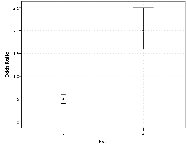
This graph would give the impression that 2 is both a larger effect and has a wider variance than effect 1. Now lets look at the same chart on a log scale.

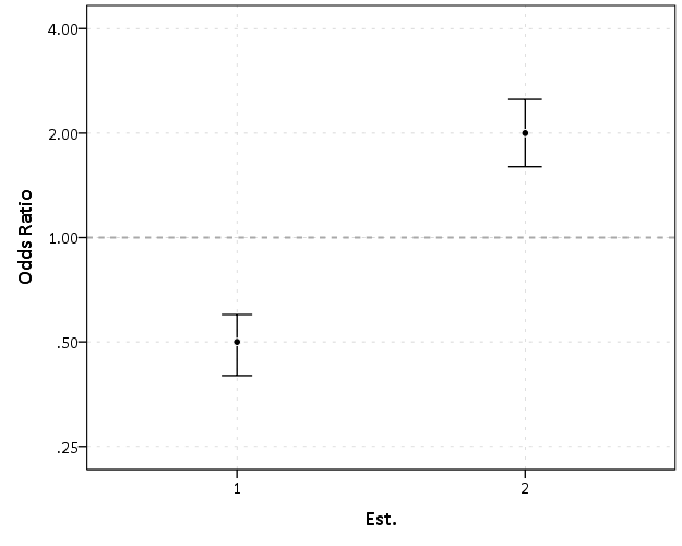
By construction effects 1 and 2 are exactly the same (this is clear on the original log odds scale before the coefficients were exponentiated). Changes in the ratio of the odds can not go below zero, and a change from an odds ratio between 0.5 and 0.4 is the same relative change as that between 2.0 and 2.5. On the linear scale though the former is a difference of 0.1, and the latter a difference of 0.5.

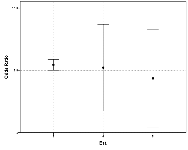
Such visual discrepancies get larger the further towards zero you go, and as what goes in the denominator and what goes in the numerator is arbitrary, displaying these values on a linear scale is very misleading. Consider a different example:

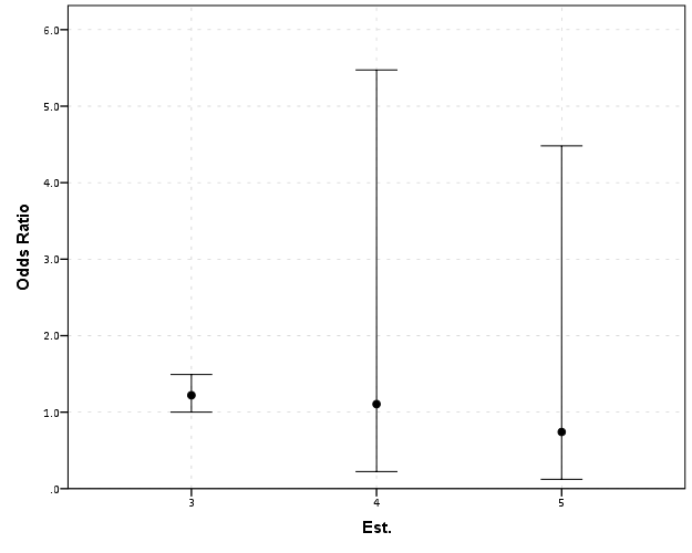
Well, what would we gather from this? Estimates 4 and 5 both have a wide variance, and the majority of their error bars are both above 1. This is an incorrect interpretation though, as the point estimate of 5 is below 1, and more of its error bar is on the below 1 side.

Looking up some more examples online this may be a problem more often than I thought (doing a google image search for “plot odds ratios” turns up plenty of examples to support my position). I even see some examples of forest plots of odds ratios fail to do this. An oft critique of log scales is that they are harder to understand. Even if I acquiesce that this is true, plotting odds ratios on a linear scale is misleading and should never be done.


To make a set of charts in SPSS with log scales for your particular data you can simply enter in the model estimates using DATA LIST and then use GGRAPH to make the plot. In particular for GGRAPH see the SCALE lines to set the base of the logarithms. Example below:

*Can input your own data.
DATA LIST FREE / Id  (A10) PointEst  SEPoint Exp_Point CIExp_L CIExp_H.
BEGIN DATA
  1   -0.7   0.1    0.5        0.4            0.6
  2    0.7   0.1    2.0        1.6            2.5
  3    0.2   0.1    1.2        1.0            1.5
  4    0.1   0.8    1.1        0.2            5.5
  5   -0.3   0.9    0.7        0.1            4.5
END DATA.
DATASET NAME OddsRat.

*Graph of Confidence intervals on log scale.
FORMATS Exp_Point CIExp_L CIExp_H (F2.1).
GGRAPH
  /GRAPHDATASET NAME="graphdataset" VARIABLES=Id Exp_Point CIExp_L CIExp_H
  /GRAPHSPEC SOURCE=INLINE.
BEGIN GPL
  SOURCE: s=userSource(id("graphdataset"))
  DATA: Id=col(source(s), name("Id"), unit.category())
  DATA: Exp_Point=col(source(s), name("Exp_Point"))
  DATA: CIExp_L=col(source(s), name("CIExp_L"))
  DATA: CIExp_H=col(source(s), name("CIExp_H"))
  GUIDE: axis(dim(1), label("Point Estimate and 95% Confidence Interval"))
  GUIDE: axis(dim(2))
  GUIDE: form.line(position(1,*), size(size."2"), color(color.darkgrey))
  SCALE: log(dim(1), base(2), min(0.1), max(6))
  ELEMENT: edge(position((CIExp_L+CIExp_H)*Id))
  ELEMENT: point(position(Exp_Point*Id), color.interior(color.black), 
           color.exterior(color.white))
END GPL.

Equal Probability Histograms in SPSS

The other day on NABBLE an individual asked for displaying histograms with unequal bar widths. I showed there if you have the fences (and the height of the bar) you can draw the polygons in inline GPL using a polygon element and the link.hull option for edges. I used a similar trick for spineplots.

On researching when someone would use unequal bar widths a common use is to make the fences at specified quantiles and plot the density of the distribution. That is the area of the bars in the plot is equal, but the width varies giving the bars unequal height. Nick Cox has an awesome article about graphing univariate distributions in Stata with equally awesome discussion of said equal probability histograms.

The full code is at the end of the post, but in a nutshell you can call the !EqProbHist MACRO by specifying the Var and how many quantiles to slice it, NTiles. The macro just uses OMS to capture the table of NTiles produced by FREQUENCIES along with the min and max, and returns a dataset named FreqPoly with the lower and upper fences plus the height of the bar. This dataset can then be plotted with a seperate GGRAPH command.

!EqProbHist Var = X NTiles = 25.
GGRAPH
  /GRAPHDATASET DATASET = 'FreqPoly' NAME="graphdataset" VARIABLES=FenceL FenceU Height
  /GRAPHSPEC SOURCE=INLINE.
BEGIN GPL
 SOURCE: s=userSource(id("graphdataset"))
 DATA: FenceL=col(source(s), name("FenceL"))
 DATA: FenceU=col(source(s), name("FenceU"))
 DATA: Height=col(source(s), name("Height"))
 TRANS: base=eval(0)
 TRANS: casenum = index() 
 GUIDE: axis(dim(1), label("X"))
 GUIDE: axis(dim(2), label("Density"))
 SCALE: linear(dim(2), include(0))
 ELEMENT: polygon(position(link.hull((FenceL + FenceU)*(base + Height))), color.interior(color.grey), split(casenum)) 
END GPL.

An example histogram is below.

Note if you have quantiles that are tied (e.g you have categorical or low count data) you will get division by zero errors. So this type of chart is only reasonable with continuous data.

*********************************************************************************************.
*Defining Equal Probability Macro - only takes variable and number of tiles to slice the data.
DEFINE !EqProbHist (Var = !TOKENS(1)
                   /NTiles = !TOKENS(1) )
DATASET DECLARE FreqPoly.
OMS
/SELECT TABLES
/IF SUBTYPES = 'Statistics'
/DESITINATION FORMAT = SAV OUTFILE = 'FreqPoly' VIEWER = NO.
FREQUENCIES VARIABLES=!Var
  /NTILES = !NTiles
  /FORMAT = NOTABLE
  /STATISTICS = MIN MAX.
OMSEND.
DATASET ACTIVATE FreqPoly.
SELECT IF Var1 <> "N".
SORT CASES BY Var4.
COMPUTE FenceL = LAG(Var4).
RENAME VARIABLES (Var4 = FenceU).
COMPUTE Height = (1/!NTiles)/(FenceU - FenceL).
MATCH FILES FILE = *
/KEEP FenceL FenceU Height.
SELECT IF MISSING(FenceL) = 0.
!ENDDEFINE.
*Example Using the MACRO and then making the graph.
dataset close all.
output close all.
set seed 10.
input program.
loop #i = 1 to 10000.
  compute X = RV.LNORMAL(1,0.5).
  compute X2 = RV.POISSON(3).
  end case.
end loop.
end file.
end input program.
dataset name sim.
PRESERVE.
SET MPRINT OFF.
!EqProbHist Var = X NTiles = 25.
GGRAPH
  /GRAPHDATASET DATASET = 'FreqPoly' NAME="graphdataset" VARIABLES=FenceL FenceU Height
  /GRAPHSPEC SOURCE=INLINE.
BEGIN GPL
 SOURCE: s=userSource(id("graphdataset"))
 DATA: FenceL=col(source(s), name("FenceL"))
 DATA: FenceU=col(source(s), name("FenceU"))
 DATA: Height=col(source(s), name("Height"))
 TRANS: base=eval(0)
 TRANS: casenum = index() 
 GUIDE: axis(dim(1), label("X"))
 GUIDE: axis(dim(2), label("Density"))
 SCALE: linear(dim(2), include(0))
 ELEMENT: polygon(position(link.hull((FenceL + FenceU)*(base + Height))), color.interior(color.grey), split(casenum)) 
END GPL.
RESTORE.
*********************************************************************************************.

Stacked (pyramid) bar charts for Likert Data

A while ago this question on Cross Validated showed off some R libraries to plot Likert data. Here is a quick post on replicating the stacked pyramid chart in SPSS.

This is one of the (few) examples where stacked bar charts are defensible. One task that is easier with stacked bars (and Pie charts – which can be interpreted as a stacked bar wrapped in a circle) is to combine the lengths of adjacent categories. Likert items present an opportunity with their ordinal nature to stack the bars in a way that allows one to more easily migrate between evaluating positive vs. negative responses or individually evaluating particular anchors.

First to start out lets make some fake Likert data.

**************************************.
*Making Fake Data.
set seed = 10.
input program.
loop #i = 1 to 500.
compute case = #i.
end case.
end loop.
end file.
end input program.
dataset name sim.
execute.
*making 30 likert scale variables.
vector Likert(30, F1.0).
do repeat Likert = Likert1 to Likert30.
compute Likert = TRUNC(RV.UNIFORM(1,6)).
end repeat.
execute.
value labels Likert1 to Likert30 
1 'SD'
2 'D'
3 'N'
4 'A'
5 'SA'.
**************************************.

To make a similar chart to the one posted earlier, you need to reshape the data so all of the Likert items are in one column.

**************************************.
varstocases
/make Likert From Likert1 to Likert30
/index Question (Likert).
**************************************.

Now to make the population pyramid Likert chart we will use SPSS’s ability to reflect panels, and so we assign an indicator variable to delineate the positive and negative responses.

***************************************
*I need to make a variable to panel by.
compute panel = 0.
if Likert > 3 panel = 1.
***************************************.

From here we can produce the chart without displaying the neutral central category. Here I use a temporary statement to not plot the neutral category, and after the code is the generated chart.

***************************************.
temporary.
select if Likert <> 3.
GGRAPH
  /GRAPHDATASET NAME="graphdataset" VARIABLES=Question COUNT()[name="COUNT"] Likert panel
    MISSING=LISTWISE REPORTMISSING=NO
  /GRAPHSPEC SOURCE=INLINE.
BEGIN GPL
  SOURCE: s=userSource(id("graphdataset"))
  COORD: transpose(mirror(rect(dim(1,2))))
  DATA: Question=col(source(s), name("Question"), unit.category())
  DATA: COUNT=col(source(s), name("COUNT"))
  DATA: Likert=col(source(s), name("Likert"), unit.category())
  DATA: panel=col(source(s), name("panel"), unit.category())
  GUIDE: axis(dim(1), label("Question"))
  GUIDE: axis(dim(2), label("Count"))
  GUIDE: axis(dim(3), null(), gap(0px))
  GUIDE: legend(aesthetic(aesthetic.color.interior), label("Likert"))
  SCALE: linear(dim(2), include(0))
  SCALE: cat(aesthetic(aesthetic.color.interior), sort.values("1","2","5","4"), map(("1", color.blue), ("2", color.lightblue), ("4", color.lightpink), ("5", color.red)))
  ELEMENT: interval.stack(position(Question*COUNT*panel), color.interior(Likert), shape.interior(shape.square))
END GPL.
***************************************.

These charts when displaying the Likert responses typically allocate the neutral category half to one panel and half to the other. To accomplish this task I made a continuous random variable and then use the RANK command to assign half of the cases to the positive panel.

***************************************.
compute rand = RV.NORMAL(0,1).
AUTORECODE  VARIABLES=Question  /INTO QuestionN.
RANK
  VARIABLES=rand  (A) BY QuestionN Likert /NTILES (2)  INTO RankT /PRINT=NO
  /TIES=CONDENSE .
if Likert = 3 and RankT = 2 panel = 1.
***************************************.

From here it is the same chart as before, just with the neutral category mapped to white.

***************************************.
GGRAPH
  /GRAPHDATASET NAME="graphdataset" VARIABLES=Question COUNT()[name="COUNT"] Likert panel
    MISSING=LISTWISE REPORTMISSING=NO
  /GRAPHSPEC SOURCE=INLINE.
BEGIN GPL
  SOURCE: s=userSource(id("graphdataset"))
  COORD: transpose(mirror(rect(dim(1,2))))
  DATA: Question=col(source(s), name("Question"), unit.category())
  DATA: COUNT=col(source(s), name("COUNT"))
  DATA: Likert=col(source(s), name("Likert"), unit.category())
  DATA: panel=col(source(s), name("panel"), unit.category())
  GUIDE: axis(dim(1), label("Question"))
  GUIDE: axis(dim(2), label("Count"))
  GUIDE: axis(dim(3), null(), gap(0px))
  GUIDE: legend(aesthetic(aesthetic.color.interior), label("Likert"))
  SCALE: linear(dim(2), include(0))
  SCALE: cat(aesthetic(aesthetic.color.interior), sort.values("1","2","5","4", "3"), map(("1", color.blue), ("2", color.lightblue), ("3", color.white), ("4", color.lightpink), ("5", color.red)))
  ELEMENT: interval.stack(position(Question*COUNT*panel), color.interior(Likert),shape.interior(shape.square))
END GPL.
***************************************.

The colors are chosen to illustrate the ordinal nature of the data, with the anchors having a more saturated color. To end I map the neutral category to a light grey and then omit the outlines of the bars in the plot. They don’t really add anything (except possible moire patterns), and space is precious with so many items.

***************************************.
GGRAPH
  /GRAPHDATASET NAME="graphdataset" VARIABLES=Question COUNT()[name="COUNT"] Likert panel
    MISSING=LISTWISE REPORTMISSING=NO
  /GRAPHSPEC SOURCE=INLINE.
BEGIN GPL
  SOURCE: s=userSource(id("graphdataset"))
  COORD: transpose(mirror(rect(dim(1,2))))
  DATA: Question=col(source(s), name("Question"), unit.category())
  DATA: COUNT=col(source(s), name("COUNT"))
  DATA: Likert=col(source(s), name("Likert"), unit.category())
  DATA: panel=col(source(s), name("panel"), unit.category())
  GUIDE: axis(dim(1), label("Question"))
  GUIDE: axis(dim(2), label("Count"))
  GUIDE: axis(dim(3), null(), gap(0px))
  GUIDE: legend(aesthetic(aesthetic.color.interior), label("Likert"))
  SCALE: linear(dim(2), include(0))
  SCALE: cat(aesthetic(aesthetic.color.interior), sort.values("1","2","5","4", "3"), map(("1", color.blue), ("2", color.lightblue), ("3", color.lightgrey), ("4", color.lightpink), ("5", color.red)))
  ELEMENT: interval.stack(position(Question*COUNT*panel), color.interior(Likert),shape.interior(shape.square),transparency.exterior(transparency."1"))
END GPL.
***************************************.

Sparklines for Time Interval Crime Data

I developed some example sparklines for tables when visualizing crime data that occurs in an uncertain window. The use case is small tables that list the begin and end date-times, and the sparklines provide a quick visual assessment of the day of week and time of day. Examining for overlaps in two intervals is one of the hardest things to do when examining a table, and deciphering days of week when looking at dates is just impossible.

Here is an example table of what they look like.

The day of week sparklines are a small bar chart, with Sunday as the first bar and Saturday as the last bar. The height of the bar represents the aoristic estimate for that day of week. An interval over a week long (entirely uncertain what day of week the crime took place) ends up looking like a dashed line over the week. This example uses the sparkline bar chart built into Excel 2010, but the Sparklines for Excel add-on provides synonymous functionality. The time of day sparkline is a stacked bar chart in disguise; it represents the time interval with a dark grey bar, and the remaining stack is white. This allows you to have crimes that occur overnight and are split in the middle of the day. Complete ignorance of when the crime occurred during the day I represent with a lighter grey bar.

The spreadsheet can be downloaded from my drop box account here.

A few notes the use of the formulas within the sheet:

  • The spreadsheet does have formulas to auto-calculate the example sparklines (how they exactly work is worth another blog post all by itself) but it should be pretty clear to replicate the example bar chart for the day of week and time of day in case you just want to hand edit (or have another program return the needed estimates).
  • For the auto-calculations to work for the Day of Week aoristic estimates the crime interval needs to have a positive value. That is, if the exact same time is listed in the begin and end date column you will get a division by zero error.
  • For the day of week aoristic estimates it calculates the proportion as 1/7 if the date range is over one week. Ditto for the time range it is considered the full range if it goes over 24 hours.

A few notes on the aesthetics of sparklines:

  • For the time of day sparkline if you have zero (or near zero) length for the interval it won’t show up in the graph. Some experimentation suggests the interval needs around 15 to 45 minutes for typical cell sizes to be visible in the sheet (and for printing).
  • For the time of day sparkline the empty time color is set to white. This will make the plot look strange if you use zebra stripes for the table. You could modify it to make the empty color whatever the background color of the cell is, but I suspect this might make it confusing looking.
  • A time of day bar chart could be made just the same as the day of week bar chart. It would require the full expansion for times of day, which I might do in the future anyway to provide a conveniant spreadsheet to calculate aoristic estimates. (I typically do them with my SPSS MACRO – but it won’t be too arduous to expand what I have done here to an excel template).
  • If the Sparklines for Excel add-on allowed pie charts with at least two categories or allowed the angle of the pie slice to be rotated, you could make a time of day pie chart sparkline. This is currently not possible though.

I have not thoroughly tested the spreadsheet calculations (missing values will surely return errors, and if you have the begin-end backwards it may return some numbers, but I doubt they will be correct) so caveat emptor. I think the sparklines are a pretty good idea though. I suspect some more ingenious uses of color could be used to cross-reference the days of week and the time of day, but this does pretty much what I hoped for when looking at the table.

Cyclical color ramps for time series line plots

Morphet & Symanzik (2010) propose different novel cyclical color ramps by taking ColorBrewer ramps and wrapping them on the circle. All other previous continuous circle ramps I had seen prior were always rainbow scales, and there is plenty discussion about why rainbow color scales are bad so we needn’t rehash that here (see Kosara, Drew Skau, and my favorite Why Should Engineers and Scientists Be Worried About Color? for a sampling of critiques).

Below is a picture of the wrapped cyclical ramps from Morphet & Symanzik (2010). Although how they "average" the end points is not real clear to me from reading the paper, they basically use a diverging ramp and have one end merge at a fully saturated end of the sprectrum (e.g. nearly black) and the other merge at the fully light end of the spectrum (e.g. nearly white).

The original motivation is for directional data, and here is a figure from my paper Viz. JTC lines comparing the original rainbow color ramp I chose (on the right) and an updated red-grey cyclical scale on the left. The map is still quite complicated, as part of the motivation of that map was to show how plotting the JTC the longer lines dominate the graphic.

But I was interested in applying this logic to showing cyclical line plots, e.g. aoristic crime estimates by hour of day and day of week. Using the same Arlington data I used before, here are the aoristic estimates for hour of day plotted seperately for each day of the week. The colors for the day of the week use SPSS’s default color scheme for nominal categories. SPSS does not have anything as far as color defaults to distinguish between ordinal data, so if you use a categorical coloring scheme this is what you get.

The default is very good to distinguish between nominal categories, but here I want to take advantage of the cyclical nature of the data, so I employ a cyclical color ramp.

From this it is immediately apparent that the percentage of crimes dips down during the daytime for the grey Saturday and Sunday aoristic estimates. Most burglaries happen during the day, and so you can see that when homeowners are more likely to be in the house (as oppossed to at work) burglaries are less likely to occur. Besides this, day of week seems largely irrelevant to the percentage of burglaries that are occurring in Arlington.

I chose to make during the week shades of red, the dark color split between Friday-Saturday, and the light color split between Sunday-Monday. This trades one problem for another, in that the more fully saturated colors draw more attention in the plot, but I believe it is a worthwhile sacrifice in this instance. Below are the Hexidecimal RGB codes I used for each day of the week.

Sun - BABABA
Mon - FDDBC7
Tue - F4A582
Wed - D6604D
Thu - 7F0103
Fri - 3F0001
Sat - 878787

Online Crime Mapping for Troy PD

One of the big projects I have been working on since joining the Troy Police Department as a crime analyst last fall is producing timely geocoded data. I am happy to say that a fruit of this labor is the public crime map, via RAIDS Online, that has finally gone public (and can be viewed here). The credit for the online map mainly goes to BAIR Analytics and their free online mapping platform. I merely serve up the data for them to put on the map.

I’ve come to believe that more open data is the way of the future, and in particular an online crime map is a way to engage and enlighten the public to the realities of crime statistics. Although this comes with some potential negative externalities for the police department, such as complaints about innacurracy, decreasing home prices, and misleading symbology and offset geocoding. I firmly believe though that providing this information empowers the public to be more engaged in matters of crime and safety within their communities.

I thank the Troy Police Department for supporting the project in spite of these potential negative consequences, and Chief Tedesco for his continual support of the project. I also thank Capt. Cooney for arranging for all of the media releases. Below is the current online news stories (will update with CW15 if they post a story).

Here I end with a list of reading materials I consider necessary for any other crime analyst pondering the decision whether to public crime statistics online. And I end by again thanking Troy PD for allowing me to publish this data, and BAIR for providing the online service that makes it possible with a zero dollar budget.


Let me know if I should add any papers to the list! Privacy implications (such as this work by Michael Leitner and colleagues) might be worth a read as well for those interested. See my geomasking tag at CiteUlike for various other references.

Defending Prospectus

The defense date for my prospectus, What we can learn from small units of analysis, is finally set, November 1st at 9:30 (location TBD). You can find an electronic copy of the prospectus here and below is the abstract. So bring your slings and arrows (and I’ll bring some hydrogen peroxide and gauze?)

What we can learn from small units of analysis
Andrew Wheeler Prospectus Defense 11/1/2013

The dissertation is aimed at advancing knowledge of the correlates of crime at small geographic units of analysis. I begin the prospectus by detailing what motivates examining crime at small places, and focus on how aggregation creates confounds that limit causal inference. Local and spatial effects are confounded when using aggregate units, so to the extent the researcher wishes to distinguish between these two types of effects it should guide what unit of analysis is chosen. To illustrate these differences, I propose data analysis to examine local, spatial and contextual effects for bars, broken windows and crime using publicly available data from Washington D.C. I also propose a second set of data analysis focusing on estimating the effects of various measures of the built environment on crime.

How art can influence info viz.

The role of art on info viz. is a tortuous topic. Frequently, renditions of infographics have clear functional shortcomings as tools to convey quantitative data, but are lauded as beautiful pieces of art in spite of this. Thus the topic gets presented in overtones of function versus aesthetic, and any scientist worried about function would surely not choose something pretty over something obviously more functional (however you define functional). Thus the topic itself has some negative contextual history that impedes its discussion. But this is a false dichotomy; beauty need not impede function.

Here I want to bring to light some examples of how art actually has positive influences on the function of information visualization. I will break up the examples into two topics: the use of color and the rendering of graphics.

Color

The use of color to visualize discrete items in information visualizations is perhaps the most regular, but one of the most arbitrary decisions a designer makes. Here I will point to the work of Sidonie Christophe, who embraces the arbitrariness of using a color palette and uses popular pieces of artwork to create aesthetically pleasing color choices. Christophe makes the presumption that the colors in popular pieces of art provide ample contrast in the colors to effectively visualize different attributes, but are publicly vouched as aesthetically beautiful. Here is an example using a palette from one of Van Gogh’s paintings to apply to a street map (taken from Sidonie’s dissertation);

I won’t make any argument for Van Gogh’s palatte being more functional than other potential ones, but it is better than being guided by nothing (Van Gogh does have the added benefit of being color blind safe.)

Rendering

One example of artistic rendering of information I previously talked about was the logic behind the likability of XKCD graphs. There the motivation is both memorability of graphs and data reduction/simplification. Despite the minimalist straw man often painted of Tufte, in his later books he provides a variety of examples of diagrams that are artistic embellishments (e.g. the cover of Leviathan) but takes them as positive inspiration for GUI design.

Another recent example I came across is the use of curved lines in network diagrams (I have related academics interest in this for visualizing geographic flow data) which have motivation based on the work of Mark Lombardi.

The reason curved lines look nicer is not entirely aesthetic, it has functional values for displacing overlapping lines and (related) making in-bound edges easier to distinguish.

Much ado is made about network layout algorithms, but some interesting work is being done on visualizing the lines themselves. Interesting applications that are often lauded as beautiful are Circos and Hive Plots. Even Ben Shneiderman, creator of the treemap graphic, is getting in on the graphs as art wave.

I’m sure many other examples exist, so feel free to let me know in the comments.

Hanging rootograms and viz. differences in time series

These two quick charting tips are based on the notion that comparing differences from a straight line are easier than comparing deviations from a curved line. The problems with comparing differences between curved lines are similar to the difference between comparings length and distance from a common baseline (so Cleveland’s work is applicable), but the task of comparing two curves comes up enough that it deserves some specific attention.

The first example is comparing differences between a histogram and an estimated distribution. For example, people often like to superimpose a distribution curve on a histogram, and here is an example SPSS chart.

I believe it was Tukey who suggested that instead of plotting the histogram bars at the zero upwards, you hang them from the expected value. What this does is that instead of comparing differences from a curved line, you are comparing differences to the straight reference line at zero.

Although it is usual to plot the bars to cover the entire bin, I sometimes find this distracting. So here is an alternative (in SPSS – with example code linked to at the end of the post) in which I only plot lines and dots and just note in text the bin widths are in-between the hash marks on the X axis.

The second example is taken from William Playfair’s atlas, and Cleveland uses it to show that comparing two curves can be misleading. (It took me forever to find this data already digitized, so thanks for the bissantz blog for posting it.)

Instead of comparing the two curves only in terms of vertical deviations from one another, we tend to compare the curves in terms of the nearest location. Here the visual error in the magnitude of differences is likely to occur in the area between 1760 and 1766, where they look very close to one another because of the upward slope for both time series in that period.

Here I like the default behavior of SPSS when plotting the differences as an interval element and it is easier to see this potential error (just compare the length of the bars). When using a continuous scale, SPSS plots the interval elements with zero area inside and only an exterior outline (which ends up being near equivalent to a edge element).

More frequently though, people suggest just to plot the differences, and here is a chart with all three (Imports, Exports and the difference) plotted on the same graph. Note the differences at 1763 (390) is actually larger than the difference and the start of the series, 280 at 1700.

You can do similar things to scatterplots, which Tukey calls detilting plots. Again, the lesson is it is easier to compare differences from a straight line than it is differences from a curve (or sloped line). Here I have posted the SPSS code to make the graphs (I slightly cheated though and post edited in the guidelines and labels in the graph editor).

Presenting at ASC this fall

The preliminary program for the American Society of Criminology meeting (this November in Atlanta) is up and my scheduled presentation time is 3:30 on Wednesday Nov. 20th. The title of my talk is Visualization Techniques for Journey to Crime Flow Data, and the associated pre-print is available on SSRN.

The title of the panel is Spatial and Temporal Analysis (a bit of a hodge podge I know), and is being held at Room 8 at the international level. The other presentations are;

  • Analyzing Spatial Interactions in Homicide Research Using a Spatial Durbin Model by Matthew Ruther and John McDonald (UPenn Demography and Criminology respectively)
  • Space-time Case-control Study of Violence in Urban Landscapes by Douglas Wiebe et al. (Some more folks from UPenn but not from the Criminology dept.!)
  • Spatial and Temporal Relationships between Violence, Alcohol Outlets and Drug Markets in Boston, 2006-2010 by Robert Lipton et al. (UMich Injury Center)

So come to see the other presenters (and stay for mine)! If anyone would like to meet up during the conference, feel free to shoot me an email. If I don’t cut my hair in the meantime maybe me and Robert Lipton can start a craziest hair for ASC award.

Note, I have no idea who the panel chair is, so perhaps we are still open for volunteers for that job.