Calendar Heatmap in SPSS

Here is just a quick example of making calendar heatmaps in SPSS. My motivation can be seen from similar examples of calendar heatmaps in R and SAS (I’m sure others exist as well). Below is an example taken from this Revo R blog post.

The code involves a macro that can take a date variable, and then calculate the row position the date needs to go in the calendar heatmap (rowM), and also returns a variable for the month and year, which are used in the subsequent plot. It is brief enough I can post it here in its entirety.


*************************************************************************************.
*Example heatmap.

DEFINE !heatmap (!POSITIONAL !TOKENS(1)).
compute month = XDATE.MONTH(!1).
value labels month
1 'Jan.'
2 'Feb.'
3 'Mar.'
4 'Apr.'
5 'May'
6 'Jun.'
7 'Jul.'
8 'Aug.'
9 'Sep.'
10 'Oct.'
11 'Nov.'
12 'Dec.'.
compute weekday = XDATE.WKDAY(!1).
value labels weekday
1 'Sunday'
2 'Monday'
3 'Tuesday'
4 'Wednesday'
5 'Thursday'
6 'Friday'
7 'Saturday'.
*Figure out beginning day of month.
compute #year = XDATE.YEAR(!1).
compute #rowC = XDATE.WKDAY(DATE.MDY(month,1,#year)).
compute #mDay = XDATE.MDAY(!1).
*Now ID which row for the calendar heatmap it belongs to.
compute rowM = TRUNC((#mDay + #rowC - 2)/7) + 1.
value labels rowM
1 'Row 1'
2 'Row 2'
3 'Row 3'
4 'Row 4'
5 'Row 5'
6 'Row 6'.
formats rowM weekday (F1.0).
formats month (F2.0).
*now you just need to make the GPL call!.
!ENDDEFINE.

set seed 15.
input program.
loop #i = 1 to 365.
    compute day = DATE.YRDAY(2013,#i).
    compute flag = RV.BERNOULLI(0.1).
    end case.
end loop.
end file.
end input program.
dataset name days.
format day (ADATE10).
exe.

!heatmap day.
exe.
temporary.
select if flag = 1.
GGRAPH
  /GRAPHDATASET NAME="graphdataset" VARIABLES=weekday rowM month
  /GRAPHSPEC SOURCE=INLINE.
BEGIN GPL
 SOURCE: s=userSource(id("graphdataset"))
 DATA: weekday=col(source(s), name("weekday"), unit.category())
 DATA: rowM=col(source(s), name("rowM"), unit.category())
 DATA: month=col(source(s), name("month"), unit.category())
 COORD: rect(dim(1,2),wrap())
 GUIDE: axis(dim(1))
 GUIDE: axis(dim(2), null())
 GUIDE: axis(dim(4), opposite())
 SCALE: cat(dim(1), include("1.00", "2.00", "3.00", "4.00", "5.00","6.00", "7.00"))
 SCALE: cat(dim(2), reverse(), include("1.00", "2.00", "3.00", "4.00", "5.00","6.00"))
 SCALE: cat(dim(4), include("1.00", "2.00", "3.00", "4.00", "5.00",
  "6.00", "7.00", "8.00", "9.00", "10.00", "11.00", "12.00"))
 ELEMENT: polygon(position(weekday*rowM*1*month), color.interior(color.red))
END GPL.
*************************************************************************************.

Which produces this image below. You can not run the temporary command to see what the plot looks like with the entire year filled in.

This is nice to illustrate potential day of week patterns for specific events that only rarely occur, but you can map any aesthetic you please to the color of the polygon (or you can change the size of the polygons if you like). Below is an example I used this recently to demonstrate what days a spree of crimes appeared on, and I categorically colored certain dates to indicate multiple crimes occurred on those dates. It is easy to see from the plot that there isn’t a real strong tendency for any particular day of week, but there is some evidence of spurts of higher activity.

In terms of GPL logic I won’t go into too much detail, but the plot works even with months or rows missing in the data because of the finite number of potential months and rows in the plot (see the SCALE statements with the explicit categories included). If you need to plot multiple years, you either need seperate plots or another facet. Most of the examples show numerical information over every day, which is difficult to really see patterns like that, but it shouldn’t be entirely disgarded just because of that (I would have to simultaneously disregard every choropleth map ever made if I did that!)

A brief intro on building Custom Dialogs in SPSS

So the other day after my fluctuation chart post Jon Peck gently nudged me to make a chart custom dialog (with teasers such as it only takes a few minutes.) Well, he is right, they are quite easy to make. Here I will briefly walk through the process just to highlight how easy it really is.

At first, I was confusing the custom builder dialog with the old VB like scripts. The newer builder dialog (not sure what version it was introduced, but all I note here was produced in V20) is a purely GUI application that one can build dialogs to insert arbitrary code sections based on user input. It is easier to show than say, but in the end the dialog I build here will produce the necessary syntax to make the fluctuation charts I showed in the noted prior post.

So first, to get to the Chart Builder dialog one needs to access the menu via Utilities -> Custom Dialogs -> Custom Dialog Builder.

Then, when the dialog builder is opened, one is presented with an empty dialog canvas.

To start building the dialog, you drag the elements in the tool box onto the canvas. It seems you will pretty much always want to start with a source variable list.

Now, before we finish all of the controls, lets talk about how the dialog builder interacts with the produced syntax. So, for my fluctuation chart, a typical syntax call might look like below, if we want to plot V1 against V2.

GGRAPH
  /GRAPHDATASET NAME="graphdataset" VARIABLES=V1 V2 COUNT()[name="COUNT"]
  /GRAPHSPEC SOURCE=INLINE.
BEGIN GPL
 SOURCE: s=userSource(id("graphdataset"))
 DATA: V1=col(source(s), name("V1"), unit.category())
 DATA: V2=col(source(s), name("V2"), unit.category())
 DATA: COUNT=col(source(s), name("COUNT"))
 GUIDE: axis(dim(1), label("V1"))
 GUIDE: axis(dim(2), label("V2"))
 SCALE: pow(aesthetic(aesthetic.size), aestheticMinimum(size."8px"), aestheticMaximum(size."45px"))
 SCALE: linear(aesthetic(aesthetic.color.interior), aestheticMinimum(color.lightgrey), aestheticMaximum(color.darkred))
 ELEMENT: point(position(V1*V2), shape(shape.square), color.interior(COUNT), size(COUNT))
END GPL.

So how exactly will the dialog builder insert arbitrary variables? In our syntax, we want to replace sections of code with %%Identifier%%, where Identifier refers to a particular name we assign to any particular control in the builder. So, if I wanted to have some arbitrary code to change V1 to whatever the user inputs, I would replace V1 in the original syntax with %%myvar%% (and name the control myvar). In the end, the syntax template for this particular dialog looks like below.

GGRAPH
  /GRAPHDATASET NAME="graphdataset" VARIABLES=%%x%% %%y%% COUNT()[name="COUNT"]
  /GRAPHSPEC SOURCE=INLINE.
BEGIN GPL
 SOURCE: s=userSource(id("graphdataset"))
 DATA: %%x%%=col(source(s), name("%%x%%"), unit.category())
 DATA: %%y%%=col(source(s), name("%%y%%"), unit.category())
 DATA: COUNT=col(source(s), name("COUNT"))
 GUIDE: axis(dim(1), label("%%x%%"))
 GUIDE: axis(dim(2), label("%%y%%"))
%%title%%
 SCALE: pow(aesthetic(aesthetic.size) %%minpixel%% %%maxpixel%%)
 SCALE: linear(aesthetic(aesthetic.color.interior), aestheticMinimum(color.lightgrey), aestheticMaximum(color.darkred))
 ELEMENT: point(position(%%x%%*%%y%%), shape(shape.square), color.interior(COUNT), size(COUNT))
END GPL.

To insert the syntax, there is a button in the dialog builder to open it (the tool tip will say syntax template). You can just copy and paste the code in. Here there are user inputs for both the variables for the fluctuation chart, and the minimum and maximum size of the pixels, and the chart title. Only the variables are required for execution, and if the user inputs for the other arbitrary statements are not filled in they dissapear completely from the syntax generation.

Now, we are set up with all of the arbitrary elements we want to insert into the code. Here I want to have controls for two target lists (the x and y axis variables), two number controls (for the min and max size of the pixels), and one text control (for the chart title). To associate the control with the syntax, after you place a control on the canvas you can select and edit its attributes. The Identifier attribute is what associates it with the %%mypar%% in the syntax template.

So here for the Y axis variable, I named the Identifier y.

Also take note of the syntax field, %%ThisValue%%. Here, you can change the syntax field to either just enter the field name (or user input), or enter in more syntax around that user input. As an example, the Syntax field for the Chart Title control looks like this;

GUIDE: text.title(label("%%ThisValue%%"))

If the title control is omitted, the entire %%title%% line in the syntax template is not generated. If some text is entered into the title control, the surrounding GUIDE syntax is inserted with the text replacing %%ThisValue%% in the above code example. You can see how I used this behavior to make the min and max pixel size for the points arbitrary.

To learn more about all of the different controls and more of the aesthetics and extra niceties you can do with the dialog builder, you should just take a stroll through the help for custom dialogs. Here is the location where I uploaded the FluctuationChart dialog builder to (you can open it up and edit it yourself to see the internals). I hope to see more contributions by other SPSS users in the future, they are really handy for Python and R scripts in addition to GGRAPH code.

The week at Stackexchange 4/28/13 Edition

I know several individuals have blog posts in which they list interesting other articles that happened during the week. Mine will be a bit of a different twist though. I participate in a few of the stack exchange sites (and the SPSS Nabble forum), and often I think a question is interesting, but don’t follow along closely enough to see an answer given. Another situation that happens is I give an answer, and I don’t see other answers to the same post. To help me, and bring greater attention to various posts I find interesting, I figured I would create a weekly listing of those particular questions (no guarantee the question had anything to do with the previous week – I’ll try not to be redundant though!)

CrossValidated

GIS

Academia

Others

I’ve just noted this because I’ve seen a ton of nice ggplot2 examples from the Didzis Elferts recently on stackoverflow.

SPSS Nabble Group

Fluctuation diagrams in SPSS

The other day on my spineplot post Jon Peck made a comment about how he liked the structure charts in this CV thread. Here I will show how to make them in SPSS (FYI the linked thread has an example of how to make them in R using ggplot2 if you are interested).

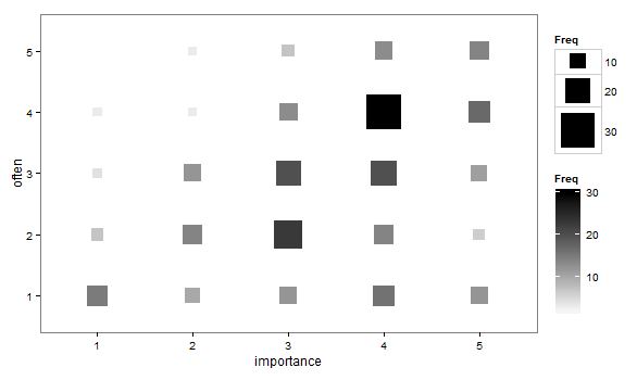
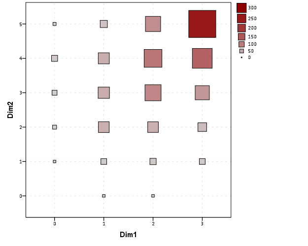
Unfortunately I accidently called them a structure plot in the original CV thread, when they are actually called fluctuation diagrams (see Pilhofer et al. (2012) and Wickham & Hofmann (2011) for citations). They are basically just binned scatterplots for categorical data, and the size of a point is mapped to the number of observations that fall within that bin. Below is the example (in ggplot2) taken from the CV thread.

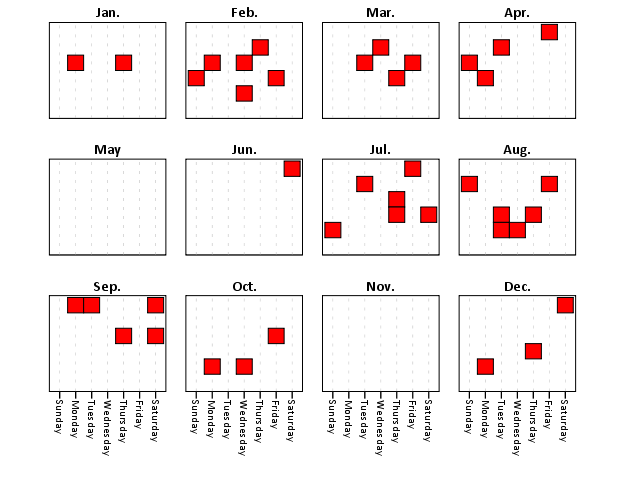
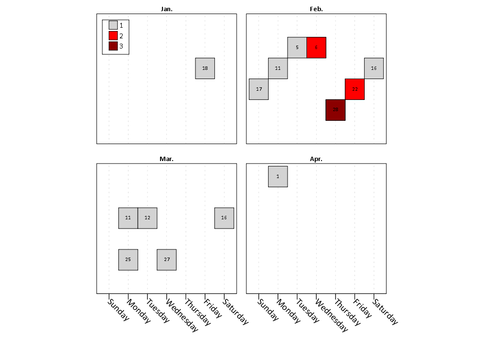
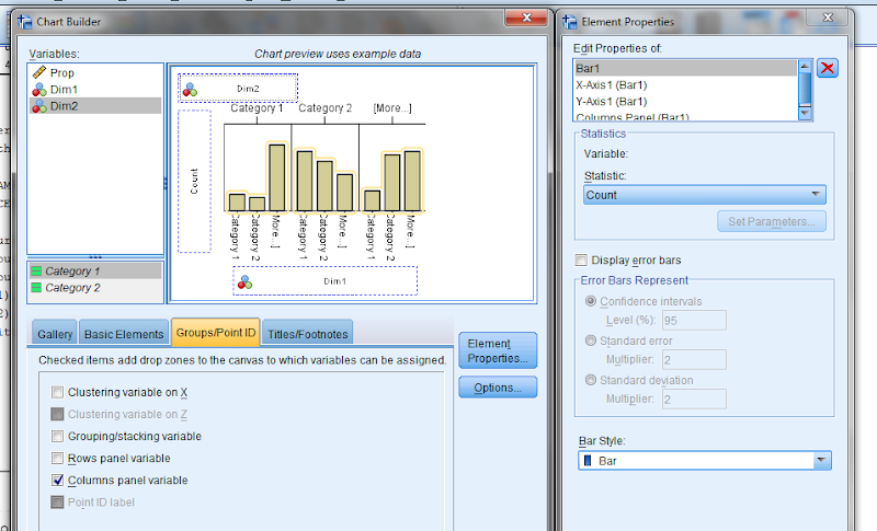
So, to make these in SPSS you first need some categorical data, you can follow along with any two categorical variables (or at the end of the post I have the complete syntax with some fake categorical data). First, it is easier to start with some boilerplate code generated through the GUI. If you have any data set open that has categorical data in it (unaggregated) you can simply open up the chart builder dialog, choose a barplot, place the category you want on the x axis, then place the category you want on the Y axis as a column panel for a paneled bar chart.

The reason you make this chart is that the GUI interprets the default behavior of this bar chart is to aggregate the frequencies. You make the colum panel just so the GUI will write out the data definitions for you. If you pasted the chart builder syntax then the GPL code will look like below.


*Fluctuation plots - first make column paneled bar chart.
GGRAPH
  /GRAPHDATASET NAME="graphdataset" VARIABLES=Dim1[LEVEL=NOMINAL] COUNT()
  [name="COUNT"] Dim2[LEVEL=NOMINAL] MISSING=LISTWISE REPORTMISSING=NO
  /GRAPHSPEC SOURCE=INLINE.
BEGIN GPL
 SOURCE: s=userSource(id("graphdataset"))
 DATA: Dim1=col(source(s), name("Dim1"), unit.category())
 DATA: COUNT=col(source(s), name("COUNT"))
 DATA: Dim2=col(source(s), name("Dim2"), unit.category())
 GUIDE: axis(dim(1), label("Dim1"))
 GUIDE: axis(dim(2), label("Count"))
 GUIDE: axis(dim(3), label("Dim2"), opposite())
 SCALE: cat(dim(1))
 SCALE: linear(dim(2), include(0))
 SCALE: cat(dim(3))
 ELEMENT: interval(position(Dim1*COUNT*Dim2), shape.interior(shape.square))
END GPL.

With this boilerplate code though we can edit to make the chart we want. Here I outline some of those steps. Only editing the ELEMENT portion, the steps below are;

  • Edit the ELEMENT statement to be a point instead of interval.
  • Delete COUNT within the position statement (within the ELEMENT).
  • Change shape.interior to shape.
  • Add in ,size(COUNT) after shape(shape.square).
  • Add in ,color.interior(COUNT) after size(COUNT).

Those are all of the necessary statements to produce the fluctuation chart. The next two are to make the chart look nicer though.

  • Add in aesthetic mappings for scale statements (both the color and the size).
  • Change the guide statements to have the correct labels (and delete the dim(3) GUIDE).

The GPL code call then looks like this (with example aesthetic mappings) and below that is the chart it produces.


*In the end fluctuation plot.
GGRAPH
  /GRAPHDATASET NAME="graphdataset" VARIABLES=Dim1 Dim2 COUNT()[name="COUNT"]
  /GRAPHSPEC SOURCE=INLINE.
BEGIN GPL
 SOURCE: s=userSource(id("graphdataset"))
 DATA: Dim1=col(source(s), name("Dim1"), unit.category())
 DATA: Dim2=col(source(s), name("Dim2"), unit.category())
 DATA: COUNT=col(source(s), name("COUNT"))
 GUIDE: axis(dim(1), label("Dim1"))
 GUIDE: axis(dim(2), label("Dim2"))
 SCALE: pow(aesthetic(aesthetic.size), aestheticMinimum(size."8px"), aestheticMaximum(size."45px"))
 SCALE: linear(aesthetic(aesthetic.color.interior), aestheticMinimum(color.lightgrey), aestheticMaximum(color.darkred))
 ELEMENT: point(position(Dim1*Dim2), shape(shape.square), color.interior(COUNT), size(COUNT))
END GPL.

Aesthetically, besides the usual niceties the only thing to note is that the size of the squares typically needs to be changed to fill up the space (you would have to be lucky to have an exact mapping between area and the categorical count to work out). I presume squares are preferred because area assessments with squares tend to be more accurate than circles, but that is just my guess (you could use any shape you wanted). I use a power scale for size aesthetic, as the area for a square increases by the size of the side squared (and people interpret the areas in the plot, not the size of the side of the square). SPSS’s default exponent for a power scale is 0.5, which is the square root so exactly what we want. You just need to supply a reasonable start and end size for the squares to let them fill up the space depending on your counts. Unfortunately, SPSS does not make a correctly scaled legend in size, but the color aesthetic is correct (I leave it in only to show that it is incorrect, if for publication I would like suppress the different sizes and only show the color gradient). (Actually, my V20 continues to not respect shape aesthetics that aren’t mapped – and this is produced via post-hoc editing of the shape – owell).

Here I show two redundant continuous aesthetic scales (size and color). SPSS’s behavior is to make the legend discrete instead of continuous. In Wilkinson’s Grammar of Graphics he states that he prefers discrete scales (even for continous aesthetics) to aid lookup.


***********************************************************.
*Making random categorical data.
set seed 14.
input program.
loop #i = 1 to 1000.
    compute Prop = RV.UNIFORM(.5,1).
    end case.
end loop.
end file.
end input program.
dataset name cats.
exe.

compute Dim1 = RV.BINOMIAL(3,PROP).
compute Dim2 = RV.BINOMIAL(5,PROP).

*Fluctuation plots - first make column paneled bar chart.
GGRAPH
  /GRAPHDATASET NAME="graphdataset" VARIABLES=Dim1[LEVEL=NOMINAL] COUNT()
  [name="COUNT"] Dim2[LEVEL=NOMINAL] MISSING=LISTWISE REPORTMISSING=NO
  /GRAPHSPEC SOURCE=INLINE.
BEGIN GPL
 SOURCE: s=userSource(id("graphdataset"))
 DATA: Dim1=col(source(s), name("Dim1"), unit.category())
 DATA: COUNT=col(source(s), name("COUNT"))
 DATA: Dim2=col(source(s), name("Dim2"), unit.category())
 GUIDE: axis(dim(1), label("Dim1"))
 GUIDE: axis(dim(2), label("Count"))
 GUIDE: axis(dim(3), label("Dim2"), opposite())
 SCALE: cat(dim(1))
 SCALE: linear(dim(2), include(0))
 SCALE: cat(dim(3))
 ELEMENT: interval(position(Dim1*COUNT*Dim2), shape.interior(shape.square))
END GPL.

*Then edit 1) element to point.
*2) delete COUNT within position statement
*3) shape.interior -> shape
*4) add in "size(COUNT)"
*5) add in "color.interior(COUNT)"
*6) add in aesthetic mappings for scale statements
*7) change guide statements - then you are done.

*In the end fluctuation plot.
GGRAPH
  /GRAPHDATASET NAME="graphdataset" VARIABLES=Dim1 Dim2 COUNT()[name="COUNT"]
  /GRAPHSPEC SOURCE=INLINE.
BEGIN GPL
 SOURCE: s=userSource(id("graphdataset"))
 DATA: Dim1=col(source(s), name("Dim1"), unit.category())
 DATA: Dim2=col(source(s), name("Dim2"), unit.category())
 DATA: COUNT=col(source(s), name("COUNT"))
 GUIDE: axis(dim(1), label("Dim1"))
 GUIDE: axis(dim(2), label("Dim2"))
 SCALE: pow(aesthetic(aesthetic.size), aestheticMinimum(size."8px"), aestheticMaximum(size."45px"))
 SCALE: linear(aesthetic(aesthetic.color.interior), aestheticMinimum(color.lightgrey), aestheticMaximum(color.darkred))
 ELEMENT: point(position(Dim1*Dim2), shape(shape.square), color.interior(COUNT), size(COUNT))
END GPL.

*Alternative ways to map sizes in the plot.
*SCALE: linear(aesthetic(aesthetic.size), aestheticMinimum(size."5%"), aestheticMaximum(size."30%")).
*SCALE: linear(aesthetic(aesthetic.size), aestheticMinimum(size."6px"), aestheticMaximum(size."18px")).

*Alternative jittered scatterplot - need to remove the agg variable COUNT.
*Replace point with point.jitter.
GGRAPH
  /GRAPHDATASET NAME="graphdataset" VARIABLES=Dim1 Dim2
  /GRAPHSPEC SOURCE=INLINE.
BEGIN GPL
 SOURCE: s=userSource(id("graphdataset"))
 DATA: Dim1=col(source(s), name("Dim1"), unit.category())
 DATA: Dim2=col(source(s), name("Dim2"), unit.category())
 GUIDE: axis(dim(1), label("Dim1"))
 GUIDE: axis(dim(2), label("Dim2"))
 ELEMENT: point.jitter(position(Dim1*Dim2))
END GPL.
***********************************************************.

Citations of Interest

Spineplots in SPSS

So the other day someone on cross-validated asked about visualizing categorical data, and spineplots was one of the responses. The OP asked if a solution in SPSS was available, and there is none currently available, with the exception of calling R code for Mosaic plots, which there is a handy function for that on developerworks. I had some code I started to attempt to make them, and it is good enough to show-case. Some notes on notation, these go by various other names (including Marimekko and Mosaic), also see this developerworkds thread which says spineplot but is something a bit different. Cox (2008) has a good discussion about the naming issues as well as examples, and Wickham & Hofmann (2011) have some more general discussion about different types of categorical plots and there relationships.

So instead of utilizing a regular stacked bar charts, spineplots make the width of the bar proportional to the size of the category. This makes categories with a larger share of the sample appear larger. Below is an example image from a recent thread on CV discussing various ways to plot categorical data.

This should be fairly intuitive what it represents. It is just a stacked bar chart, where the width of the bars on the X axis represent the marginal proportion of that category, and the height of the boxes on the Y axis represent the conditional proportion within each category (hence, all bars sum to a height of one).

Located here I have some of my example code to produce a similar plot all natively within SPSS. Directly below is an image of the result, and below that is an example of the syntax needed to generate the chart. In a nutshell, I provide a macro to generate the coordinates of the boxes and the labels. Then I just provide an example of how to generate the chart in GPL. The code currently sorts the boxes by the marginal totals on each axis, with the largest categories in the lower stack and to the left-most area of the chart. There is an optional parameter to turn this off though, in which case the sorting will be just by ascending order of however the categories are coded (the code has an example of this). I also provide an example at the end calling the R code to produce similar plots (but not shown here).

Caveats should be mentioned here as well, the code currently only works for two categorical variables, and the labels for the categories on the X-axis are labelled via data points within the chart. This will produce bad results with labels that are very close to one another (but at least you can edit/move them post-hoc in the chart editor in SPSS).

I asked Nick Cox on this question if his spineplot package for Stata had any sorting, and he replied in the negative. He has likely thought about it more than me, but I presume they should be sorted somehow by default, and sorting by the marginal totals in the categories was pretty easy to accomplish. I would like to dig into this (and other categorical data visualizations) a bit more, but unfortunately time is limited (and these don’t have much direct connection to my current scholarly work). There is a nice hodge-podge collection at the current question on CV I mentioned earlier (I think I need to add in a response about ParSets at the moment as well).


********************************************************************.
*Plots to make Mosaic Macro, tested on V20.
*I know for a fact V15 does not work, as it does not handle 
*coloring the boxes correctly when using the link.hull function.

*Change this to whereever you save the MosaicPlot macro.
FILE HANDLE data /name = "E:\Temp\MosaicPlot".
INSERT FILE = "data\MacroMosaic.sps".

*Making random categorical data.
dataset close ALL.
output close ALL.

set seed 14.
input program.
loop #i = 1 to 1000.
    compute DimStack = RV.BINOM(2,.6).
    compute DimCol = RV.BINOM(2,.7).
    end case.
end loop.
end file.
end input program.
dataset name cats.
exe.

value labels DimStack
0 'DimStack Cat0'
1 'DimStack Cat1'
2 'DimStack Cat2'.
value labels DimCol
0 'DimCol Cat0'
1 'DimCol Cat1'
2 'DimCol Cat2'.

*set mprint on.
!makespine Cat1 = DimStack Cat2 = DimCol.
*Example Graph - need to just replace Cat1 and Cat2 where appropriate.
dataset activate spinedata.
rename variables (DimStack = Cat1)(DimCol = Cat2).
GGRAPH
  /GRAPHDATASET NAME="graphdataset" VARIABLES=X2 X1 Y1 Y2 myID Cat1 Cat2 Xmiddle
  MISSING = VARIABLEWISE
  /GRAPHSPEC SOURCE=INLINE.
BEGIN GPL
 SOURCE: s=userSource(id("graphdataset"))
 DATA: Y2=col(source(s), name("Y2"))
 DATA: Y1=col(source(s), name("Y1"))
 DATA: X2=col(source(s), name("X2"))
 DATA: X1=col(source(s), name("X1"))
 DATA: Xmiddle=col(source(s), name("Xmiddle"))
 DATA: myID=col(source(s), name("myID"), unit.category())
 DATA: Cat1=col(source(s), name("Cat1"), unit.category())
 DATA: Cat2=col(source(s), name("Cat2"), unit.category())
 TRANS: y_temp = eval(1)
 SCALE: linear(dim(2), min(0), max(1.05))
 GUIDE: axis(dim(1), label("Prop. Cat 2"))
 GUIDE: axis(dim(2), label("Prop. Cat 1 within Cat 2"))
 ELEMENT: polygon(position(link.hull((X1 + X2)*(Y1 + Y2))), color.interior(Cat1), split(Cat2))
 ELEMENT: point(position(Xmiddle*y_temp), label(Cat2), transparency.exterior(transparency."1"))
END GPL.

*This makes the same chart without sorting.
dataset activate cats.
dataset close spinedata.
!makespine Cat1 = DimStack Cat2 = DimCol sort = N.
dataset activate spinedata.
rename variables (DimStack = Cat1)(DimCol = Cat2).
GGRAPH
  /GRAPHDATASET NAME="graphdataset" VARIABLES=X2 X1 Y1 Y2 myID Cat1 Cat2 Xmiddle
  MISSING = VARIABLEWISE
  /GRAPHSPEC SOURCE=INLINE.
BEGIN GPL
 SOURCE: s=userSource(id("graphdataset"))
 DATA: Y2=col(source(s), name("Y2"))
 DATA: Y1=col(source(s), name("Y1"))
 DATA: X2=col(source(s), name("X2"))
 DATA: X1=col(source(s), name("X1"))
 DATA: Xmiddle=col(source(s), name("Xmiddle"))
 DATA: myID=col(source(s), name("myID"), unit.category())
 DATA: Cat1=col(source(s), name("Cat1"), unit.category())
 DATA: Cat2=col(source(s), name("Cat2"), unit.category())
 TRANS: y_temp = eval(1)
 SCALE: linear(dim(2), min(0), max(1.05))
 GUIDE: axis(dim(1), label("Prop. Cat 2"))
 GUIDE: axis(dim(2), label("Prop. Cat 1 within Cat 2"))
 ELEMENT: polygon(position(link.hull((X1 + X2)*(Y1 + Y2))), color.interior(Cat1), split(Cat2))
 ELEMENT: point(position(Xmiddle*y_temp), label(Cat2), transparency.exterior(transparency."1"))
END GPL.
*In code online I have example using Mosaic plot plug in for R.
********************************************************************.

Citations of Interest

Some theory behind the likability of XKCD style charts


Recently on the stackexchange sites there was a wave of questions regarding how to make XKCD style charts (see example above). Specifically, the hand-drawn imprecise look about the charts.

There also appear to be a variety of other language examples floating around, like MATLAB, D3 and Python.

What is interesting about these exchanges, in some highly scientific/computing communities, is that they are excepted (that was a weird Freudian slip) accepted with open arms. Some dogmatic allegiance to Tufte may consider these to be at best chart junkie, and at worst blatant distortions of data (albeit minor ones). For an example of the fact that at least the R community on stackoverflow is aware of such things, see some of the vitriol to this question about replicating some aesthetic preferences of gradient backgrounds and rounded edges (available in Excel) in R. So what makes these XKCD charts different? Certainly the content of the information in XKCD comics is an improvement over typical horrific 3d pie charts in Excel, but this doesn’t justify there use.

Wood et al. (2012) provide some commentary as to perhaps why people like the charts. Such hypothesis include that the sketchy rendering evokes some mental model of simplicity, and thus reduces barriers to first interpreting the image. The actual sketchy rendering also makes one focus on more obvious global characteristics of the graphic, and thus avoid spending attention on minor imperceivable details. This should also lead into why it is a potentially nice tool to visualize uncertainty in the data presented. The concept of simplifying and generalizing geographic shapes has been known for awhile in cartography (I’m skeptical it is much known in the more general data-viz community), but this is a bit of a unique extension.

Besides the implementations noted at the prior places, they also provide a library, Handy for making sketchy drawings from any graphics produced in Processing. Below are two examples.


So there isn’t just a pretty picture behind the logic of why everyone likes the XKCD style charts. It is a great example of the divide between classical statistical graphics (ala Tufte and Cleveland) versus current individuals within journalism and data-viz who attempt to make charts aesthetically pleasing, attention grabbing, and for the masses. Wood and company take great lengths to show the relative error in the paper cited when using such sketchy rendering, but weighing the benefits of readability vs. error in graphics is a difficult question to address going forward.


Citations

My posts on CrossValidated Blog

I’ve made several guest posts on the (now) currently dormat Cross Validated Community Blog. They are;

The notes on making tables is IMO my most useful collection, with the post on small multiples coming in second. Other contributions currently include;

For those not familiar, Cross Validated is a stackexchange website where one can ask and answer various questions related to statistics. They are a large improvement over list-serve emails, and I hope to promote their usefulness and encourage individuals to either contribute to current forums and/or start new ones for particular areas. I also particpate on the GIS and Academia sites (as well as programming questions for SPSS and R on stackoverflow).

The blog is just an extension of the site, in that Q/A sessions are not well suited for long discussions. So instead of fitting a square peg in a round hole at times, I believe the blog is a useful place for discussions and greater commentary useful for the communities that aren’t quite well placed in Q/A. Unfortunately, community up-take in the blog has been rather minor, so it is currently dormant. Feel free to stop by the Cross Validated chat room Ten fold if you are interested in contributing. I hope to see the blog not die, but IMO there isn’t much point in any of the current people to continue to contribute unless there becomes greater community contribution from other individuals.

Some notes on single line charts in SPSS

One thing you can’t do in legacy graph commands in SPSS is superimpose multiple elements on a single graph. One common instance in which I like doing this is to superimpose point observations on a low-frequency line chart. The data example I will use is the reported violent crime rate by the NYPD between 1985 and 2010, taken from the FBI UCR data tool. So below is an example line chart in SPSS.


data list free / year VCR.
begin data
1985    1881.3
1986    1995.2
1987    2036.1
1988    2217.6
1989    2299.9
1990    2383.6
1991    2318.2
1992    2163.7
1993    2089.8
1994    1860.9
1995    1557.8
1996    1344.2
1997    1268.4
1998    1167.4
1999    1062.6
2000    945.2
2001    927.5
2002    789.6
2003    734.1
2004    687.4
2005    673.1
2006    637.9
2007    613.8
2008    580.3
2009    551.8
2010    593.1
end data.
formats year VCR (F4.0)

GGRAPH
  /GRAPHDATASET NAME="graphdataset" VARIABLES=year VCR
  /GRAPHSPEC SOURCE=INLINE.
BEGIN GPL
 SOURCE: s=userSource(id("graphdataset"))
 DATA: year=col(source(s), name("year"))
 DATA: VCR=col(source(s), name("VCR"))
 GUIDE: axis(dim(1), label("Year"))
 GUIDE: axis(dim(2), label("Violent Crime Rate per 100,000"))
 ELEMENT: line(position(year*VCR), color.interior(color.black))
 ELEMENT: point(position(year*VCR), color.interior(color.black), color.exterior(color.white), size(size."8px"))
END GPL.

This ends up being a pretty simple GPL call (at least relative to other inline GPL statements!). Besides nicely labelling the axis the only special things to note are

  • I drew the line element first.
  • I superimposed a point element on top of the line, filled black, with a white outline.

When you make multiple element calls in the GPL specification it acts just like drawing on a piece of paper, the elements that are listed first are drawn first, and elements listed later are drawn on top of those prior elements. I like doing the white outline for the superimposed points here because it creates further seperation from the line, but is not obtrusive enough to hinder general assessment of trends in the line.

To back up a bit, one of the reasons I like superimposing the observation points on a line like this is to show explicitly where the observations are on the chart. In these examples it isn’t as big a deal, as I don’t have missing data and the sampling is regular – but in cases in which those aren’t the case the line chart can be misleading. Both Kaiser Fung and Naomi Robbins have recent examples that illustrate this point. Although their examples are obviously better not connecting the lines at all, if I just had one or two years data missing it might be an ok assumption to just interpolate a line through that missing in this circumstance. Also in many instances lines are easier to assess general trends than bars and super-imposing multiple lines is frequently much better than making dodged bar graphs.

Another reason I like superimposing the points is because in areas of rapid change, the lines appear longer, but the sampling is the same. Superimposing the points reinforces the perception that the line is based on regularly sampled places on the X-axis.

Here I extend this code to further superimpose error intervals on the chart. This is a bit of a travesty for an example of time-series analysis (I just make prediction intervals from a regression on time, time squared and time cubed), but just go with it for the graphical presentation!


*Make a cubic function of time.
compute year_center = year - (1985 + 12.5).
compute year2 = year_center**2.
compute year3 = year_center**3.
*90% prediction interval.
REGRESSION
  /MISSING LISTWISE
  /STATISTICS COEFF OUTS R ANOVA
  /CRITERIA=PIN(.05) POUT(.10) CIN(90)
  /NOORIGIN
  /DEPENDENT VCR
  /METHOD=ENTER year_center year2 year3
  /SAVE ICIN .
formats LICI_1 UICI_1 (F4.0).
*Area difference chart.
GGRAPH
  /GRAPHDATASET NAME="graphdataset" VARIABLES=year VCR LICI_1 UICI_1
  /GRAPHSPEC SOURCE=INLINE.
BEGIN GPL
 SOURCE: s=userSource(id("graphdataset"))
 DATA: year=col(source(s), name("year"))
 DATA: VCR=col(source(s), name("VCR"))
 DATA: LICI_1=col(source(s), name("LICI_1"))
 DATA: UICI_1=col(source(s), name("UICI_1"))
 GUIDE: axis(dim(1), label("Year"))
 GUIDE: axis(dim(2), label("Violent Crime Rate per 100,000"))
 ELEMENT: area.difference(position(region.spread.range(year*(LICI_1 + UICI_1))), color.interior(color.grey), 
                  transparency.interior(transparency."0.5"))
 ELEMENT: line(position(year*VCR), color.interior(color.black))
 ELEMENT: point(position(year*VCR), color.interior(color.black), color.exterior(color.white), size(size."8px"))
END GPL.

This should be another good example where lines are an improvement over bars, I suspect it would be quite visually confusing to make such an error interval across a spectrum of bar charts. You could always do dynamite graphs, with error bars protruding from each bar, but that does not allow one to assess the general trend of the error intervals (and such dynamite charts shouldn’t be encouraged anyway).

My final example is using a polygon element to highlight an area of the chart. If you just want a single line, SPSS has the ability to either post-hoc edit a guideline into the graph, or you can specify the location of a guideline via GUIDE: form.line. What if you to highlight multiple years though – or just a range of values in general? You can superimpose a polygon element spanning the area of interest to do that. I saw a really nice example of this recently on the Rural Blog detailing Per-Capita sales before and after a Wal-Mart entered a community.

So here in this similar example I will highlight an area of a few years.


GGRAPH
  /GRAPHDATASET NAME="graphdataset" VARIABLES=year VCR
  /GRAPHSPEC SOURCE=INLINE.
BEGIN GPL
 SOURCE: s=userSource(id("graphdataset"))
 DATA: year=col(source(s), name("year"))
 DATA: VCR=col(source(s), name("VCR"))
 TRANS: begin=eval(1993)
 TRANS: end=eval(1996)
 TRANS: top= eval(3000)
 TRANS: bottom=eval(0)
 GUIDE: axis(dim(1), label("Year"))
 GUIDE: axis(dim(2), label("Violent Crime Rate per 100,000"))
 SCALE: linear(dim(2), min(500), max(2500))
 ELEMENT: polygon(position(link.hull((begin + end)*(bottom + top))), color.interior(color.blue), 
                  transparency.interior(transparency."0.5"))
 ELEMENT: line(position(year*VCR), color.interior(color.black))
 ELEMENT: point(position(year*VCR), color.interior(color.black), color.exterior(color.white), size(size."8px"))
END GPL.

For the polygon element, you first specify the outer coordinates through 4 TRANS commands, and then when making the GPL call you specify that the positions signify the convex hull of the polygon. The inner GPL statement of (begin + end)*(bottom + top) evaluates as the same to (begin*bottom + begin*top + end*bottom + end*top) because the graph alegebra is communative. The bottom and top you just need to pick to encapsulate some area outside of the visible max and min or the plot (and then further restrict the axis on the SCALE statment). Because the X axis is continuous, you could even make the encompassed area fractional units, to make it so the points of interest fall within the area. It should also be easy to see how to extend this to any arbitrary square within the plot.

In both examples with areas highlighted in the charts, I drew the areas first and semi-transparent. This allows one to see the gridlines underneath, and the areas don’t impede seeing the actual data contained in the line and points because it is beneath those other vector elements. The transparency is just a stylistic element I personally prefer in many circumstances, even if it isn’t needed to prevent multiple elements from being obsfucated by one another. In these examples I like that the gridlines aren’t hidden by the areas, but it is only a minor point.

Why I feel SPSS (or any statistical package) is better than Excel for this particular job

I debated on pulling an Andrew Gelman and adding a ps to my prior Junk Charts Challenge post, but it ended up being too verbose, so I just made an entirely new follow-up. To start, the discussion has currently evolved from this series of posts;

  • The original post on remaking a great line chart by Kaiser Fung, with the suggestion that the task (data manipulation and graphing) is easier in Excel.
  • My response on how to make the chart in SPSS.
  • Kaiser’s response to my post, in which I doubt I swayed his opinion on using Excel for this task! It appears to me based on the discussion so far the only real quarrel is whether the data manipulation is sufficiently complicated enough compared to the ease of pointing and clicking in Excel to justify using Excel. In SPSS to recreate Kaiser’s chart is does take some advanced knowledge of sorting and using lags to identify the pit and recoveries (the same logic could be extended to the data manipulations Kaiser says I skim over, as long as you can numerically or externally define what is a start of a recession).

All things considered for the internet, discussion has been pretty cordial so far. Although it is certainly sprinkled in my post, I didn’t mean for my post on SPSS to say that the task of grabbing data from online, manipulating it, and creating the graph was in any objective way easier in SPSS than in Excel. I realize pointing-and-clicking in Excel is easier for most, and only a few really adept at SPSS (like myself) would consider it easier in SPSS. I write quite a few tutorials on how to do things in SPSS, and that was one of the motivations for the tutorial. I want people using SPSS (or really any graphing software) to make nice graphs – and so if I think I can add value this way to the blogosphere I will! I hope my most value added is through SPSS tutorials, but I try to discuss general graphing concepts in the posts as well, so even for those not using SPSS it hopefully has some other useful content.

My original post wasn’t meant to discuss why I feel SPSS is a better job for this particular task, although it is certainly a reasonable question to ask (I tried to avoid it to prevent flame wars to be frank – but now I’ve stepped in it at this point it appears). As one of the comments on Kaiser’s follow up notes (and I agree), some tools are better for some jobs and we shouldn’t prefer one tool because of some sort of dogmatic allegiance. To make it clear though, and it was part of my motivation to write my initial response to the challenge post, I highly disagree that this particular task, which entails grabbing data from the internet, manipulating it, and creating a graph, and updating said graph on a monthly basis is better done in Excel. For a direct example of my non-allegiance to doing everything in SPSS for this job, I wouldn’t do the grabbing the data from the internet part in SPSS (indeed – it isn’t even directly possible unless you use Python code). Assuming it could be fully automated, I would write a custom SPSS job that manipulates the data after a wget command grabs the data, and have it all wrapped up in one bat file that runs on a monthly timer.

To go off on a slight tangent, why do I think I’m qualified to make such a distinction? Well, I use both SPSS and Excel on a regular basis. I wouldn’t consider myself a wiz at Excel nor VBA for Excel, but I have made custom Excel MACROS in the past to perform various jobs (make and format charts/tables etc.), and I have one task (a custom daily report of the crime incidents reported the previous day) I do on a daily basis at my job in Excel. So, FWIW, I feel reasonably qualified to make decisions on what tasks I should perform in which tools. So I’m giving my opinion, the same way Kaiser gave his initial opinion. I doubt my experience is as illustruous as Kaiser’s, but you can go to my CV page to see my current and prior work roles as an analyst. If I thought Excel, or Access, or R, or Python, or whatever was a better tool I would certainly personally use and suggest that. If you don’t have alittle trust in my opinion on such matters, well, you shouldn’t read what I write!

So, again to be clear, I feel this is a job better for SPSS (both the data manipulation and creating the graphics), although I admit it is initially harder to write the code to accomplish the task than pointing, clicking and going through chart wizards in Excel. So here I will try to articulate those reasons.

  • Any task I do on a regular basis, I want to be as automated as possible. Having to point-click, copy-paste on a regular basis invites both human error and is a waste of time. I don’t doubt you could fully (or very near) automate the task in Excel (as the comment on my blog post mentions). But this will ultimately involve scripting in VBA, which diminishes in any way that the Excel solution is easier than the SPSS solution.
  • The breadth of both data management capabilities, statistical analysis, and graphics are much larger in SPSS than in Excel. Consider the VBA code necessary to replicate my initial VARSTOCASES command in Excel, that is reshaping wide data to stacked long form. Consider the necessary VBA code to execute summary statistics over different groups without knowing what the different groups are beforehand. These are just a sampling of data management tools that are routine in statistics packages. In terms of charting, the most obvious function lacking in Excel is that it currently does not have facilities to make small-multiple charts (you can see some exceptional hacks from Jon Peltier, but those are certainly more limited in functionality that SPSS). Not mentioned (but most obvious) is the statistical capabilities of a statistical software!

So certainly, this particular job, could be done in Excel, as it does not require any functionality unique to a stats package. But why hamstring myself with these limitations from the onset? Frequently after I build custom, routine analysis like this I continually go back and provide more charts, so even if I have a good conceptualization of what I want to do at the onset there is no guarantee I won’t want to add this functionality in later. In terms of charting not having flexible small multiple charts is really a big deal, they can be used all the time.

Admittedly, this job is small enough in scope, if say the prior analyst was doing a regular updated chart via copy-paste like Kaiser is suggesting, I would consider just keeping that same format (it certainly is a lost opportunity cost to re-write the code in SPSS, and the fact that it is only on a monthly basis means to get time recovered if the task were fully automated would take quite some time). I just have personally enough experience in SPSS I know I could script a solution in SPSS quicker from the on-set than in Excel (I certainly can’t extrapolate that to anyone else though).

Part of both my preference and experience in SPSS comes from the jobs I personally have to do. For an example, I routinely pull a database of 500,000 incidents, do some data cleaning, and then merge this to a table of 300,000 charges and offenses and then merge to a second table of geocoded incident locations. Then using this data I routinely subset it, create aggregate summaries, tables, estimate various statistics and models, make some rudimentary maps, or even export the necessary data to import into a GIS software.

For arguments sake (with the exception of some of the more complicated data cleaning) this could be mostly done in SQL – but certainly no reasonable person should consider doing these multiple table merges and data cleaning in Excel (the nice interactive facilities with working with the spreadsheet in Excel are greatly dimished with any tables that take more a few scrolls to see). Statistical packages are really much more than tools to fit models, they are tools for working and manipulating data. I would highly recommend if you have to conduct routine tasks in which you manipulate data (something I assume most analysts have to do) you should consider learning statistical sofware, the same way I would recommend you should get to know SQL.

To be more balanced, here are things (knowing SPSS really well and Excel not as thoroughly) I think Excel excels at compared to SPSS;

  • Ease of making nicely formatted tables
  • Ease of directly interacting and editing components of charts and tables (this includes adding in supplementary vector graphics and labels).
  • Sparklines
  • Interactive Dashboards/Pivot Tables

Routine data management is not one of them, and only really sparklines and interactive dashboards are functionality in which I would prefer to make an end product in Excel over SPSS (and that doesn’t mean the whole workflow needs to be one software). I clean up ad-hoc tables for distribution in Excel all the time, because (as I said above) editing them in Excel is easier than editing them in SPSS. Again, my opinion, FWIW.

Update for Aoristic Macro in SPSS

I’ve substantially updated the aoristic macro for SPSS from what I previously posted. The updated code can be found here. The improvements are;

  • Code is much more modularized, it is only 1 function and takes an Interval parameter to determine what interval summaries you want.
  • It includes Agresti-Coull binomial error intervals (95% Confidence Intervals). It also returns a percentage estimate and the total number of cases the estimate is based off of, besides the usual info for time period, split file, and the absolute aoristic estimate.
  • allows an optional command to save the reshaped long dataset

Functionality dropped are default plots, and saving of begin, end and middle times for the same estimates. I just didn’t find these useful (besides academic purposes).

The main motivation was to add in error bars, as I found when I was making many of these charts it was obvious that some of the estimates were highly variable. While the Agresti-Coull binomial proportions are not entirely justified in this novel circumstance, they are better than nothing to at least illustrate the error in the estimates (it seems to me that they will likely be too small if anything, but I’m not sure).

I think a good paper I might work on in the future when I get a chance to is 1) show how variable the estimates are in small samples, and 2) evaluate the asympotic coverages of various estimators (traditional binomial proportions vs. bootstrap I suppose). Below is an example output of the updated macro, again with the same data I used previously. I make the small multiple chart by different crime types to show the variability in the estimates for given sample sizes.