Stacking Intervals

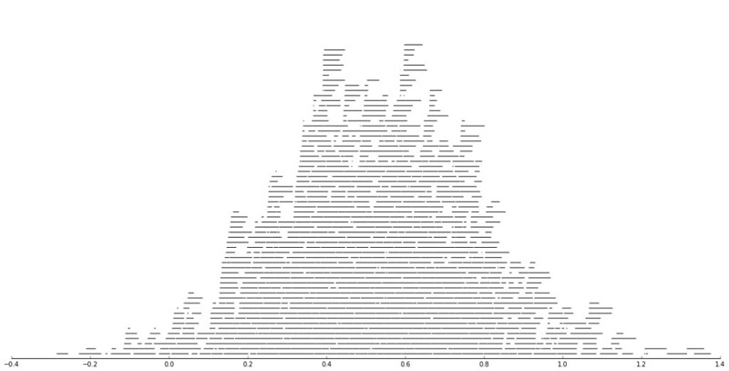
Motivated by visualizing overlapping intervals from the This is not Rocket Science blog (by Valentine Svensson) (updated link here) I developed some code in SPSS to accomplish a similar feat. Here is an example plot from the blog:

It is related to a graph I attempted to make for visualizing overlap in crime events and interval censored crime data is applicable. The algorithm I mimic by Valentine here is not quite the same, but similar in effect. Here is the macro I made to accomplish this in SPSS. (I know I could also use the python code by the linked author directly in SPSS.)

DEFINE !StackInt (!POSITIONAL = !TOKENS(1)
                 /!POSITIONAL = !TOKENS(1) 
                 /Fuzz = !DEFAULT("0") !TOKENS(1) 
                 /Out = !DEFAULT(Y) !TOKENS(1) 
                 /Sort = !DEFAULT(Y) !TOKENS(1) 
                 /TempVals = !DEFAULT(100) !TOKENS(1) )
!IF (!Sort = "Y") !THEN
SORT CASES BY !1 !2.
!IFEND
VECTOR #TailEnd(!TempVals).
DO IF ($casenum = 1).  
  COMPUTE #TailEnd(1) = End + !UNQUOTE(!Fuzz).
  COMPUTE !Out = 1.
  LOOP #i = 2 TO !TempVals.
    COMPUTE #TailEnd(#i) = Begin-1.
  END LOOP.
ELSE.
  DO REPEAT i = 1 TO !TempVals /T = #TailEnd1 TO !CONCAT("#TailEnd",!TempVals).
    COMPUTE T = LAG(T).
    DO IF (Begin > T AND MISSING(Y)).
      COMPUTE T = End + !UNQUOTE(!Fuzz).
      COMPUTE !Out = i.
    END IF.
  END REPEAT.
END IF.
FORMATS !Out !CONCAT("(F",!LENGTH(!TempVals),".0)").
FREQ !Out /FORMAT = NOTABLE /STATISTICS = MAX.
!ENDDEFINE.

An annoyance for this is that I need to place the ending bins in a preallocated vector. Since you won’t know how large the offset values are to begin with, I default to 100 values. The function prints a set of frequencies after the command though (which forces a data pass) and if you have missing data in the output you need to increase the size of the vector.

One simple addition I made to the code over the original is what I call Fuzz in the code above. What happens for crime data is that there are likely to be many near overlaps in addition to many crimes that have an exact known time. What the fuzz factor does is displaces the lines if they touch within the fuzz factor. E.g. if you had two intervals, (1,3) and (3.5,5), if you specified a fuzz factor of 1 the second interval would be placed on top of the first, even though they don’t exactly overlap. This appears to work reasonably well for both small and large n in some experimentation, but if you use too large a fuzz factor it will produce river like runs through the overlap histogram.

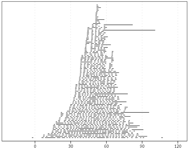
Here is an example of using the macro with some fake data.

SET SEED 10.
INPUT PROGRAM.
LOOP #i = 1 TO 1000.
  COMPUTE Begin = RV.NORMAL(50,15).
  COMPUTE End = Begin + EXP(RV.GAMMA(1,2)).
  END CASE.
END LOOP.
END FILE.
END INPUT PROGRAM.

!StackInt Begin End Fuzz = "1" TempVals = 101.

GGRAPH
  /GRAPHDATASET NAME="graphdataset" VARIABLES=Begin End Mid
  /GRAPHSPEC SOURCE=INLINE.
BEGIN GPL
  SOURCE: s=userSource(id("graphdataset"))
  DATA: End=col(source(s), name("End"))
  DATA: Begin=col(source(s), name("Begin"))
  DATA: Y=col(source(s), name("Y"), unit.category())
  GUIDE: axis(dim(1))
  GUIDE: axis(dim(2), null())
  ELEMENT: edge(position((End+Begin)*Y))
END GPL.

And here is the graph:

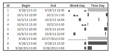
Using the same burglary data from Arlington I used for my aoristic macro, here is an example plot for a few over 6,300 burglaries in Arlington in 2012 using a fuzz factor of 2 days.

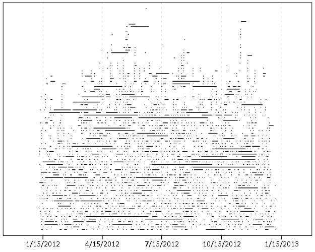
This is somewhat misleading, as events with a known exact time are not given any area in the plot. Here is the same plot but with plotting the midpoint of the line as a circle over top of the edge.

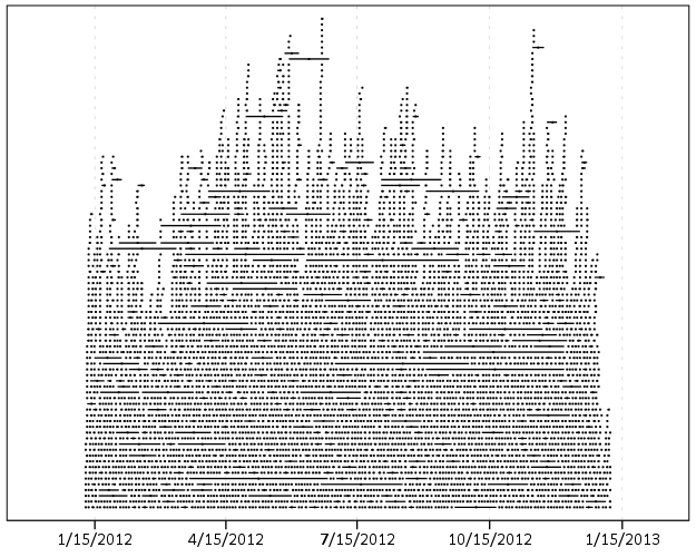
You can also add in other information to the plot. Here I color edges and points according to the beat that they are in.

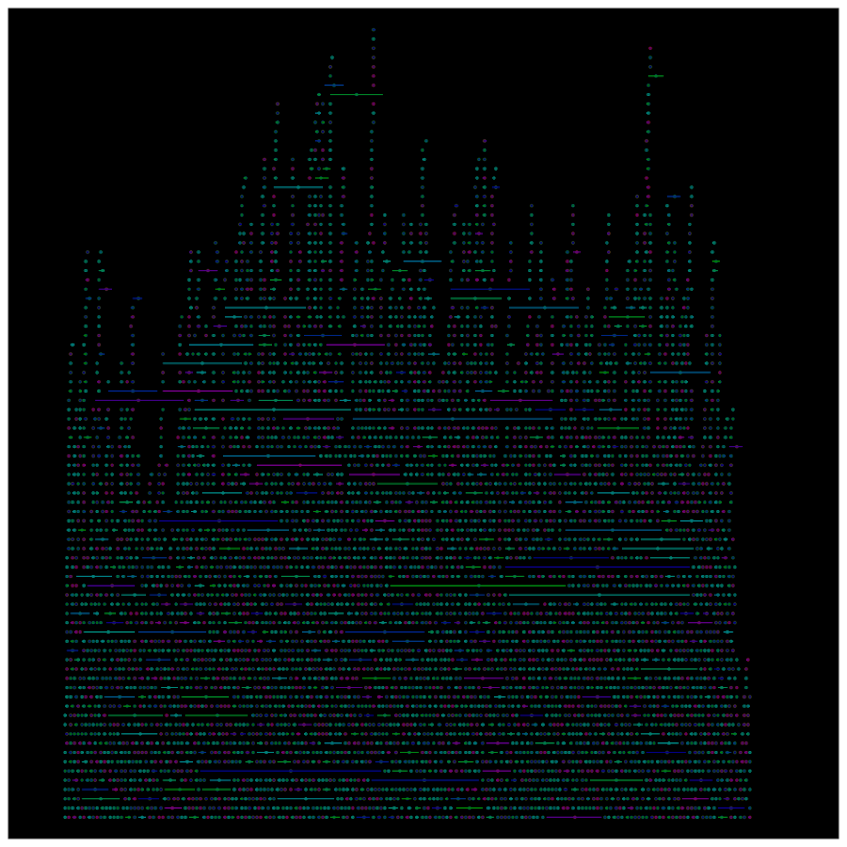
It produces a pretty plot, but it is difficult to discern any patterns. I imagine this plot would be good to evaluate when there is the most uncertainty in crime reports. I might guess if I did this type of plot with burglaries after college students come back from break you may see a larger number of long intervals, showing that they have large times of uncertainty. It is difficult to see any patterns in the Arlington data though besides more events in the summertime (which an aoristic chart would have shown to begin with.) At the level of abstraction of over a year I don’t think you will be able to spot any patterns (like with certain days of the week or times of the month).

I wonder if this would be useful for survival analysis, in particular to spot any temporal or cohort effects.

Presentation at IACA 2014 – Making Field Stops Smart

Part of the work I am doing with the Finn Institute in collaboration with the Albany Police Department was accepted as a presentation at the upcoming IACA conference in Seattle next week. The NIJ used to have a separate Crime Mapping conference, but they folded it into the yearly IACA conference. So this is one of the NIJ Crime Mapping presentations.

The title of the presentation is Making Field Stops Smart, and below is the abstract:

Mapping hot spots of crime incidents for use in allocating patrol resources has become commonplace. This research is intended to extend the logic to mapping locations of field interviews. The project has two specific spatial analysis components; 1) are most of the stops being conducted a high crime locations, and 2) are locations with the most stops the locations with the most productive stops (in terms of arrests, contraband recovery, stopping chronic offenders). Making stops smart is being conducted as a research partnership between the Albany, NY police department and the Finn Institute of Public Safety.

The time of the presentation is at 15:30 on Thursday 9/11. Two other presenters, Eric Paull from Akron, Ohio and Christian Peterson from Portland, Oregon have presentations on the panel as well (see the IACA agenda for their talk abstracts).

I am uncomfortable publicly releasing the pre-print white papers given the collaboration (Rob Worden and Sarah McLean are co-authors) and because that APD’s name is directly attached to the work. But if you send me an email I can forward the white paper for this presentation and related work we are doing.

If you see me at IACA feel free to come up and say hi. I do not have any other plans while I am in town besides going to presentations.


Understanding Uncertainty – crime counts and the Poisson distribution

A regular occurrence for me when I was a crime analyst went along the lines of, "There was a noteworthy crime event in the media, can you provide some related analysis". Most of the time this followed one or multiple noteworthy crimes that caught the public’s attention, which could range from a series of thefts from vehicles over a month, the same gas station being robbed on consecutive days, or a single murder.

Any single violent crime is awful, and this is not meant to deny that. But often single noteworthy events are often misconstrued as crime waves, or general notions that the neighborhood is in decline or the city is a more dangerous place now than it ever was. The media is intentionally hyperbole, so it is not an effective gauge whether or not crime is really increasing or decreasing. Here I will show an example of using the Poisson distribution to show whether or not a recent spree of crimes is more than you would expect by chance.

So lets say that over the course of 20 years, the mean number of homicides in a jurisdiction is 2. Lets also say that in the year so far, we have 5 homicides. Ignoring that the year has not concluded, what is the probability of observing 5 or more homicides? Assuming the number of homicides is a Poisson distributed random variable (often not too unreasonable for low counts over long time periods) the probability is 5.7%. Small, but not totally improbable. To calculate this probability it is just 1 minus the cumulative distribution function for a Poisson distribution with the given mean. This can be calculated easily in R by using ppois, i.e. 1 - ppois(5-1,2) (just replace 5 with your observed count and 2 with your mean). Note that I subtract 1 from 5, otherwise it would be testing the probability of over 5 instead of 5 or more. For those analysts using Excel, the formula is =1 - POISSON.DIST(5-1,2,TRUE). For SPSS it would be COMPUTE Prob = 1 - CDF.POISSON(5-1,2).

The reason for making these calculations is specifically to understand chance variations given the numbers historically. For the crime analyst it is necessary to avoid chasing noise. For the public it is necessary to understand the context of the current events in light of historical data. For another example, say that the average number of robberies in a month is 15, what is the probability of observing 21 or more robberies? It is 8%, so basically you would expect this high of a number to happen at least one time every year (i.e. 0.08*12~1). Without any other information, there is little reason for a crime analyst to spend extra time examining 21 robberies in a month based on the total number of events alone. Ditto for the public there is little reason to be alarmed by that many robberies in a month given the historical data. (The analyst may want to examine the robberies for other reasons, but there is no reason to be fooled into thinking there is an unexpected increase.)

Here I’ve ignored some complications for the sake of simplicity in the analysis. One is that crime may not be Poisson distributed, but may be under or over-dispersed. In the case of over-dispersion (which seems to happen more often with crime data) the series likely has a higher number of 0’s and then high bursts of activity. In this case you would expect the higher bursts more often than you would with the Poisson distribution. For under-dispersed Poisson data, the variance is smaller than the mean, and so higher bursts of activity are less likely. These are fairly simple to check (at least to see if they are grossly violated), either see if the mean approximately equals the variance, or draw a histogram and superimpose a density estimate for the Poisson distribution. This also ignores seasonal fluctuations in crime (e.g. more burglaries occur in the summer than in the winter).

Even if you do not like making the Poisson assumption a very simple analysis to conduct is to plot the time series of the event over a long period. The rarer the crime the larger aggregation and time series you might need, but this is pretty straightforward to conduct with a SQL query and whatever program you use to conduct analysis. If it is for UCR crime counts, you can try going onto the UCR data tool to see if your jurisdiction has historical annual data going back to 1985. My experience is the vast majority of crime waves depicted in the media are simply chance fluctuations, clearly visible as such just by inspecting the time series plot. Similarly such a plot will show if there is an increase or a decrease compared to historical numbers. Another simple analysis is to take the current numbers and rank them against, say the prior 50 to 100 values in the series. If it is abnormal it should be the the highest or very near the highest in those prior values.

Another complication I have ignored is that of multiple testing. When one is constantly observing a series, even a rare event is likely to happen over a long period of observation. So lets say that in your jurisdiction on average there are 3 domestic assaults in a week, and one week you observe 9. The probability of observing 9 or more is 0.003, but over a whole year the probability of this happening at least once is around 18% (i.e. 1 - ppois(8,3)^52 in R code). Over the course of 10 years (around 520 weeks) we would expect around 2 weeks to have 9 or more domestic assaults (i.e. 520*(1-ppois(8,3))). (This probability goes up higher if we consider sliding windows, e.g. 9 or more domestic assaults in any 7 day span, instead of just over different weeks.) These statistics make the assumption that events are independent (likely not true in practice) but I rather make that false assumption to get a sense of the probability then rely on gut feelings or opinions based on the notoriety of the recent crime(s).

The title for this blog post is taken from David Spiegelhalter’s site Understanding Uncertainty, and that link provides a synonymous example with the recent cluster of plane crashes.

New paper – Testing for Randomness in Day of Week Crime Sprees with Small Samples

I’ve uploaded a new paper, Testing for Randomness in Day of Week Crime Sprees with Small Samples, to SSRN. The abstract is below:

This paper discusses exact tests for evaluating whether a series of offences are randomly distributed across days of the week for small sample sizes. The given context is if a crime analyst has identified a series of events that are committed by the same offender(s), can the analyst determine if those events are randomly distributed with respect to the day of week given only a few offences? I detail how one can develop exact reference distributions since the number of potential permutations are small. I also discuss the power of the chi^2 and Kuiper’s V test for small sample sizes, and give an example of hypothesis testing when crimes have uncertain days of occurrence.

Here is an example graph of the power of the tests under different alternate hypotheses of crimes only having probability of being committed on a certain subset of days in the week. Comments on the paper would be wonderful (I will have to bug someone to give me some pre peer-review feedback) – so feel free.

Sparklines for Time Interval Crime Data

I developed some example sparklines for tables when visualizing crime data that occurs in an uncertain window. The use case is small tables that list the begin and end date-times, and the sparklines provide a quick visual assessment of the day of week and time of day. Examining for overlaps in two intervals is one of the hardest things to do when examining a table, and deciphering days of week when looking at dates is just impossible.

Here is an example table of what they look like.

The day of week sparklines are a small bar chart, with Sunday as the first bar and Saturday as the last bar. The height of the bar represents the aoristic estimate for that day of week. An interval over a week long (entirely uncertain what day of week the crime took place) ends up looking like a dashed line over the week. This example uses the sparkline bar chart built into Excel 2010, but the Sparklines for Excel add-on provides synonymous functionality. The time of day sparkline is a stacked bar chart in disguise; it represents the time interval with a dark grey bar, and the remaining stack is white. This allows you to have crimes that occur overnight and are split in the middle of the day. Complete ignorance of when the crime occurred during the day I represent with a lighter grey bar.

The spreadsheet can be downloaded from my drop box account here.

A few notes the use of the formulas within the sheet:

  • The spreadsheet does have formulas to auto-calculate the example sparklines (how they exactly work is worth another blog post all by itself) but it should be pretty clear to replicate the example bar chart for the day of week and time of day in case you just want to hand edit (or have another program return the needed estimates).
  • For the auto-calculations to work for the Day of Week aoristic estimates the crime interval needs to have a positive value. That is, if the exact same time is listed in the begin and end date column you will get a division by zero error.
  • For the day of week aoristic estimates it calculates the proportion as 1/7 if the date range is over one week. Ditto for the time range it is considered the full range if it goes over 24 hours.

A few notes on the aesthetics of sparklines:

  • For the time of day sparkline if you have zero (or near zero) length for the interval it won’t show up in the graph. Some experimentation suggests the interval needs around 15 to 45 minutes for typical cell sizes to be visible in the sheet (and for printing).
  • For the time of day sparkline the empty time color is set to white. This will make the plot look strange if you use zebra stripes for the table. You could modify it to make the empty color whatever the background color of the cell is, but I suspect this might make it confusing looking.
  • A time of day bar chart could be made just the same as the day of week bar chart. It would require the full expansion for times of day, which I might do in the future anyway to provide a conveniant spreadsheet to calculate aoristic estimates. (I typically do them with my SPSS MACRO – but it won’t be too arduous to expand what I have done here to an excel template).
  • If the Sparklines for Excel add-on allowed pie charts with at least two categories or allowed the angle of the pie slice to be rotated, you could make a time of day pie chart sparkline. This is currently not possible though.

I have not thoroughly tested the spreadsheet calculations (missing values will surely return errors, and if you have the begin-end backwards it may return some numbers, but I doubt they will be correct) so caveat emptor. I think the sparklines are a pretty good idea though. I suspect some more ingenious uses of color could be used to cross-reference the days of week and the time of day, but this does pretty much what I hoped for when looking at the table.

Online Crime Mapping for Troy PD

One of the big projects I have been working on since joining the Troy Police Department as a crime analyst last fall is producing timely geocoded data. I am happy to say that a fruit of this labor is the public crime map, via RAIDS Online, that has finally gone public (and can be viewed here). The credit for the online map mainly goes to BAIR Analytics and their free online mapping platform. I merely serve up the data for them to put on the map.

I’ve come to believe that more open data is the way of the future, and in particular an online crime map is a way to engage and enlighten the public to the realities of crime statistics. Although this comes with some potential negative externalities for the police department, such as complaints about innacurracy, decreasing home prices, and misleading symbology and offset geocoding. I firmly believe though that providing this information empowers the public to be more engaged in matters of crime and safety within their communities.

I thank the Troy Police Department for supporting the project in spite of these potential negative consequences, and Chief Tedesco for his continual support of the project. I also thank Capt. Cooney for arranging for all of the media releases. Below is the current online news stories (will update with CW15 if they post a story).

Here I end with a list of reading materials I consider necessary for any other crime analyst pondering the decision whether to public crime statistics online. And I end by again thanking Troy PD for allowing me to publish this data, and BAIR for providing the online service that makes it possible with a zero dollar budget.


Let me know if I should add any papers to the list! Privacy implications (such as this work by Michael Leitner and colleagues) might be worth a read as well for those interested. See my geomasking tag at CiteUlike for various other references.

Querying Graph Neighbors in SPSS

The other day I showed how one could make an edge list in SPSS, which is needed to generate network graphs. Today, I will show how one can use an edge list in long format to identify neighbors for higher degree relationships.

So to start, what do I mean by a neighbor of higher degree relationship? Lets say I have a relationship between two nodes A B. Now lets also say I have another relationship between nodes B C. I might say that A and C don’t have a direct relationship, but they are related in that they both have a relationship to B. So A is a first degree neighbor of B, and A is a second degree neighbor of C. If I drew a graph of the listed network, the degree relationship between A and C would be the minimum number of edges one would have to traverse to get from the A node to the C node.

A  B  C

Why would a criminologist or crime analyst care about relationships of higher degrees? Well, here are two examples I am familiar with in criminology;

For more simple and practical motivation for crime analysts, you may just have some particular individuals who you want to have targeted enforcement towards (known chronic offenders, violent gang members) and you would like to compile a more extended network of individuals related to those particular offenders to keep an eye on, or further investigate for possible ties to co-offending or gang activity.

So to start in SPSS, lets say that we have a edge list in long format, where there is a column that ID’s each person, and another column that shows if those two people are related at the same event. Exampe ties for a crime analyst may be victimizations, or co-offending, or being stopped for field interviews at the same time.

*Long dataset marking people sharing same incident (ID).
data list free / IncID (F2.0) Person (A15).
begin data
1 John 
1 Mary
2 John 
2 Frank
3 John 
3 William
4 John 
4 Andrew
5 Mary 
5 Frank
6 Mary 
6 William
7 Frank 
7 Kelly
8 Andrew 
8 Penny
9 Matt 
9 Andrew
10 Kelly 
10 Andrew
end data.
dataset name long.
dataset activate long.

Now, lets say we want to grab higher degree neighbors for Mary, first I will ID the first degree neighbors by creating a flag, and then aggregating within the incident ID. That is, cases that share an incident with Mary.


*ID Mary and then aggregate to get first degree.
compute degree1 = (Person = "Mary").
*Now aggregate to get all degree1s.
AGGREGATE
  /OUTFILE=* MODE=ADDVARIABLES OVERWRITE = YES
  /BREAK=IncID
  /degree1 = MAX(degree1).

To identify if a person is a second degree neighbor of Mary, I can first aggregate within person, to ID that both John and Frank are first degree neighbors, and then pick their first degree neighbors, who I will then be able to tell are second degree neighbors of Mary.


*Aggregate within edge ID to get second degrees.
AGGREGATE
  /OUTFILE=* MODE=ADDVARIABLES OVERWRITE = YES
  /BREAK=Person
  /degree2 = MAX(degree1).
AGGREGATE
  /OUTFILE=* MODE=ADDVARIABLES OVERWRITE = YES
  /BREAK=IncID
  /degree2 = MAX(degree2).

I can continue to do the same procedure for third degree neighbors.


*Aggregate within edge ID to get third degrees.
AGGREGATE
  /OUTFILE=* MODE=ADDVARIABLES OVERWRITE = YES
  /BREAK=Person
  /degree3 = MAX(degree2).
AGGREGATE
  /OUTFILE=* MODE=ADDVARIABLES OVERWRITE = YES
  /BREAK=IncID
  /degree3 = MAX(degree3).

So now this should be clear how I can make a recursive structure to identify neighbors of however many degrees I want. I end the post with a general MACRO to estimate all neighbors of a certain degree given an edge list in long format. Since this will expand to very many cases, you will likely only want to use a smaller list, or I provided an option in the macro to only check certain flagged individuals for neighbors.

I’d love to see or hear about other applications crime analysts are using such social networks for. On the academic bucket list to learn more about graph layout algorithms, so hopefully you see more posts about that from me in the future.


*Current requirement - personid needs to be a string variable.
*Flag argument will return people who have a value of one for that variable and all of there
neighbors in the long list.
DEFINE !neighbor (incid = !TOKENS(1)
                           /personid = !TOKENS(1)
                           /number = !TOKENS(1) 
                           /flag = !DEFAULT ("") !TOKENS(1)   )

dataset copy neighbor.
dataset activate neighbor.
match files file = *
/keep = !incid !personid !flag.

rename variables (!incid = IncID)
(!personid = Person).

*I need to make a stacked dataset for all cases.
compute XXconstXX = 1.

*Making wide dataset of Persons in the long list.
dataset copy XXwideXX.
dataset activate XXwideXX.

*eliminating duplicate people.
sort cases by Person.
match files file = *
/first = XXkeepXX
/by Person
/drop IncID.
select if XXkeepXX = 1.

*reshaping long to wide - could use flip here but that requires numeric PersonIDs.
*flip variables = Person.
!IF (!flag  !NULL) !THEN
select if !flag = 1.
!IFEND
casestovars
/ID = XXconstXX
/seperator = ""
/drop XXkeepXX !flag.
*Similar here you could just replace with a list of all unique offender nodes - just needs to be in wide format.

*Match back to the original long dataset.
dataset activate neighbor.
match files file = *
/table = 'XXwideXX'
/by XXconstXX.
dataset close XXwideXX.

*Reshape wide to long - @ is for filler so I dont need to know how many people - it gets dropped by default in varstocases.
string @ (A1).
varstocases
/make DegreePers from Person1 to @
/drop XXconstXX !flag.

sort cases by DegreePers IncID Person.

*Make first degree.
compute degree1 = (Person = DegreePers).
AGGREGATE
  /OUTFILE=* MODE=ADDVARIABLES OVERWRITE = YES
  /BREAK=IncID DegreePers
  /degree1 = MAX(degree1).
AGGREGATE
  /OUTFILE=* MODE=ADDVARIABLES OVERWRITE = YES
  /BREAK=Person DegreePers
  /degree1 = MAX(degree1).
*dropping self checks.
select if Person  DegreePers.

!LET !past = "degree1"
!DO !i = 2 !TO !number
!LET !current = !CONCAT("degree",!i)
AGGREGATE
  /OUTFILE=* MODE=ADDVARIABLES OVERWRITE = YES
  /BREAK=IncID DegreePers
  /!current = MAX(!past).
AGGREGATE
  /OUTFILE=* MODE=ADDVARIABLES OVERWRITE = YES
  /BREAK=Person DegreePers
  /!current = MAX(!current).
!LET !past = !current
!DOEND
*Clean up and delete duplicates.
compute degree = (!number + 1) - SUM(degree1 to !current).
string P1 P2 (A100).
DO IF Person <= DegreePers.
    compute P1 = Person.
    compute P2 = DegreePers.
ELSE.
    compute P1 = DegreePers.
    compute P2 = Person.
END IF.
sort cases by P1 P2.
match files file = *
/first = XXkeepXX
/by P1 P2
/drop DegreePers Person.
*will be [1 + degrees searched] if not a neighbor.
select if XXkeepXX = 1 and degree <= !number.
match files file = *
/drop degree1 to !current XXkeepXX IncID.
formats degree (!CONCAT("F",!LENGTH(!number),".0")).
!ENDDEFINE.

*Example use case - uncomment to check it out.
*dataset close ALL.
*Long dataset marking people sharing same incident (ID).
*data list free / IncID (F2.0) Person (A15).
*begin data
1 John 
1 Mary
2 John 
2 Frank
3 John 
3 William
4 John 
4 Andrew
5 Mary 
5 Frank
6 Mary 
6 William
7 Frank 
7 Kelly
8 Andrew 
8 Penny
9 Matt 
9 Andrew
10 Kelly 
10 Andrew
*end data.
*dataset name long.
*dataset activate long.
*compute myFlag = 1.
*set mprint on.
*output close ALL.
*neighbor incid = IncID personid = Person number = 3.
*set mprint off.
*dataset activate long.
*dataset close neighbor.
*compute myFlag = (Person = "Mary" or Person = "Andrew").
*set mprint on.
*output close ALL.
*neighbor incid = IncID personid = Person number = 3 flag = myFlag.
*set mprint off.

Update for Aoristic Macro in SPSS

I’ve substantially updated the aoristic macro for SPSS from what I previously posted. The updated code can be found here. The improvements are;

  • Code is much more modularized, it is only 1 function and takes an Interval parameter to determine what interval summaries you want.
  • It includes Agresti-Coull binomial error intervals (95% Confidence Intervals). It also returns a percentage estimate and the total number of cases the estimate is based off of, besides the usual info for time period, split file, and the absolute aoristic estimate.
  • allows an optional command to save the reshaped long dataset

Functionality dropped are default plots, and saving of begin, end and middle times for the same estimates. I just didn’t find these useful (besides academic purposes).

The main motivation was to add in error bars, as I found when I was making many of these charts it was obvious that some of the estimates were highly variable. While the Agresti-Coull binomial proportions are not entirely justified in this novel circumstance, they are better than nothing to at least illustrate the error in the estimates (it seems to me that they will likely be too small if anything, but I’m not sure).

I think a good paper I might work on in the future when I get a chance to is 1) show how variable the estimates are in small samples, and 2) evaluate the asympotic coverages of various estimators (traditional binomial proportions vs. bootstrap I suppose). Below is an example output of the updated macro, again with the same data I used previously. I make the small multiple chart by different crime types to show the variability in the estimates for given sample sizes.

Informational Asymmetries in my role as Crime Analyst

One aspect I’ve come to realize in my job as crime analyst, and really in any technical job I’ve had, is that I face large informational asymmetries between myself and my employers (and colleagues). What exactly do I mean? Well, I consider a prime example of informational asymmetry when I have a large body of knowledge about some particular topic or task I need to conduct, and the person asking for the task has relatively little.

I believe this is problematic in one major way with my job: That people don’t know what is or is not reasonable to ask me to do, or similarly how long it takes me to conduct particular tasks. I believe most of the time this makes people hesitate to ask me particular questions or ask me to conduct particular analysis. The obverse happens though not entirely infrequently, I get asked nonchalantly to do something that is a considerable investment.

I’m not sure how to best solve this situation (especially the not asking part) besides by developing relationships with colleagues and the boss, and through experience elucidating what I can (or can’t do). To a certain extent I can’t know what people want if they don’t ask me.

The situation in which someone asks me to do something that takes more of in investment is easier, in that I can directly tell the person that this request is either unreasonable or will take along time. A good example of tasks that on the outside may look similar in scope, but are largely different are descriptive vs. causal analysis.

Examples of the difference are “How many calls for service occurred at this particular apartment in the last year?” (descriptive), or “Is there more crime around 15 Main St. than we would normally expect?” (causal). The first is typically just a query or the database and a table or map, and this will typically satisfy the answer. The other though is much more difficult, I have to dream up a reasonable comparison, else the information I provide may be potentially out of context.

The information I produce also depends on who is asking. If someone within the PD asks for descriptive statistics, that is usually all I provide. If someone from the public asks for descriptive statistics, I frequently (at least attempt to) provide more context for those statistics (i.e. some reasonable comparisons or historical trends that form the basis for causal analysis).

This is because I assume people within the PD have the necessary external context to evaluate the information, whereas people outside the PD don’t. If I just stated how many calls for service occurred on your street block, you may think your street is crime ridden, because you don’t have a good internal baseline to judge what is a reasonable number of calls for service. In such requests to the public I try to provide historical numbers over a long period (as people are often worried about newer trends) or comparisons to neighboring areas.

The informational asymmetry problem stills persists though, and filters into other areas of work. In particular how am I evaluated within the PD itself.