A repeated annoying task I have had to undertake is take a list of names and date-of-births and match them to a reference set. This can happen when you try to merge data from different sources. Or when working with police RMS data, a frequent problem is the same individual can go into the master name list multiple times. This can be either due to data error, or someone being malicious and providing the PD with fraudulent data.
Most often I am trying to match a smaller set of names to a bigger set from a police RMS system. Typically what I do is grab all of the names in the police RMS, make them the same case, and then simply sort the file by last then first name. Then I typically go through one by one from the smaller file and identify the name ID’s that are in the sorted bigger police database. Ctrl-F can make it a quick search for only a few people.
This works quite well for small numbers, but I wanted to see if I could make some simple rules when I need to match a larger list. For example, the above workflow may be fine if I need to look up 10 names quickly, but say you want to eliminate duplicates in the entire PD RMS system? A manually hand search through 100,000+ names is crazy (and will be out of date before you finish).
A tool I’ve used in the past (and would recommend) is FRIL, Fine-grained records integration and linkage tool. In a nutshell the way that tool works is that you can calculate string distances between names and/or date distances between date-of-births from two separate files. Then you specify how close you want the records to be to either automatically match the records or manually view and make a personal determination if the two records are the same person. FRIL has a really great interface to quickly view the suggested matches and manually confirm or reject certain matches.
FRIL uses the Potter Stewart I know it when I see it approach to finding matches. There is no ground truth, you just use your best judgement whether two names belong to the same person, and FRIL uses some metrics to filter out the most unlikely candidates. I have a bit of a unique strategy though to identify typical string and date of birth differences in fuzzy name matches by using Police RMS data itself. Police RMS’s tend to have a variety of people who are linked up to the same master name index value, but for potentially several reasons they have various idiosyncrasies among different individual incidents. This allows me to calculate distances within persons, so a ground truth estimate, and then I can evaluate different distances compared to a control sample to see how well they the metrics discriminate matches.
There can be several reasons for slightly different data among an individuals incidents in a police RMS, but that they end up being linked to the same person. One is that frequently RMS systems incorporate tables from several different data sources, dispatchers have their own CAD system, the PD has a system to type in paper records, custodial arrests/finger printing may have another system, etc. Merging this data into one RMS may simply cause differences in how the data is stored or even how particular fields tend to be populated in the database. A second reason is that individuals can be ex-ante associated to a particular master name index, but can still have differences is various person fields for any particular incident.
One simple example is that for an arrest report the offender may have an old address in the system, so the officer types in the new address. The same thing can happen to slight name changes or DOB changes. The master name index should update with the most recent info, but you have a record trail of all the minor variations through each incident. Depending on the type of involvement in an incident has an impact on what information is collected and the quality of that information as well. For example, if I was interviewed as a witness to a crime, I may just go down in the report as Andy Wheeler with no date of birth info. If I was arrested, someone would take more time to put in my full name, Andrew Wheeler, and my date of birth. But if the original person inputting the data took the time, they would probably realize I was the same person and associate me with the same master ID.
So I can look at these within ID changes to see the typical distances. What I did was take a name database from a police department I work with, make all pair-wise comparisons between unique names and date of births, and then calculate several string distances between the names and the date differences between listed DOB’s. I then made a randomly matched sample for a comparison group. For the database I was working with this ended up being over 100,000 people with the same ID, but different names/DOB’s somewhere in different incidents, with an average of between 2~3 different names/dob’s per person (so a sample of nearly 200,000 same name comparisons, two names only results in one comparison, but three names results in 3 comparisons). My control sample took one of these names person and matched another random person in the database as a control group, so I have a control group sample of over 100,000 cases.
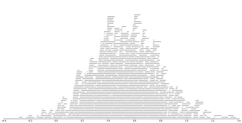
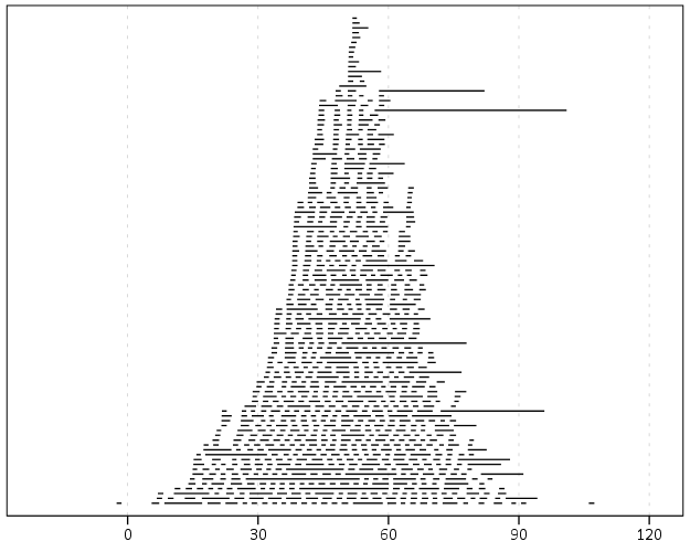
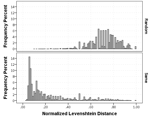
The data I was working with is secondary, so the names were already aggregated to Last, First Middle. If I had the original database I could do distances for the individual fields (and probably not worry about the middle name) but it somewhat simplifies the analysis as well. Here are some histograms of the Levenshtein distance between the name strings for the same person and random samples. The Levenshtein distance is the number of single edits it takes to transform one string to another string, so 0 would be the same word.
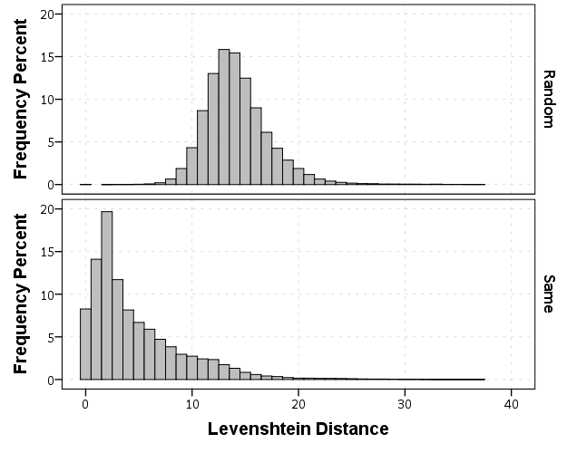
Part of the reason the distances within the same name have such a long tail is because of the already aggregated data. There end up being some people with full middle names, some with middle initials, and some with no middle names at all. So what I did was calculate a normalized Levenshtein distance based on the max and min possible values (listed at the Wikipedia page) the string can take given the size of the two input strings. The minimum value is the difference in the length of the two strings, the maximum is the length of the longest string. So then I calculate NormLevenDist = (LevenDist - min)/(max - min). This would cause Wheeler, Andy P and Wheeler, Andy Palmer to have a normalized distance of zero, whereas the edit distance would be 5. So in these histograms you can see even more discrimination between the two classes, based mainly on such names being perfect subsets of other names.
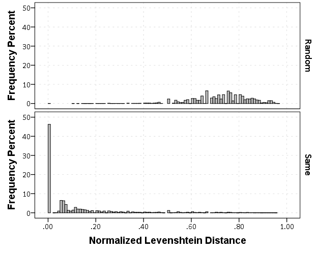
If you eliminate the 0’s in the normalized distance, you can get a better look at the shapes of each distribution. There is no clear cut-off between the samples, but there is a pretty clear difference in the distributions.
I also calculated the Jaro-Winkler and the Dice (bi-gram) string distances. All four of these metrics had a fairly high correlation, around 0.8 with one another, and all did pretty well classifying the same ID’s according to their ROC curves.
If I wanted to train a classifier as accurately as possible, I would use all of these metrics and probably make some sort of decision tree (or estimate their effects via logistic regression), but I wanted to make a simple function (since it will be doing quite a few comparisons) that calculates as few of the metrics as possible, so I just went with the normalized Levenshtein distance here. Jaro-Winkler would probably be more competitive if I had the separate first and last names (and played around with the weights for the beginning and ends of the strings). If you had mixed strings, like some are First Middle Last and others are Last First I suspect the dice similarity would be the best.
But in the end I think all of the string metrics will do a pretty similar job for this input data, and the normalized Levenshtein distance will work pretty well so I am going to stick with that. (I don’t consider soundex matching here, I’ve very rarely come across an example where soundex would match but had a high edit distance for names, e.g. typos are much more common than intentional mis-spellings based on enunciation I believe, and even the intentional mis-spellings tend to have a small edit distance.)
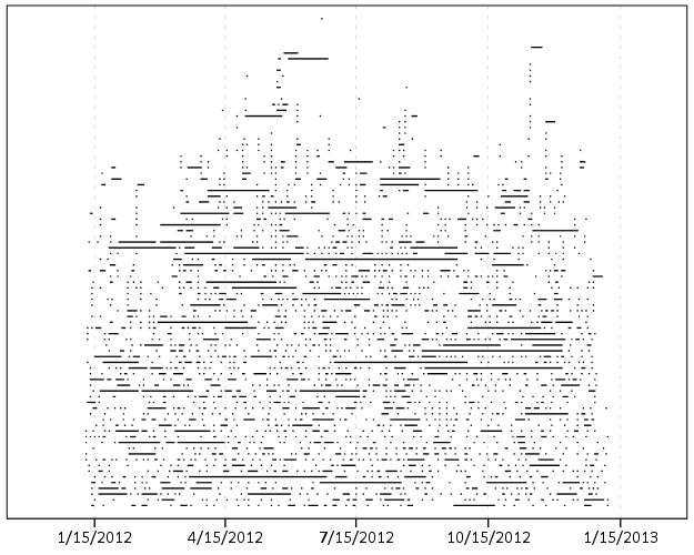
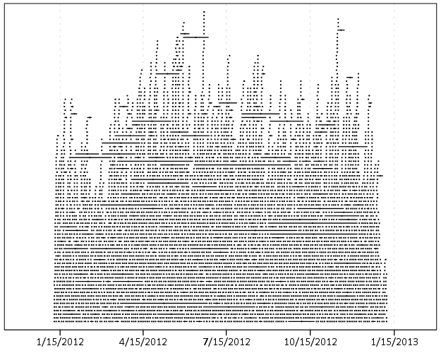
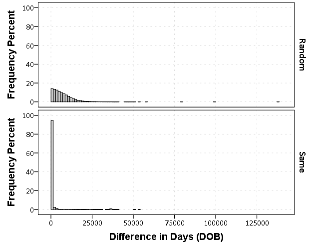
Now looking at the absolute differences in the DOB’s (where both are available) provides a bit of a different pattern. Here is the histograms
But I think the easiest illustration of this is to examine the frequency table of the most common day differences for the same individuals.
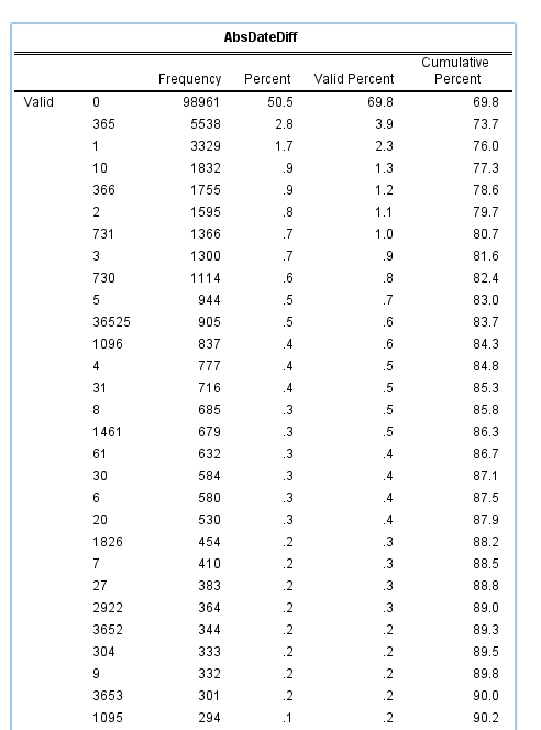
Obviously zero is the most common, but you can see a few other bumps that illustrate the nature of data mistakes. The second is 365 days – exactly off by one year. Also in the top 10 are 366, 731 & 730 – off by either a year and a day or two years. 1096, 1095, 1461, 1826, are examples of these yearly cycles as well. 36,525 are examples of being off by a century! Somewhere along the way some of the DOB fields were accidentally assigned to dates in the future (such as 2032 vs. 1932). The final examples are off by some other number typical of a simple typo, such as 10, 20, or by the difference in one month 30,31,27. By the end of this table of PDF of the same persons is smaller than the PDF of the control sample.
I also calculated string distances by transforming the DOB’s to mm/dd/yy format, but when incorporating the yearly cycles and other noted mistakes they did not appear to offer any new information.
So based on this information, I made a set of ad-hoc rules to classify matched names. I wanted to keep the false positive rate at less than 1 in 1,000, but make the true positive as high as possible. The simple rules I came up with were:
- If a normalized Levenshtein distance of less than 0.2, consider a match
- If a normalized Levenshtein distance of less than 0.4 and a close date, consider a match.
Close dates are defined as:
- absolute difference of within 10 days OR
- days apart are 10,20,27,30,31 OR
- the number of days within a yearly cycle are less than 10
This match procedure produces the classification table below:
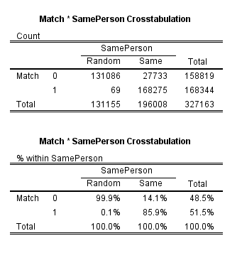
The false positive rate is right where I wanted it to be, but the true positive is a bit lower than I hoped. But it is a simple tool though to implement, and built into it you can have missing data for a birthday.
It is a bit hard to share this data and provide reproducible code, but if you want help doing something similar with your own data just shoot me an email and I will help. This was all done in SPSS and Python (using the extended transforms python code). In the end I wanted to make a simple Python function to use with the FUZZY command to automatically match names.