Some random SPSS graph tips: shading areas under curves and using dodging in binned dot plots

This is just a quick post on some random graphing examples you can do with SPSS through inline GPL statements, but are not possible through the GUI dialog. These also take knowing alittle bit about the grammar of graphics, and the nuts and bolts of SPSS’s implementation. First up, shading under a curve.

Shading under a curve

I assume the motivation for doing this is obvious, but it is alittle advanced GPL to figure out how to accomplish. I swore someone asked how to do this the other day on NABBLE, but I could not find any such questions. Below is an example.

*****************************************.
input program.
loop #i = 1 to 2000.
compute X = (#i - 1000)/250.
compute PDF = PDF.NORMAL(X,0,1).
compute CDF = CDF.NORMAL(X,0,1).
end case.
end loop.
end file.
end input program.
dataset name sim.
exe.

formats PDF X (F2.1).

*area under entire curve.
GGRAPH
  /GRAPHDATASET NAME="graphdataset" VARIABLES=X PDF MISSING=LISTWISE
  REPORTMISSING=NO
  /GRAPHSPEC SOURCE=INLINE.
BEGIN GPL
 SOURCE: s=userSource(id("graphdataset"))
 DATA: X=col(source(s), name("X"))
 DATA: PDF=col(source(s), name("PDF"))
 GUIDE: axis(dim(1), label("X"))
 GUIDE: axis(dim(2), label("Prob. Dens."))
 ELEMENT: area(position(X*PDF), missing.wings())
END GPL.


*Mark off different areas.
compute tails = 0.
if CDF <= .025 tails = 1.
if CDF >= .975 tails = 2.
exe.

*Area with particular locations highlighted.
GGRAPH
  /GRAPHDATASET NAME="graphdataset" VARIABLES=X PDF tails 
  /GRAPHSPEC SOURCE=INLINE.
BEGIN GPL
 SOURCE: s=userSource(id("graphdataset"))
 DATA: X=col(source(s), name("X"))
 DATA: PDF=col(source(s), name("PDF"))
 DATA: tails=col(source(s), name("tails"), unit.category())
 SCALE: cat(aesthetic(aesthetic.color.interior), map(("0",color.white),("1",color.grey),("2",color.grey)))
 SCALE: cat(aesthetic(aesthetic.transparency.interior), map(("0",transparency."1"),("1",transparency."0"),("2",transparency."0")))
 GUIDE: axis(dim(1), label("X"))
 GUIDE: axis(dim(2), label("Prob. Dens."))
 GUIDE: legend(aesthetic(aesthetic.color.interior), null())
 GUIDE: legend(aesthetic(aesthetic.transparency.interior), null())
 ELEMENT: area(position(X*PDF), color.interior(tails), transparency.interior(tails))
END GPL.
*****************************************.

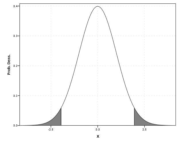
The area under the entire curve is pretty simple code, and can be accomplished through the GUI. The shading under different sections though requires a bit more thought. If you want both the upper and lower tails colored of the PDF, you need to specify seperate categories for them, otherwise they will connect at the bottom of the graph. Then you need to map the categories to specific colors, and if you want to be able to see the gridlines behind the central area you need to make the center area transparent. Note I also omit the legend, as I assume it will be obvious what the graph represents given other context or textual summaries.

Binning scale axis to produce dodging

The second example is based on the fact that for SPSS to utilize the dodge collision modifier, one needs a categorical axis. What if you want the axis to really be scale though? You can make the data categorical but the axis on a continuous scale by specifying a binned scale, but just make the binning small enough to suit your actual data values. This is easy to show with a categorical dot plot. If you can, IMO it is better to use dodging than jittering, and below is a perfect example. If you run the first GGRAPH statement, you will see the points aren’t dodged, although the graph is generated just fine and dandy with no error messages. The second graph bins the X variable (which is on the second dimension) with intervals of width 1. This ends up being exactly the same as the continuous axis, because the values are all positive integers anyway.

*****************************************.
set seed = 10.
input program.
loop #i = 1 to 1001.
compute X = TRUNC(RV.UNIFORM(0,101)).
compute cat = TRUNC(RV.UNIFORM(1,4)).
end case.
end loop.
end file.
end input program.
dataset name sim.

GGRAPH
  /GRAPHDATASET NAME="graphdataset" VARIABLES=X cat
  /GRAPHSPEC SOURCE=INLINE.
BEGIN GPL
 SOURCE: s=userSource(id("graphdataset"))
 DATA: X=col(source(s), name("X"))
 DATA: cat=col(source(s), name("cat"), unit.category())
 COORD: rect(dim(1,2))
 GUIDE: axis(dim(1), label("cat"))
 ELEMENT: point.dodge.symmetric(position(cat*X))
END GPL.

*Now lets try to bin X so the points actually dodge!.
GGRAPH
  /GRAPHDATASET NAME="graphdataset" VARIABLES=X cat
  /GRAPHSPEC SOURCE=INLINE.
BEGIN GPL
 SOURCE: s=userSource(id("graphdataset"))
 DATA: X=col(source(s), name("X"))
 DATA: cat=col(source(s), name("cat"), unit.category())
 COORD: rect(dim(1,2))
 GUIDE: axis(dim(1), label("cat"))
 ELEMENT: point.dodge.symmetric(position(bin.rect(cat*X, dim(2), binWidth(1))))
END GPL.
****************************************.

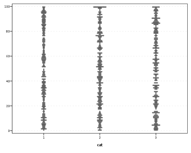
Both examples shown here only take slight alterations to code generatable through the GUI, but take a bit more understanding of the grammar to know how to accomplish (or even know they are possible). You unfortunately can’t implement Wilkinson’s (1999) true dot plot technique like this (he doesn’t suggest binning, but by choosing where the dots are placed by KDE estimation). But this should be sufficient for most circumstances.

Interval graph for viz. temporal overlap in crime events

I’ve currently made a vizualization intended to be an exploratory tool to identify overlapping criminal events over a short period. Code to reproduce the macro is here, and that includes an example with made up data. As opposed to aoristic analysis, which lets you see globally the aggregated summaries of when crime events occurred potentially correcting for the unspecified time period, this graphical procedure allows you to identify whether local events overlap. It also allows one to perceive global information as well, in particular whether the uncertainty of events occur in morning, afternoon, or night.

A call to the macro ends up looking like this (other vars is optional and can include multiple variables – I assume token names are self-explanatory);

!interval_data date_begin = datet_begin time_begin = XTIMEBEGIN date_end = datet_end time_end = XTIMEEND 
label_id = myid other_vars = crime rand.

This just produces a new dataset name interval_data, which can then be plotted. And here is the example graph that comes with the macro and its fake data (after I edited the chart slightly).

GGRAPH
  /GRAPHDATASET NAME="graphdataset" dataset = "interval_data" VARIABLES= LABELID DAY TIMEBEGIN TIMEEND MID WITHINCAT DAYWEEK
  /GRAPHSPEC SOURCE=INLINE.
BEGIN GPL
 SOURCE: s=userSource(id("graphdataset"))
 DATA: LABELID=col(source(s), name("LABELID"), unit.category())
 DATA: DAY=col(source(s), name("DAY"), unit.category())
 DATA: TIMEBEGIN=col(source(s), name("TIMEBEGIN"))
 DATA: TIMEEND=col(source(s), name("TIMEEND"))
 DATA: MID=col(source(s),name("MID"))
 DATA: WITHINCAT=col(source(s),name("WITHINCAT"), unit.category())
 DATA: DAYWEEK=col(source(s),name("DAYWEEK"), unit.category())
 COORD: rect(dim(1,2), cluster(3,0))
 SCALE: cat(dim(3), values("1","2","3","4","5","6","7","8","9","10","11","12","13","14","15","16","17","18","19","20","21","22","23",
                                         "24","25","26","27","28","29","30","31"))
 ELEMENT: interval(position(region.spread.range(WITHINCAT*(TIMEBEGIN + TIMEEND)*DAY)), color.interior(DAYWEEK),
                             transparency.interior(transparency."0.1"), transparency.exterior(transparency."1")))
 ELEMENT: point(position(WITHINCAT*MID*DAY), color.interior(DAYWEEK), label(LABELID))
END GPL.

The chart can be interpreted as the days of the week are colored, and each interval represents on crime event, except when a crime events occurs over night, then the bar is split over two days (and each day the event is labeled). I wanted labels in the chart to easily reference specific events, and I assigned a point to the midpoint of the intervals to plot labels (also to give some visual girth to events that occurred over a short interval – otherwise they would be invisible in the chart). To displace the bars horizontally within the same day the chart essentially uses the same type of procedure that occurs in clustered bar charts.

GPL code can be inserted directly within macros, but it is quite a pain. It is better to use python to paramaterize GGRAPH, but I’m too lazy and don’t have python installed on my machine at work (ancient version of SPSS, V15, is to blame).

Here is another example with more of my data in the wild. This is for thefts from motor vehicles in Troy from the beginning of the year until 2/22. We had a bit of a rash over that time period, but they have since died down after the arrest of one particular prolific offender. This is evident in the chart,

We can also break down by other categories. This is what the token other_vars is for, it carries forward these other variables for use in facetting. For an example Troy has 4 police zones, and here is the graph broken down by each of them. Obviously crime sprees within short time frames are more likley perpetrated in close proximity. Also events committed by the same person are likely to re-occur within the same geographic proximity. The individual noted before was linked to events in Zone 4. I turn the labels off (it is pretty easy to toggle them in SPSS), and then one can either focus on individual events close in time or overlapping intervals pretty easily.

*Panelling by BEAT_DIST.
GGRAPH
  /GRAPHDATASET NAME="graphdataset" dataset = "interval_data" VARIABLES= LABELID DAY TIMEBEGIN TIMEEND MID WITHINCAT DAYWEEK BEAT_DIST
  /GRAPHSPEC SOURCE=INLINE.
BEGIN GPL
 SOURCE: s=userSource(id("graphdataset"))
 DATA: LABELID=col(source(s), name("LABELID"), unit.category())
 DATA: DAY=col(source(s), name("DAY"), unit.category())
 DATA: TIMEBEGIN=col(source(s), name("TIMEBEGIN"))
 DATA: TIMEEND=col(source(s), name("TIMEEND"))
 DATA: MID=col(source(s),name("MID"))
 DATA: WITHINCAT=col(source(s),name("WITHINCAT"), unit.category())
 DATA: DAYWEEK=col(source(s),name("DAYWEEK"), unit.category())
 DATA: BEAT_DIST=col(source(s),name("BEAT_DIST"), unit.category())
 COORD: rect(dim(1,2), cluster(3,0))
 SCALE: cat(dim(3), values("1","2","3","4","5","6","7","8","9","10","11","12","13","14","15","16","17","18","19","20","21","22","23",
                           "24","25","26","27","28","29","30","31","32","33","34","35","36","37","38","39","40","41","42","43","44","45",
                           "46"))
 ELEMENT: interval(position(region.spread.range(WITHINCAT*(TIMEBEGIN + TIMEEND)*DAY*1*BEAT_DIST)), color.interior(DAYWEEK),
                             transparency.interior(transparency."0.1"), transparency.exterior(transparency."1")))
 ELEMENT: point(position(WITHINCAT*MID*DAY*1*BEAT_DIST), color.interior(DAYWEEK), label(LABELID))
END GPL.

Note that to make the X axis insert all of the days I needed to include all of the numerical categories (between 1 and 46) in the value statement in the SCALE statement.

The chart in its current form can potentially be improved in a few ways, but I’ve had trouble accomplishing them so far. One is instead of utilizing clustering to displace the intervals, one could use dodging directly. I have yet to figure out how to specify the appropriate GPL code though when using dodging instead of clustering. Another is to utilize the dates directly, instead of any aribitrary categorical counter since the beginning of the series. To use dodging or clustering the axis needs to be categorical, so you could just make the axis the date, but bin the dates and specify the width of the bin categories to be 1 day (this would also avoid the annoying values statement to specify all the days). Again though, I was not able to figure out the correct GPL code to accomplish this.

I’d like to investigate ways to make this interactive and link with maps as well. I suspect it is possible in D3.js, and if I get around to figuring out how to make such a map/graphic duo I will for sure post it on the blog. In the meantime any thoughts or comments are always appreciated.

Aoristic analysis with SPSS

I’ve written a macro to conduct aoristic analysis with SPSS. Here I will briefly describe what it is, provide alternative references and demonstrate some of its utility on example data from Arlington PD.

In short, crime event data are frequently recorded as occurring within some indefinate time frame. For example, you may park your car and go to work at 08:00, and when you come back out at 04:30 on the same day to find your car window broken and your GPS stolen. Unless there happens to be other witnesses to the crime, you don’t know when the criminal event occurred besides between those two times. Where this is problematic for crime analysis is, you want to be able to look at the distribution of when events occurred, so as to give suggestions to understand why the event is occurring and how to potentially address it. Allocating patrols geographically and temporally to areas of high crime incidence has been regular practice for a long time (Wilson, 1963)! Aoristic analysis is simply a means to take into account that uncertainty of when the event occurred when we examine the overal incidence of crimes occurring across a set of times.

For a very brief illustrative example, lets say we want to know the number of crimes occuring for within the hours of 08:00, 09:00 and 10:00. If we had a criminal event that potentially occurred between 08:00 and 10:00, which is a total time span of 120 minutes (2 hours), instead of counting that event as occurring at 08:00 (the begin time), 10:00 (the end time) or 09:00 (the middle time), we spread the event out over the time frame, and only partially count it within any particular interval. So here it would count as a total of 0.50 weight in both the 08:00 and 09:00 category (60/120=0.25) and assign 0 weight in the 10:00 category (note the weights sum back to the value of 1). This just ends up being a way to estimate the incidence of some event within a given time bin knowing that the event did not necessarily occur in that time bin, so only partially counts towards the total in that bin (where partially is defined by how long the interval is and how much of that interval overlaps with the bin).

Here I illustrate the macro with some examples from the Arlington PD data downloaded on 1/11/2013. This is the only dataset I’ve found publicly available online that has both start and end dates for events (I first looked at NIBRS, and was slightly surprised that they did not have this information). I have the macro code, with examples therein of fake data and the same Arlington PD data, and compare them to this online calculator.

Note, my results will be slightly different than most other programs (including the online app I pointed to) because of one arbitrary (but what I feel is reasonable) coding decision. When an event is over the time period evaluated in the particular estimate (either days or week for my functions), it simply returns the event coded as having equal weight across the time period. Other’s don’t do this as far as I’m aware. So say an event takes place between 08:00 on 1/2/2013 and 10:00 on 1/3/2013. For my functions that only evaluate times over the day, I would return equal probability within every time slot, although some calculators would say there is a higher probability of occurring for times between 08:00 and 10:00 (because of the wrap-around). I believe this practice is a bit of a stretch, and any uncertainty over a day is essentially saying it is totally useless information to determine when during the time of day at all (although my week functions would be equivalent in that example). In those cases the begin and end times say more about when people check there cars, wake up in the morning, get home from work, come back from vacation etc. than they do about when the actual crime occurred.

Some examples

If you want to follow along right within SPSS, I suggest going to the google code site I’ve posted the code and data, but otherwise you can just take my word for it and see how the macro works in practice. I provide several seperate functions to either estimate the frequency of crimes occurring during 1 hour bins over the day, 15 minute bins over the day, days over the week, 1 hour bins over the week, or 15 minute bins over the week.

Here is an example call of the macro and the output from the 1 hour bins over the day with all crimes for the Arlington data.

!aoristic_day1hour begin_date = Date1 begin_time = Time1 end_date = Date2 end_time = Time2.

Date1 and Date2 are the begin and end dates respectively, Time1 and Time2 are the begin and end times respectively. Below is (close to) the automated graph the macro produces, which is just a line chart super-imposing the both the aoristic estimate and what the estimate would be if using the begin, end or middle time. The only differences are I post-hoc edited the aoristoc estimate line to be thicker and in the front (so it is more prominent) plus my personal chart template. Paramaterizing GGRAPH charts to work in macros is quite annoying, and python is a preferable solution (I’m personally happy with just a helper function to return the data in a nice format for me to generate the approprate GGRAPH code to generate the chart myself, there is more power in knowing the grammar than being complacent with the default chart).


So you can see here that overall, the aoristoc number does not make much of a difference. Here is the same info for the 15 minute bins across the week.

!aoristic_day15min begin_date = Date1 begin_time = Time1 end_date = Date2 end_time = Time2.


You can see here the aoristic estimate smooths out the data quite a bit more (which is nice above and beyond just worrying about whether one approach is correct or not. With the smaller time bins you can also see patterns to over-report incidents at natural times of hour and half-hour intervals. You can also see midnight, noon and 08:00 are aberently popular times to report either beginning or end times of incidents. You can spot a few other ones as well that differ between begin and end times, for instance it appears 07:00 is a popular end time but not so popular a begin time. The obverse is true for events in the middle afternoon, late evening and early night (e.g. the big spikes in the green begin time line for hours between 17:00 till midnight). Also note that it is near universal that crime dips to its lowest around 4~5 am, and you can see using either the aoristic estimate or the middle point of the event brings the number of events up during this period (as expected).

Also in the set of functions I have the capability to specify an arbitrary category to split the results by, and here is an example splitting the day of week aoristic estimate by the beat variable provided with the Arlington data. Again this isn’t the direct code, but a subsequent GGRAPH command to produce a nicer chart (the original is ok if you make it much bigger, but with so many categories facet wrapping is appropriate to save space).

!aoristic_week begin_date = Date1 begin_time = Time1 end_date = Date2 end_time = Time2 split = Beat.


The main thing that draws attention in this graph is the difference in levels of calls and different trends between beats (there were no obvious differences in the aoristic estimates versus the naive estimates, which is unsurprising since most incidents don’t have uncertainty of over a day). I know nothing about Arlington, and I don’t know where these beats are, so I can’t say anything about why these differences may potentially occur. In SPSS days start at Sunday (so Sunday = 1 and Saturday = 7). It isn’t that strange to expect slightly more crime on Fridays and Saturdays (people out and about doing things that make them more vulnerable), but for most of the beats showing a flat profile this is not strange either. But it is interesting to see Beat 260 have an atypical pattern of obviously more crimes during the week, and if I had to hazard a guess I would assume there is a middle or high school in Beat 260.

Although you could argue aoristic analysis is called for based purely on theoretical grounds, all these examples show events that it doesn’t make much of a difference whether you use it or simpler methods. Where it is likely to make the most difference though are events which have the longest unknown time intervals. Property crimes tend to be committed when the victim is not around, and so here I compare the aoristic estimate for 15 minute intervals over the day for burglaries, which will show an example where the aoristic estimate makes an actual difference!


One can see the property crimes have a larger difference for the aoristic estimate across the day, and it is largely flat compared to begin and end times. The end and begin times are likely biased to report when people discovered that the victimization occurred or when they last left their home vulnerable. There is some slight trend for more burglaries to occur during the daytime, and somewhat higher periods during the night (with lulls around 08:00 and 18:00. These are near the exact opposite conclusions you would make with utilizing the begin and end times as to when most burglaries occurred! Middle times results in some weird differences as well, with a high spike in the 01:00 to 04:00 range.

Some closing

This project kicked my butt alittle, and took much longer than I expected. Certainly the code could use improvement and re-factoring, but I’m glad it is done (and seemingly working). You will see there is certainly alot of redundancy between the functions, some temporary variables are computed multiple times, and the week long functions take a while to compute.

In the SPSS macro what I do in a nutshell is make a variable for every time bin, calculate the weight each case has for that time bin, then reshape the dataset wide to long, then at last aggregate the total weight within each time bin. Note this results in many more cases than the original data. For example, the Arlington data I will display later in the post has slightly over 49,000 incidents. For the 15 minute intervals per day (96), this results in over 4.7 million cases (49,000*96). For the 1 hour bins across the week, this results in n times 168 more cases, for the 15 minute bins across the week in n times 672! Subsequently those latter two take an appreciable amount of time to compute for larger datasets (if you don’t run out of local memory on your computer entirely, which I’m guessing could easily happen for some of the older systems and when you have upwards of probably 60,000 cases).

For those interested, the bottle-neck is obviously the VARSTOCASES procedure. But, I have a substantive reason for going through that step, and that is if one wants to use the original data weighted, for say kernel density maps sliced by time of day having the data in that format (long with a field identifying the factor) is more convienant than in the wide format. Thinking about it I could generate NULL data for 0 weight categories and then drop those cases during the VARSTOCASES, but it remains to be seen if that will have much of an appreciable effect on real world datasets. Hopefully in the near future I will get the time to provide examples of that (probably in R using facetting and small multiple maps). If anyone has improvements to the code feel free to send them to me (or just shoot me an email).

In the future I plan on talking about some more visualization techniques to explore crime data with intervals like this. In particular I have a plot manipulating the grammar of graphics a bit to produce a visualization of individual incidents, but it still needs some work and writing up into a nice function. Here is an example though.


Citations

Wilson, O.W. 1963. Police Administration. McGraw-Hill.

Ratcliffe, Jerry H. 2002. Aoristic signatures and the spatio-temporal analysis of high volume crime patterns. Journal of Quantitative Criminology 18(1): 23-43. PDF Here.

Some more about black backgrounds for maps

I am at it again discussing black map backgrounds. I make a set of crime maps for several local community groups as part of my job as a crime analyst for Troy PD. I tend to make several maps for each group, seperating out violent, property and quality of life related crimes. Within each map I try to attempt to make a hierarchy between crime types, with more serious crimes as larger markers and less severe crimes as smaller markers.

Despite critiques, I believe the dark background can be useful, as it creates greater contrast for map elements. In particular, the small crime dots are much easier to see (and IMO in these examples the streets and street name labels are still easy to read). Below are examples of the white background, a light grey background, and a black background for the same map (only changes are the black point marker is changed to white in the black background map, streets and parks are drawn with a heavy amount of transparency to begin with so don’t need to be changed).

Surprisingly to me, ink be damned, even printing out the black background looks pretty good! (I need to disseminate paper copies at these meetings) I think if I had to place the legend on the black map background I would be less thrilled, but currently I have half the page devoted to the map and the other half devoted to a table listing the events and the time they occurred, along with the legend (ditto for the scale bar and the North arrow not looking so nice).

I could probably manipulate the markers to provide more contrast in the white background map (e.g. make them bigger, draw the lighter/smaller symbols with dark outlines, etc.) But, I was quite happy with the black background map (and the grey background may be a useful in-between the two as well). It took no changes besides changing the background in my current template (and change black circles to white ones) to produce the example maps. I also chose those sizes for markers for a reason (so the map did not appear flooded with crime dots, and more severe and less severe crimes were easily distinguished), and so I’m hesistant to think that I can do much better than what I have so far with the white background maps (and I refuse to put those cheesy crime marker symbols, like a hand gun or a body outline, on my maps).

In terms of differentiating between global and local information in the maps, I believe the high contrast dark background map is nice to identify local points, but does not aid any in identifying general patterns. I don’t think general patterns are a real concern though for the local community groups (displaying so many points on the same map in general isn’t good for distinguishing general patterns anyway).

I’m a bit hesitant to roll out the black maps as of yet (maybe if I get some good feedback on this post I will be more daring). I’m still on the fence, but I may try out the grey background maps for the next round of monthly meetings. I will have to think if I can devise a reasonable experiment to differentiate between the maps and whether they meet the community groups goals and/or expectations. But, all together, the black background maps should certainly be given serious consideration for similar tasks. Again, as I said previously, the high contrast with smaller elements makes them more obvious (brings them more to the foreground) than with the white background, which as I show here can be useful in some circumstances.

The leaning tower optical illusion: Is it applicable to statistical graphics?


Save in the memory banks whether the slope of the lines in the left hand panel appear similar, smaller or larger than the slope of the lines in the right hand panel.

I enjoy reading about optical illusions, both purely because I think they are neat and there applicability to how we present and perceive information in statistical graphics. A few examples I am familiar with are;

  • The Rubin Vase optical illusion in which it is difficult to distinguish between what object is the background and which is the foreground. This is applicable to making clear background/foreground seperation between grid lines and chart elements.
  • Change blindness, which makes it difficult to interpret animated graphics that do not have smooth, continous transitions between chart states.
  • Mach bands, where the color of an object is perceived differently given the context of the surrounding colors. I recently came across one of the most dramatic examples of this at the very cool mighty optical illusion site. I actually went and edited the image in that example to make sure there was no funny business it was so dramatic an effect! Image included below.


I was recently pointed to a new (to me) example of an optical illusion, the leaning tower illusion, in a paper by Kingdom, Yoonessi & Gheorghiu (2007) (referred via the Freakonometrics blog).


Although I suggest to read the article (it is very brief) – to sum it up both pictures above are identical, although the tower on the right appears to be leaning more to the right. Although the pictures are seperate (and have some visual distinction) our minds interpret them in the same “plane”. And hence objects that are further away in the distance should not be parallel but should actually converge within the image.

Off-the-cuff this reminded me of the Ponzo illusion, where our minds know that the lines are still running parallel, and our perception of other surrounding elements changes conditional on that dominant parallel lines pattern. Here is another good example of this from the mighty optical illusions site (actually I did not know the name of this effect – and when I googled subway tile illusion this is the site that came up – and I’m glad I found it!)

Is this applicable to statistical graphics though? One of the later images in the Perception article appear to be potentially more reminiscent of a small multiple line chart (and we all know I strongly advocate for the use of small multiple charts).


We do know that interpreting the distance between sloping lines is difficult (as elaborated on in some of Cleveland’s work), but this is different in that potentially our perception of the parallelness of lines between panels in a small multiple is distorted based the directions of lines within the panel. Off-hand though we may expect that the context doesn’t exactly carry-over, there is no visual schematic in 2d statistical graphics that lines are running further from our perspective. So to test this out I attempted to create some settings in small multiple line panels that might cause similar optical illusions.

So, going back to the picture at the beginning of the article, here are those same lines superimposed on the original picture. My personal objectivity to tell if these result in visual distortions is gone at this point, but at best I could only conjure up perhaps some slight distortion between panels (which is perhaps no worse than our ability to effectively perceive slopes accurately anyway).

I think along these lines one could come up with some more examples where between panel comparisons for line graphs in small multiples produce such distortions, but I was unable to produce anything compelling in some brief tries (so let me know if you come across any examples where such distortions occur!) Simply food for thought though at this point.

I do think though that the Ponzo scheme can be illustrated with essentially the same graphic.


It isn’t as dramatic as the subway tile example, but I do think it appears the positive sloping line where the negative sloping lines converge at the top of the image appears larger than the line in space and the bottom right of the image.

I suspect this could actually occur in real life graphics in which we have error bars superimposed on a graph with several lines of point estimates. If the point estimates start at a wide interval and then converge, it may produce a similar illusion that the error bars appear larger around the point estimates that are closer together. Again though I produced nothing real compelling in my short experimentation.

Using the edge element in SPSS inline GPL with arbitrary X,Y coordinates

This post is intended to be a brief illustration of how one can utilize the edge element in SPSS’s GGRAPH statements to produce vector flow fields. I post this because the last time I consulted the GGRAPH manual (which admittedly is probably a few versions olds) they only have examples of SPSS’s ability to utilize random graph layouts for edge elements. Here I will show how to specify the algebra for edge elements if you already have X and Y coordinates for the beginning and end points for the edges. Also to note if you want arrow heads for line elements in your plots you need to utilize edge elements (the main original motivation for me to figure this out!)

So here is a simple example of utilizing coordinate begin and end points to specify arrows in a graph, and below the code is the image it produces.

DATA LIST FREE/ X1 X2 Y1 Y2 ID.
BEGIN DATA
1 3 2 4 1
1 3 4 3 2
END DATA.

GGRAPH
  /GRAPHDATASET NAME="graphdataset" VARIABLES=X1 Y1 X2 Y2 ID MISSING=LISTWISE REPORTMISSING=NO
  /GRAPHSPEC SOURCE=INLINE.
BEGIN GPL
  SOURCE: s=userSource(id("graphdataset"))
  DATA: X1=col(source(s), name("X1"))
  DATA: Y1=col(source(s), name("Y1"))
  DATA: X2=col(source(s), name("X2"))
  DATA: Y2=col(source(s), name("Y2"))
  DATA: ID=col(source(s), name("ID"))
  GUIDE: axis(dim(1), label("X"))
  GUIDE: axis(dim(2), label("Y"))
  ELEMENT: edge(position((X1*Y1)+(X2*Y2)), shape(shape.arrow))
END GPL.

The magic happens in the call to the edge element, specifically the graph algebra position statement of (X1*Y1)+(X2*Y2). I haven’t read Wilkinson’s Grammar of Graphics, and I will admit with SPSS’s tutorial on graph algebra at the intro to the GPL manual it isn’t clear to me why this works. I believe the best answer I can say is that different elements have different styles to specify coordinates in the graph. For instance interval elements (e.g. bar charts) can take a location in one dimension and an interval in another dimension in the form of X*(Y1+Y2) (see an example in this post of mine on Nabble – I also just found in my notes an example of specifying an edge element in the similar manner to the interval element). This just happens to be a valid form to specify coordinates in edge elements when you aren’t using one of SPSS’s automatic graph layout rendering. I guess it is generically of the form FromNode(X*Y),ToNode(X*Y), but I haven’t seen any documentation for this and all of the examples I had seen in the reference guide utilize a different set of nodes and edges, and then specify a specific type of graph layout.

Here is another example visualizing a vector flow field. Eventually I would like to be able to superimpose such elements on a map – but that appears to not yet be possible in SPSS.

set seed = 10.
input program.
loop #i = 0 to 10.
loop #j = 0 to 10.
compute X = #i.
compute Y = #j.
*compute or_deg = RV.UNIFORM(0,360).
end case.
end loop.
end loop.
end file.
end input program.
dataset name sim.
execute.

*making orientation vary directly with X & Y attributes.

compute or_deg = 18*X + 18*Y.

*now to make the edge I would figure out the X & Y coordinate with alittle distance added (lets say .01) based on the orientation.
COMPUTE #pi=4*ARTAN(1).
compute or_rad = (or_deg/180)*#pi.
compute distance = .7.
execute.

compute X2 = X + sin(or_rad)*distance.
compute Y2 = Y + cos(or_rad)*distance.
execute.

DATASET ACTIVATE sim.
* Chart Builder.
GGRAPH
  /GRAPHDATASET NAME="graphdataset" VARIABLES=X Y X2 Y2 or_deg MISSING=LISTWISE REPORTMISSING=NO
  /GRAPHSPEC SOURCE=INLINE.
BEGIN GPL
  SOURCE: s=userSource(id("graphdataset"))
  DATA: X=col(source(s), name("X"))
  DATA: Y=col(source(s), name("Y"))
  DATA: X2=col(source(s), name("X2"))
  DATA: Y2=col(source(s), name("Y2"))
  DATA: or_deg=col(source(s), name("or_deg"))
  GUIDE: axis(dim(1), label("X"))
  GUIDE: axis(dim(2), label("Y"))
  ELEMENT: edge(position((X*Y)+(X2*Y2)), shape(shape.arrow))
END GPL.

You can then use other aesthetics in these charts same as usual (color, size, transparency, etc.)

Using Bezier curves to draw flow lines

As I talked about previously, great circle lines are an effective way to visualize flow lines, as the bending of the arcs creates displacement among over-plotted lines. A frequent question that comes up though (see an example on GIS.stackexchange and on the flowing data forums) is that great circle lines don’t provide enough bend over short distances. Of course for visualizing journey to crime data (one of the topics I am interested in), one has the problem that most known journey’s are within one particular jurisdiction or otherwise short distances.

In the GIS question I linked to above I suggested to utilize half circles, although that seemed like over-kill. I have currently settled on drawing an arcing line utilizing quadratic Bezier curves. For a thorough demonstration of Bezier curves, how to calculate them, and to see one of the coolest interactive websites I have ever come across, check out A primer on Bezier curves – by Mike "Pomax" Kamermans. These are flexible enough to produce any desired amount of bend (and are simple enough for me to be able to program!) Also I think they are more aesthetically pleasing than irregular flows. I’ve seen some programs use hook like bends (see an example of this flow mapping software from the Spatial Data Mining and Visual Analytics Lab), but I’m not all that fond of that for either aesthetic reasons or for aiding the visualization.

I won’t go into too great of details here on how to calculate them, (you can see the formulas for the quadratic equations from the Mike Kamermans site I referenced), but you basically, 1) define where the control point is located at (origin and destination are already defined), 2) interpolate an arbitrary number of points along the line. My SPSS macro is set to 100, but this can be made either bigger or smaller (or conditional on other factors as well).

Below is an example diagram I produced to demonstrate quadratic Bezier curves. For my application, I suggest placing a control point perpindicular to the mid point between the origin and destination. This creates a regular arc between the two locations, and conditional on the direction one can control the direction of the arc. In the SPSS function provided the user then provides a value of a ratio of the height of the control point to the distance between the origin and destination location (so points further away from each other will be given higher arcs). Below is a diagram using Latex and the Tikz library (which has a handy function to calulate Bezier curves).

Here is a simpler demonstration of the controlling the direction and adjusting the control point to produce either a flatter arc or an arc with more eccentricity.

Here is an example displaying 200 JTC lines from the simulated data that comes with the CrimeStat program. The first image are the original straight lines, and the second image are the curved lines using a control point at a height half the distance between the origin and destination coordinate.

Of course, both are most definately still quite crowded, but what do people think? Are my curved lines suggestion benificial in this example?

Here I have provided the SPSS function (and some example data) used to calculate the lines (I then use the ET Geowizards add-on to turn the points into lines in ArcGIS). Perhaps in the future I will work on an R function to calculate Bezier curves (I’m sure they could be of some use), but hopefully for those interested this is simple enough to program your own function in whatever language of interest. I have the starting of a working paper on visualizing flow lines, and I plan on this being basically my only unique contribution (everything else is just a review of what other people have done!)

One could be more fancy as well, and make the curves different based on other factors. For instance make the control point closer to either the origin or destination is the flow amount is assymetrical, or make the control point further away (and subsequently make the arc larger) is the flow is more volumous. Ideas for the future I suppose.

Making value by alpha maps with ArcMap

I recently finished reading Cynthia Brewer’s Designing better maps: A guide for GIS users. Within the book she had an example of making a bi-variate map legend manually in ArcMap, and then the light-bulb went off in my mind that I could use that same technique to make value by alpha maps in ArcMap.

For a brief intro into what value by alpha maps are, Andy Woodruff (one of the creators) has a comprehensive blog post on them on what they are and their motivation. Briefly though, we want to visualize some variable in a choropleth map, but that variable is measured with varying levels of reliability. Value by alpha maps de-emphasize areas of low reliability in the choropleth values by increasing the transparency of that polygon. I give a few other examples of interest related to mapping reliability in this answer on the GIS site as well, How is margin of error reported on a map?. Essentially those techniques mentioned either only display certain high reliability locations, make two maps, or use technqiues to overlay multiple attributes (like hashings). But IMO the value by alpha maps looks much nicer than the maps with multiple elements, and so I was interested in how to implement them in ArcMap.

What value by alpha maps effectively do is reduce the saturation and contrast of polygons with high alpha blending, making them fade into the background and be less noticable. I presented an applied example of value by alpha maps in my question asking for examples of beautiful maps on the GIS site. You can click through to see further citations for the map and reasons for why I think the map is beautiful. But below I include an image here as well (taken from the same Andy Woodruff blog post mentioned earlier).

Here I will show to make the same maps in ArcMap, and present some discussion about their implementation, in particular suitable choices for the original choropleth colors. Much was already discussed by the value by alpha originators, but I suppose I didn’t really appreciate them until I got my hands alittle dirty and tried to make them myself. Note this question on the GIS site, How to implement value-by-alpha map in GIS? gives other resources for implementing value-by-alpha maps. But as far as I am aware this contribution about how to do them in ArcMap is novel.

Below I present an example displaying the percentage of female heads of households with children (abbreviated PFHH from here on) for 2010 census blocks within Washington, D.C. Here we can consider the reliability of the PFHH dependent on the number of households within the block itself (i.e. we would expect blocks with smaller number of households to have a higher amount of variability in the PFHH). The map below depicts blocks that have at least one household, and so the subsequent PFHH maps will only display those colored polygons (about a third, 2132 out of 6507, have no households).

I chose the example because female headed households are a typical covariate of interest to criminologists for ecological studies. I also chose blocks as they are the smallest unit available from the census, and hence I expected them to show the widest variability in estimates. Below I provide an example on how one might typically display PFHH, while simultaneously incorporating information on the baseline number the maps will be map of.

The first example seperately displays the denominator number of households on the left and the percent of female headed households with children on the right both in a sequential choropleth scheme (darker colors are a higher PFHH and Number of Households).

One can also superimpose the same information on the map. Sun & Wong, 2010 suggest one use cross hatching above the the choropleth colors to depict reliability, but here I will demonstrate using choropleth colors for the baseline number of households and a proportional point symbols for the PFHH. I supplement the map on the right with a scatterplot, that has the number of households on the X axis and the PFHH on the Y axis.

These both do an alright job (if you made me pick one, I think I would pick the side-by-side sets of maps), but lets see if we can do better with value-by-alpha maps! The following tutorial will be broken up into two sections. The first section talks about actually generating the map, and the second section talks about how to make the legend. Neither is difficult, but making the legend is more of a pain in the butt.

How to make the value by alpha map

First one can start out by making the base layer with the desired choropleth classifications and color scheme. Note here I changed what I am visualizing from a sequential color scheme of PFHH to location quotients with only four categories. I will discuss why I did this later on in the post.

Then one can make several copies of that layer (right click -> copy -> paste within hierarchy), based on however many different reliability classifications you want to display. Here I will do 4 different reliability classifications. Note after you make them for management of the TOC it is easier to group them.

Then one uses selection criteria to filter out only those polygons that fall within the specified reliability range. And then sets the transparency for the that level to the desired value.

And voila, you have your value by alpha map. Note if after you make the layers you decide you want a different classification and/or color scheme, you can make the changes to one layer and then apply the changes to all of the other layers.

How to make the legend

Now making the legend is the harder part. If one goes to the layout view, one will see that since in this example one has essentially for layers superimposed on the same map, one has four seperate legend entries. Below is what it looks like with my defaults (plus a vertical rule I have in my map).

What we want in the end is a bivariate scheme, with the PFHH dimension running up and down, and the transparency dimension running from one side to the other (the same as in the example mortality rate map at the beginning of the post). To do this, one has to convert the legends to graphics.

The ungroup the elements so each can be individualy manipulated. Note, sometimes I have to do this operation multiple times.

Then re-arrange the panels and labels into the desired format.

More tedious than making the seperate layers, but not crazy unreasonable if you only have to do it for one (or a small number of maps). If you need to do it for a larger number of maps a better workflow will be needed, like creating a seperate “fake inset” map that replicates the legend, making the legend in a seperate tool, or just making the map entirely in a program where alpha blending is more readily incorporated. For instance in statistical packages it is typically a readily available encoding that can be added to a graphic (they also will allow continous color ramps and continous levels of transparency).

And voila, here is the final map. To follow is some discussion about choosing color schemes and whether you should use a black background or not.

Some discussion about color schemes

The Roth et al. (2010) paper in the cartographic journal and Andy Woodruff’s blog post I cited at the beginning of this post initially talked about color schemes and utilizing a black background, but I didn’t really appreciate the complexity of this choice until I went and made a value-by-alpha map of my own. In the end I decided to use location quotients to display the data, as the bivariate color scheme provides further contrast. I feel weird using a bivariate color scheme for a continous scale (hence the conversion to location quotients), but I feel like I should get over that. Everything has its time and place, and set rules like that aren’t good for anyone but bureaucrats or the mindless.

I certainly picked a complex dataset to start with, and the benifits of the value by alpha map over the two side by side maps (if any) are slight. I suspect why mine don’t look quite as nice as the ones created by Roth, Woodruff and company are partially due to the greater amount of complexity. The map with the SatScan reliabilities I noted as one of my favorite maps is quite striking, but it is partly due to the relibaility having a very spatially contiguous pattern (although the underlying cancer mortality rate map is quite spatially heterogenous). Here the spatial regularity is much weaker, in either the pattern being mapped or the reliability thresholds I had chosen. It does produce a quite pretty map though, FWIW.

For reference, here is the same map utilizing a black background. The only thing different in this map is that the most transparent layer is now set to 80% transparency instead of 90% (it was practically invisible at 90% with black as the modifying background color). Also it was necessary to do the fake inset map for a legend I talked about earlier with black as the background color. This is because the legend generated by ArcGIS always has white as the modifying color. If you refer back to the map with white as the modifying color, you can tell this produces greater contrast among the purples (the location quotient 2.1 – 4 for fully opaque and 4.1 – 12.6 for 40% transparent with white as the modifying color appear very similar).

The Roth Cartographic journal article gives other bivariate and nominal color scheme suggestions, you should take their advice. Hopefully in the future it will be simpler to incorporate bivariate color schemes in ArcMap, as it would make the process much simpler (and hence more useful for exploratory data analysis).

I would love it if people point me to other examples in which value by alpha maps are useful. I think in theory it is a good idea, but the complexity intoduced in the map is a greater burden than I intially estimated until I made a few. I initially thought this would be useful for presenting the results of geographically weighted regression or perhaps cancer atlas maps in general (where sometimes people just filter out results below some population threshold). But maybe not given the greater complexity introduced.

When should we use a black background for a map?

Some of my favorite maps utilize black (or dark) backgrounds. For some examples;


Steven Romalewski offers a slight critique of them recently in his blog post, Mapping NYC stop and frisks: some cartographic observations;

I know that recently the terrific team at MapBox put together some maps using fluorescent colors on a black background that were highly praised on Twitter and in the blogs. To me, they look neat, but they’re less useful as maps. The WNYC fluorescent colors were jarring, and the hot pink plus dark blue on the black background made the map hard to read if you’re trying to find out where things are. It’s a powerful visual statement, but I don’t think it adds any explanatory value.

I don’t disagree with this, and about all I articulate in their favor so far is essentially “well lit places create a stunning contrast with the dark background” while white background maps just create a contrast and are not quite as stunning!

I think the proof of a black backgrounds usefulness can be seen in the example value-by-alpha maps and the flow maps of James Chesire, where a greater amount of contrast is necessary. IMO in the value by alpha maps the greater contrast is needed for the greater complexity of the bivariate color scheme, and in Chesire’s flow maps it is needed because lines frequently don’t have enough areal gurth to be effectively distinguished from the background.

I couldn’t find any more general literature on the topic though. It doesn’t seem to be covered in any of the general cartography books that I have read. Since it is really only applicable to on-screen maps (you certainly wouldn’t want to print out a map with a black background) perhaps it just hasn’t been addressed. I may be looking in the wrong place though, some text editors have a high contrast setting where text is white on a dark background (for likely the same reasons they look nice in maps), so it can’t be that foreign a concept to have no scholarly literature on the topic.

So in short, I guess my advice is utilize a black background when you want to highly focus attention on the light areas, essentially at the cost of greatly diminishing the contrast with other faded elements in the map. This is perhaps a good thing for maps intended as complex statistical summaries, and the mapnificient travel times map is probably another good example where high focus in one area is sufficient and other background elements are not needed. I’m not sure though for choropleth maps black backgrounds are really needed (or useful), and any more complicated thematic maps certainly would not fit this bill.

To a certain extent I wonder what lessons from black backgrounds can be applied to the backgrounds of statistical graphics more generally. Leave me some comments if you have any thoughts or other examples of black background maps!

Why great circle lines look nicer in flow maps

I got sick of working on my dissertation the other day so I started writing a review article on visualizing flow lines for journey to crime data. Here I will briefly illustrate why great circle lines tend to look nicer in flow maps than do straight lines.

Flow maps tend to be very visually complicated, and so what happens (to a large extent) is what happens in Panel B in the above graphic. Bending the lines, as is done with great circles, tends to displace the lines from one another to a greater extent. Although perfect overlap as is demonstrated in the picture doesn’t necessarily happen that frequently, the same logic applies to nearly overlapped lines. One of the nicest examples of this you can find is the facebook friends map that made the internet rounds (note there are many other aesthetic elements in the plot that make it look nice besides just the great circle lines).

Of course with great circle lines you don’t get the bending in the other direction for reciprocal flows I demonstrate in my first figure (the great circle line is the same regardless of direction). Because of this, and because when using a local projection great circles lines don’t really provide enough eccentricity in the bend to produce the desired displacement of the lines, I suggested to utilize half circles and discuss how to calculate them given a set of origin-destination coordinates at this question on the GIS site.

I need to test this out in the wild some more though. I suspect a half-circle is too much, but my attempts to script a version where the eccentricity is less pronounced has befuddled me so far. I will post an update on here if I come to a better solution, and when the working paper is finished I will post a copy of that as well. Preferably I would like the script to take an arbitrary parameter to control the amount of bend in the arc, so if you have suggestions feel free to shoot me an email or leave a comment here.

For those interested in the topic I would suggest to peruse one of my other answers at the GIS site. Therein I give a host of references and online mapping examples of visualizing flows.