Optimal and Fair Spatial Siting

A bit of a belated MLK day post. Much of the popular news on predictive or machine learning algorithms has a negative connotation, often that they are racially biased. I tend to think about algorithms though in almost the exact opposite way – we can adjust them to suit our objectives. We just need to articulate what exactly we mean by fair. This goes for predictive policing (Circo & Wheeler, 2021; Liberatore et al., 2021; Mohler et al., 2018; Wheeler, 2020) as much as it does for any application.

I have been reading a bit about spatial fairness in siting health resources recently, one example is the Urban Institutes Equity Data tool. For this tool, you put in where your resources are currently located, and it tells you whether those locations are located in areas that have demographic breakdowns like the overall city. So this uses the container approach (not distance to the resources), which distance traveled to resources is probably a more typical way to evaluate fair spatial access to resources (Hassler & Ceccato, 2021; Koschinsky et al., 2021).

Here what I am going to show is instead of ex-ante saying whether the siting of resources is fair, I construct an integer linear program to site resources in a way we define to be fair. So imagine that we are siting 3 different locations to do rapid Covid testing around a city. Well, we do the typical optimization and minimize the distance traveled for everyone in the city on average to those 3 locations – on average 2 miles. But then we see that white people on average travel 1.9 miles, and minorities travel 2.2 miles. So it that does not seem so fair does it.

I created an integer linear program to take this difference into account, so instead of minimizing average distance, it minimizes:

White_distance + Minority_distance + |White_distance - Minority_distance|

So in our example above, if we had a solution that was white travel 2.1 and minority 2.1, this would be a lower objective value than (4.2), than the original minimize overall travel (1.9 + 2.2 + 0.3 = 4.4). So this gives each minority groups equal weight, as well as penalizes if one group (either whites or minorities) has much larger differences.

I am not going to go into all the details. I have python code that has the functions (it is very similar to my P-median model, Wheeler, 2018). The codes shows an example of siting 5 locations in Dallas (and uses census block group centroids for the demographic data). Here is a map of the results (it has points outside of the city, since block groups don’t perfectly line up with the city boundaries).

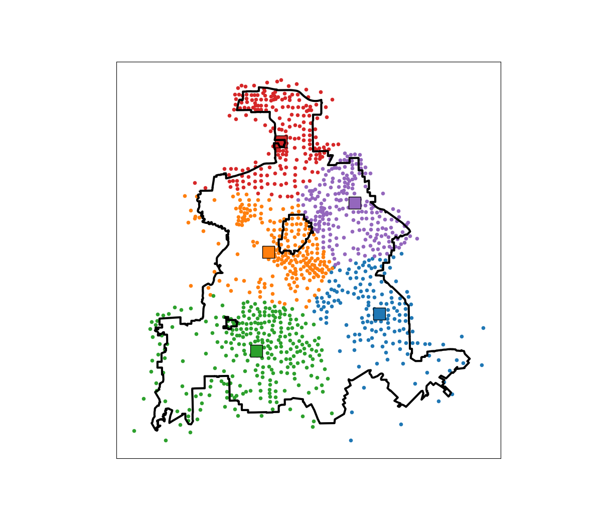
In this example, if we choose 5 locations in the city to minimize the overall distance, the average travel is just shy of 3.5 miles. The average travel for white people (not including Hispanics) is 3.25 miles, and for minorities is 3.6 miles. When I use my fair algorithm, the white average distance is 3.5 miles, and the minority average distance is 3.6 miles (minority on average travels under 200 more feet on average than white).

So this is ultimately a trade off – it ends up pushing up the average distance a white person will travel, and only slightly pushes down the minority travel, to balance the overall distances between the two groups. It is often the case though that one can be somewhat more fair, but in only results in slight trade-offs though in the overall objective function (Rodolfa et al., 2021). So that trade off is probably worth it here.

References

ptools feature engineering vignette update

For another update to my ptools R package in progress, I have added a vignette to go over the spatial feature engineering functions I have organized. These include creating vector spatial features (grid cells, hexagons, or Voronoi polygons), as well as RTM style features on the right hand side (e.g. distance to nearest, kernel density estimates at those polygon centroids, different weighted functions ala egohoods, etc.)

If you do install the package turning vignettes on you can see it:

install_github("apwheele/ptools", build_vignettes = TRUE)
vignette("spat-feateng")

Here is an example of hexgrids over NYC (I have datasets for NYC Shootings, NYC boroughs, NYC Outdoor Cafes, and NYC liquor licenses to illustrate the functions).

The individual functions I think are reasonably documented, but it is somewhat annoying to get an overview of them all. If you go to something like “?Documents/R/win-library/4.1/ptools/html/00Index.html” (or wherever your package installation folder is) you can see all of the functions currently in the package in one place (is there a nice way to pull this up using help()?). But between this vignette and the Readme on the front github page you get a pretty good overview of the current package functionality.

I am still flip flopping whether to bother to submit to CRAN. Installing from github is so easy not sure it is worth the hassle while I continually add in new things to the package. And I foresee tinkering with it for an extended period of time.

Always feel free to contribute, I want to not only add more functions, but should continue to do unit tests and add in more vignettes.

Geocoding the CMS NPI Registry (python)

So previously I wrote out creating service deserts. I have since found a nicer data source to use for this, the NPI CMS registry. This data file has over 6 million service providers across the US.

Here I will provide an example of using that data to geocode all the pharmacy’s in Texas, again using the census geocoding API and python.

Chunking up the NPI database

So first, you can again download the entire NPI database from here. So I have already downloaded and unzipped that file, which contains a CSV for the January version, named npidata_pfile_20050523-20210110.csv. So as some upfront, here are the libraries I will be using, and I also set the directory to where my data is located.

###############################
import pandas as pd
import numpy as np
import censusgeocode as cg
import time
from datetime import datetime
import os
os.chdir(r'D:\HospitalData\NPPES_Data_Dissemination_January_2021')
###############################

The file is just a bit too big for me to fit in memory on my machine. On Windows, you can use Get-Content npidata_pfile_20050523-20210110.csv | Measure-Object -Line in powershell to get the line counts, or on Unix use wc -l *.csv for example. So I know the file is not quite 6.7 million rows.

So what I do here is create a function to read in the csv file in chunks, only select the columns and rows that I want, and then return that data frame. In the end, you need to search across all of the Taxonomy codes to pull out the type of service provider you want. So for community pharmacies, the code is 3336C0003X, but it is not always in the first Taxonomy slot (some CVS’s have it in the second slot for example). You can see the big list of taxonomy codes here, so my criminology friends may say be interested in mental health or substance abuse service providers for other examples.

In addition to the taxonomy code, I always select organizations, not individuals (Entity Type = 2). And then I only select out pharmacies in Texas (although I bet you could fit all of the US pharmacies in memory pretty easily, maybe 60k in total?) Caveat emptor, I am not 100% sure how to use the deactivation codes properly in this database, as that data is always NaN for Texas pharmacies.

######################################################################
# Prepping the input data in chunks

keep_col = ['NPI','Entity Type Code','Provider Organization Name (Legal Business Name)',
            'NPI Deactivation Reason Code','NPI Deactivation Date','NPI Reactivation Date',
            'Provider First Line Business Practice Location Address',
            'Provider Business Practice Location Address City Name',
            'Provider Business Practice Location Address State Name',
            'Provider Business Practice Location Address Postal Code']
            
taxon_codes = ['Healthcare Provider Taxonomy Code_' + str(i+1) for i in range(15)]
keep_col += taxon_codes
community_pharm = '3336C0003X'
npi_csv = 'npidata_pfile_20050523-20210110.csv' #Newer files will prob change the name

# This defines the rows I want
def sub_rows(data):
    ec = data['Entity Type Code'] == "2"
    st = data['Provider Business Practice Location Address State Name'] == 'TX'
    ta = (data[taxon_codes] == community_pharm).any(axis=1)
    #ac = data['NPI Deactivation Reason Code'].isna()
    all_together = ec & st & ta #& ac
    sub = data[all_together]
    return sub

def csv_chunks(file,chunk_size,keep_cols,row_sub):
    # First lets get the header and figure out the column indices
    header_fields = list(pd.read_csv(npi_csv, nrows=1))
    header_locs = [header_fields.index(i) for i in keep_cols]
    # Now reading in a chunk of data
    skip = 1
    it_n = 0
    sub_n = 0
    ret_chunk = chunk_size
    fin_li_dat = []
    while ret_chunk == chunk_size:
        file_chunk = pd.read_csv(file, usecols=header_locs, skiprows=skip, 
                     nrows=chunk_size, names=header_fields, dtype='str')
        sub_dat = row_sub(file_chunk)
        fin_li_dat.append( sub_dat.copy() )
        skip += chunk_size
        it_n += 1
        sub_n += sub_dat.shape[0]
        print(f'Grabbed iter {it_n} total sub n so far {sub_n}')
        ret_chunk = file_chunk.shape[0]
    fin_dat = pd.concat(fin_li_dat, axis=0)
    return fin_dat


# Takes about 3 minutes
print( datetime.now() )
pharm_tx = csv_chunks(npi_csv, chunk_size=1000000, keep_cols=keep_col, row_sub=sub_rows)
print( datetime.now() )

# No deactivated codes in all of Texas
print( pharm_tx['NPI Deactivation Reason Code'].value_counts() )
######################################################################

So this ends up returning not quite 6800 pharmacies in all of Texas.

Geocoding using the census API

So first, the address data is pretty well formatted. But for those new to geocoding, if you have end parts of address strings like Apt 21 or Suite C, those endings will typically throw geocoders off the mark. So in just a few minutes, I noted the different strings that marked the parts of the addresses I should chop off, and wrote a function to clean those up. Besides that I just limit the zip code to 5 digits, as that field is a mix of 5 and 9 digit zipcodes.

######################################################################
# Now prepping the data for geocoding

ph_tx = pharm_tx.drop(columns=taxon_codes).reset_index(drop=True)

#['Provider First Line Business Practice Location Address', 'Provider Business Practice Location Address City Name', 'Provider Business Practice Location Address State Name', 'Provider Business Practice Location Address Postal Code']

# I just looked through the files and saw that after these strings are not needed
end_str = [' STE', ' SUITE', ' BLDG', ' TOWER', ', #', ' UNIT',
           ' APT', ' BUILDING',',', '#']

 
def clean_add(address):
    add_new = address.upper()
    for su in end_str:
        sf = address.find(su)
        if sf > -1:
            add_new = add_new[0:sf]
    add_new = add_new.replace('.','')
    add_new = add_new.strip()
    return add_new

# Some examples
clean_add('5700 S GESSNER DR STE G')
clean_add('10701-B WEST BELFORT SUITE 170')
clean_add('100 EAST UNIVERSITY BLVD.')
clean_add('5800 BELLAIRE BLVD BLDG 1')
clean_add('2434 N I-35 # S')

ph_tx['Zip5'] = ph_tx['Provider Business Practice Location Address Postal Code'].str[0:5]
ph_tx['Address'] = ph_tx['Provider First Line Business Practice Location Address'].apply(clean_add)
ph_tx.rename(columns={'Provider Business Practice Location Address City Name':'City',
                      'Provider Business Practice Location Address State Name':'State2'},
             inplace=True)
######################################################################

Next is my function to use the batch geocoding in the census api. Note the census api is a bit finicky – technically the census api says you can do batches of up to 5k rows, but I tend to get kicked off for higher values. So here I have a function that chunks it up into tinier batch portions and submits to the API. (A better function would cache intermediate results and wrap all that jazz in a try function.)

 ######################################################################
 #This function breaks up the input data frame into chunks
 #For the census geocoding api
 def split_geo(df, add, city, state, zipcode, chunk_size=500):
     df_new = df.copy()
     df_new.reset_index(inplace=True)
     splits = np.ceil( df.shape[0]/chunk_size)
     chunk_li = np.array_split(df_new['index'], splits)
     res_li = []
     pick_fi = []
     for i,c in enumerate(chunk_li):
         # Grab data, export to csv
         sub_data = df_new.loc[c, ['index',add,city,state,zipcode]]
         sub_data.to_csv('temp_geo.csv',header=False,index=False)
         # Geo the results and turn back into df
         print(f'Geocoding round {int(i)+1} of {int(splits)}, {datetime.now()}')
         result = cg.addressbatch('temp_geo.csv') #should try/except?
         # May want to dump the intermediate results
         #pi_str = f'pickres_{int(i)}.p'
         #pickle.dump( favorite_color, open( pi_str, "wb" ) )
         #pick_fi.append(pi_str.copy())
         names = list(result[0].keys())
         res_zl = []
         for r in result:
             res_zl.append( list(r.values()) )
         res_df = pd.DataFrame(res_zl, columns=names)
         res_li.append( res_df.copy() )
         time.sleep(10) #sleep 10 seconds to not get cutoff from request
     final_df = pd.concat(res_li)
     final_df.rename(columns={'id':'row'}, inplace=True)
     final_df.reset_index(inplace=True, drop=True)
     # Clean up csv file
     os.remove('temp_geo.csv')
     return final_df
 ######################################################################

And now we are onto the final stage, actually running the geocoding function, and piping the end results to a csv file. (Which you can see the final version here.)

######################################################################
# Geocoding the data in chunks

# Takes around 35 minutes
geo_pharm = split_geo(ph_tx, add='Address', city='City', state='State2', zipcode='Zip5', chunk_size=100)

#What is the geocoding hit rate?
print( geo_pharm['match'].value_counts() )
# Only around 65%

# Now merging back with the original data if you want
# Not quite sorted how I need them
geo_pharm['rowN'] = geo_pharm['row'].astype(int)
gp2 = geo_pharm.sort_values(by='rowN').reset_index(drop=True)

# Fields I want
kg = ['address','match','lat','lon']
kd = ['NPI',
      'Provider Organization Name (Legal Business Name)',
      'Provider First Line Business Practice Location Address',
      'Address','City','State2','Zip5']

final_pharm = pd.concat( [ph_tx[kd], gp2[kg]], axis=1 )

final_pharm.to_csv('Pharmacies_Texas.csv',index=False)
######################################################################

Unfortunately the geocoding hit rate is pretty disappointing, only around 65% in this sample. So if I were using this for a project, I would likely do a round of geocoding using the Google API (which is a bit more unforgiving for varied addresses), or perhaps build my own openstreet map geocoder for the US. (Or in general if you don’t have too many to review, doing it interactively in ArcGIS is very nice as well if you have access to Arc.)

Buffers and hospital deserts with geopandas

Just a quick blog post today. As a bit of a side project at work I have been looking into medical service provider deserts. Most people simply use a geographic cutoff of say 1 mile (see Wissah et al., 2020 for example for Pharmacy deserts). Also for CJ folks, John Hipp has done some related work for parolees being nearby service providers (Hipp et al., 2009; 2011), measuring nearby as 2 miles.

So I wrote some code to calculate nice sequential buffer areas and dissolve them in geopandas. Files and code to showcase are here on GitHub. First, as an example dataset, I geocode (using the census geocoding API) CMS certified Home Healthcare facilities, so these are hospice facilities. To see a map of those facilities across the US, and you can click on the button to get info, go to here, CMS HOME FACILITY MAP. Below is a screenshot:

Next I then generate sequential buffers in kilometers of 2, 4, 8, 16, and then the leftover (just for Texas). So you can then zoom in and darker areas are at a higher risk of not having a hospice facility nearby. HOSPICE DESERT MAP

Plotting some of these in Folium were giving me fits, so I will need to familiarize myself with that more in the future. The buffers for the full US as well were giving me trouble (these just for Texas result in fairly large files, surprised Github doesn’t yell at me for them being too big).

Going forward, what I want to do is instead of relying on a fixed function of distance, is to fit a model to identify individuals probability of going to the doctor based on distance. So instead of just saying 1+ mile and you are at high risk, fit a function that defines that distance based on behavioral data (maybe using insurance claims). Also I think the distances matter quite a bit for urban/rural and car/no-car. So rural folks traveling a mile is not a big deal, since you need a car to really do anything in rural areas. But for folks in the city relying on public transportation going a mile or two is a bigger deal.

The model then would be similar to the work I did with Gio on gunshot death risk (Circo & Wheeler, 2020), although I imagine the model would spatially vary (so maybe geographically weighted regression may work out well).

References

New book: Micro geographic analysis of Chicago homicides, 1965-2017

In joint work with Chris Herrmann and Dick Block, we now have a book out – Understanding Micro-Place Homicide Patterns in Chicago (1965 – 2017). It is a Springer Brief book, so I recommend anyone who has a journal article that is too long that this is a potential venue for the work. (Really this is like the length of three journal articles.)

A few things occurred to prompt me to look into this. First, Chicago increased a big spike of homicides in 2016 and 2017. Here is a graph breaking them down between domestic related homicides and all other homicides. You can see all of the volatility is related to non-domestic homicides.

So this (at least to me) begs the question of whether those spiked homicides show similar characteristics compared to historical homicides. Here we focus on long term spatial patterns and micro place grid cells in the city, 150 by 150 meter cells. Dick & Carolyn Block had collated data, including the address where the body was discovered, using detective case notes starting in 1965 (ending in 2000). The data from 2000 through 2017 is the public incident report data released by Chicago PD online. Although Dick and Carolyn’s public dataset is likely well known at this point, Dick has more detailed data than is released publicly on ICPSR and a few more years (through 2000). Here is a map showing those homicide patterns aggregated over the entire long time period.

So we really have two different broad exploratory analyses we employed in the work. One was to examine homicide clustering, and the other was to examine temporal patterns in homicides. For clustering, we go through a ton of different metrics common in the field, and I introduce even one more, Theil’s decomposition for within/between neighborhood clustering. This shows Theil’s clustering metric within neighborhoods in Chicago (based on the entire time period).

So areas around the loop showed more clustering in homicides, but here it appears it is somewhat confounded with neighborhood size – smaller neighborhoods appear to have more clustering. This is sort of par for the course for these clustering metrics (we go through several different Gini variants as well), in that they are pretty fickle. You do a different temporal slice of data or treat empty grid cells differently the clustering metrics can change quite a bit.

So I personally prefer to focus on long term temporal patterns. Here I estimated group based trajectory models using zero-inflated Poisson models. And here are the predicted outputs for those grid cells over the city. You can see unlike prior work David Weisburd (Seattle), myself (Albany), or Martin Andresen (Vancouver) has done, they are much more wavy patterns. This may be due to looking over a much longer horizon than any of those prior works though have.

The big wave, Group 9, ends up being clearly tied to former large public housing projects, which their demolitions corresponds to the downturn.

I have an interactive map to explore the other trajectory groups here. Unfortunately the others don’t show as clear of patterns as Group 9, so it is difficult to answer any hard questions about the uptick in 2016/2017, you could find evidence of homicides dispersing vs homicides being in the same places but at a higher intensity if you slice the data different ways.

Unfortunately the analysis is never ending. Chicago homicides have again spiked this year, so maybe we will need to redo some analysis to see if the more current trends still hold. I think I will migrate away from the clustering metrics though (Gini and Theil), they appear to be too volatile to say much of anything over short term patterns. I think there may be other point pattern analysis that are more diagnostic to really understand emerging/changing spatial patterns.

The coffee next to the cover image is Chris Herrmann’s beans, so go get yourself some as well at Fellowship Coffee!

Mapping attitudes paper published

My paper (joint work with Jasmine Silver, Rob Worden, and Sarah McLean), Mapping attitudes towards the police at micro places, has been published in the most recent issue of the Journal of Quantitative Criminology. Here is the abstract:

Objectives: We examine satisfaction with the police at micro places using data from citizen surveys conducted in 2001, 2009 and 2014 in one city. We illustrate the utility of this approach by comparing micro- and meso-level aggregations of policing attitudes, as well as by predicting views about the police from crime data at micro places.

Methods: In each survey, respondents provided the nearest intersection to their address. Using that geocoded survey data, we use inverse distance weighting to map a smooth surface of satisfaction with police over the entire city and compare the micro-level pattern of policing attitudes to survey data aggregated to the census tract. We also use spatial and multi-level regression models to estimate the effect of local violent crimes on attitudes towards police, controlling for other individual and neighborhood level characteristics.

Results: We demonstrate that there are no systematic biases for respondents refusing to answer the nearest intersection question. We show that hot spots of dissatisfaction with police do not conform to census tract boundaries, but rather align closely with hot spots of crime. Models predicting satisfaction with police show that local counts of violent crime are a strong predictor of attitudes towards police, even above individual level predictors of race and age.

Conclusions: Asking survey respondents to provide the nearest intersection to where they live is a simple approach to mapping attitudes towards police at micro places. This approach provides advantages beyond those of using traditional neighborhood boundaries. Specifically, it provides more precise locations police may target interventions, as well as illuminates an important predictor (i.e., nearby violent crimes) of policing attitudes.

And this was one of my favorites to make maps. We show how to take surveys and create analogs of hot spot maps of negative sentiment towards police. We do this via asking individuals to list their closest intersection (to still give some anonymity), and then create inverse distance weighted maps of negative attitudes towards police.

We also find in this work that nearby crimes are the biggest factor in predicting negative sentiment towards police. This hints that past results aggregating attitudes to neighborhoods is inappropriate, and that police reducing crime is likely to have the best margin in terms of making people more happy with the police in general.

As always, feel free to reach out for a copy of the paper if you cannot access JQC. (Or you could go a view the pre-print.)

Notes on making Leaflet maps in R

The other day I wrote a blog post for crimrxiv about posting interactive graphics on their pre-print sharing service. I figured it would be good to share my notes on making interactive maps, and to date I’ve mostly created these using the R leaflet library.

The reason I like these interactive maps is they allow you to zoom in and look at hot spots of crime. With the slippy base maps you can then see, oh OK this hot spot is by a train station, or an apartment complex, etc. It also allows you to check out specific data labels via pop-ups as I will show.

I’m using data from my paper on creating cost of crime weighted hot spots in Dallas (that will be forthcoming in Police Quarterly soonish). But I have posted a more direct set of replicating code for the blog post here.

R Code

So first for the R libraries I am using, I also change the working directory to where I have my data located on my Windows machine.

##########################################################
#This code creates a nice leaflet map of my DBSCAN areas

library(rgdal)       #read in shapefiles
library(sp)          #spatial objects
library(leaflet)     #for creating interactive maps
library(htmlwidgets) #for exporting interactive maps

#will need to change baseLoc if replicating on your machine
baseLoc <- "D:\\Dropbox\\Dropbox\\Documents\\BLOG\\leaflet_R_examples\\Analysis"
setwd(baseLoc)
##########################################################

Second, I read in my shapefiles using the rgdal library. This is important, as it includes the projection information. To plot the spatial objects on a slippy map they need to be in the Web Mercator projection (or technically no projection, just a coordinate reference system for the globe). As another trick I like with these basemaps, for the outlined area (the Dallas boundary here), it is easier to plot as a line spatial object, as opposed to an empty filled polygon. You don’t need to worry about the order of the layers as much that way.

##########################################################
#Get the boundary data and DBSCAN data
boundary <- readOGR(dsn="Dallas_MainArea_Proj.shp",layer="Dallas_MainArea_Proj")
dbscan_areas <- readOGR(dsn="db_scan.shp",layer="db_scan")

#Now convert to WGS
DalLatLon <- spTransform(boundary,CRS("+init=epsg:4326"))
DallLine <- as(DalLatLon, 'SpatialLines') #Leaflet useful for boundaries to be lines instead of areas
dbscan_LatLon <- spTransform(dbscan_areas,CRS("+init=epsg:4326") )

#Quick and Dirty plot to check projections are OK
plot(DallLine)
plot(dbscan_LatLon,add=TRUE,col='blue')
##########################################################

Next part, I have a custom function I have made to make pop-up labels for these leaflet maps. First I need to read in a table with the data info for the hot spot areas and merge that into the spatial object. Then the way my custom function works is I pass it the dataset, then I have arguments for the variables I want, and the way I want them labeled. The function does the work of making the labels bolded and putting in line breaks into the HTML. (No doubt others have created nice libraries to do HTML tables/graphs inside the pop-ups that I am unaware of.) If you check out the final print statement, it shows the HTML it built for one of the labels, <strong>ID: </strong>1<br><strong>$ (Thousands): </strong>116.9<br><strong>PAI: </strong>10.3<br><strong>Street Length (Miles): </strong>0.4

##########################################################
#Function for labels

#read in data
crime_stats <- read.csv('ClusterStats_wlen.csv', stringsAsFactors=FALSE)
dbscan_stats <- crime_stats[crime_stats$type == 'DBSCAN',]
dbscan_stats$clus_id <- as.numeric(dbscan_stats$AreaStr) #because factors=False!

#merge into the dbscan areas
dbscan_LL <- merge(dbscan_LatLon,dbscan_stats)

LabFunct <- function(data,vars,labs){
  n <- length(labs)
  add_lab <- paste0("<strong>",labs[1],"</strong>",data[,vars[1]])
  for (i in 2:n){
    add_lab <- paste0(add_lab,"<br><strong>",labs[i],"</strong>",data[,vars[i]])
  }
  return(add_lab)
}

#create labels
vs <- c('AreaStr', 'val_th', 'PAI_valth_len', 'LenMile')
#Lazy, so just going to round these values
for (v in vs[-1]){
  dbscan_LL@data[,v] <- round(dbscan_LL@data[,v],1)
}  
lb <- c('ID: ','$ (Thousands): ','PAI: ','Street Length (Miles): ')
diss_lab <- LabFunct(dbscan_LL@data, vs, lb)

print(diss_lab[1]) #showing off just one
##########################################################

Now finally onto the hotspot map. This is a bit to chew over, so I will go through bit-by-bit.

##########################################################
HotSpotMap <- leaflet() %>%
  addProviderTiles(providers$OpenStreetMap, group = "Open Street Map") %>%
  addProviderTiles(providers$CartoDB.Positron, group = "CartoDB Lite") %>%
  addPolylines(data=DallLine, color='black', weight=4, group="Dallas Boundary") %>%
  addPolygons(data=dbscan_LL,color = "blue", weight = 2, opacity = 1.0, 
              fillOpacity = 0.5, group="DBSCAN Areas",popup=diss_lab, 
              highlight = highlightOptions(weight = 5,bringToFront = TRUE)) %>%
  addLayersControl(baseGroups = c("Open Street Map","CartoDB Lite"),
                   overlayGroups = c("Dallas Boundary","DBSCAN Areas"),
                   options = layersControlOptions(collapsed = FALSE))  %>%
  addScaleBar(position = "bottomleft", options = scaleBarOptions(maxWidth = 100, 
              imperial = TRUE, updateWhenIdle = TRUE))
                      
HotSpotMap #this lets you view interactively

#or save to a HTML file to embed in webpage
saveWidget(HotSpotMap,"HotSpotMap.html", selfcontained = TRUE)
##########################################################

First I create the empty leaflet() object. Because I am superimposing multiple spatial layers, I don’t worry about setting the default spatial layer. Second, I add in two basemap providers, OpenStreetMap and the grey scale CartoDB positron. Positron is better IMO for visualizing global data patterns, but the open street map is better for when you zoom in and want to see exactly what is around a hot spot area. Note when adding in a layer, I give it a group name. This allows you to later toggle which provider you want via a basegroup in the layers control.

Next I add in the two spatial layers, the Dallas Boundary lines and then the hot spots. For the DBSCAN hot spots, I include a pop-up diss_lab for the dbscan hot spot layer. This allows you to click on the polygon, and you get the info I stuffed into that label vector earlier. The HTML is to make it print nicely.

Finally then I add in a layers control, so you can toggle layers on/off. Basegroups mean that only one of the options can be selected, it doesn’t make sense to have multiple basemaps selected. Overlay you can toggle on/off as needed. Here the overlay doesn’t matter much due to the nature of the map, but if you have many layers (e.g. a hot spot map and a choropleth map of demographics) being able to toggle the layers on/off helps a bit more.

Then as a final touch I add in a scale bar (that automatically updates depending on the zoom level). These aren’t my favorite with slippy maps, as I’m not even 100% sure what location the scale bar refers to offhand (the center of the map? Or literally where the scale bar is located?) But when zoomed into smaller areas like a city I guess it is not misleading.

Here is a screenshot of this created map zoomed out to the whole city using the Positron grey scale base map. So it is tough to visualize the distribution of hot spots from this. If I wanted to do that in a static map I would likely just plot the hot spot centroids, and then make the circles bigger for areas that capture more crime.

But since we can zoom in, here is another screenshot zoomed in using the OpenStreetMap basemap, and also illustrating what my pop-up labels look like.

I’m too lazy to post this exact map, but it is very similar to one I posted for my actual hot spots paper if you want to check it out directly. I host it on GitHub for free.

Here I did not show how to make a choropleth map, but Jacob Kaplan in his R book has a nice example of that. And in the future I will have to update this to show how to do the same thing in python using the Folium library. I used Folium in this blog post if you want to dig into an example though for now.

Some more examples

For some other examples of what is possible in Leaflet maps in R, here are some examples I made for my undergrad Communities and Crime class. I had students submit prediction assignments (e.g. predict the neighborhood with the most crime in Dallas, predict the street segment in Oak Cliff with the most violent crime, predict the bar with the most crimes nearby, etc.) I would then show the class the results, as well as where other students predicted. So here are some screen shots of those maps.

Choropleth

Graduated Points

Street Segment Viz

Creating a basemap in python using contextily

Me and Gio received a peer review asking for a nice basemap in Philadelphia showing the relationship between hospital locations and main arterials for our paper on shooting fatalities.

I would typically do this in ArcMap, but since I do not have access to that software anymore, I took some time to learn the contextily library in python to accomplish the same task.

Here is the map we will be producing in the end:

So if you are a crime analyst working for a specific city, it may make sense to pull the original vector data for streets/highways and create your own style for your maps. That is quite a bit of work though, so for a more general solution these basemaps are really great. (And are honestly nicer than I could personally make even with the original vector data anyway).

Below I walk through the python code, but the data to replicate my paper with Gio can be found here, including the updated base map python script and shapefile data.

Front matter

So first, I have consistently had a difficult time working with the various geo tools in python on my windows machine. Most recently the issue was older version of pyproj and epsg codes were giving me fits. So at the recommendation of the geopandas folks, I just created my own conda environment for geospatial stuff, and that has worked nicely so far.

So here I need geopandas, pyproj, & contexily as non-traditional libraries. Then I change my working directory to where I have my data, and then update my personal matplotlib defaults.

'''
Python script to make a basemap
For Philadelphia
'''

import geopandas
import pyproj
import contextily as cx
import matplotlib
import matplotlib.pyplot as plt
import os
os.chdir(r'D:\Dropbox\Dropbox\School_Projects\Shooting_Survival_Philly\Analysis\OriginalData'

#Plot theme
andy_theme = {'axes.grid': True,
              'grid.linestyle': '--',
              'legend.framealpha': 1,
              'legend.facecolor': 'white',
              'legend.shadow': True,
              'legend.fontsize': 14,
              'legend.title_fontsize': 16,
              'xtick.labelsize': 14,
              'ytick.labelsize': 14,
              'axes.labelsize': 16,
              'axes.titlesize': 20,
              'figure.dpi': 100}

matplotlib.rcParams.update(andy_theme)

Data Prep with geopandas & pyproj

The next part we load in our shapefile into a geopandas data frame (just a border for Philly), then I just define the locations of hospitals (with level 1 trauma facilities) in text in the code.

Note that the background is in projected coordinates, so then I use some updated pyproj code to transform the lat/lon into the local projection I am using.

I thought at first you needed to only use typical web map projections to grab the tiles, but Dani Arribas-Bel has done a bunch of work to make this work for any projection. So I prefer to stick to projected maps when I can.

If you happened to want to stick to typical web map projections though geopandas makes it quite easy using geo_dat.to_crs('epsg:4326').

#####################################
#DATA PREP

ph_gp = geopandas.GeoDataFrame.from_file('City_Limits_Proj.shp')

#Locations of the hospitals
hos = [('Einstein',40.036935,-75.142657),
       ('Hahneman',39.957284,-75.163222),
       ('Temple',40.005507,-75.150257),
       ('Jefferson',39.949121,-75.157631),
       ('Penn',39.949819,-75.192883)]

#Convert to local projection
transformer = pyproj.Transformer.from_crs("epsg:4326", ph_gp.crs.to_string())
hx = []
hy = []
for h, lat, lon in hos:
    xp, yp = transformer.transform(lat, lon)
    hx.append(xp)
    hy.append(yp)
#####################################

Making the basemap

Now onto the good stuff. Here I use the default plotting methods from geopandas boundary plot to create a base matplotlib plot object with the Philly border outline.

Second I turn off the tick marks.

Next I have some hacky code to do the north arrow and scale bar. The north arrow is using annotations and arrows, so this just relies on the fact that north is up in the plot. (If it isn’t, you will need to adjust this for your map.)

The scale bar is more straightforward – I just plot a rectangle on the matplotlib plot, and then put text in the middle of the bar. Since the projected units are in meters, I just draw a rectangle that is 5 kilometers longways.

Then I add in the hospital locations. Note I gave the outline a label, as well as the hospitals. This is necessary to have those objects saved into the matplotlib legend. Which I add to the plot after this, and increase the default size.

Finally I add my basemap. I do not need to do anything special here, the contextily add_basemap function figures it all out for me, given that I pass in the coordinate reference system of the basemap. (You can take out the zoom level argument at first, 12 is the default zoom for Philly.)

Then I save the file to a lower res PNG.

#####################################
#Now making a basemap in contextily

ax = ph_gp.boundary.plot(color='k', linewidth=3, figsize=(12,12), label='City Boundary', edgecolor='k')
#ax.set_axis_off() #I still want a black frame around the plot
ax.get_xaxis().set_ticks([])
ax.get_yaxis().set_ticks([])

#Add north arrow, https://stackoverflow.com/a/58110049/604456
x, y, arrow_length = 0.85, 0.10, 0.07
ax.annotate('N', xy=(x, y), xytext=(x, y-arrow_length),
            arrowprops=dict(facecolor='black', width=5, headwidth=15),
            ha='center', va='center', fontsize=20,
            xycoords=ax.transAxes)

#Add scale-bar
x, y, scale_len = 829000, 62500, 5000 #arrowstyle='-'
scale_rect = matplotlib.patches.Rectangle((x,y),scale_len,200,linewidth=1,edgecolor='k',facecolor='k')
ax.add_patch(scale_rect)
plt.text(x+scale_len/2, y+400, s='5 KM', fontsize=15, horizontalalignment='center')

#Add in hospitals as points
plt.scatter(hx, hy, s=200, c="r", alpha=0.5, label='Trauma Hospitals')

#Now making a nice legend
ax.legend(loc='upper left', prop={'size': 20})

#Now adding in the basemap imagery
cx.add_basemap(ax, crs=ph_gp.crs.to_string(), source=cx.providers.CartoDB.Voyager, zoom=12)

#Now exporting the map to a PNG file
plt.savefig('PhillyBasemap_LowerRes.png', dpi=100) #bbox_inches='tight'
#####################################

And voila, you have your nice basemap.

Extra: Figuring out zoom levels

I suggest playing around with the DPI and changing the zoom levels, and changing the background tile server to see what works best given the thematic info you are superimposing on your map.

Here are some nice functions to help see the default zoom level, how many map tiles need to be downloaded when you up the default zoom level, and a list of various tile providers available. (See the contextily github page and their nice set of notebooks for some overview maps of the providers.)

#####################################
#Identifying how many tiles
latlon_outline = ph_gp.to_crs('epsg:4326').total_bounds
def_zoom = cx.tile._calculate_zoom(*latlon_outline)
print(f'Default Zoom level {def_zoom}')

cx.howmany(*latlon_outline, def_zoom, ll=True) 
cx.howmany(*latlon_outline, def_zoom+1, ll=True)
cx.howmany(*latlon_outline, def_zoom+2, ll=True)

#Checking out some of the other providers and tiles
print( cx.providers.CartoDB.Voyager )
print( cx.providers.Stamen.TonerLite )
print( cx.providers.Stamen.keys() )
#####################################

Projecting spatial data in Python and R

I use my blog as sort of a scholarly notebook. I often repeatedly do a task, and then can’t find where I did it previously. One example is projecting crime data, so here are my notes on how to do that in python and R.

Commonly I want to take public crime data that is in spherical lat/lon coordinates and project it to some local projection. Most of the time so I can do simply euclidean geometry (like buffers within X feet, or distance to the nearest crime generator in meters). Sometimes you need to do the opposite — if I have the projected data and I want to plot the points on a webmap it is easier to work with the lat/lon coordinates. As a note, if you import your map data and then your points are not on the map (or in a way off location), there is some sort of problem with the projection.

I used to do this in ArcMap (toolbox -> Data Management -> Projections), but doing it these programs are faster. Here are examples of going back and forth for some Dallas coordinates. Here is the data and code to replicate the post.

Python

In python there is a library pyproj that does all the work you need. It isn’t part of the default python packages, so you will need to install it using pip or whatever. Basically you just need to define the to/from projections you want. Also it always returns the projected coordinates in meters, so if you want feet you need to do a conversions from meters to feet (or whatever unit you want). For below p1 is the definition you want for lat/lon in webmaps (which is not a projection at all). To figure out your local projection though takes a little more work.

To figure out your local projection I typically use this online tool, prj2epsg. You can upload a prj file, which is the locally defined projection file for shapefiles. (It is plain text as well, so you can just open in a text editor and paste into that site as well.) It will then tell you want EPSG code corresponds to your projection.

Below illustrates putting it all together and going back and forth for an example area in Dallas. I tend to write the functions to take one record at a time for use in various workflows, but I am sure someone can write a vectorized version though that will take whole lists that is a better approach.

import pyproj

#These functions convert to/from Dallas projection
#In feet to lat/lon
p1 = pyproj.Proj(proj='latlong',datum='WGS84')
p2 = pyproj.Proj(init='epsg:2276') #show how to figure this out, http://spatialreference.org/ref/epsg/ and http://prj2epsg.org/search 
met_to_feet = 3.280839895 #http://www.meters-to-feet.com/

#This converts Lat/Lon to projected coordinates
def DallConvProj(Lat,Lon):
    #always returns in meters
    if abs(Lat) > 180 or abs(Lon) > 180:
        return (None,None)
    else:
        x,y = pyproj.transform(p1, p2, Lon, Lat)
        return (x*met_to_feet, y*met_to_feet)

#This does the opposite, coverts projected to lat/lon
def DallConvSph(X,Y):
    if abs(X) < 2000000 or abs(Y) < 6000000:
        return (None,None)
    else:
        Lon,Lat = pyproj.transform(p2, p1, X/met_to_feet, Y/met_to_feet)
        return (Lon, Lat)

#check coordinates
x1 = -96.828295; y1 = 32.832521
print DallConvProj(Lat=y1,Lon=x1)

x2 = 2481939.934525765; y2 = 6989916.200679892
print DallConvSph(X=x2, Y=y2)

R

In R I use the library proj4 to do the projections for point data. R can read in the projection data from a file as well using the rgdal library.

library(proj4)
library(rgdal)

#read in projection from shapefile
MyDir <- "C:\\Users\\axw161530\\Dropbox\\Documents\\BLOG\\Projections_R_Python"
setwd(MyDir)
DalBound <- readOGR(dsn="DallasBoundary_Proj.shp",layer="DallasBoundary_Proj")
DalProj <- proj4string(DalBound)    

ProjData <- data.frame(x=c(2481939.934525765),
                       y=c(6989916.200679892),
                       lat=c(32.832521),
                       lon=c(-96.828295))
       
LatLon <- proj4::project(as.matrix(ProjData[,c('x','y')]), proj=DalProj, inverse=TRUE)
#check to see if true
cbind(ProjData[,c('lon','lat')],as.data.frame(LatLon))

XYFeet <- proj4::project(as.matrix(ProjData[,c('lon','lat')]), proj=DalProj)
cbind(ProjData[,c('x','y')],XYFeet)    

plot(DalBound)
points(ProjData$x,ProjData$y,col='red',pch=19,cex=2)

The last plot function shows that the XY point is within the Dallas basemap for the projected boundary. But if you want to project the boundary file as well, you can use the spTransform function. Here I have a simple example of tacking the projected boundary file and transforming to lat/lon, so can be superimposed on a leaflet map.

Additionally I show a trick I sometimes use for maps by transforming the boundary polygon to a polyline, as it provides easier styling options sometimes.

#transform boundary to lat/lon
DalLatLon <- spTransform(DalBound,CRS("+init=epsg:4326") )
plot(DalLatLon)
points(ProjData$lon,ProjData$lat,col='red',pch=19,cex=2)

#Leaflet useful for boundaries to be lines instead of areas
DallLine <- as(DalLatLon, 'SpatialLines')
library(leaflet)

BaseMapDallas <- leaflet() %>%
  addProviderTiles(providers$OpenStreetMap, group = "Open Street Map") %>%
  addProviderTiles(providers$CartoDB.Positron, group = "CartoDB Lite") %>%
  addPolylines(data=DallLine, color='black', weight=4, group="Dallas Boundary Lines") %>%
  addPolygons(data=DalLatLon,color = "#1717A1", weight = 1, smoothFactor = 0.5,
              opacity = 1.0, fillOpacity = 0.5, group="Dallas Boundary Area") %>%
  addLayersControl(baseGroups = c("Open Street Map","CartoDB Lite"),
                   overlayGroups = c("Dallas Boundary Area","Dallas Boundary Lines"),
                   options = layersControlOptions(collapsed = FALSE)) %>%
                   hideGroup("Dallas Boundary Lines")   
                      
BaseMapDallas

I have too much stuff in the blog queue at the moment, but hopefully I get some time to write up my notes on using leaflet maps in R soon.

American Community Survey Variables of Interest to Criminologists

I’ve written prior blog posts about downloading Five Year American Community Survey data estimates (ACS for short) for small area geographies, but one of the main hiccups is figuring out what variables you want to use. The census has so many variables that are just small iterations of one another (e.g. Males under 5, males 5 to 9, males 10 to 14, etc.) that it is quite a chore to specify the ones you want. Often you want combinations of variables or to calculate percentages as well, so you need to take two or more variables and turn them into your constructed variable.

I have posted some notes on the variables I have used for past projects in an excel spreadsheet. This includes the original variables, as well as some notes for creating percentage variables. Some are tricky — such as figuring out the proportion of black residents for block groups you need to add non-Hispanic black and Hispanic black estimates (and then divide by the total population). For spatially oriented criminologists these are basically indicators commonly used for social disorganization. It also includes notes on what is available at the smaller block group level, as not all of the variables are. So you are more limited in your choices if you want that small of area.

Let me know if you have been using other variables for your work. I’m not an expert on these variables by any stretch, so don’t take my list as authoritative in any way. For example I have no idea whether it is valid to use the imputed data for moving in the prior year at the block group level. (In general I have not incorporated the estimates of uncertainty for any of the variables into my analyses, not sure of the additional implications for the imputed data tables.) Also I have not incorporated variables that could be used for income-inequality or for ethnic heterogeneity (besides using white/black/Hispanic to calculate the index). I’m sure there are other social disorganization relevant variables at the block group level folks may be interested in as well. So let me know in the comments or shoot me an email if you have suggestions to update my list.

I would prefer if as a field we could create a set of standardized indices so we are not all using different variables (see for example this Jeremy Miles paper). It is a bit hodge-podge though what variables folks use from study-to-study, and most folks don’t report the original variables so it is hard to replicate their work exactly. British folks have their index of deprivation, and it would be nice to have a similarly standardized measure to use in social science research for the states.


The ACS data has consistent variable names over the years, such as B03001_001 is the total population, B03002_003 is the Non-Hispanic white population, etc. Unfortunately those variables are not necessarily in the same tables from year to year, so concatenating ACS results over multiple years is a bit of a pain. Below I post a python script that given a directory of the excel template files will produce a nice set of dictionaries to help find what table particular variables are in.

#This python code grabs ACS meta-data templates
#To easier search for tables that have particular variables
import xlrd, os

mydir = r'!!!Insert your path to the excel files here!!!!!'

def acs_vars(directory):
    #get the excel files in the directory
    excel_files = []
    for file in os.listdir(directory):
        if file.endswith(".xls"):
            excel_files.append( os.path.join(directory, file) )
    #getting the variables in a nice dictionaries
    lab_dict = {}
    loc_dict = {}
    for file in excel_files:
        book = xlrd.open_workbook(file) #first open the xls workbook
        sh = book.sheet_by_index(0)
        vars = [i.value for i in sh.row(0)] #names on the first row
        labs = [i.value for i in sh.row(1)] #labels on the second
        #now add to the overall dictionary
        for v,l in zip(vars,labs):
            lab_dict[v] = l
            loc_dict[v] = file
    #returning the two dictionaries
    return lab_dict,loc_dict
    
labels,tables = acs_vars(mydir)

#now if you have a list of variables you want, you can figure out the table
interest = ['B03001_001','B02001_005','B07001_017','B99072_001','B99072_007',
            'B11003_016','B14006_002','B01001_003','B23025_005','B22010_002',
            'B16002_004']
            
for i in interest:
    head, tail = os.path.split(tables[i])
    print (i,labels[i],tail)