Some more value-by-alpha maps for D.C. Census Blocks

I’ve made some more value-by-alpha maps for my dissertation for percent non-white population in comparison to percentage of female-headed households for Census blocks in 2010 in D.C. See my first post for some background. The choropleth classes for the percents are chosen according to quintiles of the distributions and the alpha classes are arbitrary (note the alpha class uses households as the baseline in both maps, even though percent non-white uses the population counts).

When making these maps I’ve found that the Color Brewer sequential styles that range two colors work out much better than those that span one color. What happens with the one color sequential themes is that the faded out colors end up being confounded with the lighter colors in the fully opaque ranges. When using the two sequential color schemes (here showing Yellow to Red and Yellow to Blue) it provides greater discrepancy between the classes.


I did not try out the black background for these maps (I thought perhaps it would be a bit jarring in the document have a swath of black stand out). The CUNY Center for Urban Research has some other example value-by-alpha maps for New York City elections in 2013. After some discussion with Steven Romalewski they decided they liked the white background better for there maps, and my quick attempts for these examples I think I agree.

Taking account of the baseline in kernel density maps using CrimeStat

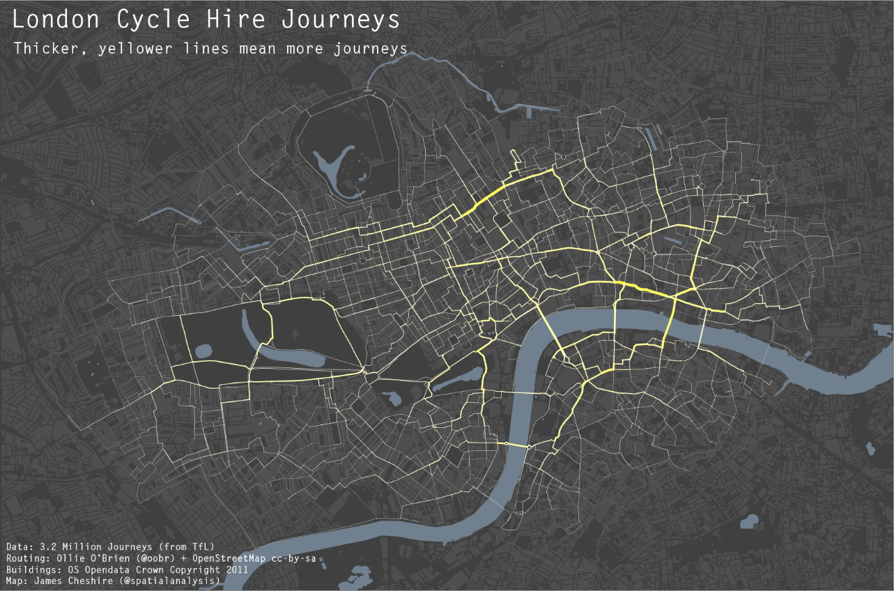
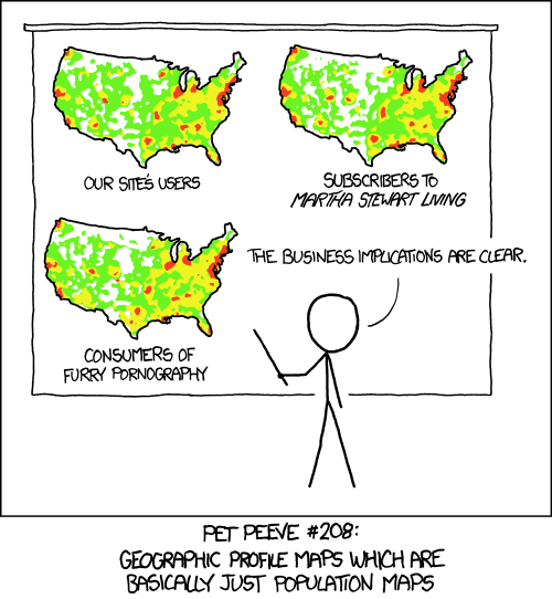
When making kernel density maps sometimes the phenonema is heavily clustered in particular locations simply because the population at risk is uneven over the study space. xkcd puts this in a bit more of laymans terms than I do:

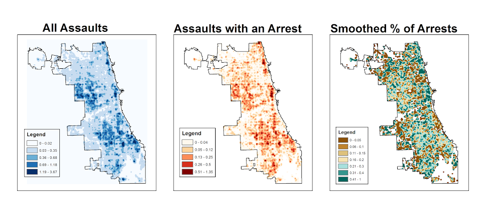
So how do we take into account the underlying population? It depends on the data, but if you actually have population at risk data as points we can make kernel density maps that are the ratio of the cases to the underlying total population. I will show how you can do this type of raster kernel density estimate in CrimeStat using some data on reported assaults and arrests from the city of Chicago.

To make the necessary smooth estimate of the proportions of arrests in CrimeStat you will need two seperate ones, the first primary file should be all arrests of interest, and the secondary file should be all of the incidents (so the arrests are a subset of all incidents). And of course both files need to have the geocoordinates already.

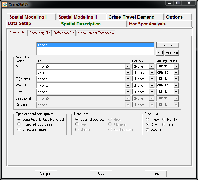
So CrimeStat has a nice GUI to make our KDE maps. So you will be greeted with the following screen after starting the CrimeStat program.

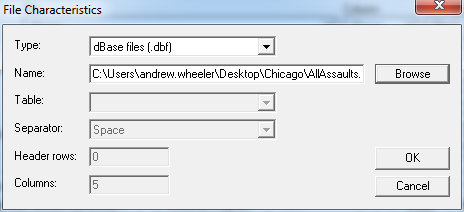
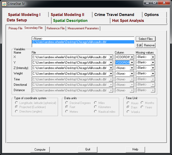
Now we can enter in our data. First click the Select Files button and then navigate to your data file. Here I saved the seperate files as DBFs, and for the primary file I use all of the arrests associated with an assault incident in Chicago in 2013.

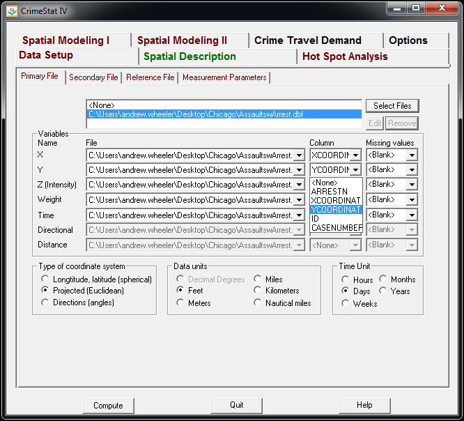
Now that the file is loaded into CrimeStat, we need to specify what fields contain the spatial coordinates in the variables section. Then we set the appropriate options in the bottom panels. Here I am using projected coordinates in feet. I don’t specify a time unit so that option is superflous.

Now we can enter in our secondary file, which will be all of the assault incidents in Chicago in 2013. The Seconday File tab is in the set of minor tabs under the larger Data Setup tab (CrimeStat has an incredible number of routines, hence the many options). It is an equivalent workflow as to that of the primary file, import the spreadsheet, and define the fields.

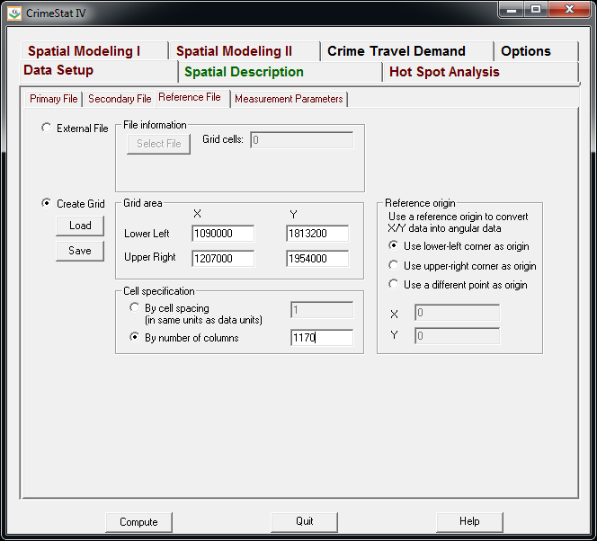
Now we need to set up the reference grid to which we will write the raster output to. Still on the same Data Setup main tab, we then navigate to the Reference file minor tab. Here we specify a set of coordinates (in the particular projection of use) as a rectangle corresponding to the lower left and upper right corners. Then you can control how fine the grid is by specifying a larger number of columns. Here the cell sizes are 300 square feet. Note you can save the particular reference file for future use.

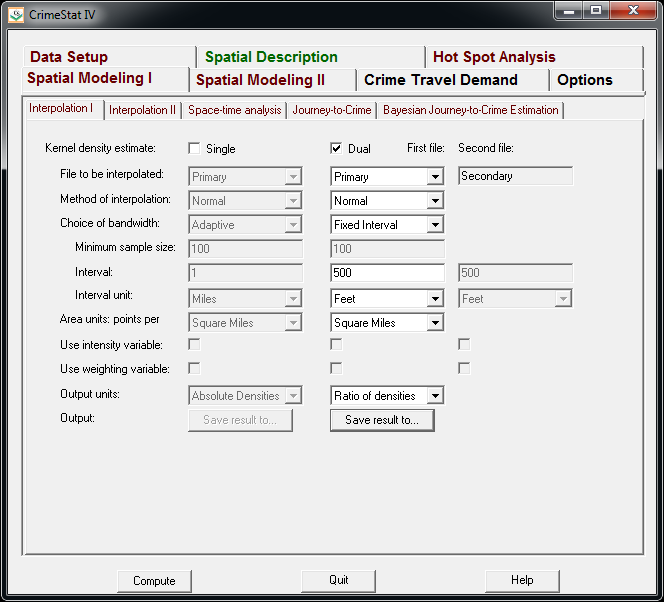
Now we can finally move onto estimating our kernel density map! Now navigate to the main Spatial Modeling I tab and navigate to the Interpolation I minor tab. To make a ratio of our two rasters (which will be the smoothed proportions of arrests). Here we choose the Dual KDE estimation, and specify the normal kernel. Typically for KDE maps the kernel makes very little difference, choosing an appropriate bandwidth impacts the look of the map to a much greater extent. I typically default to around 300 meters, but here I choose a smaller 500 foot bandwidth (we will see this is seriously undersmoothed – but I rather start with undersmoothed than oversmoothed).

The field Area units: points per ends up being superflous when specifying the ratio of the two densities. Clicking on the Save Result to button we can choose to save the output to various geographic data file formats (both vector and raster). Here I specify ArcGIS’s raster format.

Now we are ready to calculate the KDE raster. Simply click the Compute button at the bottom of CrimeStat, and be alittle patient with a dataset of this size (4,000 some arrests and over 17,500 total incidents). After that runs we can then import the rasters into your favorite GIS and make some maps.

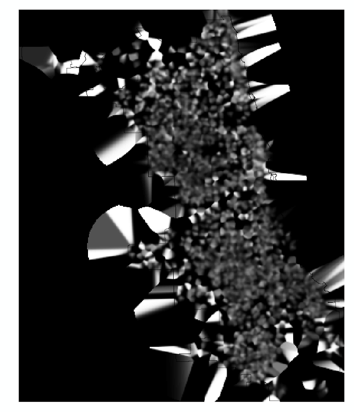
You will notice when you first upload the raster there are several strange artifacts. This is a function of places with very few incidents have a low baseline with with to calculate the smoothed proportion of arrests. Unfortunately it appears CrimeStat specifies 0 where null data values should be (places with zero density in the denominator).

A quick fix to this problem though is to make a separate kernel density map of just the incidents and superimpose that on top of your smoothed arrests. Then you can make the zero density areas the same color as the background map so they are filtered out. Here I filter areas that have a incident density of less than <0.02 (these are absolute densities, so they sum to the total number of incidents used to calculate them to begin with).

So below are the final KDE maps. As you can see from all of them 500 feet is seriously undersmoothed, but the absolute densities of incidents and arrests (the two left most maps) appears to be highly correlated. If you look at the hit rate of arrests though in the right most map, the percent of arrests appear to be spatially random.

Other possibilities for similar analysis are say accidents involving injury or pedestrians where the baseline is all accidents, field stops that result in contraband recovery, or comparison of densities before and after an intervention (although here I may take the absolute difference as opposed to the ratio).

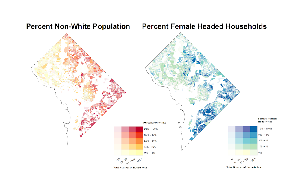
Of course this just scratches the surface of possible analysis. When the population at risk is not so conveniently labelled in the data set, such as coming from census geographies, one may consult the literature on dasymetric mapping (also see the head bang procedure in CrimeStat). Bivand et al. (2008) have an example of calculating the ratio raster along with some statistical tests, and the spatstat library has some more convenient functions to accomplish this and map the results (see the relrisk function). One can also estimate a logistic regression model with the spatial coordinates as non-linear predictors (e.g. using splines) and then plot the predicted probabilities for each grid cell.

I’m not sure of a quick global test of whether the proportion of arrests are random though. I thought off-hand you could use a spatial scan test for the case-control data (e.g. using SatScan or similar functions in the spatstat R library), although I’m not sure if that counts as quick.

Viz. JTC Flow lines – Paper for ASC this fall

Partly because I would go crazy if I worked only on my dissertation, I started a paper about visualizing JTC flow lines awhile back, and I am going to present what I have so far at the American Society of Criminology (ASC) meeting at Atlanta this fall.

My paper is still quite rough around the edges (so not quite up for posting to SSRN), but here is the current version. This actually started out as an answer I gave to a question on the GIS stackexchange site, and after I wrote it up I figured it would be worthwhile endeavor to write an article. Alasdair Rae has a couple of viz. flow data papers currently, but I thought I could extend those papers and write for a different audience of criminologists using journey to crime (JTC) data.

As always, I would still appreciate any feedback. I’m hoping to send this out to a journal in the near future, and so far I have only goated one of my friends into reviewing the paper.

Some more about black backgrounds for maps

I am at it again discussing black map backgrounds. I make a set of crime maps for several local community groups as part of my job as a crime analyst for Troy PD. I tend to make several maps for each group, seperating out violent, property and quality of life related crimes. Within each map I try to attempt to make a hierarchy between crime types, with more serious crimes as larger markers and less severe crimes as smaller markers.

Despite critiques, I believe the dark background can be useful, as it creates greater contrast for map elements. In particular, the small crime dots are much easier to see (and IMO in these examples the streets and street name labels are still easy to read). Below are examples of the white background, a light grey background, and a black background for the same map (only changes are the black point marker is changed to white in the black background map, streets and parks are drawn with a heavy amount of transparency to begin with so don’t need to be changed).

Surprisingly to me, ink be damned, even printing out the black background looks pretty good! (I need to disseminate paper copies at these meetings) I think if I had to place the legend on the black map background I would be less thrilled, but currently I have half the page devoted to the map and the other half devoted to a table listing the events and the time they occurred, along with the legend (ditto for the scale bar and the North arrow not looking so nice).

I could probably manipulate the markers to provide more contrast in the white background map (e.g. make them bigger, draw the lighter/smaller symbols with dark outlines, etc.) But, I was quite happy with the black background map (and the grey background may be a useful in-between the two as well). It took no changes besides changing the background in my current template (and change black circles to white ones) to produce the example maps. I also chose those sizes for markers for a reason (so the map did not appear flooded with crime dots, and more severe and less severe crimes were easily distinguished), and so I’m hesistant to think that I can do much better than what I have so far with the white background maps (and I refuse to put those cheesy crime marker symbols, like a hand gun or a body outline, on my maps).

In terms of differentiating between global and local information in the maps, I believe the high contrast dark background map is nice to identify local points, but does not aid any in identifying general patterns. I don’t think general patterns are a real concern though for the local community groups (displaying so many points on the same map in general isn’t good for distinguishing general patterns anyway).

I’m a bit hesitant to roll out the black maps as of yet (maybe if I get some good feedback on this post I will be more daring). I’m still on the fence, but I may try out the grey background maps for the next round of monthly meetings. I will have to think if I can devise a reasonable experiment to differentiate between the maps and whether they meet the community groups goals and/or expectations. But, all together, the black background maps should certainly be given serious consideration for similar tasks. Again, as I said previously, the high contrast with smaller elements makes them more obvious (brings them more to the foreground) than with the white background, which as I show here can be useful in some circumstances.

Presentation at ASC – November, 2012

At the American Society of Criminology conference in Chicago in a few weeks I will be presenting (I can’t link to the actual presentation it appears, but you can search the program for Wheeler and my session will come up). Don’t take this as a final product, but I figured I would put out there the working paper/chapters of my dissertation that are the motivation for my presentation and my current set of slides.

Here is my original abstract I submitted a few months ago, The title of the talk is The Measurement of Small Place Correlates of Crime;

This presentation addresses several problems related with attempting to identify correlates of crime at small units of analysis, such as street segments. In particular the presentation will focus on articulating what we can potentially learn from smaller units of analysis compared to larger aggregations, and relating a variety of different measures of the built environment and demographic characteristics of places to theoretical constructs of interest to crime at places. Preliminary results examining the discriminant and convergent validity of theoretical constructs pertinent to theories for the causes of crime using data from Washington, D.C. will be presented.

This was certainly an over-ambitious abstract (I was still in the process of writing my prospectus when I submitted it). The bulk of the talk will be focused on “What we can learn from small units of analysis?”, and as of now after that as time allows I will present some illustrations of the change of support problem. Sorry to dissapoint, but nothing about convergent or divergent validity of spatial constructs will be presented (I have done no work of interest yet, and I don’t think I would have time to present any findings in anymore than a superficial manner anyway).

Note don’t be scared off by how dull the working paper is, the presentation will certainly be more visual and less mathematical (I will need to update my dissertation to incorporate some more graphical presentations).

Maps and graphis at the end of the talk demonstrating the change of support problem are still in the works (and I will continue to update the presentation on here). Here is a preview though of the first map I made that demonstrates how D.C. disseminates geo-date aggregated and snapped to street segments, making it problematic to mash up with census data.


The presentation time is on Friday at 9:30, and I’m excited to see the other presentations as well. It looks like to me that Pizarro et al.’s related research was recently published in Justice Quarterly, so if you don’t care for my presentation come to see the other presenters!

JQC paper on the moving home effect finally published!

My first solo publication, The moving home effect: A quasi experiment assessing effect of home location on the offence location, after being in the online first que nearly a year, has finally been published in the Journal of Quantitative Criminology 28(4):587-606. It was the oldest paper in the online first section (along with the paper by Light and Harris published on the same day)!

This paper was the fruits of what was basically the equivalent of my Masters thesis, and I would like to take this opportunity to thank all of the individuals whom helped me with the project, as I accidently ommitted such thanks from the paper (entirely my own fault). I would like to thank my committee members, Rob Worden, Shawn Bushway, and Janet Stamatel. I would also like to thank Robert Apel and Greg Pogarsky for useful feedback I had recieved on in class papers based on the same topic, as well as the folks in the Worden meeting group (for not only feedback but giving me motivation to do work so I had something to say!)

Rob Worden was the chair of my committee, and he deserves extra thanks not only for reviewing my work, but also for giving me a job at the Finn Institute, which otherwise I would have never had access to such data and opportunity to conduct such a project. I would also like to give thanks to the Syracuse PD and Chief Fowler for letting me use the data and reveal the PD’s identity in the publication.

I would also like to thank Alex Piquero and Cathy Widom for letting me make multiple revisions and accepting the paper for publication. For the publication itself I recieved three very excellent and thoughtful peer reviews. The excellence of the reviews were well above the norm for feedback I have otherwise encountered, and demonstrated that the reviewers not only read the paper but read it carefully. I was really happy with the improvements as well as how fair and thoughtful the reviews were. I am also very happy it was accepted for publication in JQC, it is the highest quality venue I would expect the paper to be on topic at, and if it wasn’t accepted there I was really not sure where I would send it otherwise.

In the future I will publish pre-prints online, so the publication before editing can still be publicly available to everyone. But, if you can not get a copy of this (or any of the other papers I have co-authored so far) don’t hesitate to shoot me an email for a copy of the off-print. Hopefully I have some more work to share in the new future on the blog! I currently have two papers I am working on with related topics, one with visualizing journey to crime flow data, and another paper with Emily Owens and Matthew Feedman of Cornell comparing journey to work data with journey to crime data.

For a teaser for this paper here is the structured abstract from the paper and a graph demonstrating my estimated moving home effect.

Objectives
This study aims to test whether the home location has a causal effect on the crime location. To accomplish this the study capitalizes on the natural experiment that occurs when offender’s move, and uses a unique metric, the distance between sequential offenses, to determine if when an offender moves the offense location changes.

Methods
Using a sample of over 40,000 custodial arrests from Syracuse, NY between 2003 and 2008, this quasi-experimental design uses t test’s of mean differences, and fixed effects regression modeling to determine if moving has a significant effect on the distance between sequential offenses.

Results
This study finds that when offenders move they tend to commit crimes in locations farther away from past offences than would be expected without moving. The effect is rather small though, both in absolute terms (an elasticity coefficient of 0.02), and in relation to the effect of other independent variables (such as the time in between offenses).

Conclusions
This finding suggests that the home has an impact on where an offender will choose to commit a crime, independent of offence, neighborhood, or offender characteristics. The effect is small though, suggesting other factors may play a larger role in influencing where offenders choose to commit crime.

Making value by alpha maps with ArcMap

I recently finished reading Cynthia Brewer’s Designing better maps: A guide for GIS users. Within the book she had an example of making a bi-variate map legend manually in ArcMap, and then the light-bulb went off in my mind that I could use that same technique to make value by alpha maps in ArcMap.

For a brief intro into what value by alpha maps are, Andy Woodruff (one of the creators) has a comprehensive blog post on them on what they are and their motivation. Briefly though, we want to visualize some variable in a choropleth map, but that variable is measured with varying levels of reliability. Value by alpha maps de-emphasize areas of low reliability in the choropleth values by increasing the transparency of that polygon. I give a few other examples of interest related to mapping reliability in this answer on the GIS site as well, How is margin of error reported on a map?. Essentially those techniques mentioned either only display certain high reliability locations, make two maps, or use technqiues to overlay multiple attributes (like hashings). But IMO the value by alpha maps looks much nicer than the maps with multiple elements, and so I was interested in how to implement them in ArcMap.

What value by alpha maps effectively do is reduce the saturation and contrast of polygons with high alpha blending, making them fade into the background and be less noticable. I presented an applied example of value by alpha maps in my question asking for examples of beautiful maps on the GIS site. You can click through to see further citations for the map and reasons for why I think the map is beautiful. But below I include an image here as well (taken from the same Andy Woodruff blog post mentioned earlier).

Here I will show to make the same maps in ArcMap, and present some discussion about their implementation, in particular suitable choices for the original choropleth colors. Much was already discussed by the value by alpha originators, but I suppose I didn’t really appreciate them until I got my hands alittle dirty and tried to make them myself. Note this question on the GIS site, How to implement value-by-alpha map in GIS? gives other resources for implementing value-by-alpha maps. But as far as I am aware this contribution about how to do them in ArcMap is novel.

Below I present an example displaying the percentage of female heads of households with children (abbreviated PFHH from here on) for 2010 census blocks within Washington, D.C. Here we can consider the reliability of the PFHH dependent on the number of households within the block itself (i.e. we would expect blocks with smaller number of households to have a higher amount of variability in the PFHH). The map below depicts blocks that have at least one household, and so the subsequent PFHH maps will only display those colored polygons (about a third, 2132 out of 6507, have no households).

I chose the example because female headed households are a typical covariate of interest to criminologists for ecological studies. I also chose blocks as they are the smallest unit available from the census, and hence I expected them to show the widest variability in estimates. Below I provide an example on how one might typically display PFHH, while simultaneously incorporating information on the baseline number the maps will be map of.

The first example seperately displays the denominator number of households on the left and the percent of female headed households with children on the right both in a sequential choropleth scheme (darker colors are a higher PFHH and Number of Households).

One can also superimpose the same information on the map. Sun & Wong, 2010 suggest one use cross hatching above the the choropleth colors to depict reliability, but here I will demonstrate using choropleth colors for the baseline number of households and a proportional point symbols for the PFHH. I supplement the map on the right with a scatterplot, that has the number of households on the X axis and the PFHH on the Y axis.

These both do an alright job (if you made me pick one, I think I would pick the side-by-side sets of maps), but lets see if we can do better with value-by-alpha maps! The following tutorial will be broken up into two sections. The first section talks about actually generating the map, and the second section talks about how to make the legend. Neither is difficult, but making the legend is more of a pain in the butt.

How to make the value by alpha map

First one can start out by making the base layer with the desired choropleth classifications and color scheme. Note here I changed what I am visualizing from a sequential color scheme of PFHH to location quotients with only four categories. I will discuss why I did this later on in the post.

Then one can make several copies of that layer (right click -> copy -> paste within hierarchy), based on however many different reliability classifications you want to display. Here I will do 4 different reliability classifications. Note after you make them for management of the TOC it is easier to group them.

Then one uses selection criteria to filter out only those polygons that fall within the specified reliability range. And then sets the transparency for the that level to the desired value.

And voila, you have your value by alpha map. Note if after you make the layers you decide you want a different classification and/or color scheme, you can make the changes to one layer and then apply the changes to all of the other layers.

How to make the legend

Now making the legend is the harder part. If one goes to the layout view, one will see that since in this example one has essentially for layers superimposed on the same map, one has four seperate legend entries. Below is what it looks like with my defaults (plus a vertical rule I have in my map).

What we want in the end is a bivariate scheme, with the PFHH dimension running up and down, and the transparency dimension running from one side to the other (the same as in the example mortality rate map at the beginning of the post). To do this, one has to convert the legends to graphics.

The ungroup the elements so each can be individualy manipulated. Note, sometimes I have to do this operation multiple times.

Then re-arrange the panels and labels into the desired format.

More tedious than making the seperate layers, but not crazy unreasonable if you only have to do it for one (or a small number of maps). If you need to do it for a larger number of maps a better workflow will be needed, like creating a seperate “fake inset” map that replicates the legend, making the legend in a seperate tool, or just making the map entirely in a program where alpha blending is more readily incorporated. For instance in statistical packages it is typically a readily available encoding that can be added to a graphic (they also will allow continous color ramps and continous levels of transparency).

And voila, here is the final map. To follow is some discussion about choosing color schemes and whether you should use a black background or not.

Some discussion about color schemes

The Roth et al. (2010) paper in the cartographic journal and Andy Woodruff’s blog post I cited at the beginning of this post initially talked about color schemes and utilizing a black background, but I didn’t really appreciate the complexity of this choice until I went and made a value-by-alpha map of my own. In the end I decided to use location quotients to display the data, as the bivariate color scheme provides further contrast. I feel weird using a bivariate color scheme for a continous scale (hence the conversion to location quotients), but I feel like I should get over that. Everything has its time and place, and set rules like that aren’t good for anyone but bureaucrats or the mindless.

I certainly picked a complex dataset to start with, and the benifits of the value by alpha map over the two side by side maps (if any) are slight. I suspect why mine don’t look quite as nice as the ones created by Roth, Woodruff and company are partially due to the greater amount of complexity. The map with the SatScan reliabilities I noted as one of my favorite maps is quite striking, but it is partly due to the relibaility having a very spatially contiguous pattern (although the underlying cancer mortality rate map is quite spatially heterogenous). Here the spatial regularity is much weaker, in either the pattern being mapped or the reliability thresholds I had chosen. It does produce a quite pretty map though, FWIW.

For reference, here is the same map utilizing a black background. The only thing different in this map is that the most transparent layer is now set to 80% transparency instead of 90% (it was practically invisible at 90% with black as the modifying background color). Also it was necessary to do the fake inset map for a legend I talked about earlier with black as the background color. This is because the legend generated by ArcGIS always has white as the modifying color. If you refer back to the map with white as the modifying color, you can tell this produces greater contrast among the purples (the location quotient 2.1 – 4 for fully opaque and 4.1 – 12.6 for 40% transparent with white as the modifying color appear very similar).

The Roth Cartographic journal article gives other bivariate and nominal color scheme suggestions, you should take their advice. Hopefully in the future it will be simpler to incorporate bivariate color schemes in ArcMap, as it would make the process much simpler (and hence more useful for exploratory data analysis).

I would love it if people point me to other examples in which value by alpha maps are useful. I think in theory it is a good idea, but the complexity intoduced in the map is a greater burden than I intially estimated until I made a few. I initially thought this would be useful for presenting the results of geographically weighted regression or perhaps cancer atlas maps in general (where sometimes people just filter out results below some population threshold). But maybe not given the greater complexity introduced.

When should we use a black background for a map?

Some of my favorite maps utilize black (or dark) backgrounds. For some examples;


Steven Romalewski offers a slight critique of them recently in his blog post, Mapping NYC stop and frisks: some cartographic observations;

I know that recently the terrific team at MapBox put together some maps using fluorescent colors on a black background that were highly praised on Twitter and in the blogs. To me, they look neat, but they’re less useful as maps. The WNYC fluorescent colors were jarring, and the hot pink plus dark blue on the black background made the map hard to read if you’re trying to find out where things are. It’s a powerful visual statement, but I don’t think it adds any explanatory value.

I don’t disagree with this, and about all I articulate in their favor so far is essentially “well lit places create a stunning contrast with the dark background” while white background maps just create a contrast and are not quite as stunning!

I think the proof of a black backgrounds usefulness can be seen in the example value-by-alpha maps and the flow maps of James Chesire, where a greater amount of contrast is necessary. IMO in the value by alpha maps the greater contrast is needed for the greater complexity of the bivariate color scheme, and in Chesire’s flow maps it is needed because lines frequently don’t have enough areal gurth to be effectively distinguished from the background.

I couldn’t find any more general literature on the topic though. It doesn’t seem to be covered in any of the general cartography books that I have read. Since it is really only applicable to on-screen maps (you certainly wouldn’t want to print out a map with a black background) perhaps it just hasn’t been addressed. I may be looking in the wrong place though, some text editors have a high contrast setting where text is white on a dark background (for likely the same reasons they look nice in maps), so it can’t be that foreign a concept to have no scholarly literature on the topic.

So in short, I guess my advice is utilize a black background when you want to highly focus attention on the light areas, essentially at the cost of greatly diminishing the contrast with other faded elements in the map. This is perhaps a good thing for maps intended as complex statistical summaries, and the mapnificient travel times map is probably another good example where high focus in one area is sufficient and other background elements are not needed. I’m not sure though for choropleth maps black backgrounds are really needed (or useful), and any more complicated thematic maps certainly would not fit this bill.

To a certain extent I wonder what lessons from black backgrounds can be applied to the backgrounds of statistical graphics more generally. Leave me some comments if you have any thoughts or other examples of black background maps!

Why great circle lines look nicer in flow maps

I got sick of working on my dissertation the other day so I started writing a review article on visualizing flow lines for journey to crime data. Here I will briefly illustrate why great circle lines tend to look nicer in flow maps than do straight lines.

Flow maps tend to be very visually complicated, and so what happens (to a large extent) is what happens in Panel B in the above graphic. Bending the lines, as is done with great circles, tends to displace the lines from one another to a greater extent. Although perfect overlap as is demonstrated in the picture doesn’t necessarily happen that frequently, the same logic applies to nearly overlapped lines. One of the nicest examples of this you can find is the facebook friends map that made the internet rounds (note there are many other aesthetic elements in the plot that make it look nice besides just the great circle lines).

Of course with great circle lines you don’t get the bending in the other direction for reciprocal flows I demonstrate in my first figure (the great circle line is the same regardless of direction). Because of this, and because when using a local projection great circles lines don’t really provide enough eccentricity in the bend to produce the desired displacement of the lines, I suggested to utilize half circles and discuss how to calculate them given a set of origin-destination coordinates at this question on the GIS site.

I need to test this out in the wild some more though. I suspect a half-circle is too much, but my attempts to script a version where the eccentricity is less pronounced has befuddled me so far. I will post an update on here if I come to a better solution, and when the working paper is finished I will post a copy of that as well. Preferably I would like the script to take an arbitrary parameter to control the amount of bend in the arc, so if you have suggestions feel free to shoot me an email or leave a comment here.

For those interested in the topic I would suggest to peruse one of my other answers at the GIS site. Therein I give a host of references and online mapping examples of visualizing flows.

Beware of Mach Bands in Continuous Color Ramps

A recent post of mine on the cross validated statistics site addressed how to make kernel density maps more visually appealing. The answer there was basically just adjust the bandwidth until you get a reasonably smoothed surface (where reasonable means not over-smoothed to one big hill or undersmoothed to a bunch of unconnected hills).

Another problem that frequently comes along with the utlizing the default types of raster gradients is that of mach bands. Here is a replicated image I used in the cross validated site post (made utilizing the spatstat R library).

Even though the color ramp is continous, you see some artifacts around the gradient where the hue changes from what our eyes see as green to blue. To be more precise, approximately where the green hue touches the blue hue the blue color appears to be lighter than the rest of the blue background. This is not the case though, and is just an optical illusion (you can even see the mach bands in the legend if you look close). Mark Monmonier in How to Lie with Maps gives an example of this, and also uses that as a reason to not use continous color ramps (also another reason he gives is it is very difficult to map a color to an exact numerical location on the ramp). To note this isn’t just something that happens with this particular color ramp, this happens even when the hue is the same (the wikipedia page gives an example with varying grey saturation).

So what you say? Well, part of the reason it is a problem is because the artifact reinforces unnatural boundaries or groupings in the data, the exact opposite of what one wants with a continuous color ramp! Also the groupings are largely at the will of the computer, and I would think the analyst wants to define the groupings themselves when disseminating the maps (although this brings up another problem with how to define the color breaks). A general principle with how people interpret such maps is that they tend to form homogenous groupings anyway, so for both exploratory purposes and disseminating maps we should keep this in mind.

This isn’t a problem limited to isopleth maps either, the Color Brewer online app is explicitly made to demonstrate this phenonenom for choropleth maps visualizing irregular polygons. What happens is that one county that is spatially outlying compared to its neighbors appears more extreme on the color gradient than when it is surrounded by colors with the same hue and saturation. Below is a screen shot of what I am talking about, with some of the examples circled in red. They are easy to see that they are spatially outlying, but harder to map to the actual color on the ramp (and it gets harder when you have more bins).

Even with these problems I think the default plots in the spatstat program are perfectly fine for exploratory analysis. I think to disseminate the plots though I would prefer discrete bins in many (perhaps most) situations. I’ll defer discussion on how to choose the bins to another time!