Many of my colleagues use Stata (note it is not STATA), and I particularly like it for various panel data models. Also one of my favorite parts of Stata code that are sometimes tedious to replicate in other stat. software are the various post-estimation commands. These includes the test command, which does particular coefficient restriction tests or multiple coefficient tests, margins (and the corresponding marginsplot) which gives model based estimates at various values of the explanatory variables, and lincom and nlcom which I will show as being useful for differences in differences models.
To follow along with this post, I have posted all of the data and code here. Part of the data is simulated to be very similar to a panel data model I estimated recently, and the other dataset comes from Dan Kahan.
I don’t know Stata as well as I do SPSS or R, but these are things I tend to re-visit (and wish people sending me data and code follow as well). So these are for my own notes so I remember!
The Preamble
Before we go into estimating models in Stata, I first like to set the working directory, specify a plain text log file for the results, and then set how the results are displayed in the window. I know some programmers do not like you changing their directory, but this is the simplest way I’ve found to share code between colleagues – they just need to change one line at the beginning to change the directory to their local machine.
So the top of my code will typically have my name, plus what the code does. Note that comments in Stata start with an *.
*************************************************.
*Andy Wheeler, ????@email.com
*This code estimates difference in difference models
*For the X intervention on Crimes per Month
*************************************************.
After that I will set the working directory, using the cd command, which lets you upload datasets without specifying a file handle. Because of this, I can just say log using "PostEst.txt" and it saves the plain text log file in the same directory folder.
*************************************************.
*Setting up the directory
cd "C:\Users\andrew.wheeler\Dropbox\Documents\BLOG\Stata_Postest"
*logging the results in a text file
log using "PostEst.txt", text replace
*So the output just keeps going
set more off
*************************************************.
The code set more off is idiosyncratic to the Stata display. For results that you need to scroll, Stata asks you to click on see more output. This makes it so it just pipes all the results to the display without you needing to click on anything.
Importing Data and Setting up a Panel Model
Now we will go on to a simulated example very similar to a difference in difference model I estimated recently. Because the working directory is set that already contains my datasets, I can just call:
use "Monthly_Sim_Data.dta", clear To load up my simulated dataset. Before we estimate panel models in Stata, you need to tell Stata what the panel id variables refer to. You use the tsset command for that. Here the variable Exper refers to a dummy variable that equals 1 for the experimental time series, and 0 for the control time series. Ord is a squential counter for each time period – here the data is suppossed to look like the count of crimes during the month over several years. So the first variable after tsset in the panel id, and the second refers to the time variable (if there is a time variable).
*Set the panel vars
tsset Exper Ord
Now we are ready to estimate our model. In my real use case I had looked at the univariate series, and found that an ARIMA(1,0,0) model with monthly dummies to account for seasonality fit pretty well and took care of temporal auto-correlation, so I decided a reasonable substitute for the panel model would be a GEE Poisson model with monthly dummies and the errors having an AR(1) correlation.
To fit this model in Stata is:
*Original model
xtgee Y Exper#Post i.Month, family(poisson) corr(ar1)
Here I do not worry about the standard errors, but if the data are over-dispersed you can either fit a negative binomial model and/or estimate robust standard errors (or bootstrapped standard errors). So you can specify these as something like xtgee Y X, family(poisson) corr(ar1) vce(robust). The vce option is available for many of the panel data models. (Note the bootstrap does not make sense when you only have two series as in this example.)
The Post variable is the dummy variable equal to 0 before the intervention, and 1 after the intervention. Exper#Post is one way to specify interaction variables in Stata. The variable i.Month tells Stata that the Month variable is a factor, and it should estimate a different dummy variable for each month (dropping one to prevent perfect collinearity).
You can of course create your own interactions or dummy variables, but using Stata’s inbuilt commands is very nice when working with post-estimation commands, which I will show in a bit. Some models in Stata do not like the i.Factor notation, so a quick way to make all of the dummy variables is via tabulate Month, gen(m). This would create variables m1, m2, m3....m12 in the dataset that you can include on the right hand side of regression equations.
This model then produces the output:
Iteration 1: tolerance = .00055117
Iteration 2: tolerance = 1.375e-06
Iteration 3: tolerance = 2.730e-09

GEE population-averaged model                   Number of obs      =       264
Group and time vars:             Exper Ord      Number of groups   =         2
Link:                                  log      Obs per group: min =       132
Family:                            Poisson                     avg =     132.0
Correlation:                         AR(1)                     max =       132
                                                Wald chi2(14)      =    334.52
Scale parameter:                         1      Prob > chi2        =    0.0000

------------------------------------------------------------------------------
           Y |      Coef.   Std. Err.      z    P>|z|     [95% Conf. Interval]
-------------+----------------------------------------------------------------
  Exper#Post |
        0 1  |    .339348   .0898574     3.78   0.000     .1632307    .5154653
        1 0  |   1.157615   .0803121    14.41   0.000     1.000206    1.315023
        1 1  |   .7602288   .0836317     9.09   0.000     .5963138    .9241439
             |
       Month |
          2  |    .214908   .1243037     1.73   0.084    -.0287228    .4585388
          3  |   .2149183   .1264076     1.70   0.089    -.0328361    .4626726
          4  |   .3119988   .1243131     2.51   0.012     .0683497    .5556479
          5  |   .4416236   .1210554     3.65   0.000     .2043594    .6788877
          6  |    .556197   .1184427     4.70   0.000     .3240536    .7883404
          7  |   .4978252   .1197435     4.16   0.000     .2631322    .7325182
          8  |   .2581524   .1257715     2.05   0.040     .0116447      .50466
          9  |    .222813   .1267606     1.76   0.079    -.0256333    .4712592
         10  |    .430002    .121332     3.54   0.000     .1921956    .6678084
         11  |   .0923395   .1305857     0.71   0.479    -.1636037    .3482828
         12  |  -.1479884   .1367331    -1.08   0.279    -.4159803    .1200035
             |
       _cons |   .9699886   .1140566     8.50   0.000     .7464418    1.193536
------------------------------------------------------------------------------
Post estimation commands
So now the fun part begins – trying to interpret the model. Non-linear models – such as a Poisson regression – I think are almost always misleading to interpret the coefficients directly. Even exponentiating the coefficients (so they are incident rate ratios) I think tends to be misleading (see this example). To solve this, I think the easiest solution is to just predict the model based outcome at different locations of the explanatory variables back on the original count scale. This is what the margins post-estimation command does.
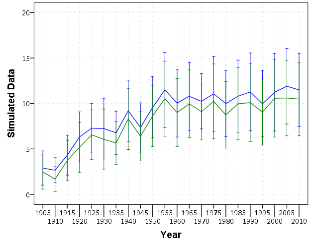
*Marginsplot
margins Post#Exper, at( (base) Month )
marginsplot, recast(scatter)
So basically once you estimate a regression equation, Stata has many of its attributes accessible to subsequent command. What the margins command does is predict the value of Y at the 2 by 2 factor levels for Post and Exper. The at( (base) Month ) option says to estimate the effects at the base level of the Month factor, which happens to default to January here. The marginsplot shows this easier than I can explain.
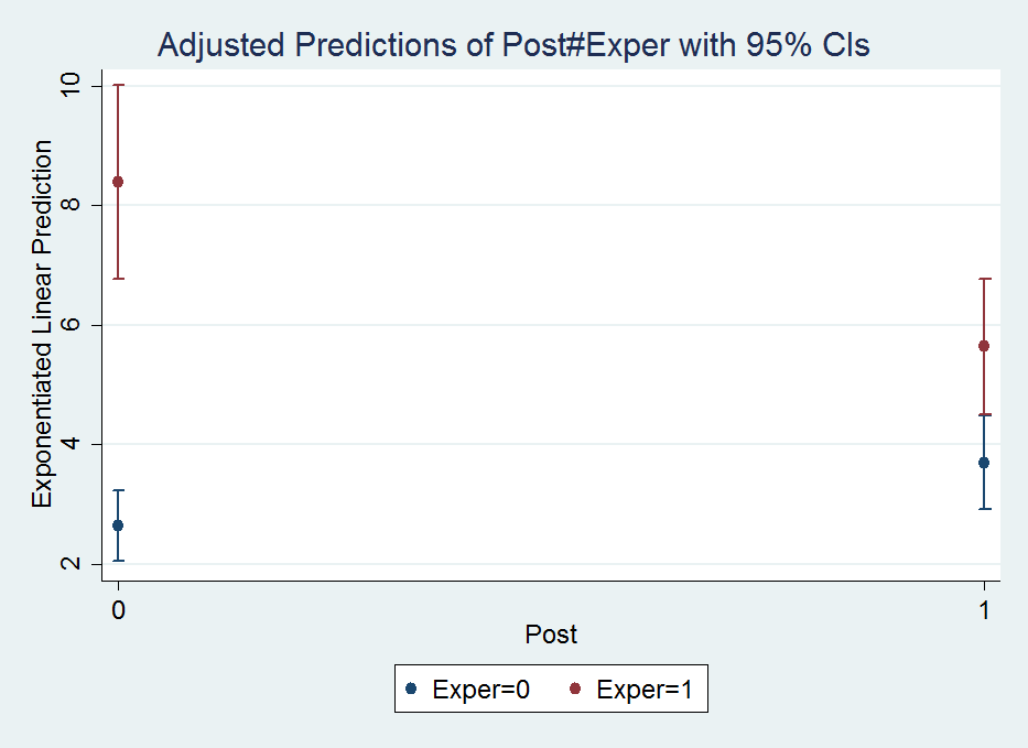
The option recast(scatter) draws the plot so there are no lines connecting the different points. Note I prefer to draw these error bar like plots without the end cross hairs, which can be done like marginsplot, recast(scatter) ciopts(recast(rspike)), but this causes a problem when the error bars overlap.
So I initially interpreted this simply as the experimental series went down by around 2 crimes, and the control series went up by around 1 crime. A colleague though pointed out the whole point of having control series though is to say what would have happend if the intervention did not take place (the counterfactual). Because the control series was going up, we would have also expected the experimental series to go up.
The coefficients in this model though don’t directly answer that question. To estimate that relative decrease is somewhat convoluted in this parameterization, but you can use the test and lincom post-estimation commands to do it. Test basically does linear model restrictions for one or multiple variables. This can be useful to test if multiple coefficients are equal to one another, or joint testing to see if one coefficient is equal to another, or to test if a coefficient is different from a non-zero value.
So to test the relative decrease in this DiD setup ends up being (which I am too lazy to explain):
test 1.Exper#1.Post = (1.Exper#0.Post + 0.Exper#1.Post)Note you can also do a joint test for all dummy variables with testparm:
testparm i.Monthwhich spits out:
 ( 1)  2.Month = 0
 ( 2)  3.Month = 0
 ( 3)  4.Month = 0
 ( 4)  5.Month = 0
 ( 5)  6.Month = 0
 ( 6)  7.Month = 0
 ( 7)  8.Month = 0
 ( 8)  9.Month = 0
 ( 9)  10.Month = 0
 (10)  11.Month = 0
 (11)  12.Month = 0

           chi2( 11) =   61.58
         Prob > chi2 =    0.0000
The idea behind this is that it often does not make sense to test the significance of only one level of a dummy variable – you want to jointly test whether the whole set of dummy variables is statistically significant. Most of the time I do this using F-tests for model restrictions (see this example in R). But here Stata does a chi-square test. (I imagine they will result in the same inferences in most circumstances.)
test just gives inferential statistics though, I wanted an actual estimate of the relative decrease. To do this you can use lincom. So working with my same set of variables I get:
lincom 1.Exper#1.Post - 0.Exper#1.Post - 1.Exper#0.PostWhich produces in the output:
 ( 1)  - 0b.Exper#1.Post - 1.Exper#0b.Post + 1.Exper#1.Post = 0

------------------------------------------------------------------------------
           Y |      Coef.   Std. Err.      z    P>|z|     [95% Conf. Interval]
-------------+----------------------------------------------------------------
         (1) |  -.7367337   .1080418    -6.82   0.000    -.9484917   -.5249757
------------------------------------------------------------------------------
I avoid explaining why this particular set of coefficient contrasts produces the relative decrease of interest because there is an easier way to specify the DiD model to get this coefficient directly (see the Wikipedia page linked earlier for an explanation):
*An easier way to estimate the model
xtgee Y i.Exper i.Post Exper#Post i.Month, family(poisson) corr(ar1)
Which you can look at the output and see that the interaction term now recreates the same -.7367337 (.1080418) estimate as the prior lincom command:
Iteration 1: tolerance = .00065297
Iteration 2: tolerance = 1.375e-06
Iteration 3: tolerance = 2.682e-09

GEE population-averaged model                   Number of obs      =       264
Group and time vars:             Exper Ord      Number of groups   =         2
Link:                                  log      Obs per group: min =       132
Family:                            Poisson                     avg =     132.0
Correlation:                         AR(1)                     max =       132
                                                Wald chi2(14)      =    334.52
Scale parameter:                         1      Prob > chi2        =    0.0000

------------------------------------------------------------------------------
           Y |      Coef.   Std. Err.      z    P>|z|     [95% Conf. Interval]
-------------+----------------------------------------------------------------
     1.Exper |   1.157615   .0803121    14.41   0.000     1.000206    1.315023
      1.Post |    .339348   .0898574     3.78   0.000     .1632307    .5154653
             |
  Exper#Post |
        1 1  |  -.7367337   .1080418    -6.82   0.000    -.9484917   -.5249757
             |
       Month |
          2  |    .214908   .1243037     1.73   0.084    -.0287228    .4585388
          3  |   .2149183   .1264076     1.70   0.089    -.0328361    .4626726
          4  |   .3119988   .1243131     2.51   0.012     .0683497    .5556479
          5  |   .4416236   .1210554     3.65   0.000     .2043594    .6788877
          6  |    .556197   .1184427     4.70   0.000     .3240536    .7883404
          7  |   .4978252   .1197435     4.16   0.000     .2631322    .7325182
          8  |   .2581524   .1257715     2.05   0.040     .0116447      .50466
          9  |    .222813   .1267606     1.76   0.079    -.0256333    .4712592
         10  |    .430002    .121332     3.54   0.000     .1921956    .6678084
         11  |   .0923395   .1305857     0.71   0.479    -.1636037    .3482828
         12  |  -.1479884   .1367331    -1.08   0.279    -.4159803    .1200035
             |
       _cons |   .9699886   .1140566     8.50   0.000     .7464418    1.193536
------------------------------------------------------------------------------
But we can do some more here, and figure out the hypothetical experimental mean if the experimental series would have followed the same trend as the control series. Here I use nlcom and exponentiate the results to get back on the original count scale:
nlcom exp(_b[1.Exper] + _b[1.Post] + _b[_cons])Which gives an estimate of:
       _nl_1:  exp(_b[1.Exper] + _b[1.Post]  + _b[_cons])

------------------------------------------------------------------------------
           Y |      Coef.   Std. Err.      z    P>|z|     [95% Conf. Interval]
-------------+----------------------------------------------------------------
       _nl_1 |   11.78646   1.583091     7.45   0.000     8.683656    14.88926
------------------------------------------------------------------------------
So in our couterfactual world, the intervention decreased crimes from around 12 to 6 per month instead of 8 to 6 in my original interpretation, a larger effect because of the control series. We can show how nlcom reproduces the output of margins by reproducing the experimental series mean at the baseline, over 8 crimes per month.
*This creates the observed estimates, (at January) - if you want for another month need to add to above
margins Post#Exper, at( (base) Month )
*to show it recreates margins of pre period
nlcom exp(_b[1.Exper] + _b[_cons])
Which produces the output:
. margins Post#Exper, at( (base) Month )

Adjusted predictions                              Number of obs   =        264
Model VCE    : Conventional

Expression   : Exponentiated linear prediction, predict()
at           : Month           =           1

------------------------------------------------------------------------------
             |            Delta-method
             |     Margin   Std. Err.      z    P>|z|     [95% Conf. Interval]
-------------+----------------------------------------------------------------
  Post#Exper |
        0 0  |   2.637914   .3008716     8.77   0.000     2.048217    3.227612
        0 1  |   8.394722   .8243735    10.18   0.000      6.77898    10.01046
        1 0  |   3.703716   .3988067     9.29   0.000     2.922069    4.485363
        1 1  |   5.641881   .5783881     9.75   0.000     4.508261    6.775501
------------------------------------------------------------------------------

. *to show it recreates margins of pre period
. nlcom exp(_b[1.Exper] + _b[_cons])

       _nl_1:  exp(_b[1.Exper] + _b[_cons])

------------------------------------------------------------------------------
           Y |      Coef.   Std. Err.      z    P>|z|     [95% Conf. Interval]
-------------+----------------------------------------------------------------
       _nl_1 |   8.394722   .8243735    10.18   0.000      6.77898    10.01046
------------------------------------------------------------------------------
Poisson models are no big deal
Much of my experience suggests that although Poisson models are standard fare for predicting low crime counts in our field, they almost never make a difference when evaluating the marginal effects like I have above. So here we can reproduce the same GEE model, but instead of Poisson have it be a linear model. Here I use the quietly command to suppress the output of the model. Comparing coefficients directly between the two models does not make sense, but comparing the predictions is fine.
*Compare Poisson to a linear model
quietly xtgee Y Exper#Post i.Month, family(gaussian) corr(ar1)
margins Post#Exp, at( (base) Month )
And this subsequently produces:
Adjusted predictions                              Number of obs   =        264
Model VCE    : Conventional

Expression   : Linear prediction, predict()
at           : Month           =           1

------------------------------------------------------------------------------
             |            Delta-method
             |     Margin   Std. Err.      z    P>|z|     [95% Conf. Interval]
-------------+----------------------------------------------------------------
  Post#Exper |
        0 0  |   1.864656   .6951654     2.68   0.007     .5021569    3.227155
        0 1  |   9.404887   .6951654    13.53   0.000     8.042388    10.76739
        1 0  |   3.233312   .6992693     4.62   0.000     1.862769    4.603854
        1 1  |   5.810809   .6992693     8.31   0.000     4.440266    7.181351
------------------------------------------------------------------------------
The predictions are very similar between the two models. I simply state this here because I think the parallel trends assumption for the DiD model makes more sense on a linear scale than it does for the exponential scale. Pretty much wherever I look, the effects of explanatory variables appear pretty linear to me when predicting crime counts, so I think linear models make a lot of sense, even if you are predicting low count data, despite current conventions in the field.
An additional Example using marginsplot and areas
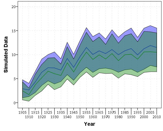
Long post – but stick with me! The last thing I wanted to go over was how to get area’s instead of error bars for marginsplot. The pdf help online has some examples – so this is pretty much just a restatement of the help. (Stata’s help in the online PDFs are excellent – code and math and figures and references and intelligible discussion all in one.) Like Andrew Gelman, I think the discrete bars are misleading when the sample locations are just arbitrary locations along a continuous function. I also think the areas look nicer, especially when the error bars overlap.
So using the same example from Dan Kahan, we first use drop _all to get rid of the prior panel data, then use import to load up the csv file.
*This clears the prior data.
drop _all

*grab the csv data
import delimited gelman_cup_graphic_reporting_challenge_data
Now we can estimate our model and our margins:
*estimate a similar logit model
logit agw c.left_right##c.religiosity
*graph areas using margins - pretended -1 and 1 are the high/low religious cut-offs
quietly margins, at(left_right=(-1.6(0.1)1.6) religiosity=(-1 1))
quietly is definately useful here for the margins command, we don’t want to pour through the whole text table, since it is only intended for a chart. And now to make our area chart at the sample points:
marginsplot, xlabel(-1.6(0.4)1.6) recast(line) recastci(rarea) ciopts(color(*.8))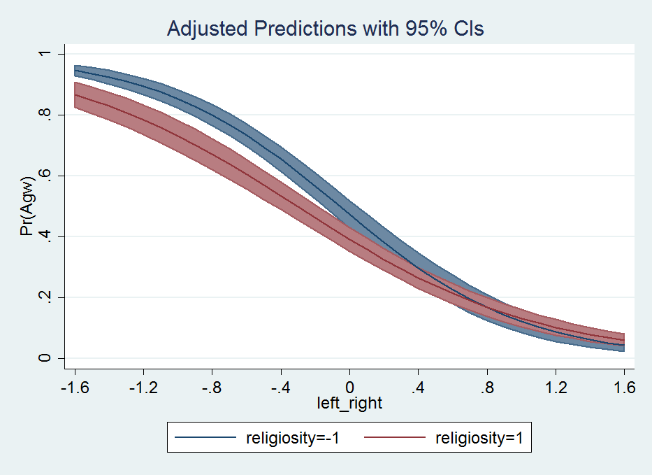
That is much better looking that the default with the ugly cross-hair error bars overlapping. Stata draws the lines unfortunately in the wrong order (see the blue line over the red area), and if I figure out an easy way to fix that I will update the post in the future. I need to learn the options for Stata charts to a greater extent before I give any more advice about Stata charts though.
To wrap up. I typically have in my Stata do file:
**************.
*Finish the script.
drop _all
exit, clear
**************.
This drops the dataset (as mentioned before), and exit, clear then basically closes out of Stata.