Adding a command button to a toolbar in ArcGIS

I’m currently teaching a graduate level class in Crime Mapping using ArcGIS. I make my own tutorials from week to week, and basically sneak in generic pro-tips for using the software while students are doing other regular types of analyses. I can only subject my students to so much though – but here is one I have found useful, adding a regularly used button to a toolbar.

I use CrimeStat to generate kernel densities from point data, so as of V10 whenever I want to make a classified raster map I get this error:

V9 it used to just do this for you automatically :(.

I typically make classified raster maps simply because I think they look nicer than continous ones. My continuous ones always look fuzzy, whereas having discrete cuts you can focus attention on particular hot spot areas. It is arbitrary for sure – but that is something we need to learn to live with when making maps.

So in class I had students open ArcToolBox, navigate down the tree, and find the Calculate Statistics tool for rasters. In my personal set up though I do this enough that I added the button to my toolbar. So first, go to the file menu and in customize -> toolbars make sure you have the spatial analyst toolbar selected. (Here is a kernel density grd file to follow along with if you want.)

Now in the right hand most edge of the new spatial analyst toolbar, left click on the little downward pointing arrow and select Customize. (Sorry, my toolbar is a bit crowded!)

In the customize window that pops up, select the Commands tab. Now in this window you can select any particular command and then drag it onto any toolbar. Here I go to Data Management in the left hand categories area, and then scroll down till I find the Calculate Statistics button.

Then I left click on the Calculate Statistics row, hold down the mousebutton, and drag it to my toolbar.

Now you are done, and ArcGIS saves this button on the toolbar when making future maps. You can change the icon if you want, but there are tooltips when hovering over the icon (so even if you have multiple hammers on your toolbars it only takes a second to browse between them).

Making and Exploring Crime Networks (Access and Excel)

I’ve been doing quite a bit of stuff with gang networks lately at work. Networks are a total PIA though to create and do data manipulation on in traditional spreadsheets and statistic tools, so I figured I would blog about some of my attempts to ease the pain for fellow crime analysts.

First I will show how to create an edge list in Access from the way a traditional police RMS database is set up. Second I will show a trick about exploring people and gangs by creating a dynamic lookup in Excel. You can download the Access Database I used and the Excel spreadsheet here to follow along.

Making an Edge List in Access

I’ve previously shown how to make an edgelist in SPSS. I’ll cast the net wider and show how to do this in Access though.

In a nutshell, an edge list is a table of the form:

Person A, Person B
Person B, Person C
Person C, Person D

Where being in the same row shows some type of connection between the two persons, e.g. Person A is connected to Person B. In police databases the connections most often of interest are co-offending (e.g. two people were arrested for the same incident) or being stopped together (e.g. in the same car or during the same field interrogation).

Typically police databases will have a table that lists a common incident identifier, along with persons associated with that incident and their involvement. Here is a screen shot of the simple example I made in an Access Database to mimic this which I named IncidentPersons:

So here we can see that for incident 1, Andy Pandy, Sandy Randy, and Candy Dandy are all persons involved. Candy is the victim, and the other two were arrested. This table is always called something different for every PD’s RMS system, but some examples I have come across are crossref and person_exploded. All RMS’s I have seen though have some sort of table like this.

To make an edge list from this table takes some knowledge of SQL, but it can be done in one query. Basically we will be joining a table to itself, and selecting out distinct rows. Here is the most basic SQL query in Access to accomplish this.

SELECT DISTINCT F.PersonID, F.PersonName, S.PersonID, S.PersonName
FROM IncidentPersons AS F INNER JOIN IncidentPersons AS S ON F.IncidentID = S.IncidentID
WHERE F.PersonID < S.PersonID;

To walk through this, we make two table aliases from the same original IncidentPersons table, F and S. Then we do an INNER JOIN based on the original incident ID. If we stopped here without the last WHERE clase, what would happen is we would have pairs of people with themselves, and with duplicate ties of the form A -> B and B -> A. So selecting only instances in which F.PersonID < S.PersonID eliminates those self edges and duplicates. The last part here is SELECT DISTINCT instead of select. This will make it so any particular edge is only returned once. (If you deleted DISTINCT in this database, Andy Pandy -> Sandy Randy would be returned twice.)

Running this query we then have:

In practice it will be more complicated because you will want to filter certain connections and add more info. on people into the final edge list. Here I ignore the involvement type, but you may want to only restrict matches to certain co-involvements (since offender-victim is of a different nature than co-offending). You also may want to not just know those connected, but count up the number of times those people are connected. For my work, I have always just limited to co-offending and being stopped together (and haven’t ever worried about the number of ties).

Also depending on how the database is normalized, often people names will change/have spelling errors, but they will still be linked to the same personid. These different spellings would cause the DISTINCT selection to not work as expected. A workaround is to only select based on the unique PersonID’s and not import other data, then in an additoional query merge in the person data. For gang network analysis you will likely want to merge in gang affiliation (which will probably be in a seperate table, not in the RMS). If you are still following along though you can figure that stuff out on your own.

Making an Edge Lookup Table in Excel

So now that I have shown how to make the edge table, what to do with it now? (No excuses – since I gave examples in both SPSS and SQL!) Here I will show a simple trick to explore the network using filtering in Excel.

The edge list itself is often the needed format to import into other network based software. So you can make a nice network graph using Gephi or whatever. The graph is good to see the overall form of the network when the graph is limited to only a few nodes, but they are typically really complicated, and tools like Gephi aren’t very good for drilling down into specific people. Here I will show my simple drilldown solution using Excel.

The network I use for this example is entirely made up; it was simulated using NetworkX (python), names are random based on some internet lists of popular baby names and last names I forgot the source of already, and Date of births are random between 1975 and 1997. I also made up a list of 7 gangs (but people have a 9/16 chance to be assigned to no gang).

So starting with an edgelist, here is a screenshot of my made up edge list excel table.

The problem in this format is if I filter the Id.1 column for 19 (BONNIE BARKER), they could potentially be in the Id.2 column as well, so I potentially miss edges. A simple solution to this is just to duplicate the data, but switch the order of the edges. Then when I filter by Id = 19, I will get all possible Bonnie Barker edges.

For a simple example of how to do this on a small table, if you start with:

17,19
18,19
19,20
19,21

If you filter the first column by 19, you will eliminate the 19’s in the second column. So just make a new table that has the ID’s reversed:

19,17
19,18
20,19
21,19

And then stack the two tables on top of one another

17,19 |
18,19 |  Table 1
19,20 |
19,21 |
19,17 +
19,18 +  Table 2
20,19 +
21,19 +

So now if you filter the first column by 19 you get 19’s all four connections. This is just three copy-pastes in excel to go from the original edge list to this table.

Now we can make a filter that dynamically changes based on user input. Here I make a selection in the top row, in N2 you can put in a persons ID. Then in A2, the formula is =IF(B2=$N$1,1,0). You can then paste this formula down, and it always references cell N2 because of the absolute $ modifiers.

Here is a screenshot of my example LookupTable in excel filtering for person 431.

If you update the personid in N1, then hit the reapply button in the toolbar (or hit Ctrl+Alt+L) to update the filter. Here I updated to be person 382.

The context of why I created this example was to identify people that were connected to gang members, but themselves were not in the gang. Basically have a list to take to officers and say, are you sure this person is not an actual member of the gang? The spreadsheet is then a tool if I have a meeting, where someone can say, who is Raelyn Hatfield connected to? I can easily update the id and filter.

You can do this drill down in the original edge table if you have the IF condition look in both the first and second id column, but I do this because it is easier to see who a person is connected to. You only have to look in one column – you don’t have to scan back and forth between two columns to see the connections.

You can also do other aggregations on this table as well. For instance if you aggregate using a pivot table and count the number of instances it is the edge centrality of a person (i.e. the number of different people a person is connected to).

If you want to do a drilldown of specific gangs you could use the same logic and build another filter column, but this will duplicate people when they are connected to another person in the same gang. That would be an instance where it might be easier to use just the original edge table.

Maps in inline GPL statements (SPSS)

Here I will go through an example of using inline GPL statements to import map backgrounds in SPSS charts. Here you can download the data and code to follow along with this post. This is different than using maps via VIZTEMPLATE, as I will show.

Note you can also use the graphboard template chooser to make some default maps, but I’ve never really learned how to make them on my own. For example, say I want to map that sets both the color and the transparency of areas based on different attributes. This is not possible with the current selection of map templates that comes with SPSS (V22).

But I figured out some undocumented ways to import maps into inline GPL code, and you can get pretty far with just the possibilities available within the grammar of graphics.

The data I will be using is a regular grid of values across DC. What I calculated was the hour of the day with the most Robberies over along time period (2011 through 2015 data) using a weighted average approach synonymous with geographically weighted regression. Don’t take this too seriously though, as there appears to be some errors in the time fields for the historical DC crime data.

So below I first define a handle to where my data is stored, recode the hour field into a smaller set of bins, and then make a scatterplot.

FILE HANDLE data /NAME = "C:\Users\andrew.wheeler\Dropbox\Documents\BLOG\Inline_Maps_GGRAPH".

GET FILE = "data\MaxRobHour.sav".
DATASET NAME MaxRob.

*Basic Scatterplot.
FREQ HourEv.
RECODE HourEv (0 THRU 3 = 1)(11 THRU 19 = 2)(ELSE = COPY) INTO HourBin.
VALUE LABELS HourBin
 1 '0 to 3'
 2 '11 to 19'.

DATASET ACTIVATE MaxRob.
* Chart Builder.
GGRAPH
  /GRAPHDATASET NAME="graphdataset" VARIABLES=XMetFish[LEVEL=SCALE] YMetFish[LEVEL=SCALE] HourBin
    MISSING=LISTWISE REPORTMISSING=NO
  /GRAPHSPEC SOURCE=INLINE.
BEGIN GPL
  SOURCE: s=userSource(id("graphdataset"))
  DATA: XMetFish=col(source(s), name("XMetFish"))
  DATA: YMetFish=col(source(s), name("YMetFish"))
  DATA: HourBin=col(source(s), name("HourBin"), unit.category())
  GUIDE: axis(dim(1), label("XMetFish"))
  GUIDE: axis(dim(2), label("YMetFish"))
  GUIDE: legend(aesthetic(aesthetic.color.exterior), label("HourBin"))
  ELEMENT: point(position(XMetFish*YMetFish), color.exterior(HourBin))
END GPL.

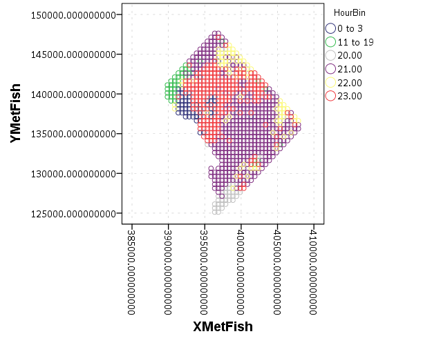
We can do quite a bit to make this map look nicer. Here I change:

  • make the aspect ratio 1 to 1, and set the map limits
  • get rid of the X and Y axis (the particular projected coordinates make no difference)
  • make a nice set of colors based on a ColorBrewer palatte and map the color to the interior of the point

And below that is the map it produces.

*Making chart nice, same aspect ratio, colors, drop x & y.
FORMATS HourBin (F2.0).
GGRAPH
  /GRAPHDATASET NAME="graphdataset" VARIABLES=XMetFish[LEVEL=SCALE] YMetFish[LEVEL=SCALE] HourBin
    MISSING=LISTWISE REPORTMISSING=NO
  /GRAPHSPEC SOURCE=INLINE.
BEGIN GPL
  SOURCE: s=userSource(id("graphdataset"))
  DATA: XMetFish=col(source(s), name("XMetFish"))
  DATA: YMetFish=col(source(s), name("YMetFish"))
  DATA: HourBin=col(source(s), name("HourBin"), unit.category())
  COORD: rect(dim(1,2), sameRatio())
  GUIDE: axis(dim(1), null())
  GUIDE: axis(dim(2), null())
  GUIDE: legend(aesthetic(aesthetic.color.exterior), label("HourBin"))
  SCALE: linear(dim(1), min(389800), max(408000))
  SCALE: linear(dim(2), min(125000), max(147800))
  SCALE: cat(aesthetic(aesthetic.color.interior), map(("1",color."810f7c"),("2",color."edf8fb"),("20",color."bfd3e6"),("21",color."9ebcda"),
         ("22",color."8c96c6"),("23",color."8856a7")))
  ELEMENT: point(position(XMetFish*YMetFish), color.interior(HourBin))
END GPL.

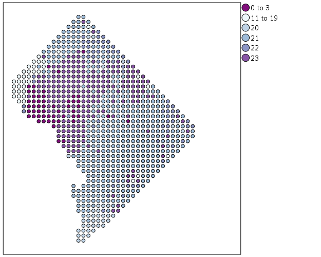
So that is not too shabby a map for just plain SPSS. Now it is a bit hard to vizualize the patterns though, because the surface has needless discontinuities because of the circles. We can use squares as the shape and just do some experimentation to figure out the size needed to fill up each grid cell. Also pro-tip when making choropleth maps, with many areas often light outlines look nicer than black ones.

*Alittle nicer, squares, no outline.
GGRAPH
  /GRAPHDATASET NAME="graphdataset" VARIABLES=XMetFish[LEVEL=SCALE] YMetFish[LEVEL=SCALE] HourBin
    MISSING=LISTWISE REPORTMISSING=NO
  /GRAPHSPEC SOURCE=INLINE.
BEGIN GPL
  SOURCE: s=userSource(id("graphdataset"))
  DATA: XMetFish=col(source(s), name("XMetFish"))
  DATA: YMetFish=col(source(s), name("YMetFish"))
  DATA: HourBin=col(source(s), name("HourBin"), unit.category())
  COORD: rect(dim(1,2), sameRatio())
  GUIDE: axis(dim(1), null())
  GUIDE: axis(dim(2), null())
  GUIDE: legend(aesthetic(aesthetic.color.exterior), label("HourBin"))
  SCALE: linear(dim(1), min(389800), max(408000))
  SCALE: linear(dim(2), min(125000), max(147800))
  SCALE: cat(aesthetic(aesthetic.color.interior), map(("1",color."810f7c"),("2",color."edf8fb"),("20",color."bfd3e6"),("21",color."9ebcda"),
         ("22",color."8c96c6"),("23",color."8856a7")))
  ELEMENT: point(position(XMetFish*YMetFish), color.interior(HourBin), shape(shape.square), size(size."9.5"), 
           transparency.exterior(transparency."1"))
END GPL.

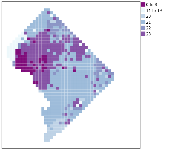
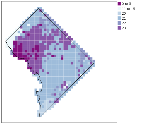
Again looking pretty good for just a map in plain SPSS. With the larger squares it is easier to clump together areas with similar patterns for the peak robbery time. The city never sleeps in Georgetown it appears. A few of the polygons though are very hard to see on the edge of DC though, so we will add in the outline. See the SOURCE: mapsrc, DATA: lon*lat, and the ELEMENT: polygon lines for how this is done. The “DCOutline.smz” is the map template file created by SPSS.

*Now include the outline.
GGRAPH
  /GRAPHDATASET NAME="graphdataset" VARIABLES=XMetFish[LEVEL=SCALE] YMetFish[LEVEL=SCALE] HourBin
    MISSING=LISTWISE REPORTMISSING=NO
  /GRAPHSPEC SOURCE=INLINE.
BEGIN GPL
  SOURCE: s=userSource(id("graphdataset"))
  DATA: XMetFish=col(source(s), name("XMetFish"))
  DATA: YMetFish=col(source(s), name("YMetFish"))
  DATA: HourBin=col(source(s), name("HourBin"), unit.category())
  SOURCE: mapsrc = mapSource(file("C:\\Users\\andrew.wheeler\\Dropbox\\Documents\\BLOG\\Inline_Maps_GGRAPH\\DCOutline.smz"))
  DATA: lon*lat = mapVariables(source(mapsrc))
  COORD: rect(dim(1,2), sameRatio())
  GUIDE: axis(dim(1), null())
  GUIDE: axis(dim(2), null())
  GUIDE: legend(aesthetic(aesthetic.color.exterior), label("HourBin"))
  SCALE: linear(dim(1), min(389800), max(408000))
  SCALE: linear(dim(2), min(125000), max(147800))
  SCALE: cat(aesthetic(aesthetic.color.interior), map(("1",color."810f7c"),("2",color."edf8fb"),("20",color."bfd3e6"),("21",color."9ebcda"),
         ("22",color."8c96c6"),("23",color."8856a7")))
  ELEMENT: point(position(XMetFish*YMetFish), color.interior(HourBin), shape(shape.square), size(size."9.5"), 
           transparency.exterior(transparency."1"))
  ELEMENT: polygon(position(lon*lat))
END GPL.

Now we have a bit more of a reference. The really late at night area appears to be north of Georgetown. The reason I figured this was even possible is that although mapSource is not documented in the GPL reference guide, there is an example using it with the project function (see page 194).

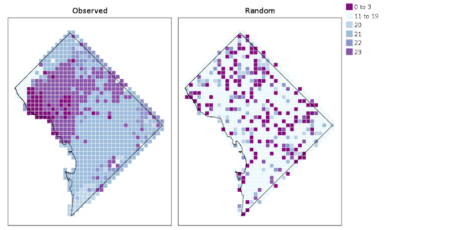
Now, if I were only making one map this isn’t really much of a help – I would just export the data values, make it in ArcGIS and be done with it. But, one of the things hard to do in GIS is make small multiple maps. That is something we can do fairly easily in stat. software though. For an example, here I make a random map to compare with the observed patterns. The grammar automatically recognizes lon*lat*Type and replicates the background outline across each panel. Also I change the size of the overall plot using PAGE statements. I just typically experiment until it looks nice.

*Can use the outline to do small multiples.
COMPUTE HourRand = TRUNC(RV.UNIFORM(0,24)).
RECODE HourRand (0 THRU 3 = 1)(4 THRU 19 = 2)(ELSE = COPY).
VARSTOCASES 
  /MAKE Hour FROM HourBin HourRand
  /INDEX Type.
VALUE LABELS Type 1 'Observed' 2 'Random'.

*Small multiple.
GGRAPH
  /GRAPHDATASET NAME="graphdataset" VARIABLES=XMetFish YMetFish Hour Type
    MISSING=LISTWISE REPORTMISSING=NO
  /GRAPHSPEC SOURCE=INLINE.
BEGIN GPL
  PAGE: begin(scale(1000px,500px))
  SOURCE: s=userSource(id("graphdataset"))
  DATA: XMetFish=col(source(s), name("XMetFish"))
  DATA: YMetFish=col(source(s), name("YMetFish"))
  DATA: Hour=col(source(s), name("Hour"), unit.category())
  DATA: Type=col(source(s), name("Type"), unit.category())
  SOURCE: mapsrc = mapSource(file("C:\\Users\\andrew.wheeler\\Dropbox\\Documents\\BLOG\\Inline_Maps_GGRAPH\\DCOutline.smz"))
  DATA: lon*lat = mapVariables(source(mapsrc))
  COORD: rect(dim(1,2), sameRatio(), wrap())
  GUIDE: axis(dim(1), null())
  GUIDE: axis(dim(2), null())
  GUIDE: axis(dim(3), opposite())
  GUIDE: legend(aesthetic(aesthetic.color.exterior), label("HourBin"))
  SCALE: linear(dim(1), min(389800), max(408000))
  SCALE: linear(dim(2), min(125000), max(147800))
  SCALE: cat(aesthetic(aesthetic.color.interior), map(("1",color."810f7c"),("2",color."edf8fb"),("20",color."bfd3e6"),("21",color."9ebcda"),
         ("22",color."8c96c6"),("23",color."8856a7")))
  ELEMENT: point(position(XMetFish*YMetFish*Type), color.interior(Hour), shape(shape.square), size(size."8"), 
           transparency.exterior(transparency."1"))
  ELEMENT: polygon(position(lon*lat*Type))
  PAGE: end()
END GPL.

We can see that this extreme amount of clustering is clearly not random.

This example works out quite nice because the micro level areas are a regular grid, so I can simulate a choropleth map look by just using square point markers. Unfortunately, I was not able to figure out how to map areas to merge a map file and an id like you can in VIZTEMPLATE. You can see some of my attempts in the attached code. You can however have multiple mapSource statements, so you could import say a street network, rivers and parks and map a nice background map right in SPSS. Hopefully IBM updates the documentation so I can figure out how to make a choropleth map in inline GPL statements.

Dropbox links blocked in China – just email me

A bit of material I share on the blog is hosted via Dropbox. A current student of mine mentioned that Dropbox links are blocked in China. So when he was home on break he did not have access to materials I linked to on my site. He mentioned Dropbox links have been blocked for around a year (although – his words – youtube and facebook have been blocked for years).

If I post something on the blog, but you do not have access to it, always feel free to send me an email. I will send the materials directly. My email is available via my About page, or on my CV.

It is unfortunate Dropbox links are blocked in China, but I see no reason to change services because of this – since any service I could switch to would potentially share the same fate as Dropbox.


Turning SPSS data into Python data

Previously I blogged about how to take Python data and turn it back into SPSS data. Here we are going to do the opposite — turn SPSS data into Python objects. First to start out we will make a simple dataset of three variables.

DATA LIST Free /X Y (2F1.0) Z (A1). 
BEGIN DATA
1 2 A
4 5 B
7 8 C
END DATA.
DATASET NAME Test.
EXECUTE.

To import this data into Python, we need to import the spss class of functions, which then you can read cases from the active dataset using the Cursor attribute. Here is an example of grabbing all of the cases.

*Importing all of the data.
BEGIN PROGRAM Python.
import spss
dataCursor = spss.Cursor()
AllData = dataCursor.fetchall()
dataCursor.close()
print AllData
END PROGRAM.

What this then prints out is ((1.0, 2.0, 'A'), (4.0, 5.0, 'B'), (7.0, 8.0, 'C')), a set of nested tuples. You can also just grab one case by replacing dataCursor.fetchall() with dataCursor.fetchone(), in which case it will just return one tuple.

To only grab particular variables from the list, you can pass a set of indices in the spss.Cursor object. Remember, Python indices start at zero, so if you want the first and second variables in the dataset, you need to grab the 0 and 1 indices.

*Only grabbing certain variables.
BEGIN PROGRAM Python.
dataNum = spss.Cursor([0,1])
spNumbers = dataNum.fetchall()
dataNum.close()
print spNumbers
END PROGRAM.

This subsequently prints out ((1.0, 2.0), (4.0, 5.0), (7.0, 8.0)). When grabbing one variable, you may want just a list of the objects instead of the nested tuples. Here I use list comprehension to turn the resulting tuples for the Z variable into a nice list.

*Converting to a nice list.
BEGIN PROGRAM Python.
dataAlp = spss.Cursor([2])
spAlp = dataAlp.fetchall()
dataAlp.close()
spAlp_list = [i[0] for i in spAlp] #convert to nice list
print spAlp
print spAlp_list
END PROGRAM.

The first print object is (('A',), ('B',), ('C',)), but the second is ['A', 'B', 'C'].

The above code works fine if you know the position of the variable in the file, but if the position can change this won’t work. Here is a one liner to get the variable names of the active dataset and plop them in a list.

*Way to get SPSS variable names.
BEGIN PROGRAM Python.
varList = [spss.GetVariableName(i) for i in range(spss.GetVariableCount())]
print varList
END PROGRAM.

Now if you have your list of variable names you want, you can figure out the index value. There are two ways to do it, iterate over the list of variable names in the dataset, or iterate over the list of your specified variables. I do the latter here (note this will result in an error if you supply a variable name not in the dataset).

*Find the indices of specific variables.
BEGIN PROGRAM Python.
LookVars = ["X","Z"]
VarInd = [varList.index(i) for i in LookVars]
print VarInd
END PROGRAM.

Now you can just supply VarInd above to the argument for spss.Cursor to grab those variables. Here I wrapped it all up in a function.

*Easy function to use.
BEGIN PROGRAM Python.
import spss
def AllSPSSdat(vars):
  if vars == None:
    varNums = range(spss.GetVariableCount())
  else:
    allvars = [spss.GetVariableName(i) for i in range(spss.GetVariableCount())]
    varNums = [allvars.index(i) for i in vars]
  data = spss.Cursor(varNums)
  pydata = data.fetchall()
  data.close()
  return pydata
END PROGRAM.

You can either supply a list of variables or None, in the latter case all of the variables are returned.

BEGIN PROGRAM Python.
MyDat = AllSPSSdat(vars=["Y","Z"])
print MyDat
END PROGRAM.

This set of nested tuples is then pretty easy to convert to other Python objects. Panda’s dataframes, Numpy arrays, and NetworkX objects are all one liners. Here is turning the entire dataset into a panda’s data frame.

*Turn into pandas data frame.
BEGIN PROGRAM Python.
import pandas as pd
MyDat = AllSPSSdat(vars=None)
allvars = [spss.GetVariableName(i) for i in range(spss.GetVariableCount())]
PanDat = pd.DataFrame(list(MyDat),columns=allvars)
print PanDat
END PROGRAM.

Which prints out.

   X  Y  Z 
0  1  2  A 
1  4  5  B 
2  7  8  C

Blogging in review 2015

For some meta commentary on the blog itself, the blog has continued to grow, surpassing a total of 100,000 cumulative site views since its inception in December 2011 (according to the stats that wordpress keeps). I added a total of 50 posts & pages in 2015, for a total of 170. The monthly growth is shown below, and it now appears linear. (This data was a few days short of the 1st, so December ended up cracking 4,000 site views in total.)

Pretty much all of my top posts are SPSS related, and were posted in years prior to 2015. Currently I average around 140 views per day, but it is spread out over many of the pages. Below is a table of the average views per day for my most popular pages. Note that the average site views of my home page are currently much higher, but it is dated to when I created the blog. (Created as of 12/28/15, so a few days short of the new year.)

Top Pages
Title Date Posted Views Days Since Posted Average Views Per Day URL
1 Home page / Archives 12/15/11 20048 1474 13.60 https://andrewpwheeler.wordpress.com/
2 Odds Ratios NEED To Be Graphed On Log Scales 10/26/13 6460 793 8.15 https://andrewpwheeler.wordpress.com/2013/10/26/odds-ratios-need-to-be-graphed-on-log-scales/
3 Comparing continuous distributions of unequal size groups in SPSS 04/29/12 6722 1338 5.02 https://andrewpwheeler.wordpress.com/2012/04/29/comparing-continuous-distributions-of-unequal-size-groups-in-spss/
4 Using the Google Places API in Python 05/15/14 2339 592 3.95 https://andrewpwheeler.wordpress.com/2014/5/15/using-the-google-places-api-in-python/
5 Hacking the default SPSS chart template 01/03/12 5705 1455 3.92 https://andrewpwheeler.wordpress.com/2012/01/03/hacking-the-default-spss-chart-template/
6 Why I feel SPSS (or any statistical package) is better than Excel for this particular job 03/30/13 3786 1003 3.77 https://andrewpwheeler.wordpress.com/2013/3/30/why-i-feel-spss-(or-any-statistical-package)-is-better-than-excel-for-this-particular-job/
7 Avoid Dynamite Plots! Visualizing dot plots with super-imposed confidence intervals in SPSS and R 02/20/12 4868 1407 3.46 https://andrewpwheeler.wordpress.com/2012/02/20/avoid-dynamite-plots-visualizing-dot-plots-with-super-imposed-confidence-intervals-in-spss-and-r/
8 Using sequential case processing for data management in SPSS 02/18/13 3539 1043 3.39 https://andrewpwheeler.wordpress.com/2013/2/18/using-sequential-case-processing-for-data-management-in-spss/

So most of the posts go relatively unnoticed, and even when they do get shared it at best a few hundred views in a day or two after it is posted. Being on my home page probably gets all of my posts abit of exposure for a week or two. But looking at the long haul many of my tutorial SPSS, python, and R posts get a fair amount of traffic. Or at least enough to continue to motivate me to write more posts!

As always, I don’t have a real fixed schedule I plan to write posts, nor any real roadmap of what I plan to blog about. I will say though doing my tour on the job market it has been interesting to get some recognition for what I post on the blog. It is mainly students who have asked me about it, but I’ve have some folks mention it at conferences as well.

Using Python to grab Google Street View imagery

Update: I have been asked several times over the years for help on this. In response I have made a simple GUI tool, given a list of addresses and a download folder location, will download all of the images. Applications are websites listing properties and marketers for mailings.

The tool costs $300, Check out the CRIME De-Coder Store to purchase.


I am at it again with using Google data. For a few projects I was interested in downloading street view imagery data. It has been used in criminal justice applications as a free source for second hand systematic social observation by having people code aspects of disorder from the imagery (instead of going in person) (Quinn et al., 2014), as estimates of the ambient walking around population (Yin et al., 2015), and examining criminogenic aspects of the built environment (Vandeviver, 2014).

I think it is just a cool source of data though to be honest. See for example Phil Cohen’s Family Inequality post in which he shows examples of auctioned houses in Detroit over time.

Using the Google Street View image API you can submit either a set of coordinates or an address and have the latest street view image returned locally. This ends up being abit simpler than my prior examples (such as the street distance API or the places API) because it just returns the image blob, no need to parse JSON.

Below is a simple example in python, using a set of addresses in Detroit that are part of a land bank. This function takes an address and a location to download the file, then saves the resulting jpeg to your folder of choice. I defaulted for the image to be 1200×800 pixels.

import urllib, os

myloc = r"C:\Users\andrew.wheeler\Dropbox\Public\ExampleStreetView" #replace with your own location
key = "&key=" + "" #got banned after ~100 requests with no key

def GetStreet(Add,SaveLoc):
  base = "https://maps.googleapis.com/maps/api/streetview?size=1200x800&location="
  MyUrl = base + urllib.quote_plus(Add) + key #added url encoding
  fi = Add + ".jpg"
  urllib.urlretrieve(MyUrl, os.path.join(SaveLoc,fi))

Tests = ["457 West Robinwood Street, Detroit, Michigan 48203",
         "1520 West Philadelphia, Detroit, Michigan 48206",
         "2292 Grand, Detroit, Michigan 48238",
         "15414 Wabash Street, Detroit, Michigan 48238",
         "15867 Log Cabin, Detroit, Michigan 48238",
         "3317 Cody Street, Detroit, Michigan 48212",
         "14214 Arlington Street, Detroit, Michigan 48212"]

for i in Tests:
  GetStreet(Add=i,SaveLoc=myloc)

Dropbox has a nice mosaic view for a folder of pictures, you can view all seven photos here. Here is the 457 West Robinwood Street picture:

In my tests my IP got banned after around 100 images, but you can get a verified google account which allows 25,000 image downloads per day. Unfortunately the automatic API only returns the most recent image – there is no way to return older imagery nor know the date-stamp of the current image. (You technically could download the historical data if you know the pano id for the image. I don’t see any way though to know the available pano id’s though.) Update — as of 2018 there is now a Date associated with the image, specifically a Year-Month, but no more specific than that. Not being able to figure out historical pano id’s is still a problem as far as I can tell as well.

But this is definitely easier for social scientists wishing to code images as opposed to going into the online maps. Hopefully the API gets extended to have dates and a second API to return info. on what image dates are available. I’m not sure if Mike Bader’s software app is actually in the works, but for computer scientists there is a potential overlap with social scientists to do feature extraction of various social characteristics, in addition to manual coding of the images.


Update: here is a version that works for python 3+. Currently you need to have a key, no more getting a few free images before being cut off.

# For Python Versions 3+
# Tested V3.10 on 12/15/2021
import os
import urllib.parse
import urllib.request

myloc = r"??????????????" #replace with your own location
key = "&key=" + "????????????" #you need an actual key now!!

def GetStreet(Add,SaveLoc):
  base = "https://maps.googleapis.com/maps/api/streetview?size=1200x800&location="
  MyUrl = base + urllib.parse.quote_plus(Add) + key #added url encoding
  fi = Add + ".jpg"
  urllib.request.urlretrieve(MyUrl, os.path.join(SaveLoc,fi))

Tests = ["457 West Robinwood Street, Detroit, Michigan 48203",
         "1520 West Philadelphia, Detroit, Michigan 48206",
         "2292 Grand, Detroit, Michigan 48238",
         "15414 Wabash Street, Detroit, Michigan 48238",
         "15867 Log Cabin, Detroit, Michigan 48238",
         "3317 Cody Street, Detroit, Michigan 48212",
         "14214 Arlington Street, Detroit, Michigan 48212"]

for i in Tests:
  GetStreet(Add=i,SaveLoc=myloc)

Testing day-of-week crime randomness paper published

My paper, Testing Serial Crime Events for Randomness in Day of Week Patterns with Small Samples, was recently published in the Journal of Investigative Pyschology and Offender Profiling. Here is the pre-print version on SSRN if you can’t get access to that journal.

The main idea behind the paper was if you had a series of a few crime events that you know are linked to the same offender, can we tell if those patterns are random with respect to the day of the week? We know spatial patterns are often clustered, but police responses such as surveillance are conditioned not only on a spatial location, but take place during certain days and times. I wanted to know when I could go to command staff and say, yeah you should BOLO on Saturday. Or just as importantly say in response, no the observed patterns could easily happen if the offender were just randomly picking days.

In the paper I show that if you have only 3 events and they all occur on the same day, you would reject the null that crimes have an equal probability across all seven days of the week at a p-value of less than 0.05. I also show that the exact test I propose has pretty good power for as few as 8 events in the series. So if you have, say 10 events and you fail to reject the null that each day of the week has equal probability of being chosen, it is pretty good evidence that a police response should not have any preference for a particular day.

To illustrate how one would use the test, I have a simple spreadsheet posted here (in the zip file has my other SPSS code to reproduce the results in the paper) in which you can type in the days of the week that the crimes are occurring on, and it calculates the hypothesis test.

The spreadsheet contains both the G-test and Kuiper’s V test. If you don’t read the paper and understand the difference, just use the G-test and ignore the Kuiper’s V results. For crime analysts, this is basically the minimum of what you need to know.


For analysts who are more into the nitty gritty, I also have some R code that is a bit more flexible, and calculates the exact test for varying numbers of bins and provides some code to conduct power analysis. So you can either download the code from GitHub and insert it to define the functions, or simply copy-paste it into the console. The only library dependency is the partitions library, so make sure that is installed before following along.

So if you have downloaded the code, you can use something like below to insert the functions and load the partitions library.

library(partitions)
mydir <- "C:\\Users\\andrew.wheeler\\Dropbox\\Documents\\BLOG\\ExactTest_Weekdays"
setwd(mydir)
source("Exact_Dist.R")

Now, say you had a series of crimes that had 4 on Saturday, 3 on Tuesday, and 1 on Sunday. You can test this for randomness by simply using:

crime <- c(1,0,3,0,0,0,4)
res <- SmallSampTest(d=crime)
res

Which prints at the console:

Small Sample Test Object 
Test Type is G 
Statistic is 15.5455263389754 
p-value is:  0.0182662  
Data are:  1 0 3 0 0 0 4 
Null probabilities are:  0.14 0.14 0.14 0.14 0.14 0.14 0.14 
Total permutations are:  3003  

This defaults to using the likelihood ratio G-test, but you can also use Kuiper’s V, the chi-square test, or the Komolgrov-Smirnov test. Also you can change the null hypothesis to not equal probability in the bins. I default to the G-test in my paper because it is more powerful than the more typical chi-square after 8 crimes for 7 day-of-week bins, but equal in power to the chi-square for smaller sample sizes. So to do the chi-square test on the same data, use:

resChi <- SmallSampTest(d=crime, type="Chi")
resChi
chisq.test(crime) #for comparison to base R 
chisq.test(crime, simulate.p.value = TRUE, B = 10000)

Which you can see the test statistic mimics base R’s chisq.test, and the p-value is slightly higher than the asymptotic p-value (the exact test should always have a higher p-value than the asympotic distribution, and here it is lower than the simulated p-value). This situation the simulation approach would have been fine. I prefer the exact approach when feasible though, because it is exact, and you don’t need to worry about convergence for the simulation (which most everyone simply picks a large number and hopes for the best).

I’ve also made some code that allows for easy evaluation of the power of the exact test. Coding wise it was easiest to simply use the original object created with the test, so I know it invites post-hoc power analysis – forgive me for my slothness in coding practices. So say you wanted to do apriori power analysis with the Kuiper’s V test for 10 bins and 15 observations (so over 1.3 million permutations, i.e. n <- 15; m <- 10; choose(n+m-1,m-1)). You can simply make an original object (with any observed values across the bins).

test10_data <- c(15,rep(0,9))
test10_perm <- SmallSampTest(d=test10_data, type="KS")
#takes around a minute

The default null is equal probability across the bins, and to do a power analysis you have to specify an alternative. Lets say for the alternative there is equal probability in 5 of the bins, and zero probability in the other 5. (Most of the work is done in making the original permutation object, the power analysis is quite fast, hence why I coded it to work this way.)

p_alt <- c(rep(1/5,5),rep(0,5))
Pow_test <- PowAlt(SST=test10_perm,p_alt=p_alt)
Pow_test

This prints out at the console:

Power for Small Sample Test 
Test statistic is: KS  
Power is: 0.1822815  
Null is: 0.1 0.1 0.1 0.1 0.1 0.1 0.1 0.1 0.1 0.1  
Alt is: 0.2 0.2 0.2 0.2 0.2   0   0   0   0   0  
Alpha is: 0.05  
Number of Bins: 10  
Number of Observations: 15  

So for this alternative there is quite low power, only 0.18. But if we change it to only have mass in four of the bins, the power goes way up to over 0.99.

> p_alt2  Pow_test2  Pow_test2
Power for Small Sample Test 
Test statistic is: KS  
Power is: 0.9902265  
Null is: 0.1 0.1 0.1 0.1 0.1 0.1 0.1 0.1 0.1 0.1  
Alt is: 0.25 0.25 0.25 0.25   0   0   0   0   0   0  
Alpha is: 0.05  
Number of Bins: 10  
Number of Observations: 15 

So this shows how the exact test R code can be extended beyond just 7 day-of-week bins. I have not done really any exploration of the power of the KS test or differing numbers of bins though.

The spatial consistency of bar locations – Buffalo 1901 vs. 2015

Part of my work I’m interested in the correlates of crime at very small places, particularly aspects of the built environment. Part of the difficulty of this work though is that some aspects of the built environment change very slowly. I often just anecdotally give bars as an example – when a bar goes under it often just gets replaced by another bar. So for example if I want to make an estimate of how much crime would decrease if you took a bar away, it is difficult looking at historical data because most of the time when a bar goes away it is just replaced by another in a short time span.

But admittedly this perception was just based on my anecdotal experiences. So when I saw some historical maps John Krygier posted of saloons I wanted to put a pretty strict test to my assertion. Here is a map of saloons in Buffalo (circa 1901 on John’s website):

I grabbed the current locations of places licensed to sell alcohol in New York State via the open data portal and geocoded those in Buffalo. (This includes things like grocery stores as well as bars.) I did a mediocre job trying to digitize the old map (here is the digitized image), and here we can see the overlap between the current and the historical locations. Zoom into the area with the blue icons to see the historical locations.

So we can see that my baseline of bars not changing is not accurate for this for this extreme comparison. If you zoom out you can see that there is a higher concentration of bars just to the west, so I wonder if over time there was a shift of these bar locations.

John has some more examples of historical saloon maps in Baltimore plus San Francisco and New York City (in the same post with Buffalo). I’d be interested to see those locations as well if someone takes the time to replicate this.

I may have to think more seriously about evaluating the effect of bars over time, and seeing if things like bars losing their licenses because of violations result in crime decreases.

Keeping it simple: Viz. mass shooting definitions

My wife asked me the other day about some mass shooting statistics, in particular some claims of an average of one a day in the US. Without knowing the source, I told her outright it is probably because that person widened the net to events beyond what most people stereotypically consider a mass shooting.

Now, I have no personal opinion on how it should be defined, and being a researcher in criminal justice I appreciate people digging into the details. I was prompted to write this post by an interactive application showing how the numbers change by Kevin Schaul of the Washington Post (referred via Flowing Data). I was pretty frustrated by Kevin’s example interactive application though – there are much simpler ways than making me change the definition and seeing what individual events pop up. Here is an example screen shot of inputting a definition and then how Kevin’s data pop out.

So, downloading the same Reddit data for 2015 so far (as of 12/7/15) I created what I consider to be simple summaries. Caveat – these crowdsourced datasets are likely to have substantial missing data, especially towards the events with fewer injured. First I made a frequency histogram of the total number of dead per incident.

So you can see that if you only want to include dead in your personal definition, the one per day statistic is a dramatic over-representation. If you want to draw the line at 5 or more you will have around 9 more events than you would if you made the line at 6 or more. If you make the line at 10 or more there are only two incidents, but there are another 4 if you include incidents with 8 or 9 dead.

Another simple overview is a table. Here are tables of dead, injured, and the combined counts per each incident, sorted in descending value of the count. So the way to read this is that there there 147 seperate incidents in the reddit database that had 0 deaths, and 104 that had only one death, etc. The tables also have percents and cumulative percentage, so you can see how where you define the cut-point changes how much of the data you chop-off. Cumulative counts would be just as useful.

I have no personal problem using injured as well in a mass shooting definition. Basically the difference between being shot and being killed is seemingly due to random happenstance, so a shooting with 10 injured and no one killed can easily be argued to be a mass shooting in my opinion. Kevin’s interactive makes you choose an and condition though between injured and killed, whereas one could place the cut point at an or condition or simply the combined total. Here is a cross tabulation of the frequencies of injured by dead.

You can clearly see the reddit definition is the combined total of injured or dead is 4 via the line on the upper left of the table. Kevin’s and condition forces you to make a cut-point along each axis, basically choosing a rectangle in the lower right of the above crosstab table. If you want a combined total though, it will be along a diagonal somewhere in the table.

I appreciate these interactive visualizations allow a viewer to dig deeper into specific events in the data, but that does not mean some simple summaries could not also accompany the piece.